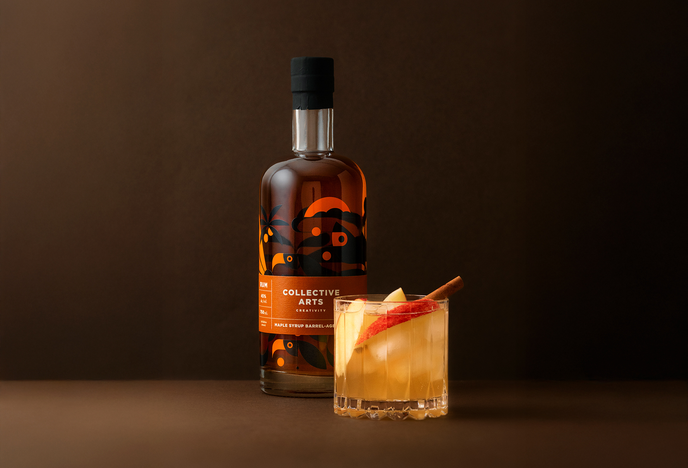
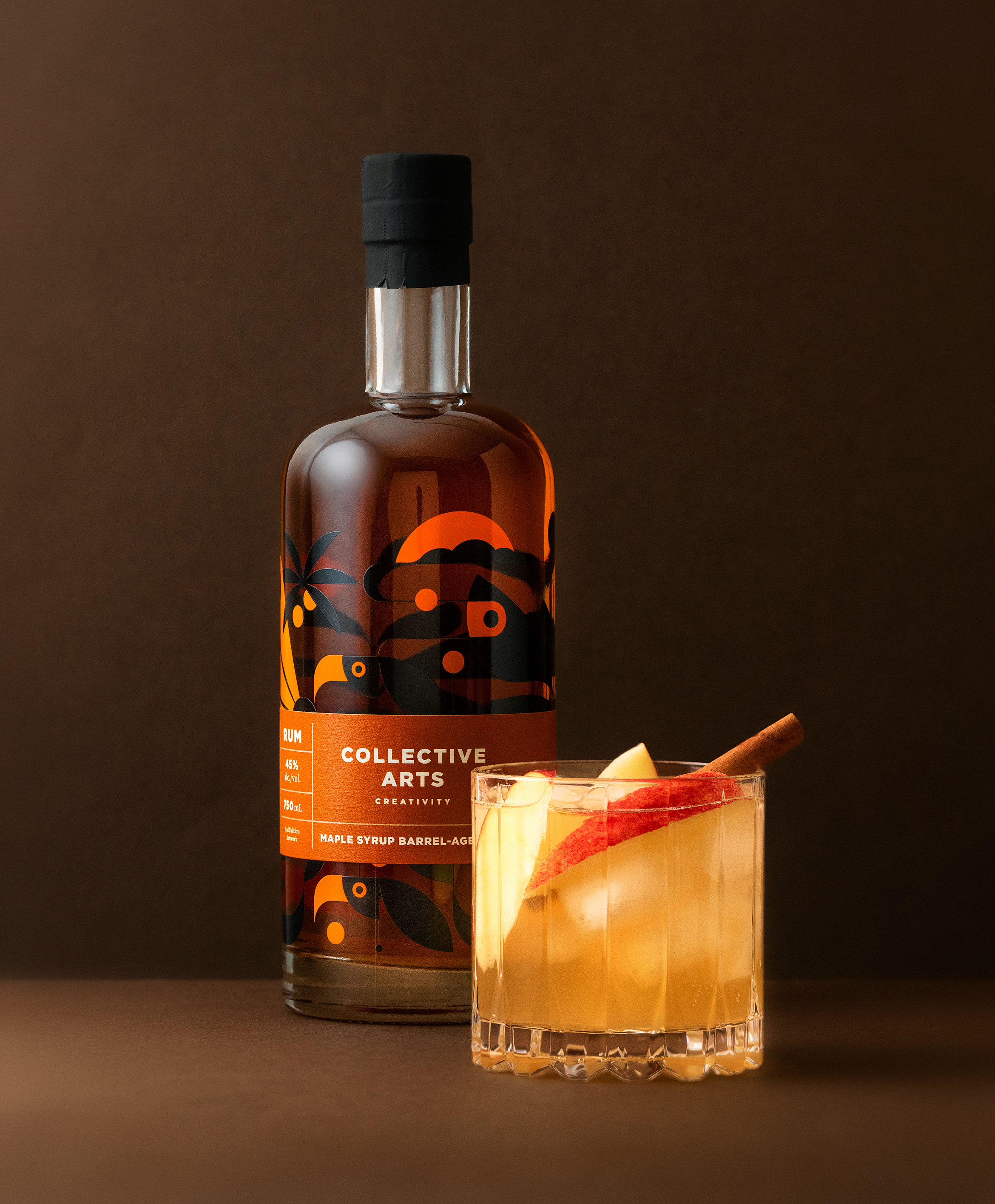
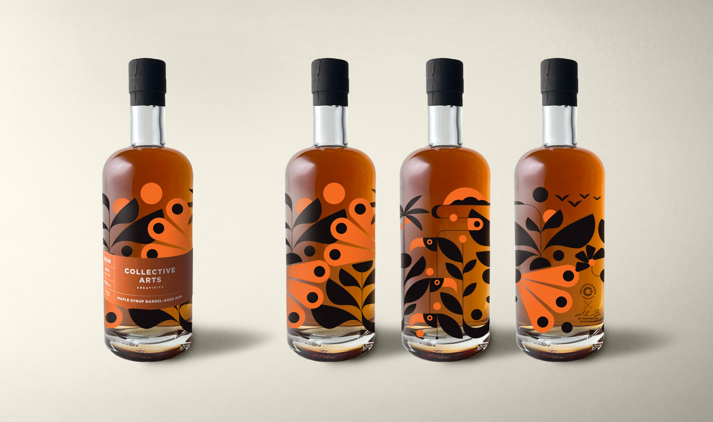
A tropical bottle design for Collective Arts maple syrup barrel-aged rum
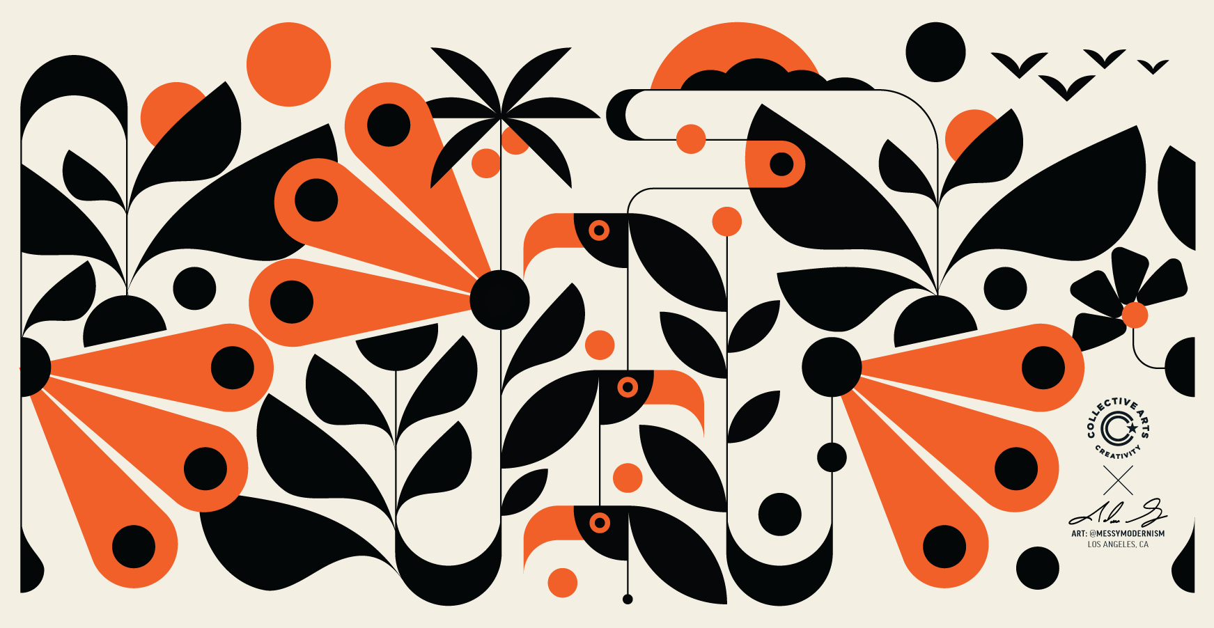
Collective Arts wanted to honor the tropical origins of rum itself through art. A modernist wraparound composition of tropical birds, flora, sunrises and sunsets weaves itself around the bottle. As the bottle empties, the artwork reveals itself, becoming a keepsake that any art lover (and cocktail enthusiast) would keep on their top shelf.
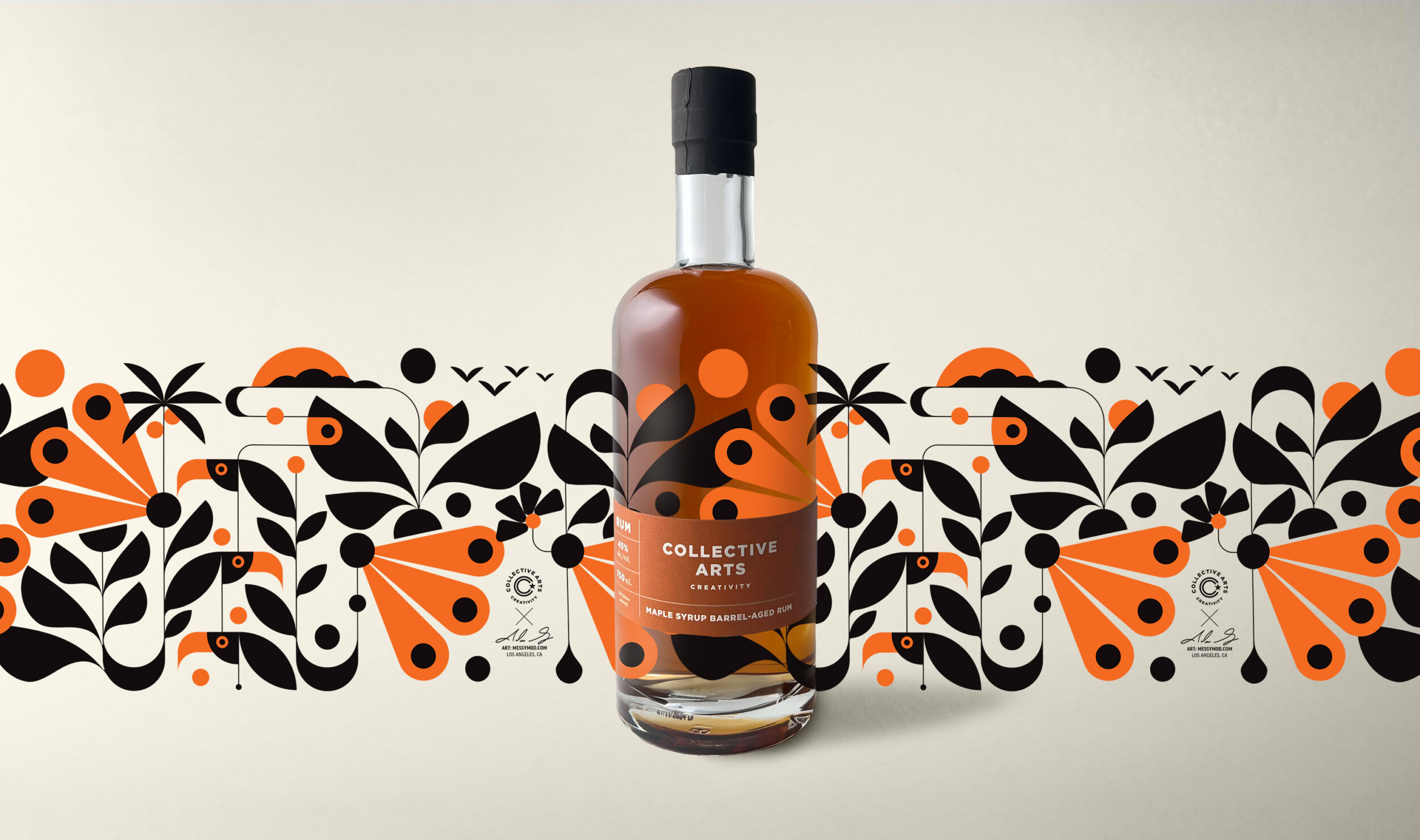
Photographs by Steve St. Jean
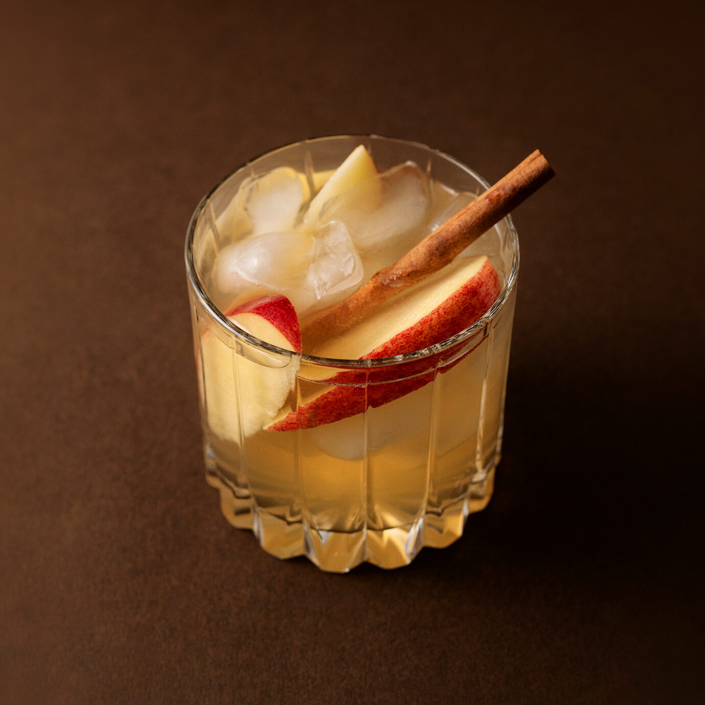
Specialty Cocktail Recipe :
Apple Maple Dark & Stormy
• 1 oz. Maple Syrup Barrel-Aged Rum
• .05 oz. Maple Syrup
• 1.5 oz. Apple Juice
• 2 oz. Ginger Beer
• Apple slice to garnish
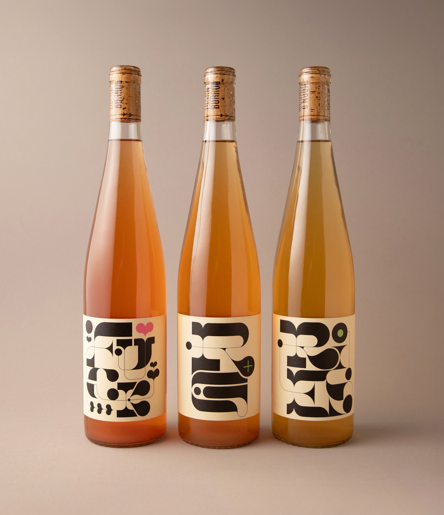
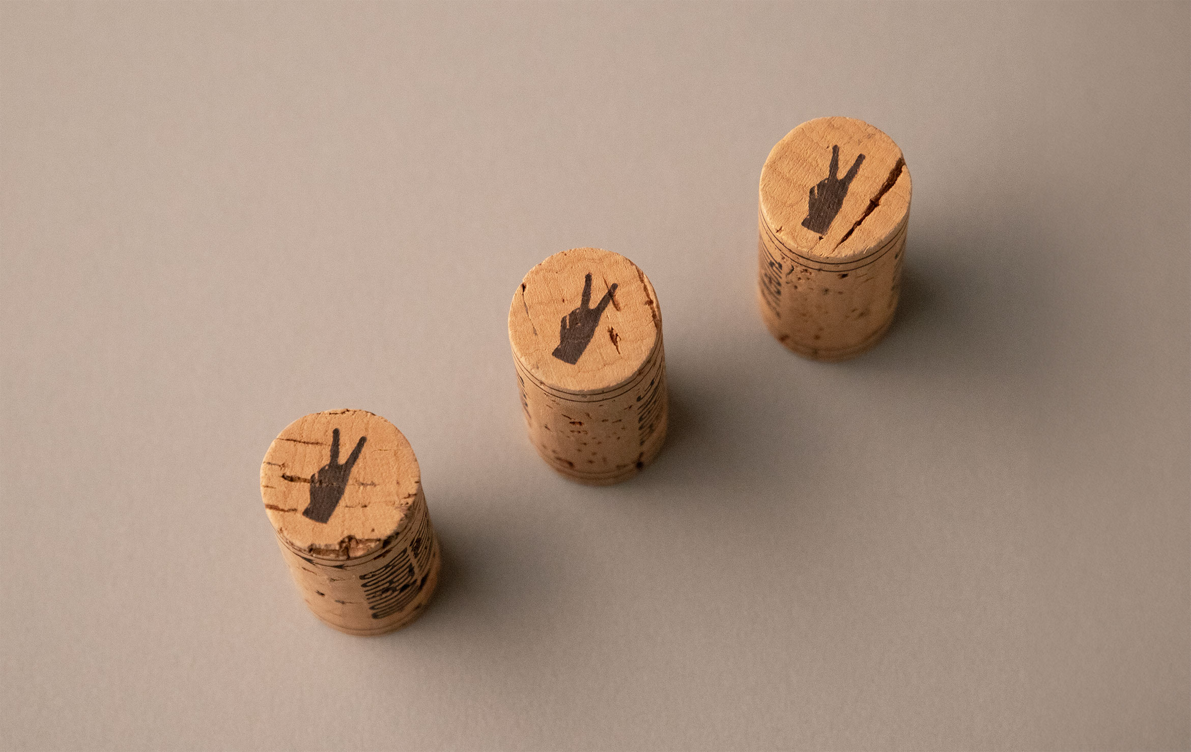
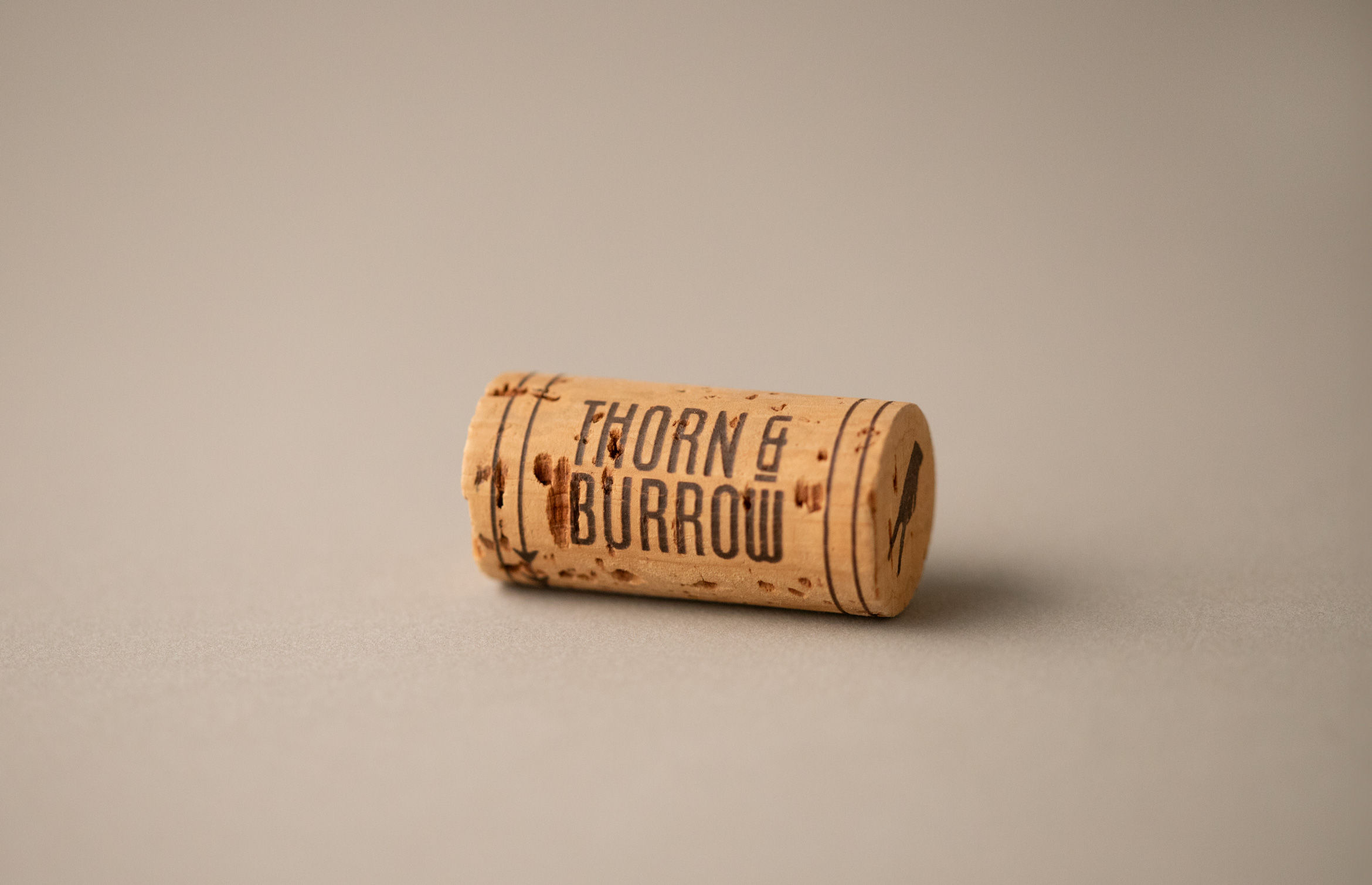
Thorn & Burrow Wines
Brand Identity / Illustration
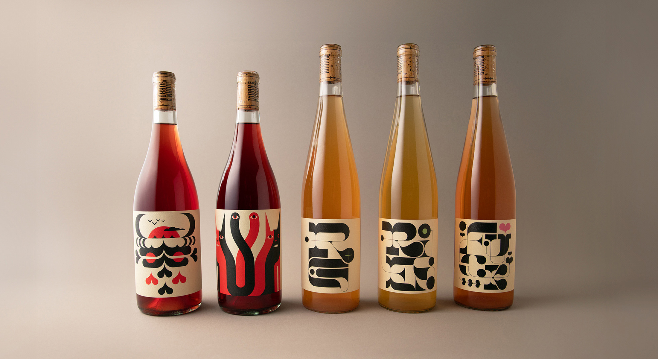
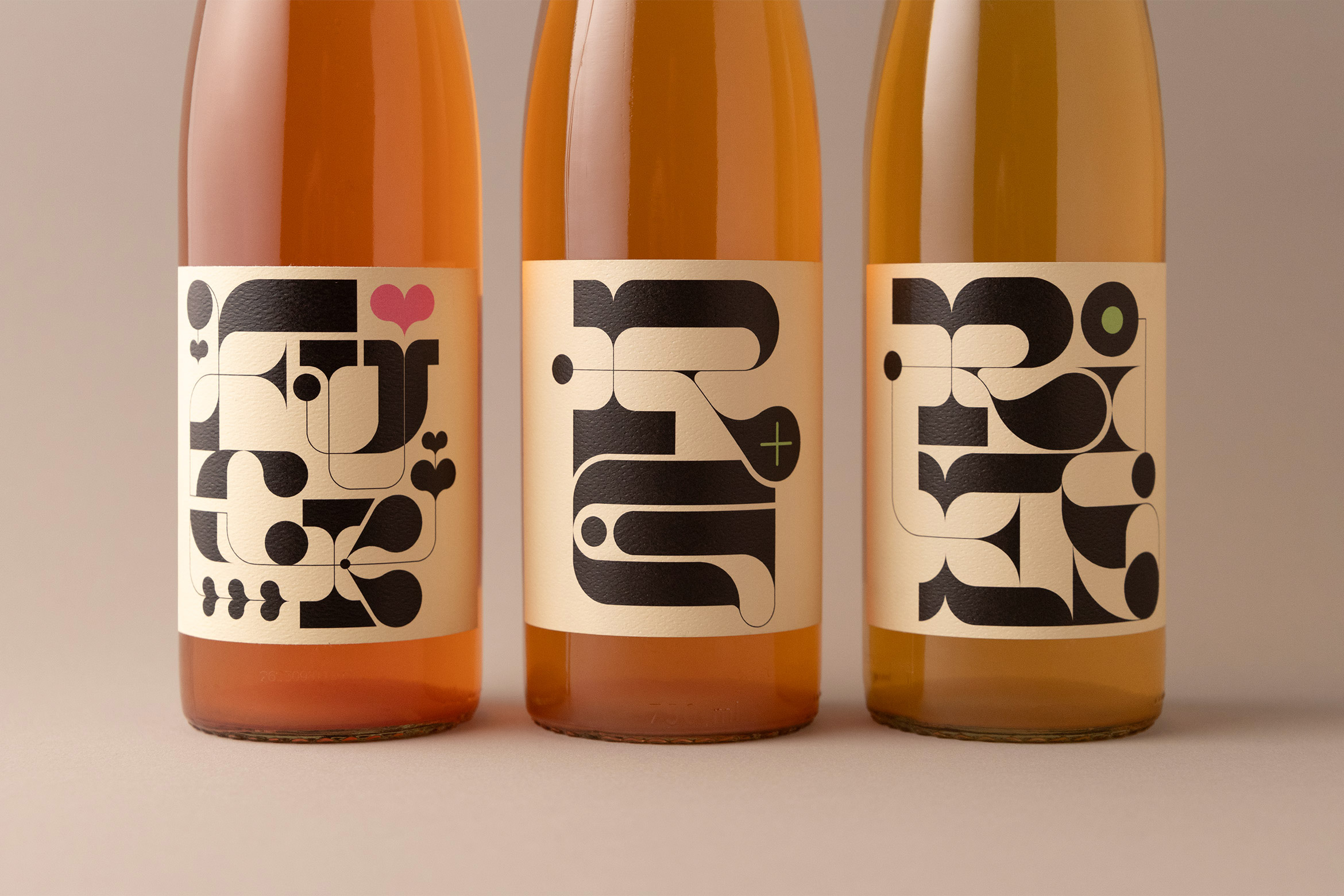
Thorn & Burrow Wines embraces the strange
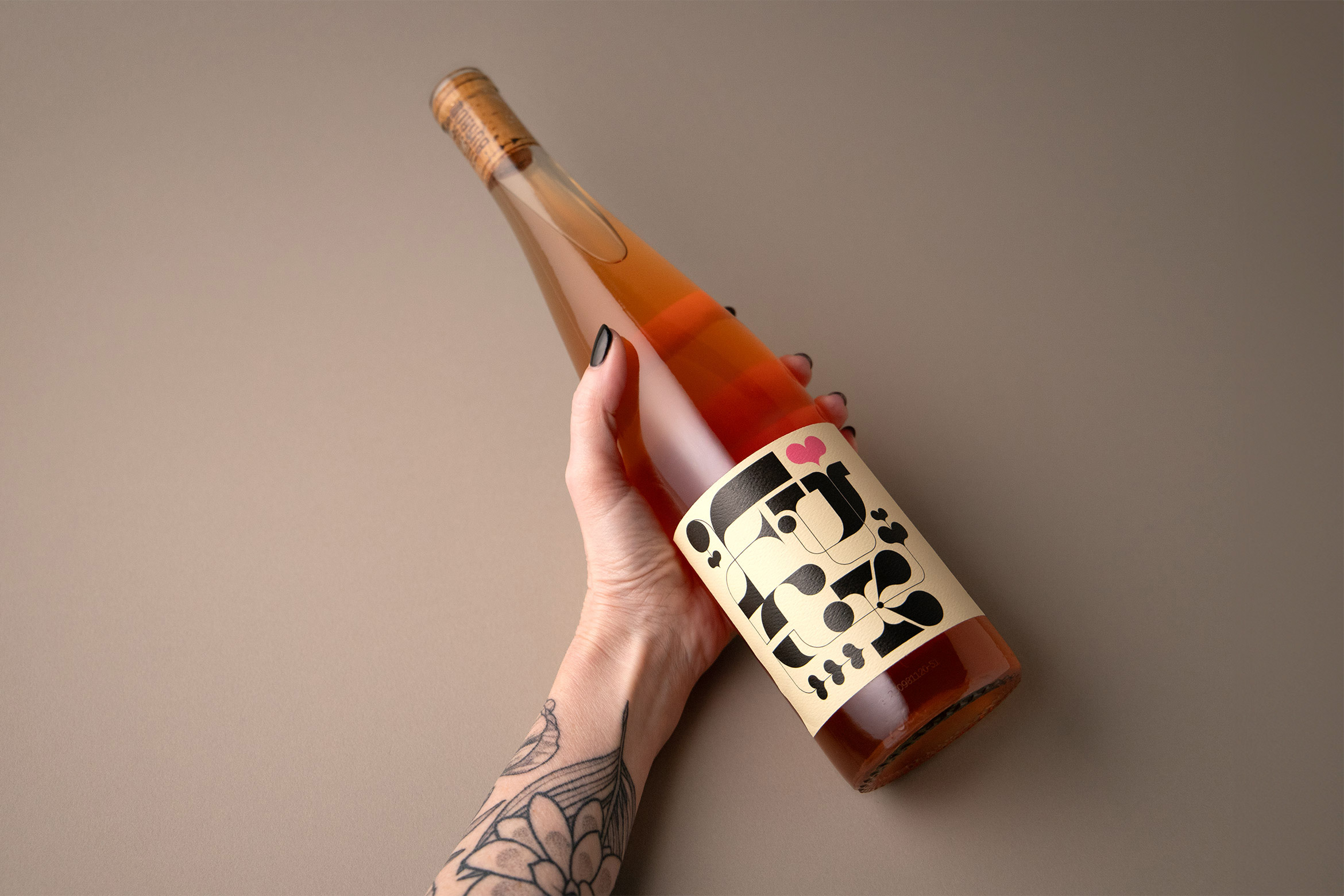
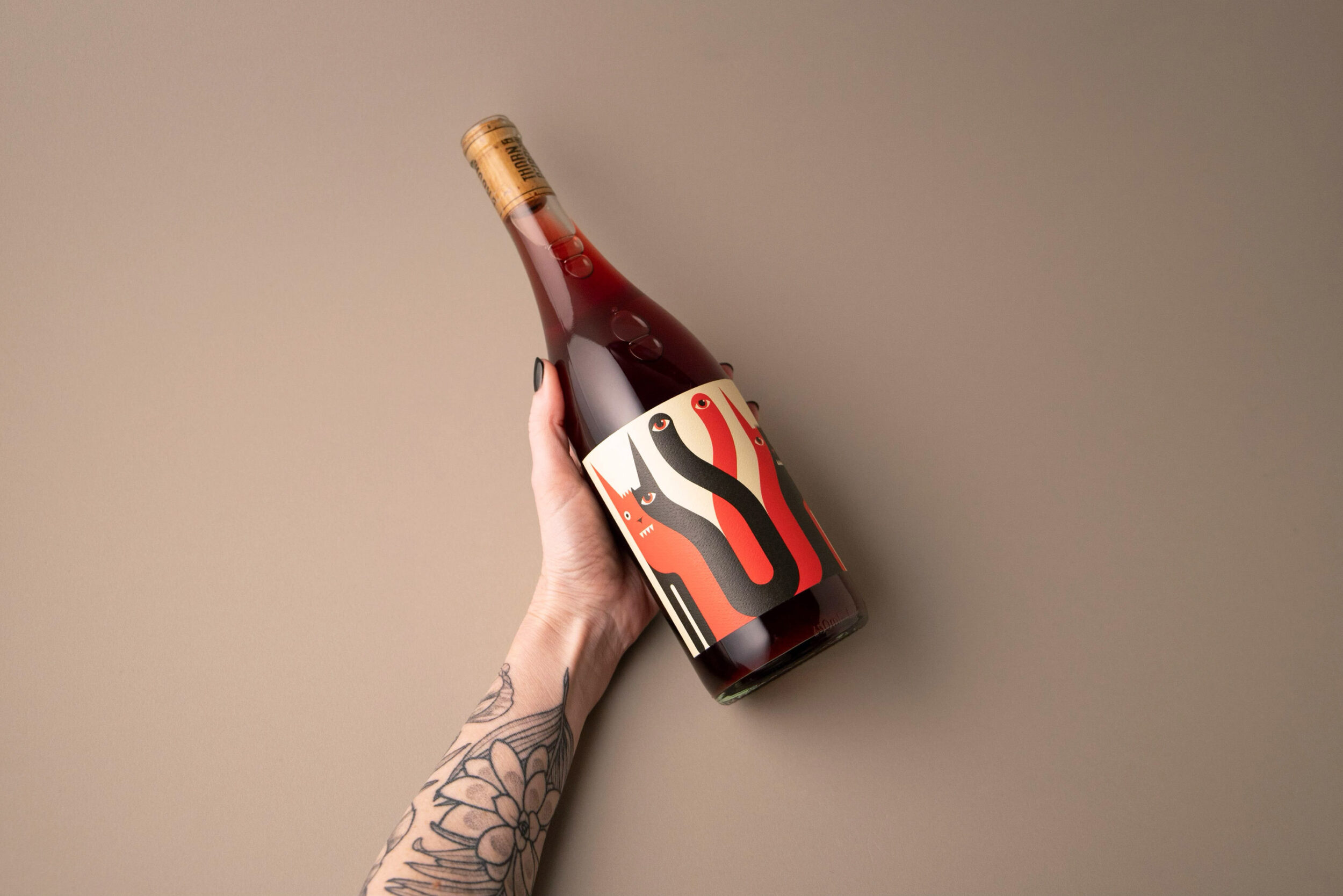
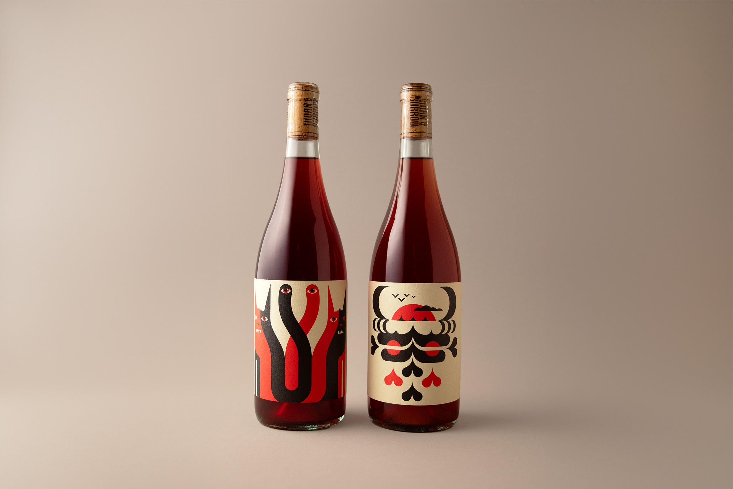
Thorn & Burrow Wines is a natural wine company located in Vancouver, British Columbia that creates unique and unconventional wine blends found nowhere else. To pair with each blend they wanted creative and offbeat label designs that establish them as visually unique as their wines.
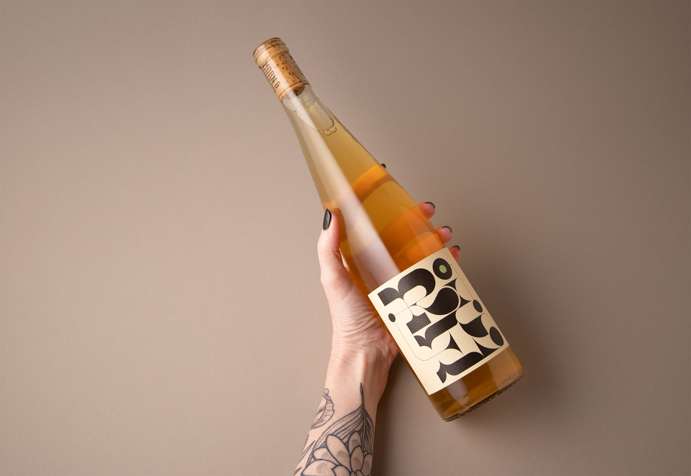
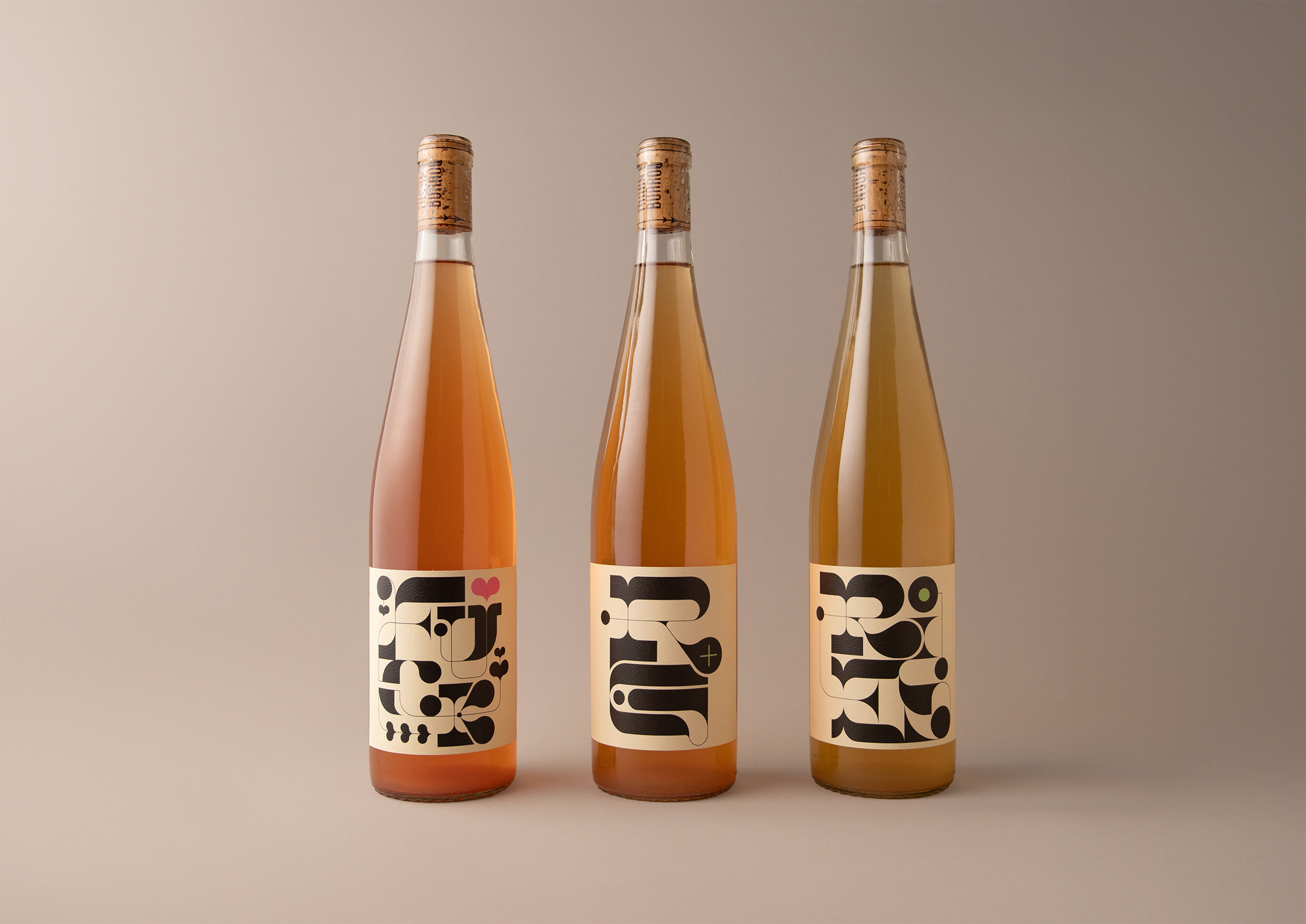
For the whites RG+ and RIES and the F*CK Rosé we created an organic and high-contrast family of custom typographic illustrations.
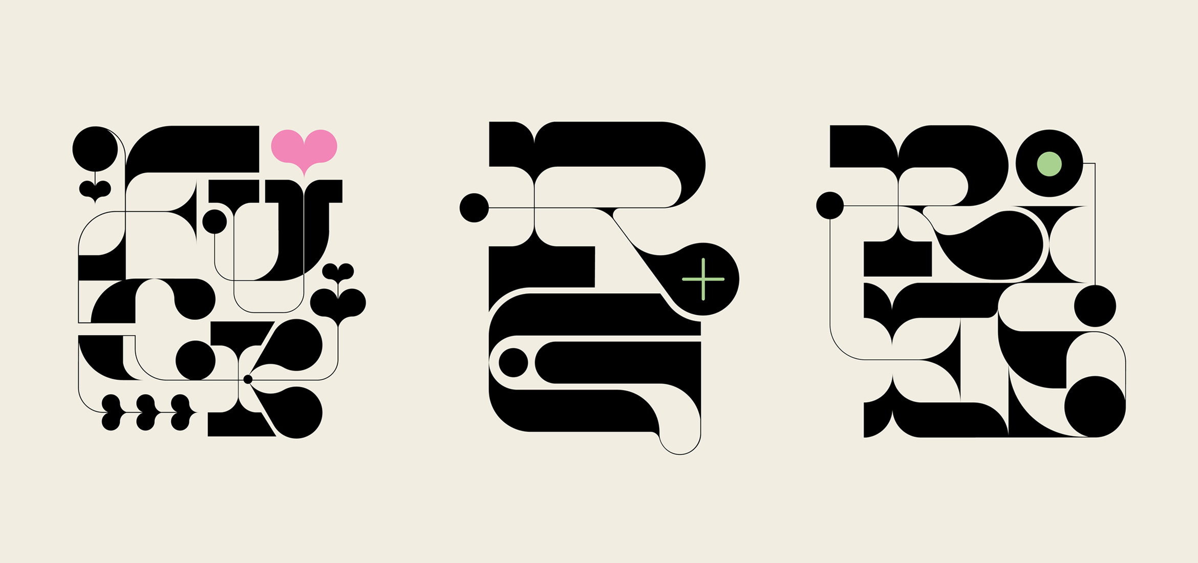
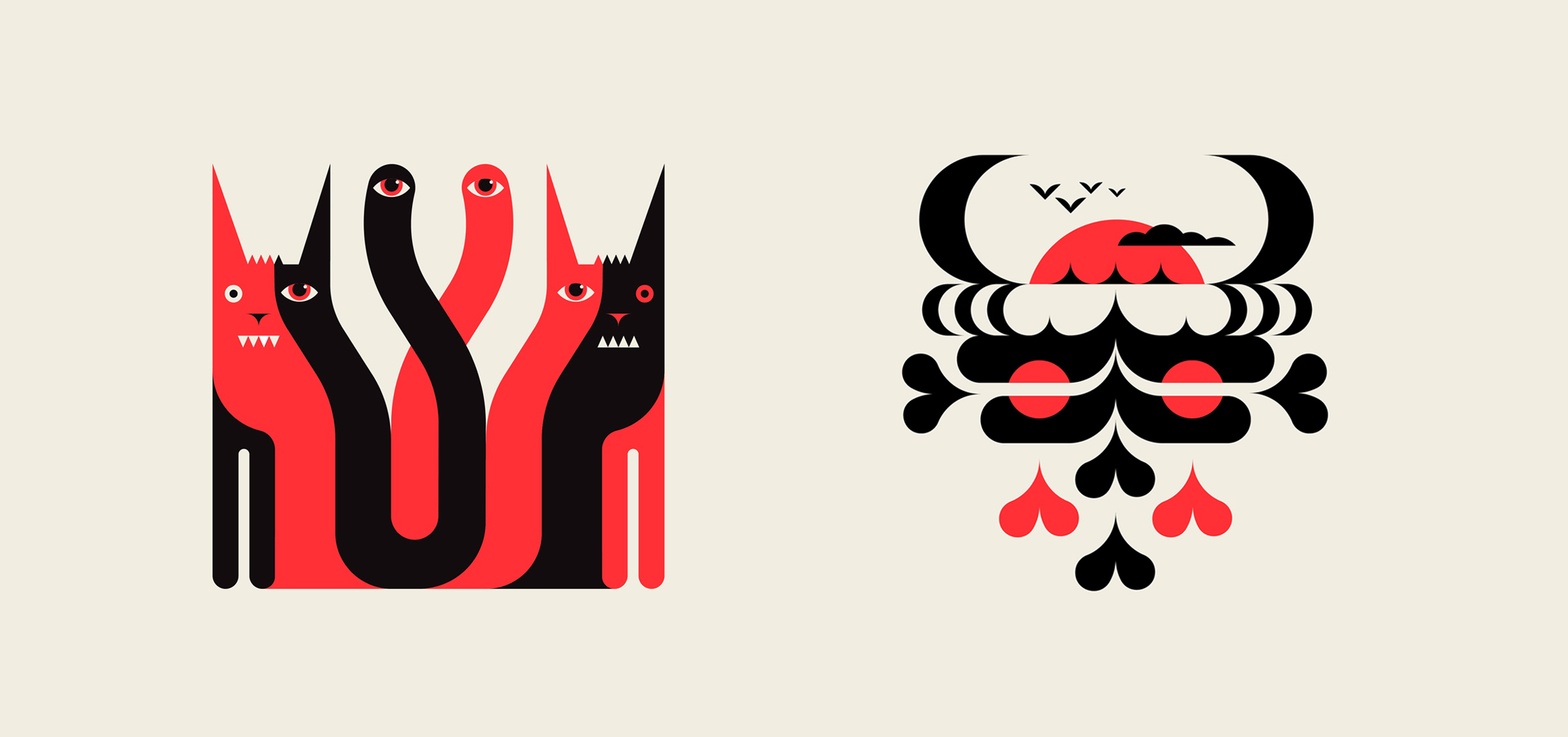
For the reds, the duo of Grumpy Cats and a Salty Pirate was used for an edgy, rebellious look that dares the consumer to try what’s inside.
A T&B monogram was designed to match the creative style for use on the back of all labels and informational materials.
More info about the ecclectic wines:
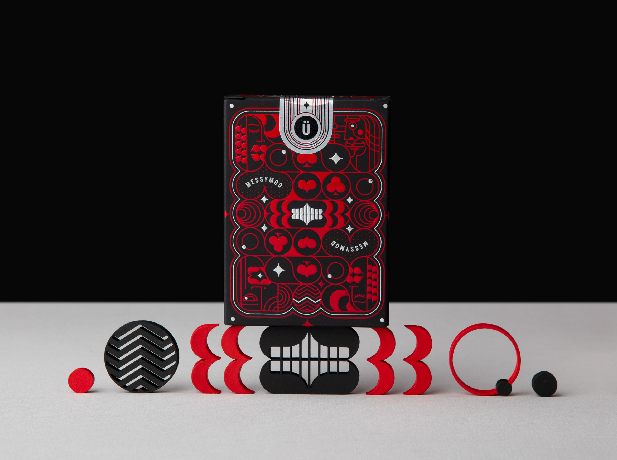
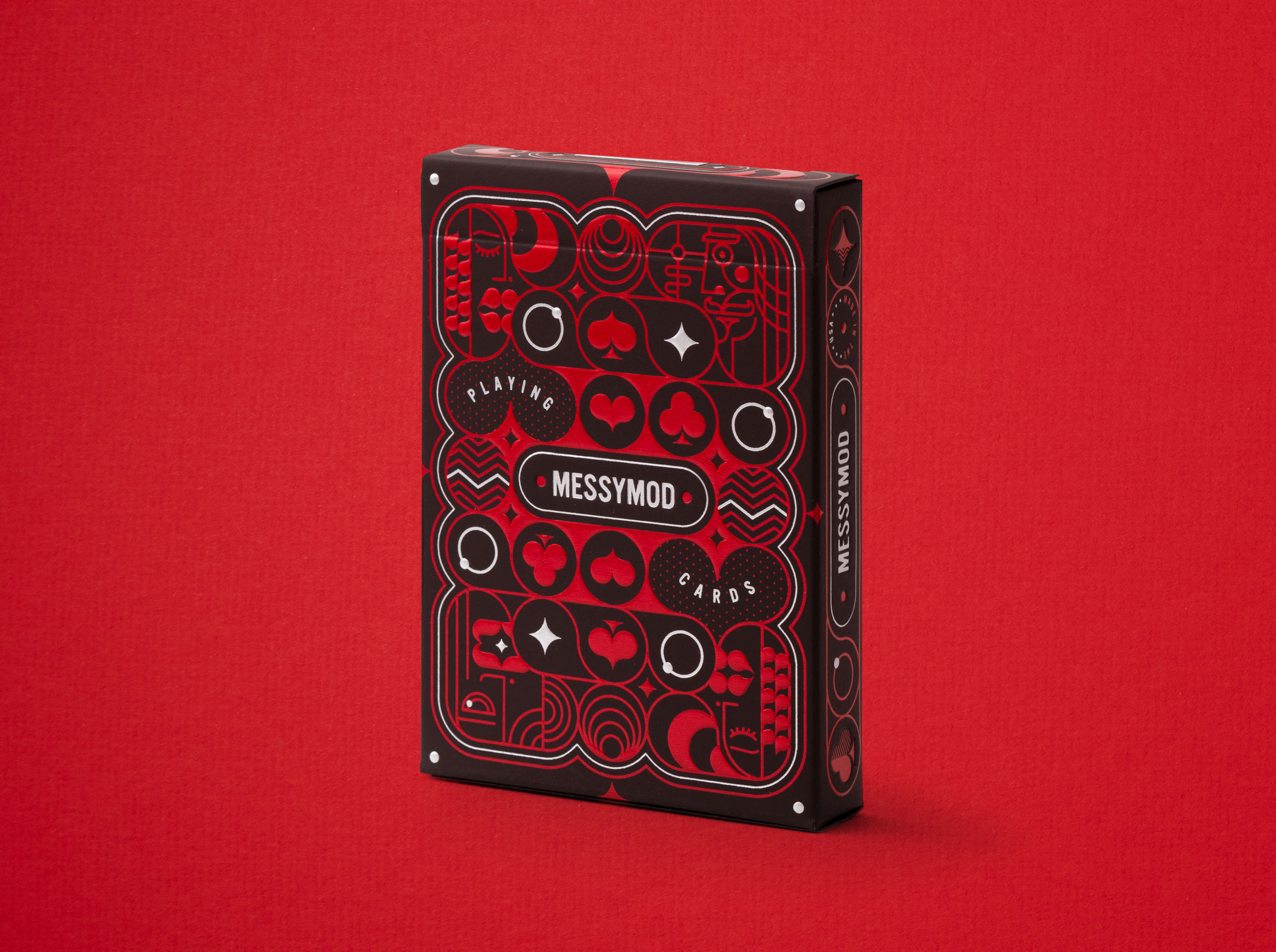
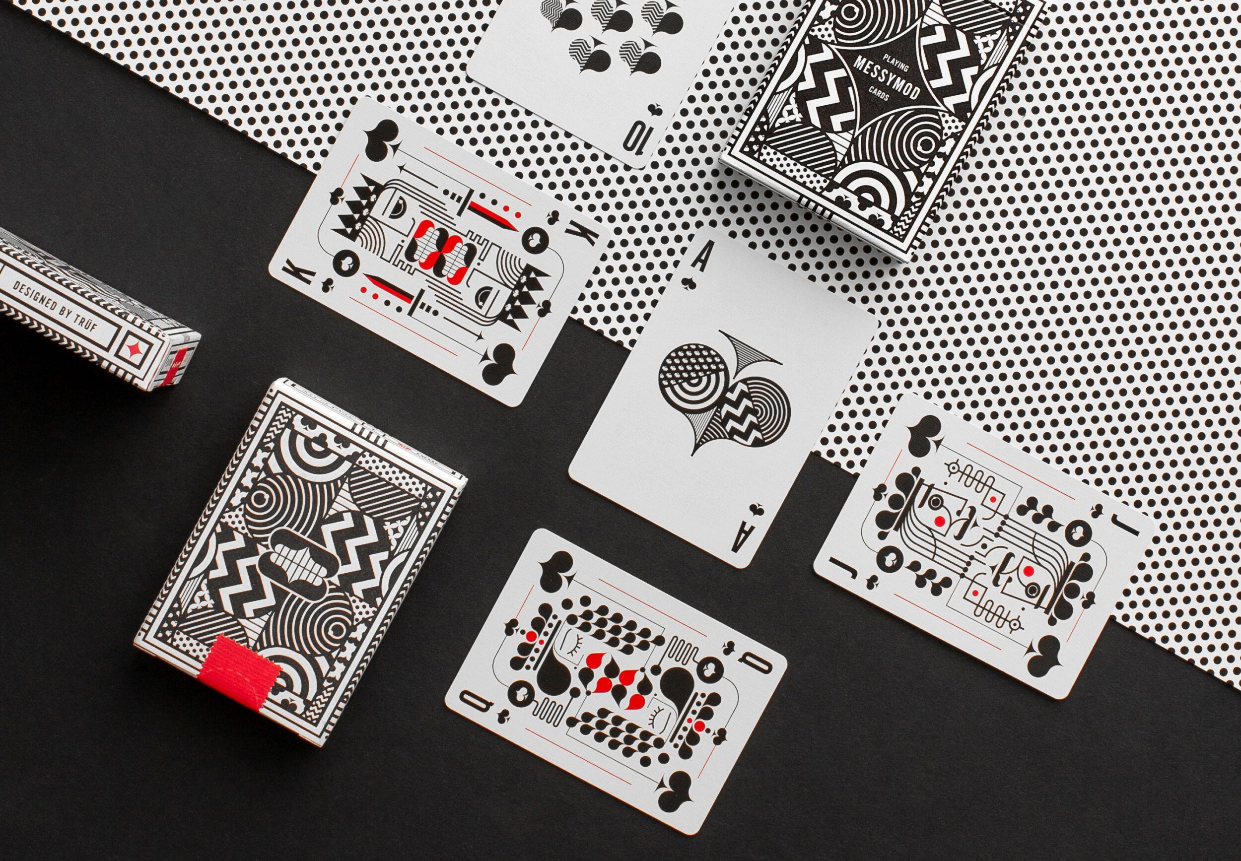
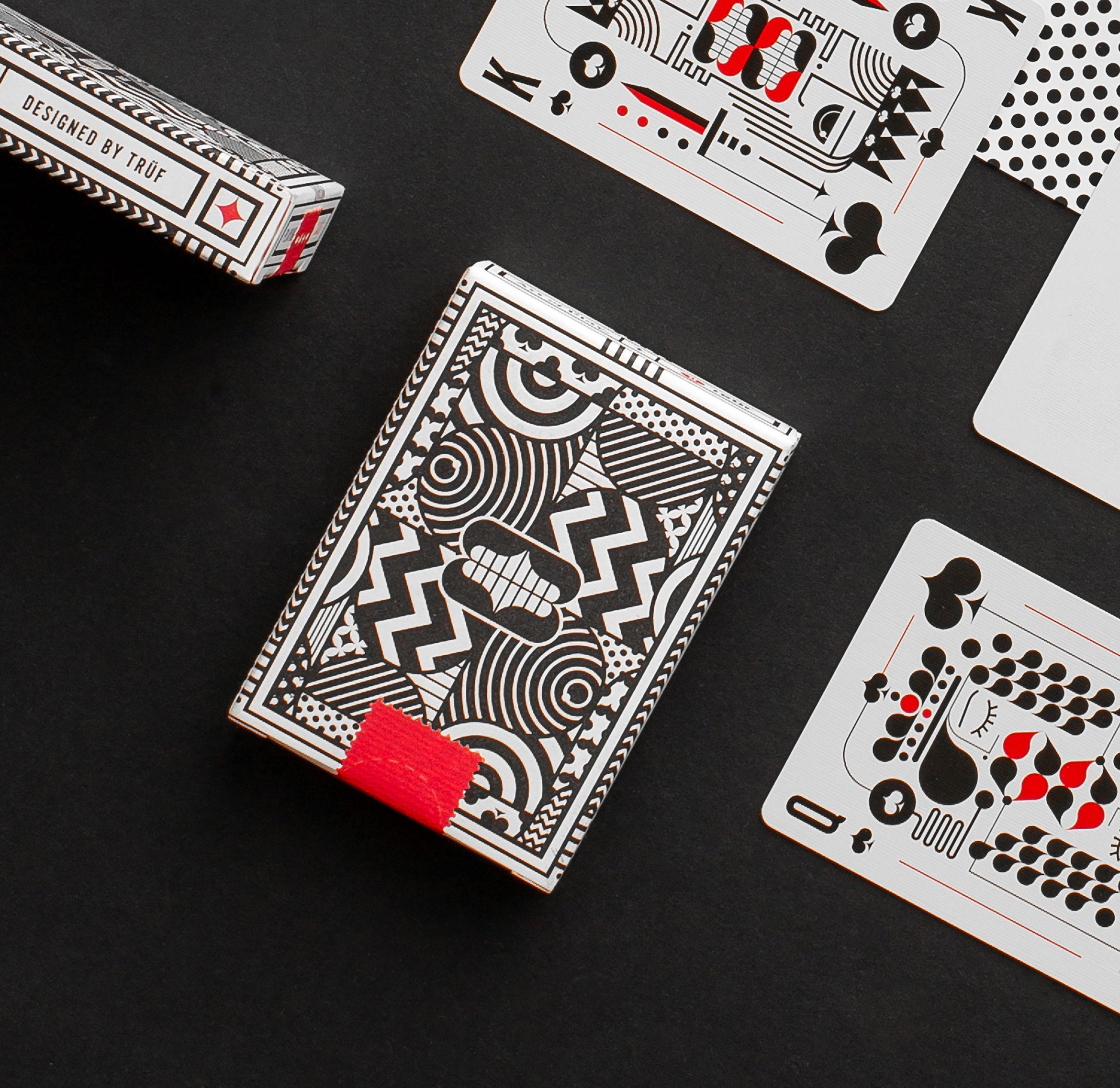
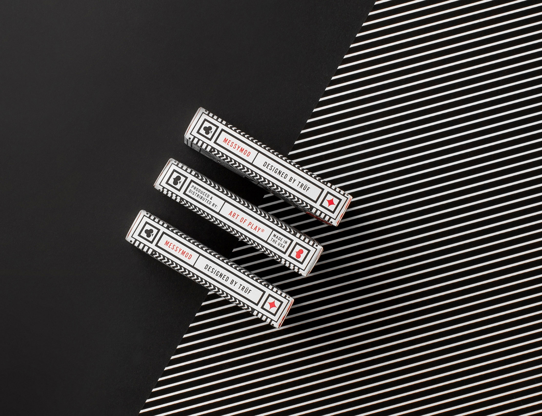
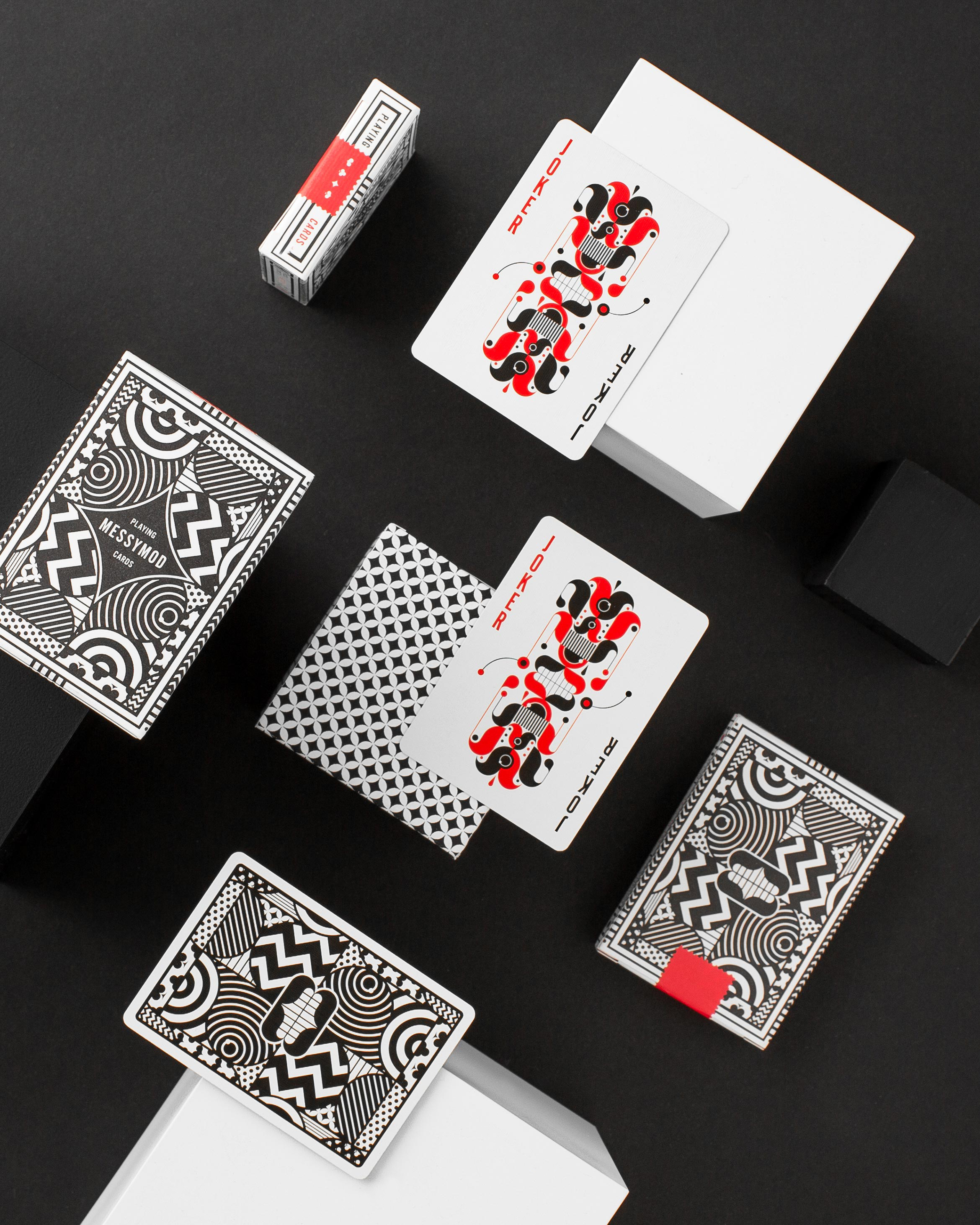
Art of Play edition 2 x TRÜF
illustration / packaging design
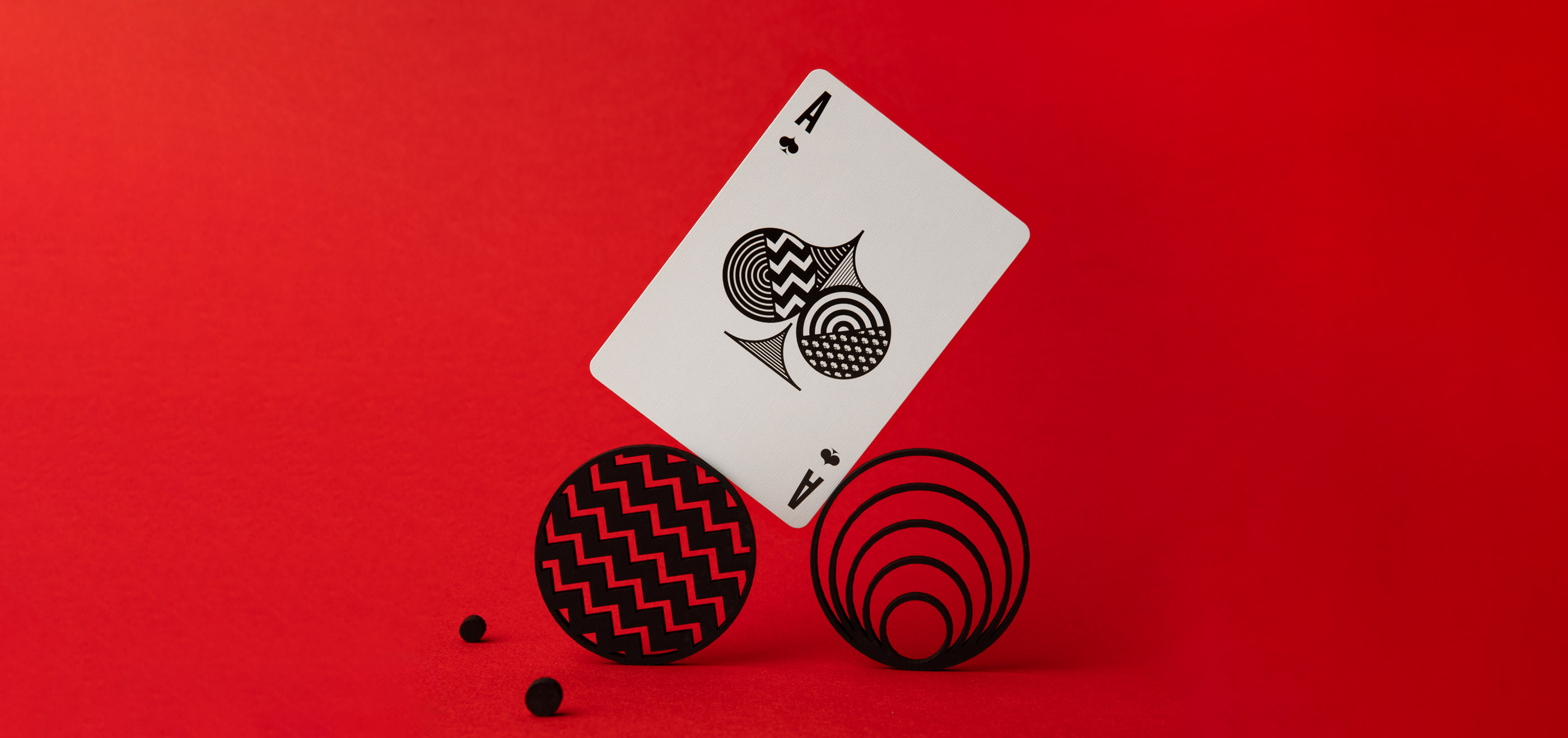
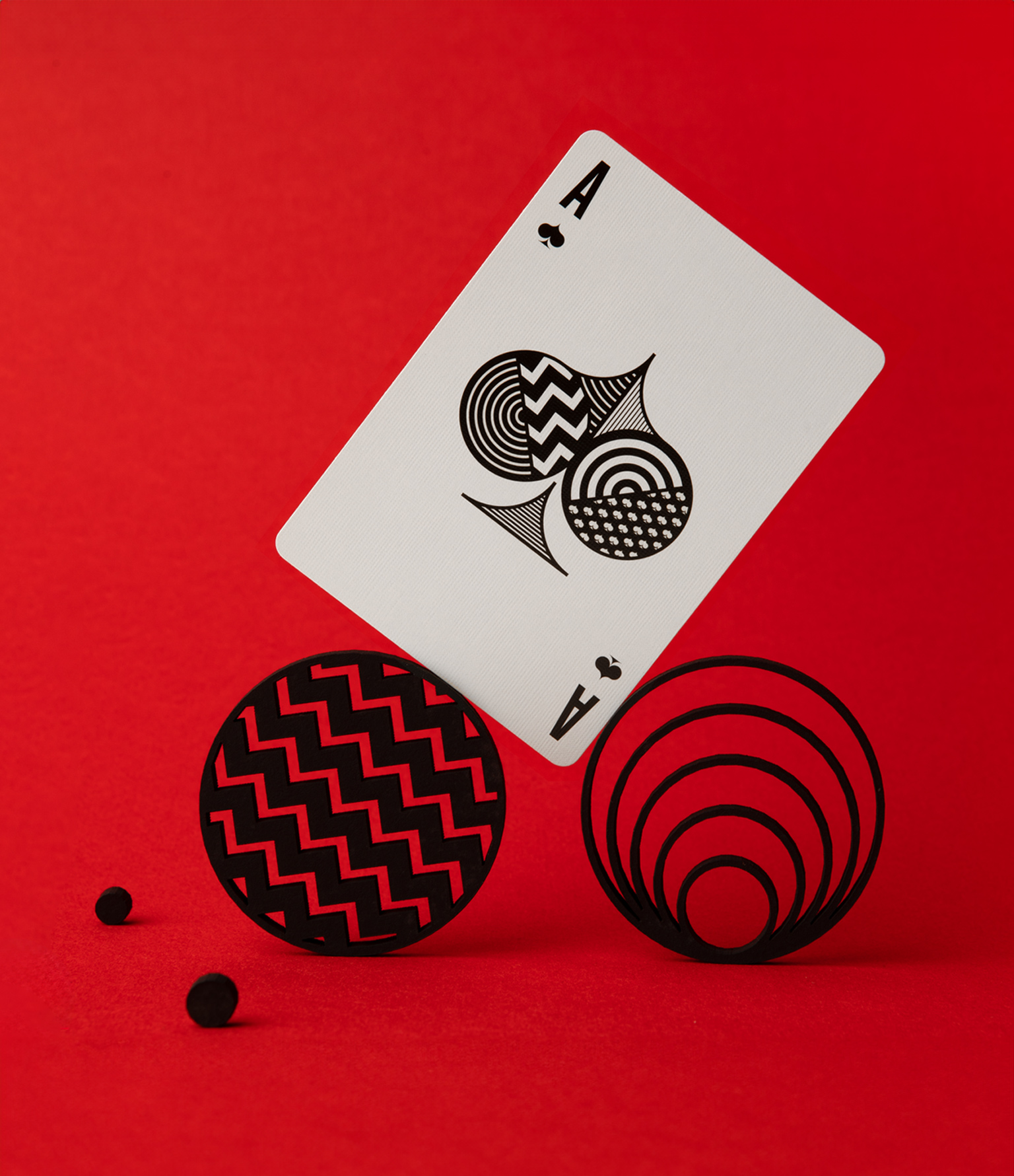
A 2nd edition of Messymod playing cards from Art of Play x TRÜF
We were thrilled to learn that our first edition of Messymod Playing Cards were so popular they sold out. We collaborated with Art of Play for a new, second edition with a new box and back design. Keeping the same Messymod theme for the cards themselves, we created a package with even more elaborate and high-end touches including red foil, hits of silver foil and embossed red elements.
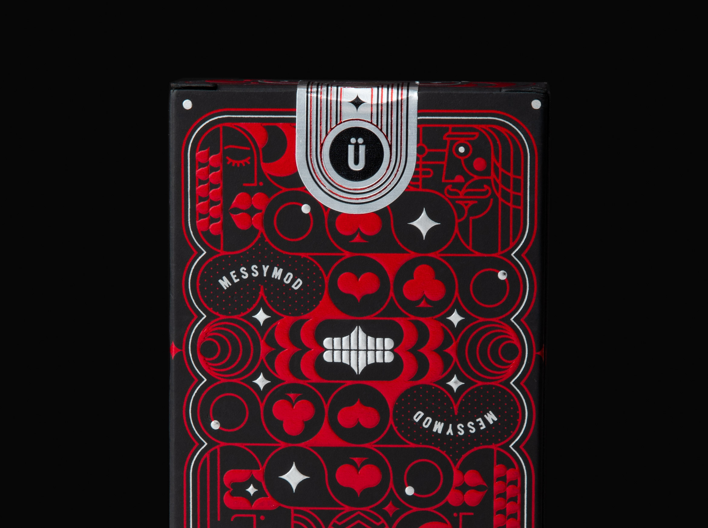
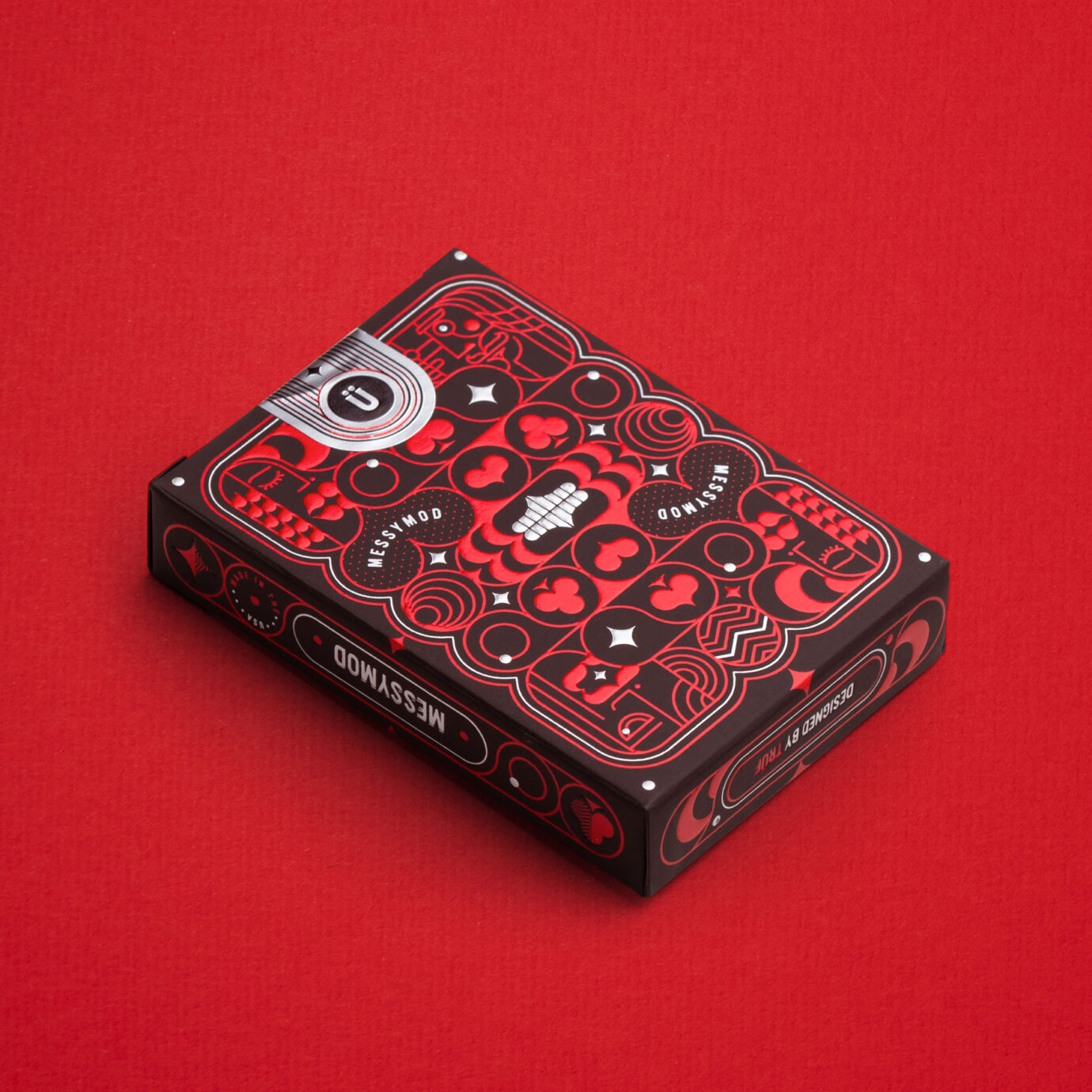
Art of Play x Messymod playing cards available as an Art + Play Bundle in our messymod shop. Get a deck bundled with a fine art print of your choice of King, Queen, Jack or Ace.
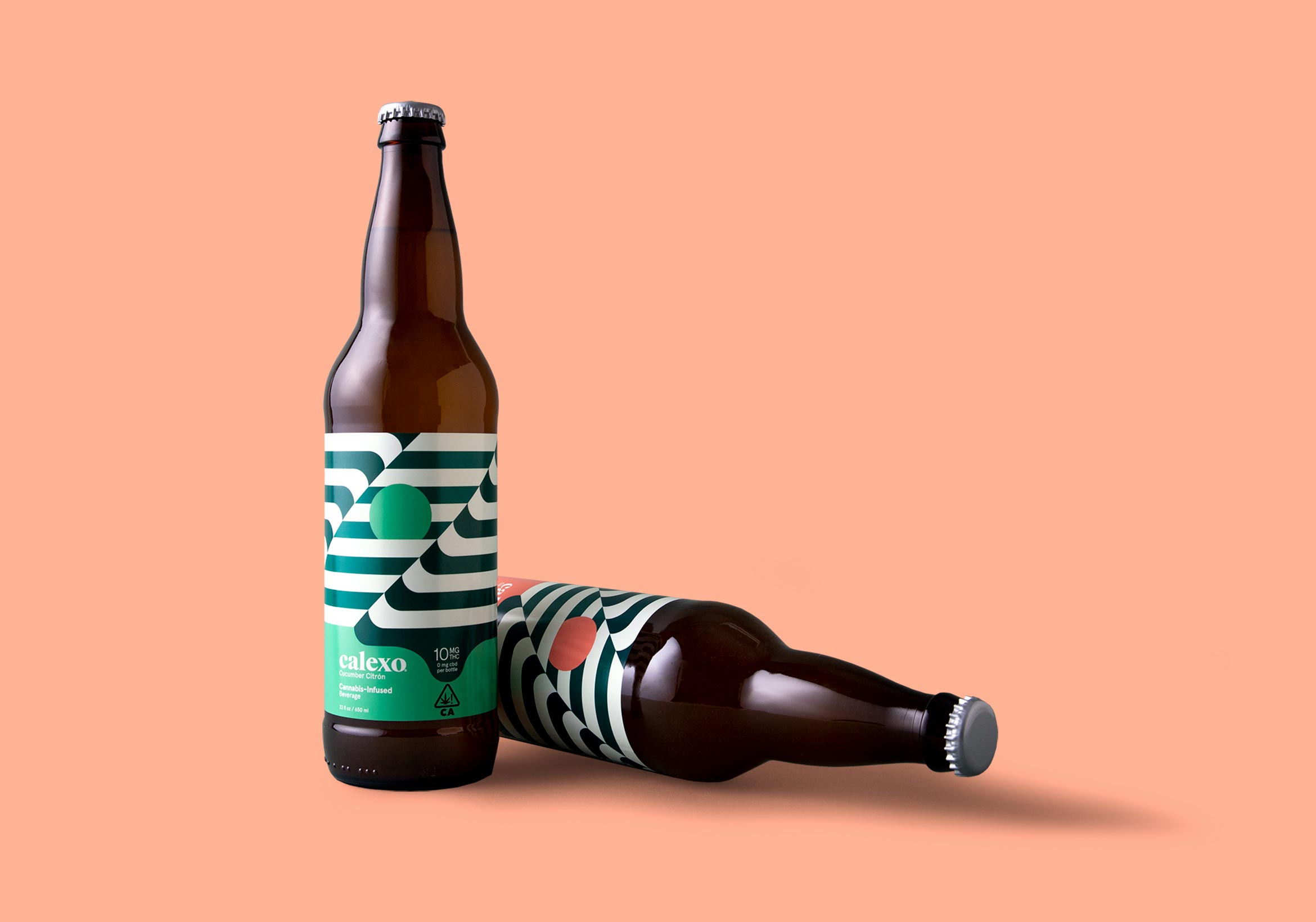
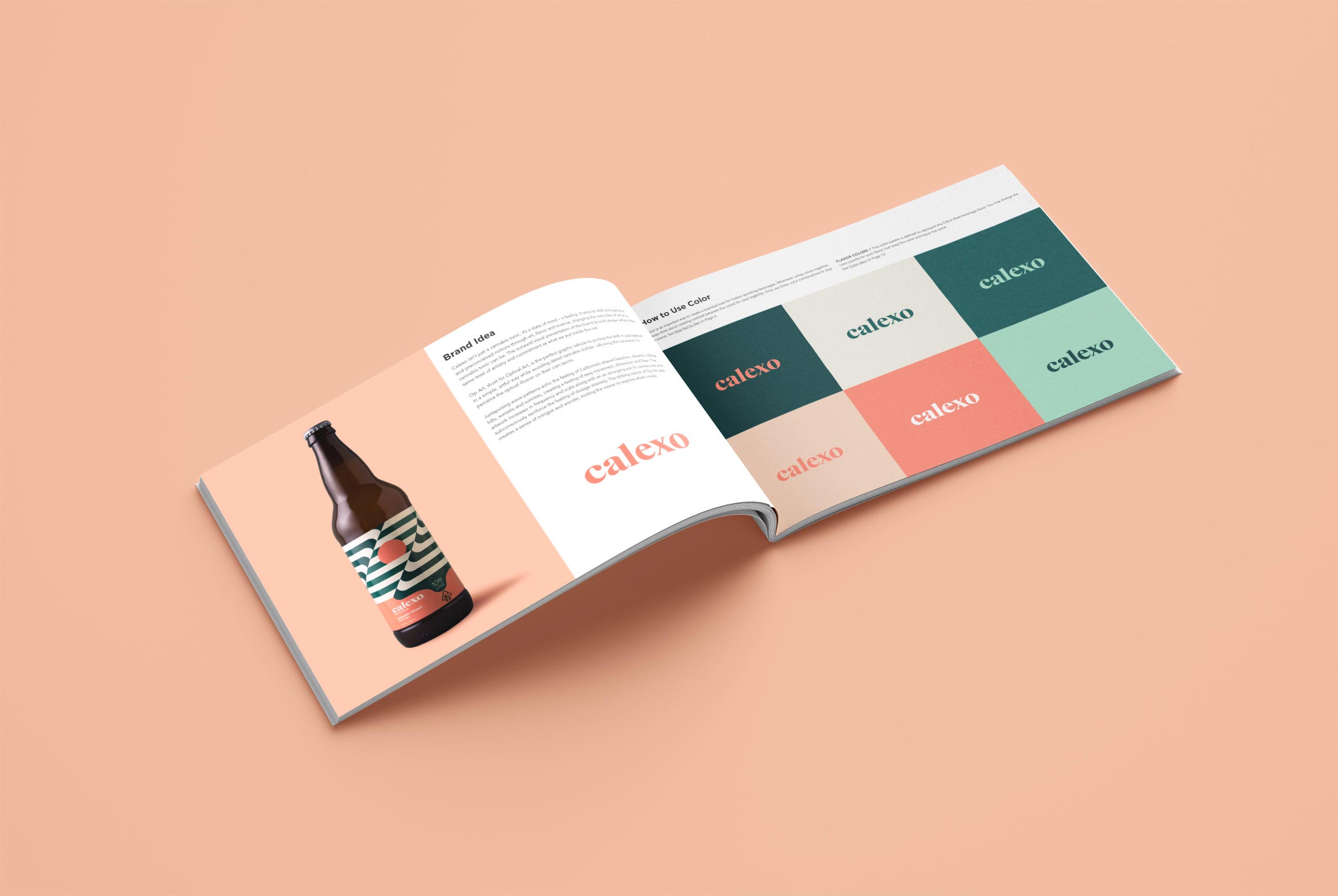
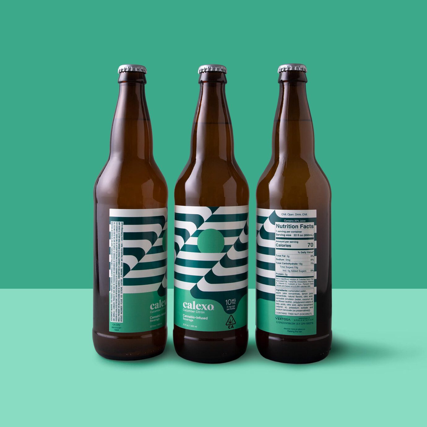
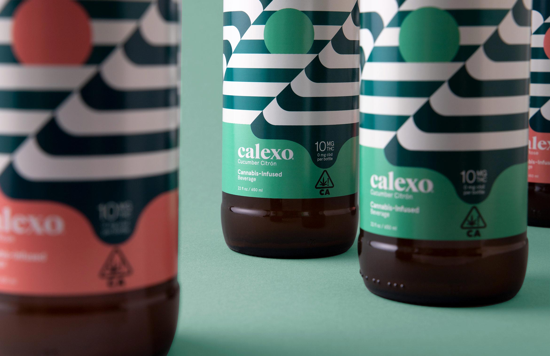
Calexo Cannabis Beverages
packaging design / brand identity
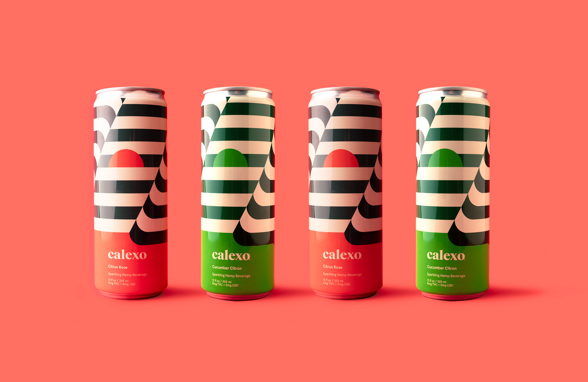
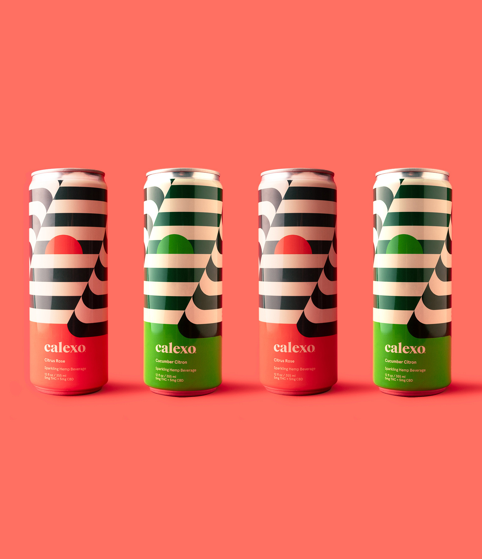
Calexo brings a smile to your mind in citrus rose or cucumber citron
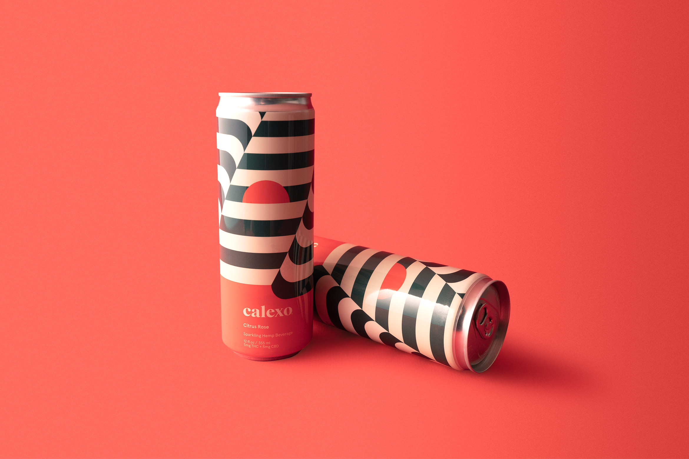
Calexo isn’t just another cannabis beverage, it’s a state of mind. It aims to shift perceptions and preconceived notions through art, flavor and science. Op Art “optical art” is the perfect graphic vehicle to portray this shift in a simple, artful way while avoiding dated cannabis clichés – allowing the consumer to perceive the illusion in the art on their own terms.
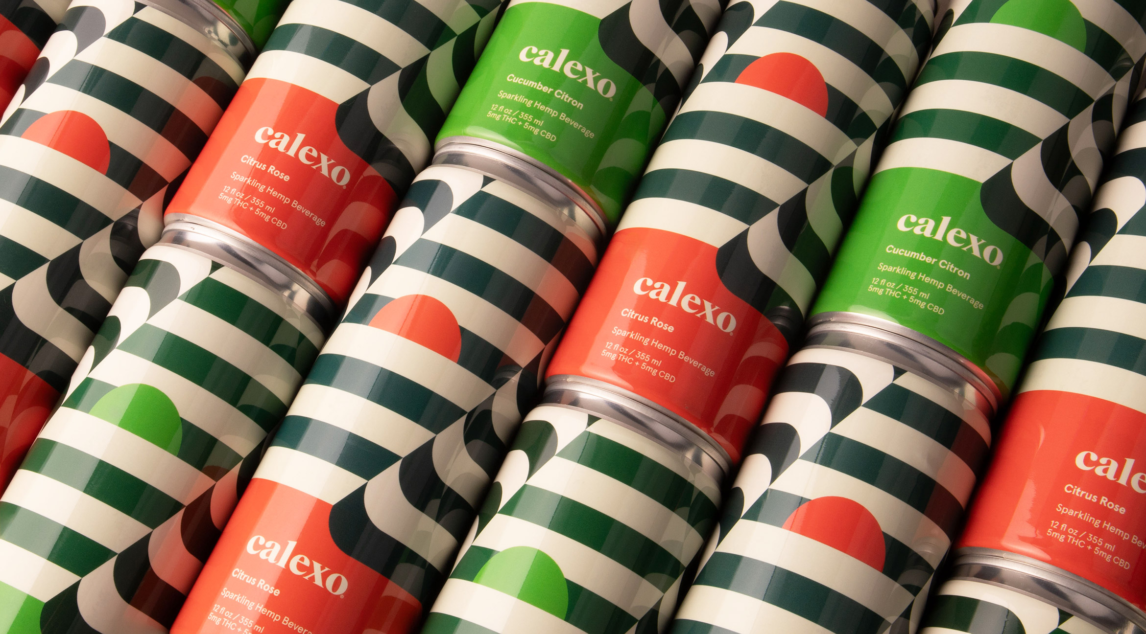
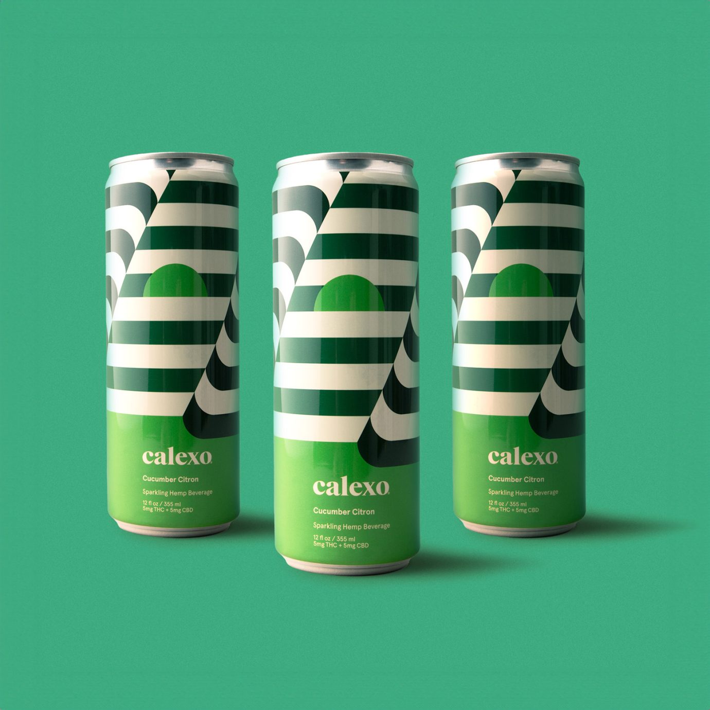
The new hemp beverage packaging is a 12 oz. can with a striped op-art wrap that continues seamlessly around. The first batch of cannabis-infused beverages were in a 22 oz. bottle with op-art labels. The sun is rising or setting depending on your mood.
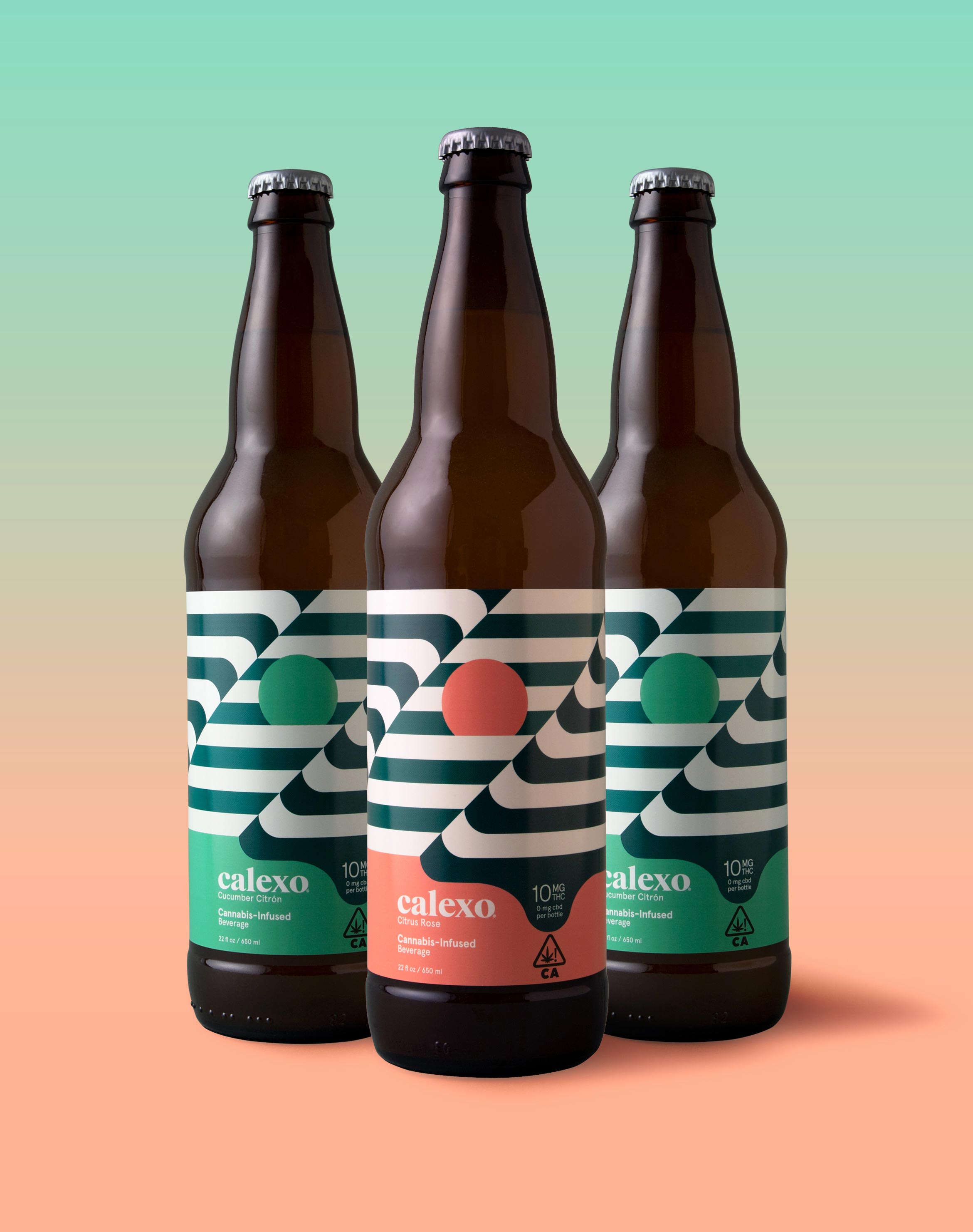
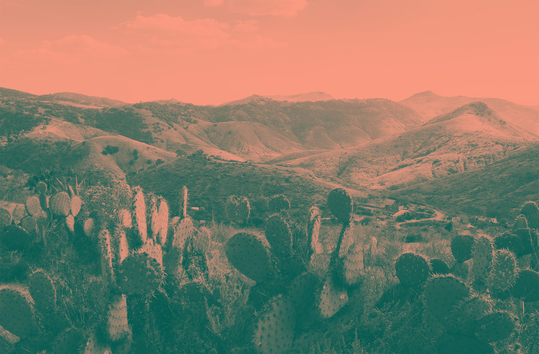
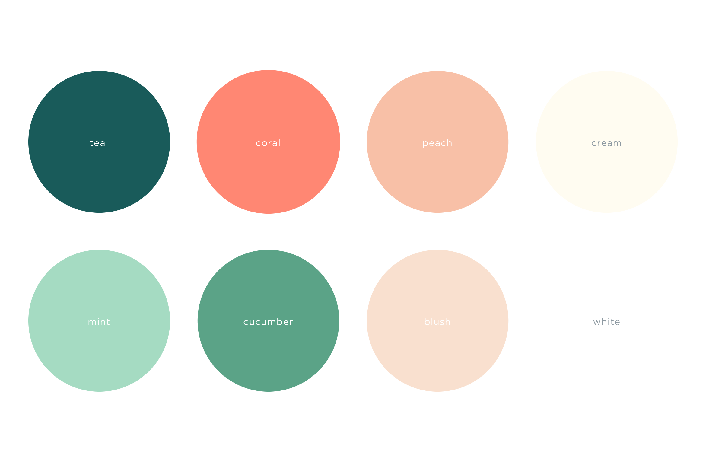
Capturing the laid-back feeling of the rolling hills, lapping water, brilliant sunsets and desert flora that defines the California and northern Mexico region, we applied a crisp, warm, color palette to both the brand and its unique flavor profiles.

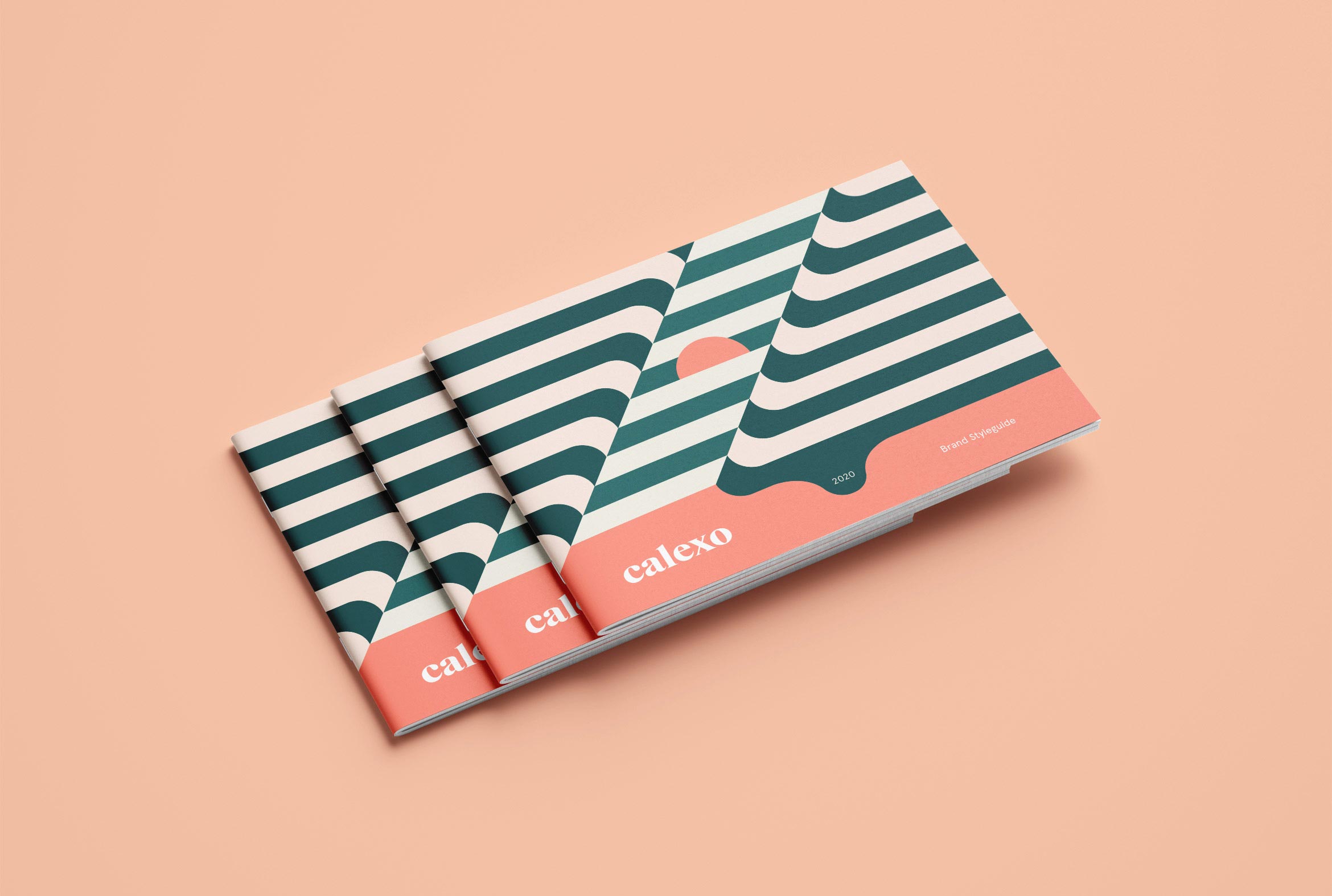
A Brand Styleguide keeps the visual identity cohesive by outlining rules for the logo, typography, color palette and graphic motifs.
Deliverables:
- Brand Identity
- Brand Guidelines
- Packaging Design
- Visual System
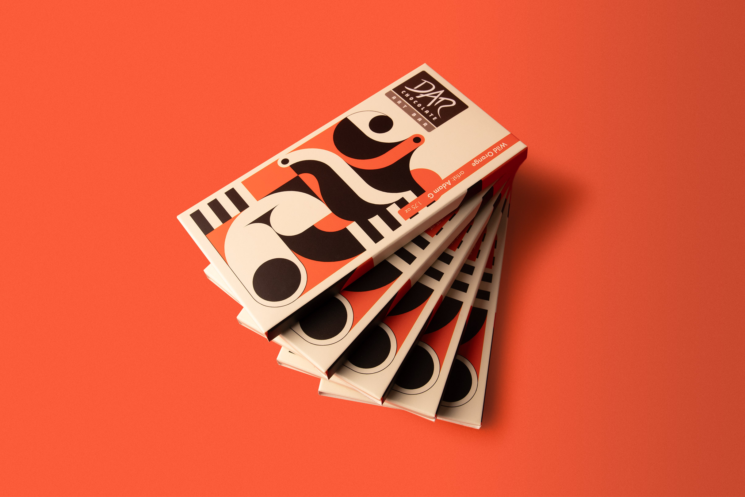
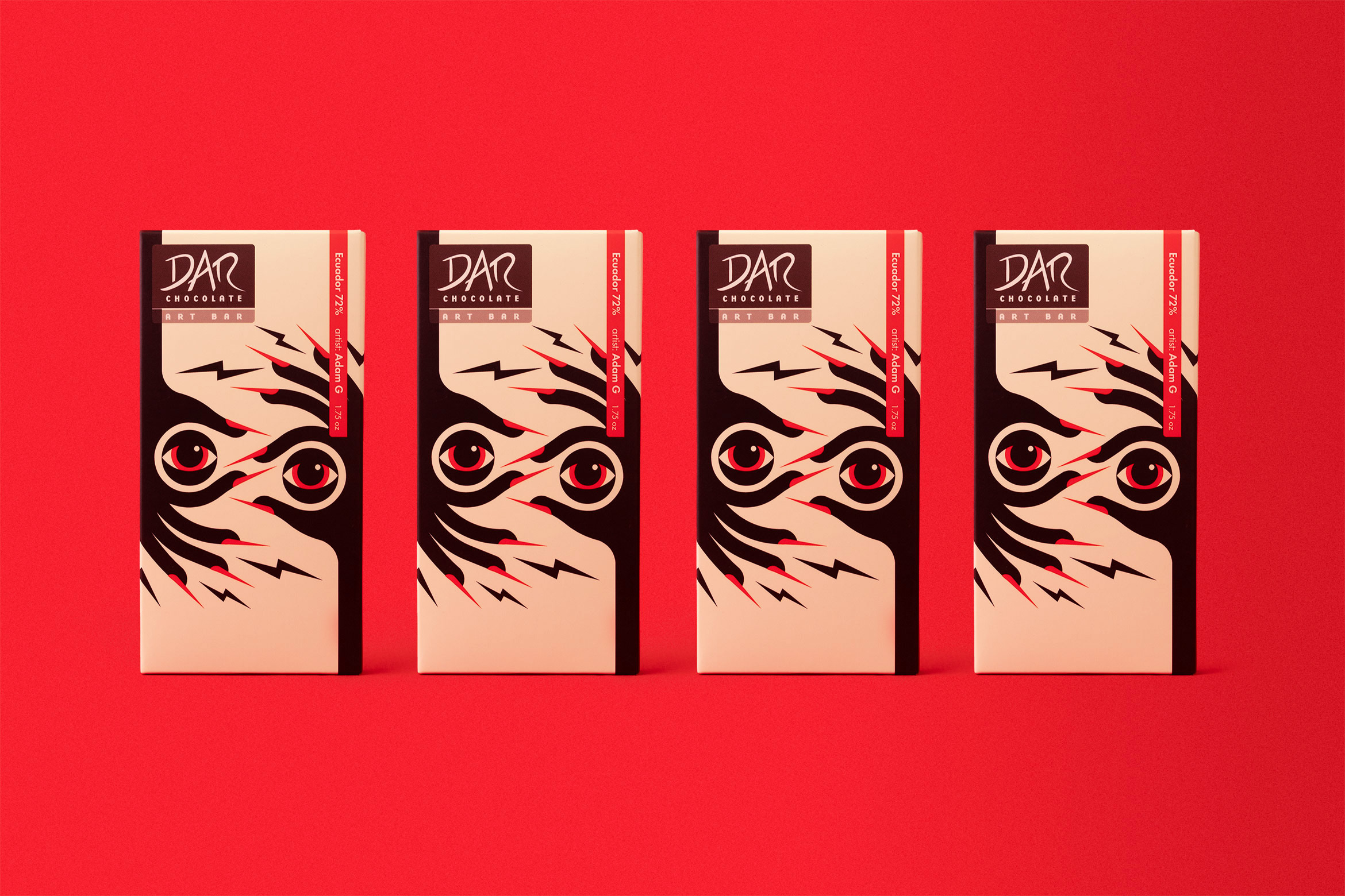
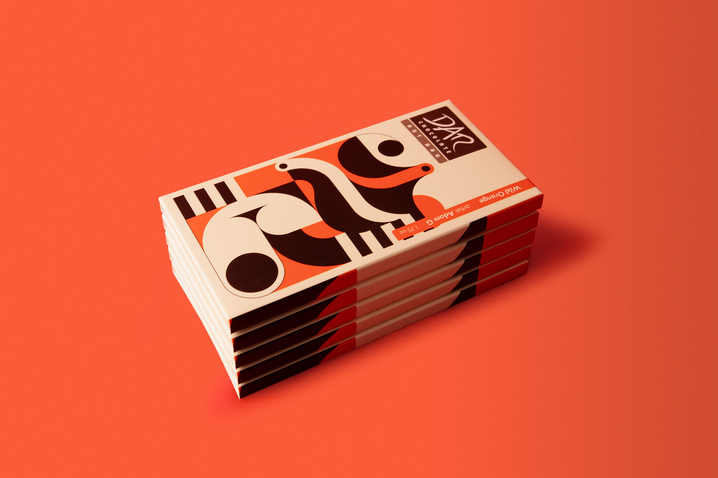
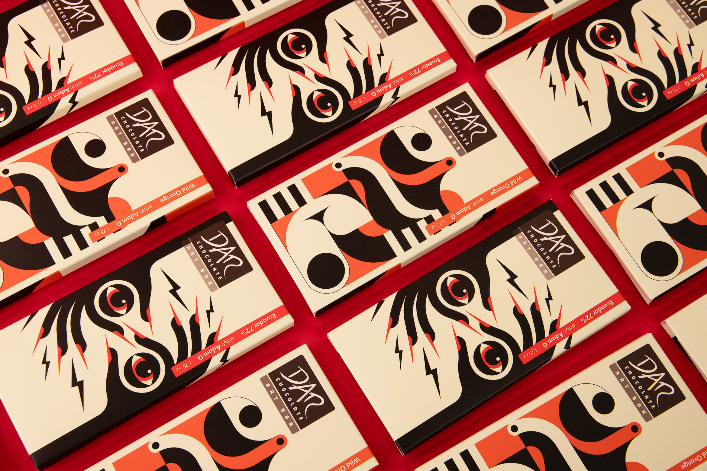
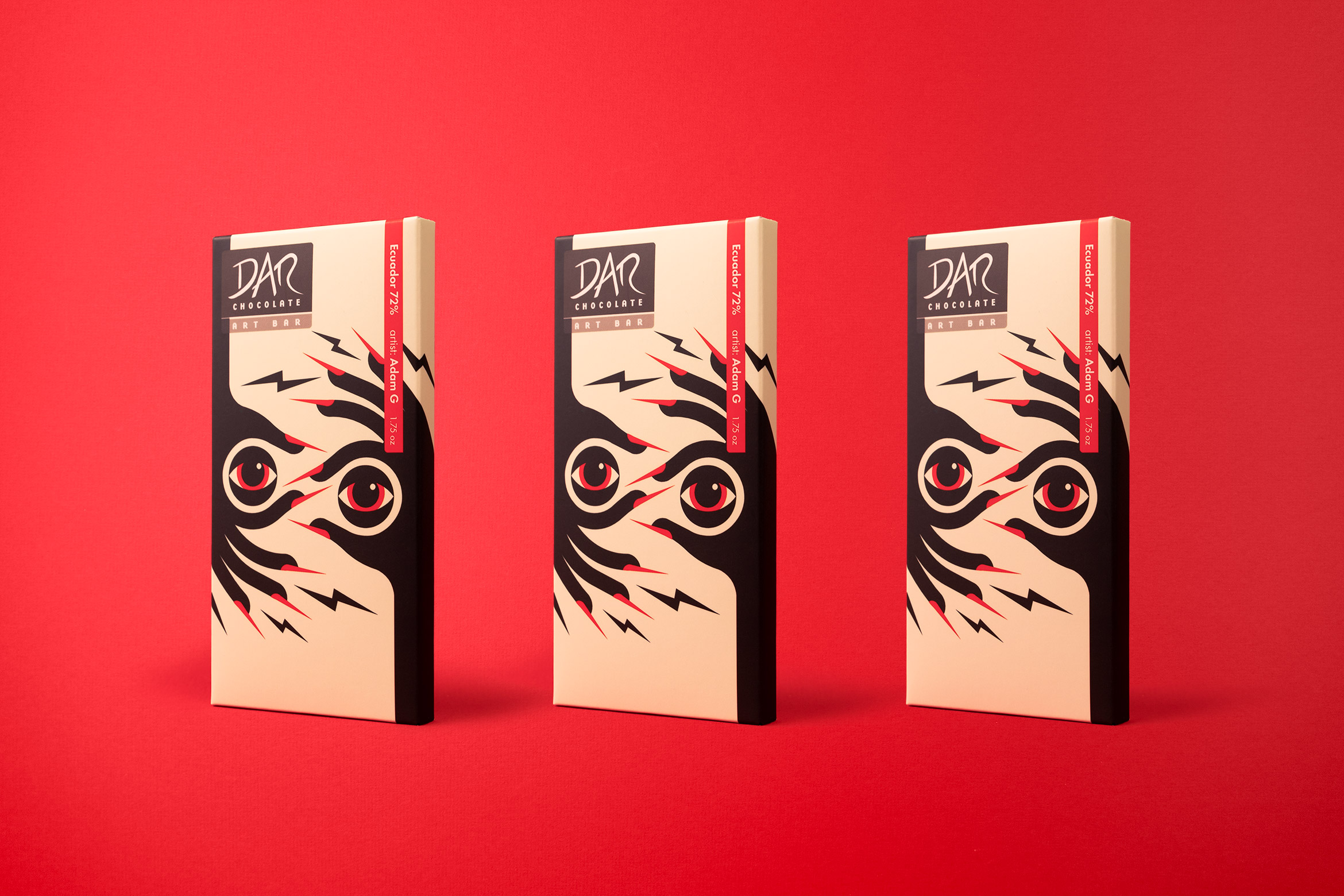
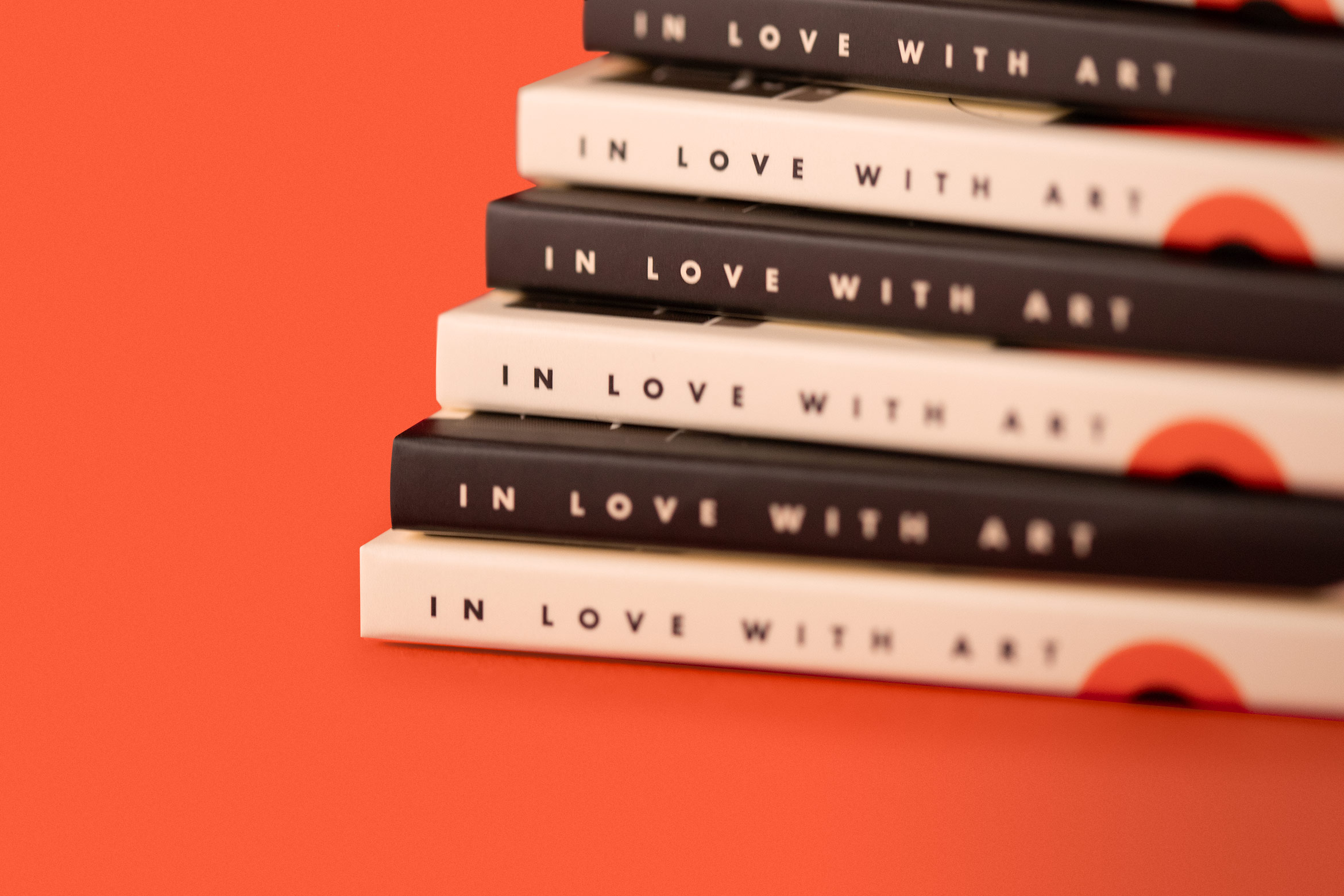
DAR Chocolate art bar
consumer goods / illustration
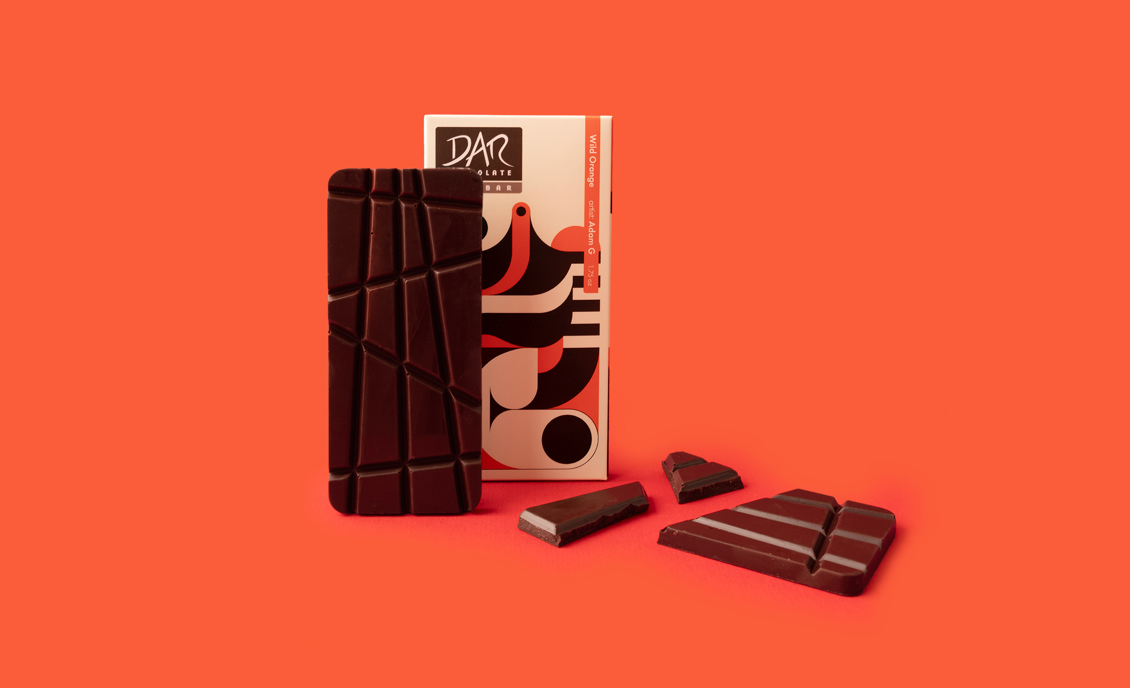
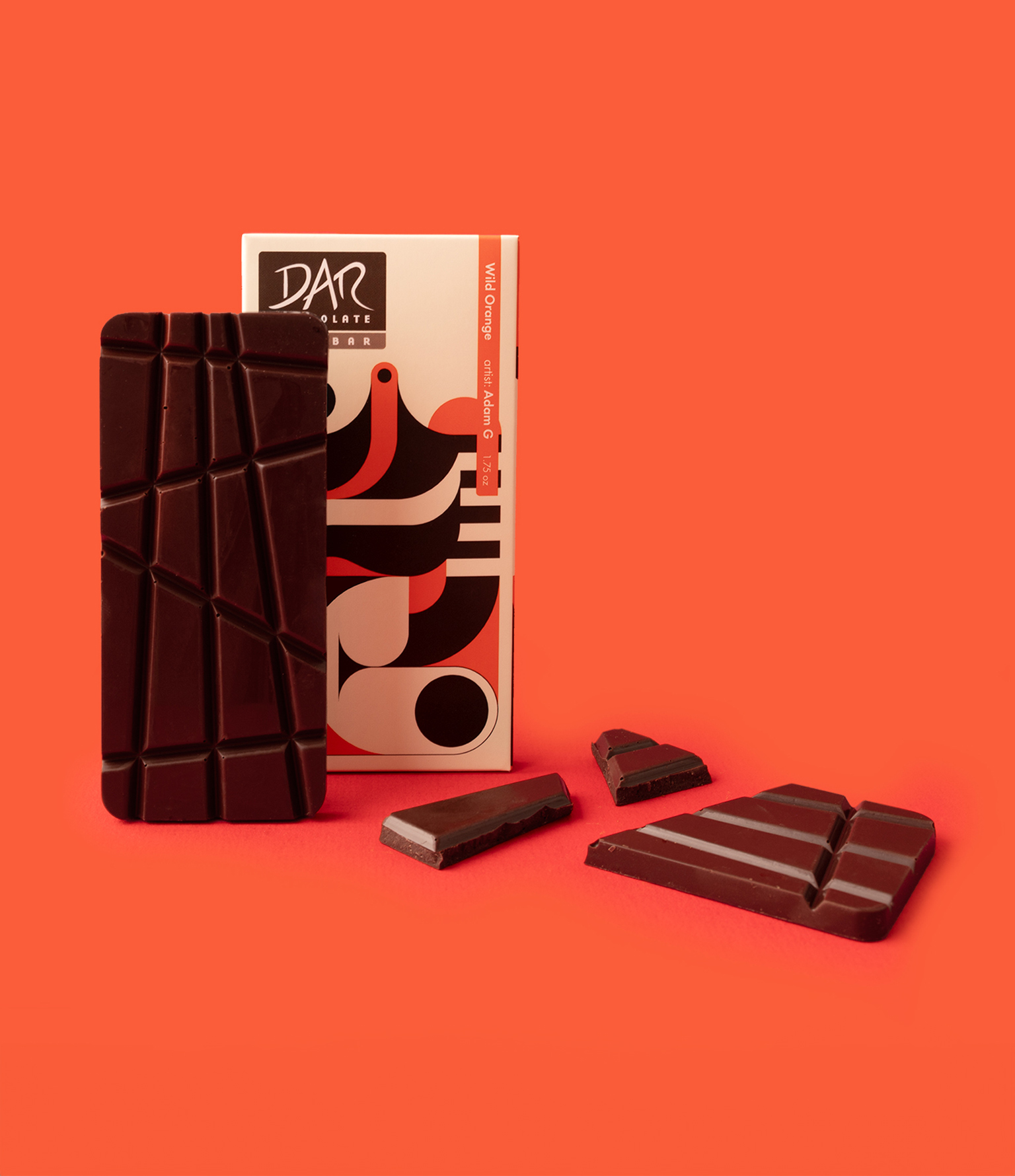
DAR Chocolate makes you fall in love with art through their gourmet chocolate
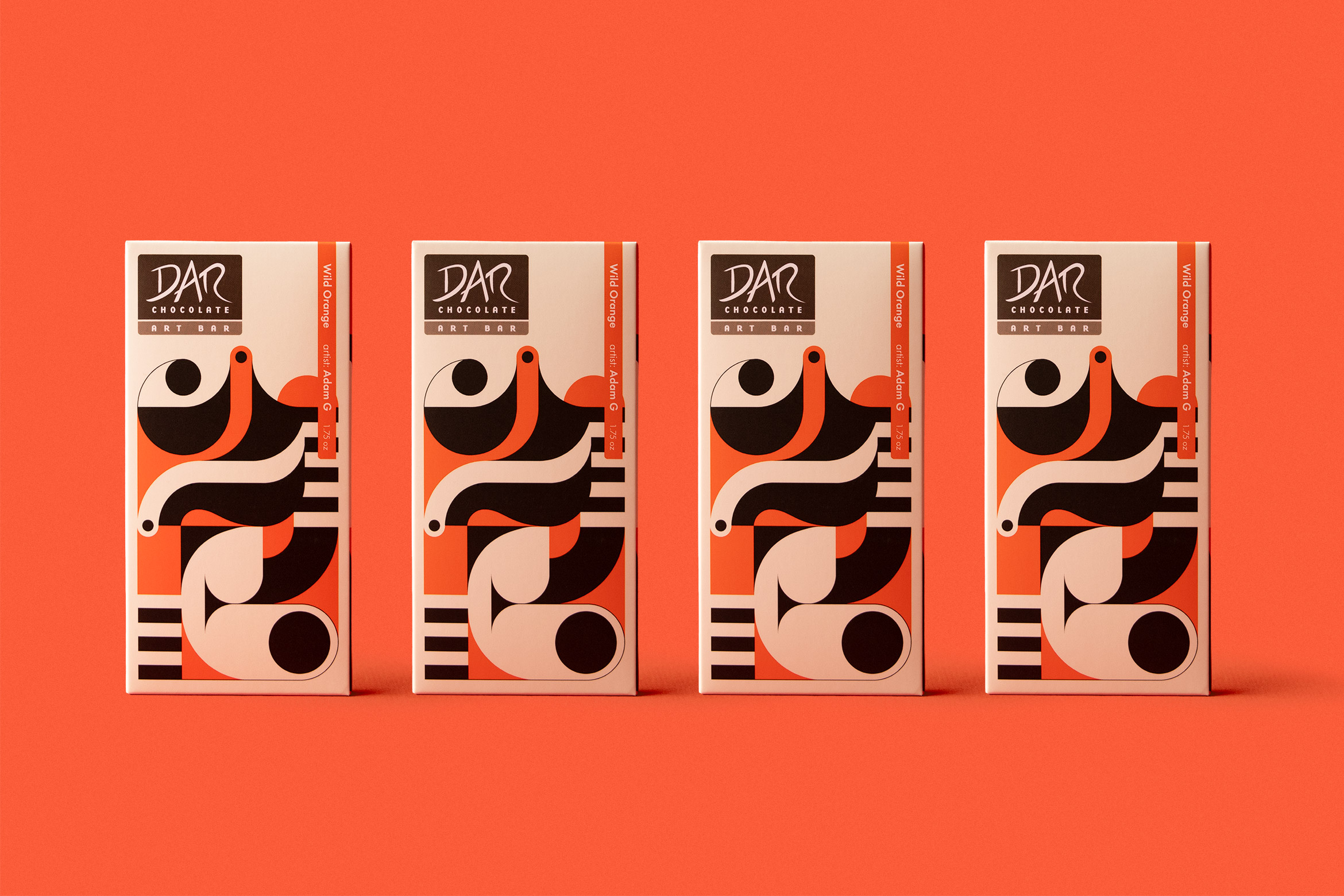
DAR Chocolate asked us to create illustrations and custom lettering for their newest art bars: Wild Orange and Ecuador, both 72% organic and ethically traded. Wild Orange is represented by a typographic ’23 for this year’s special blend. The Ecuador bar’s energetic artwork represents the intensity and hand-made nature of the chocolate.
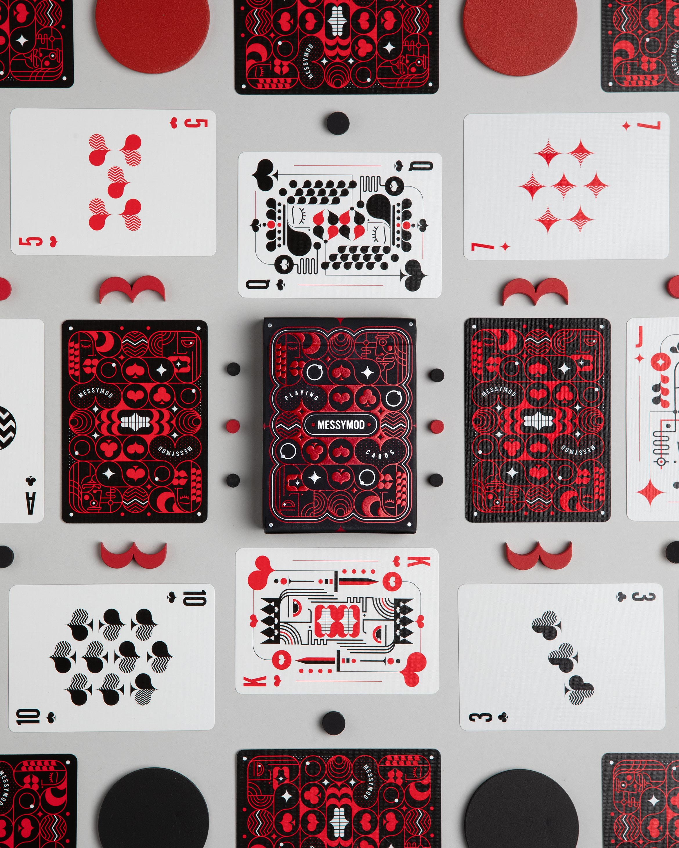
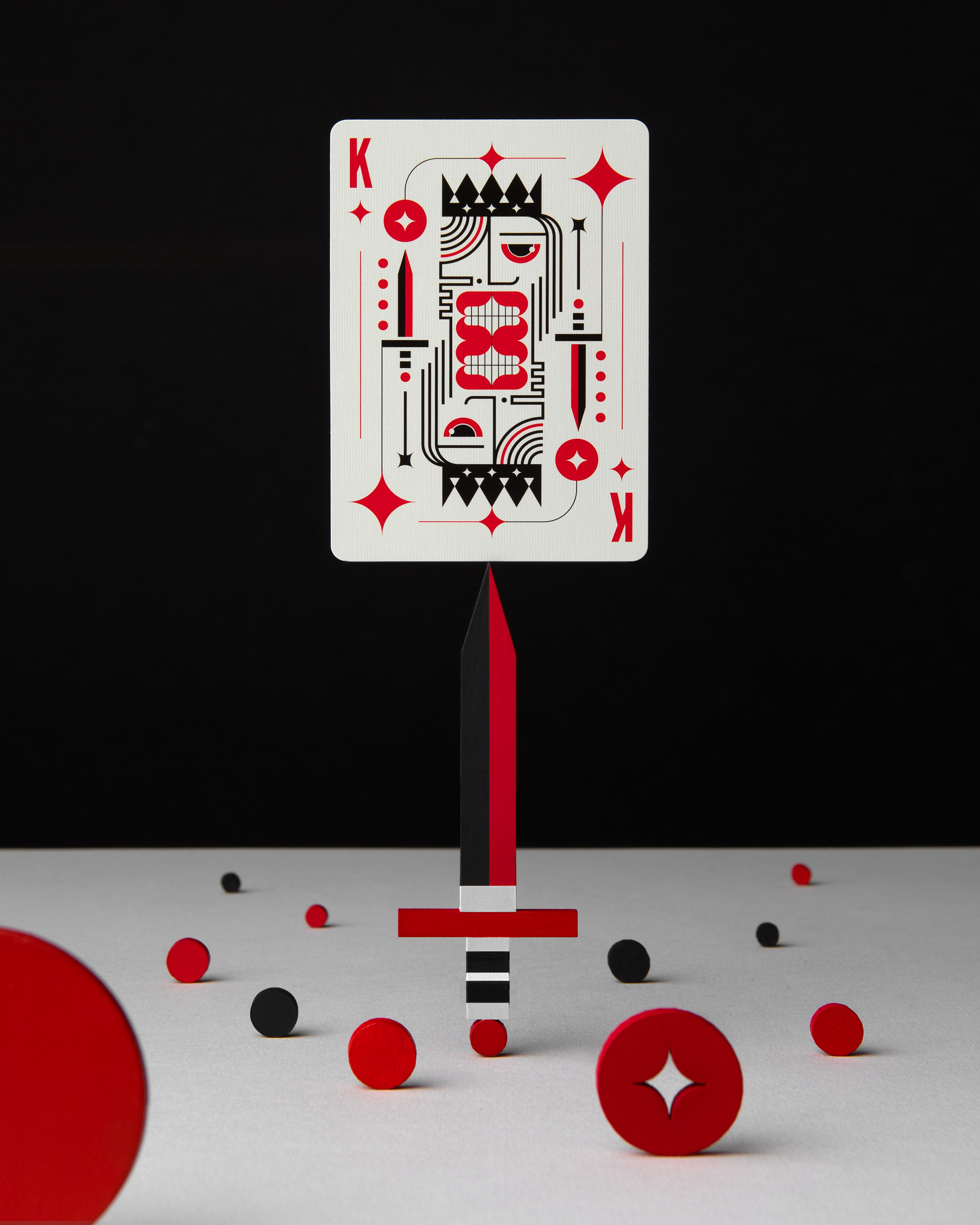
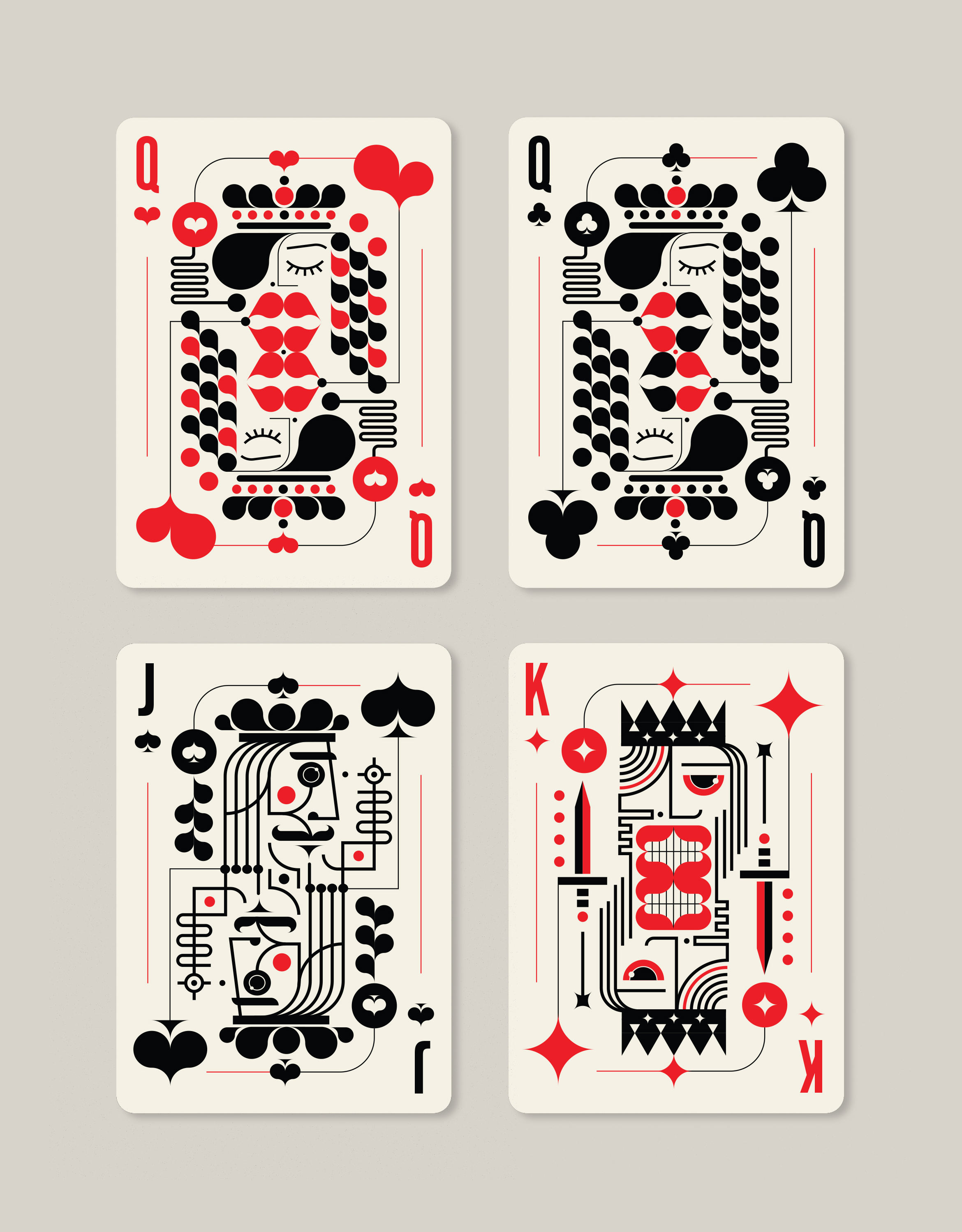
Art of Play x TRÜF
illustration / packaging design
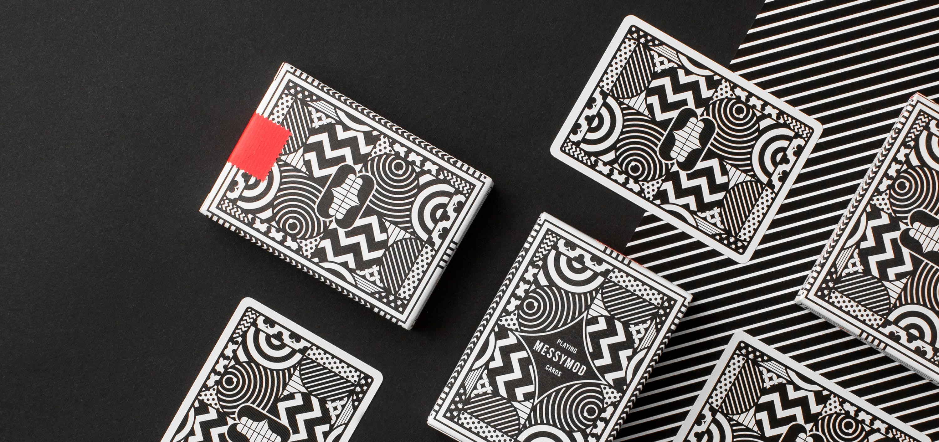
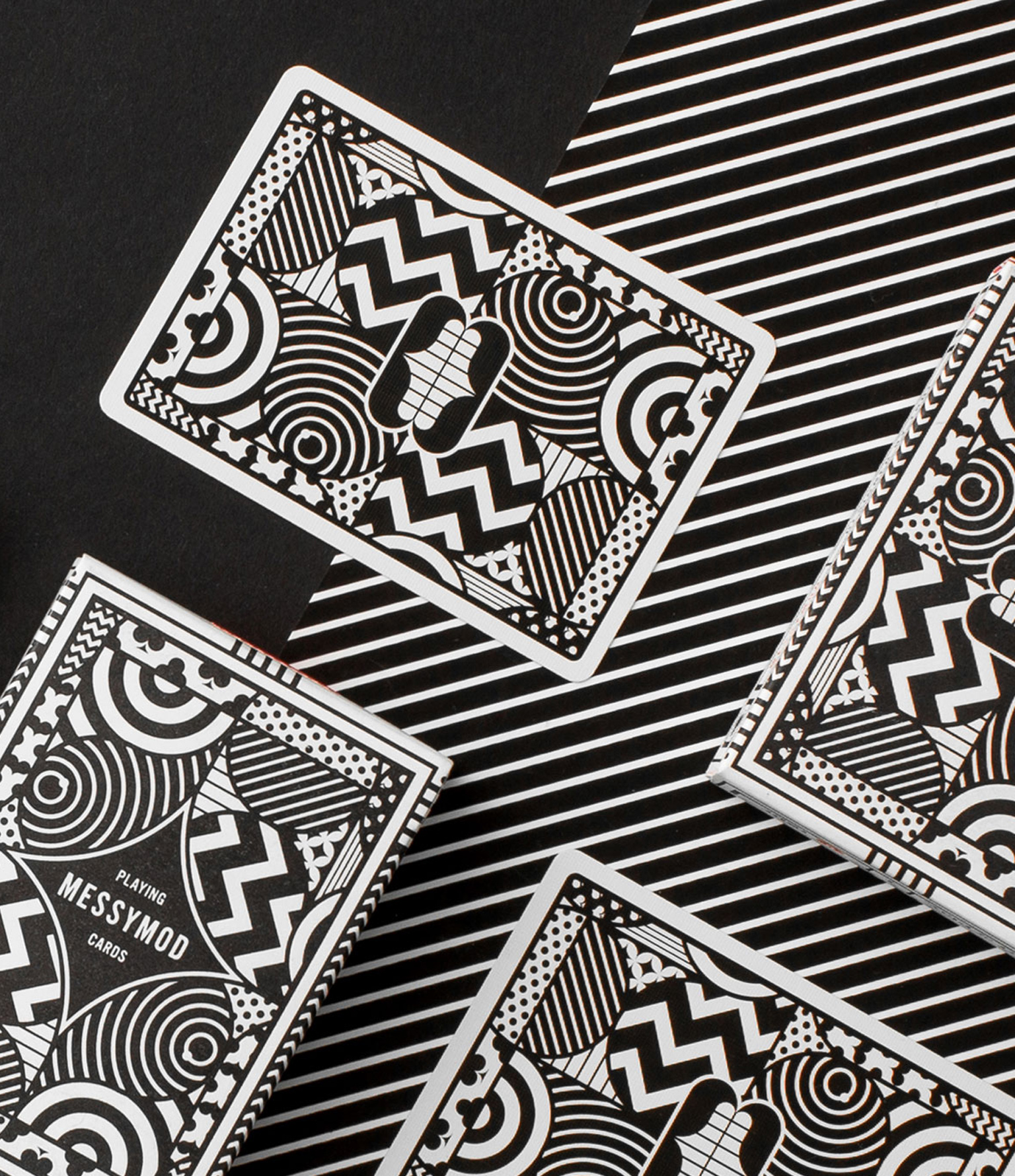
Art of Play x TRÜF = a weird, reimagined deck of Messymod Playing Cards
We collaborated with Art of Play, makers of some of the finest playing cards in the universe, to bring you one strange deck. These cards feature a completely custom design in typical Messymod fashion which can be described as minimal, modern, graphic, quirky, stylized, grotesque, delightful and just plain weird.

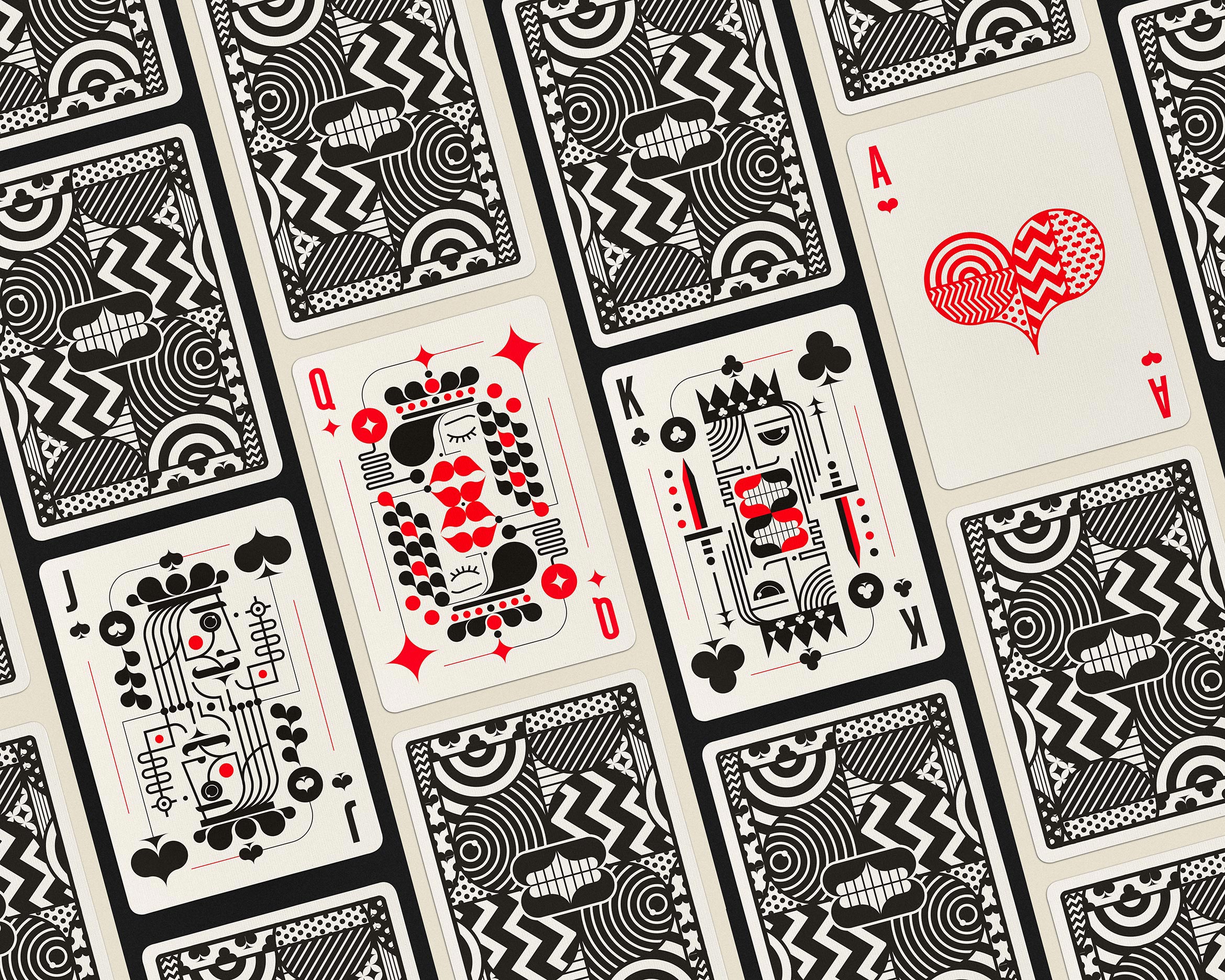
We designed this deck so that each card has its own presence and personality, making them ideal pieces of artwork that can stand on their own. Each card has patterns of suits within suits for endless fun while still being recognizable.
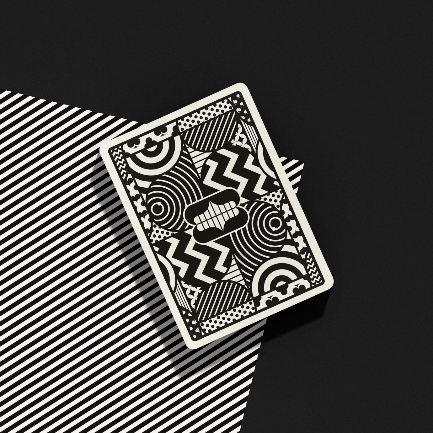
Packaged in a premium letterpress-printed tuck box both inside and out. Printed by the U.S. Playing Card Co. on Art of Play’s trademark thin stock preferred by expert cardists. Available in our messymod shop as an Art + Play bundle.
All photographs courtesy of Art of Play and Pablo Frey.
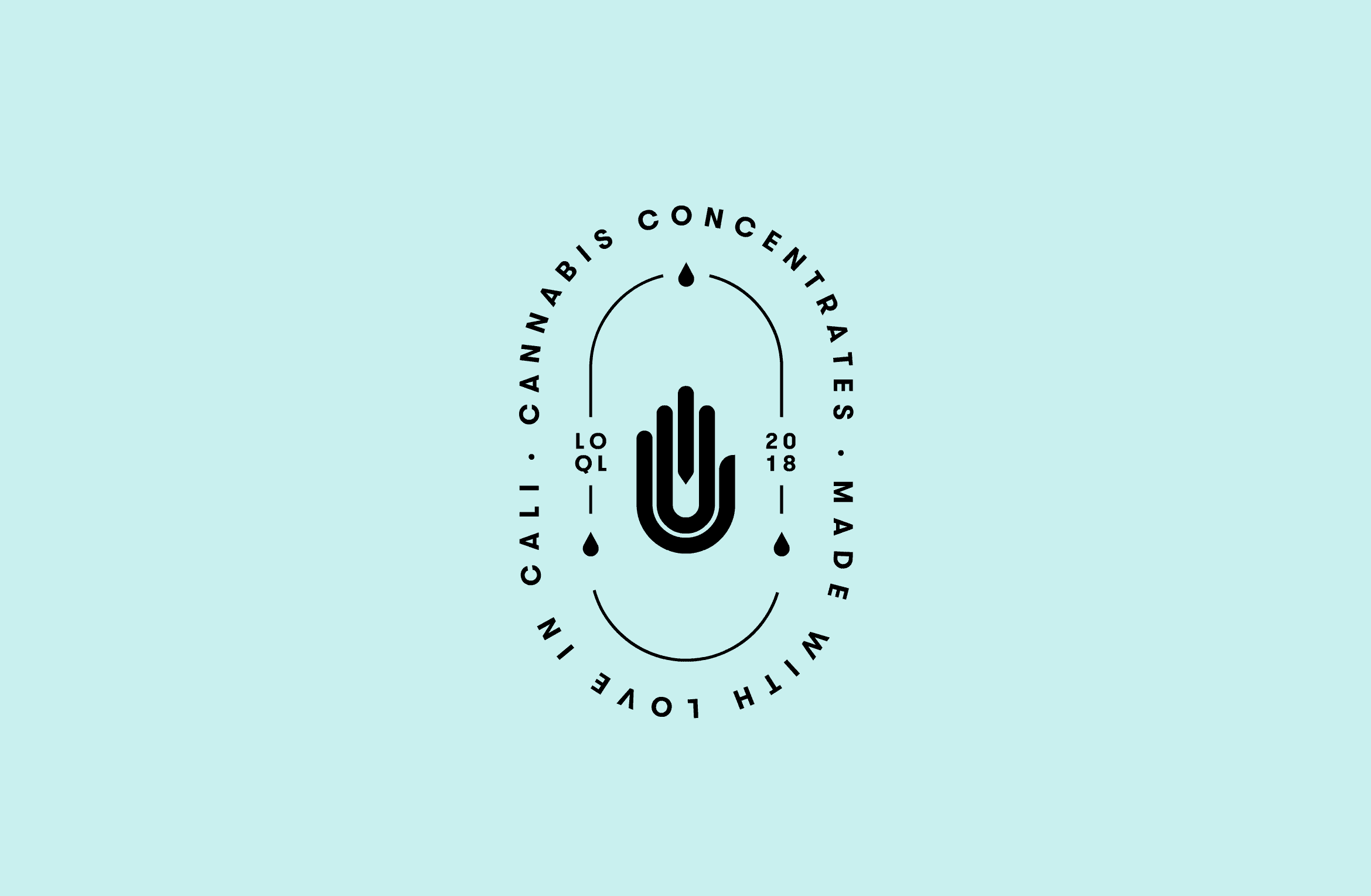
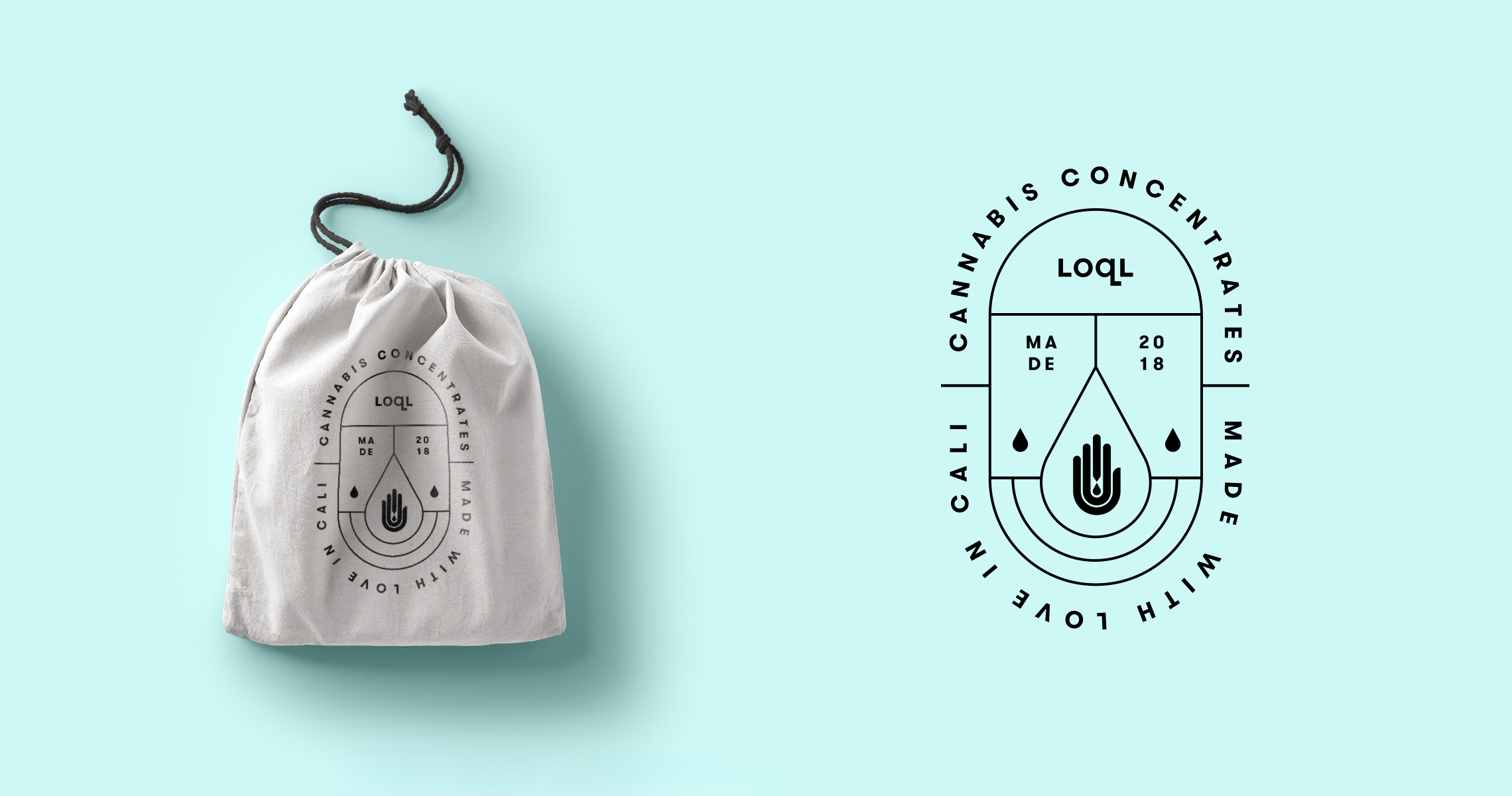
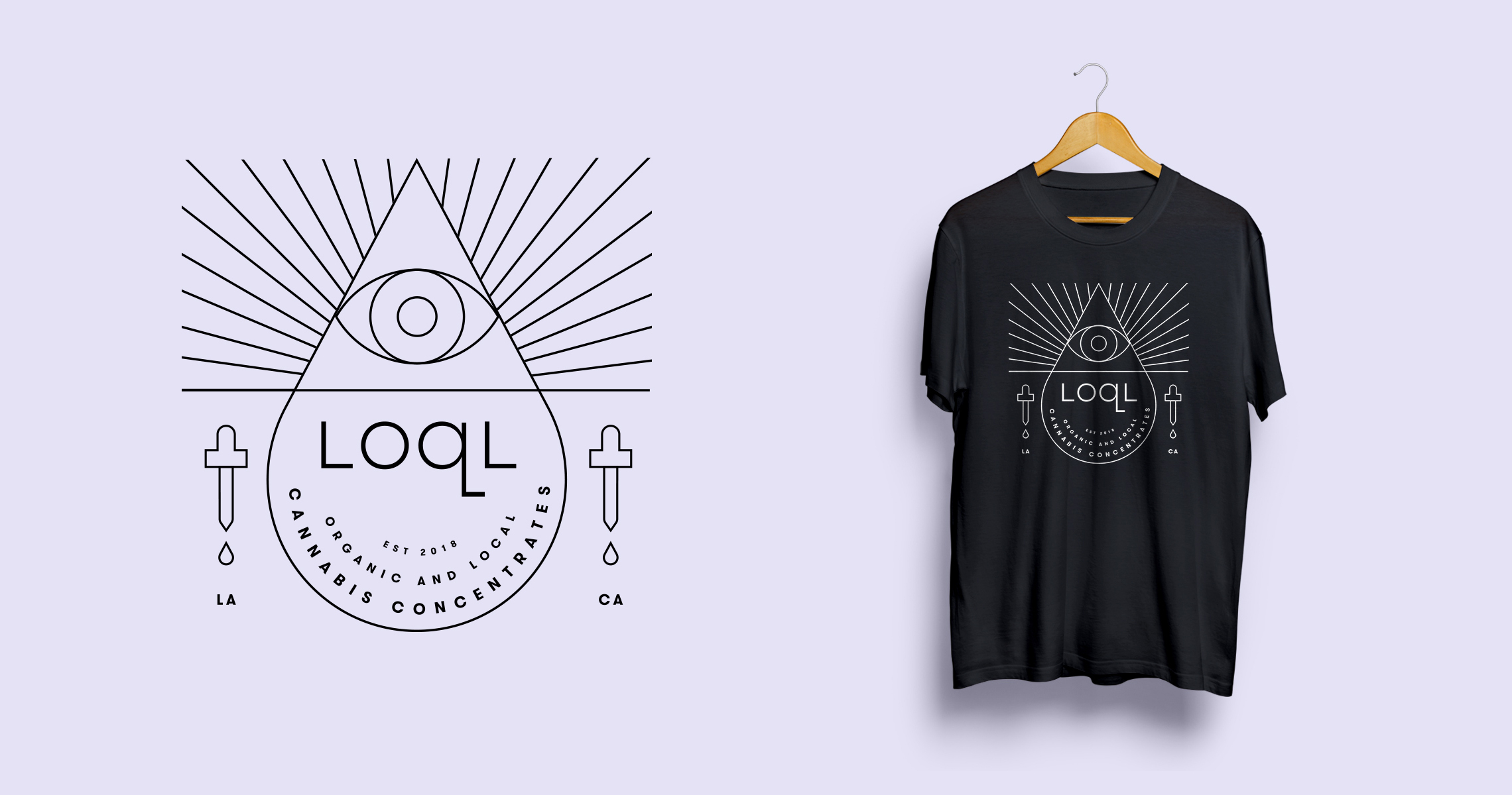
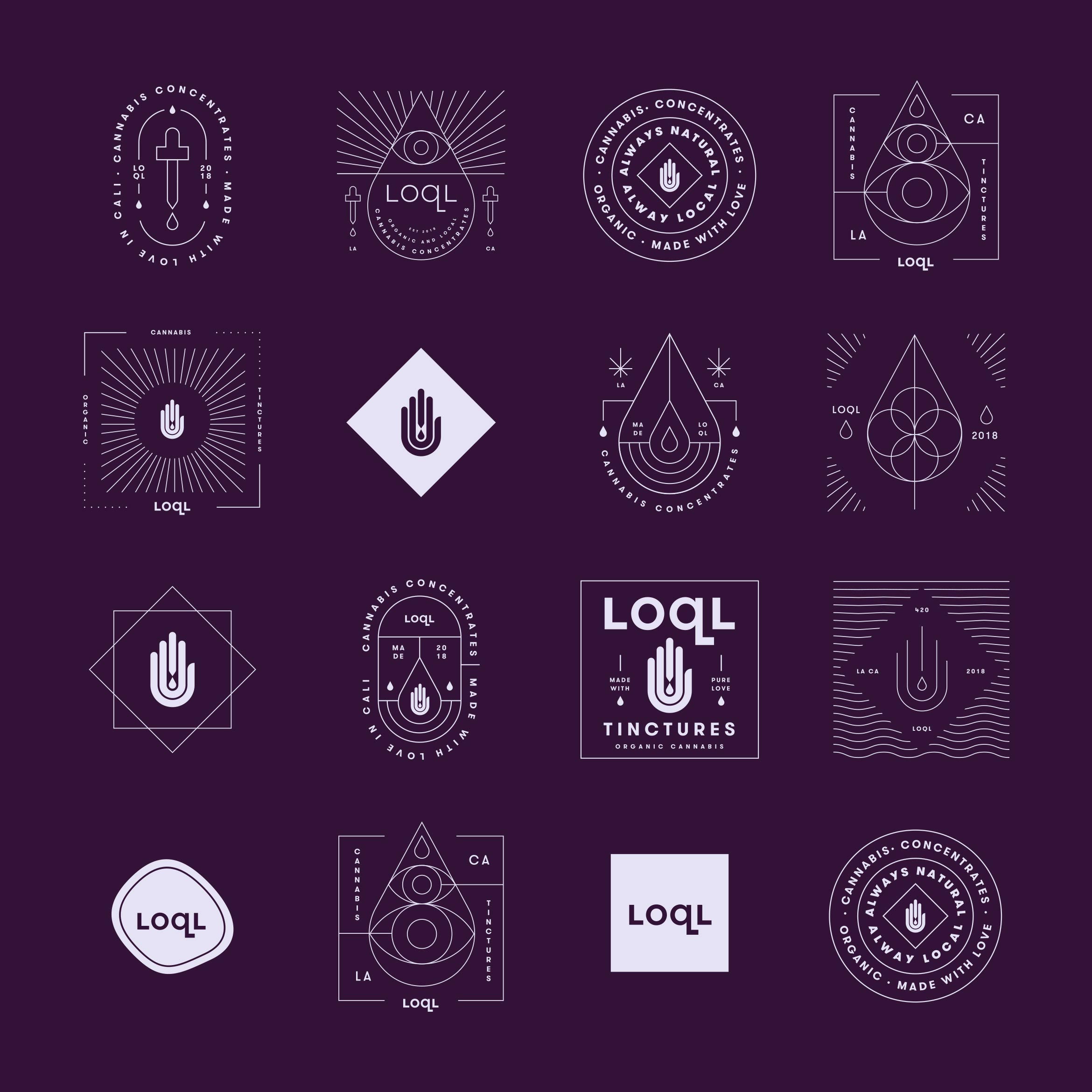
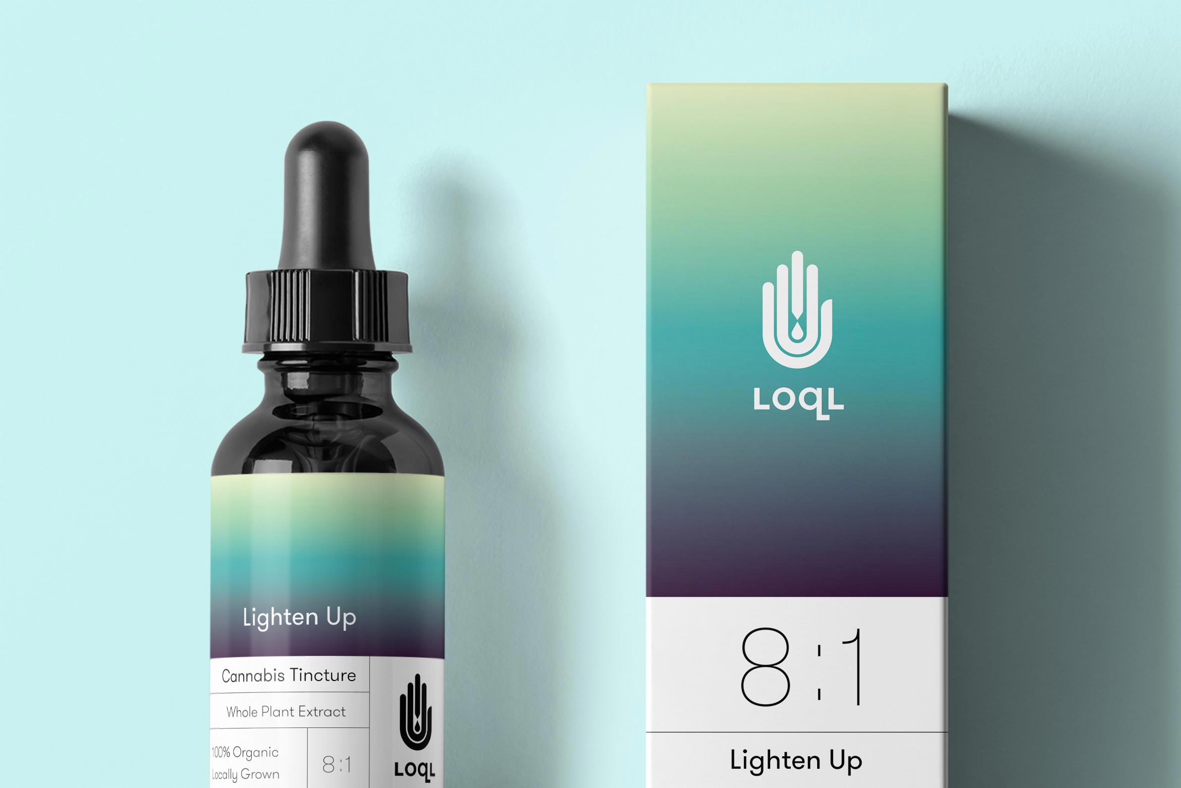
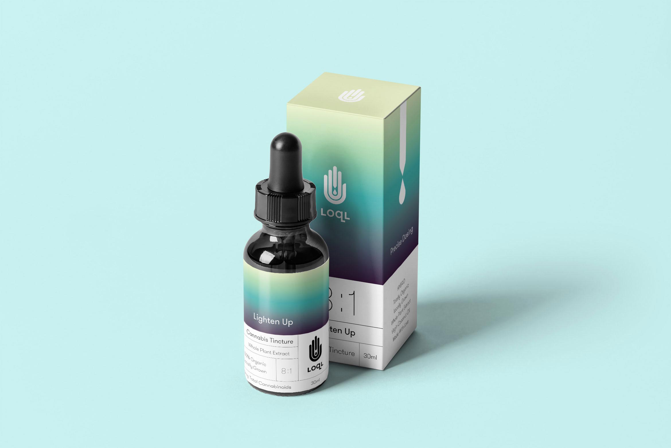
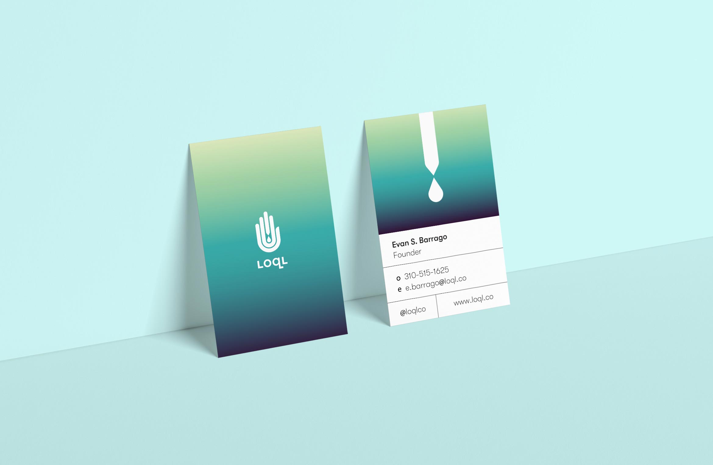
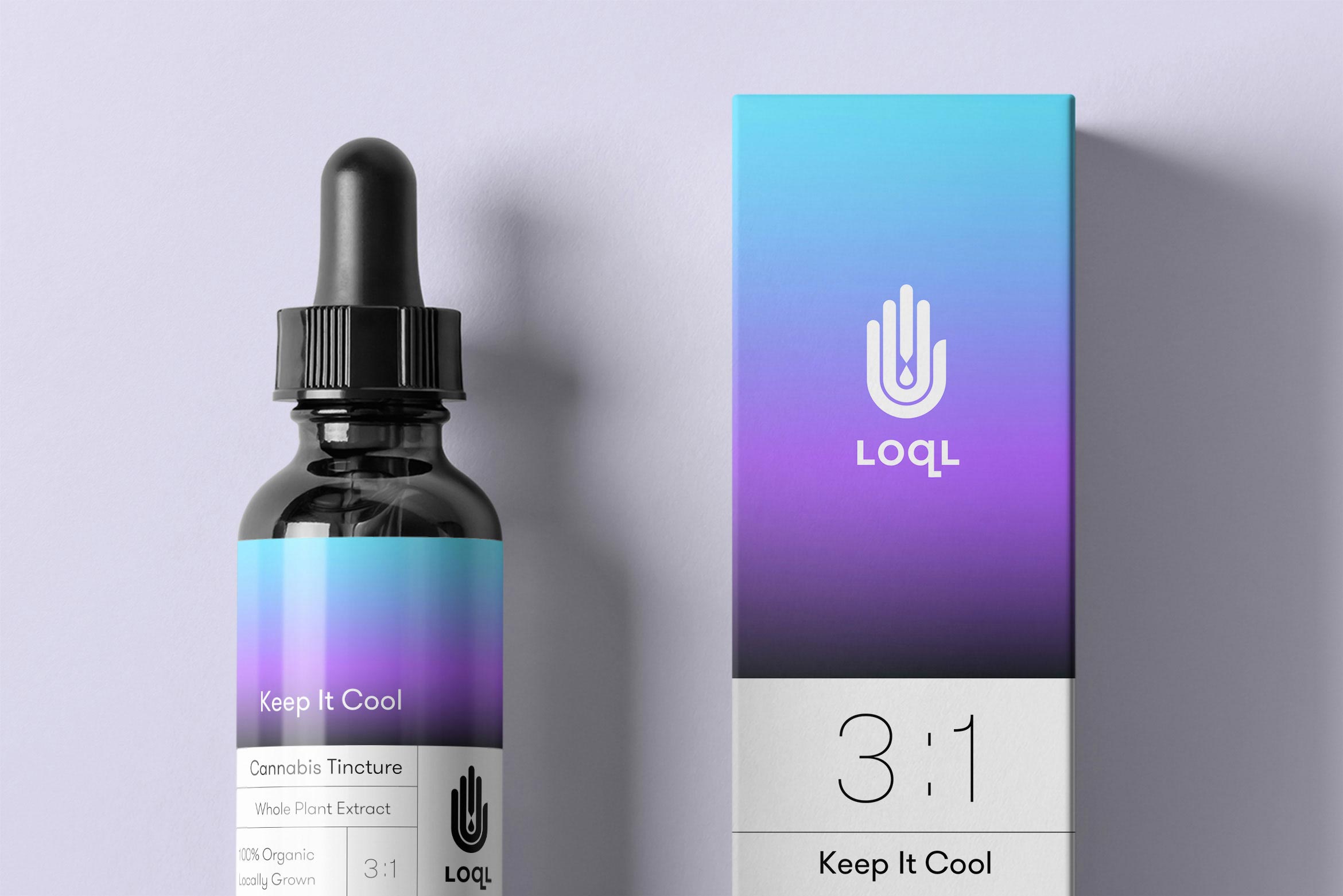
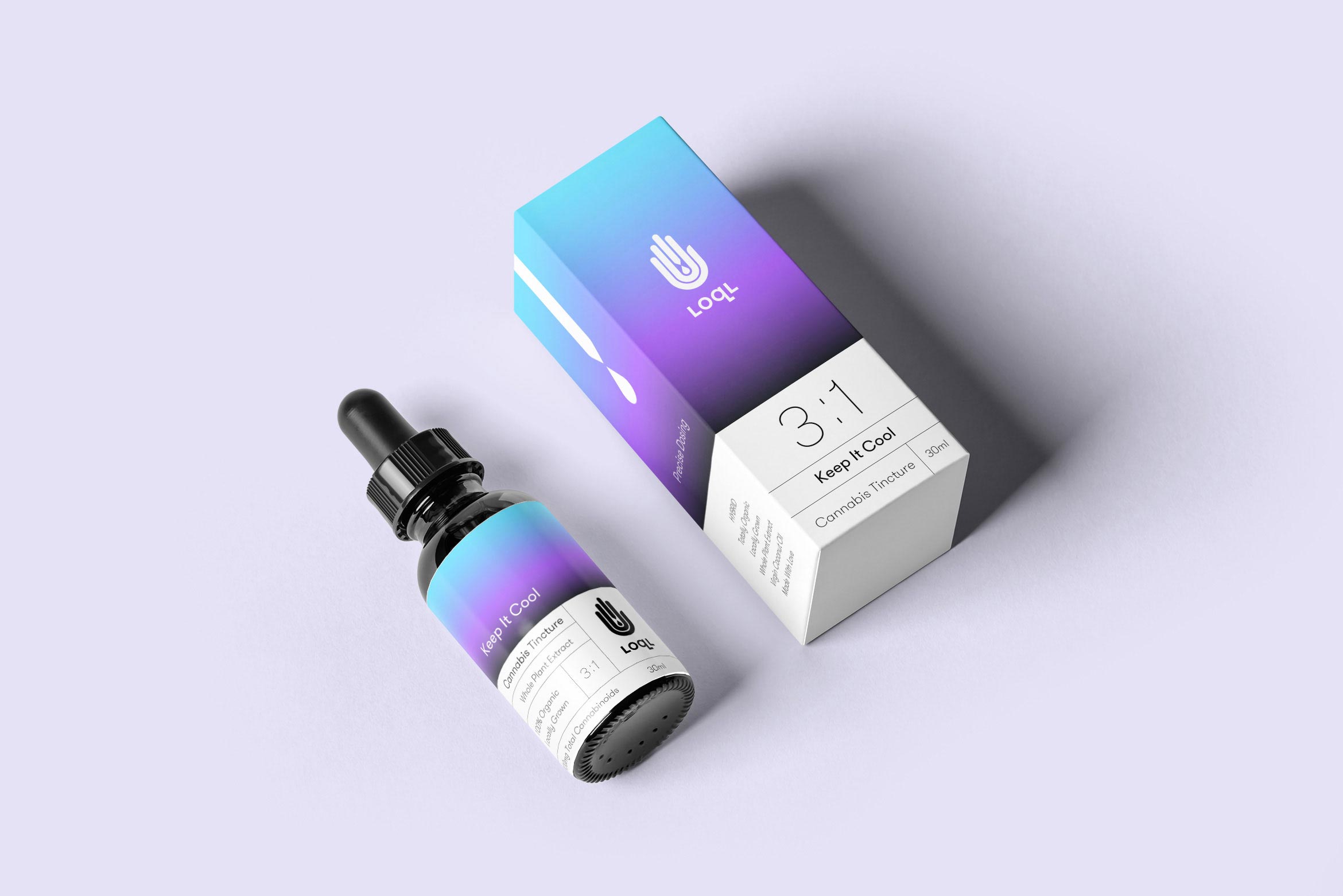
LOQL Cannabis Extracts
consumer goods / packaging design
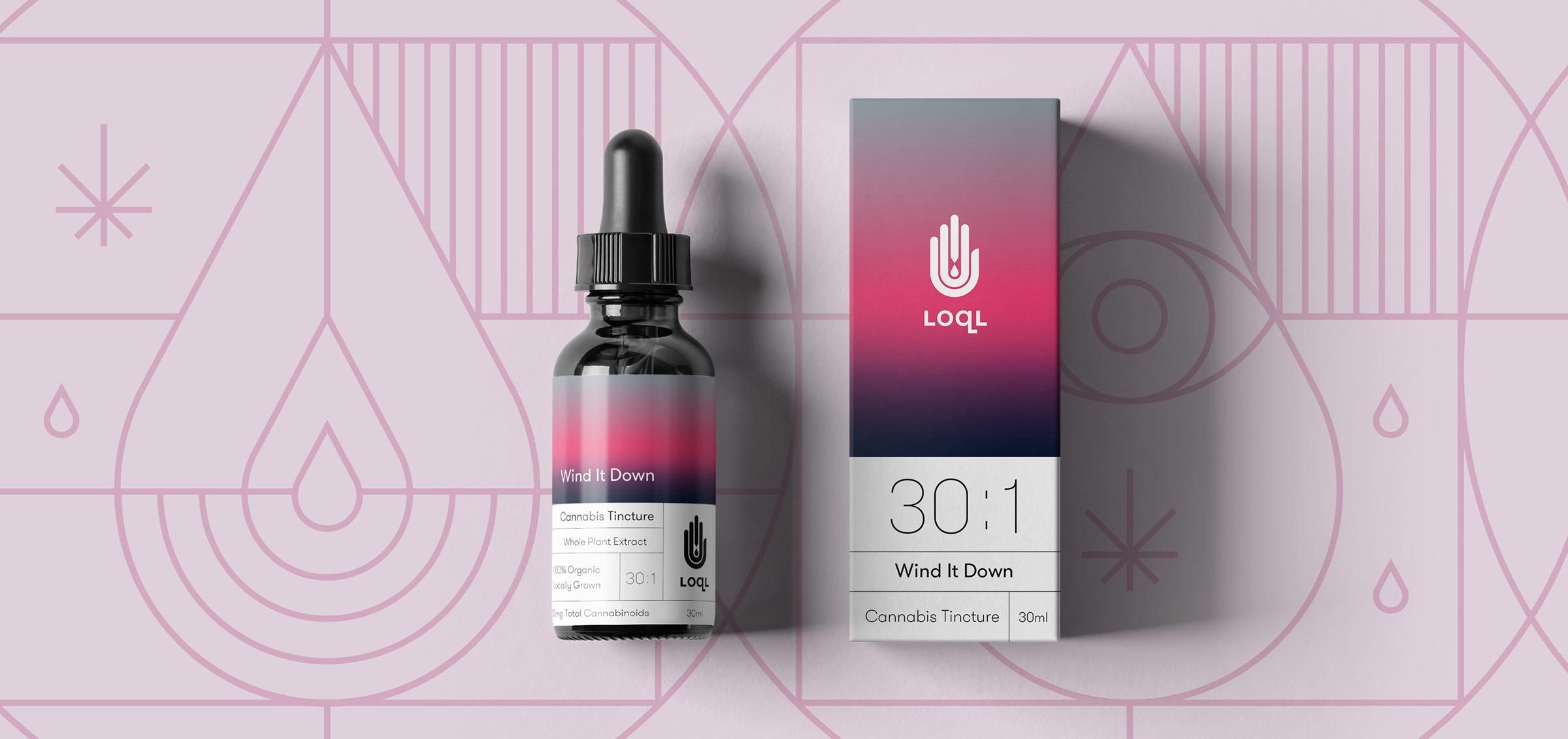
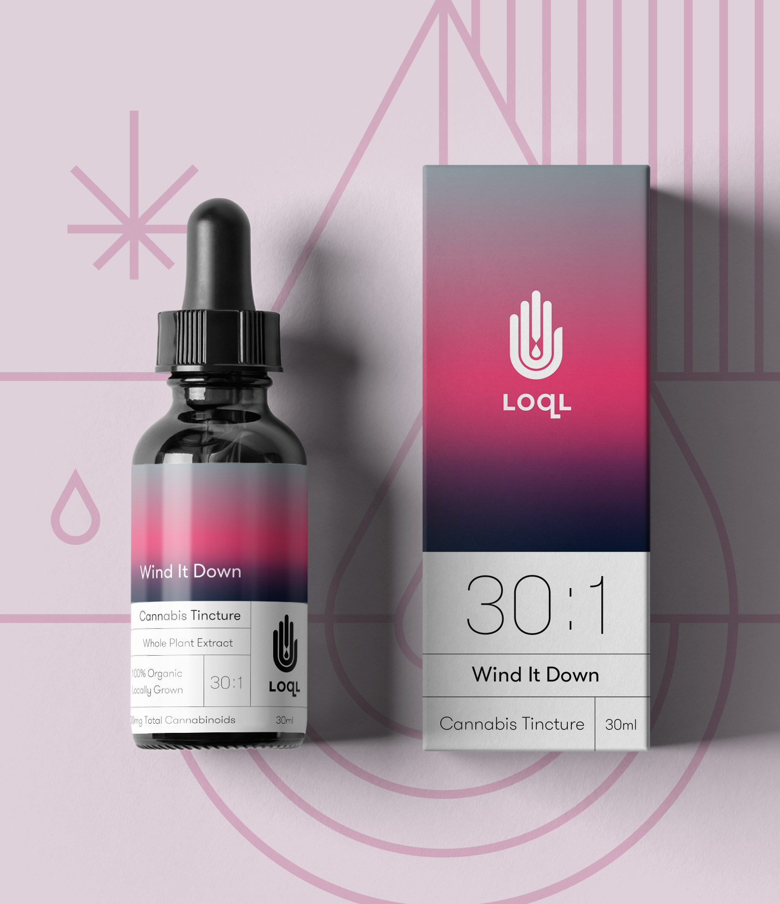
LOQL Cannabis extracts spread wellness and healing one drop at a time
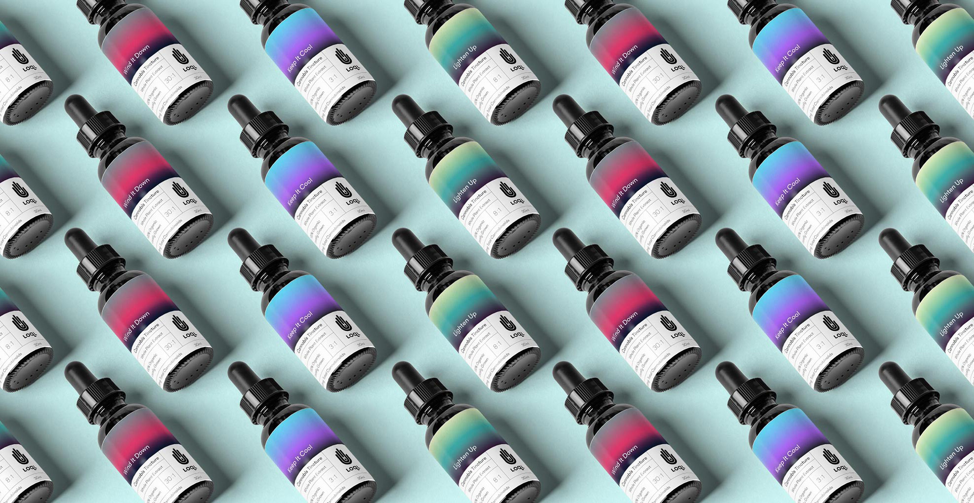
LOQL Cannabis Extracts specialize in organic, solvent-free, locally grown medicinal products. From pain and inflammation to better sleep and mood elevation – safe, targeted relief is always LOQL. The bold brand mark is based on the Hamsa, an ancient hand symbol used for protection and health.
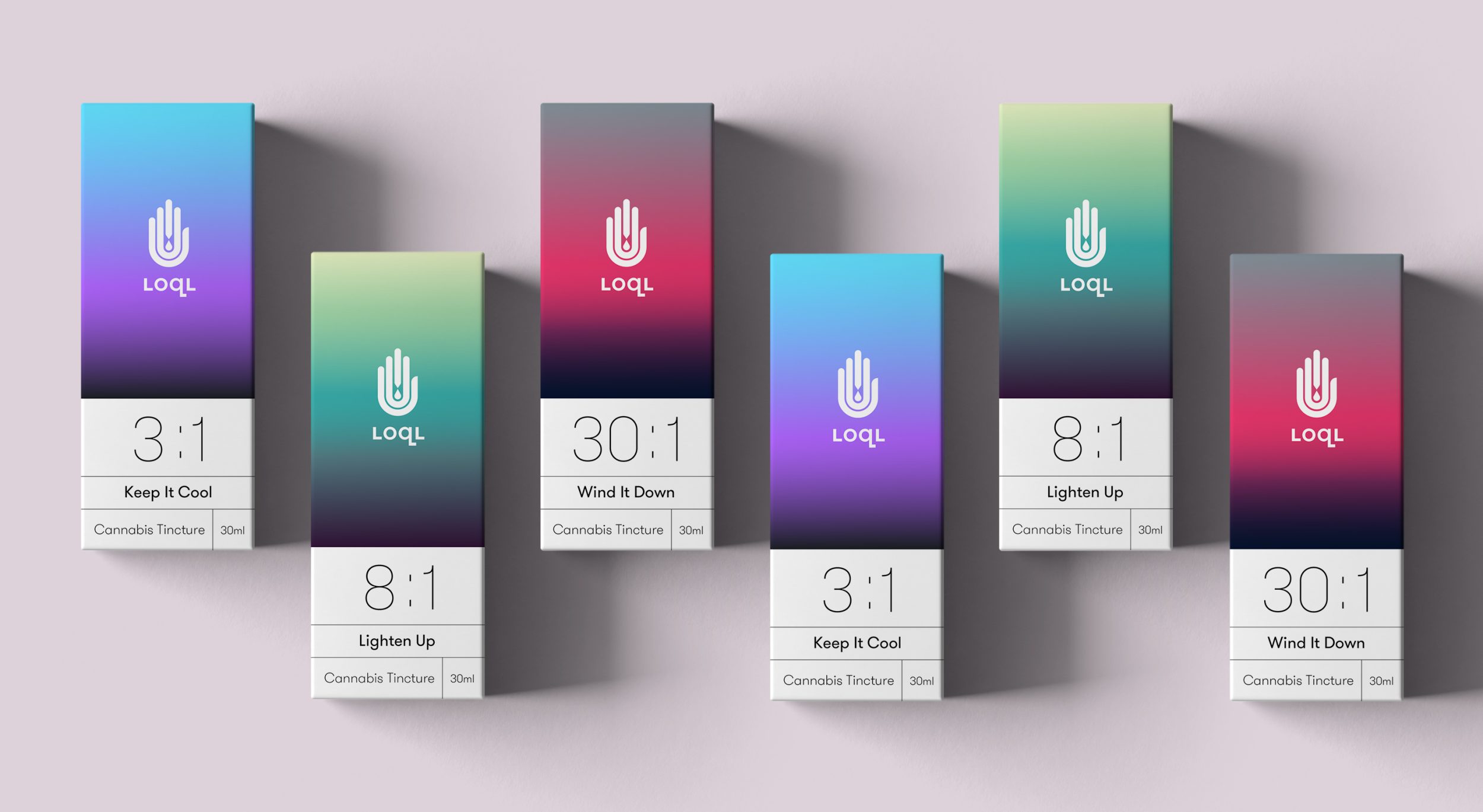
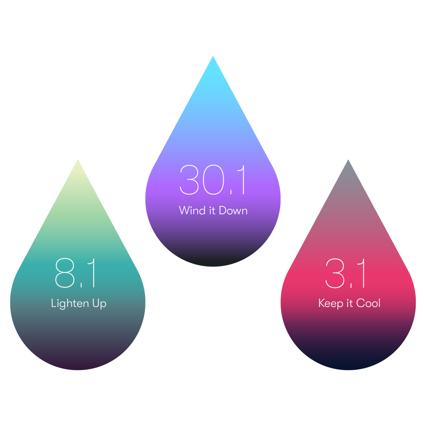
Custom gradients help set a mood for each type of CBD:THC ratio and are meant to evoke a feeling rather than a specific depiction. The benefits and pyschoactivity vary from ratio to ratio and whether the main flower being used is indica, sativa or a hybrid combination.
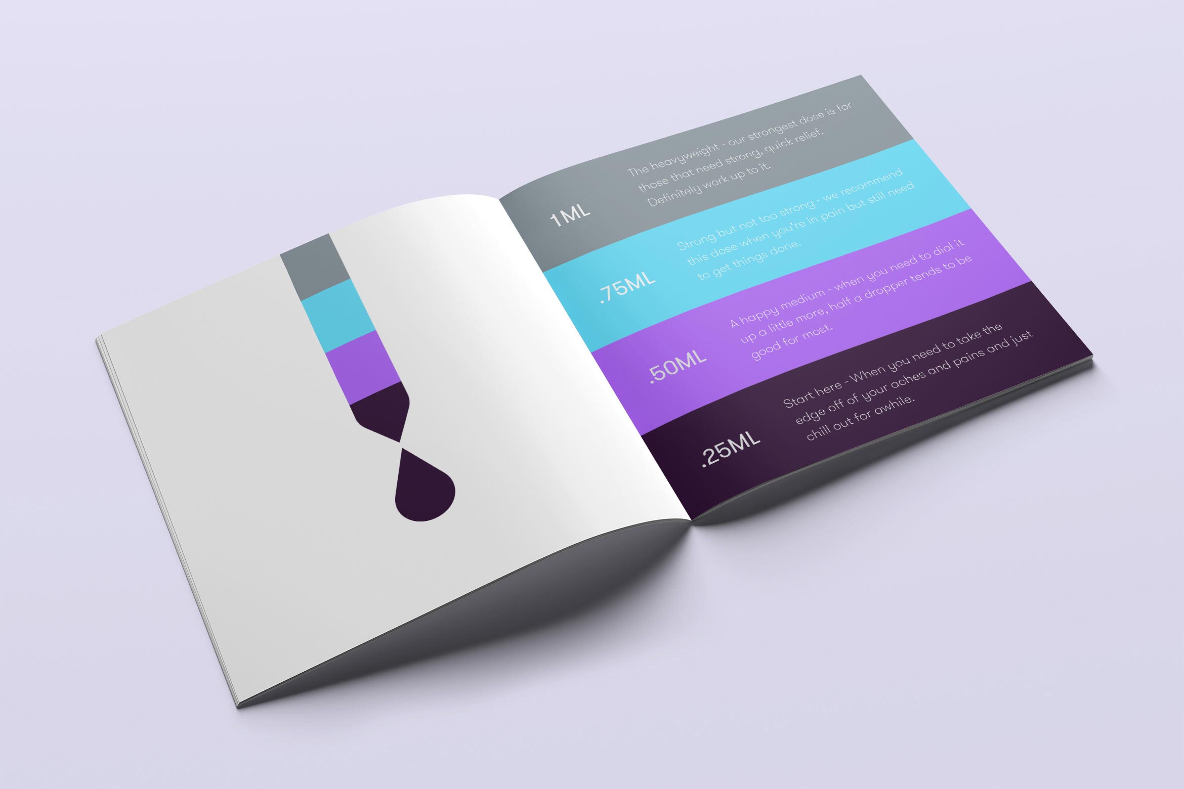
Simple, color-coded brochures were designed to quickly instruct consumers on safe, optimal dosing. The liquid dropper from the mark is used as a motif in the dosing infographic.
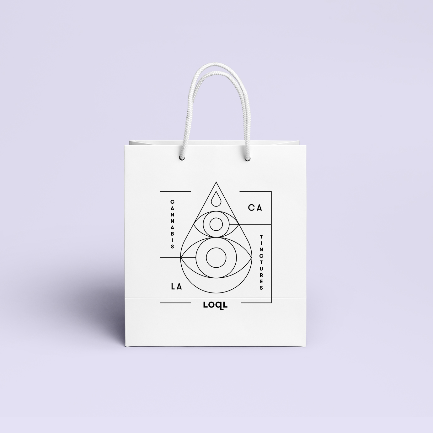
A playful, secondary system of Illustrations were created for use on swag like clothing, stickers, totes and shopping bags. The artwork uses elements from the main mark mixed with other mystical symbolism to evoke “protection”.