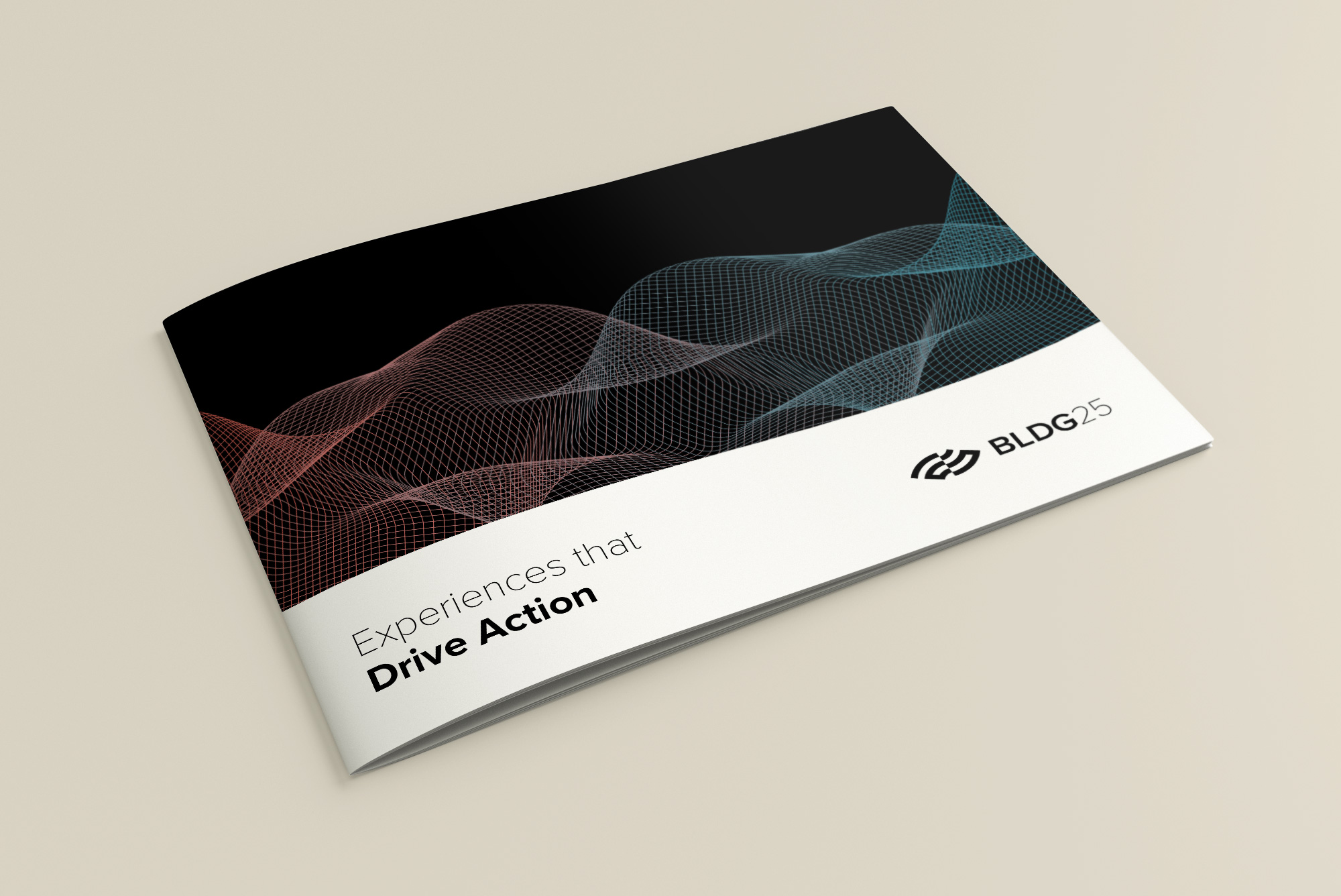
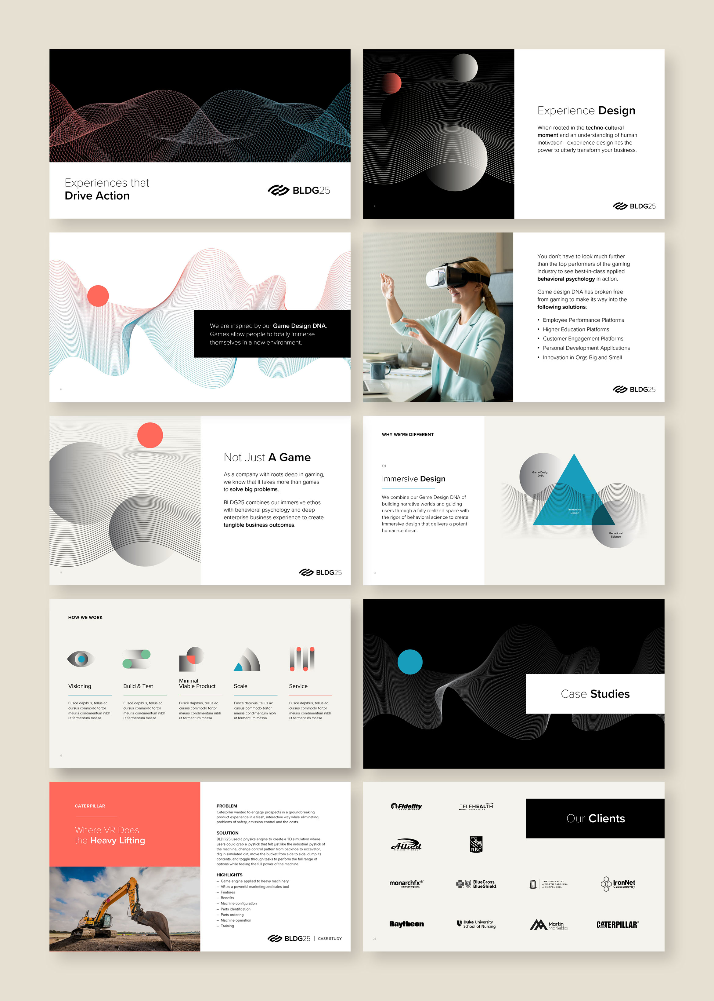
BLDG25 is where game design meets behavioral science to deliver tech solutions
BLDG25 combines a background in creative game design with deep roots in enterprise product management to solve tomorrow’s big business challenges through customized software. We designed the identity to reflect both behavioral science and technology, allowing the viewer to interpret it on their own terms. It’s a play on opposites: light and dark, science and art, data analytics and creativity, innovation and practicality.
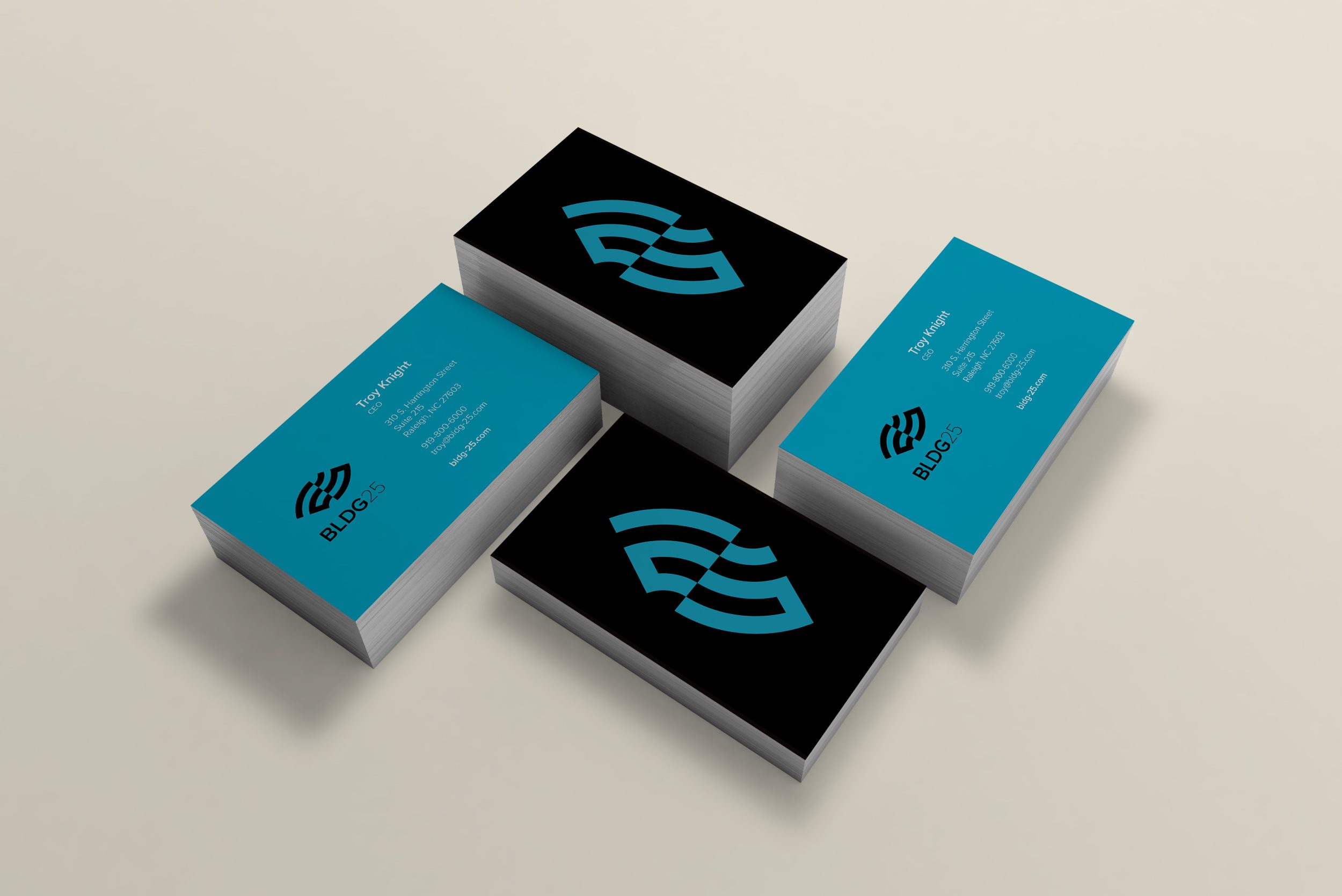
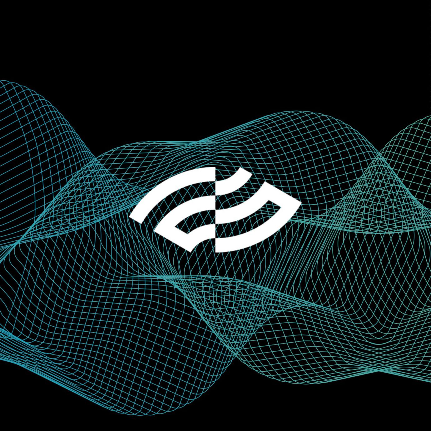
On the surface, the mark is an abstract number 25. The use of positive/negative lines bisected down the middle represents the left/right brain. It’s also an eye representing vision, insight and intelligence. A logo stinger animation really brings this idea to life.
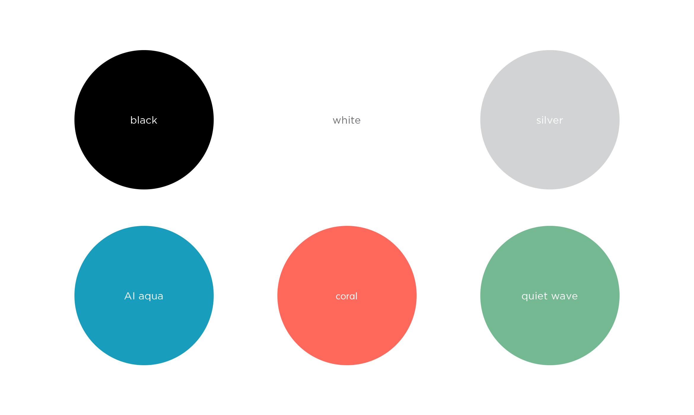

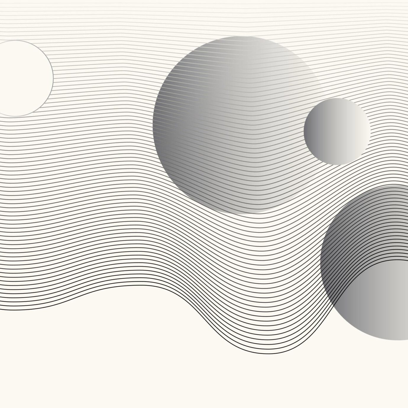
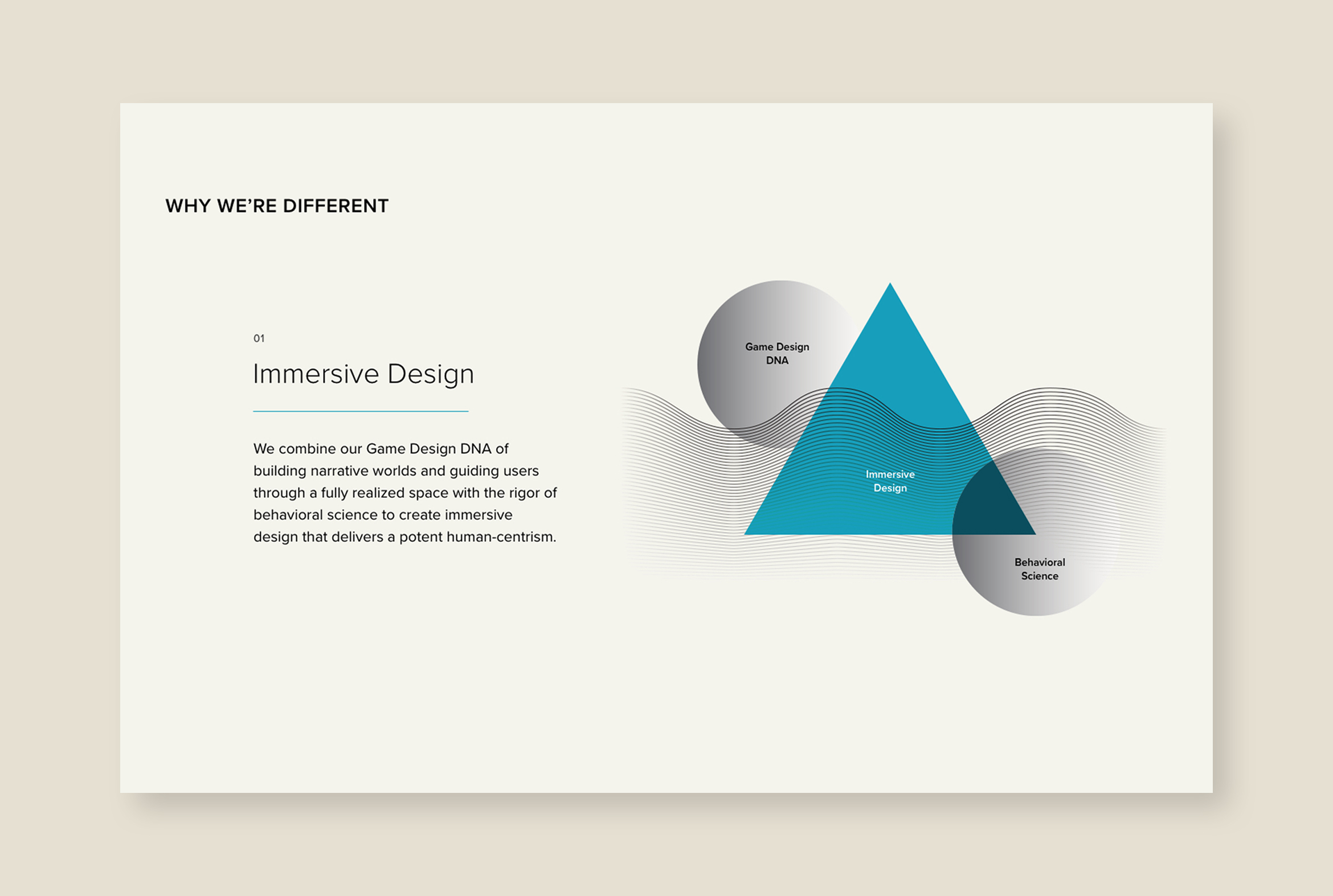
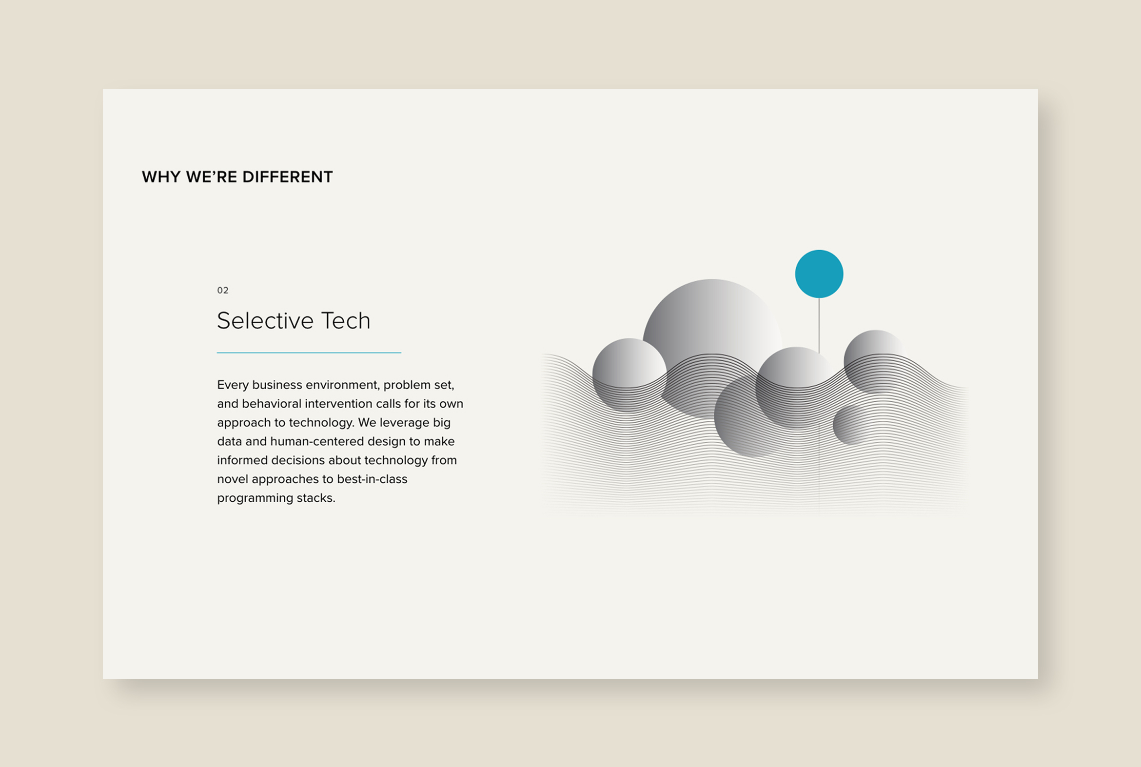
The use of mesh-like motifs is an homage to their gaming DNA, imagination and flexibility. Waves and spheres represent the transformational nature of their products, a paradigm shift that pulls the viewer into new and unexpected worlds.


Custom icons were designed to help describe intangible business concepts. Branded powerpoint templates were created using a vast library of icons, motifs and infographics for use by the BLDG25 team.
Deliverables:
- Brand Identity
- Brand Guidelines
- Visual System + Icons
- Web Design + Development
- Motion Graphics
- Collateral
A clean, responsive website describes the complexity of what BLDG25 does using immersive motion graphics, scroll effects and parallax infographics to draw the viewer in.
Calexo Cannabis Beverages
packaging design / brand identity
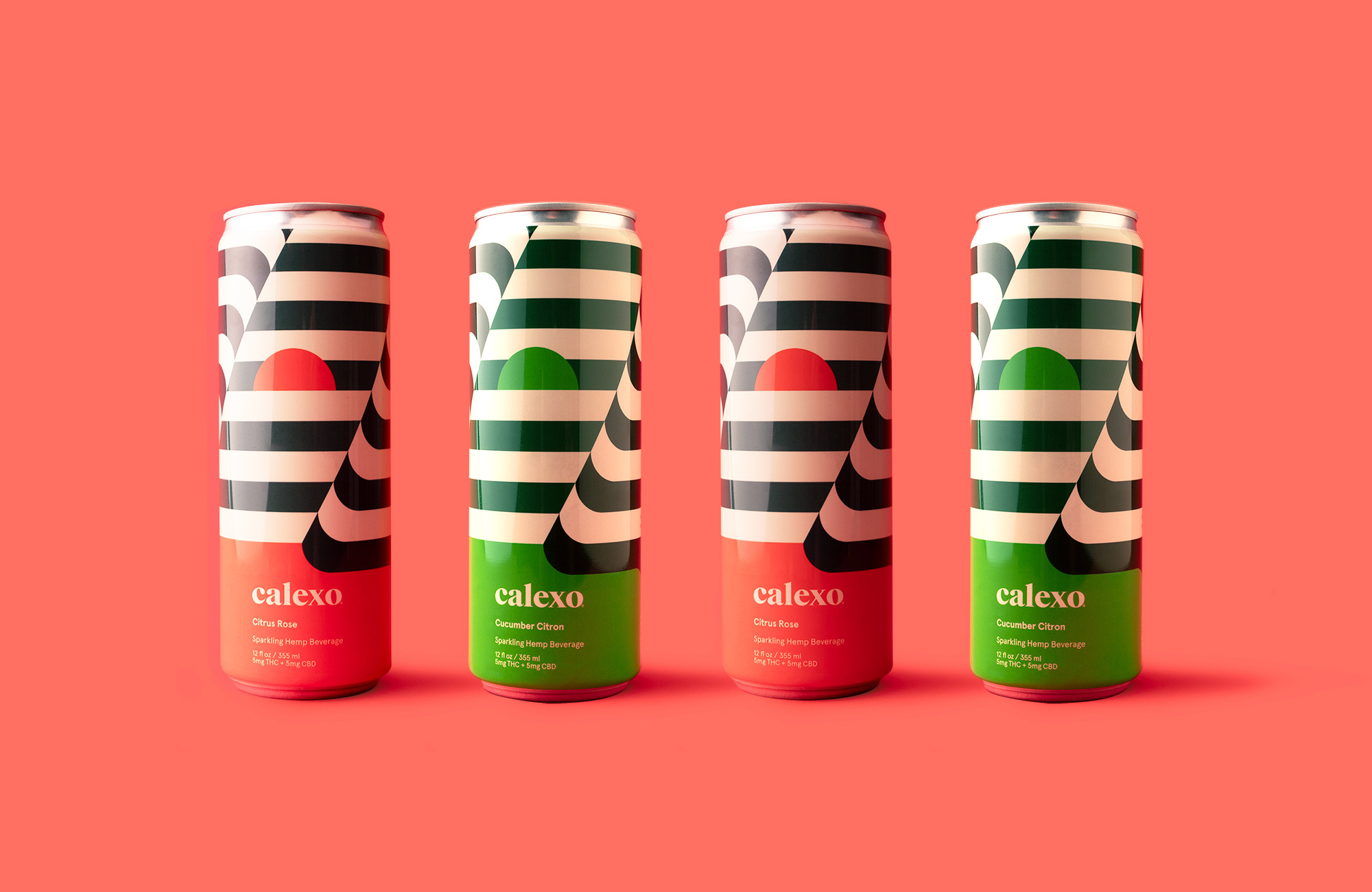
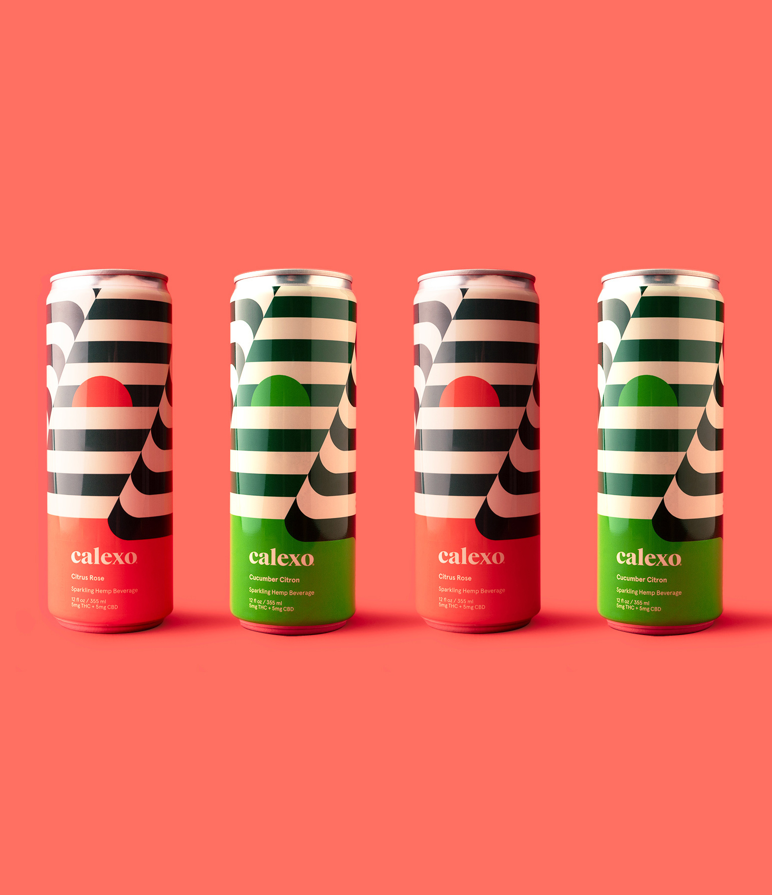
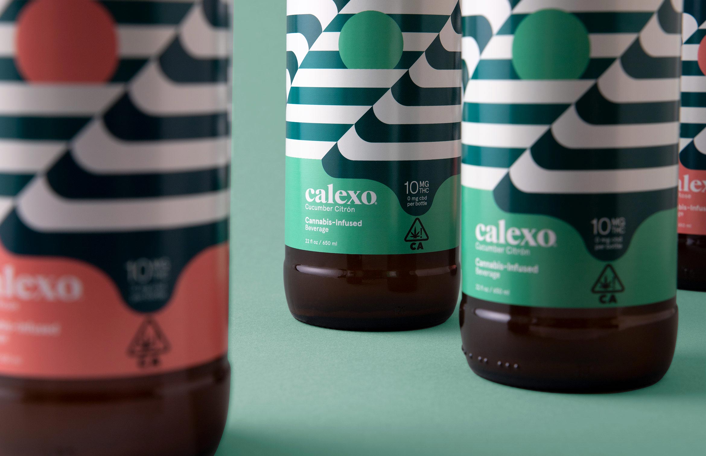
Calexo brings a smile to your mind in citrus rose or cucumber citron
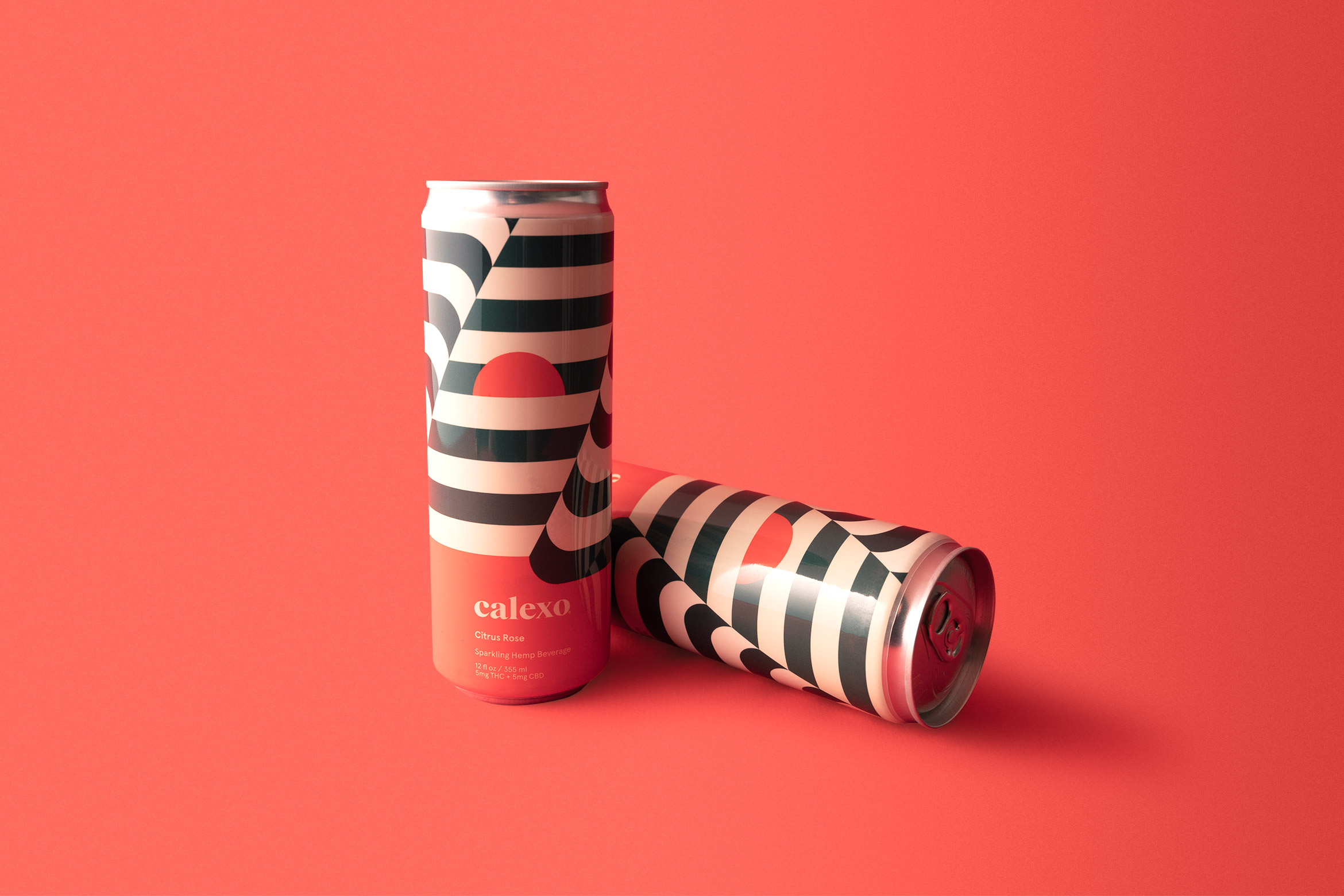
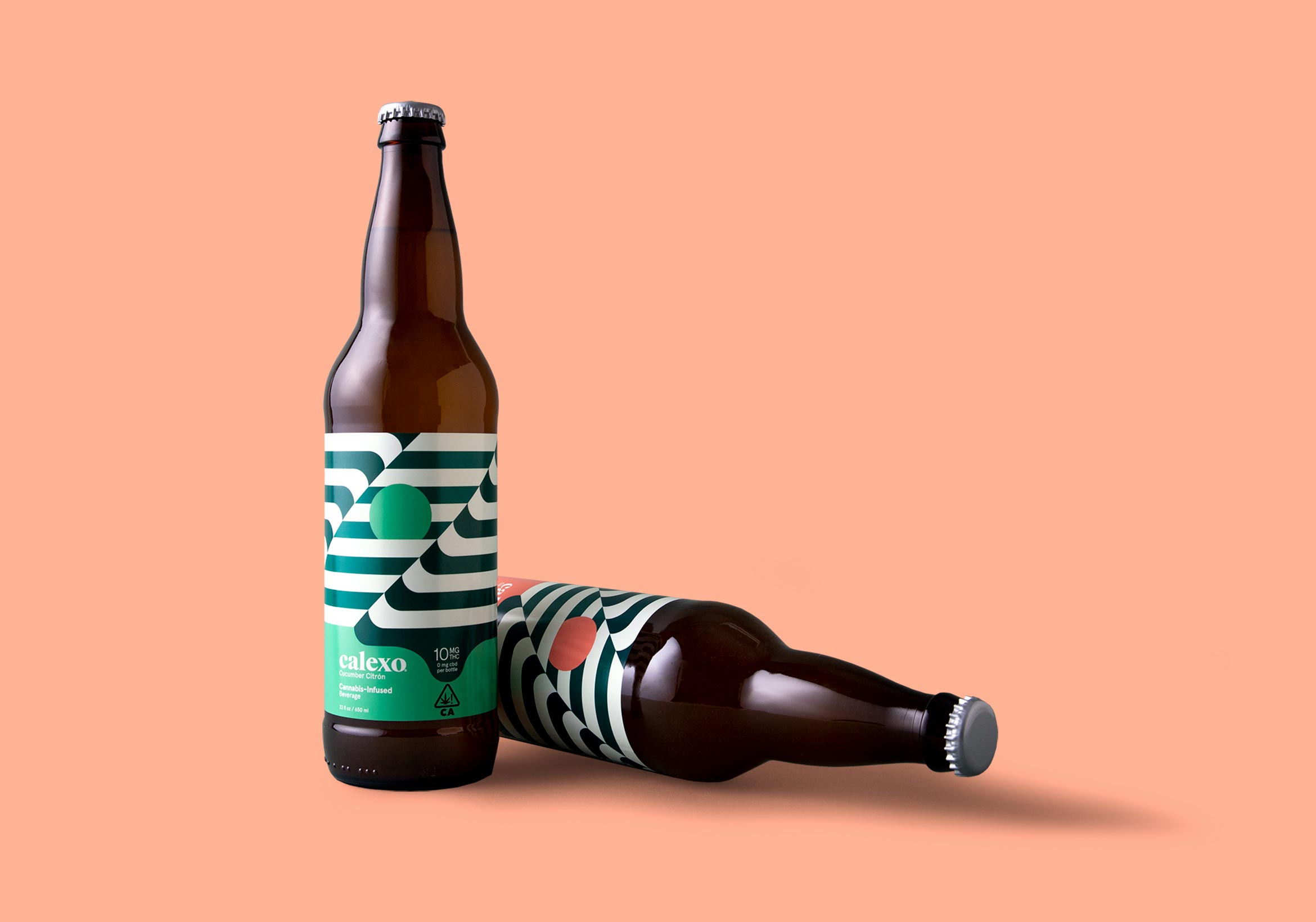
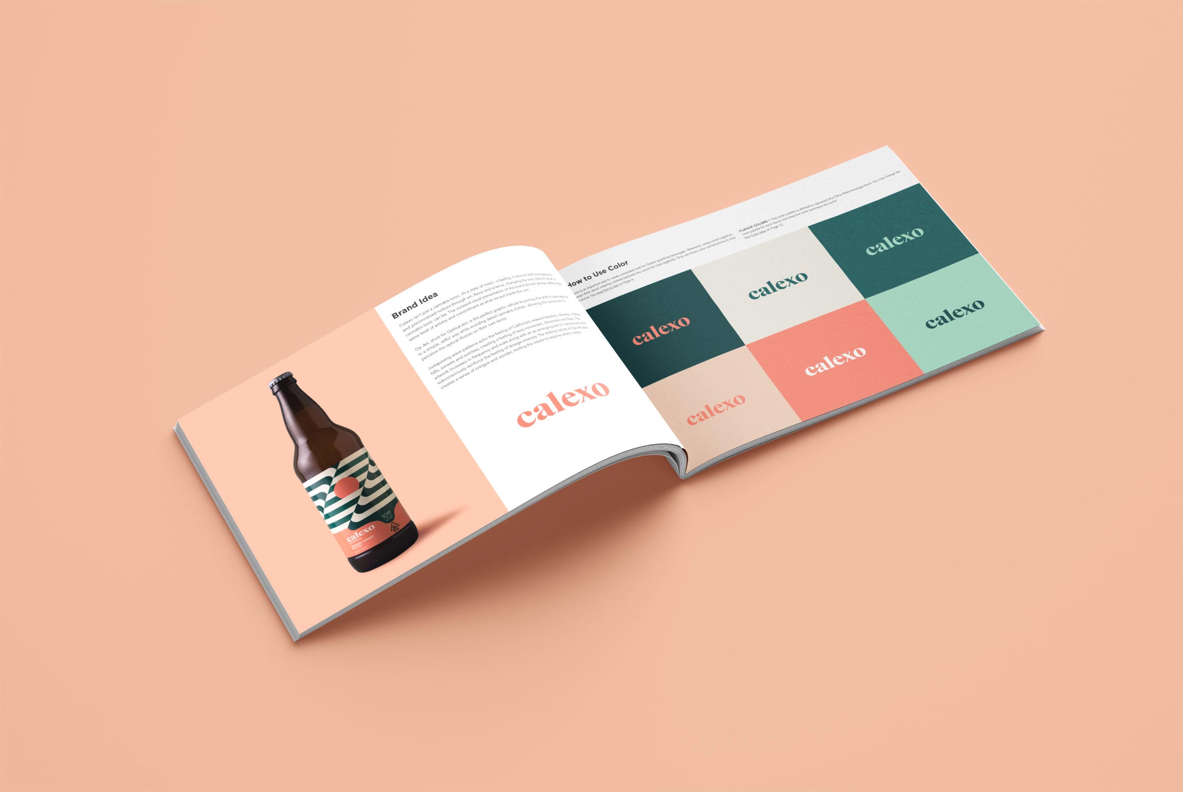
Calexo isn’t just another cannabis beverage, it’s a state of mind. It aims to shift perceptions and preconceived notions through art, flavor and science. Op Art “optical art” is the perfect graphic vehicle to portray this shift in a simple, artful way while avoiding dated cannabis clichés – allowing the consumer to perceive the illusion in the art on their own terms.
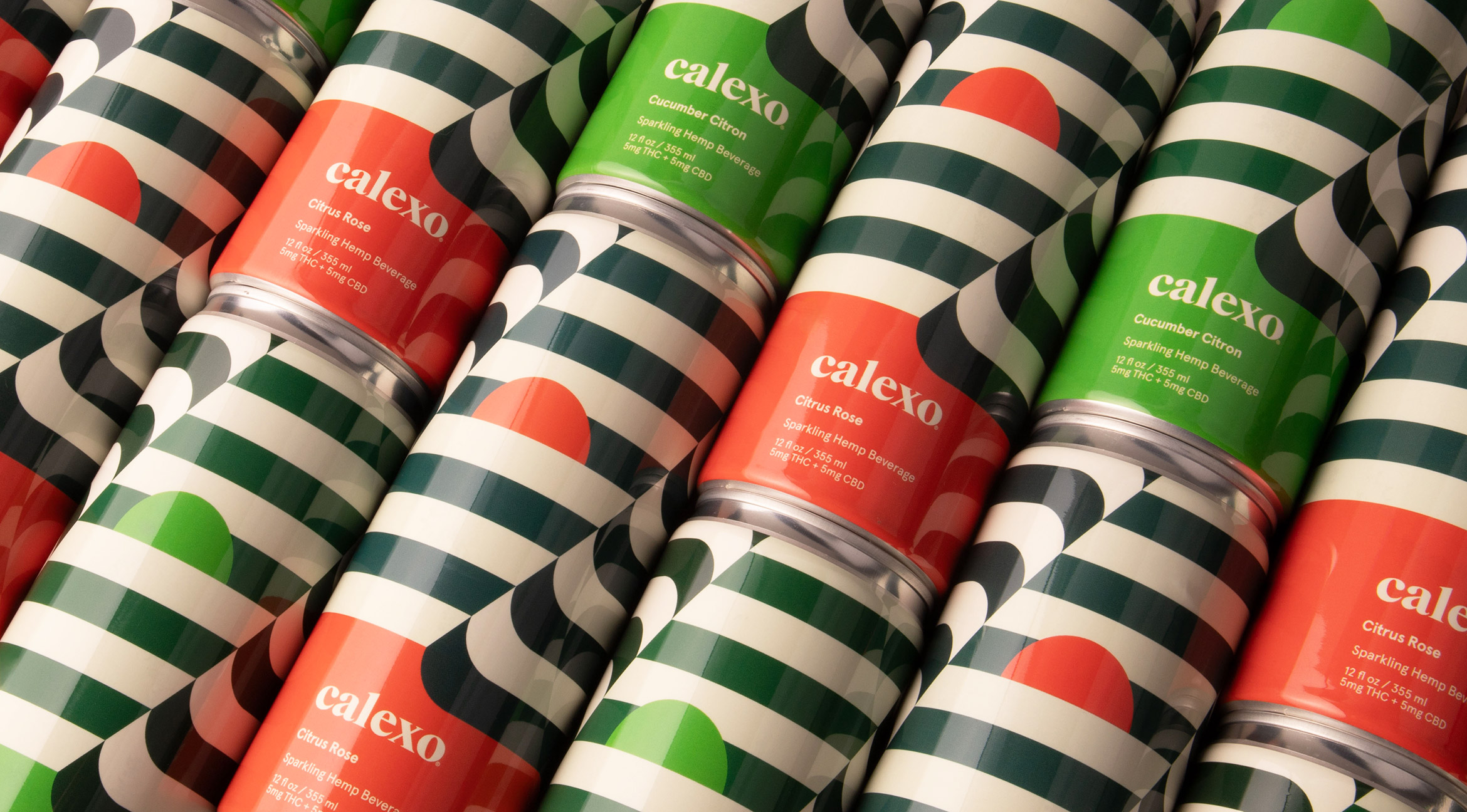
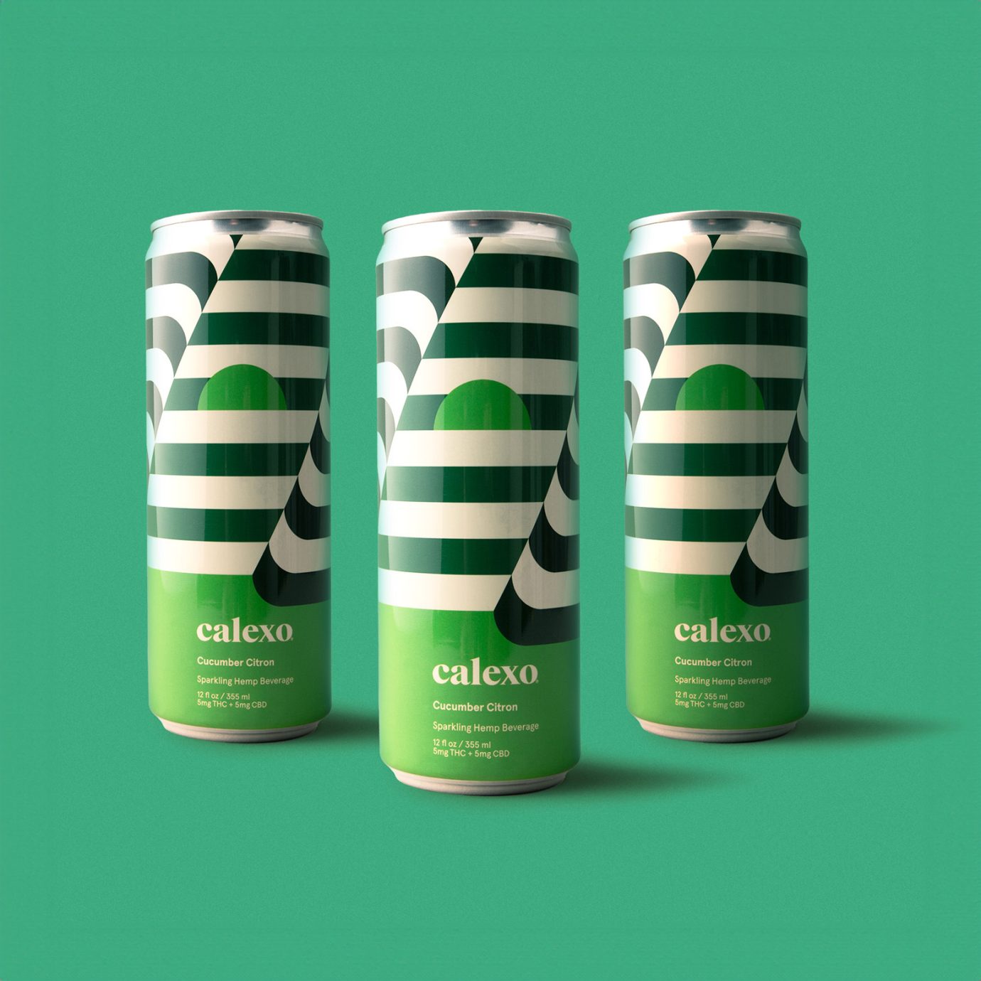
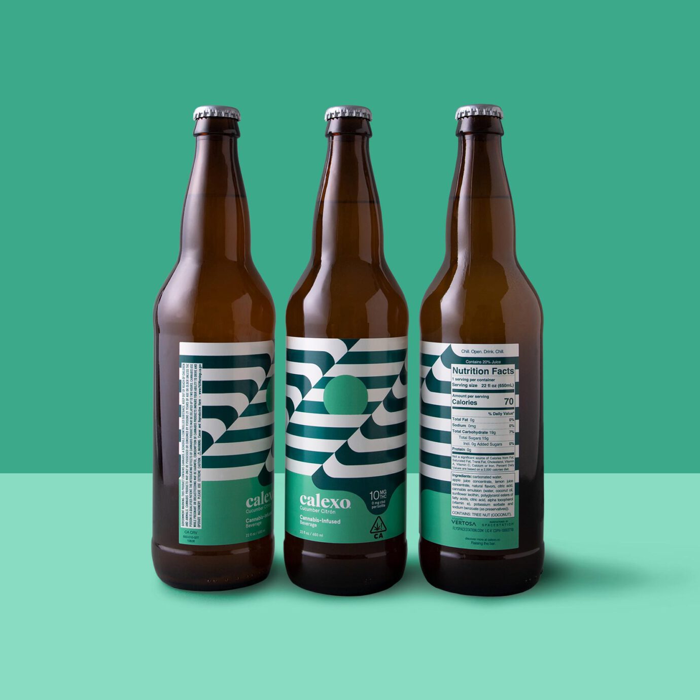
The new hemp beverage packaging is a 12 oz. can with a striped op-art wrap that continues seamlessly around. The first batch of cannabis-infused beverages were in a 22 oz. bottle with op-art labels. The sun is rising or setting depending on your mood.
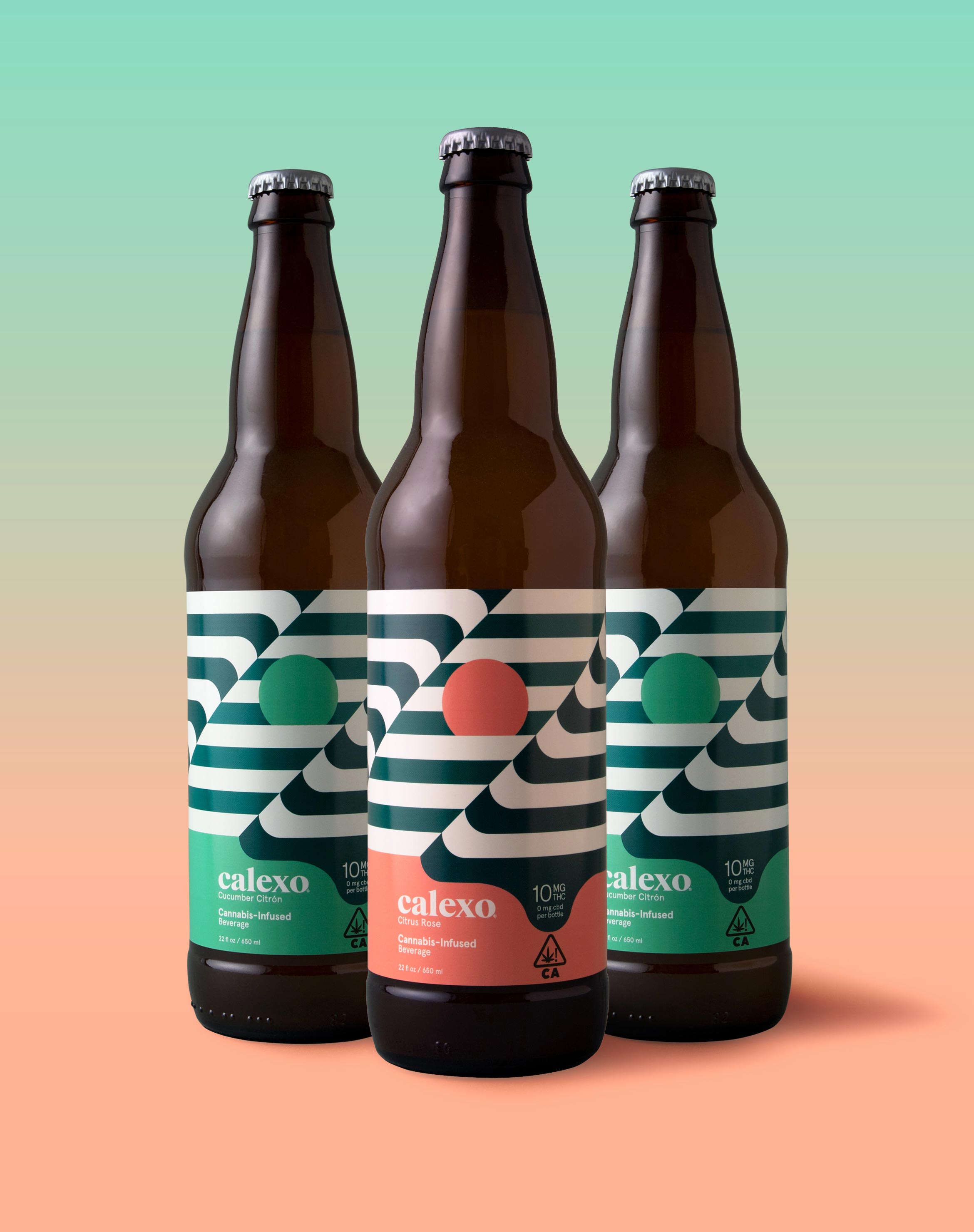
Capturing the laid-back feeling of the rolling hills, lapping water, brilliant sunsets and desert flora that defines the California and northern Mexico region, we applied a crisp, warm, color palette to both the brand and its unique flavor profiles.

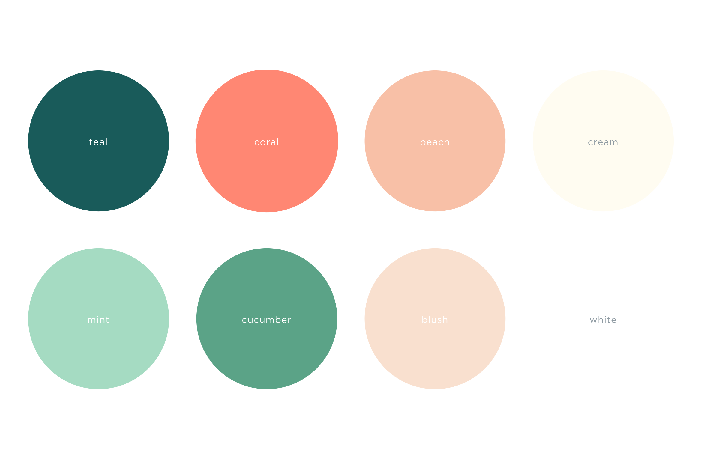

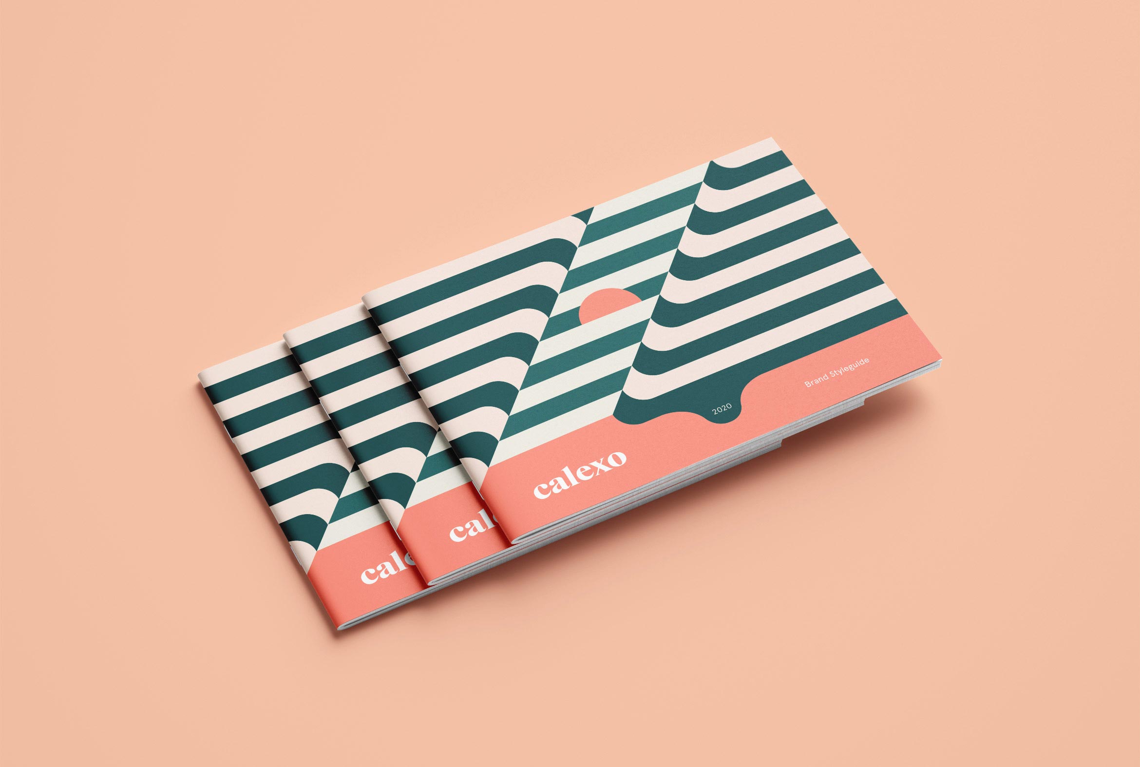
A Brand Styleguide keeps the visual identity cohesive by outlining rules for the logo, typography, color palette and graphic motifs.
Deliverables:
- Brand Identity
- Brand Guidelines
- Packaging Design
- Visual System
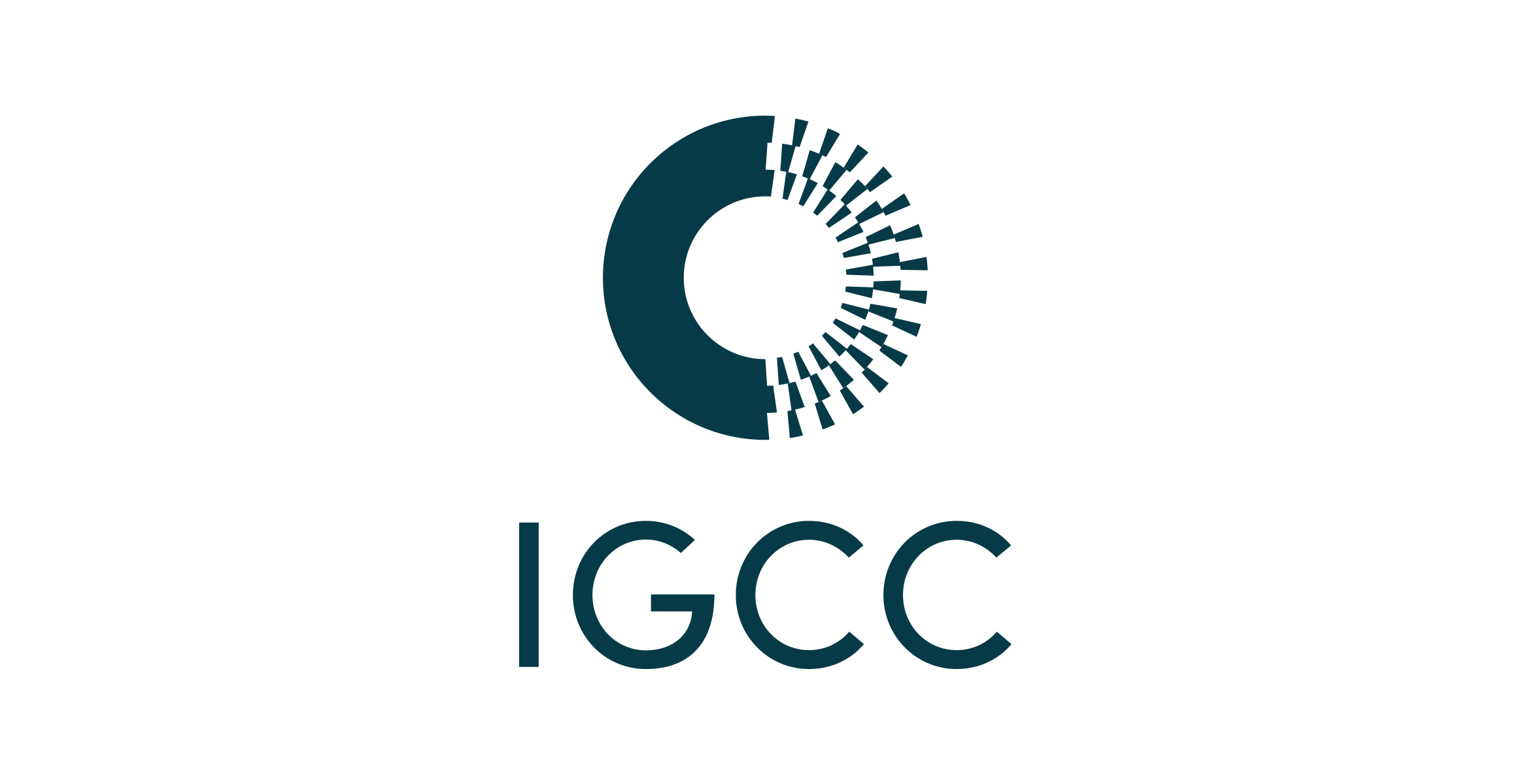
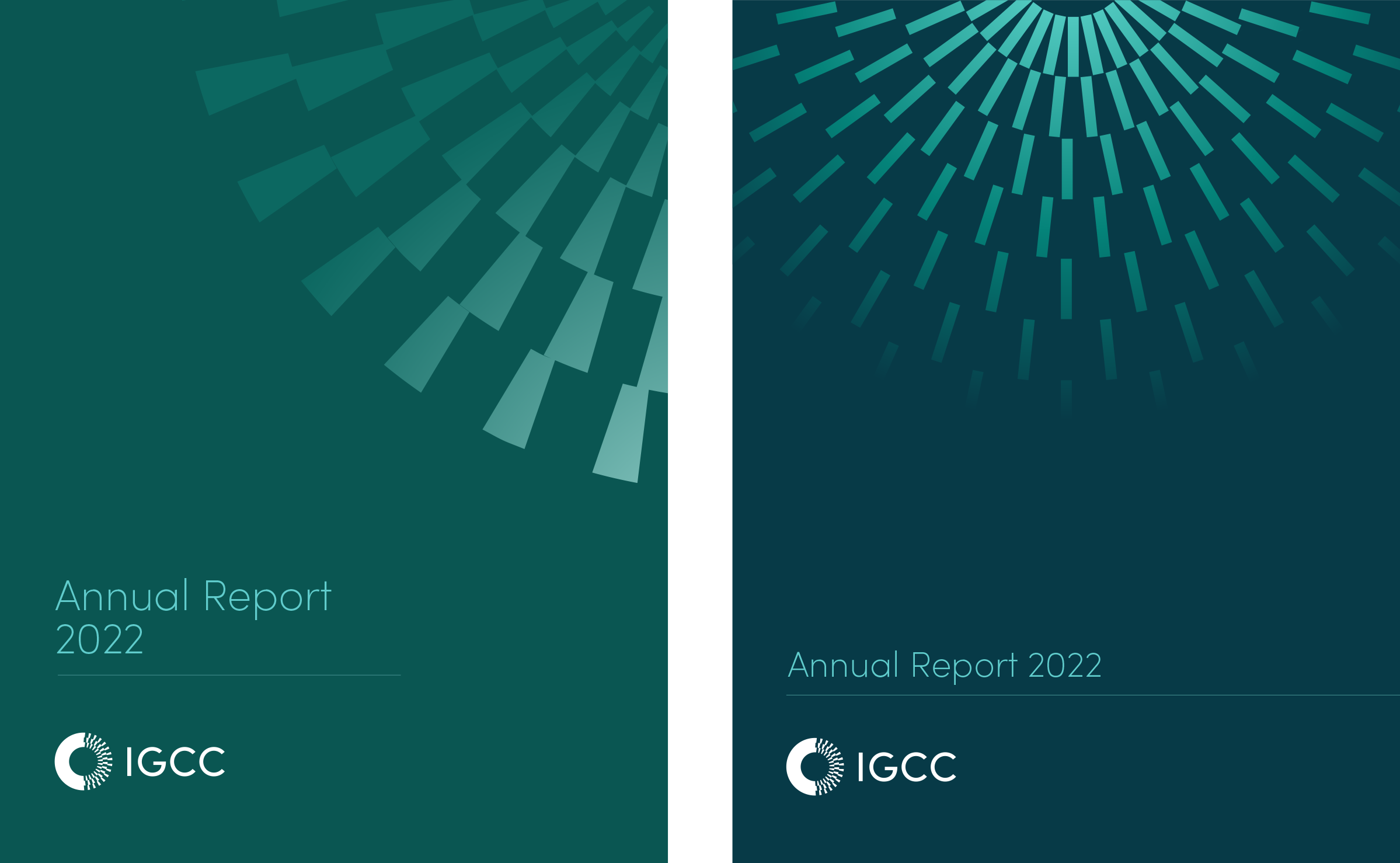
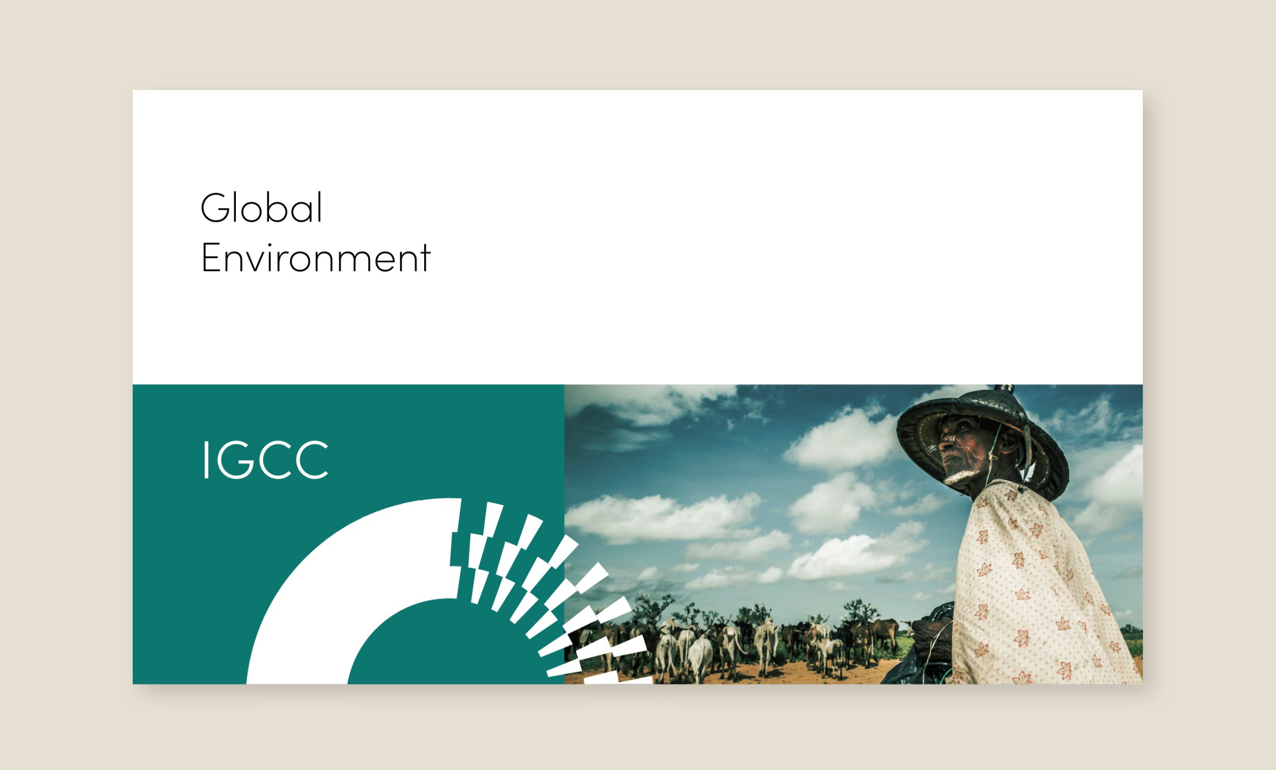
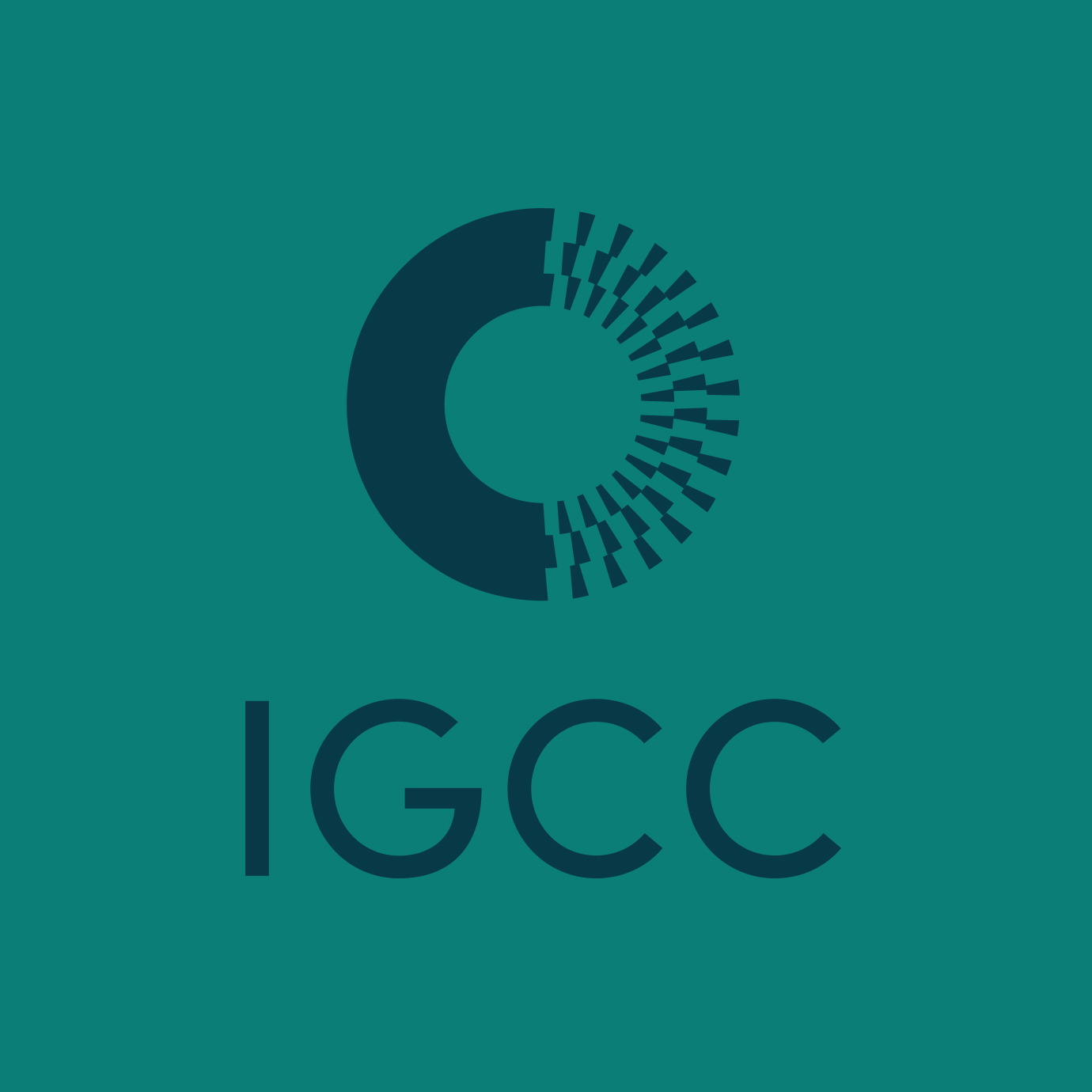
University of California IGCC
education / brand identity / website
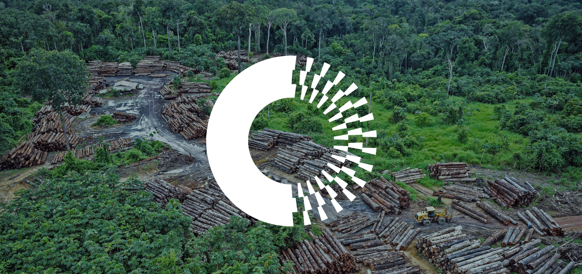
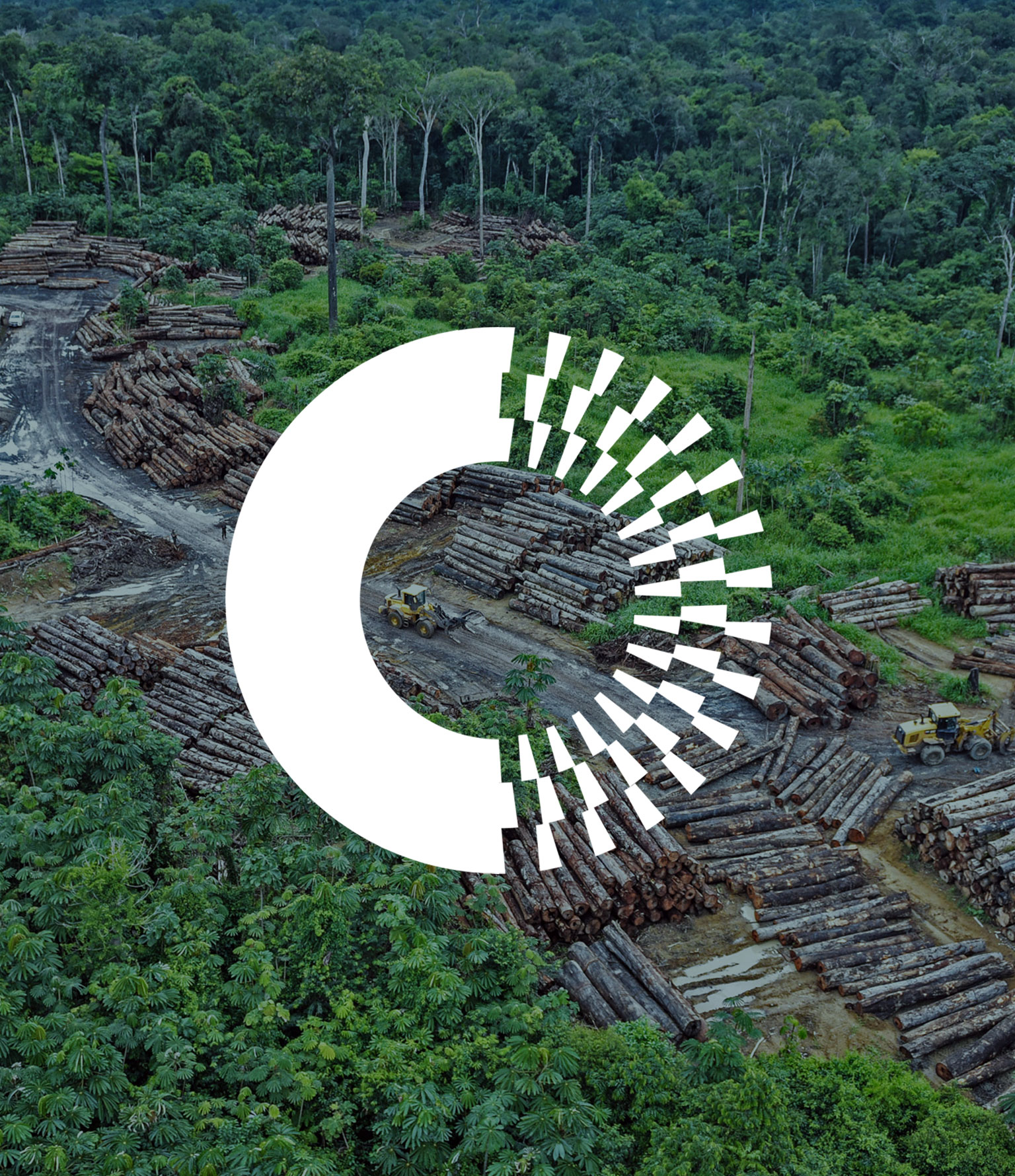
IGCC conducts research on global social science conflicts and cooperation
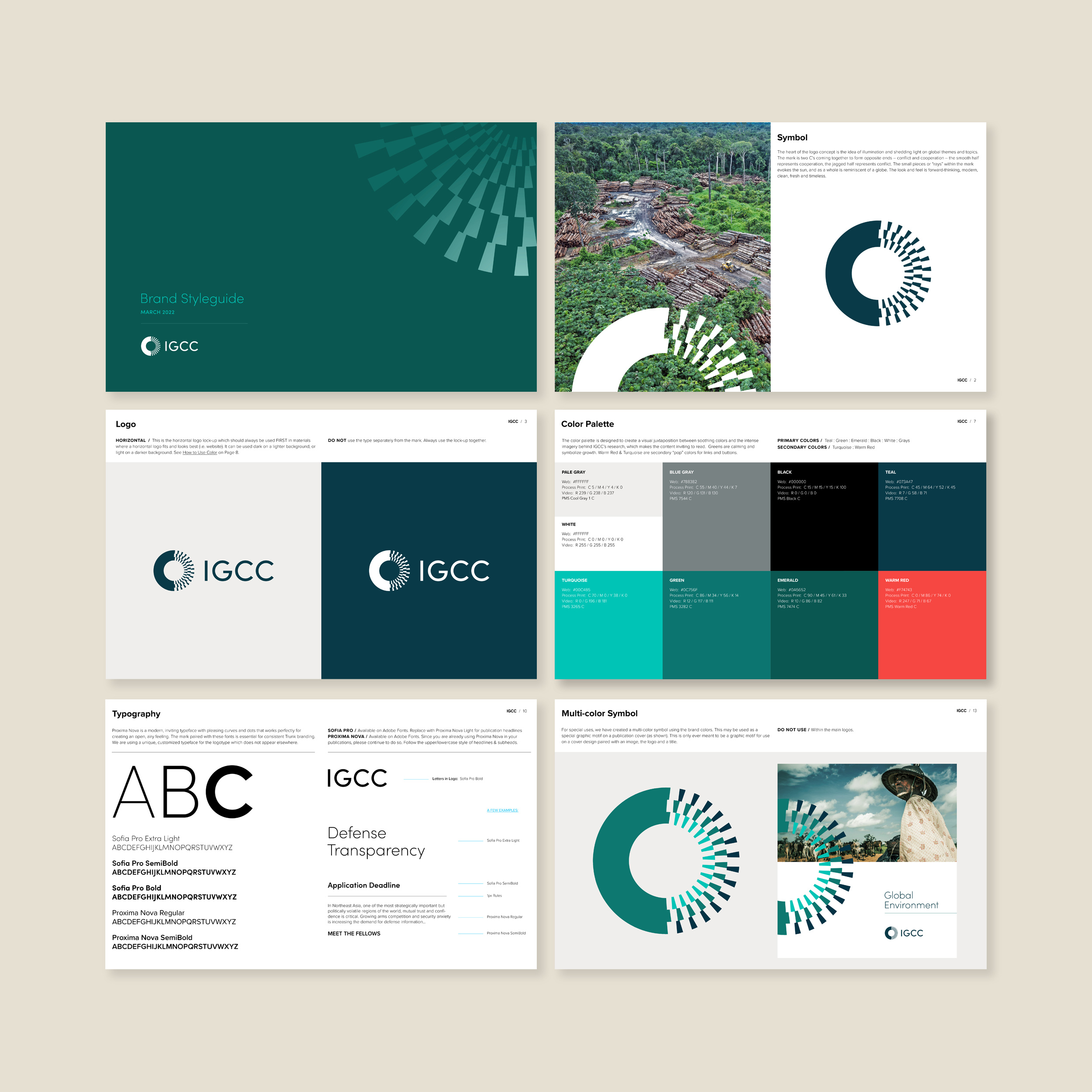
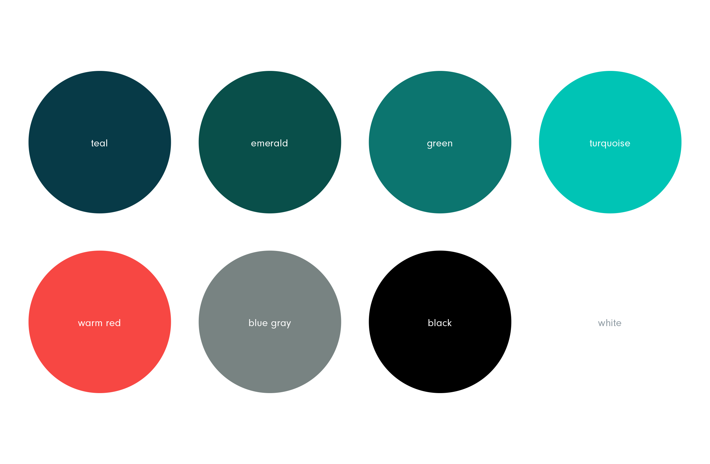
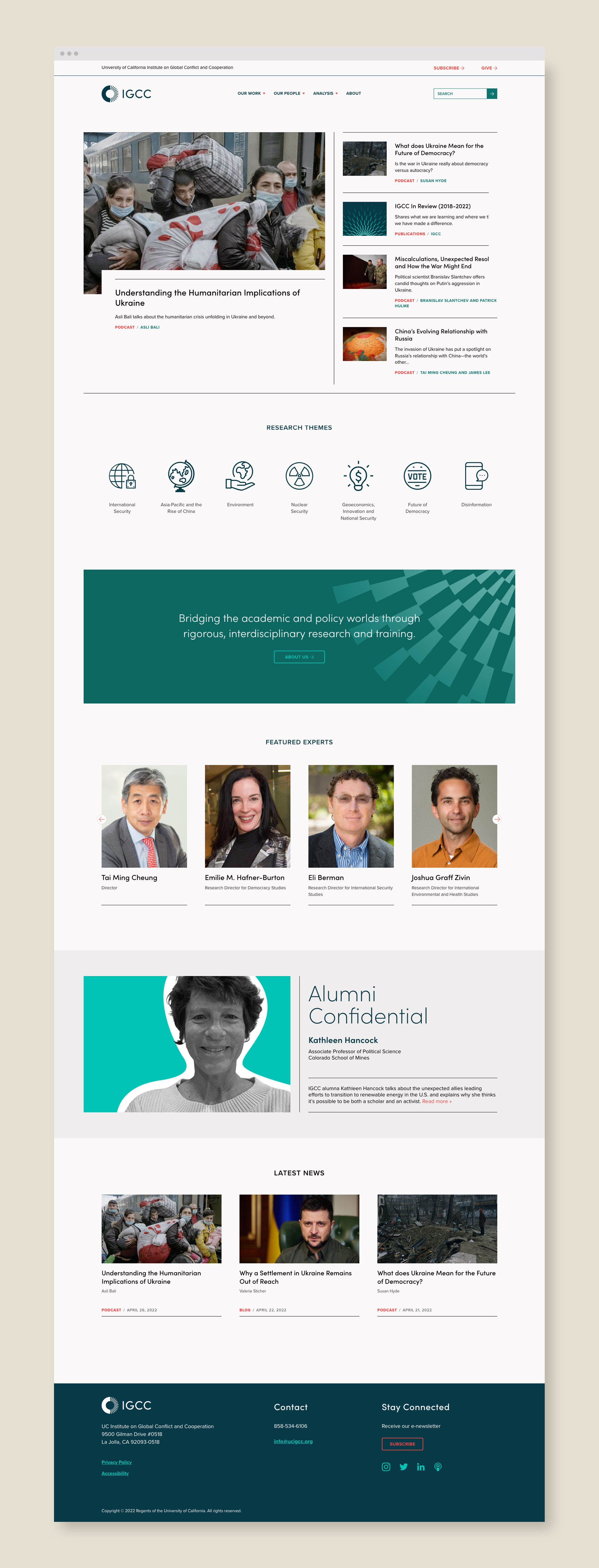
University of California Institute on Global Conflict and Cooperation–or UC IGCC–bridges the academic and policy worlds and conducts social science research on topics such as international security, geoeconomics, the future of democracy and the environment. They wanted to redesign and modernize their dated brand identity and website and separate them from the University of California’s brand look and feel.
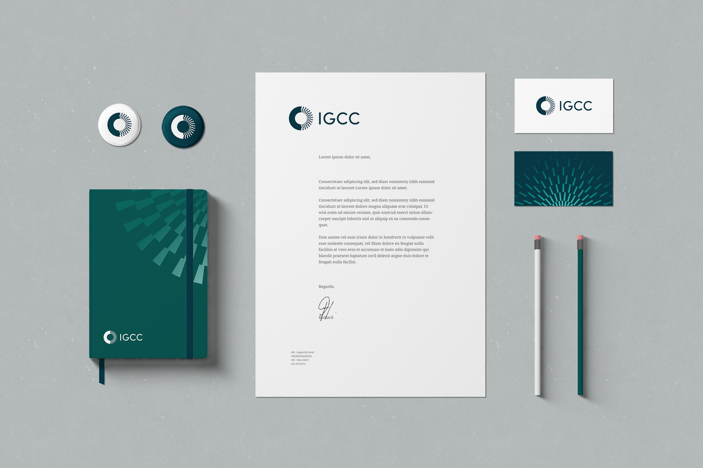
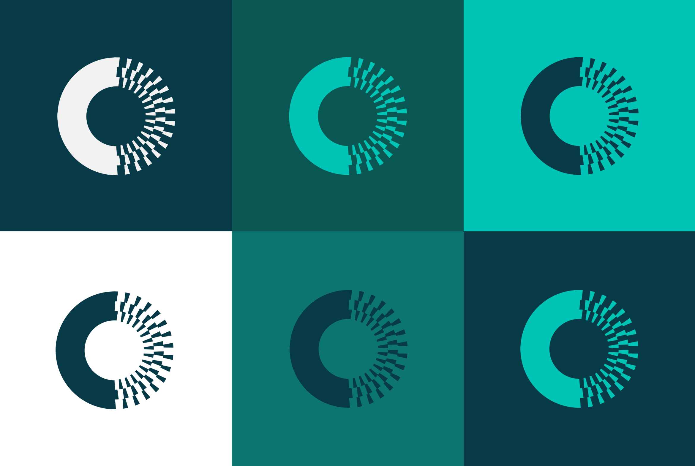
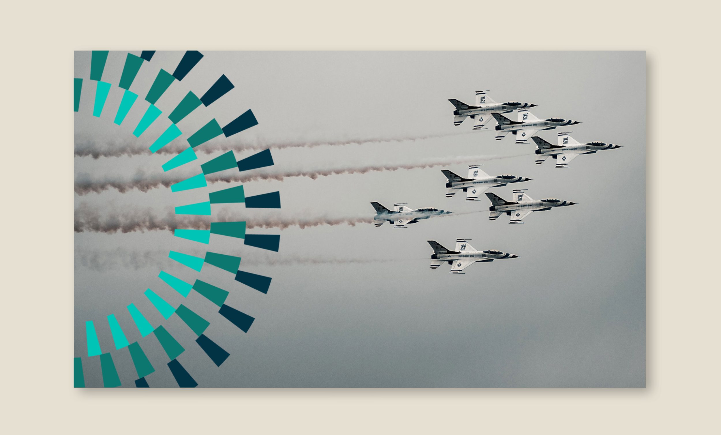
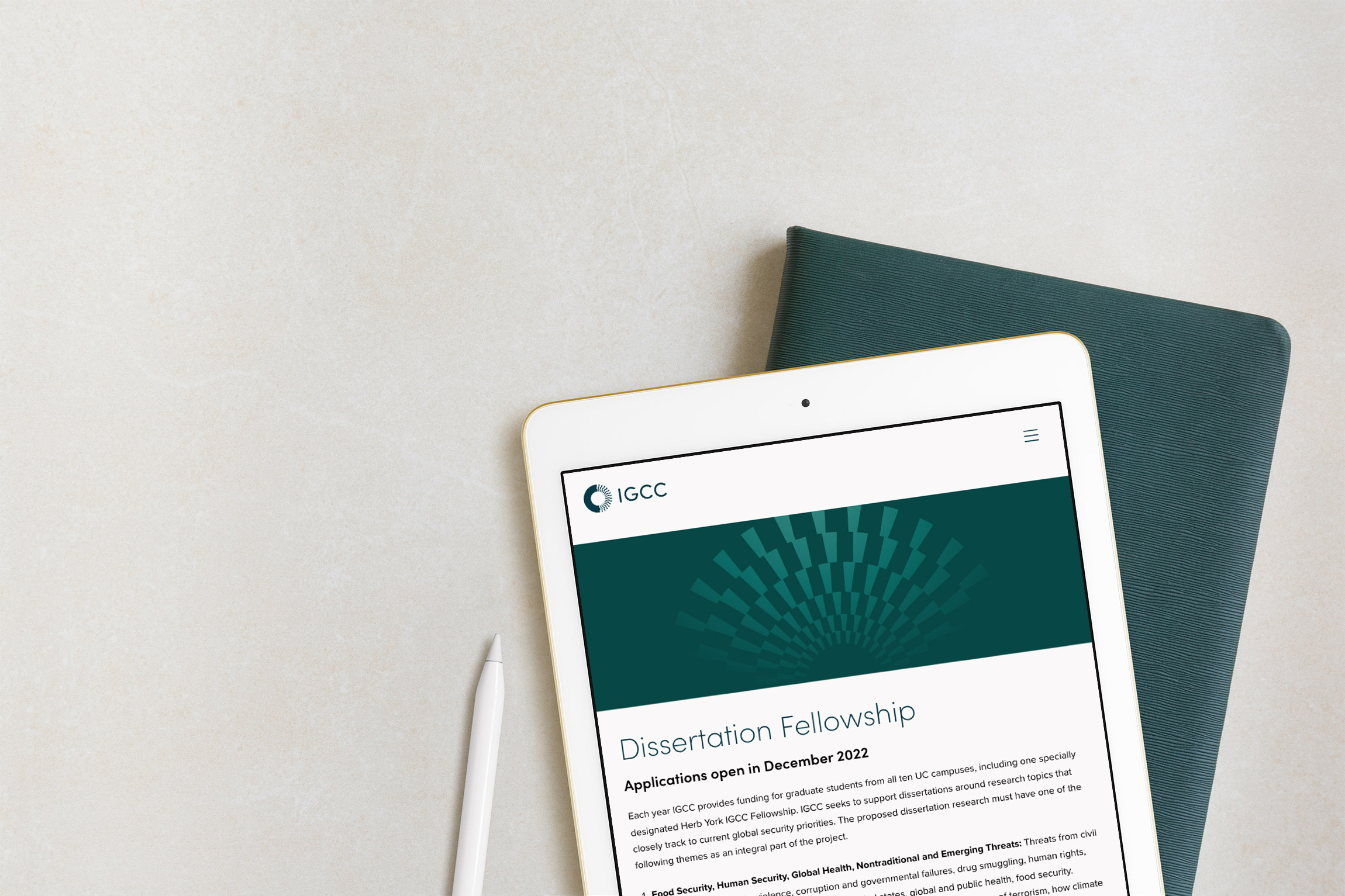
Using the “rays” from inside the mark as a graphic motif to help depict the idea of “illumination” on to challenging topics. The motif becomes a positive “light” overlapping intense photography. Motifs can be used on any marketing materials from blog posts to presentation covers to social media.

A responsive WordPress website was built to present their vast archive of content in a new way that was easy to use. It needed to feel modern and feature related experts and content on each page.
Deliverables:
- Brand Identity
- Brand Styleguide
- Visual System
- Website Design
- Web Development
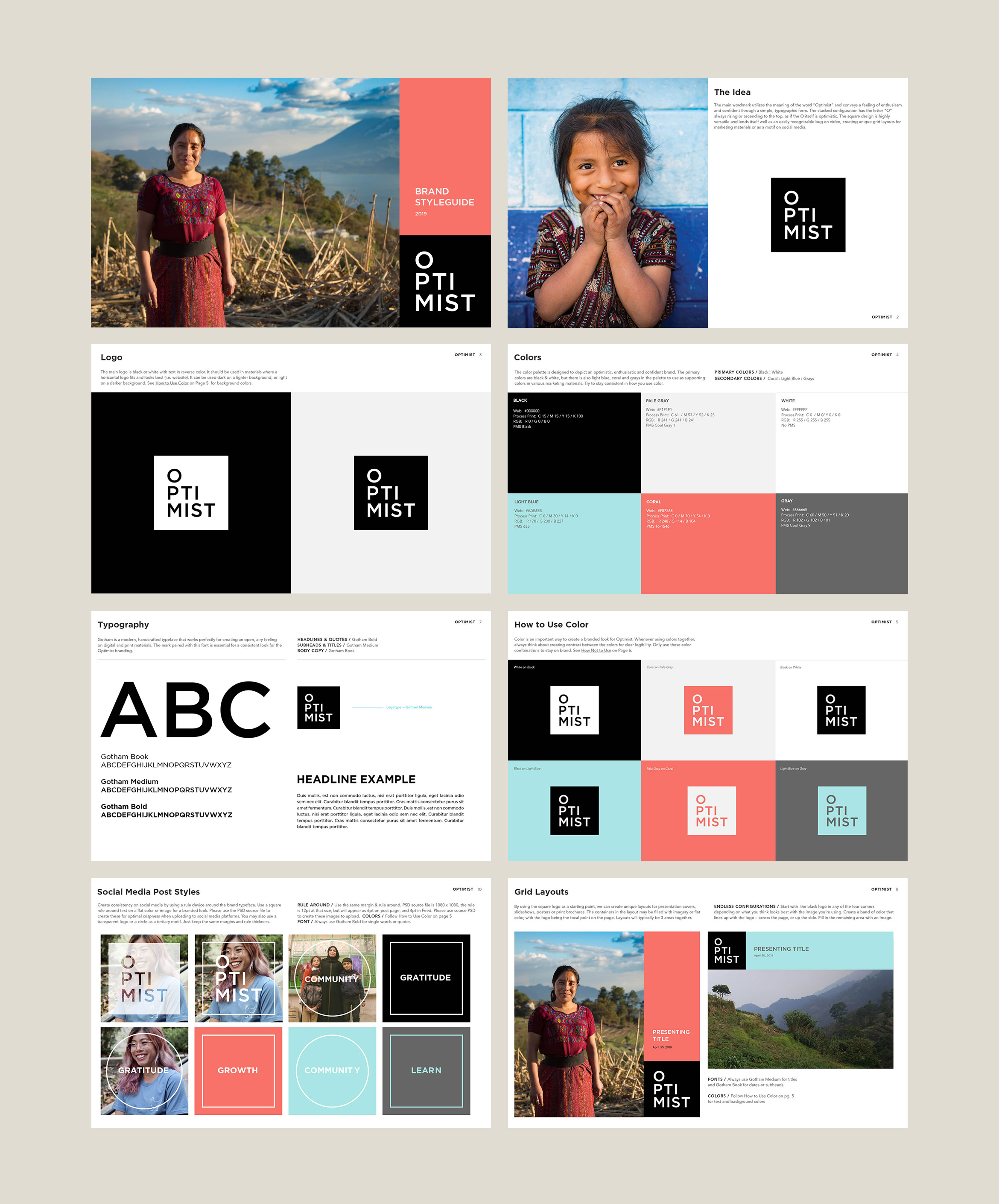
Optimist films
film production / brand identity
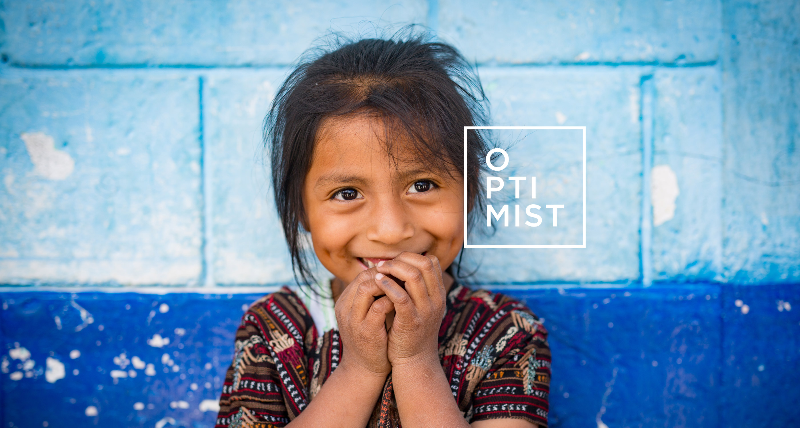
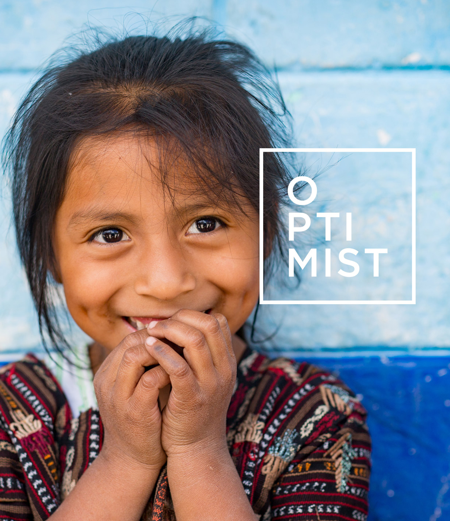
Optimist travels the world making non-profit films with impact
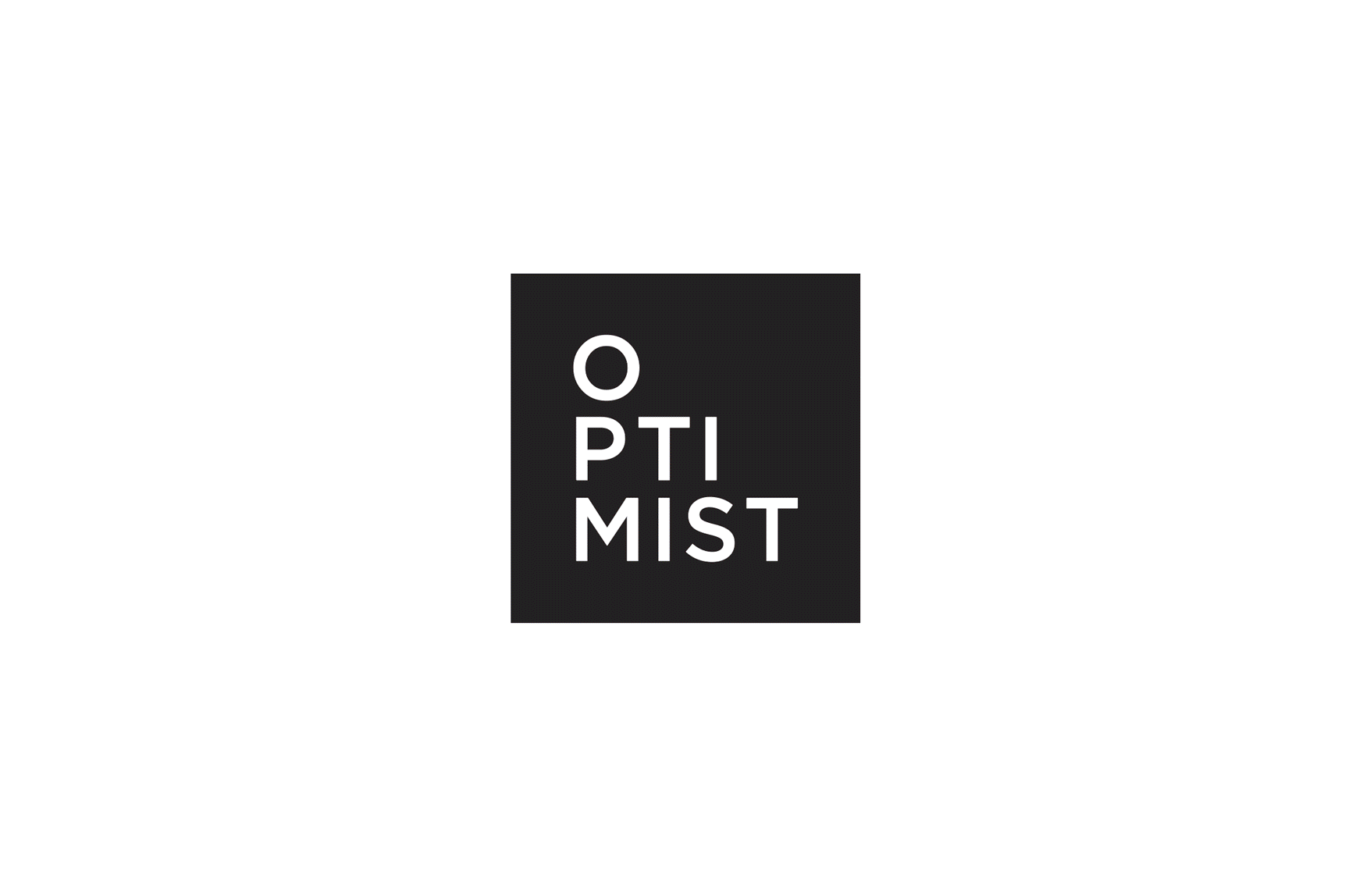
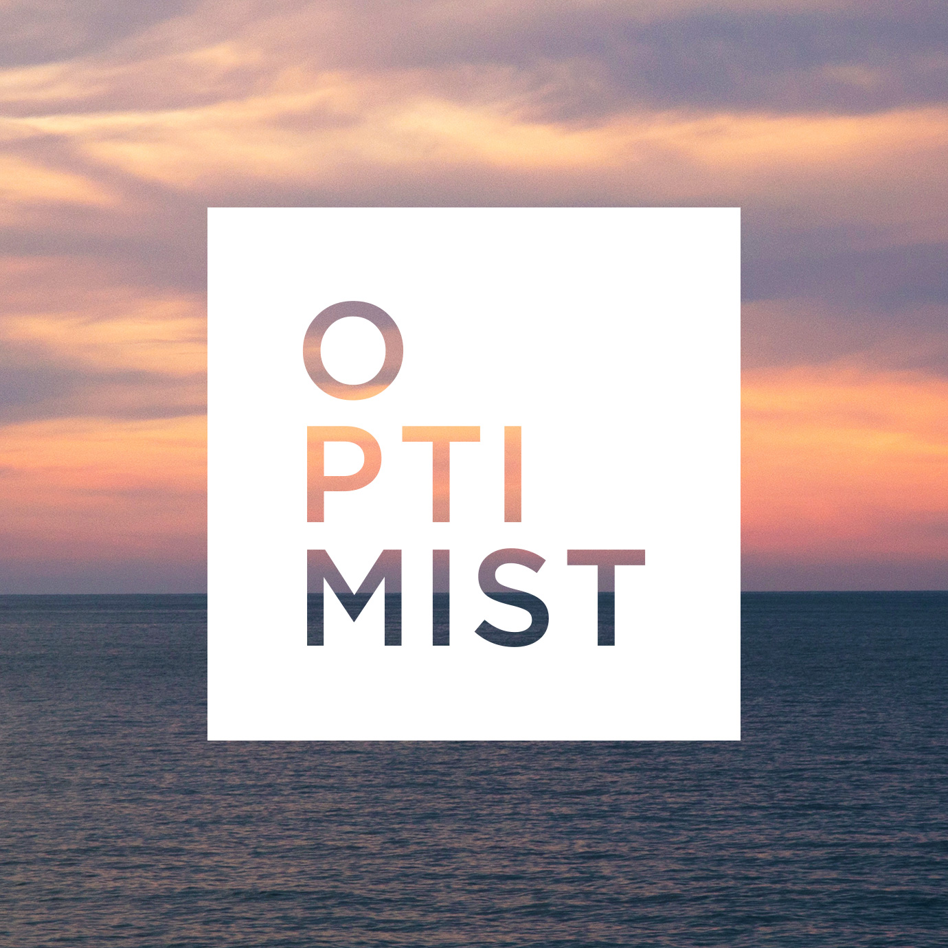
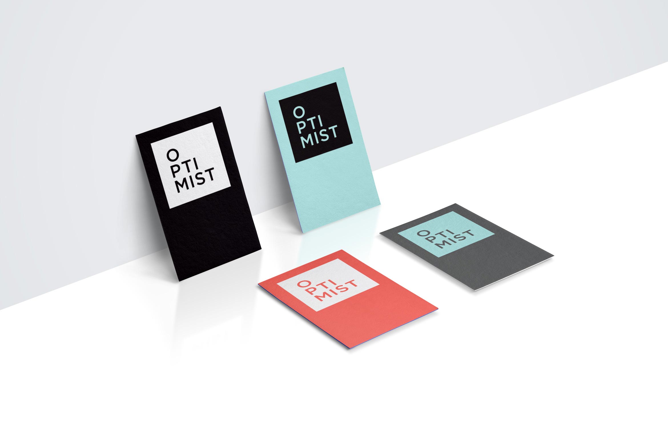
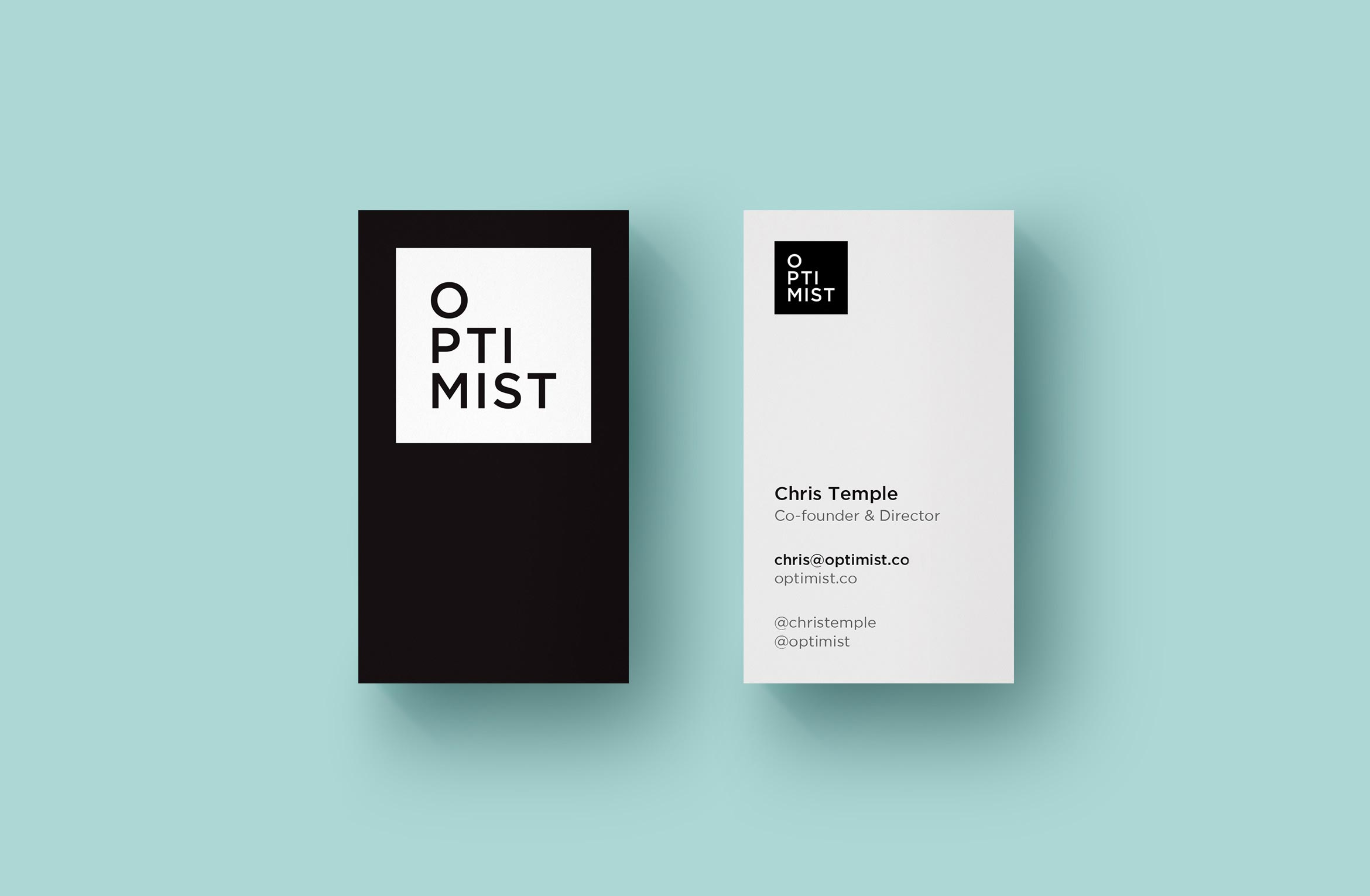
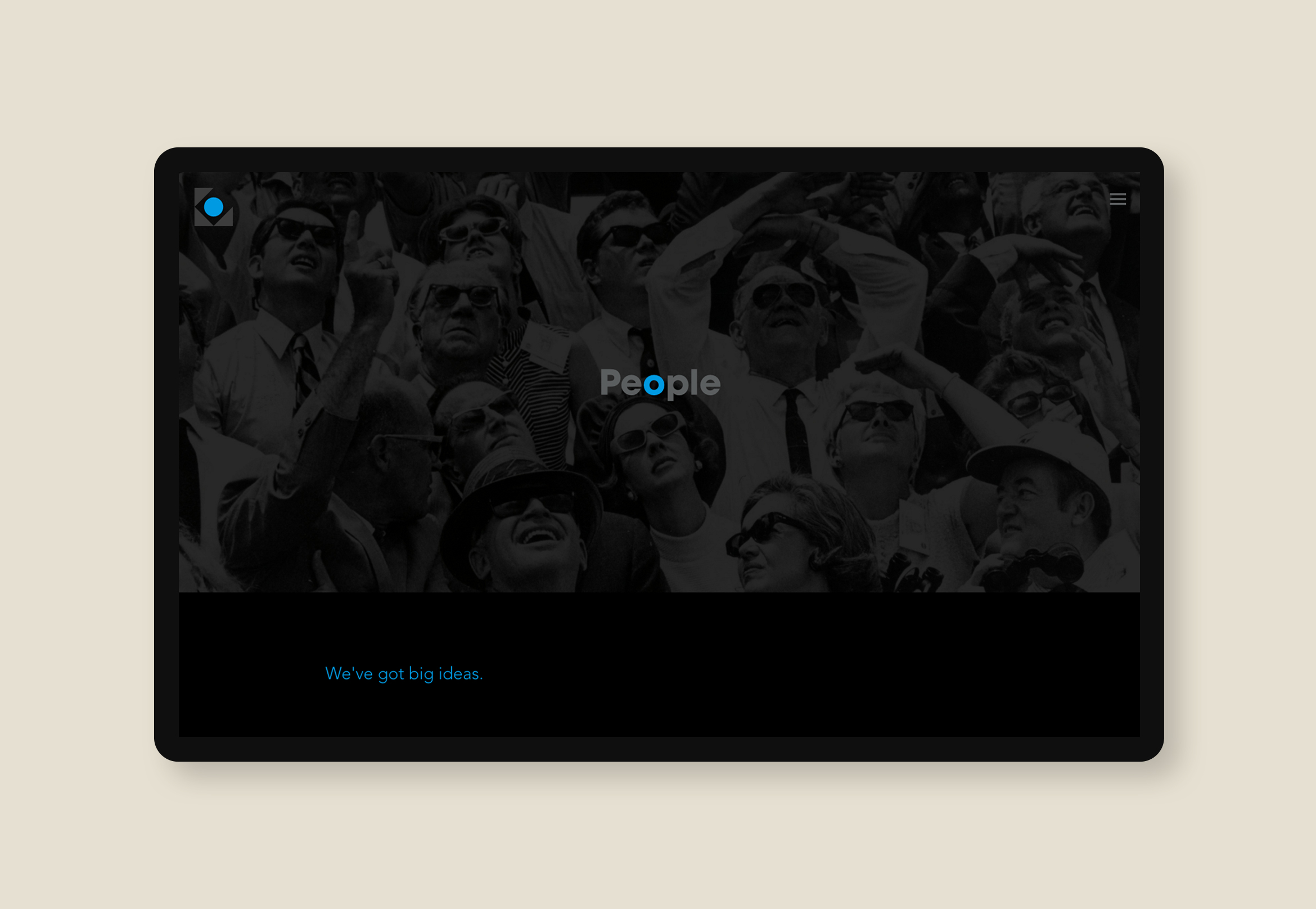
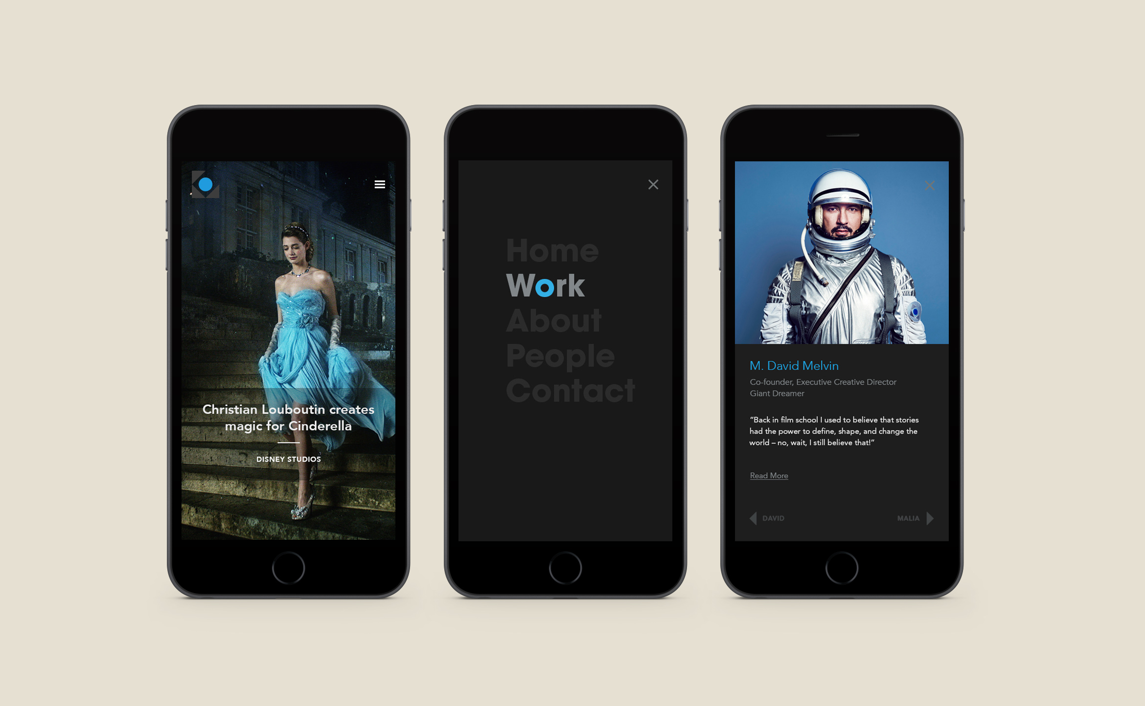
Formerly Living on One, these LA-based filmmakers create character-driven documentaries exploring complex issues through human stories and new perspectives. They changed their name and wanted an identity that felt modern, clean and instantly recognizable as an Optimist film. The word Optimist is stacked to look like its rising inside a simple square.

Video Branding was important to create a distinctive look for their content. The white logo was applied as a bug in the corner of all of their social media videos and theatrical films, as well as a clean and legible caption style using the same Gotham font.

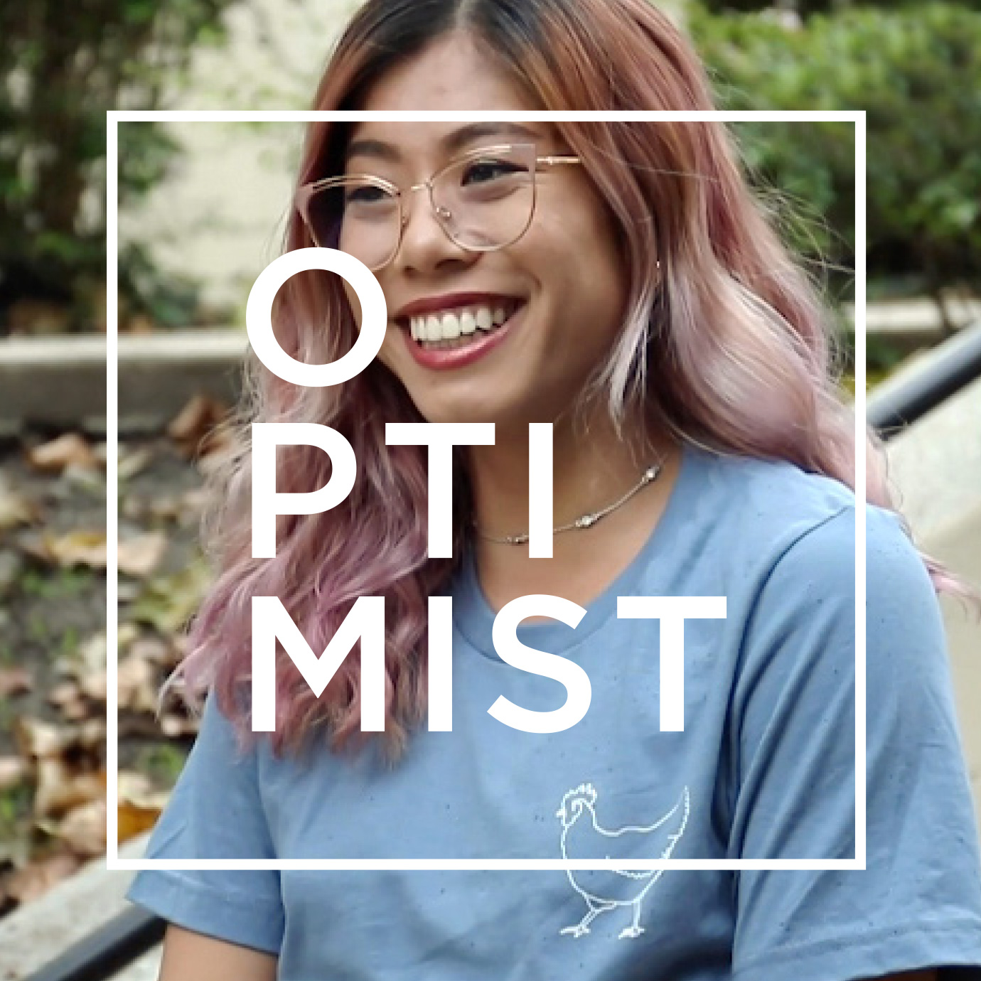
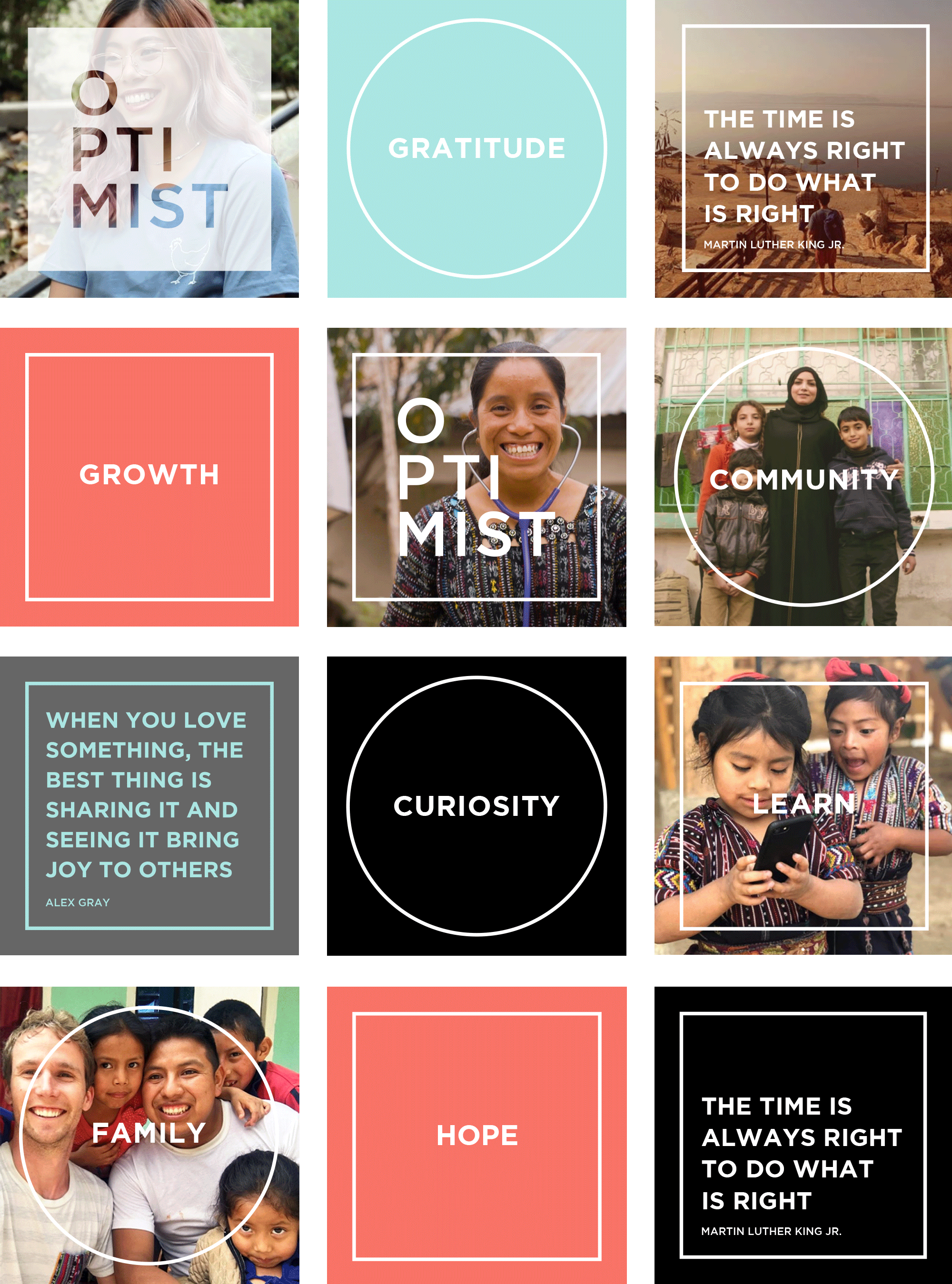
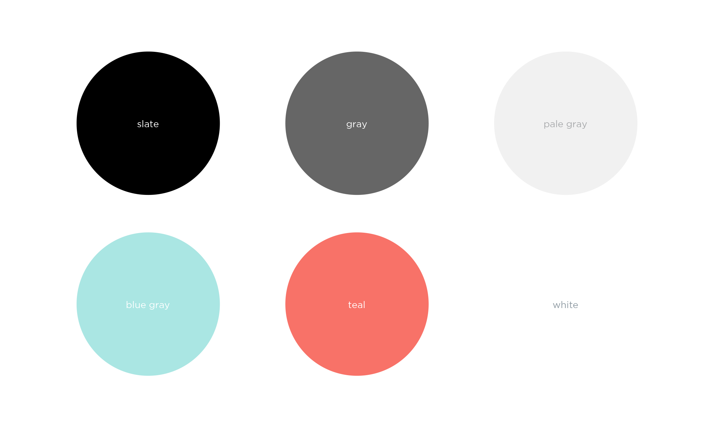
A branded visual design for Instagram is instantly recognizable as Optimist. Using quotes and aspirational words, we paired their photography with clean typography, and a supporting color palette and used square and circle motifs to highlight the message.

Deliverables:
- Brand Identity
- Brand Guidelines
- Video Branding
- Social Media Assets
- Business Cards
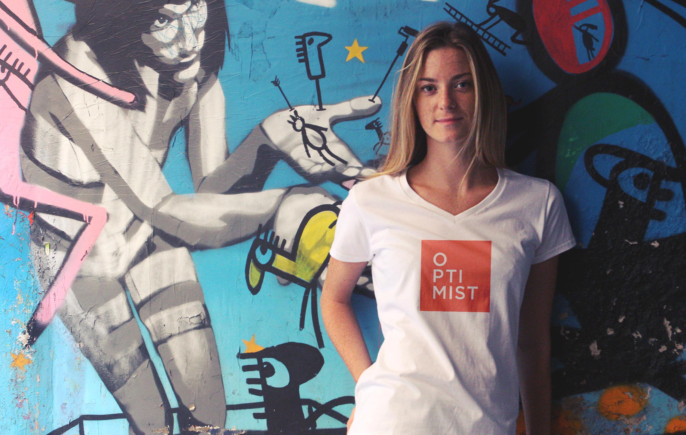
- Promotional Swag
Brand Styleguide outlines rules and guidelines for the logo, color palette, typography and graphics. The in-house content team will use this to create branded social media posts for a cohesive look.
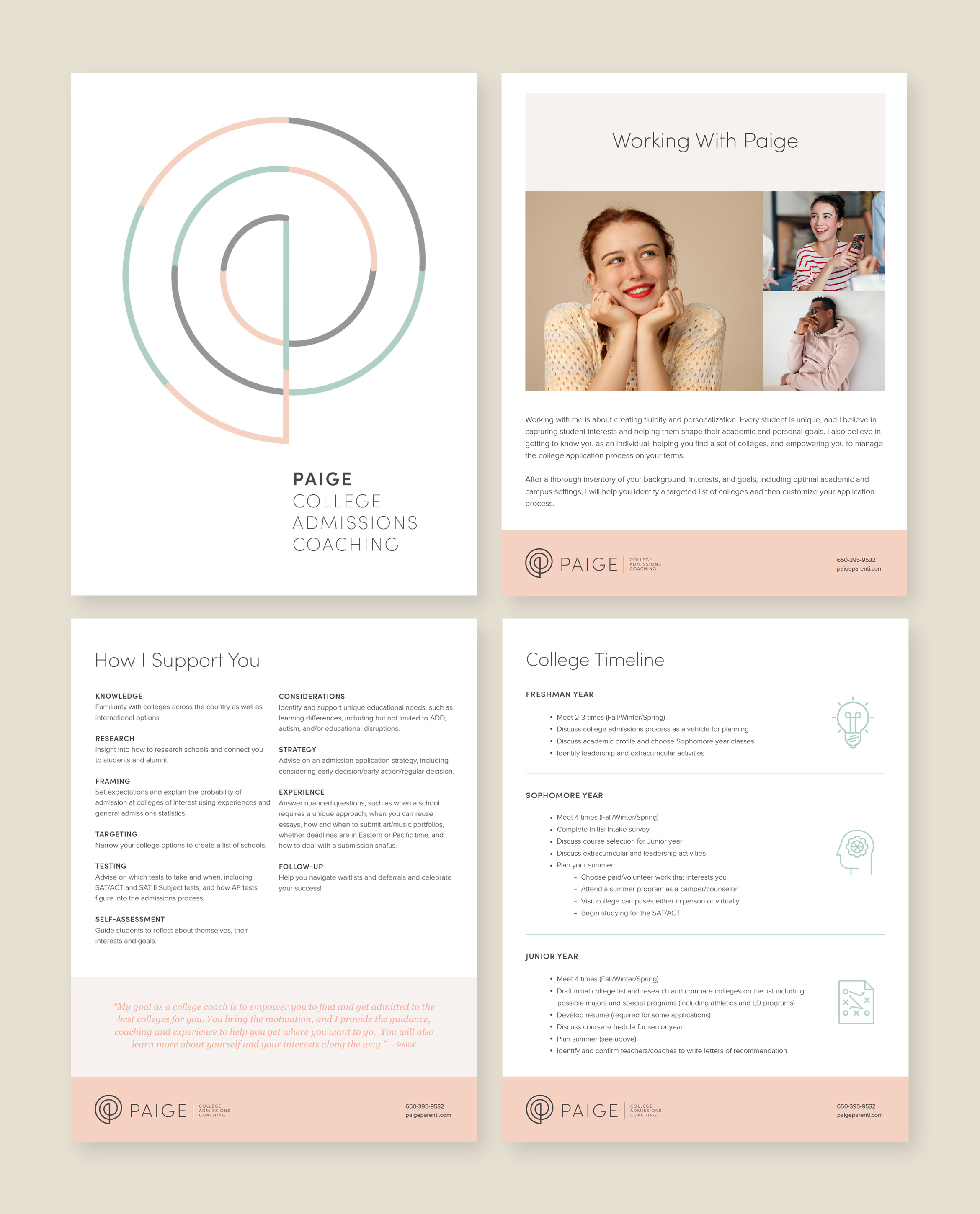
Paige Parenti college coach
service / brand identity / website


Paige is a college admissions coach with a mission to empower every student
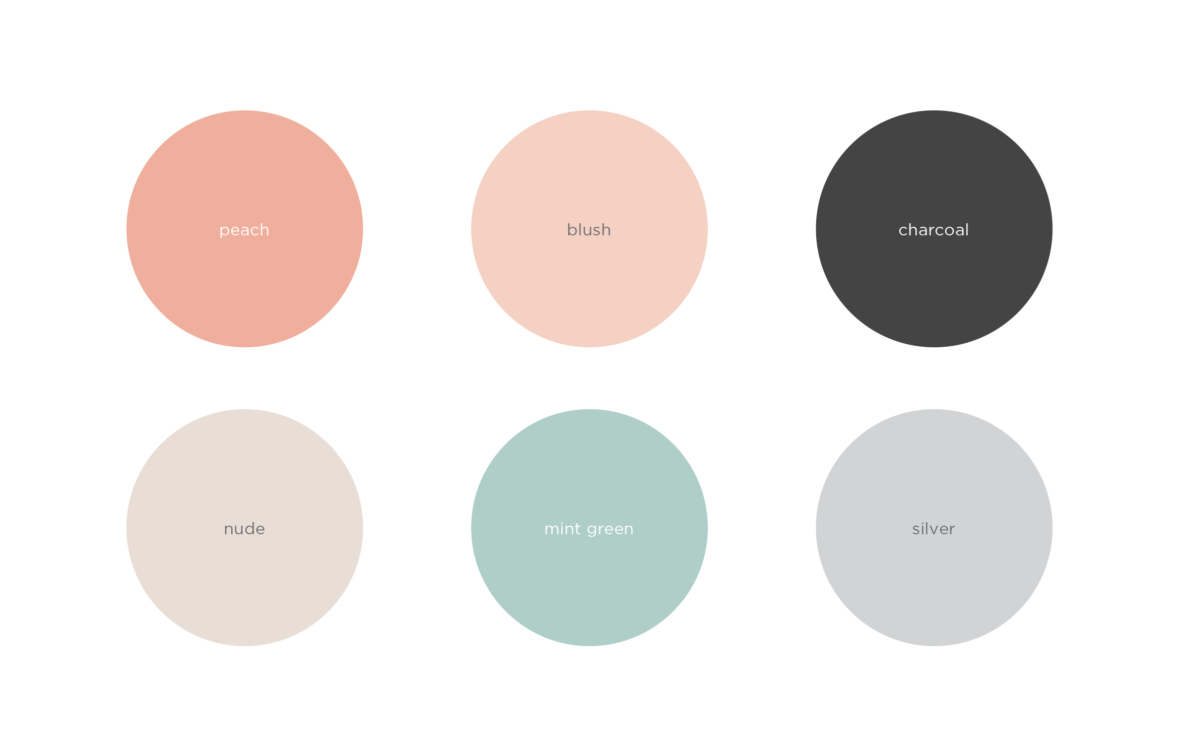
Paige helps every student find the right college for them, guides them through the admissions process, and sets them up for success. To appeal to Gen Z, and their parents, the company name was updated and the brand redesign focuses on the personal attention she gives to every student. The result is a clean and inviting look and feel using warm, soothing colors
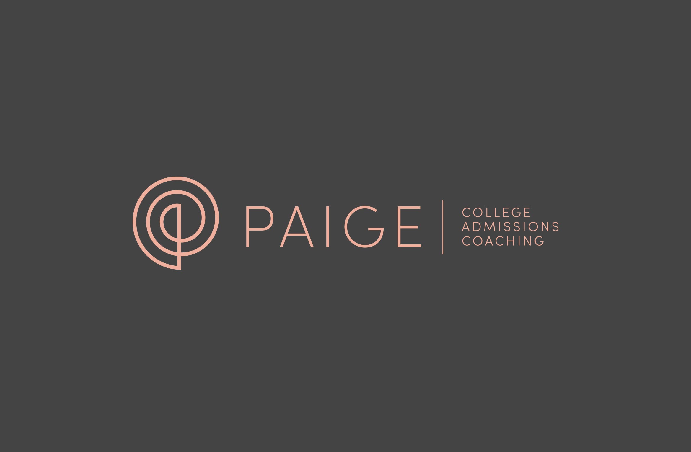

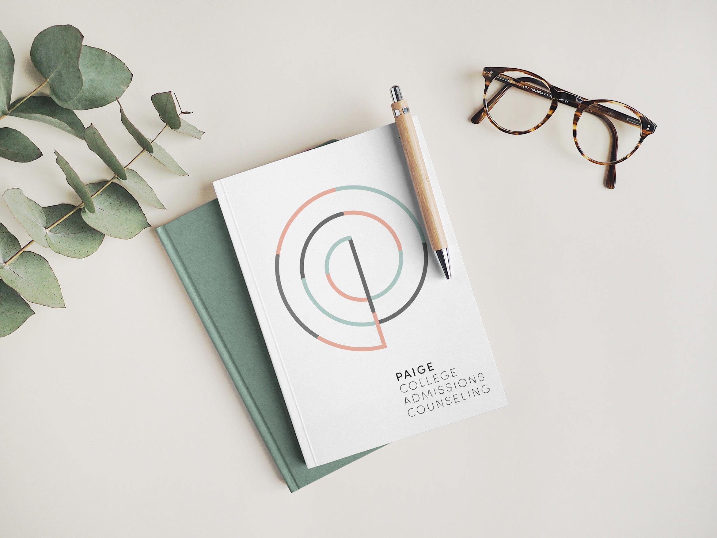
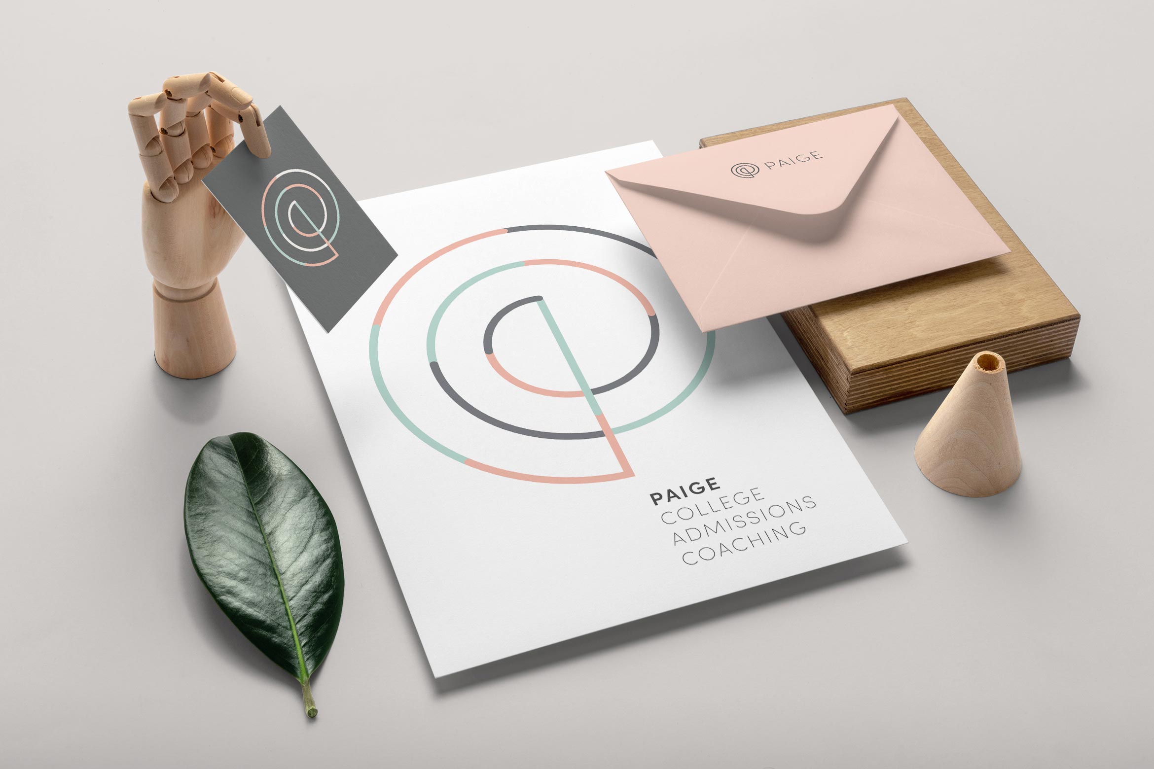
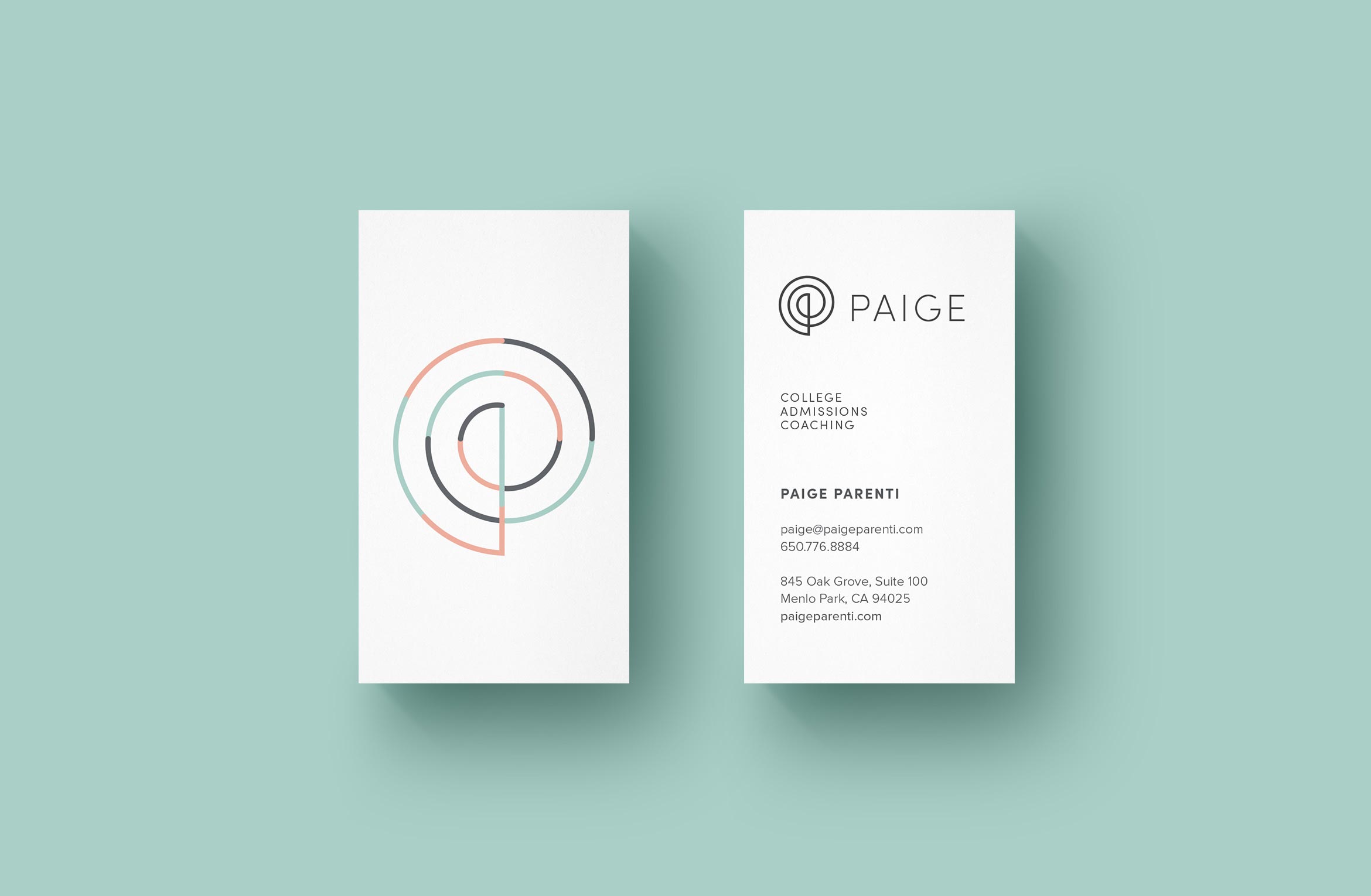
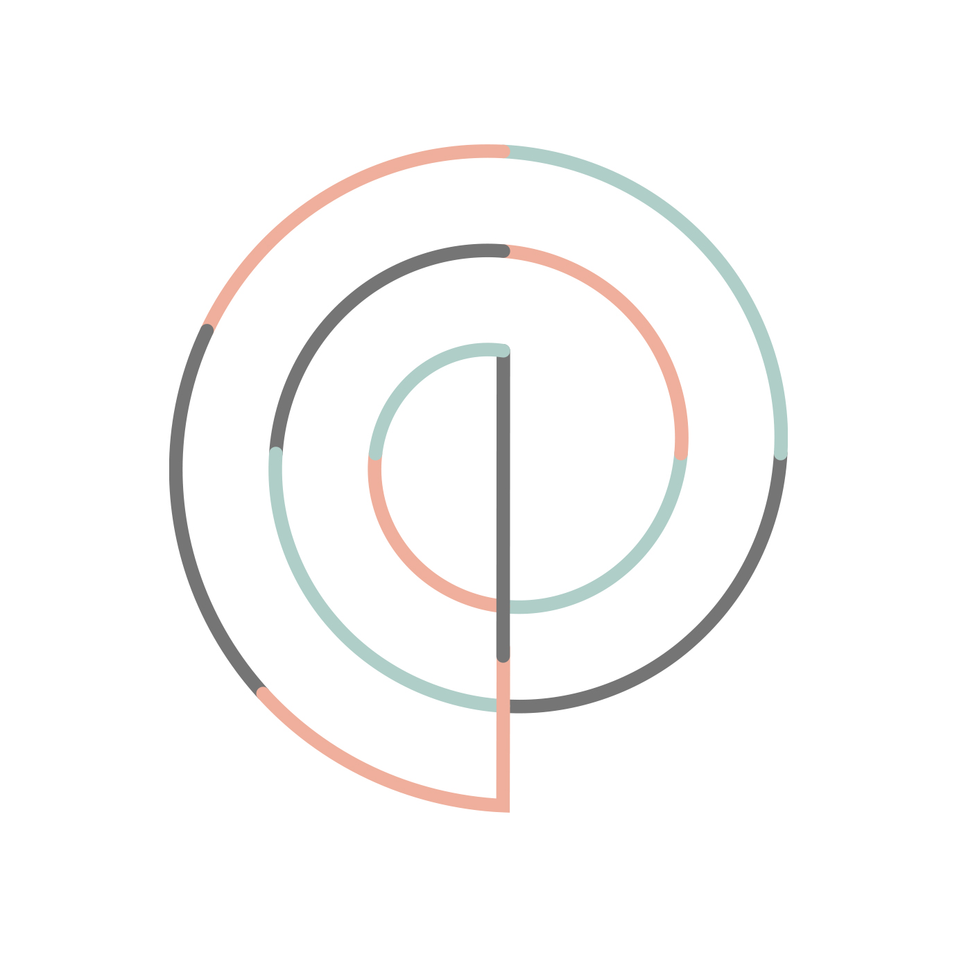
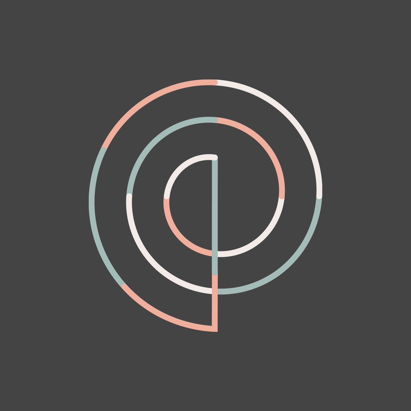
The elegant P monogram is inspired by the Golden Spiral, a sacred geometric symbol that represents higher learning and infinite possibilities. A set of thin line icons compliment the thin lines in the logo.
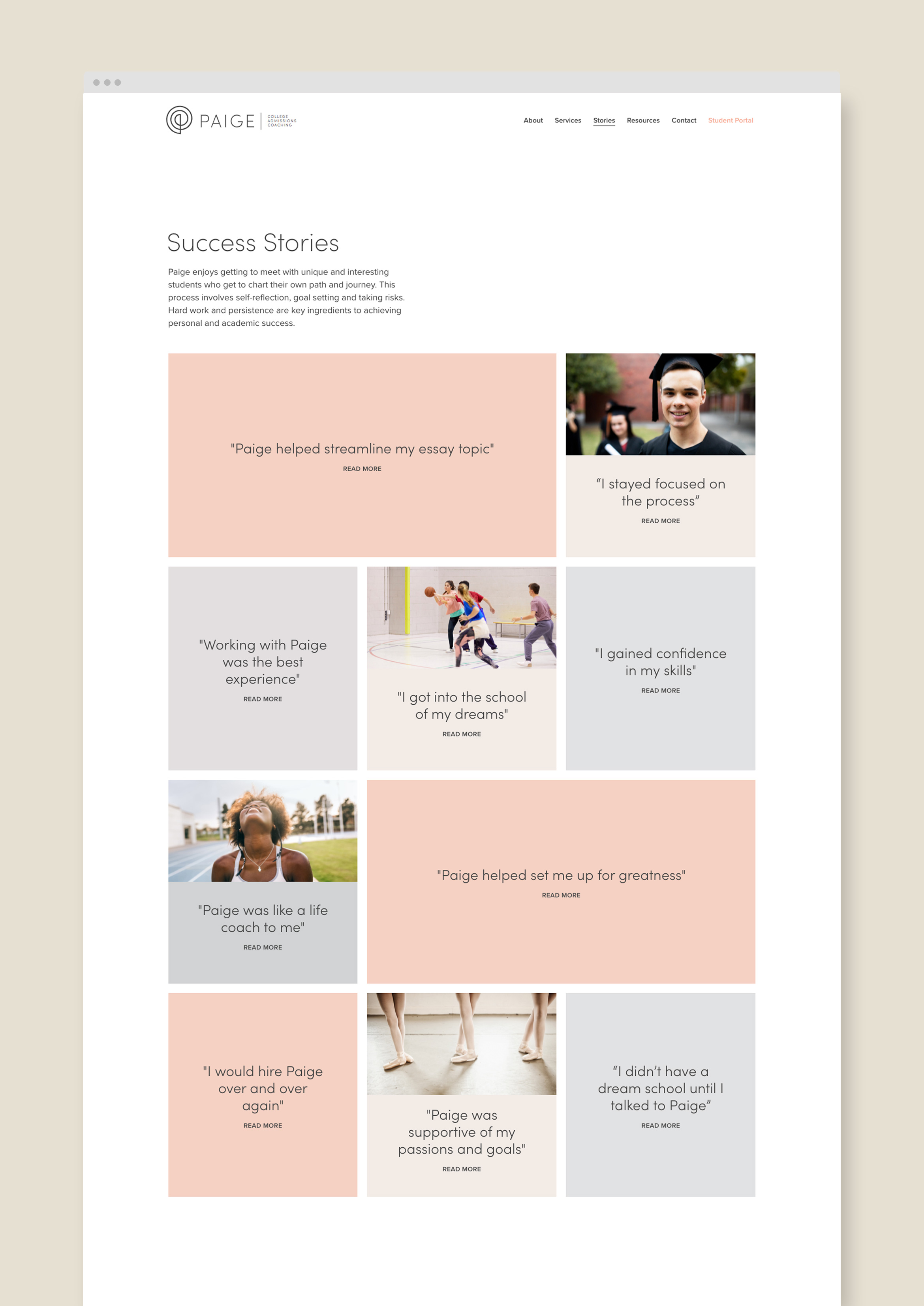
A customized website tells the story of Paige, her services and student stories to describe real-world results. The design is light and airy with easy bites of information and imagery, plus a student scheduling calendar and payment pathway.
Deliverables:
- Brand Identity
- Visual System
- Web Design
- Content Creation
- Digital Collateral
- Print Design
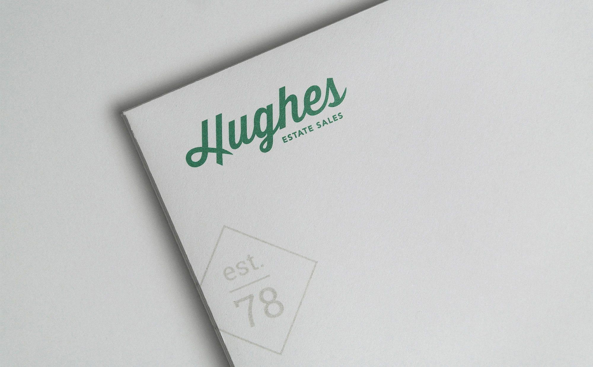
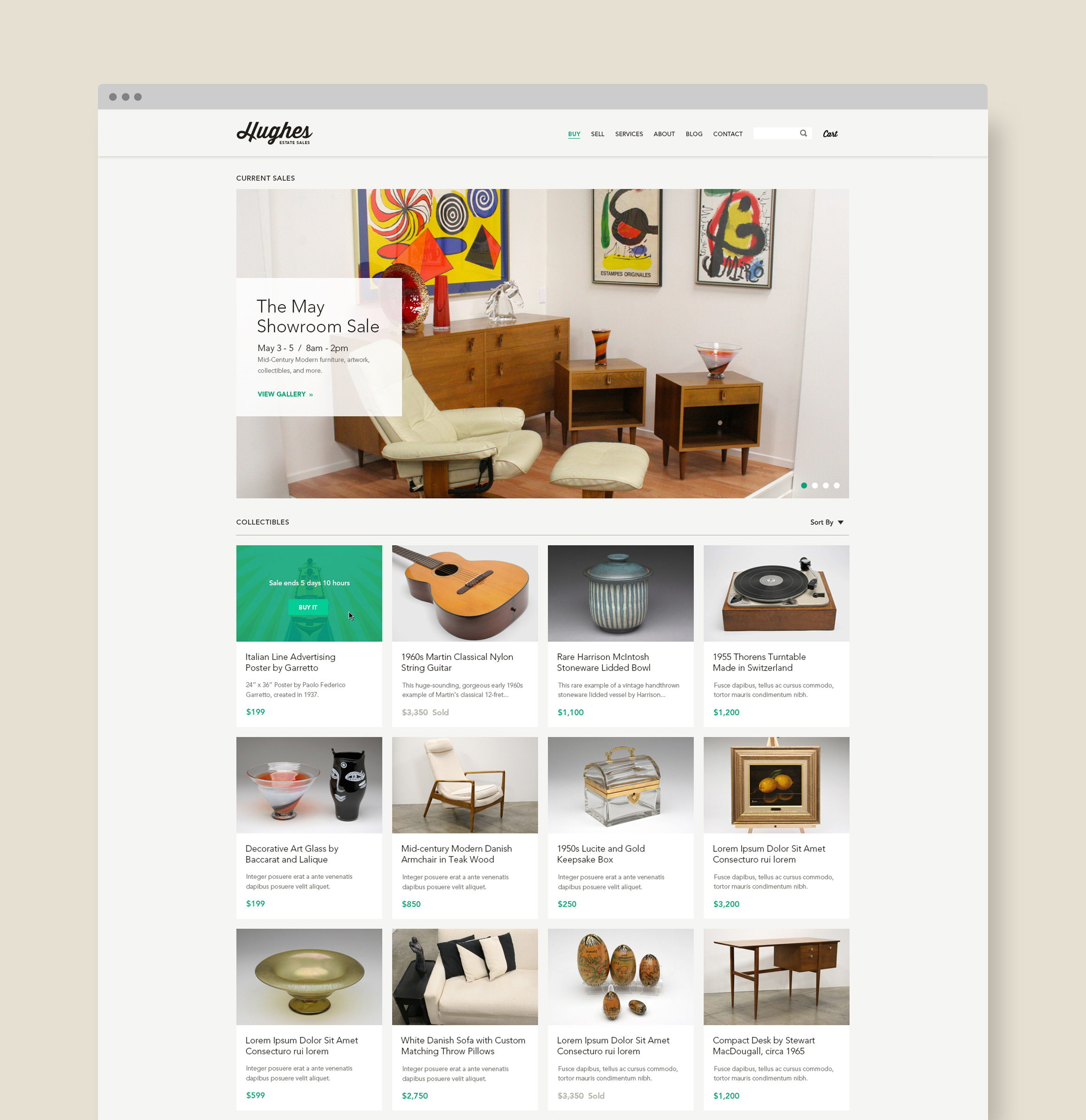
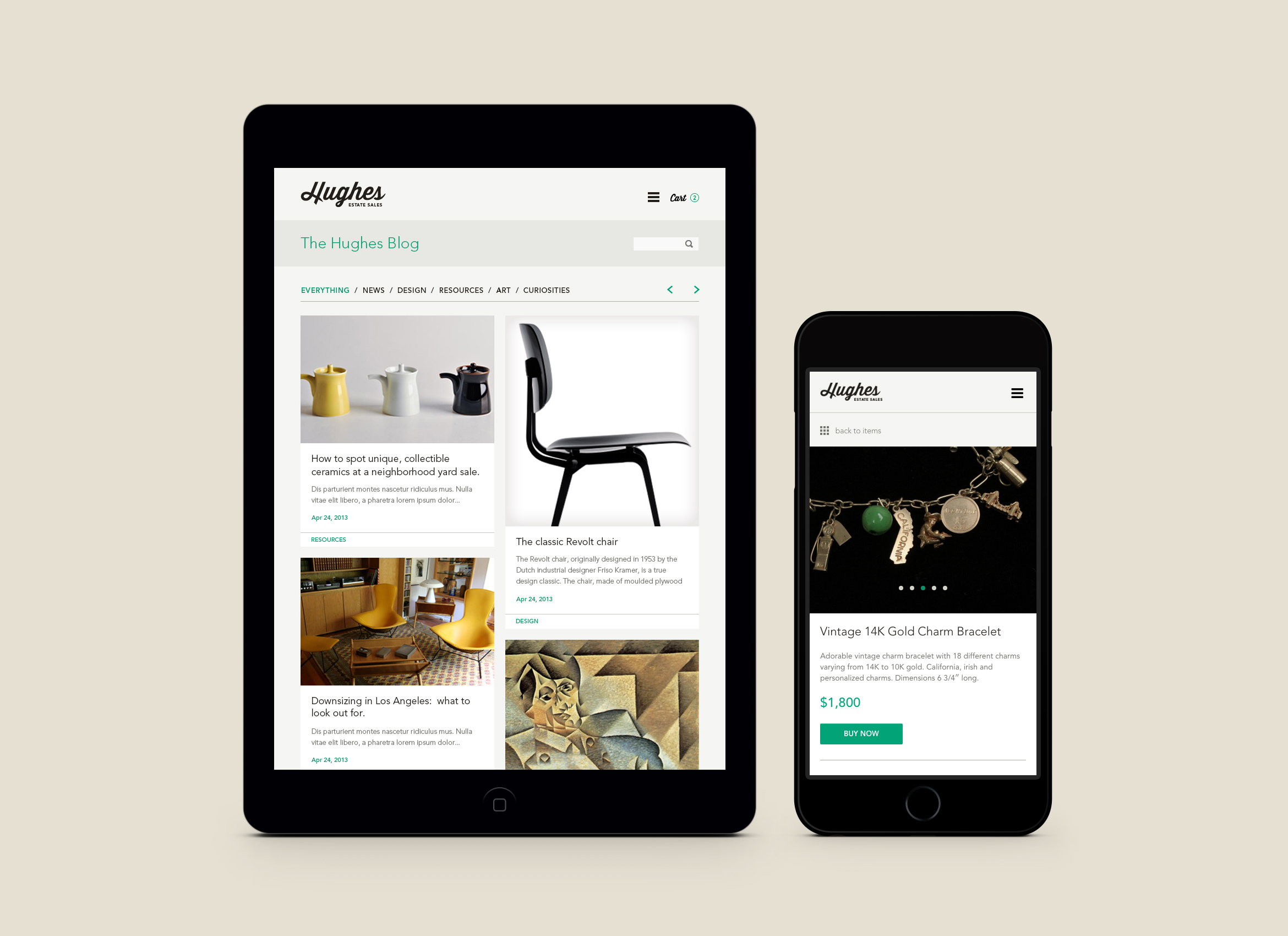
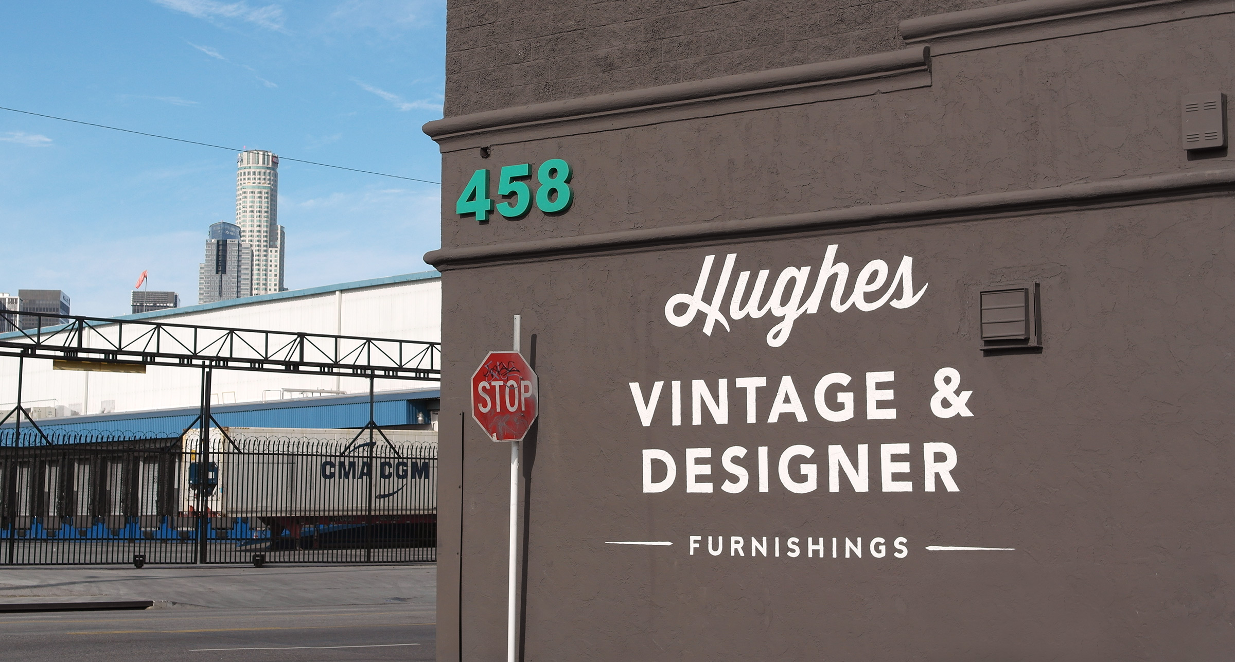
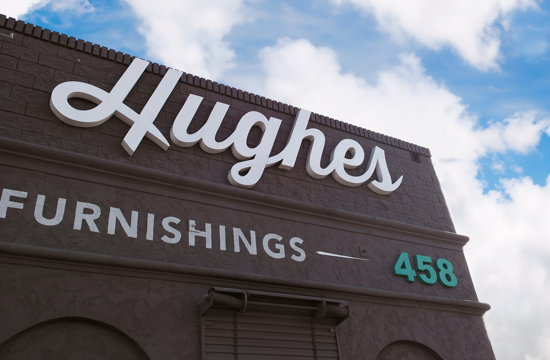
Hughes Estate Sales
services / brand identity / website / print collateral / signage
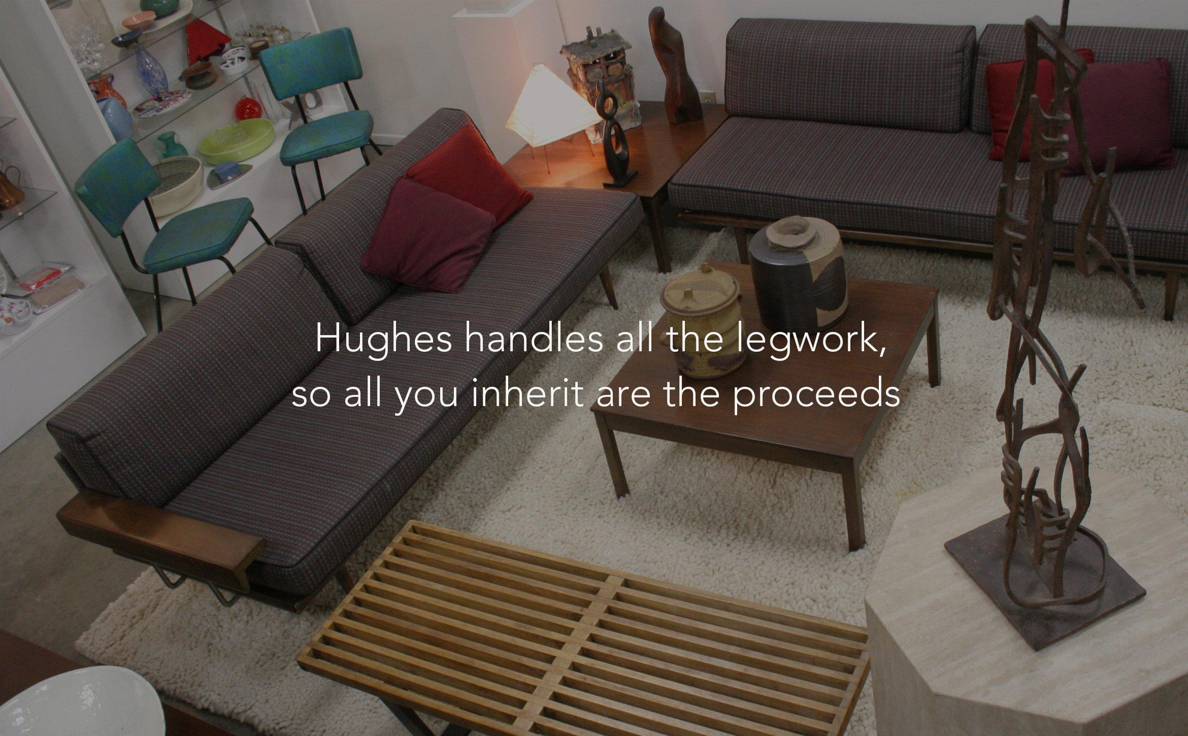
Hughes is the premier estate sales and antique auction resource in SoCal
Since 1978, Hughes has been the premier estate sale resource in the southern California region. They wanted to modernize their brand identity and create a responsive e-commerce site that expands their business model to include online sales and auctions. The logotype combines a contemporary yet classic look that echoes their past and moves them into the future.
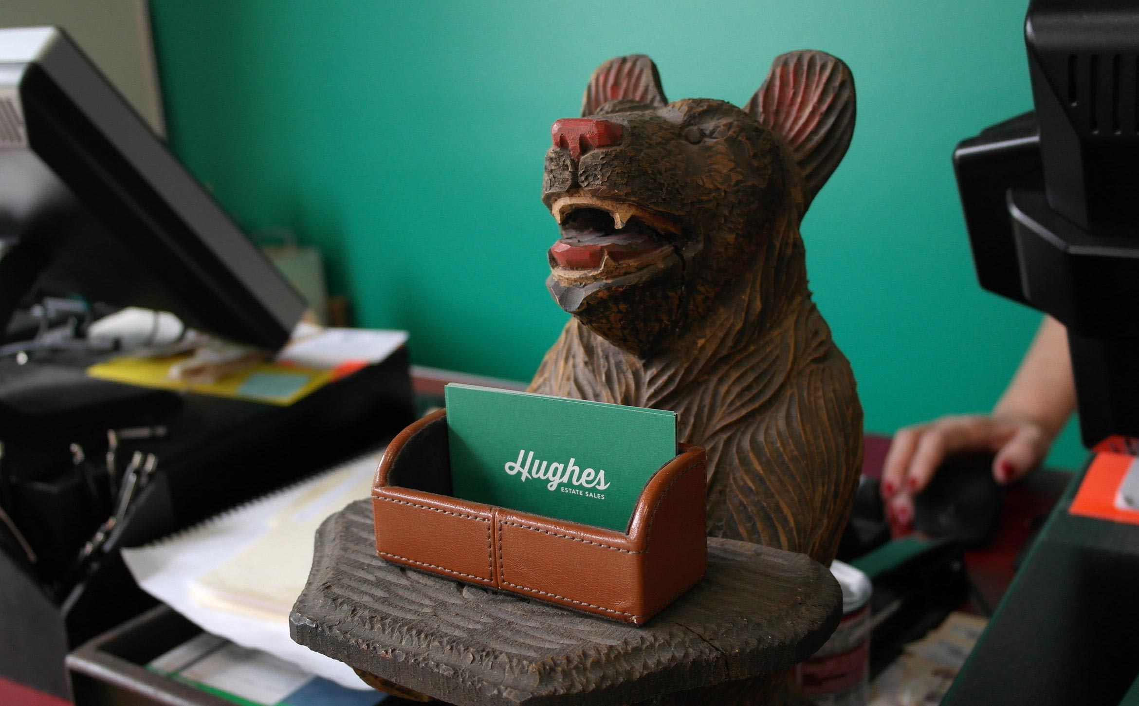
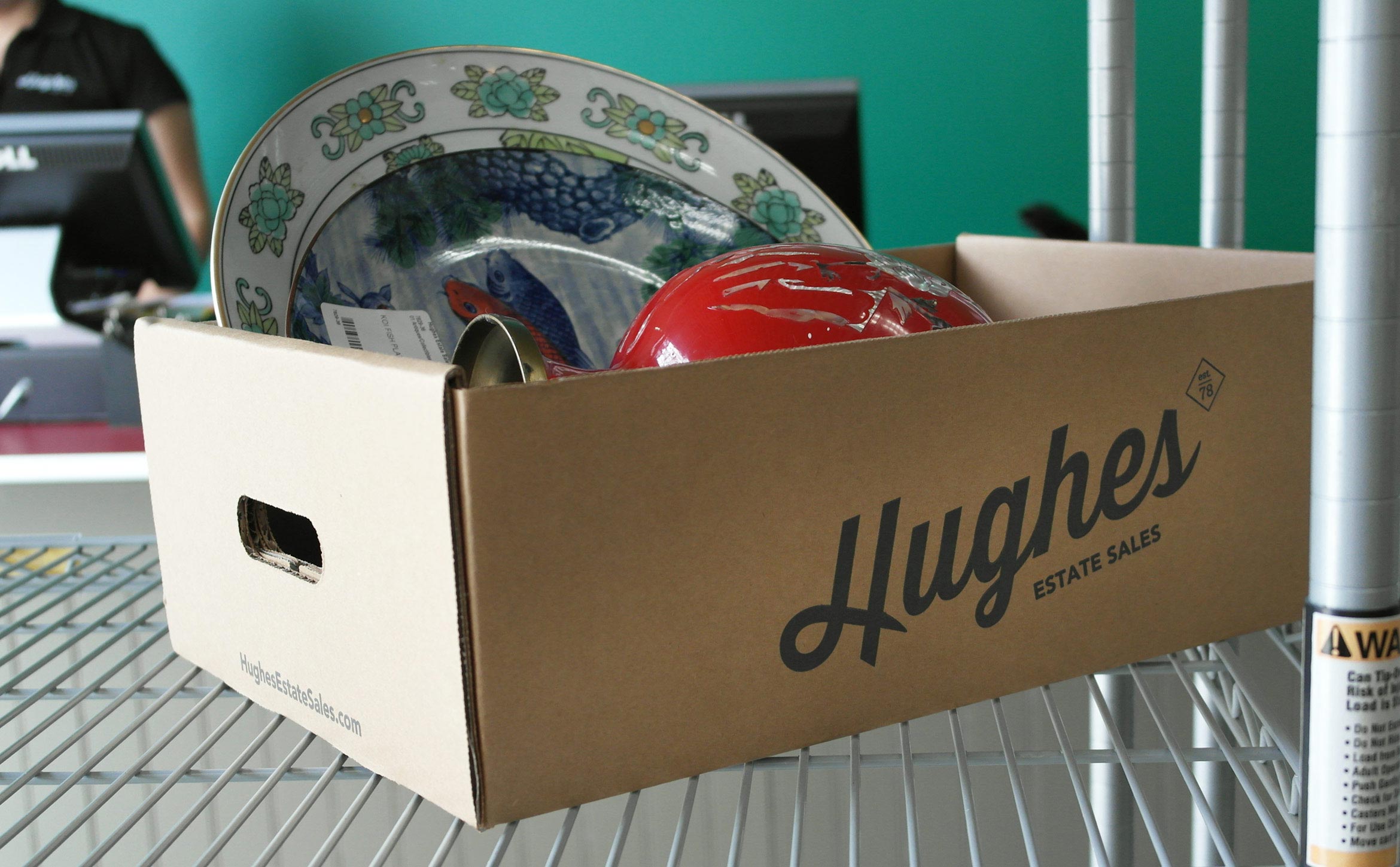
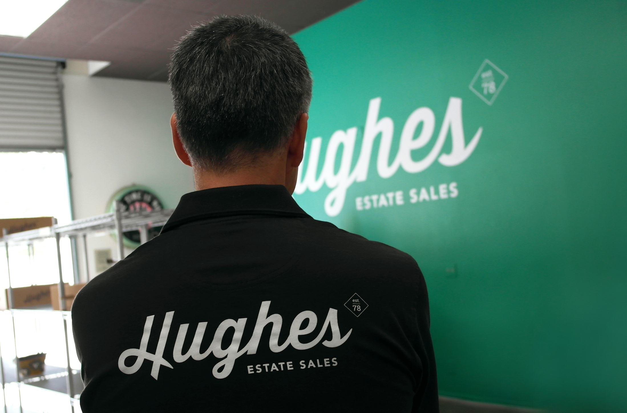
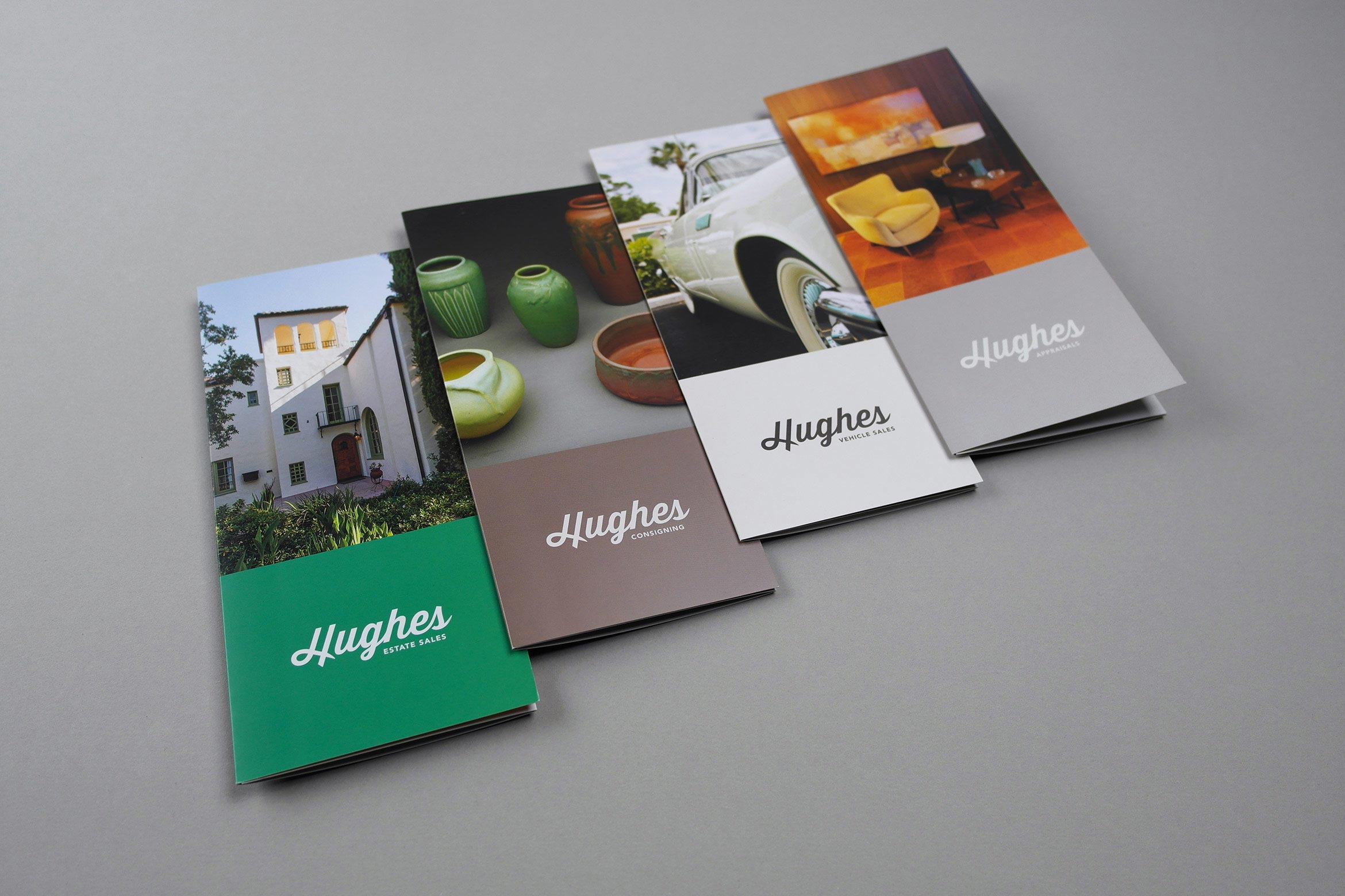
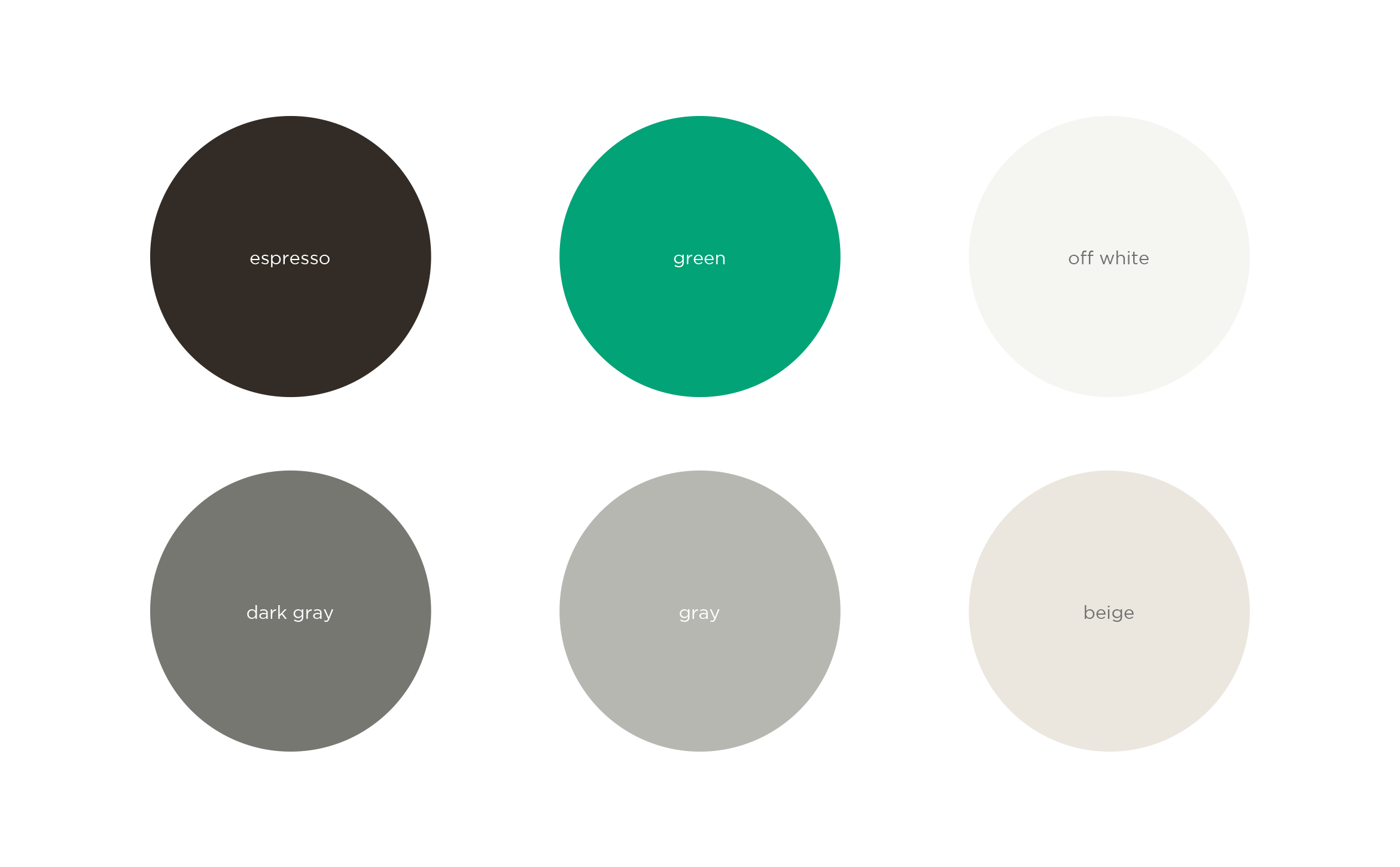
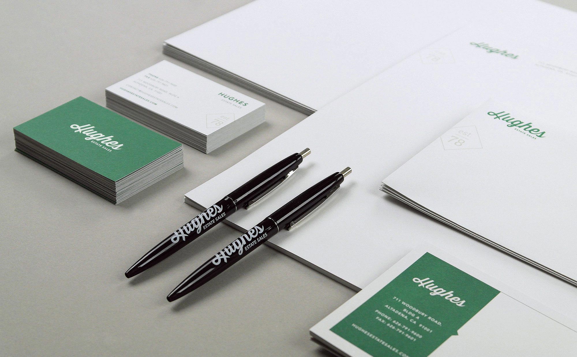
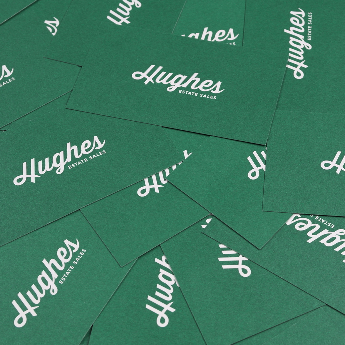
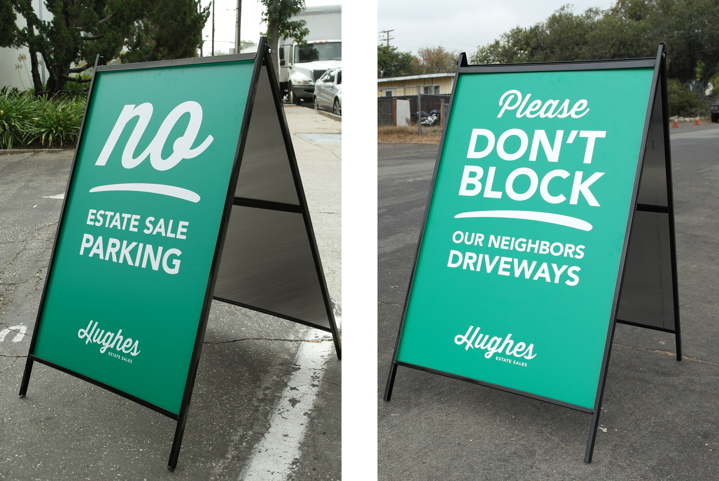
From brochures, stationery, signage, boxes and uniforms, we crafted an end-to-end branding solution that carries Hughes into the next generation. An ownable green evokes stability and trust and is easily recognizable as Hughes.
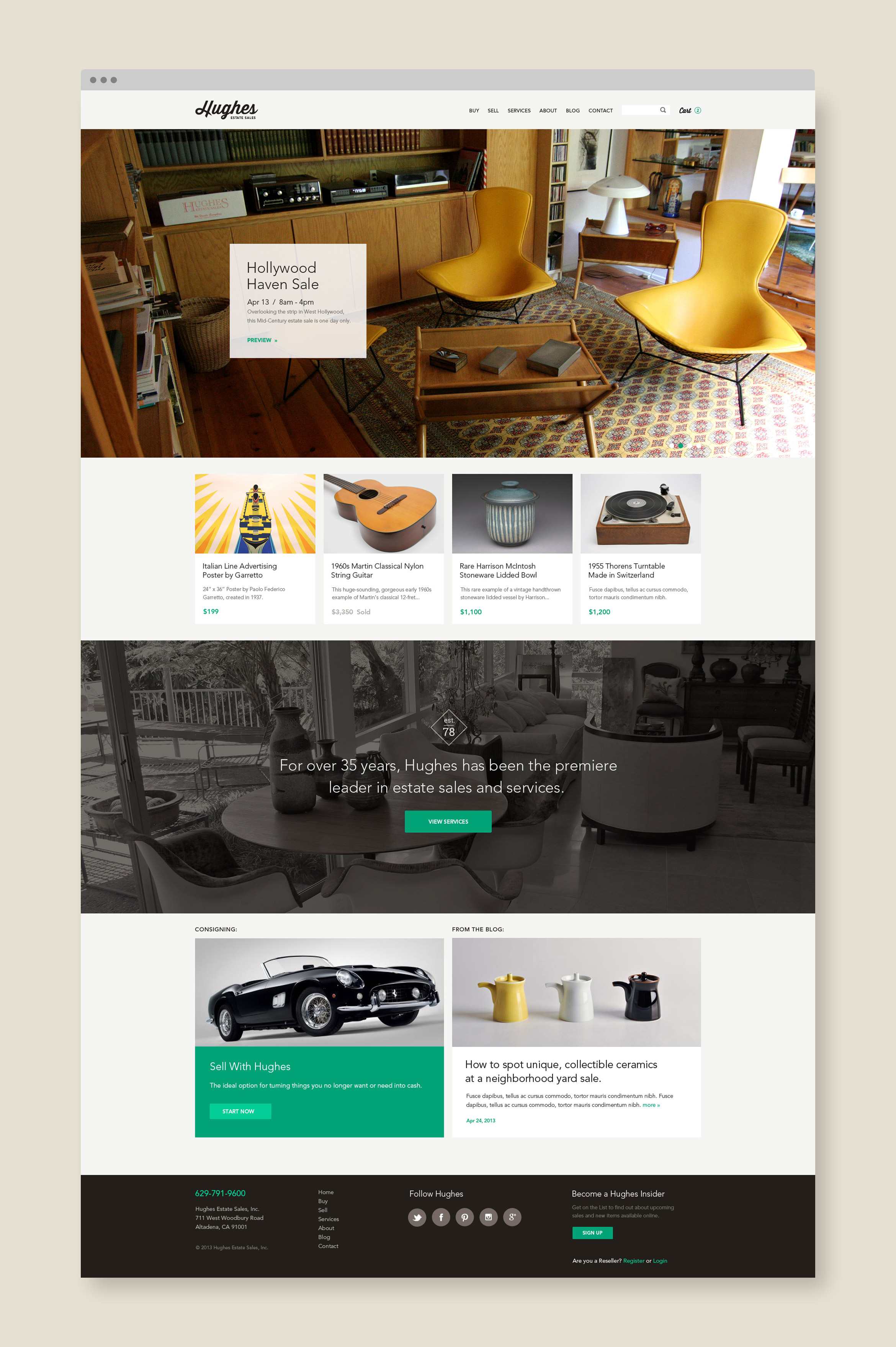
Appealing to both buyers and sellers, we built a responsive site is part slick brochure, part e-commerce. Using their library of captivating images of furniture, antiques and ephemera, the user becomes immersed in shopping and finding treasures.
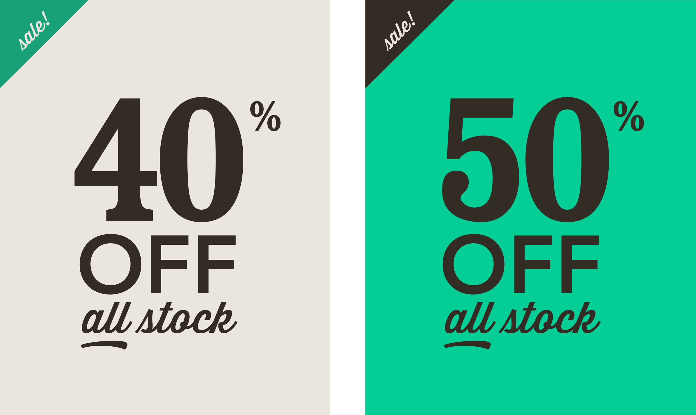
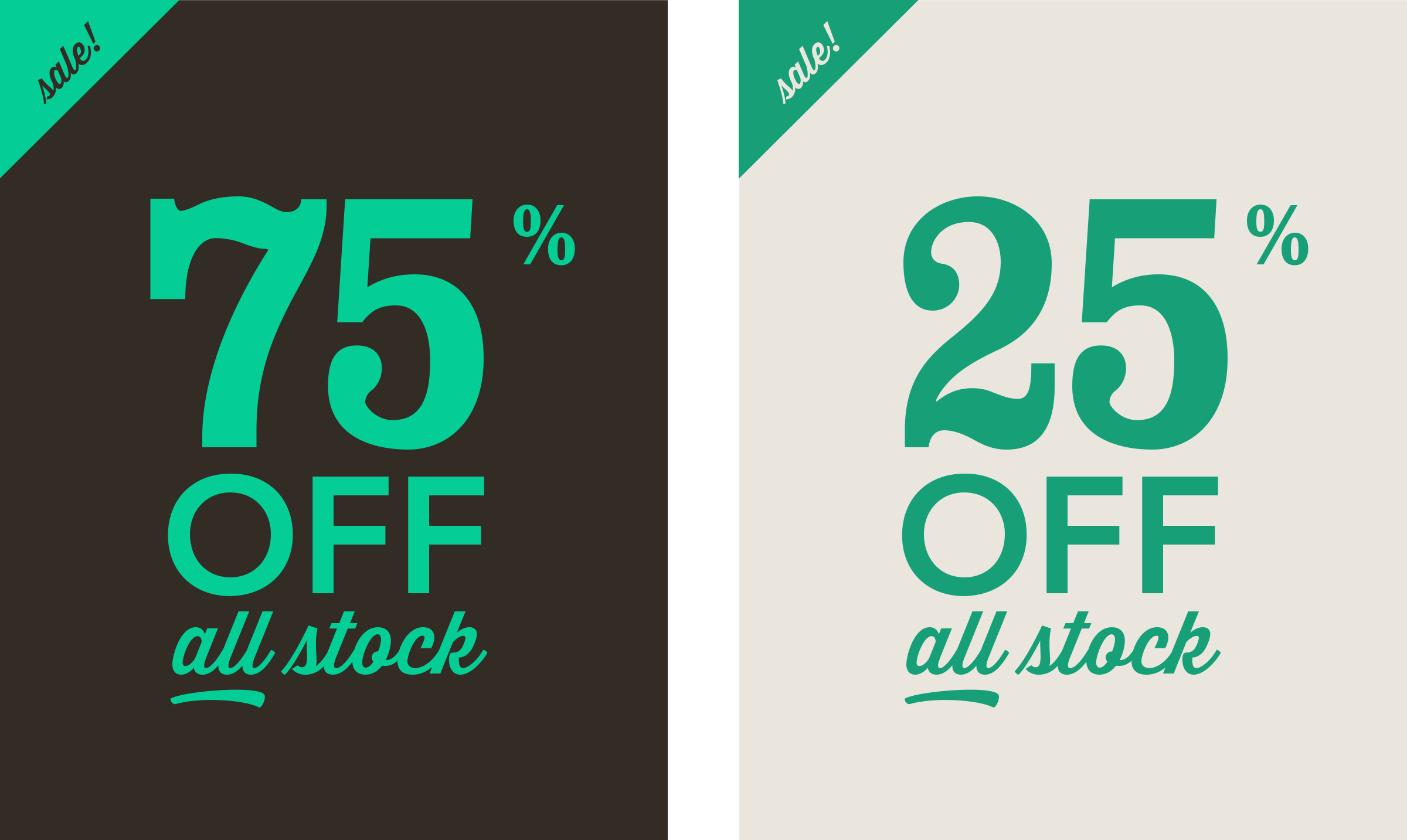
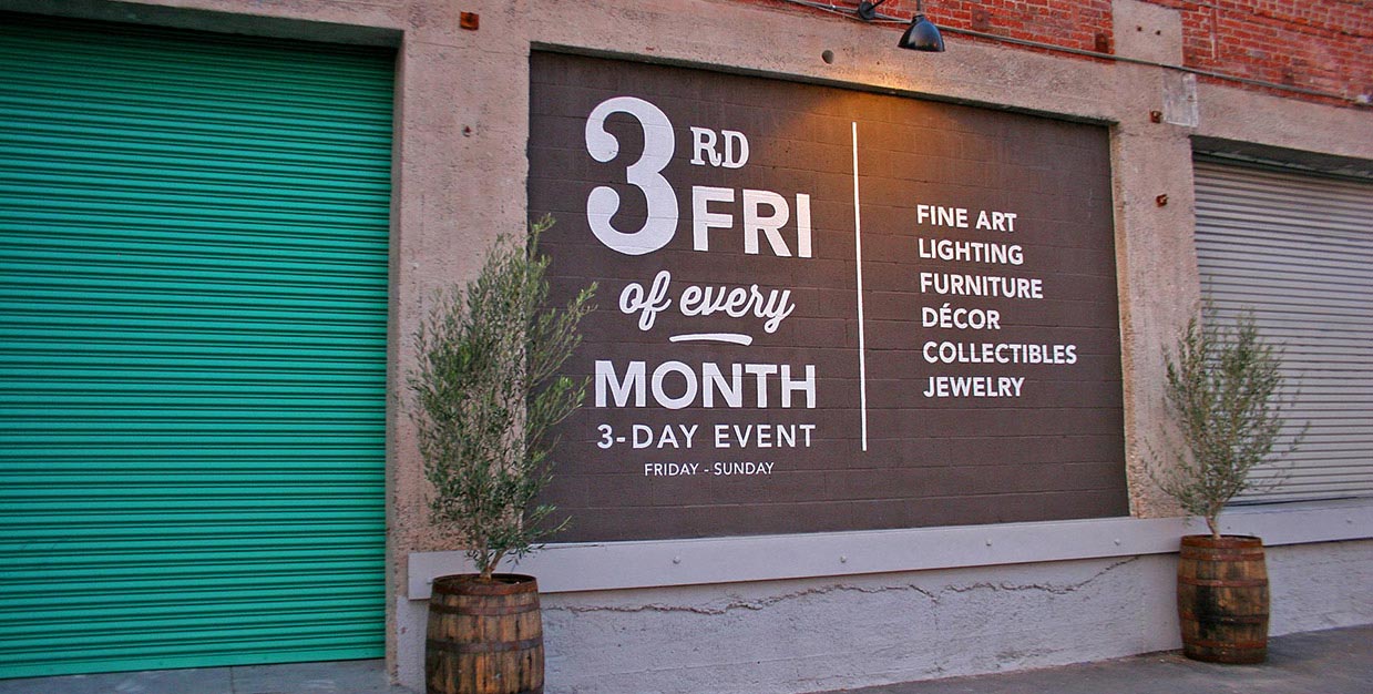
Vintage-style typography is used to create various indoor and outdoor signage for both the Altadena and Downtown LA Showrooms. Discount graphics are used in sale emails to their vast list of customers.

Deliverables:
- Brand Identity
- Brand Guidelines
- Website Design
- Web Development
- Print Collateral Design
- Signage
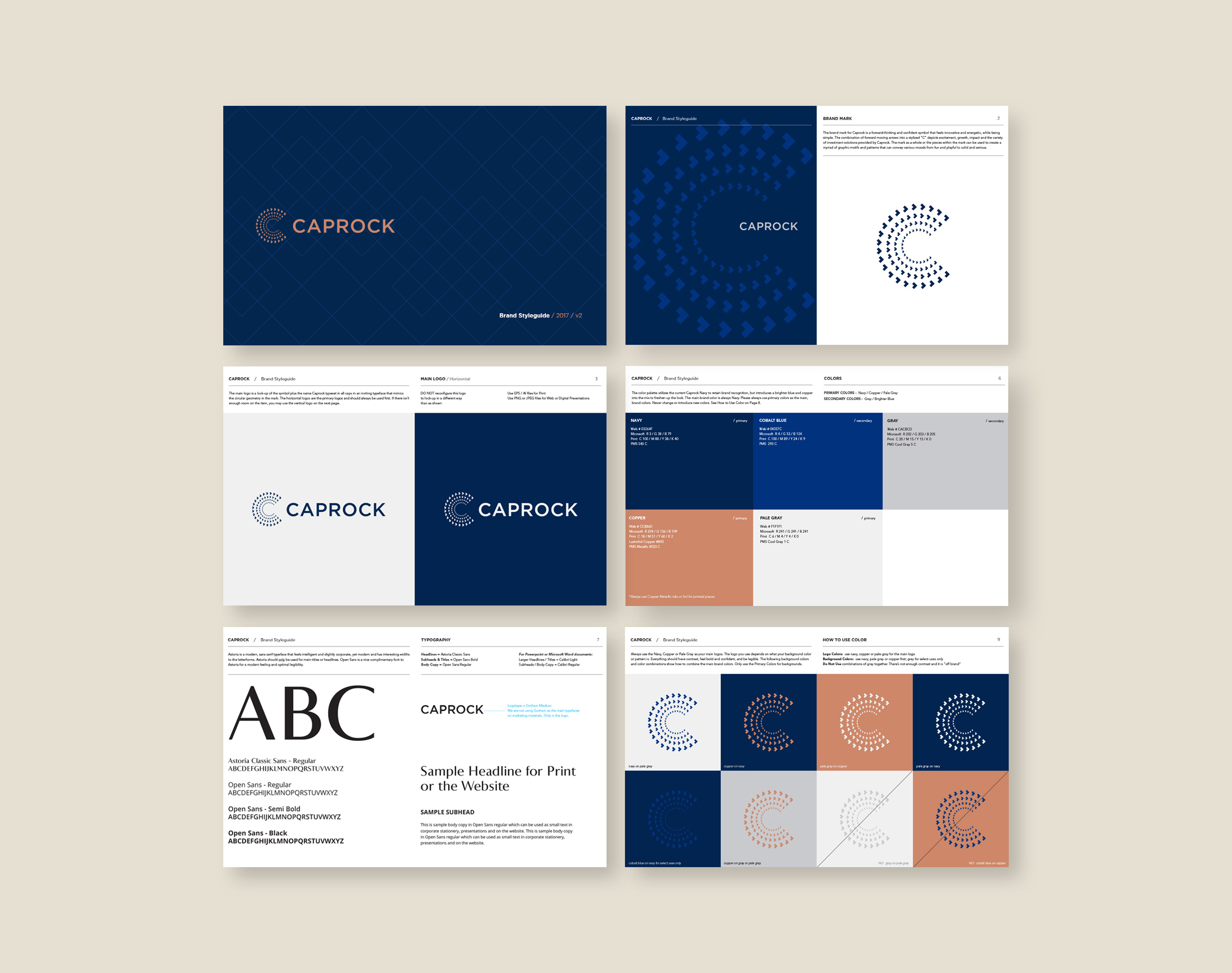
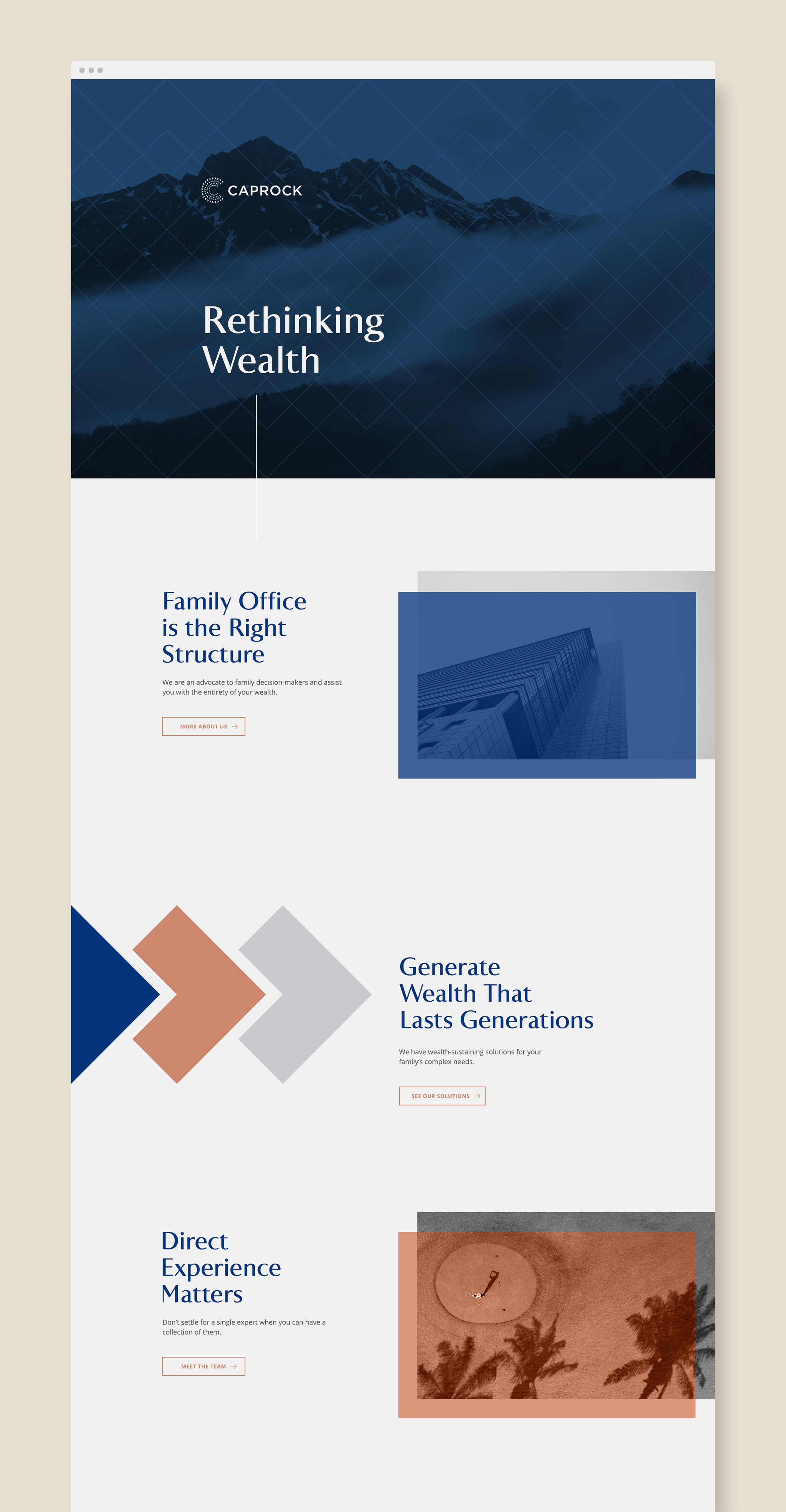
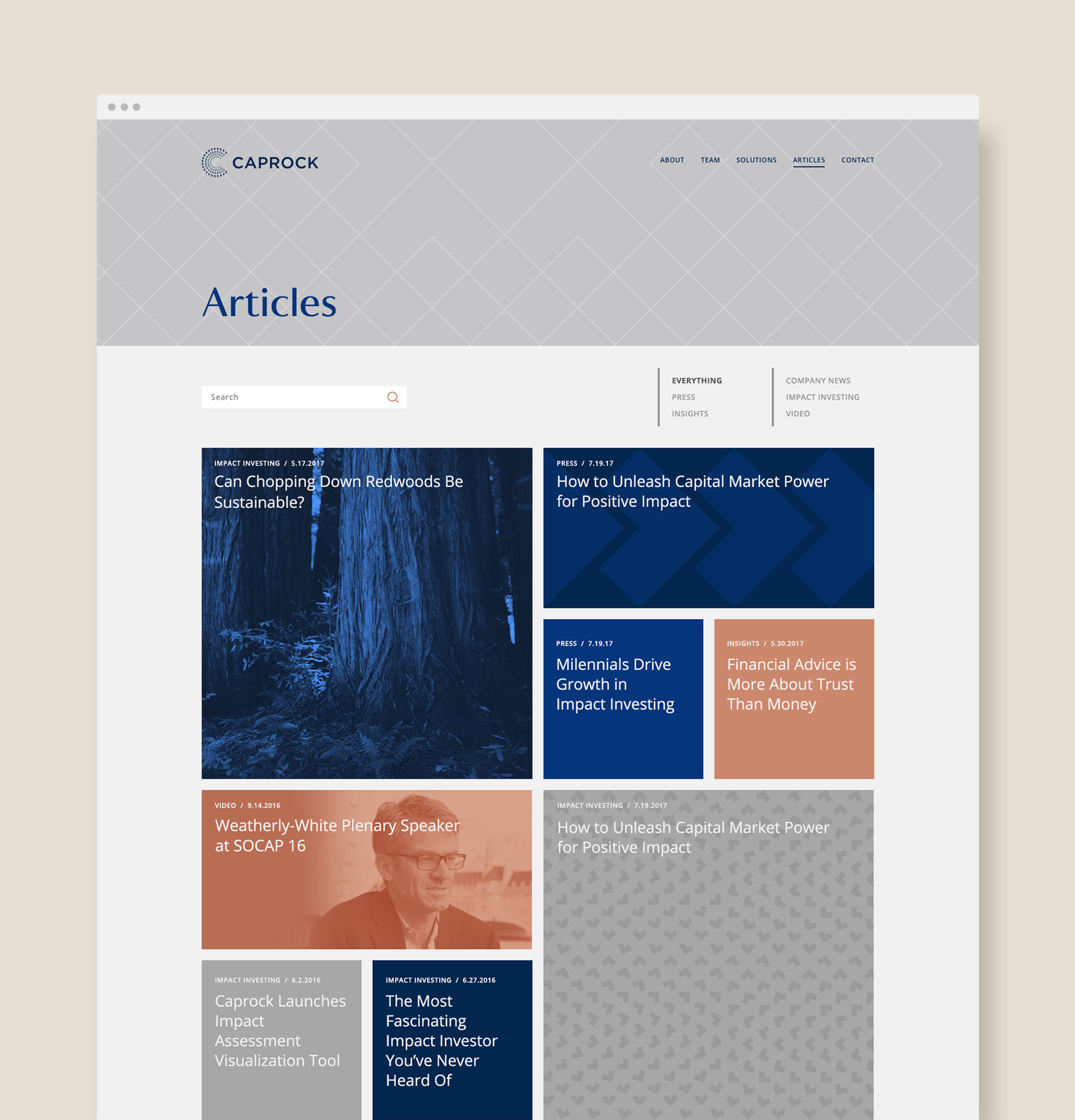
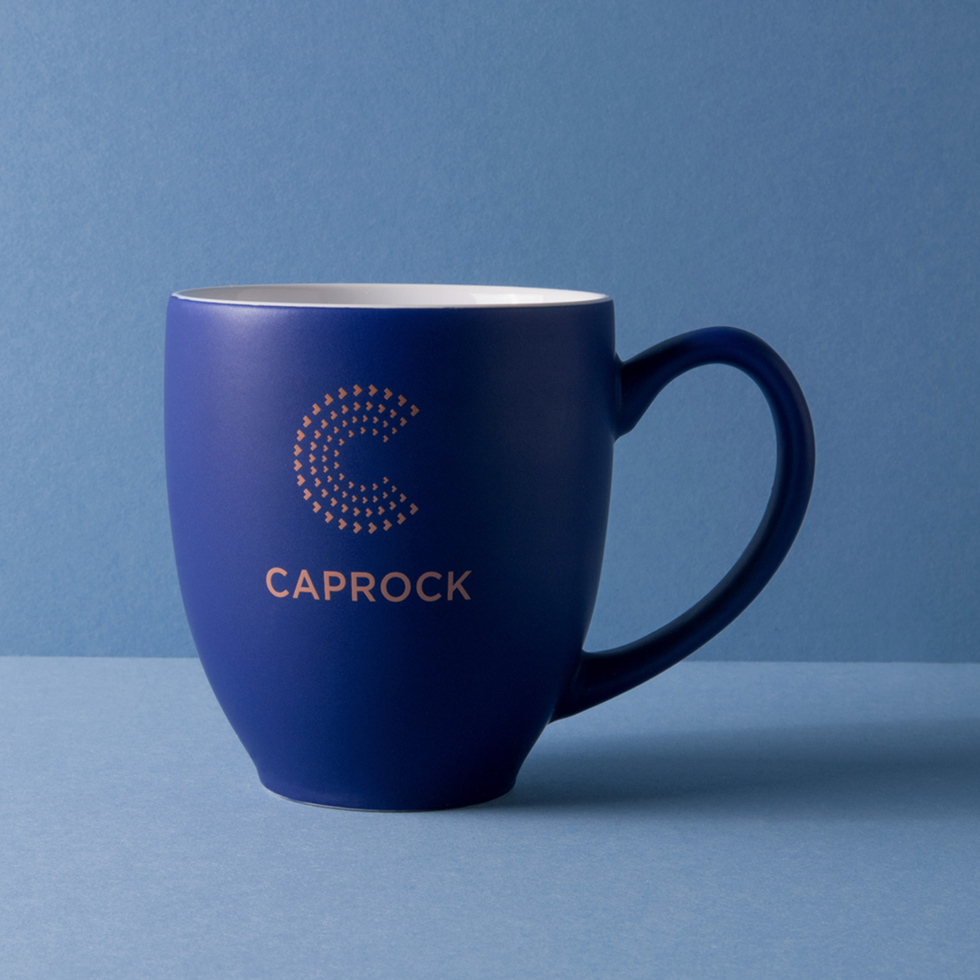
Caprock wealth management
finance / brand identity / website
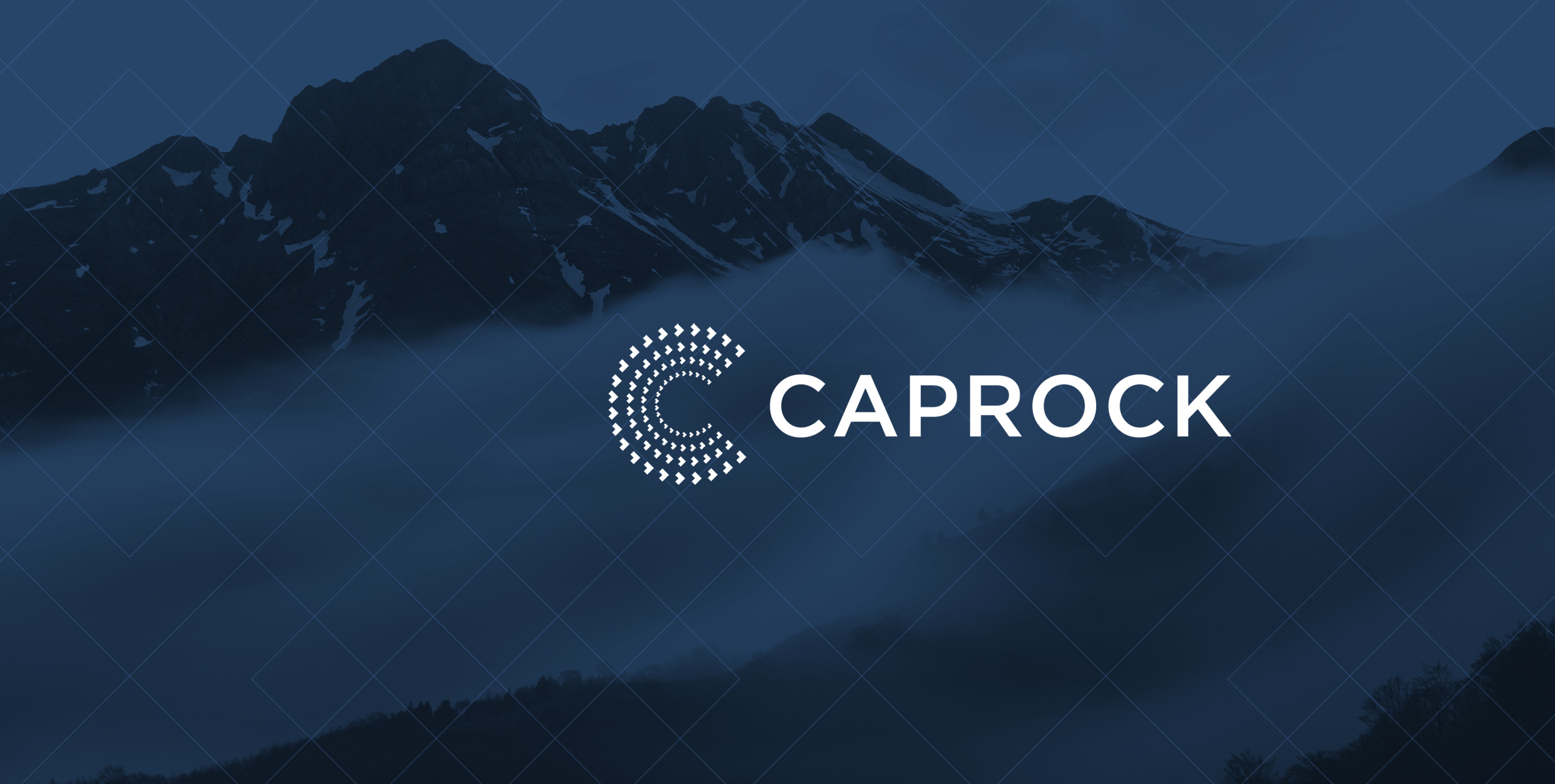
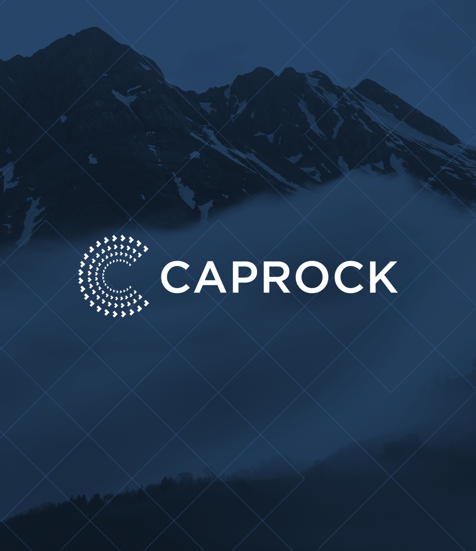
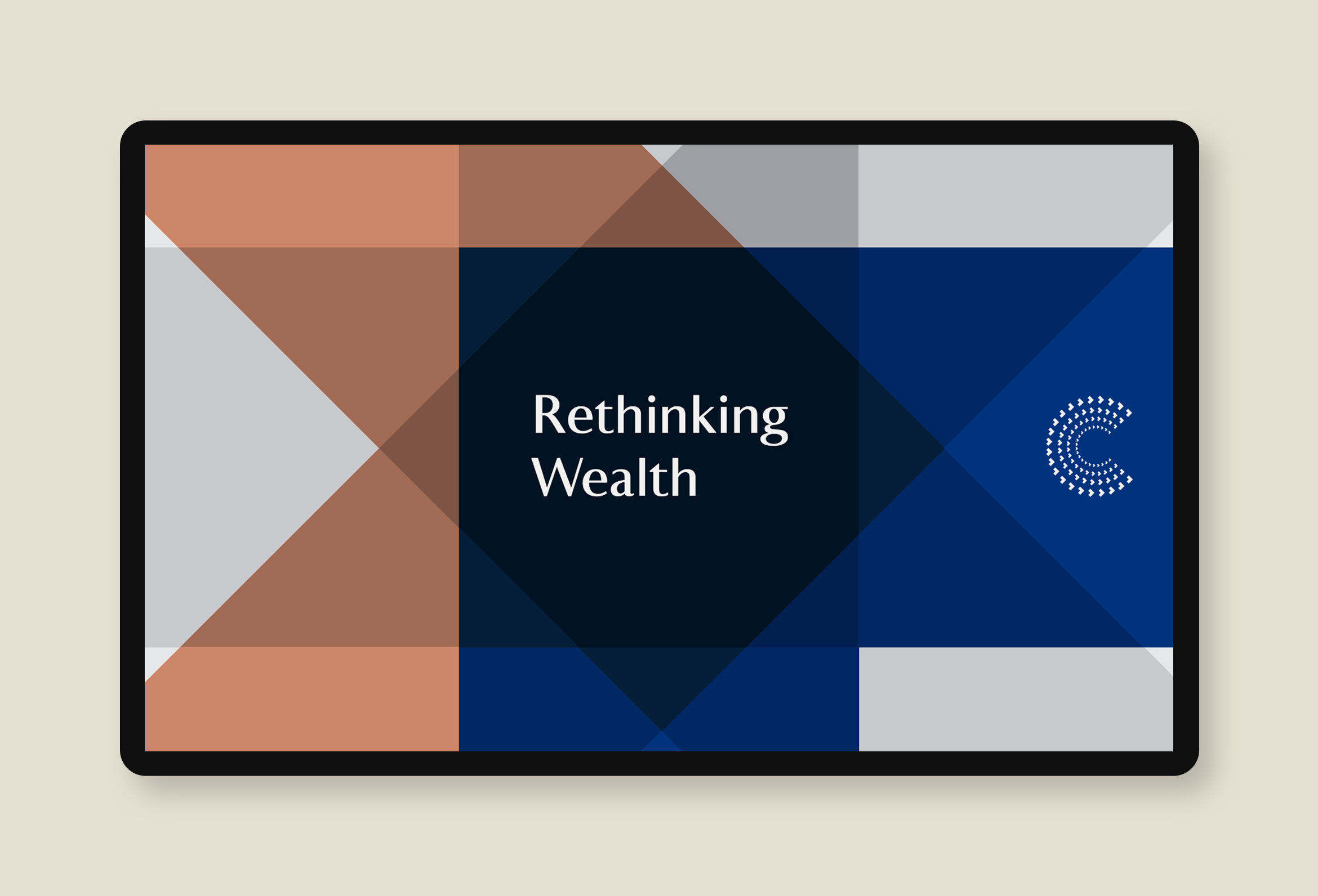
Caprock is a family office company rethinking wealth and impact investing
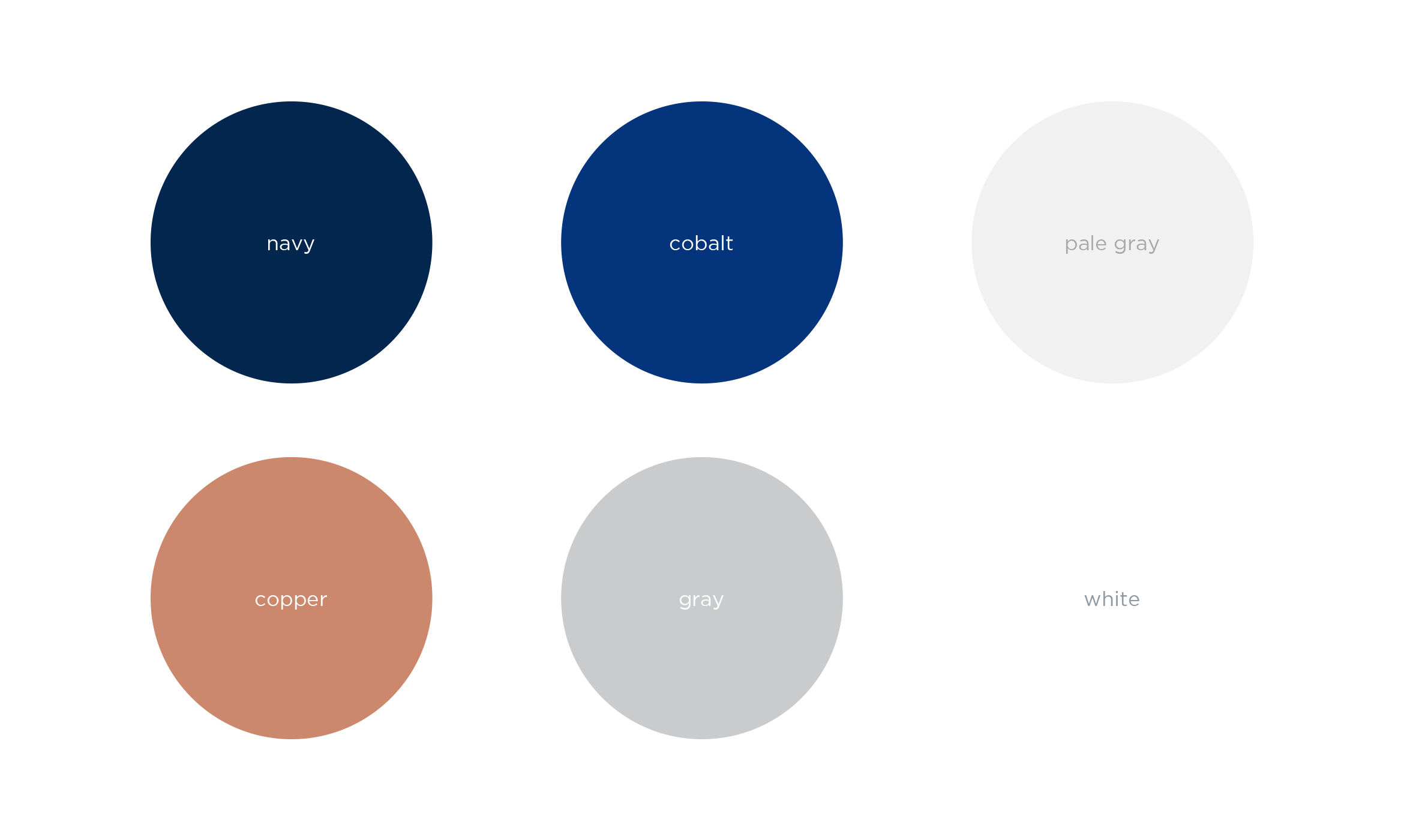
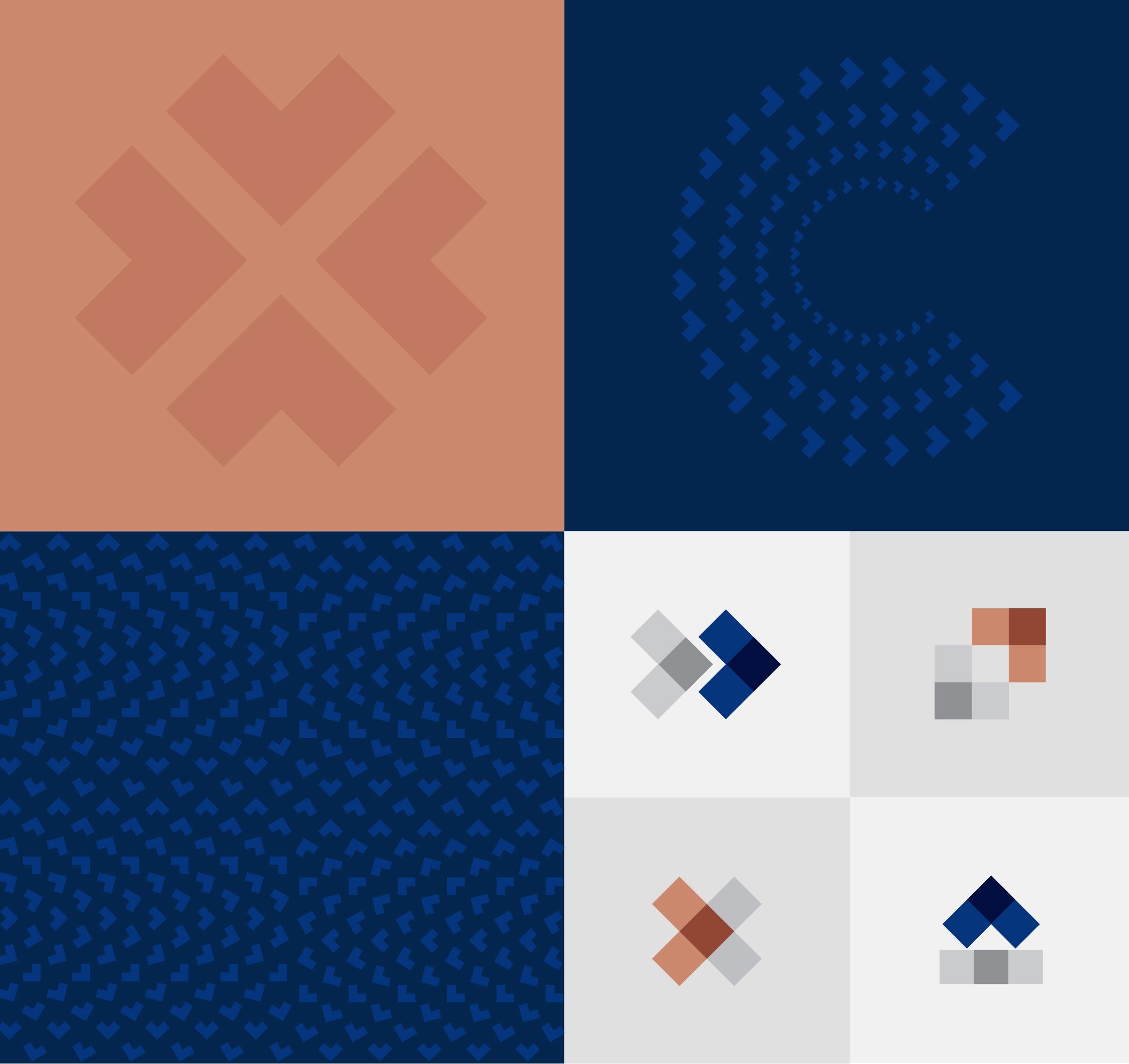
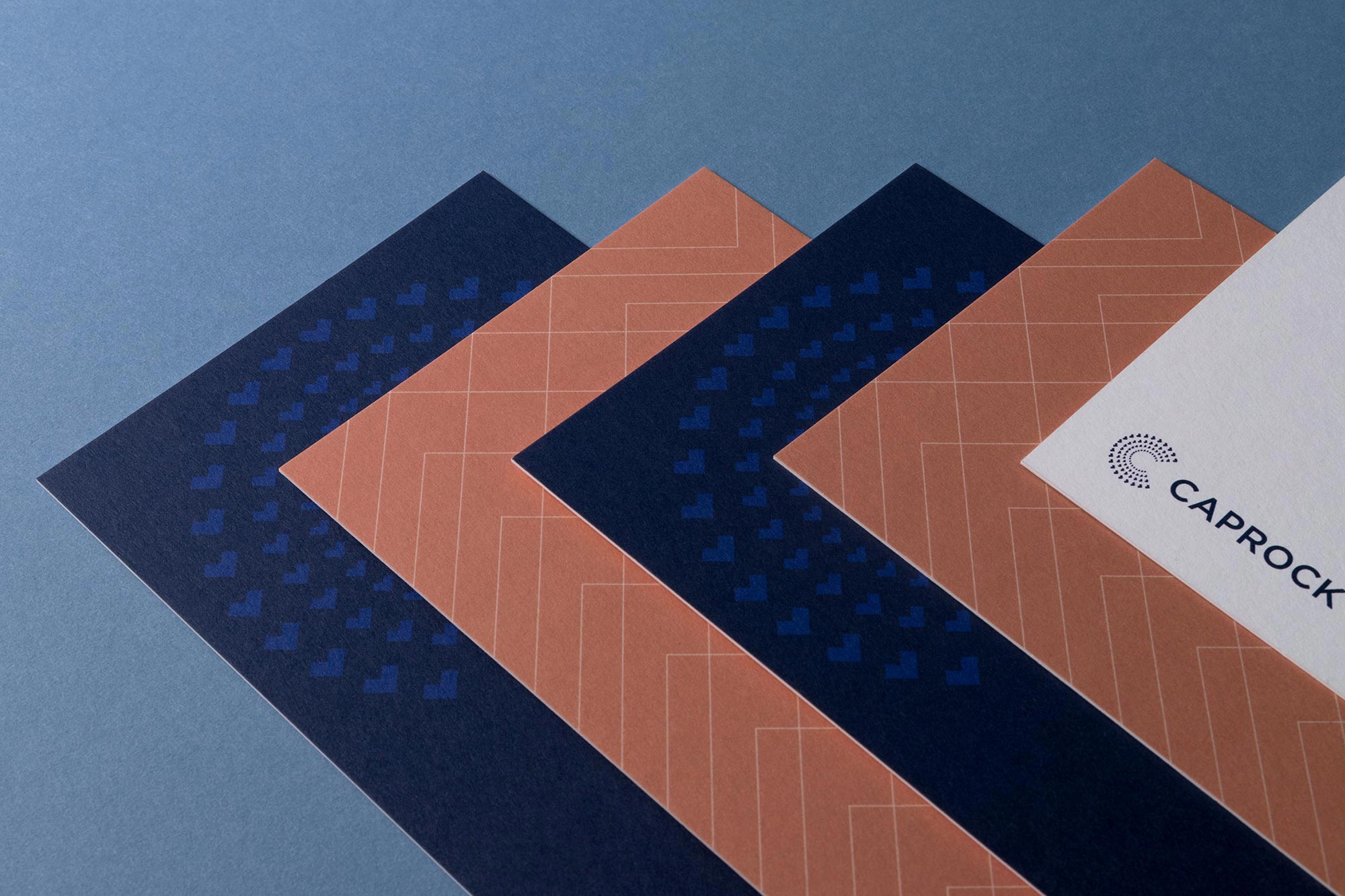
Caprock is a leader in managing family wealth with their personalized, hands-on approach. Pioneers in the impact investing space, they wanted to modernize their identity and create a cohesive visual system. To revitalize this decade-old brand, we started with a monogram “C” that’s always moving forward and speaks to financial growth and flexibility.
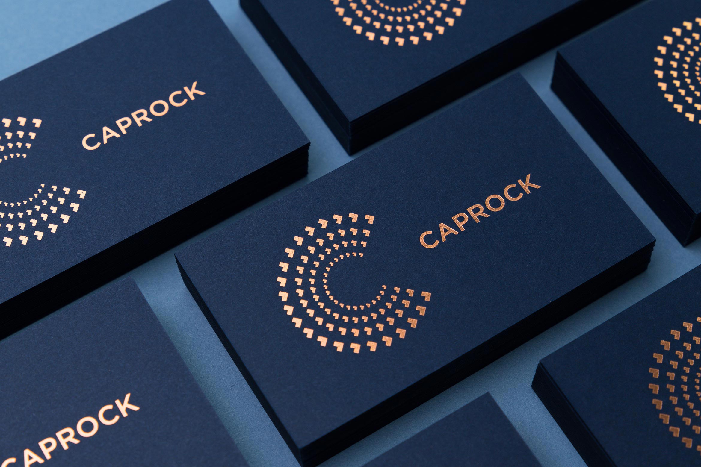
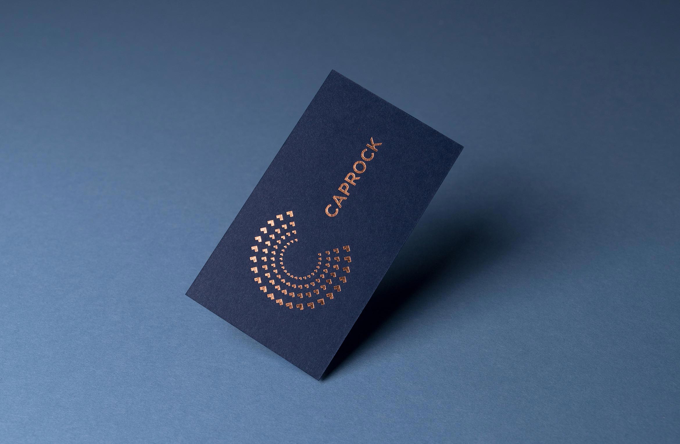
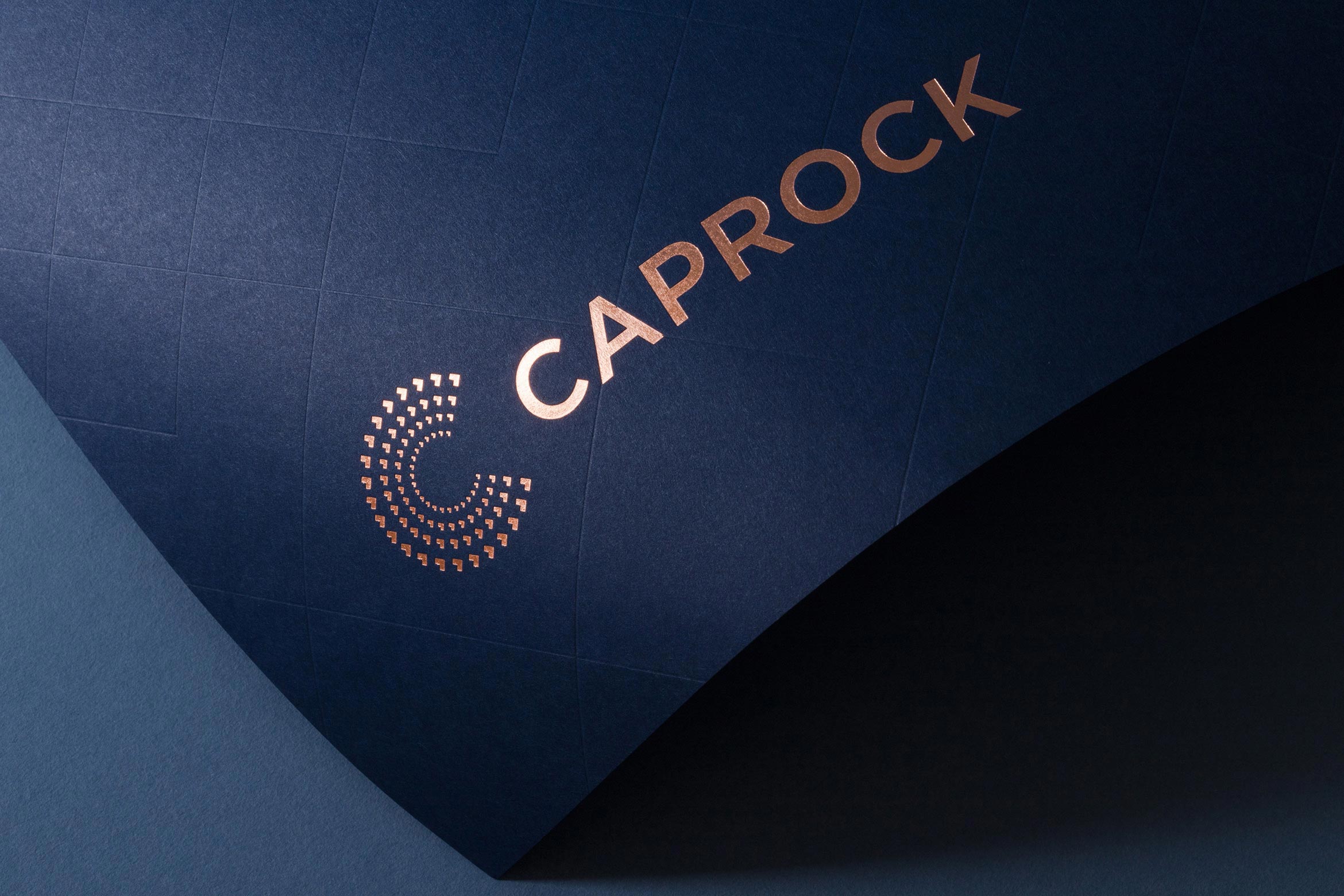
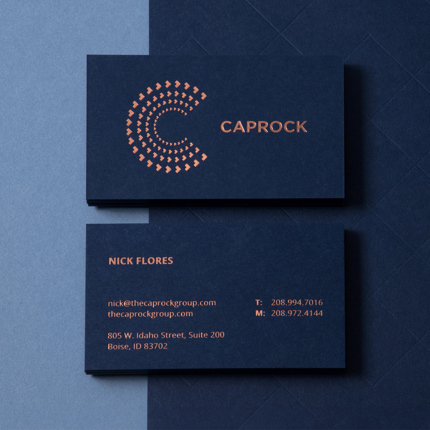
We kept their existing Navy and added copper to the color palette. Everything is printed on Colorplan patriot blue card stock, stamped with copper metallic foil that matches the color of shiny, new pennies. The arrows from the wordmark are used to create a visual system of forward-thinking patterns, motifs and icons.
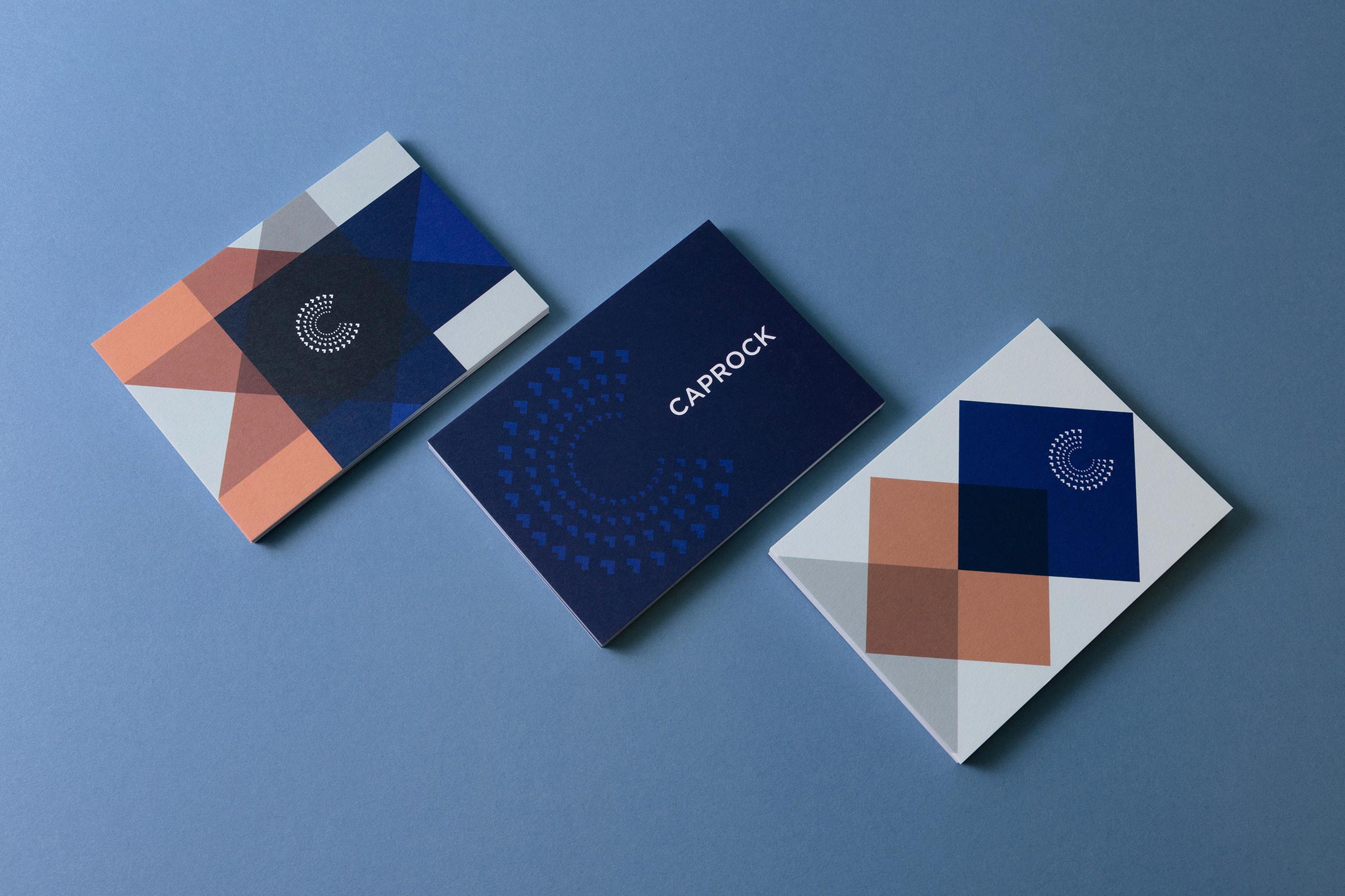
A Brand Styleguide keeps the identity cohesive by outlining rules for the logo, typography, color palette and graphic motifs.
A customized, responsive website tells the story of Caprock using layered parallax graphics, immersive imagery and smart copy that gives a modern take on financial services.
Deliverables:
- Brand Identity
- Brand Guidelines
- Visual System
- Website Design
- Print Collateral
- Promotional Items
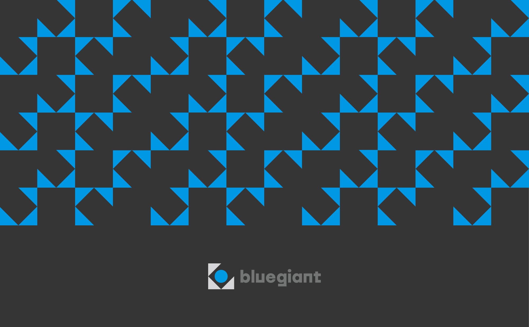
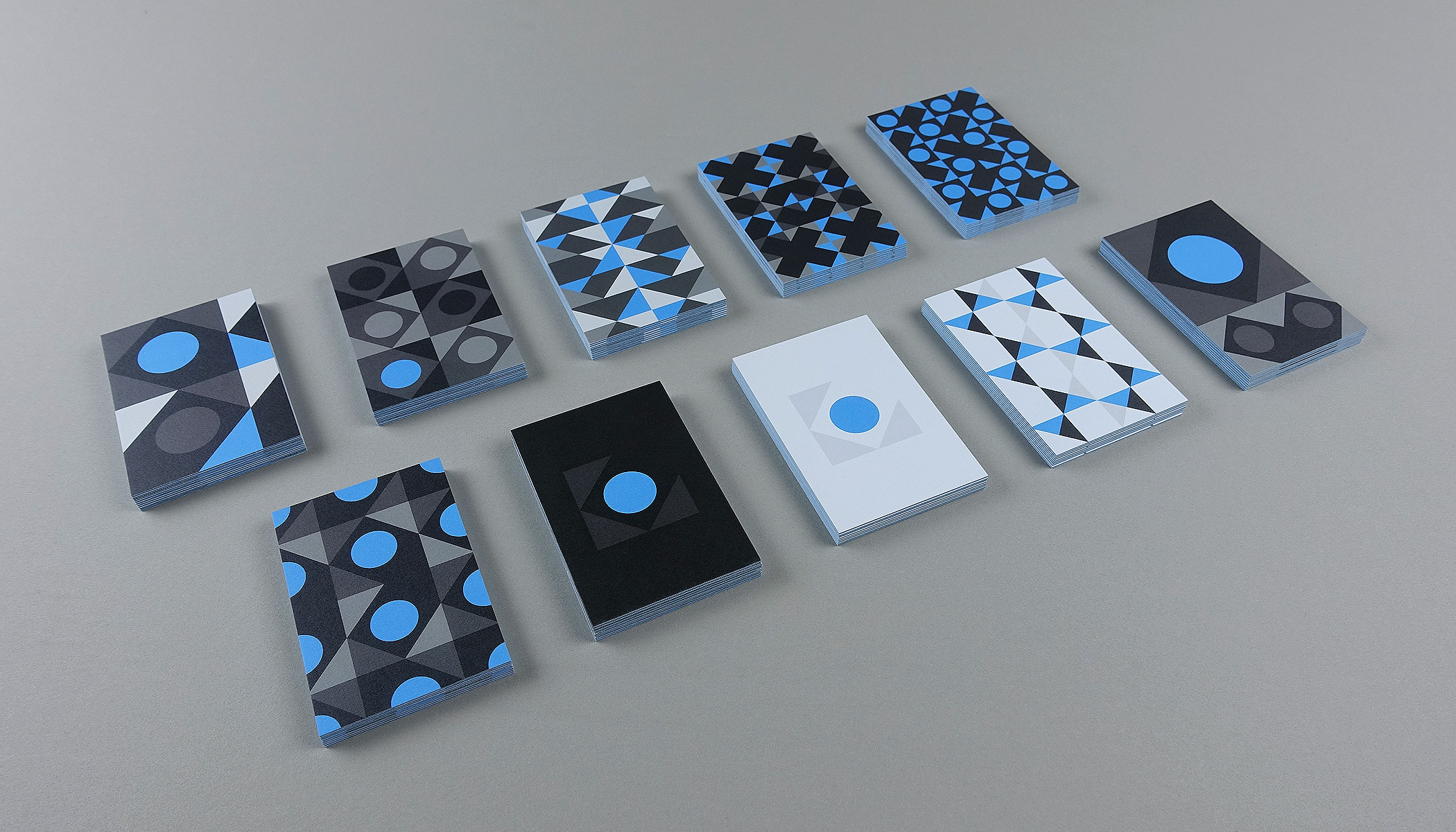
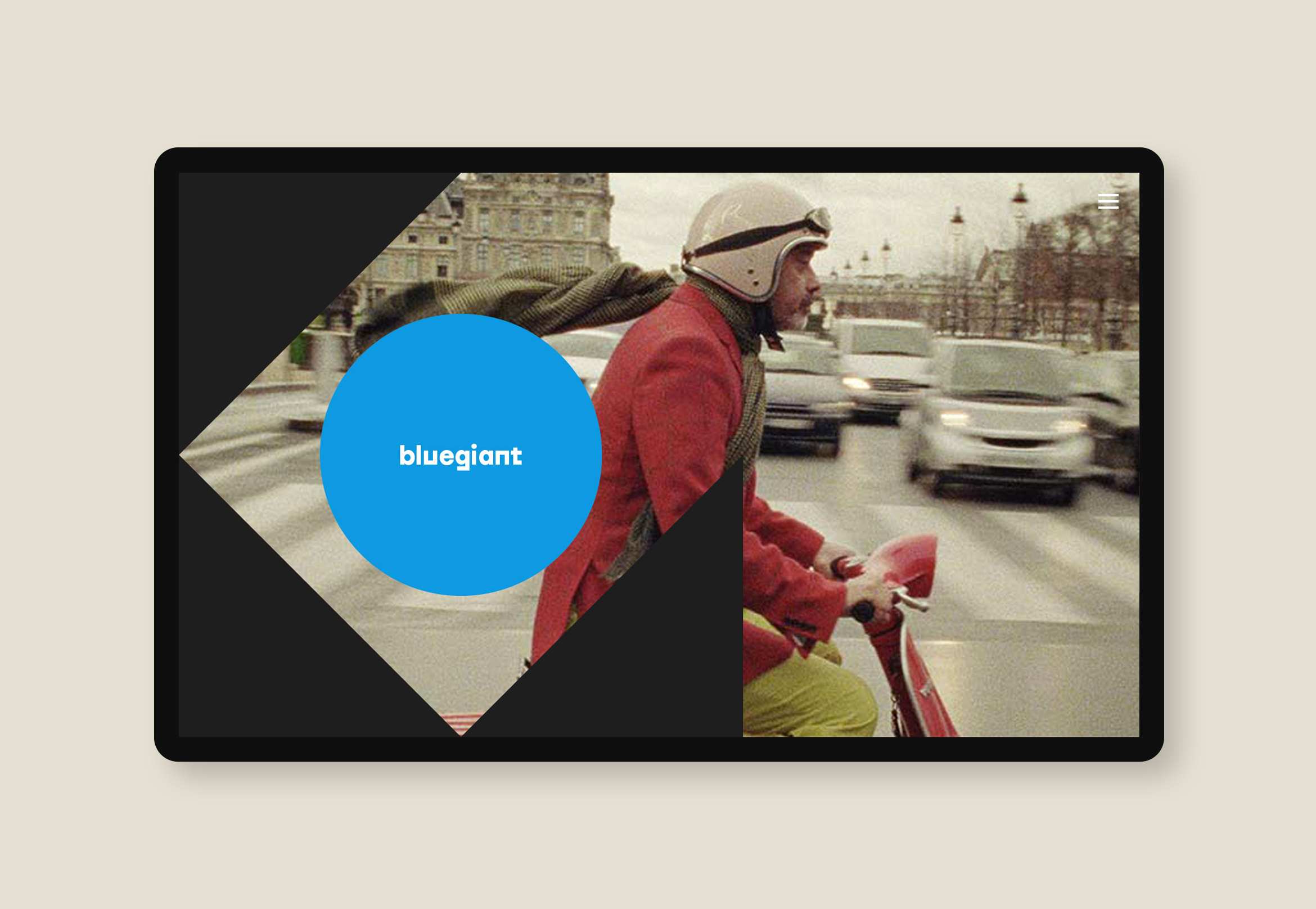
Bluegiant productions
media / brand identity / web / print
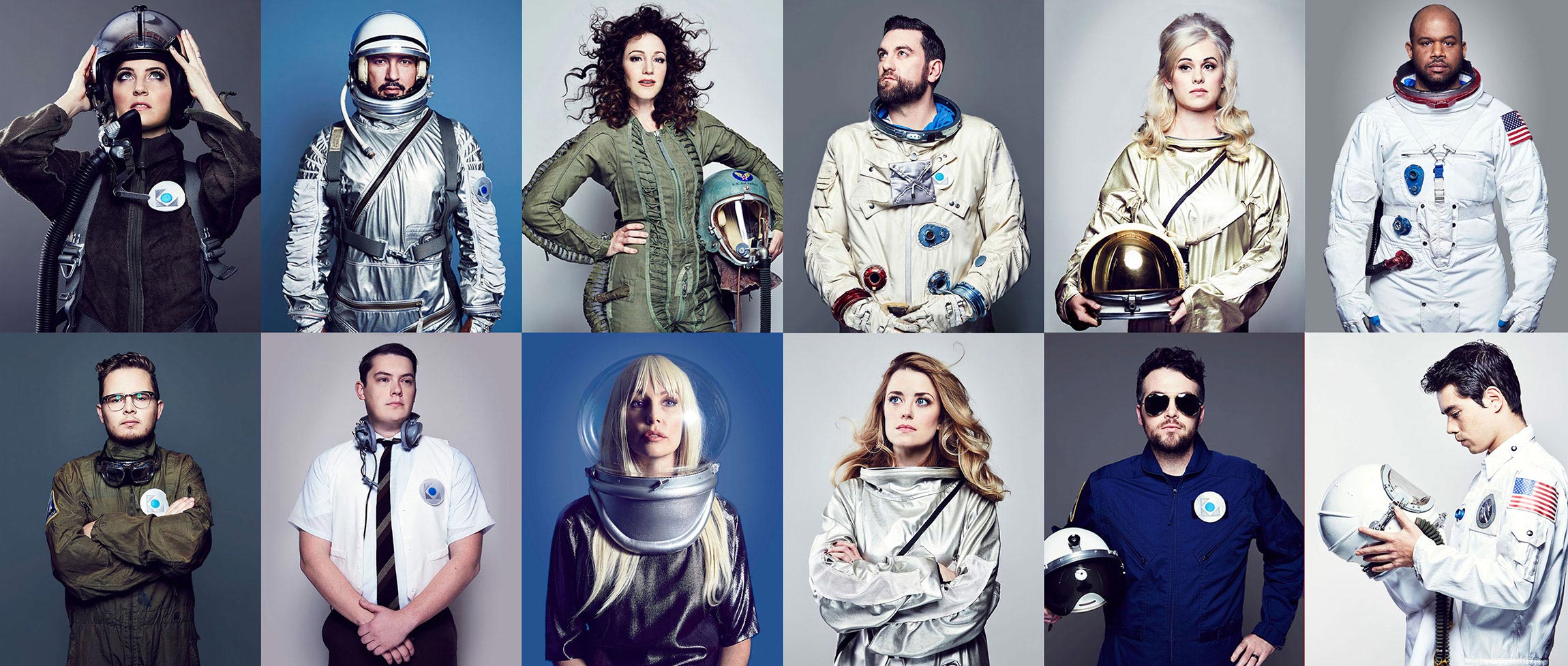
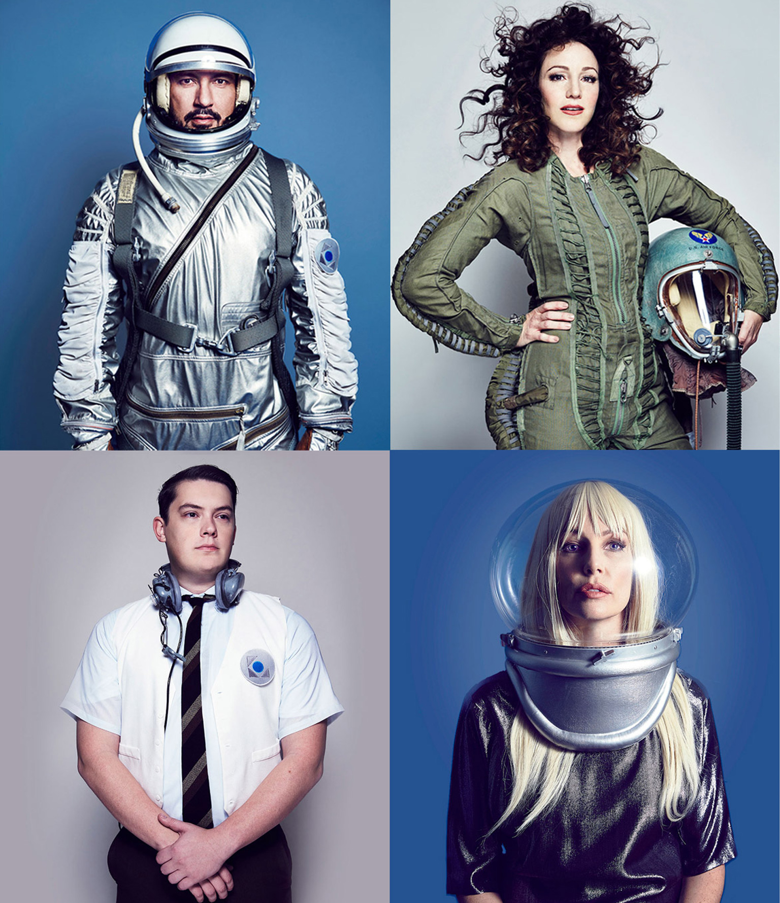
Bluegiant productions gets a stellar and polished Mid-century modern rebrand
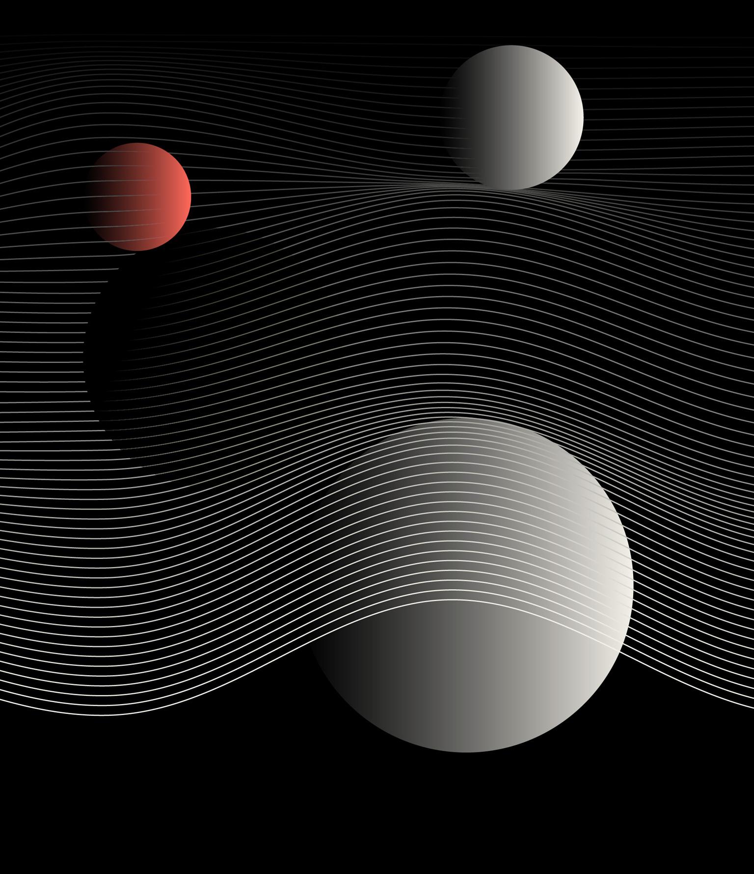
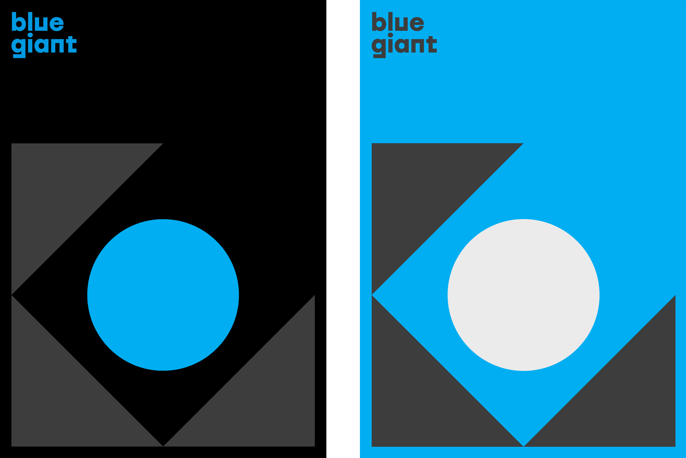
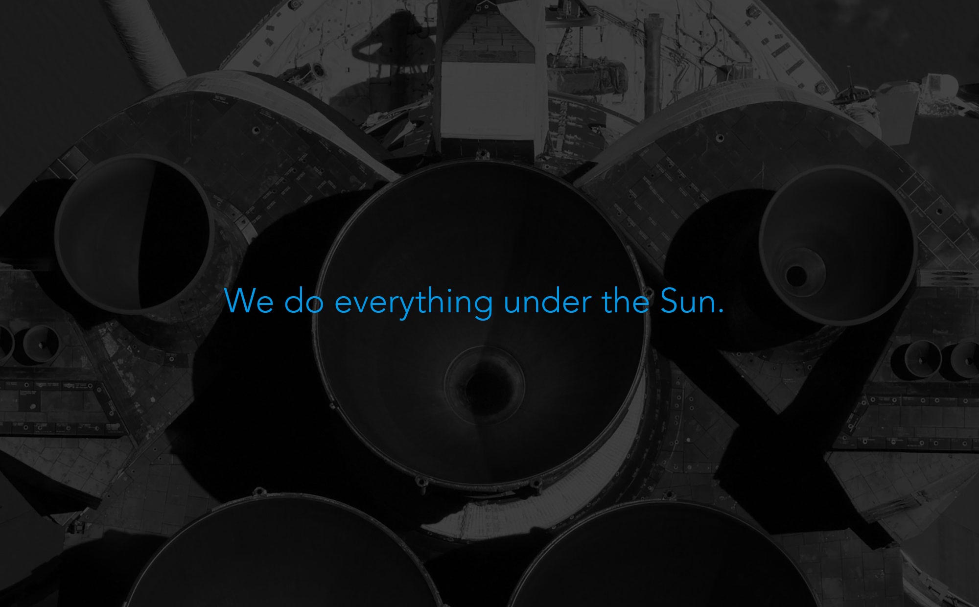
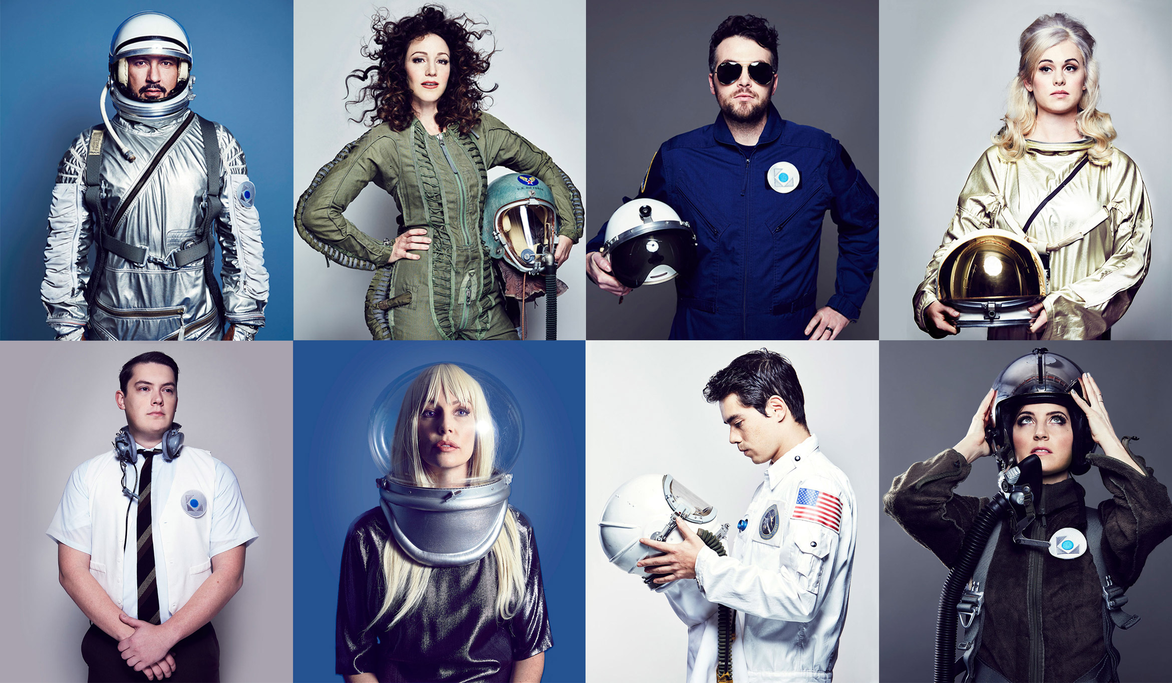
As one of many LA-based film production companies, Bluegiant wanted to stand out and show their stylish and creative side. The proposed identity evokes a Mid-century modern style with geometric shapes harnessing a “blue giant” star. The look and feel combines black, dark colors and cyan with outer space, astronauts and vintage spaceship imagery that evokes style and charm.
Deliverables:
- Brand Identity
- Visual System
- Print Collateral Design
- Web Design
- Web Development
- Content Creation
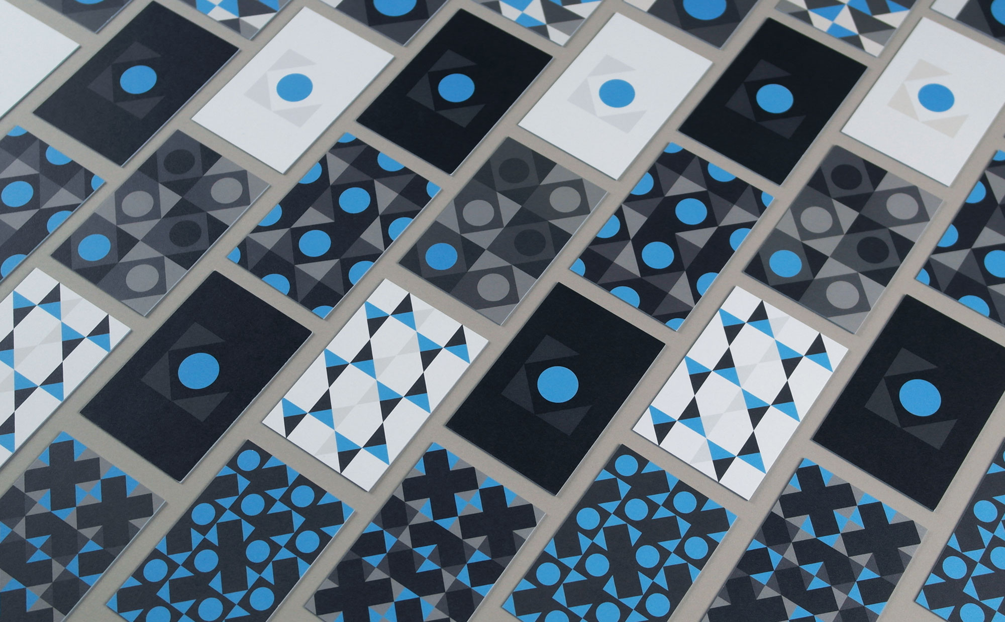
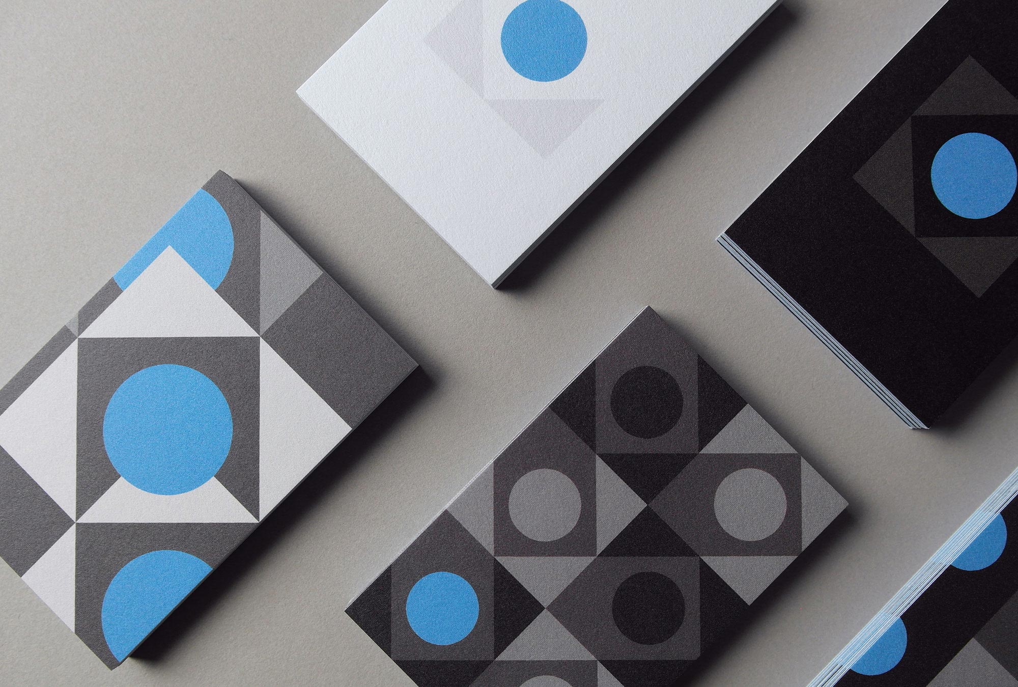
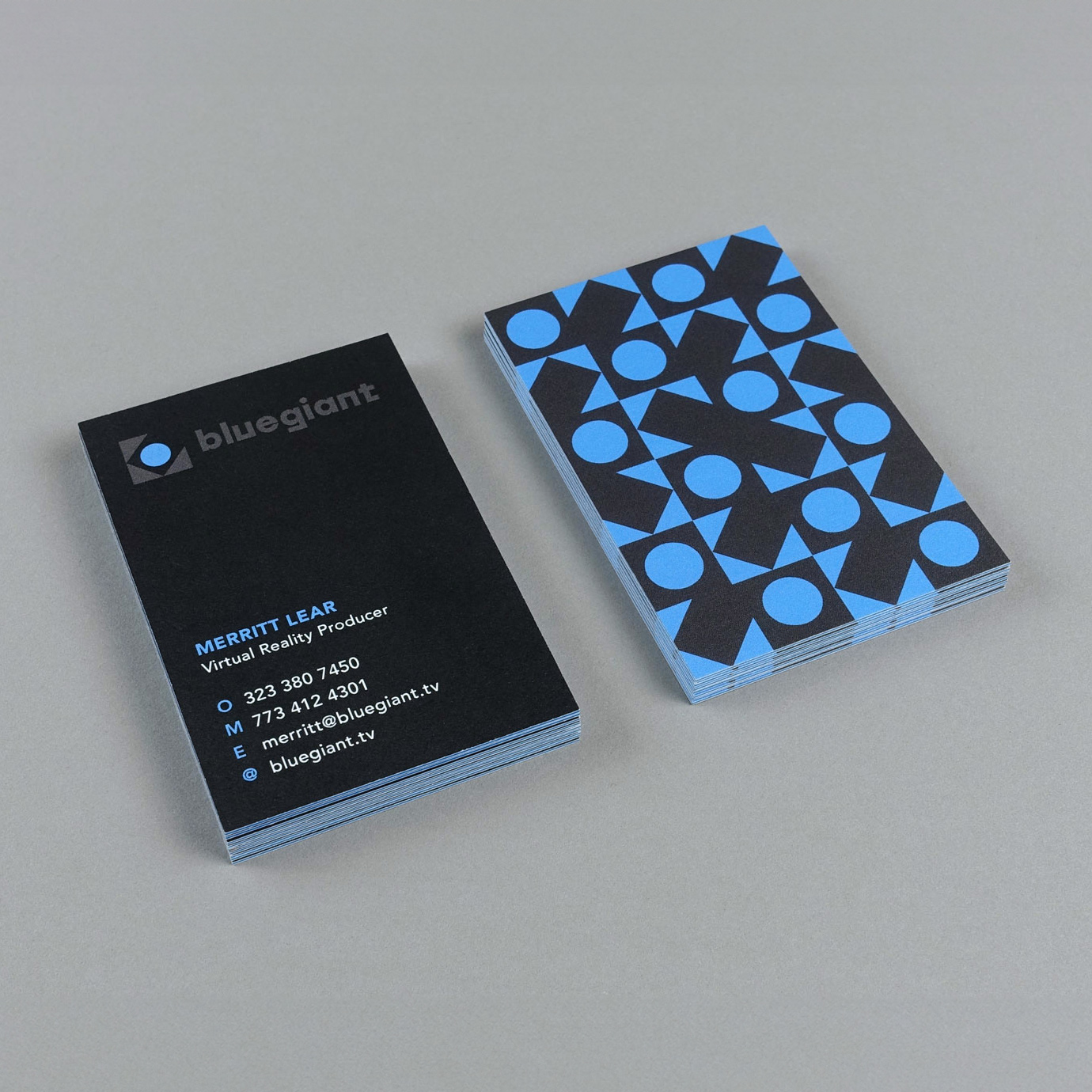
A set of 12 patterns made out of circles and triangles taken from the main mark were printed on Luxe MOO business cards for the entire team. Letting clients choose their own design becomes a fun conversation starter.
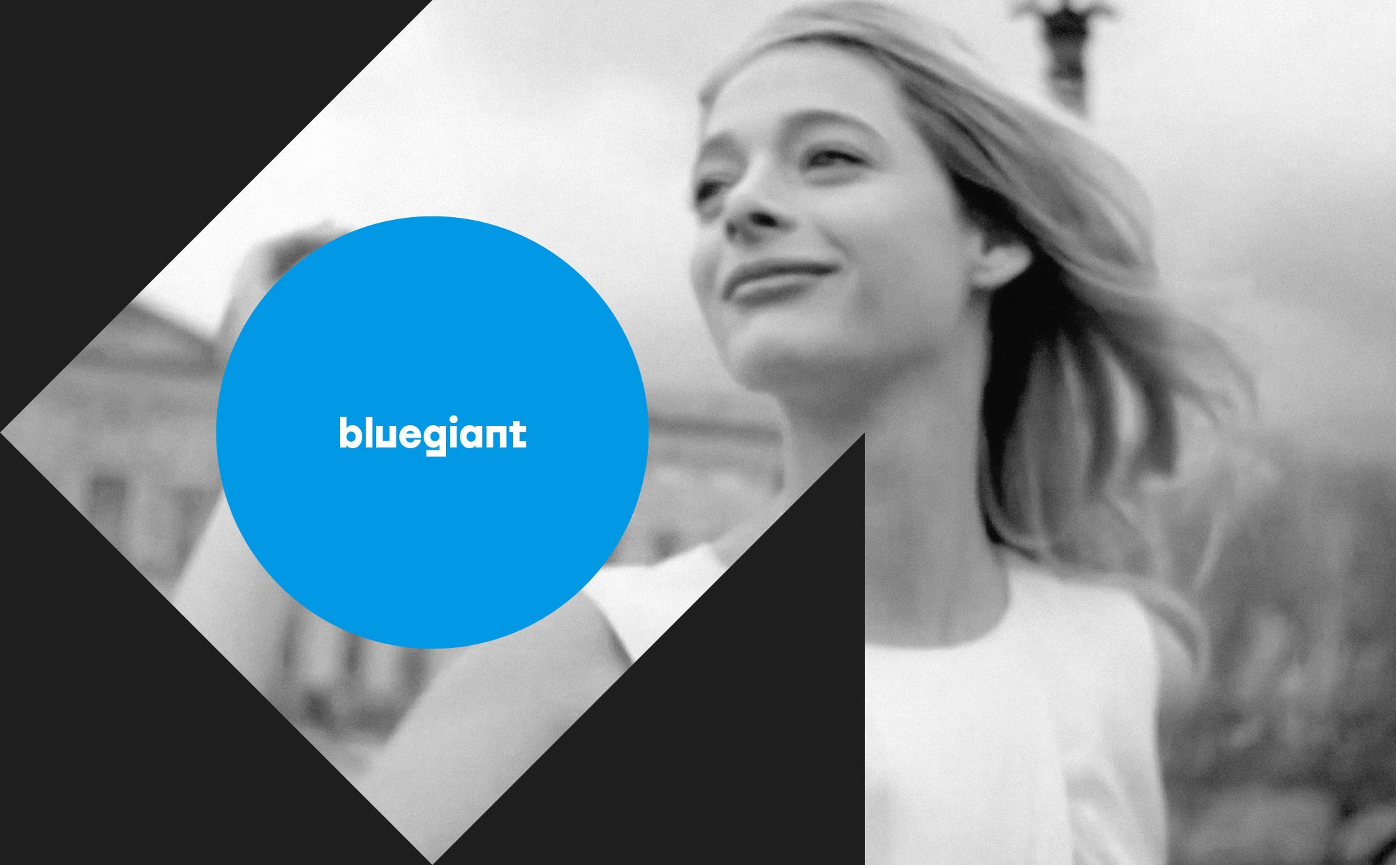
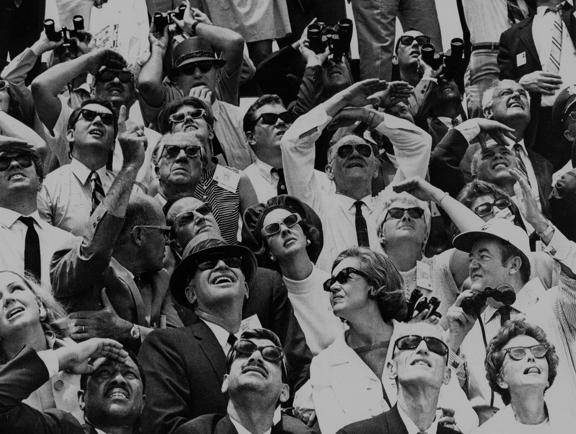
Bluegiant ran with our creative direction idea for a team photoshoot by wearing vintage astronaut suits to show everyone’s personality. Zoom out and zoom in shots were used for the people page on the website.
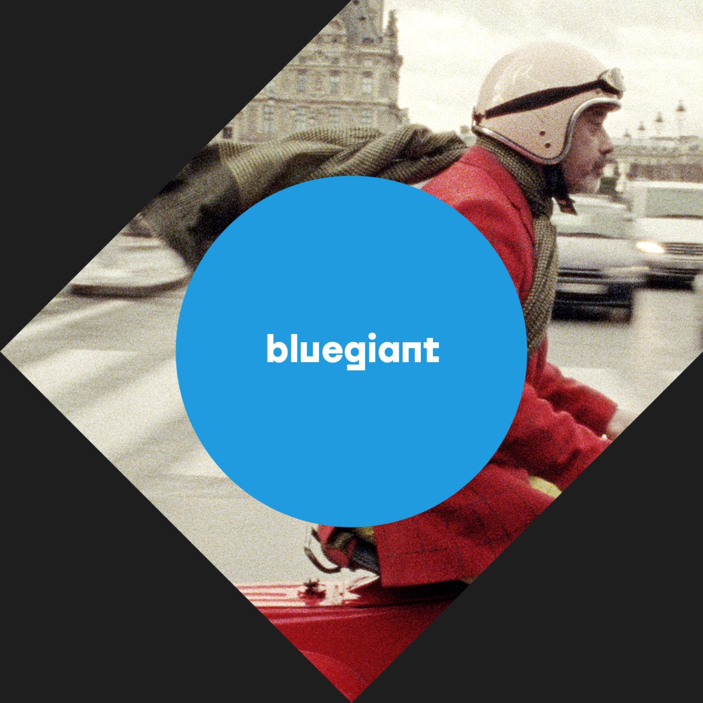
A brochure site showcases Bluegiant’s work with fun animations, edgy copy, a video reel and space-related imagery throughout.
J+R Group
service / brand identity / website / print
J+R Group sparks innovation through their commercial and residential properties
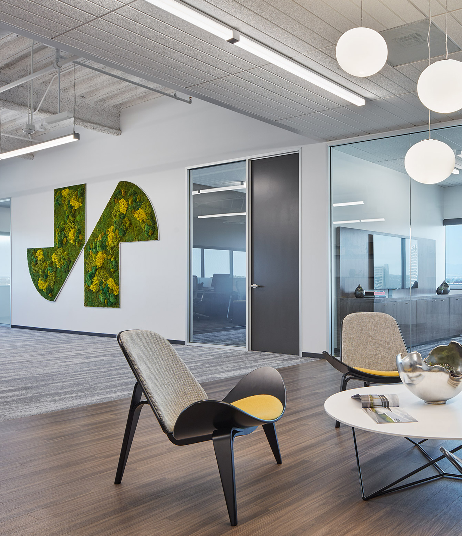
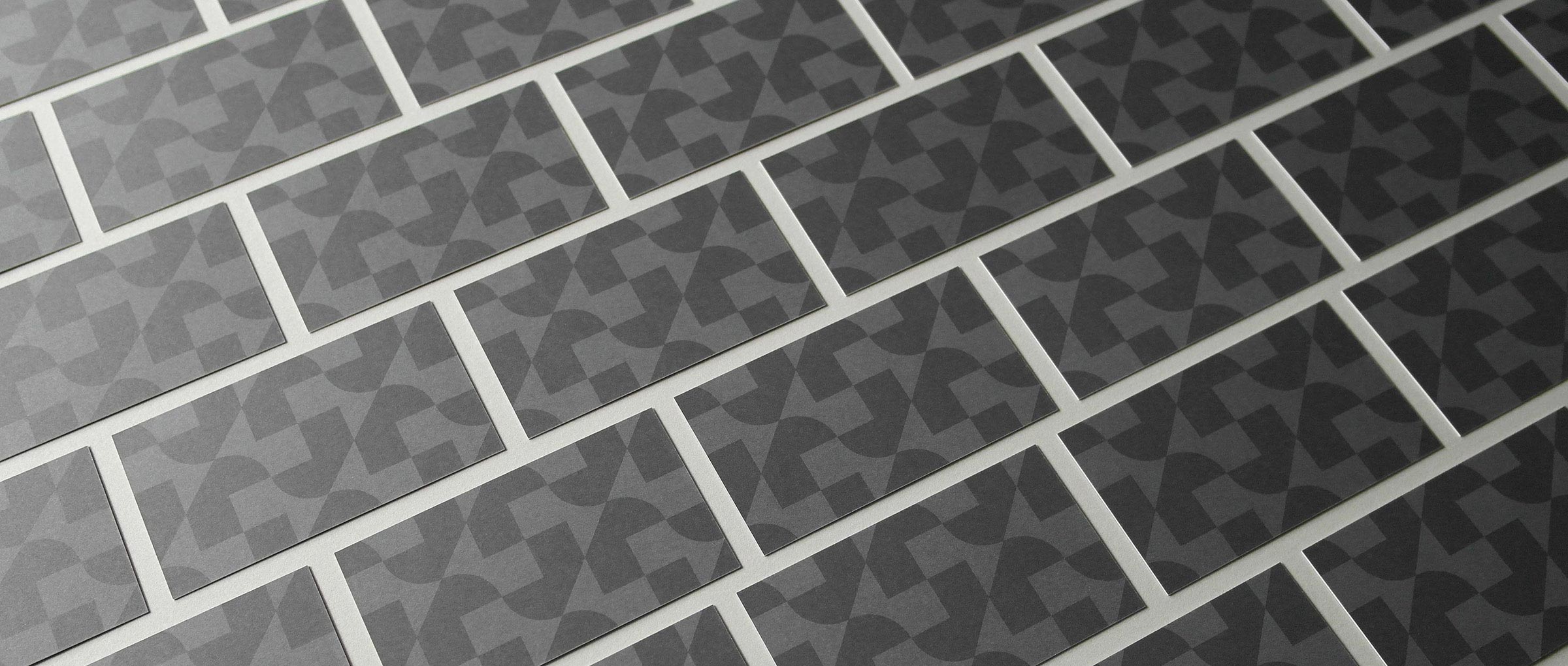
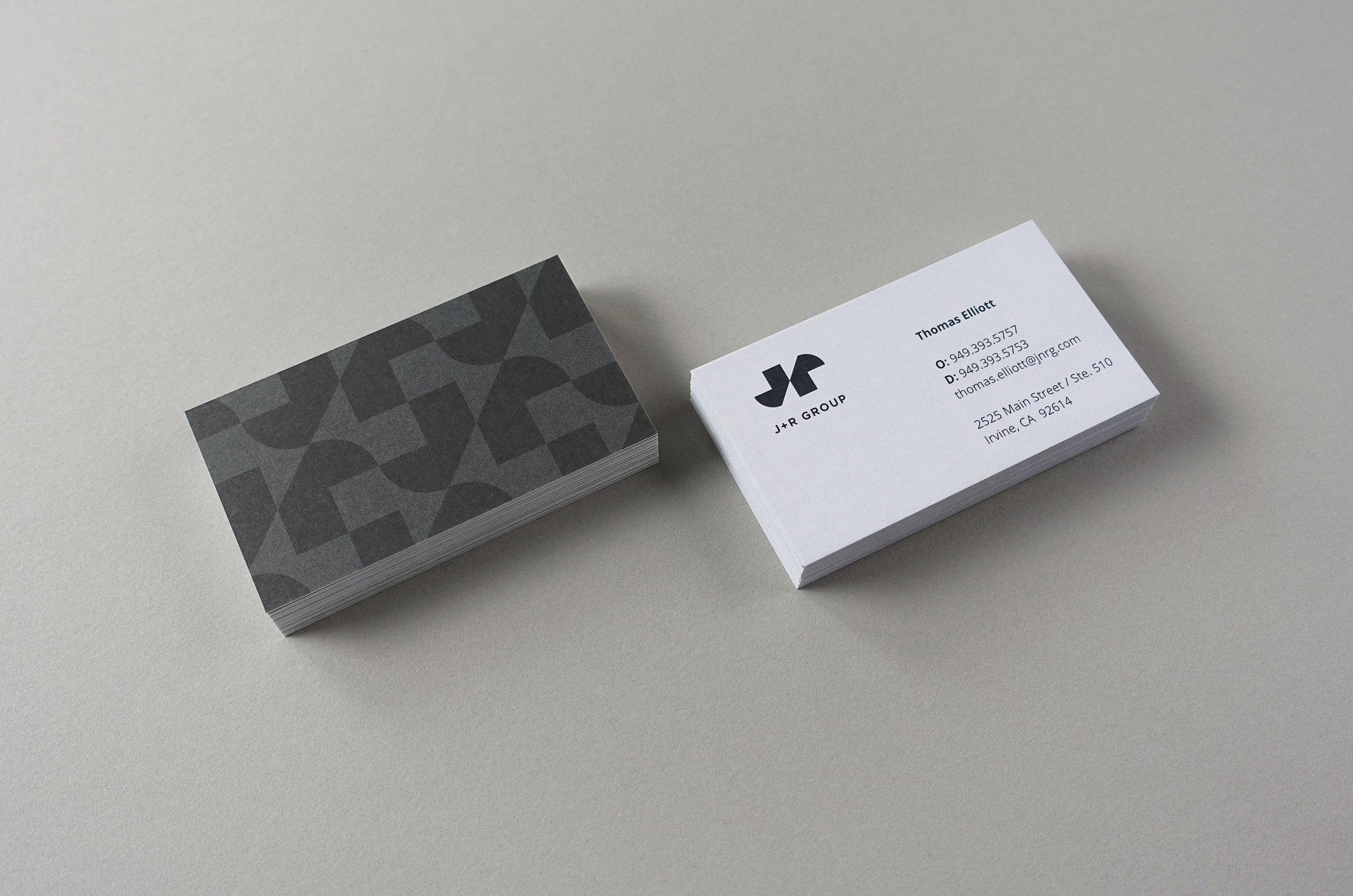
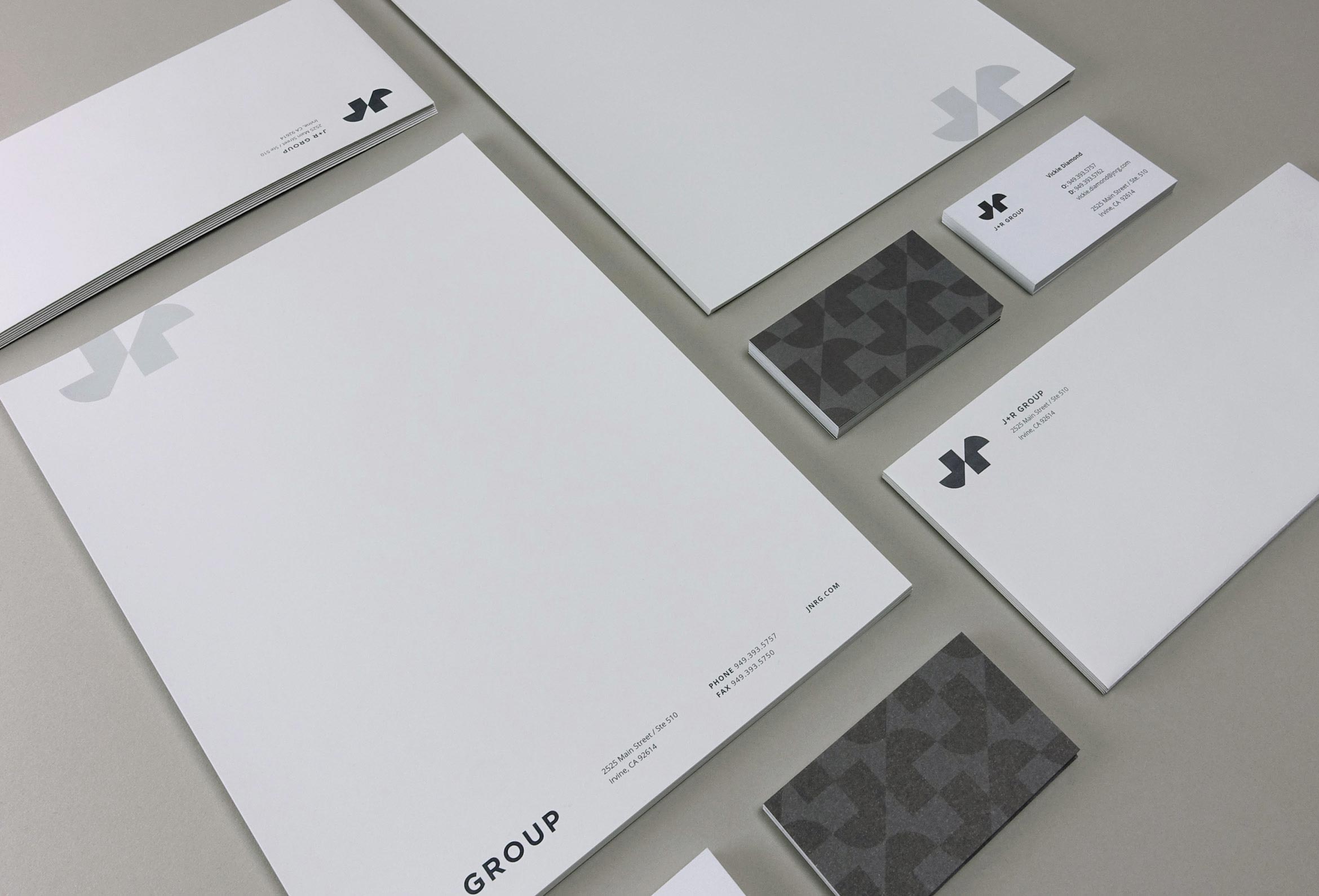
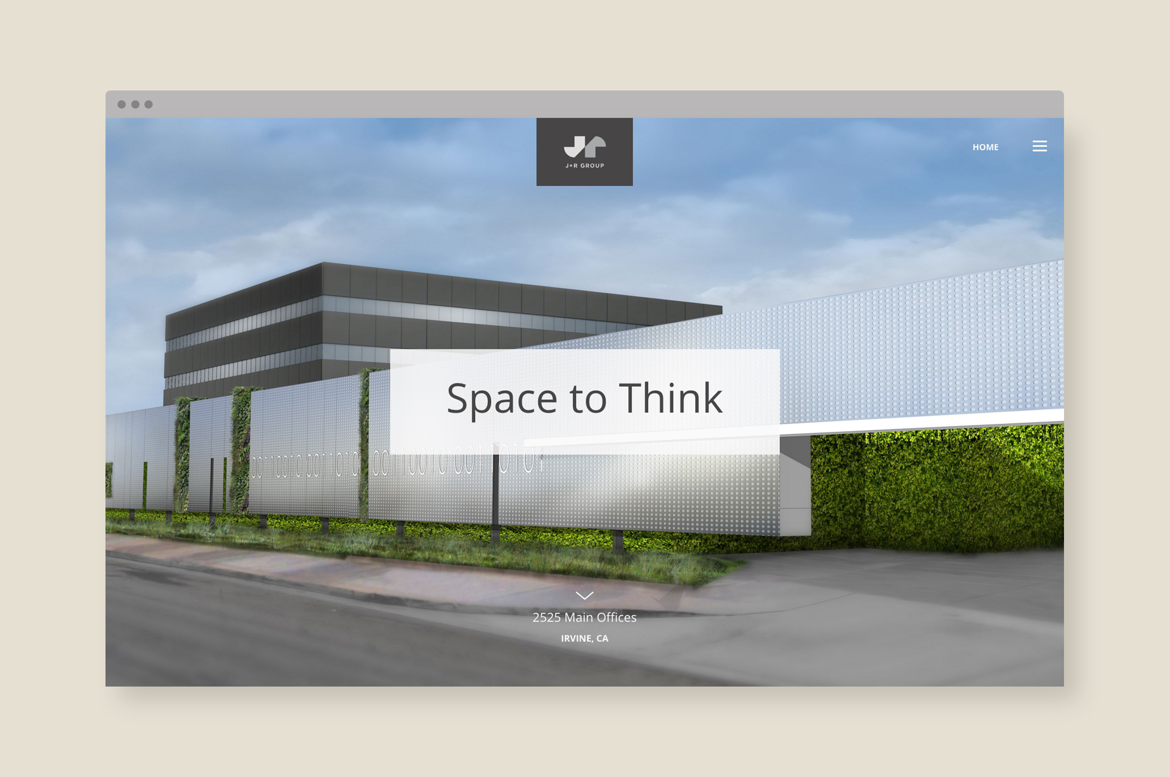
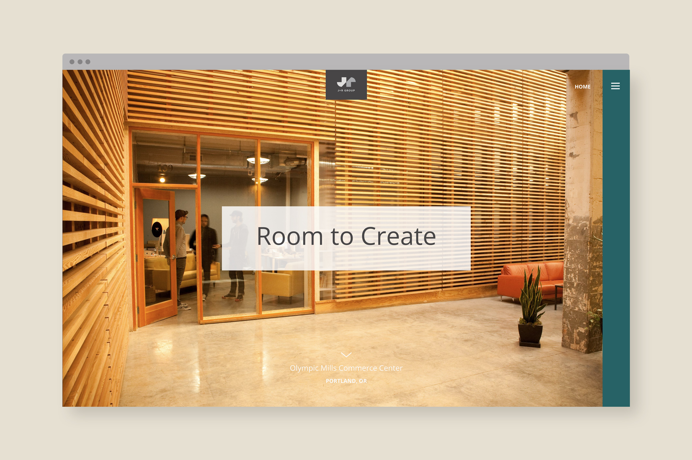
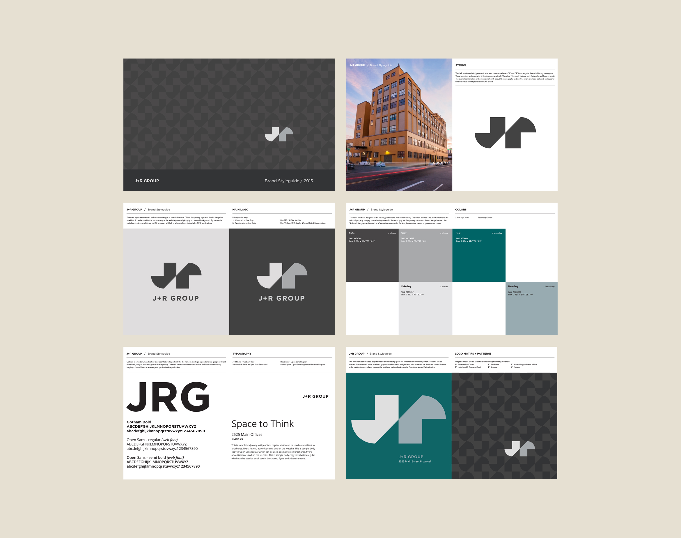
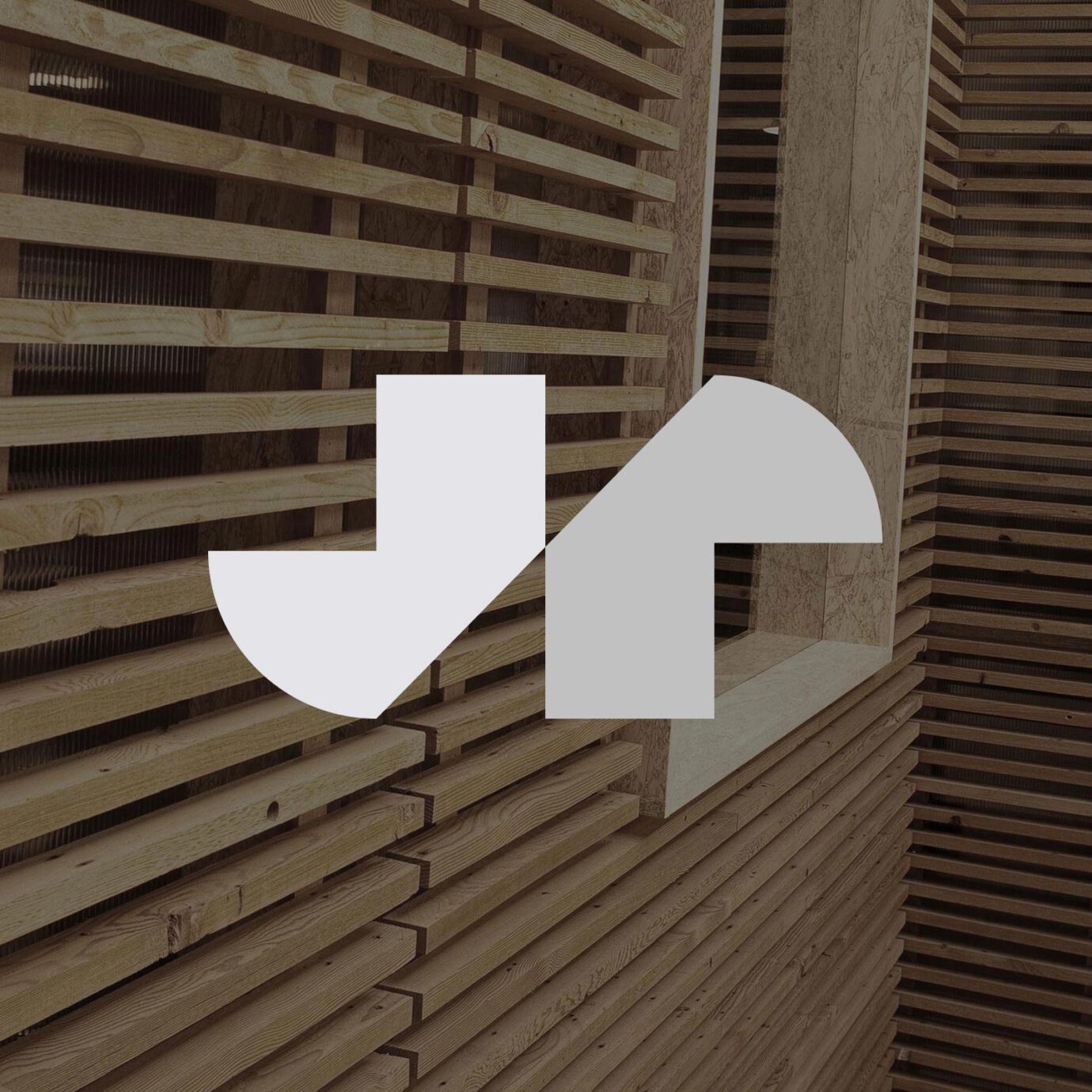
J+R Group cultivates commercial and residential properties across the Pacific Northwest and Southern California, offering sustainable and open design that helps shape their tenants’ creativity and vision. We designed their brand to be bold, energetic and polished like their philosophy. The geometric J and R letterforms create a mark that’s always moving forward and reflects their contemporary architecture style. Moss signage using the mark creates a branded environment in their own offices.
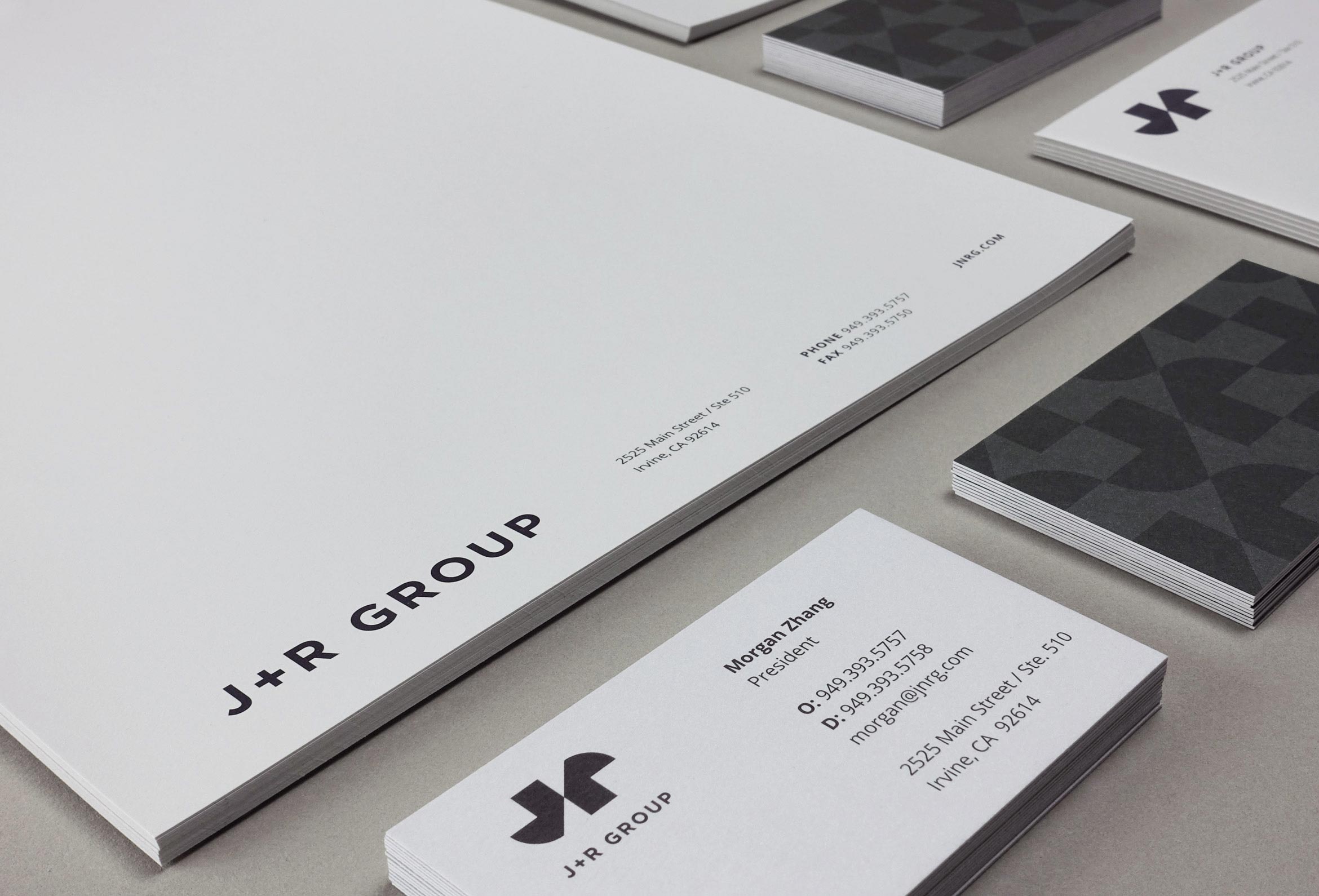
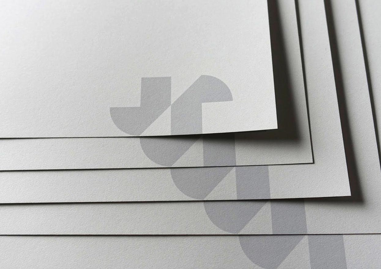
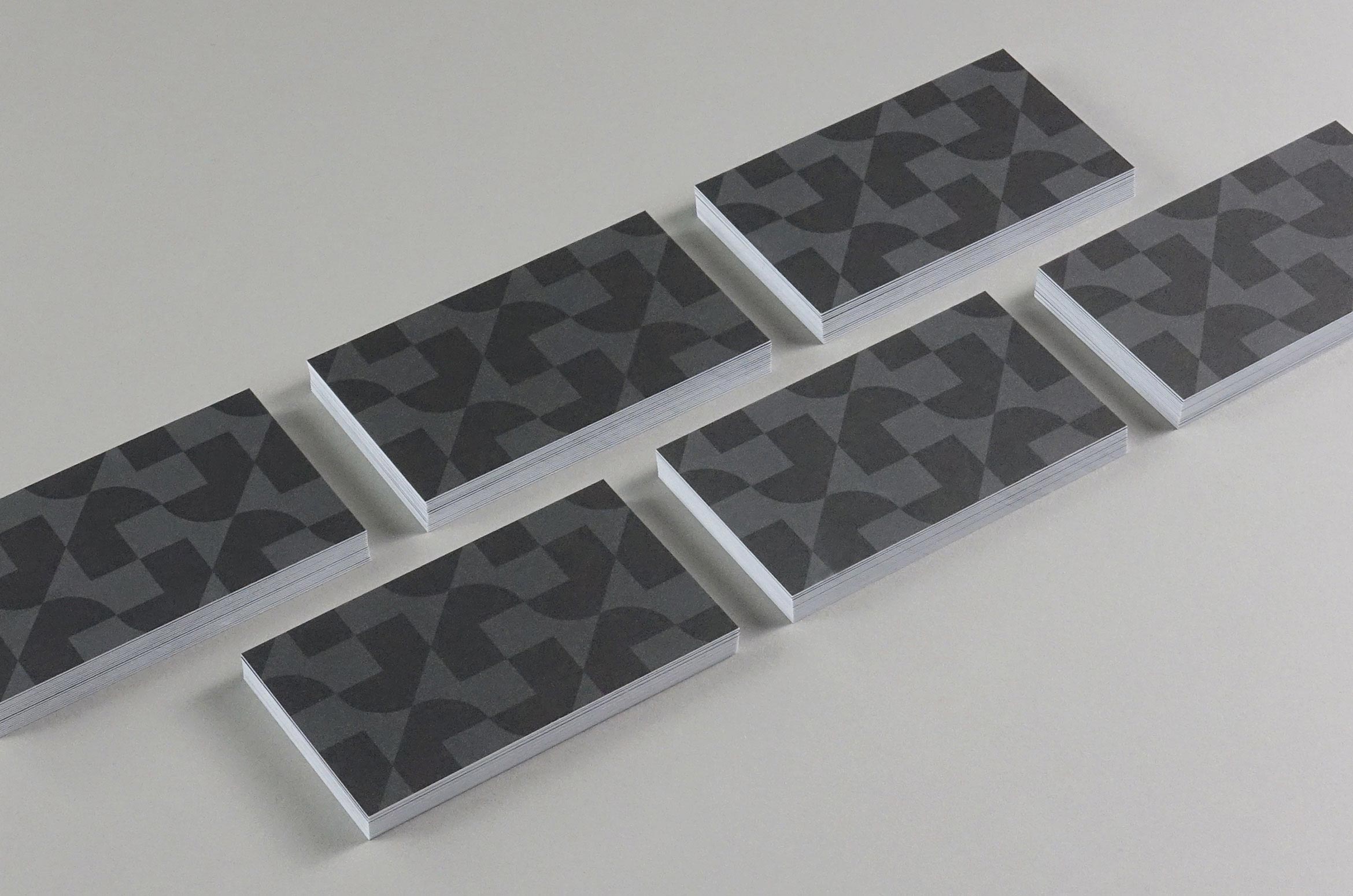
Corporate stationery was printed on antique gray paper using gray Pantone inks. A tone-on-tone repeating pattern on the cards creates a feeling of building which gives a striking first impression.
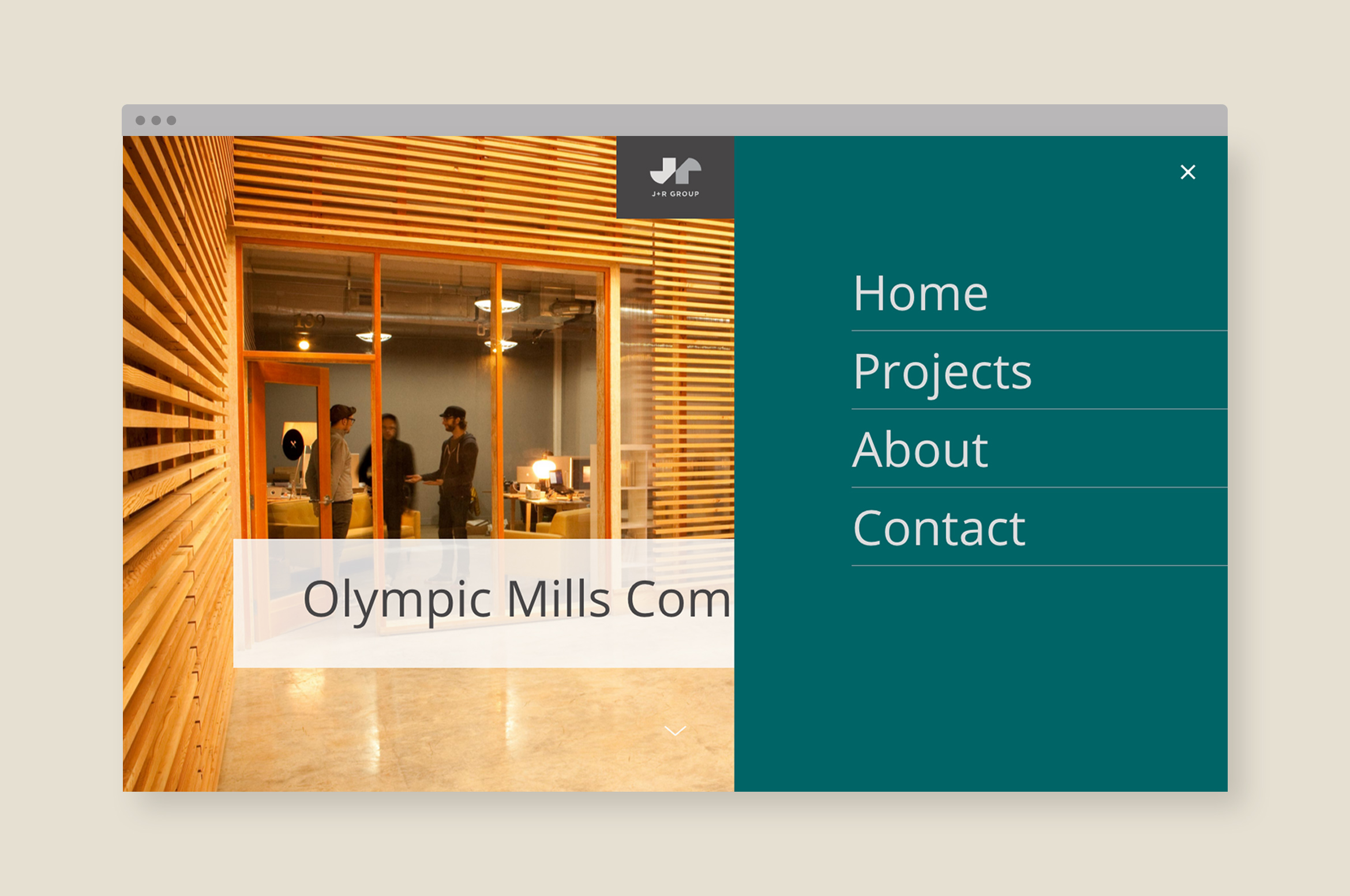
A dynamic website tells the story of each property through parallax animations, professional photography, renderings, property design details and data graphs.
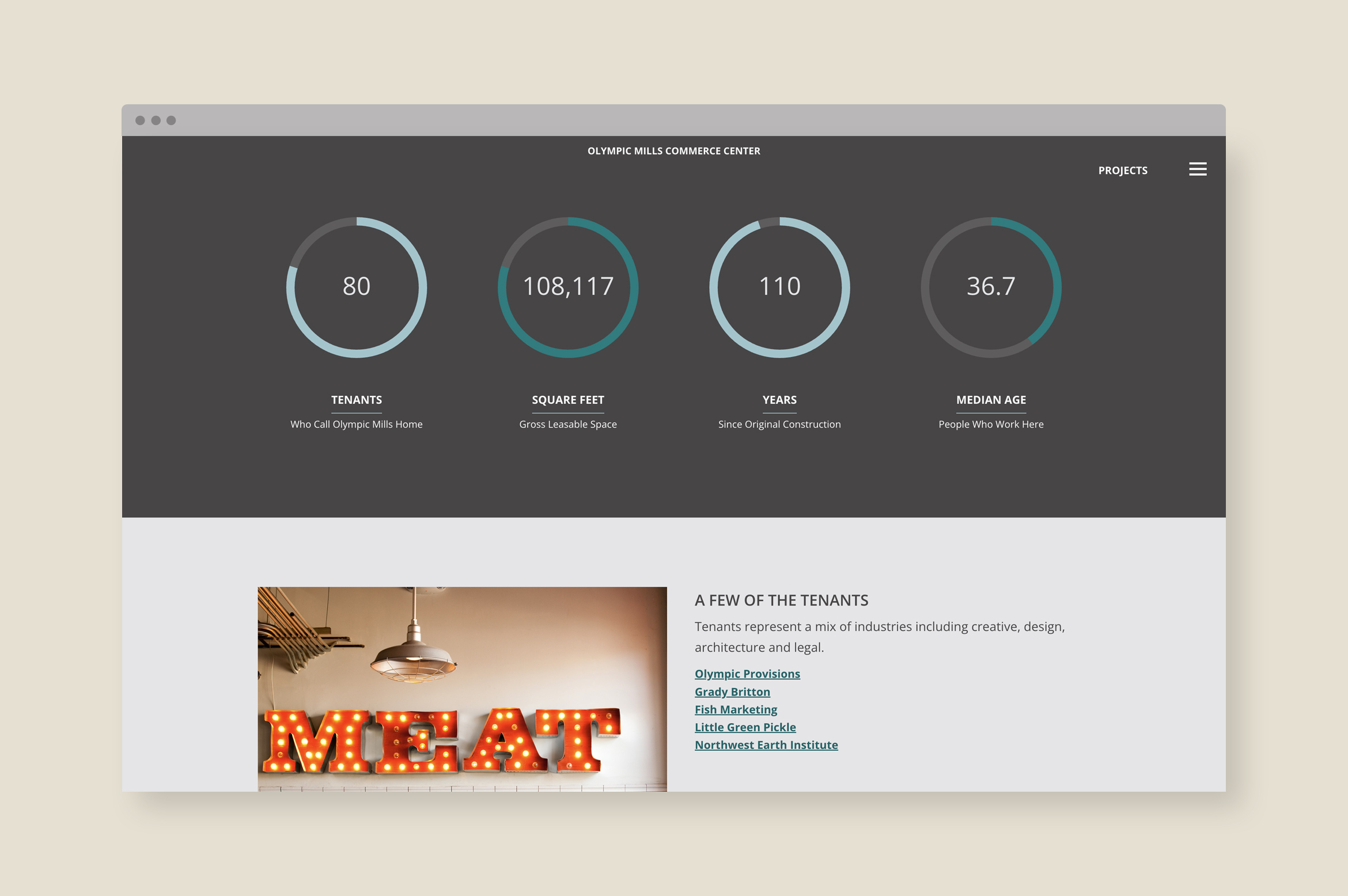
A Brand Styleguide outlines rules for the identity system including logo lock-ups, color formulas, typography, photography and graphic motifs. The guide is an important tool in creating brand cohesion.
Deliverables:
- Brand Identity
- Brand Guidelines
- Corporate Stationery
- Website Design
- Web Development
- Copywriting
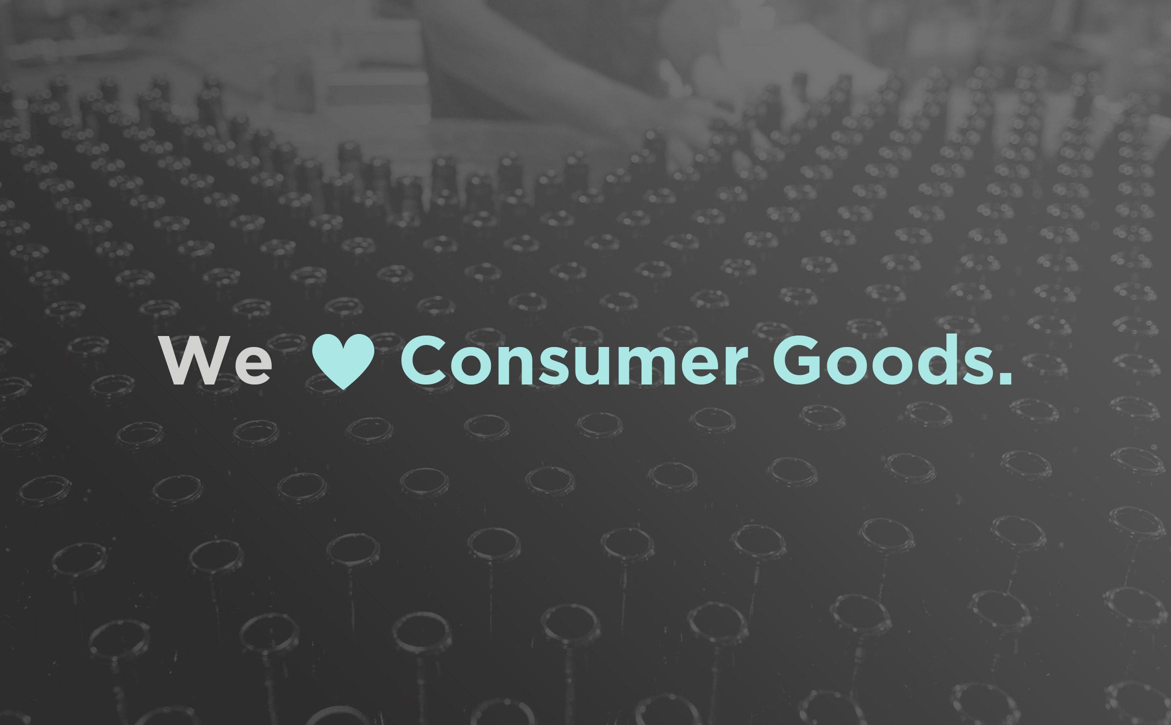
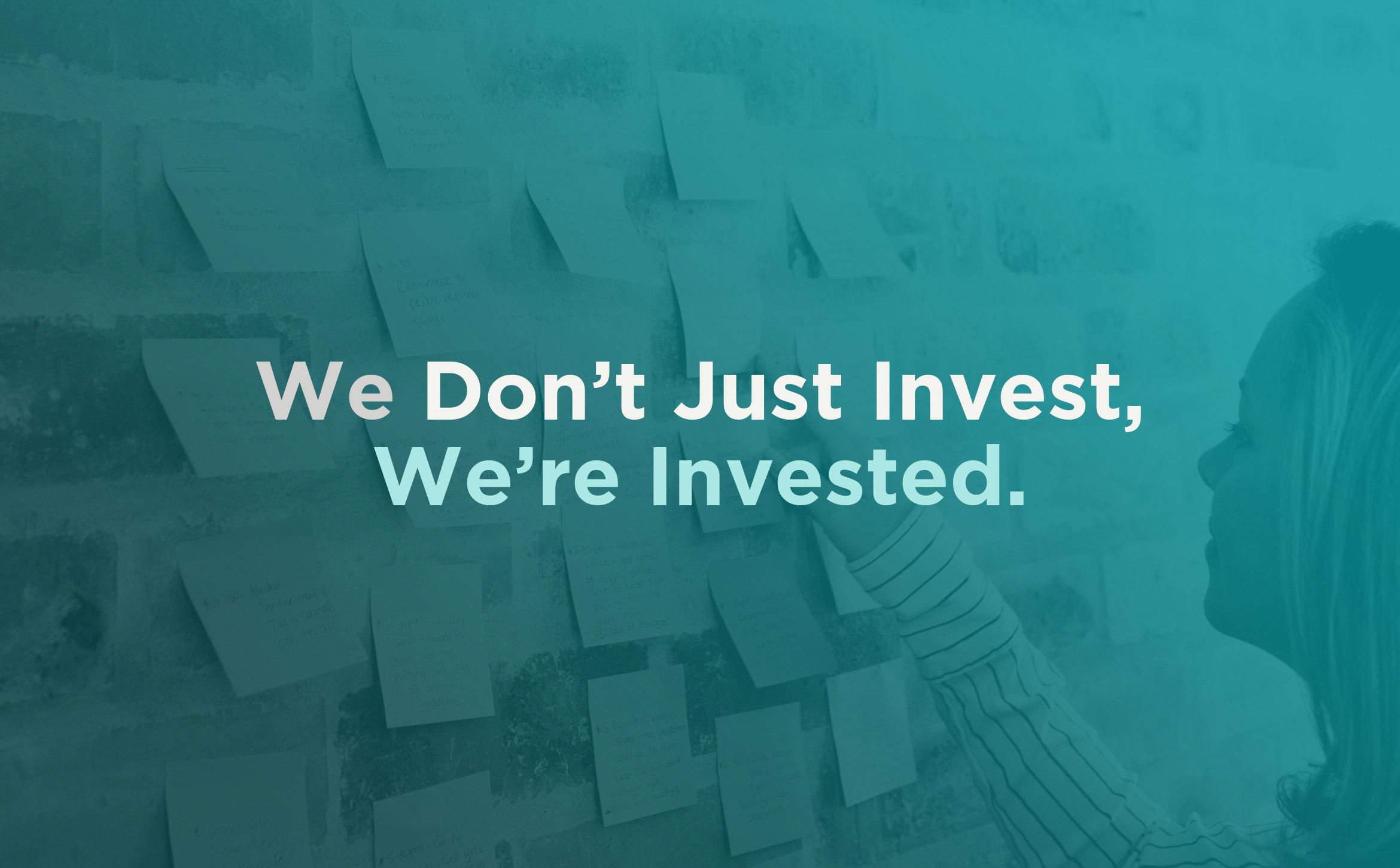
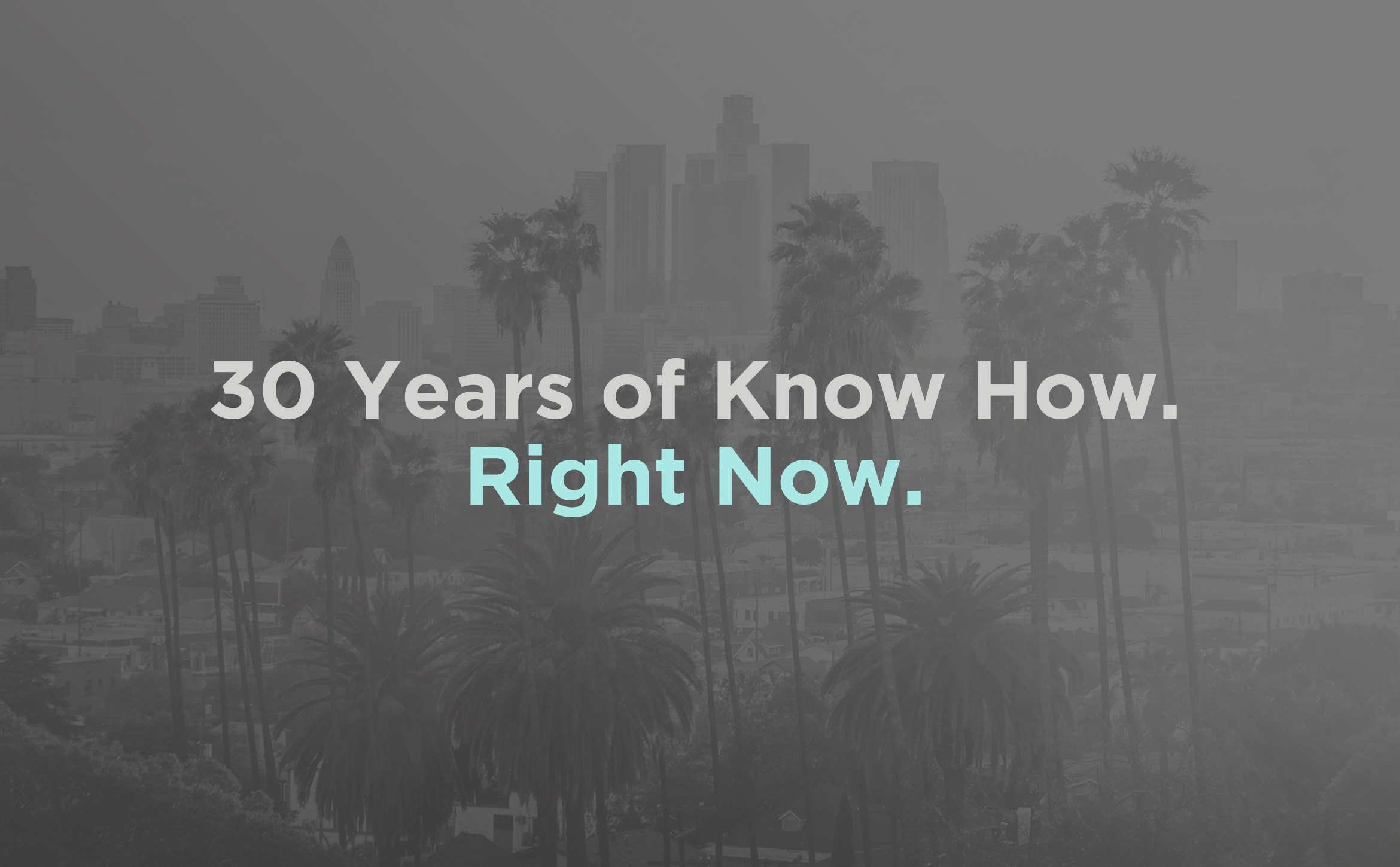
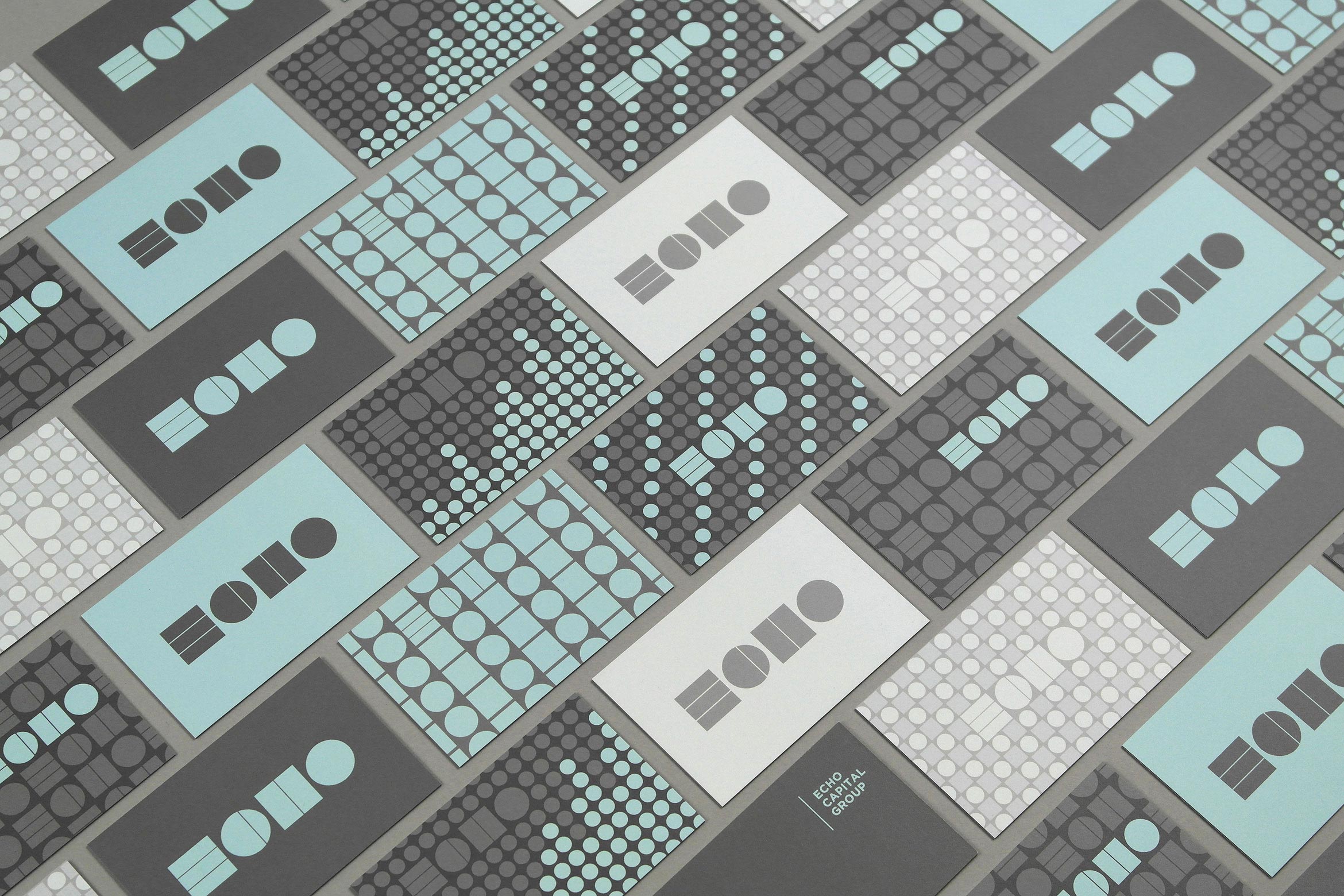
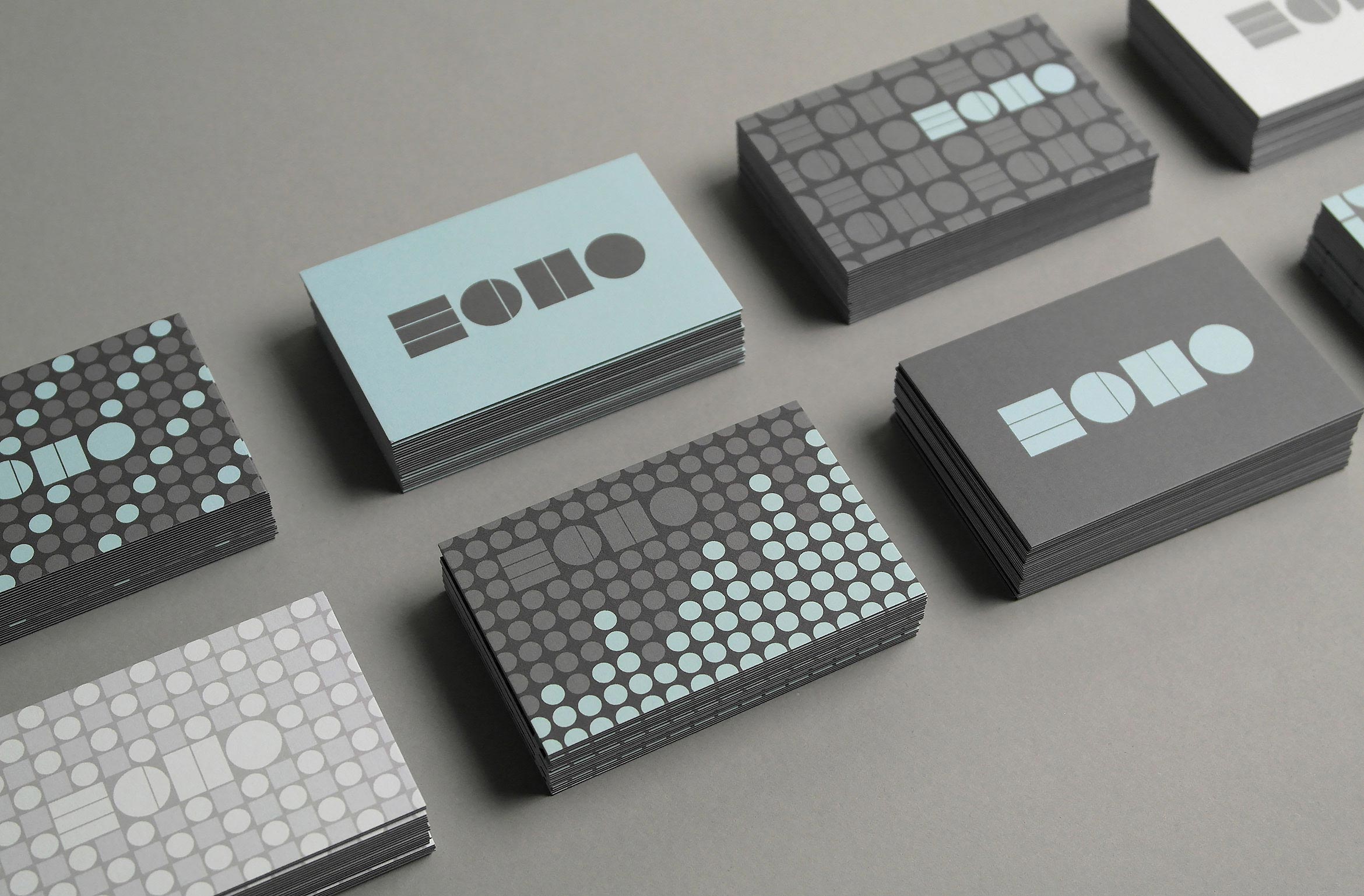
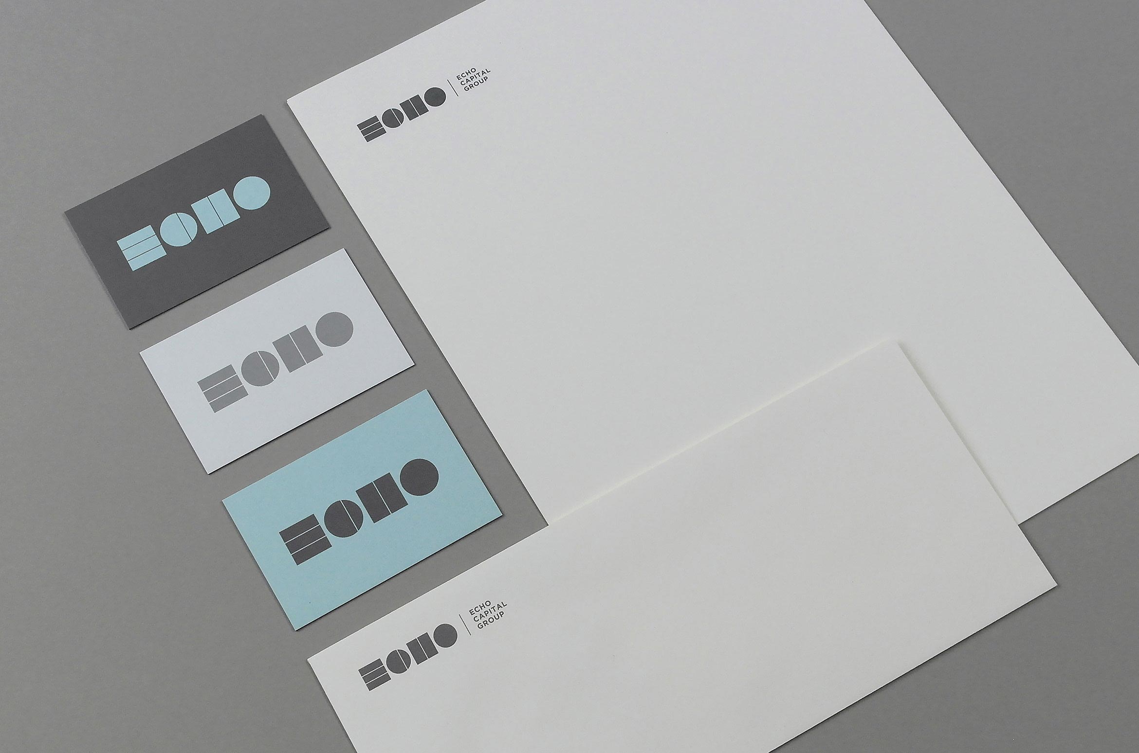
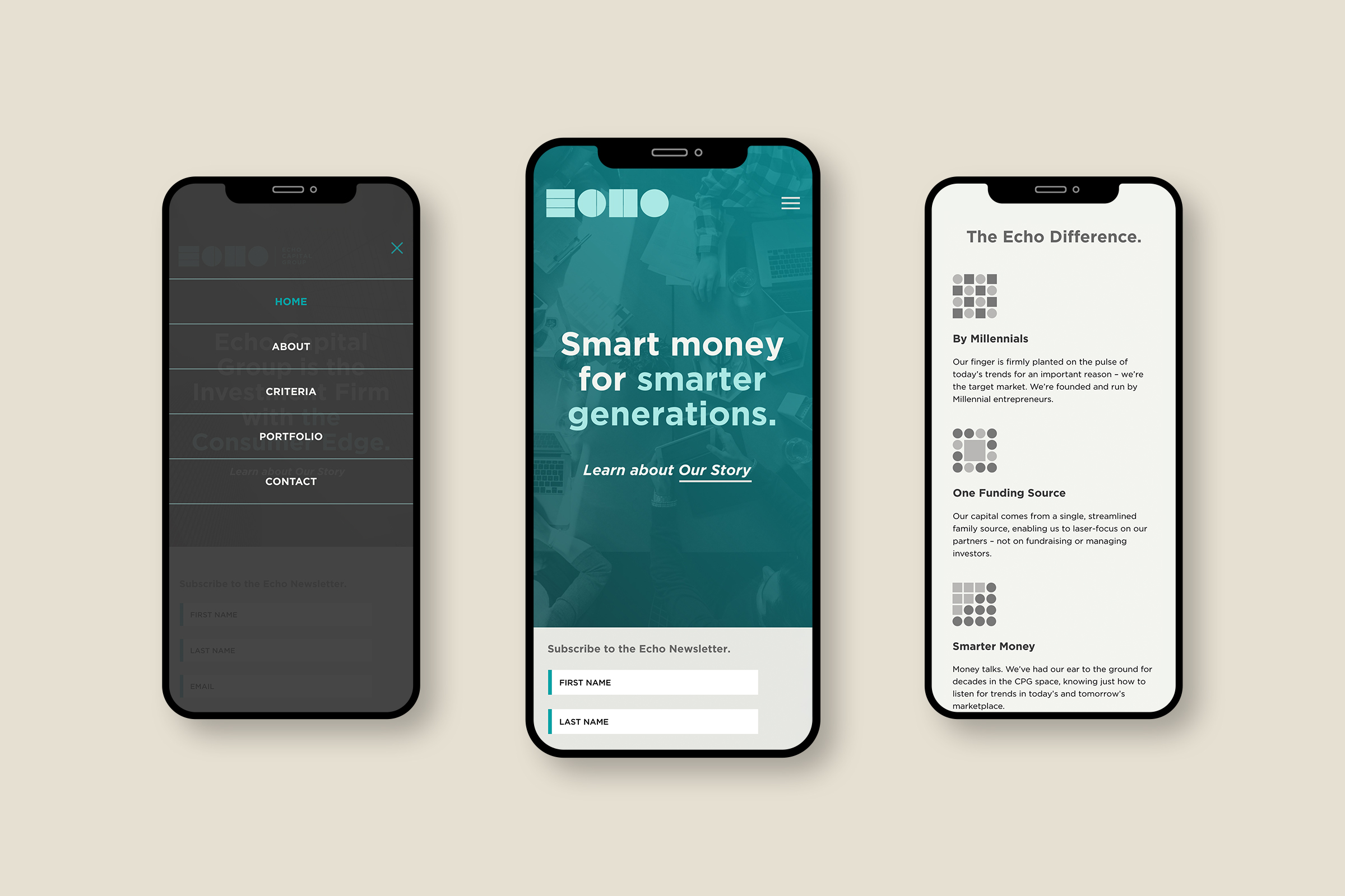
Echo Capital Group
finance / brand identity / collateral
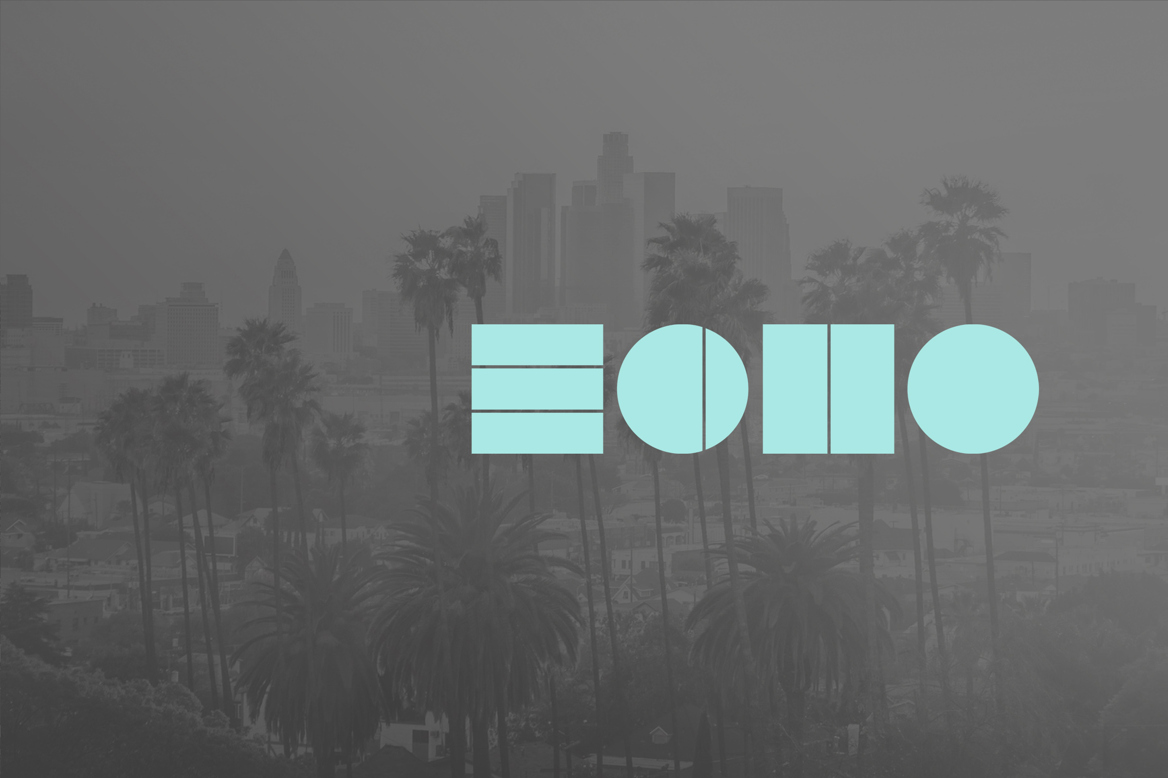
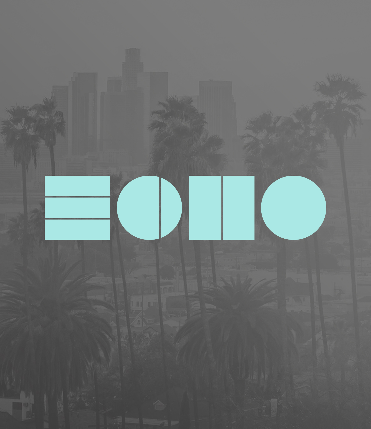
Echo Capital Group is an investment firm for Millennial entrepreneurs

Located in Denver and Los Angeles, Echo Capital Group is an Investment Firm for Millennial entrepreneurs in the Consumer Packaged Goods space. They wanted a brand identity that reflected their forward-thinking edge while maintaining a very professional image. The Avant-garde feeling stays away from “echo cliches” and gives them a unique presence in the financial industry.
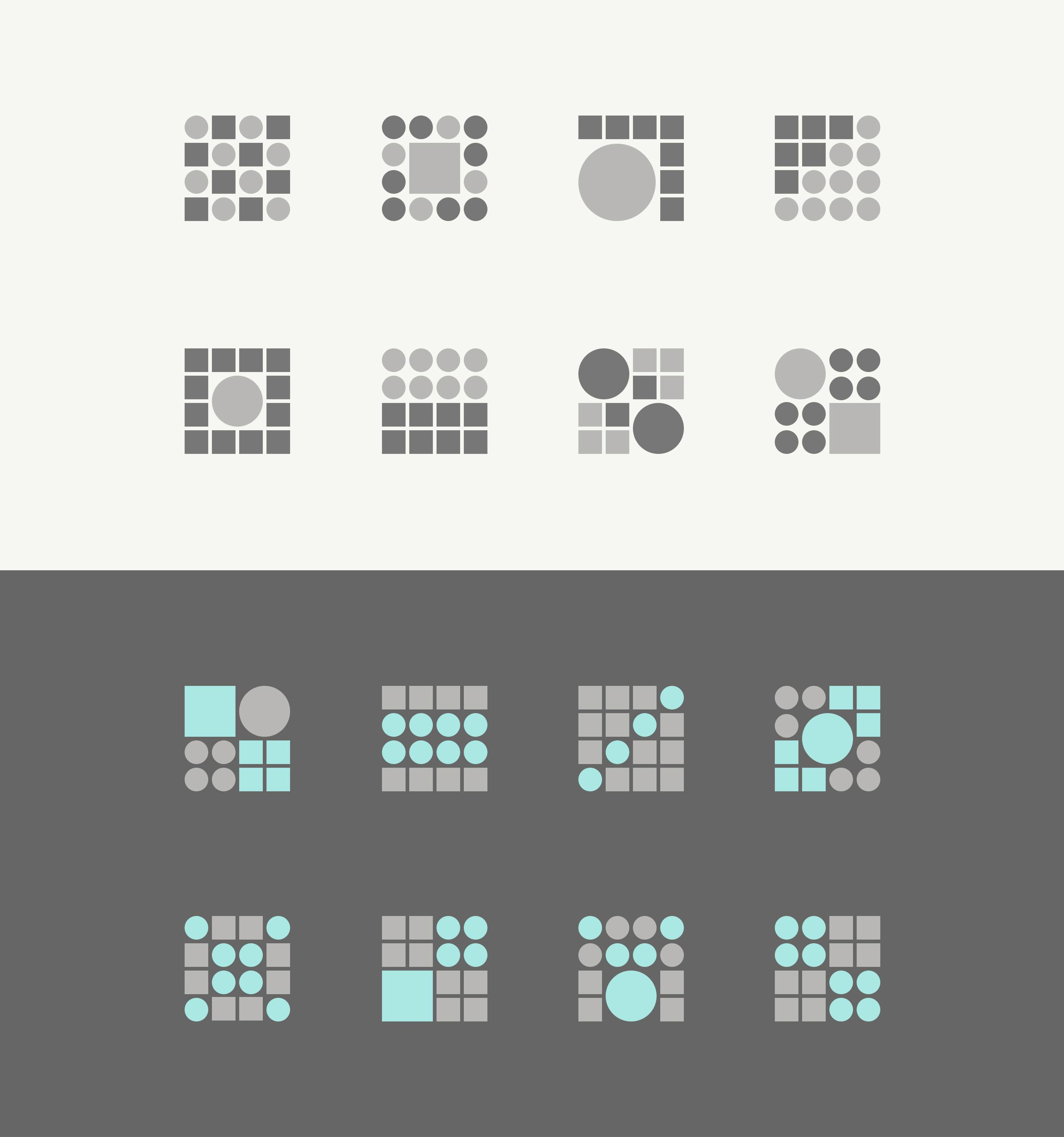
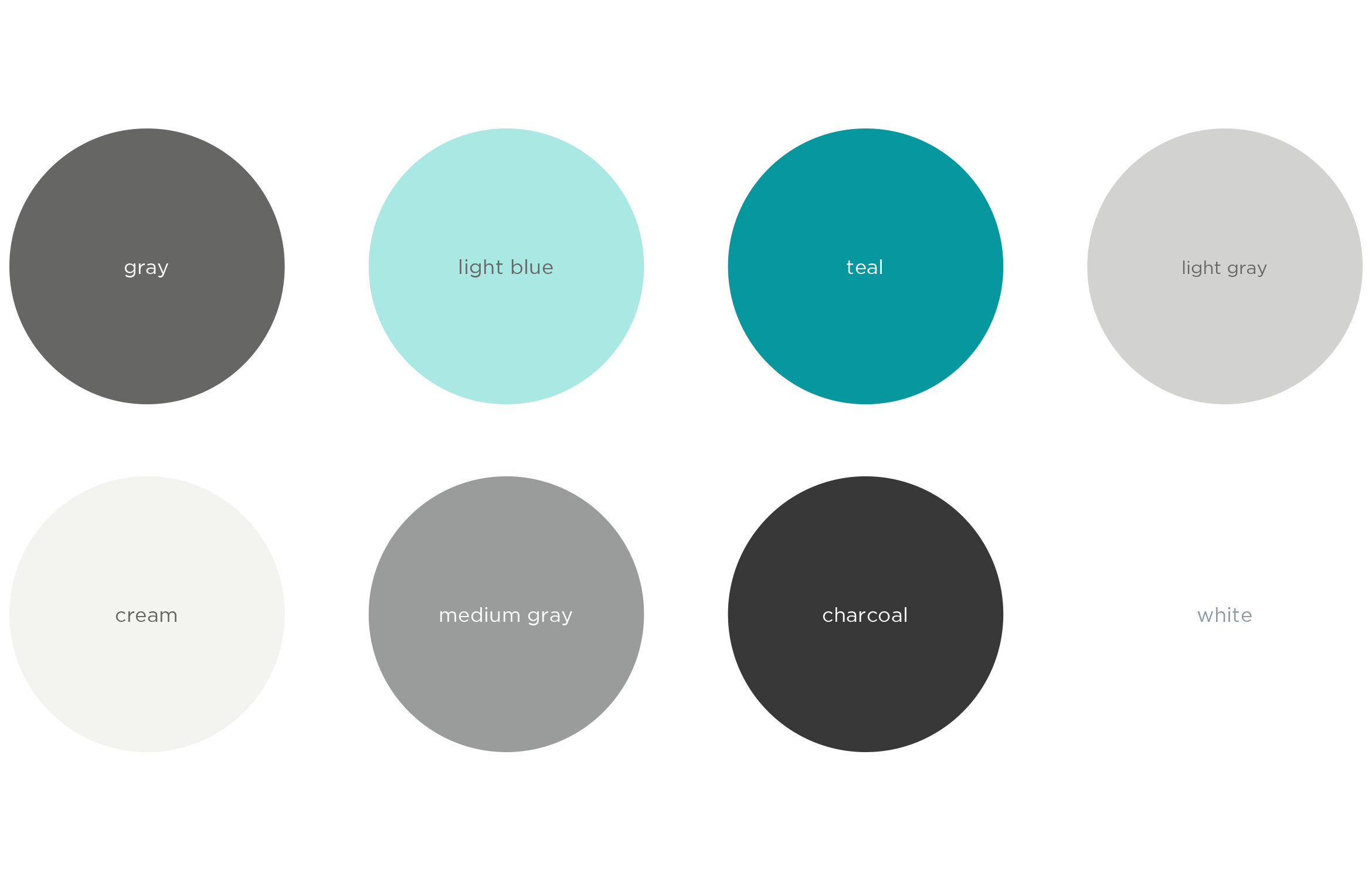
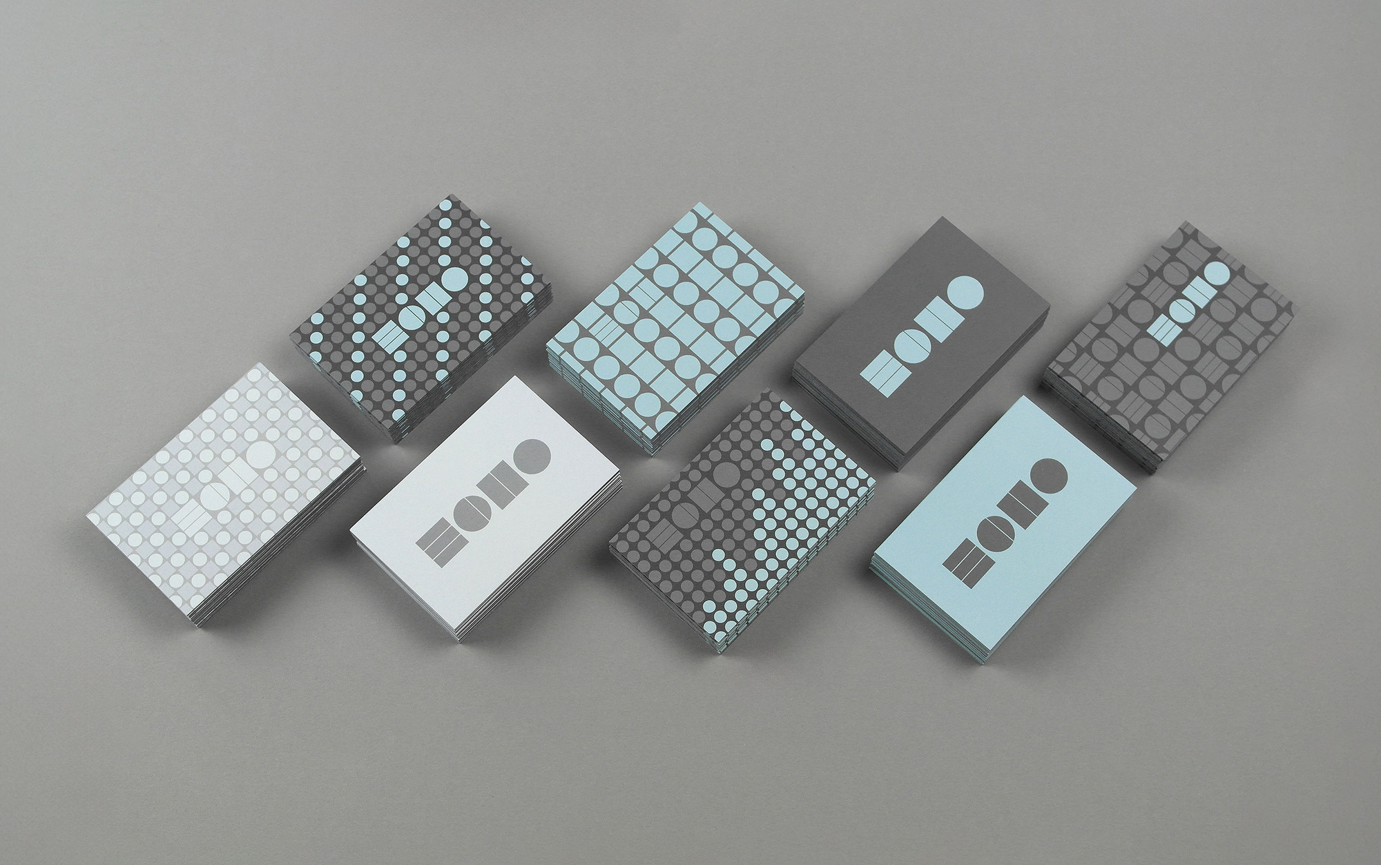
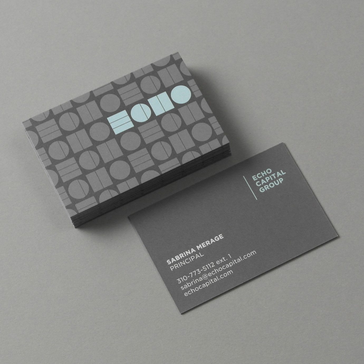
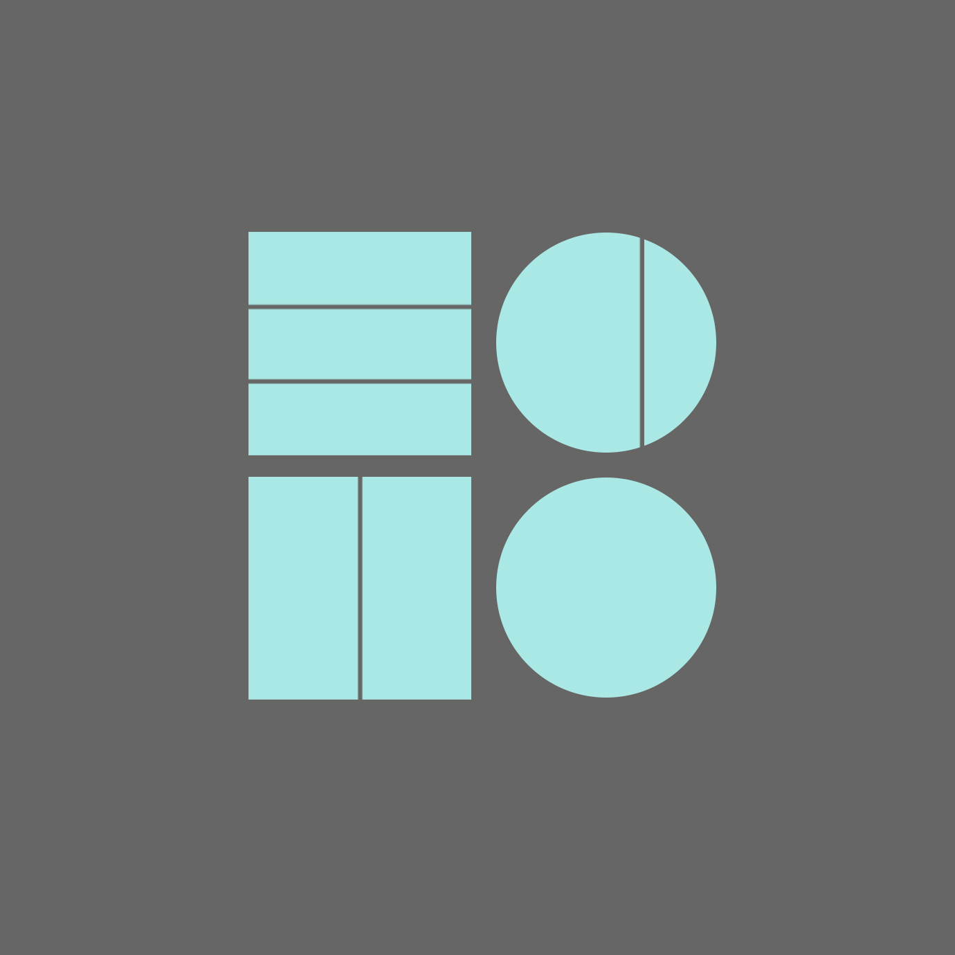
Simple shapes and unique colors create the repeating ECHO letterforms in the name, while the circles and squares lend themselves naturally to a system of patterns and icons. Together the visual identity feels like data, bar graphs or sums.
The responsive website utilizes scroll activated HTML5 animations, smart copy and immersive, entrepreneurial imagery colorized using the brand color palette.
Deliverables:
- Brand Identity
- Visual System
- Print Collateral
- Web Design
- Animated Icons
- Copywriting