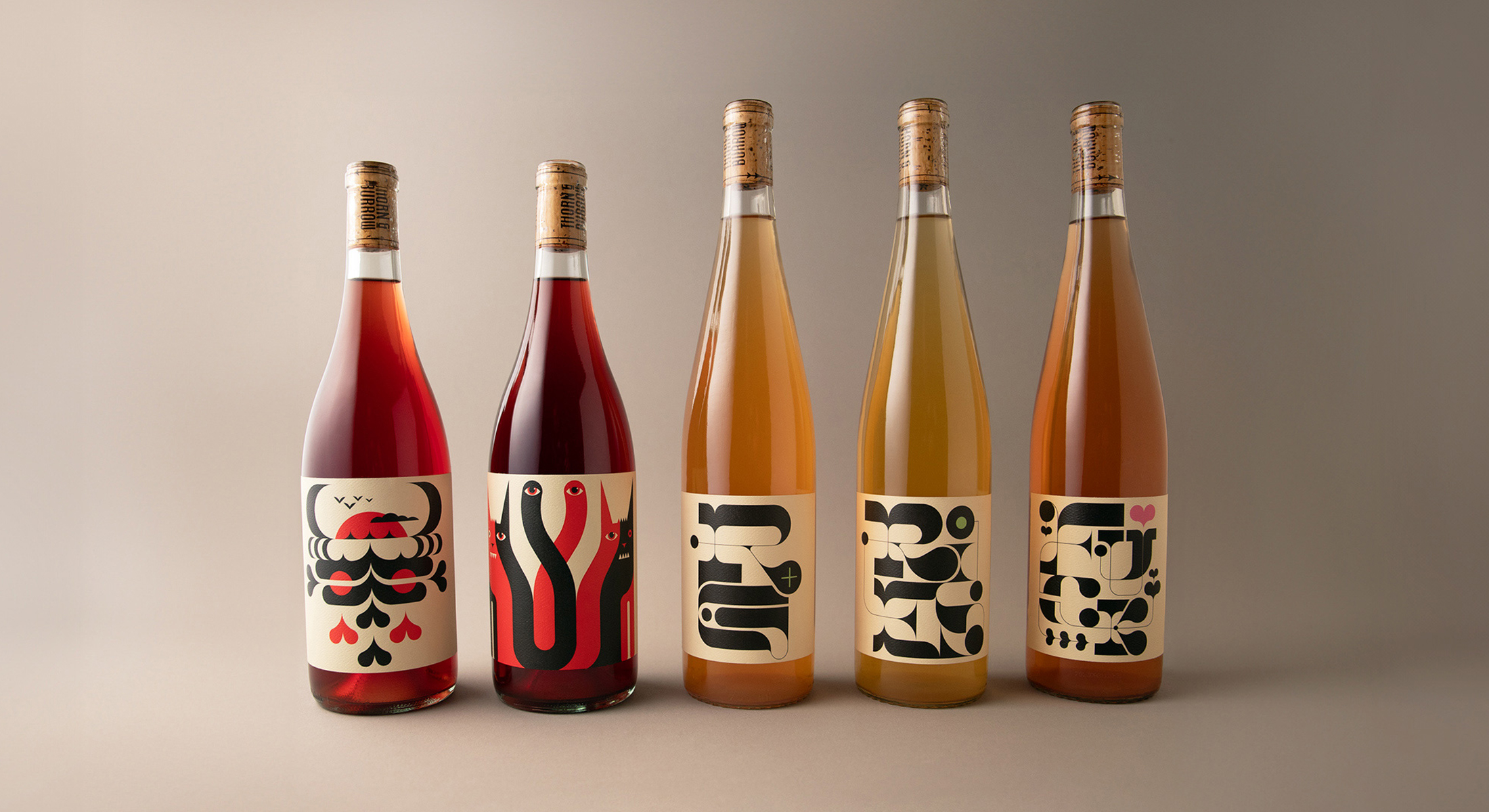
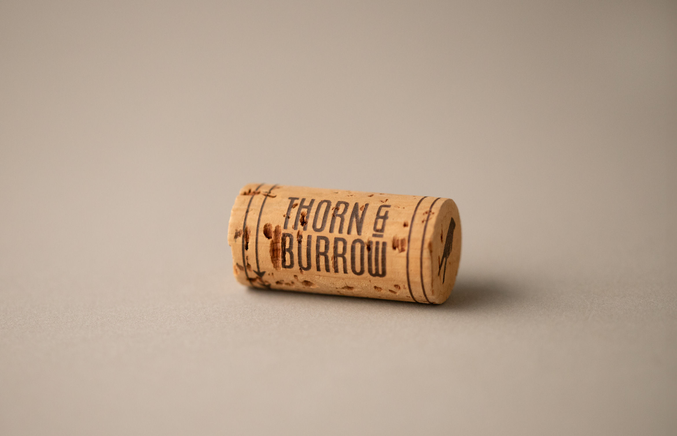
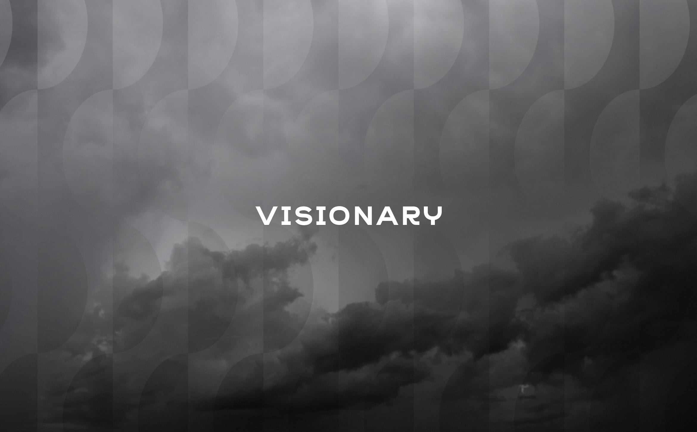
Thorn & Burrow Wines embraces the strange
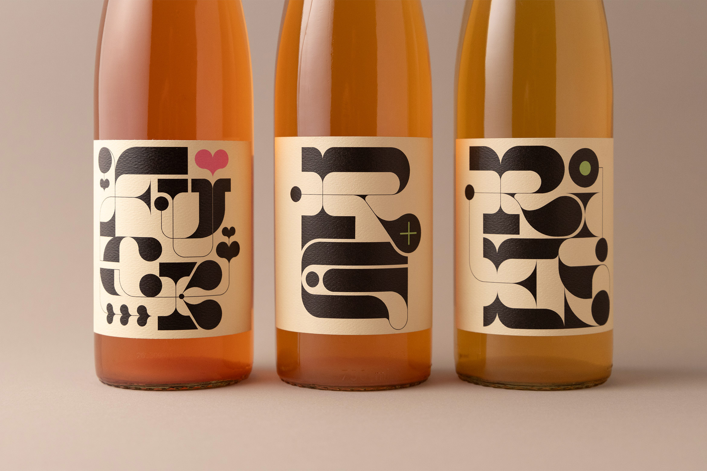
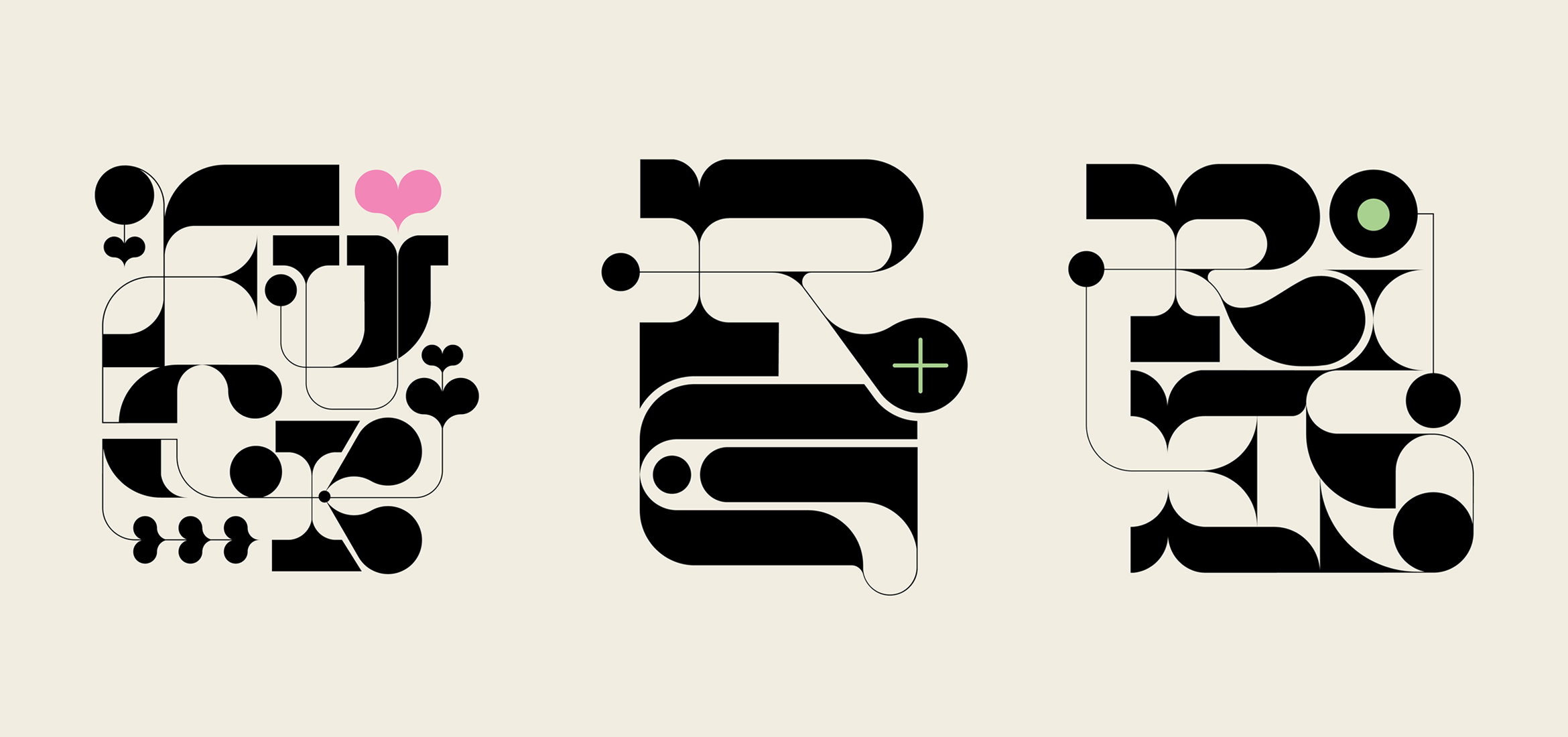
Thorn & Burrow Wines is a natural wine company located in Vancouver, British Columbia that creates unique and unconventional wine blends found nowhere else. To pair with each blend they wanted creative and offbeat label designs that establish them as visually unique as their wines.
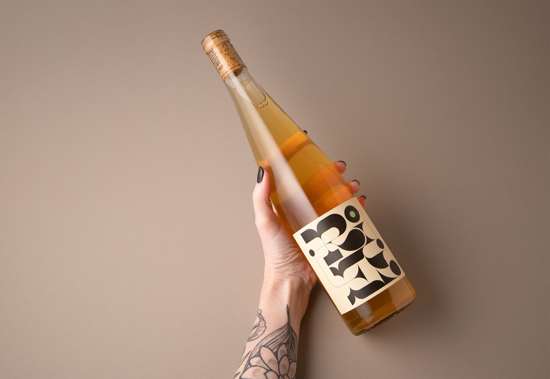
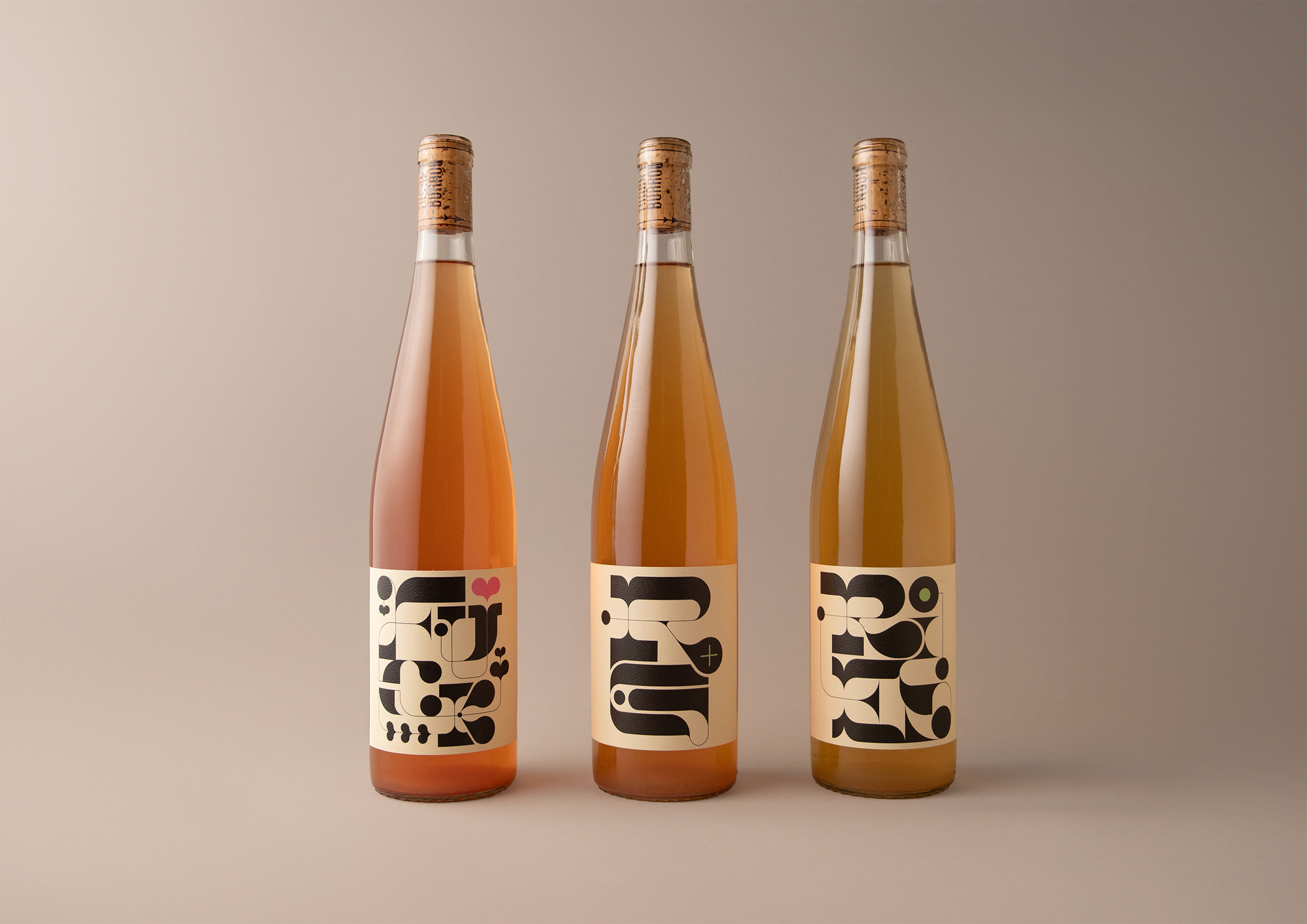
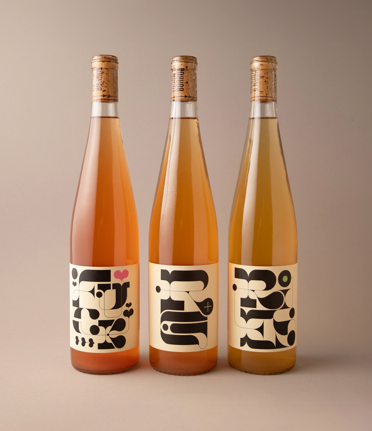
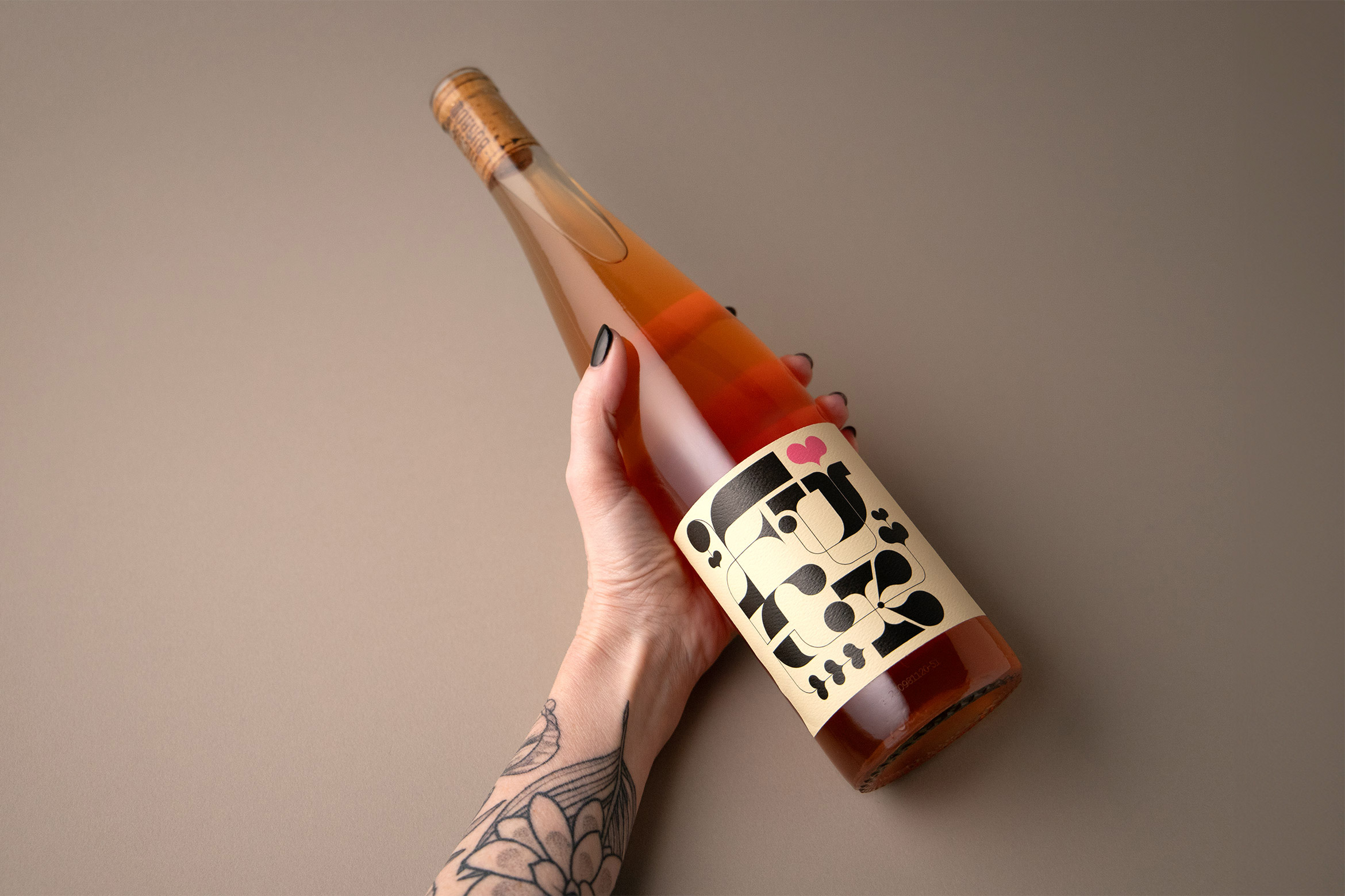
For the whites RG+ and RIES and the F*CK Rosé we created an organic and high-contrast family of custom typographic illustrations.
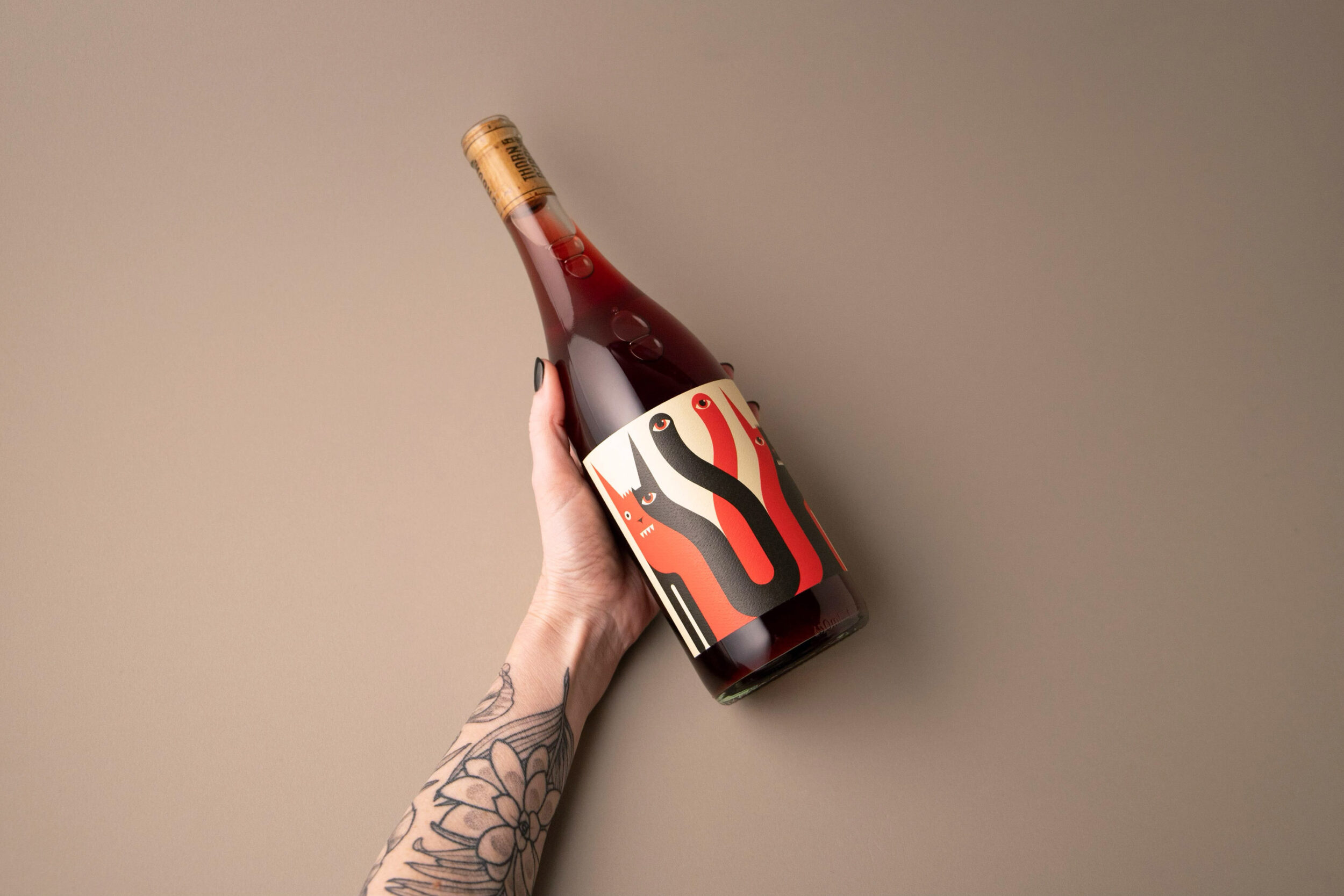
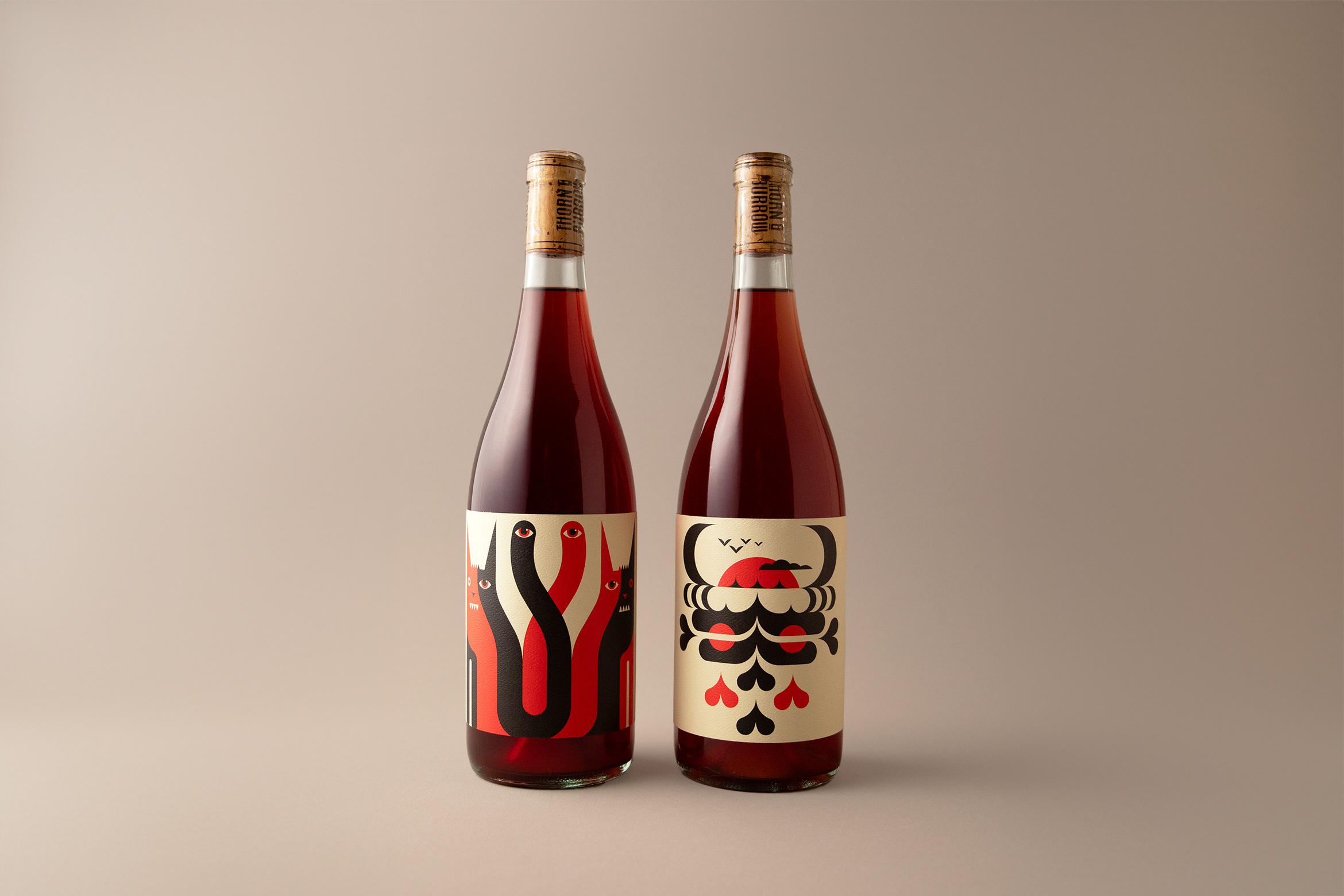
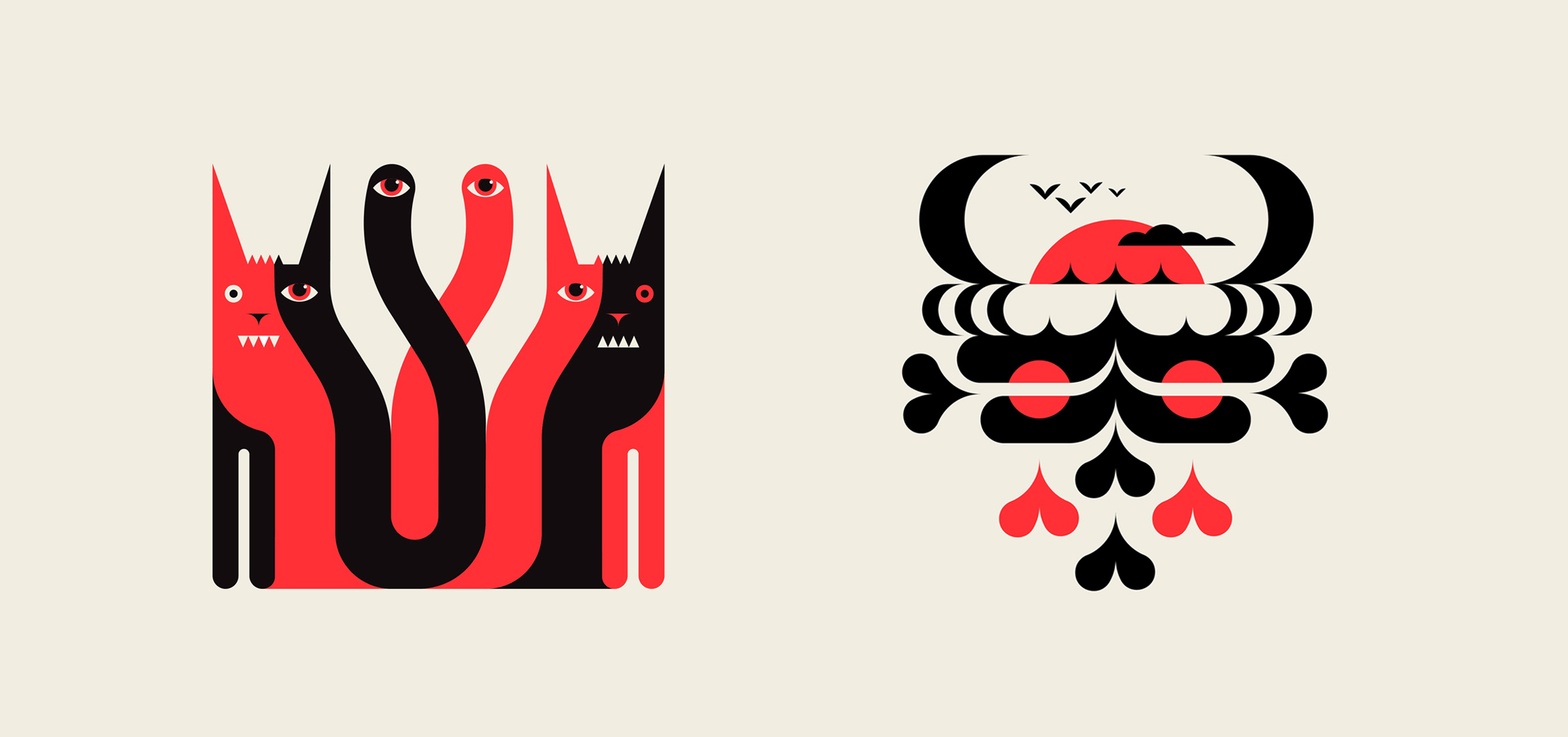
For the reds, the duo of Grumpy Cats and a Salty Pirate was used for an edgy, rebellious look that dares the consumer to try what’s inside.
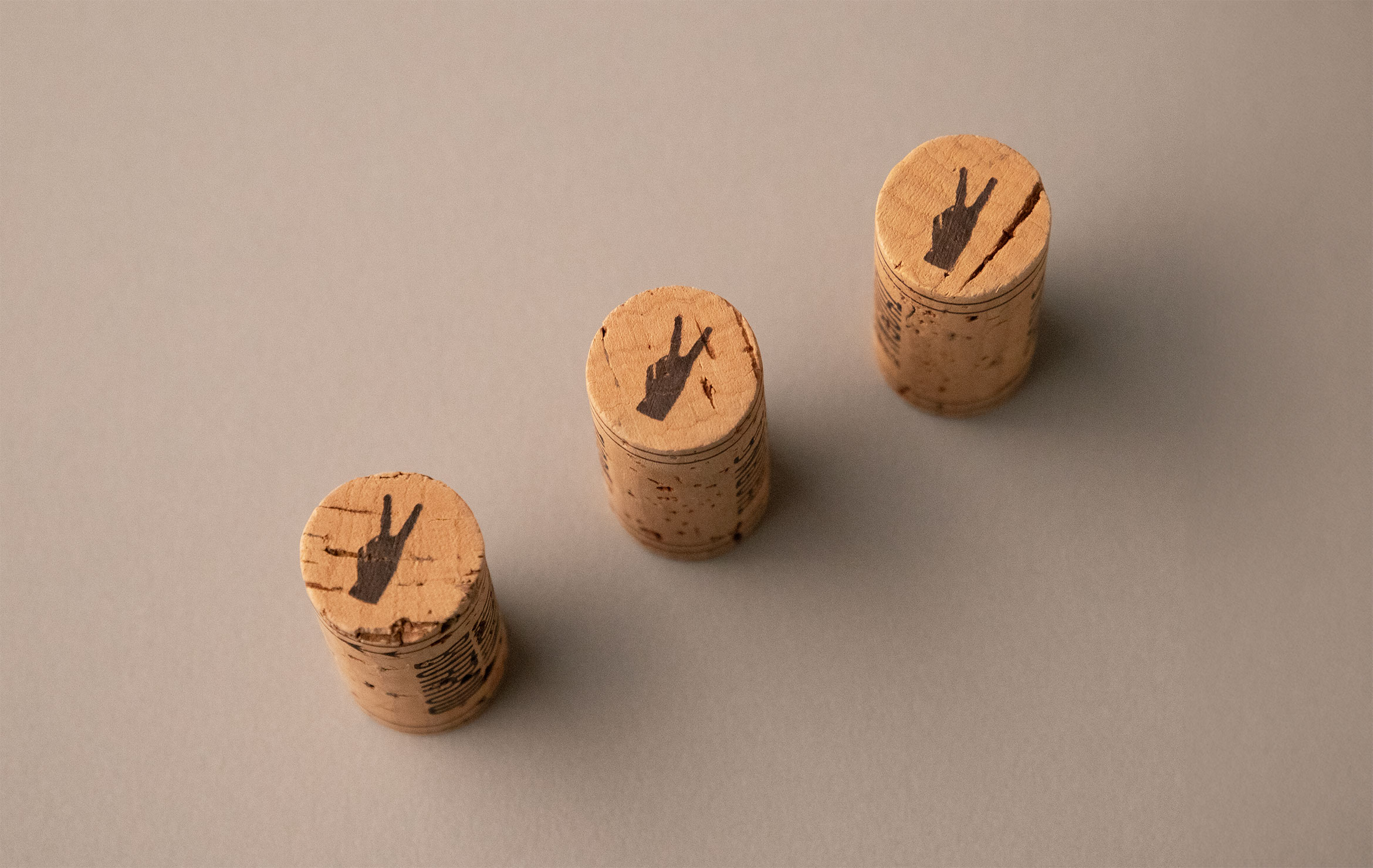
A T&B monogram was designed to match the creative style for use on the back of all labels and informational materials.
More info about the ecclectic wines:
Los Angeles Times 101 Best List
branding / illustration
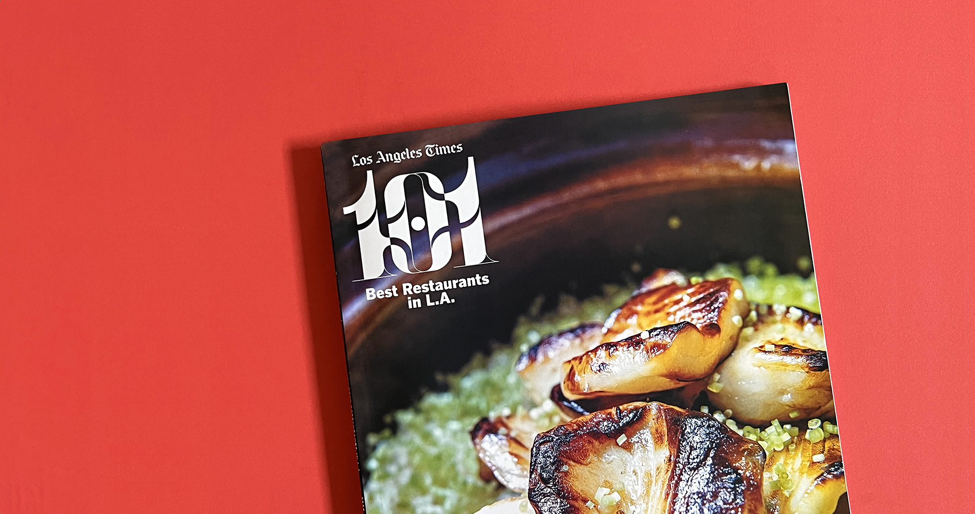
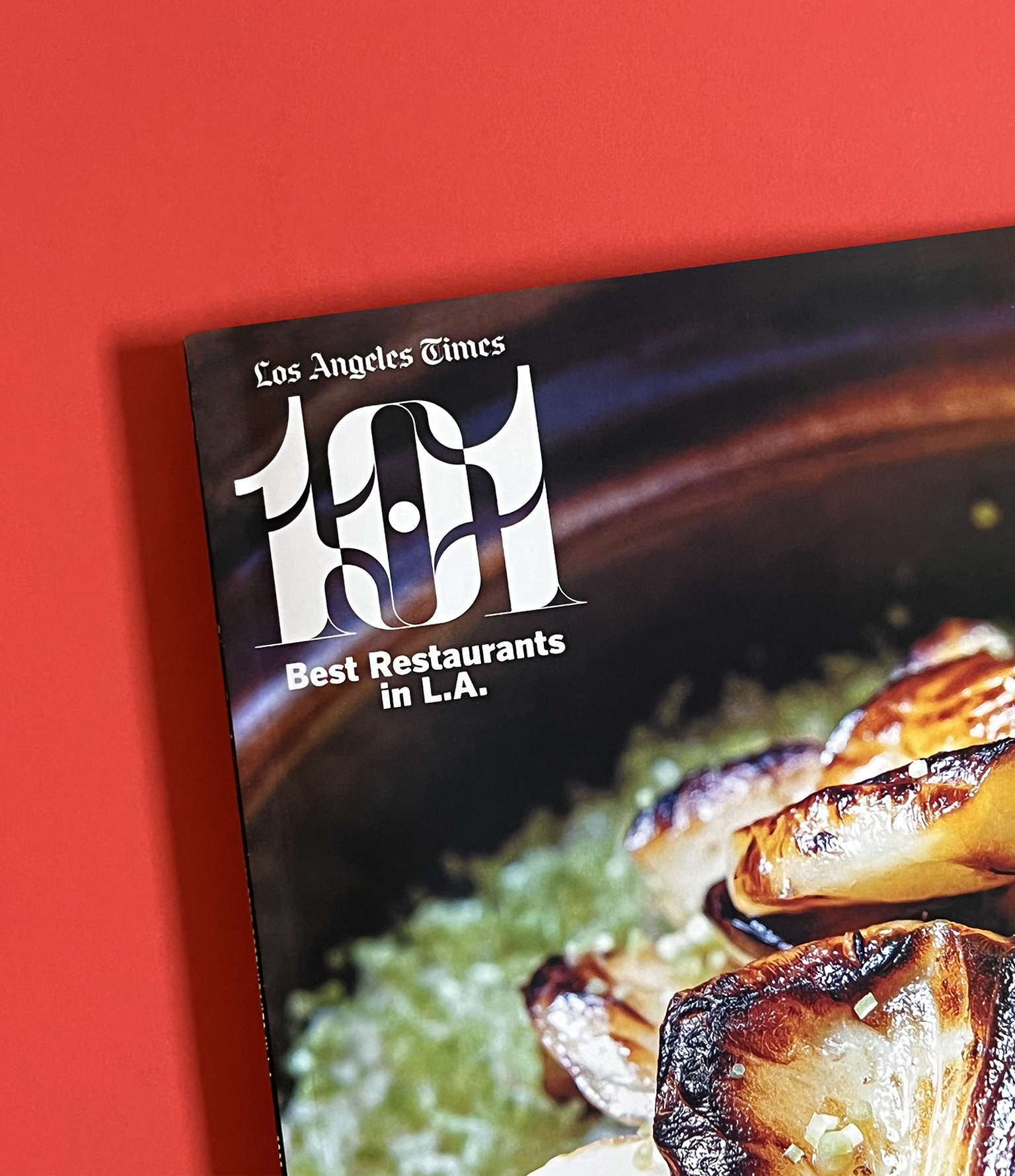
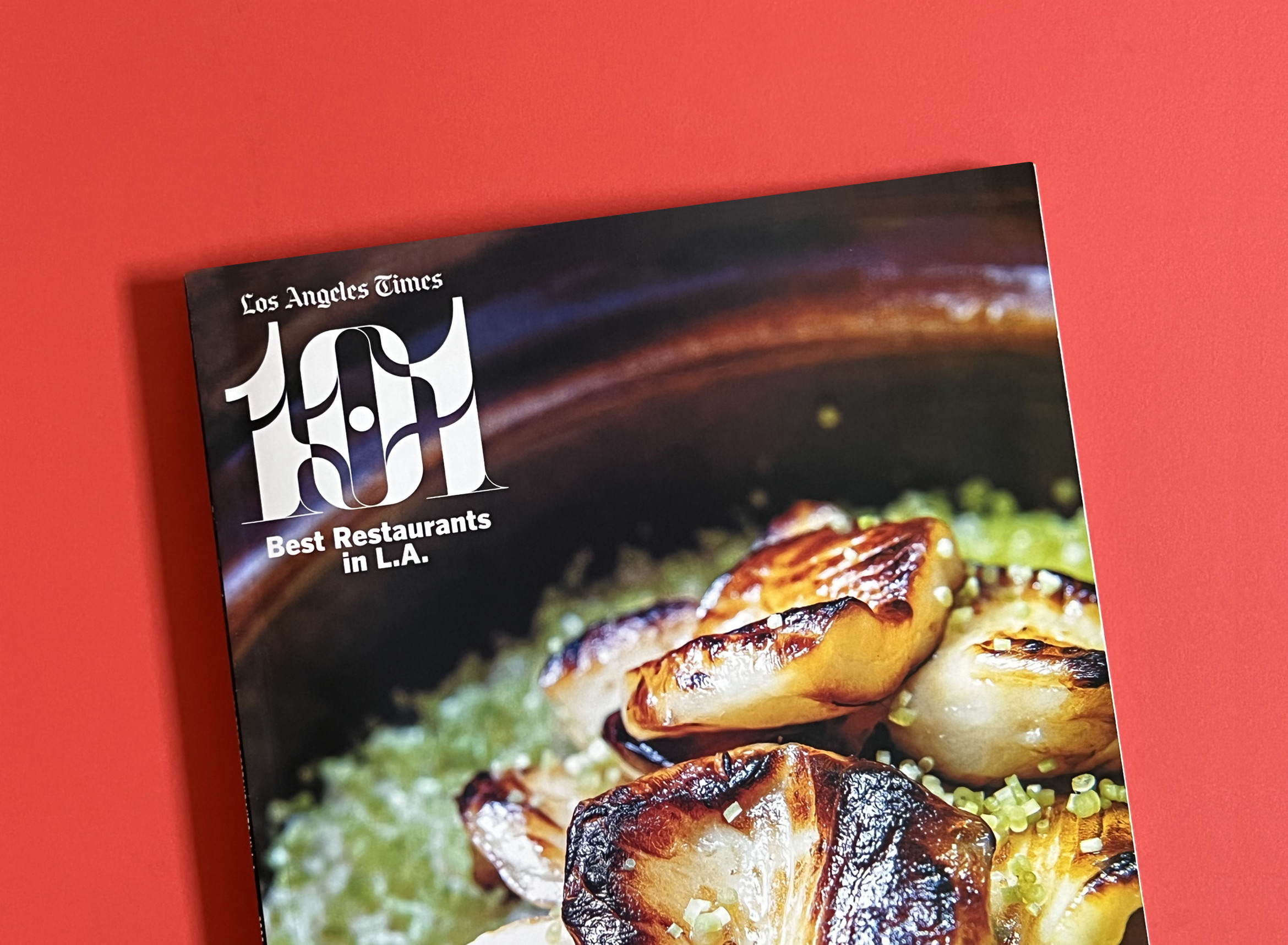
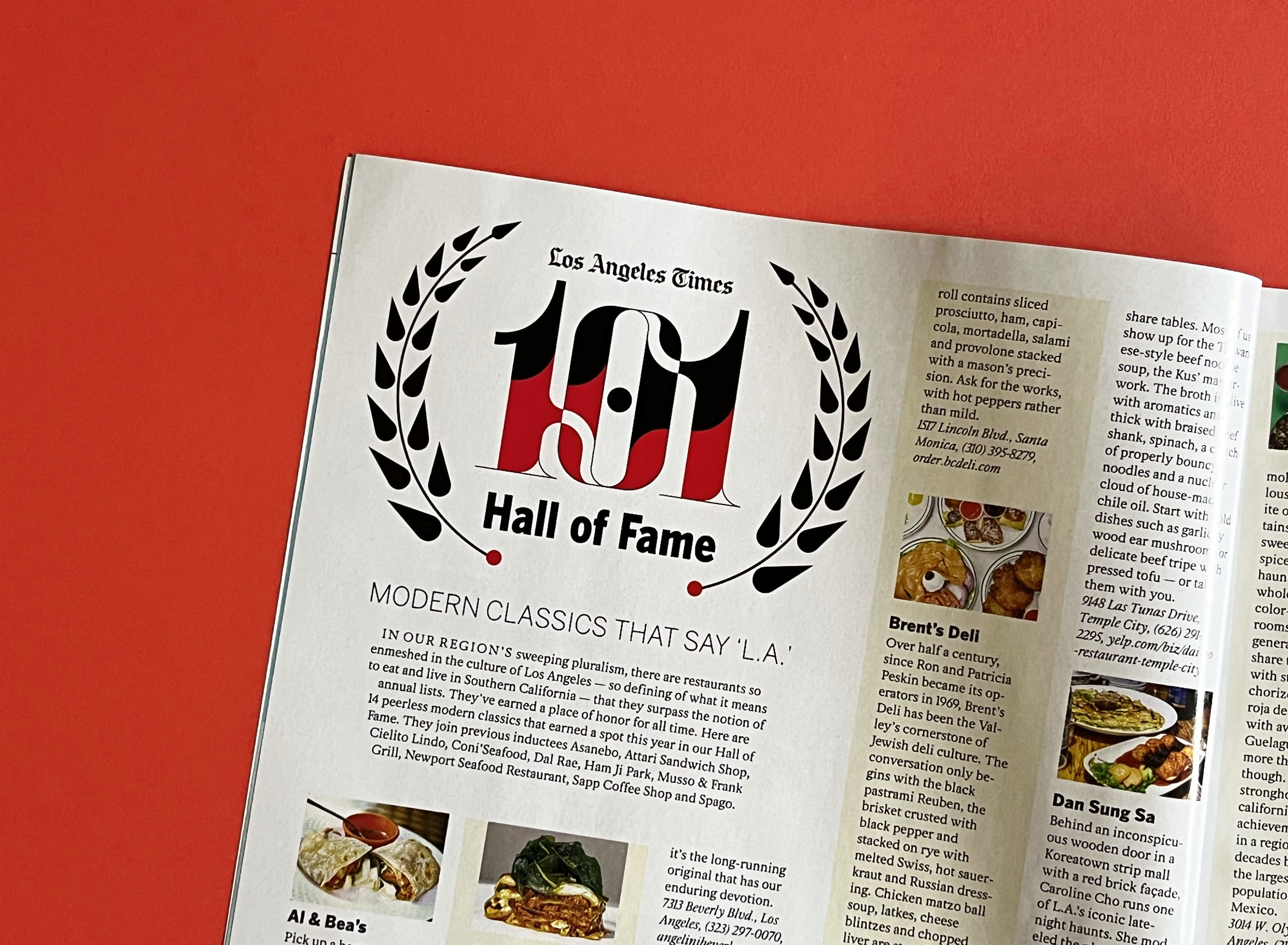
Los Angeles Times 101 Best Restaurants in LA List is Delicious
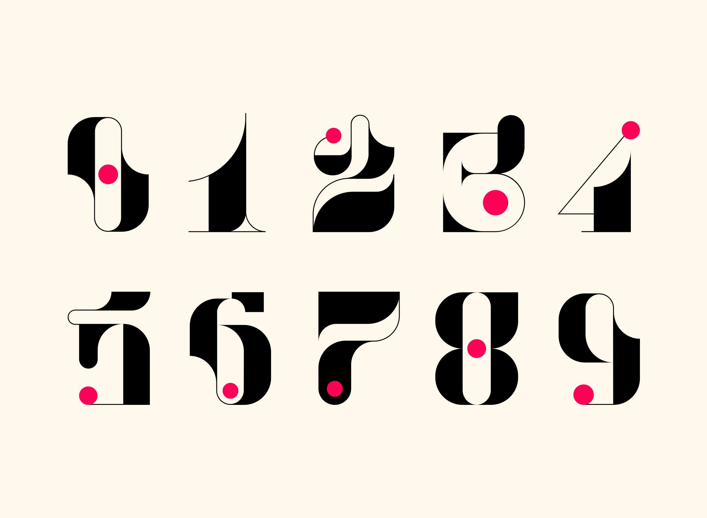
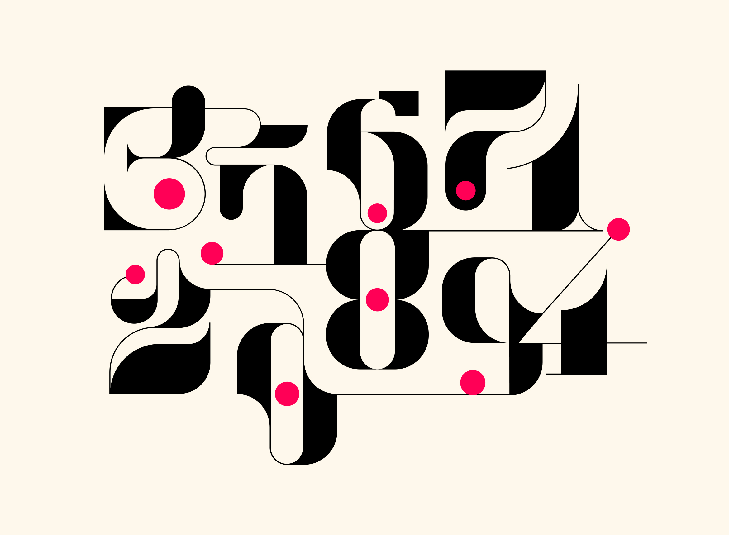
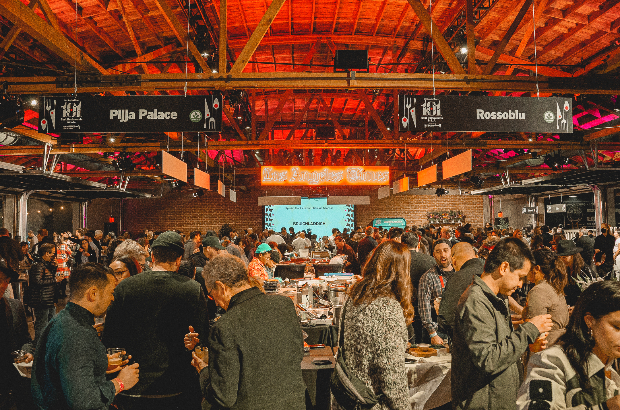
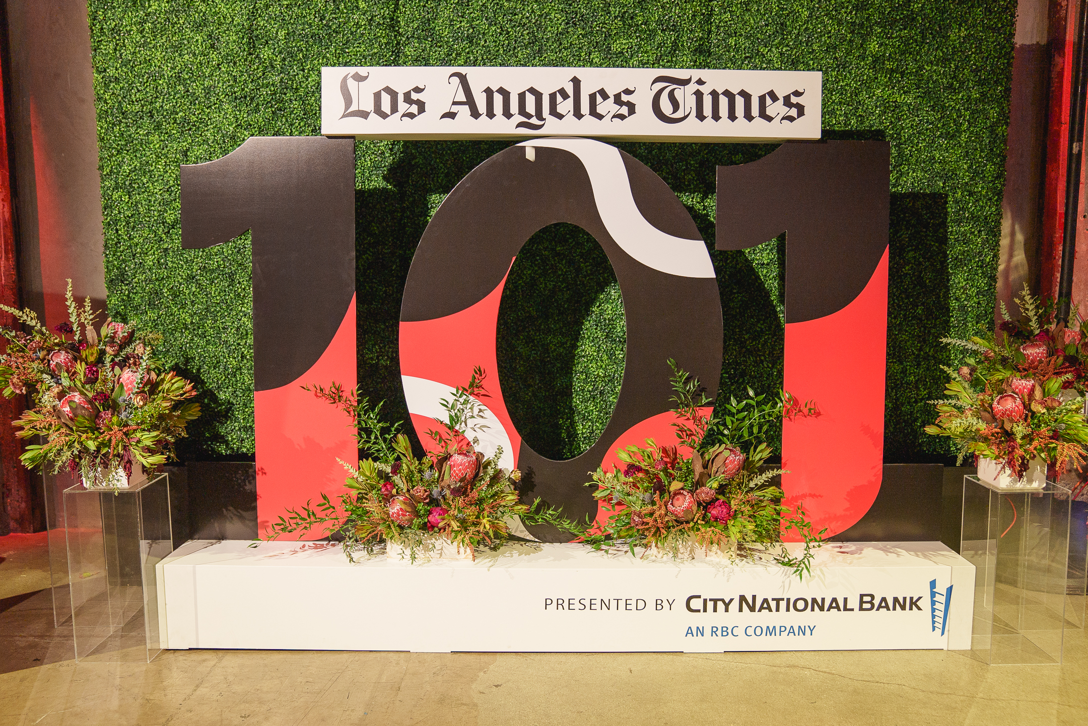
The Los Angeles Times asked us to design the visual identity for their annual 101 Best Restaurants list curated by restaurant critic Bill Addison. This year’s theme was “The Art of Food” which celebrates chefs as artists and focuses on their craft. We wanted to echo the idea of artistry and imagination through playful typography, icons and graphics and carry that theme through all print and digital materials and the live event itself.
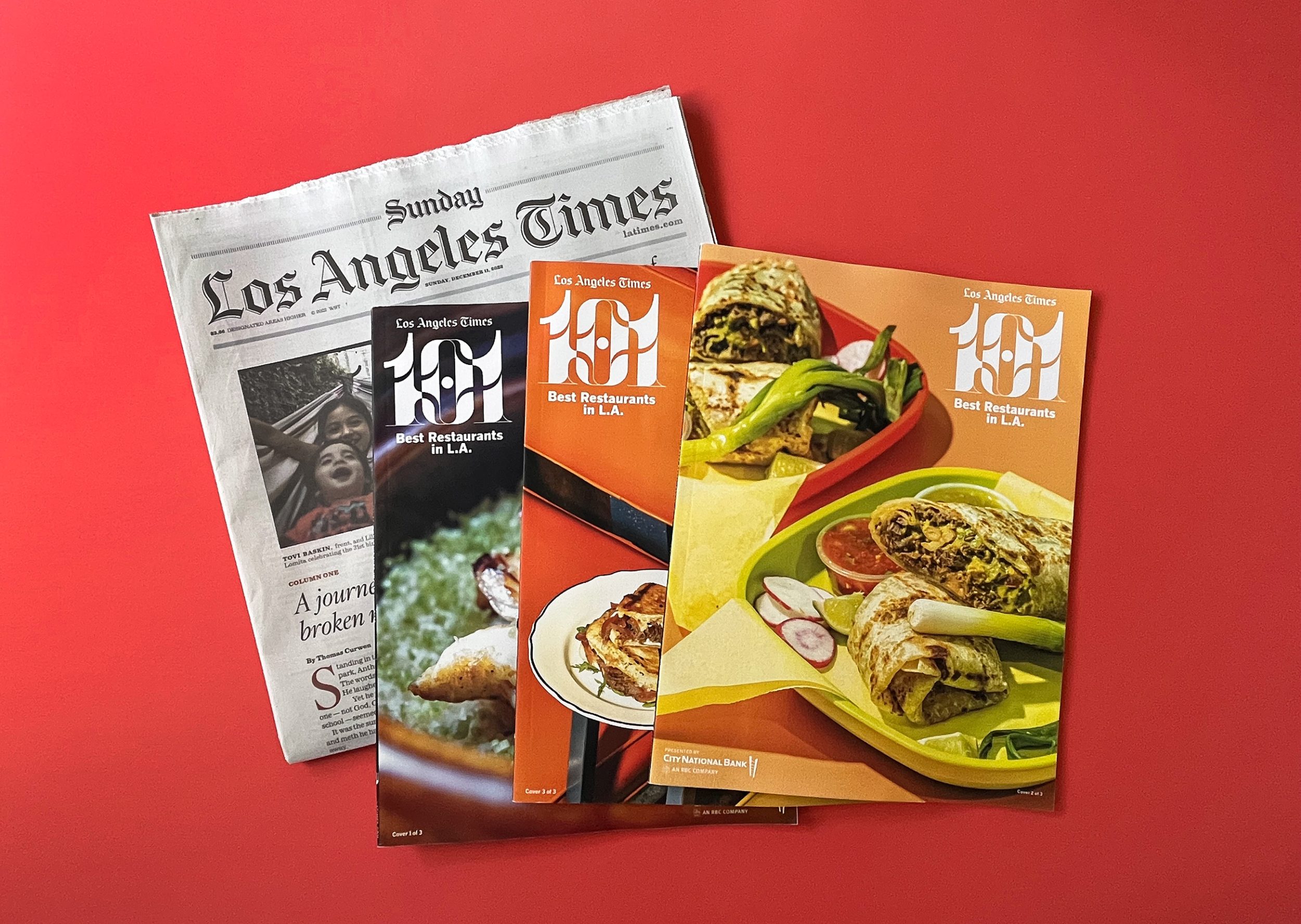
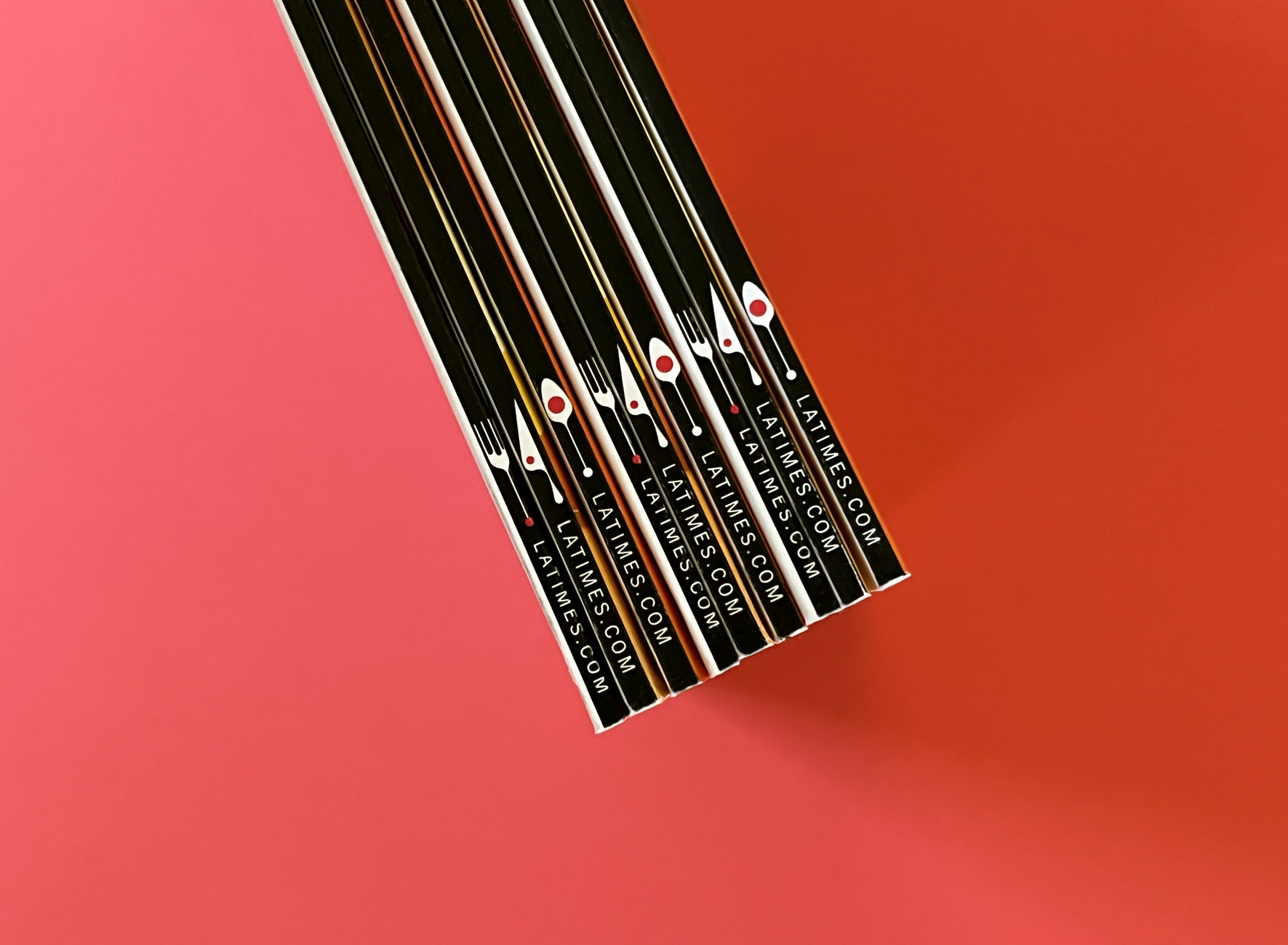
The 101 Best List can be viewed as an interactive microsite on the LA Times website, as well as a print magazine with three different covers arriving in that Sunday’s paper.
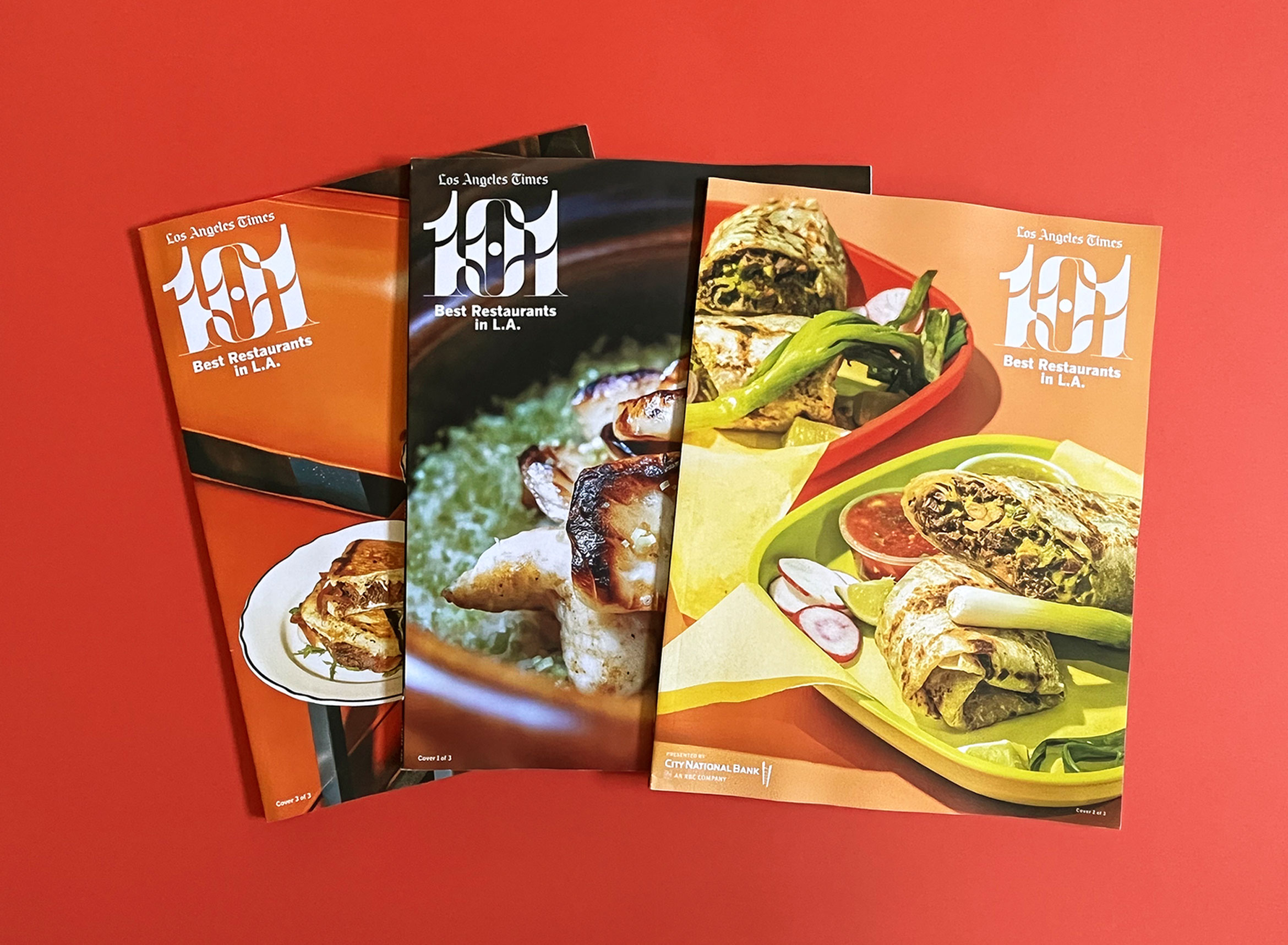
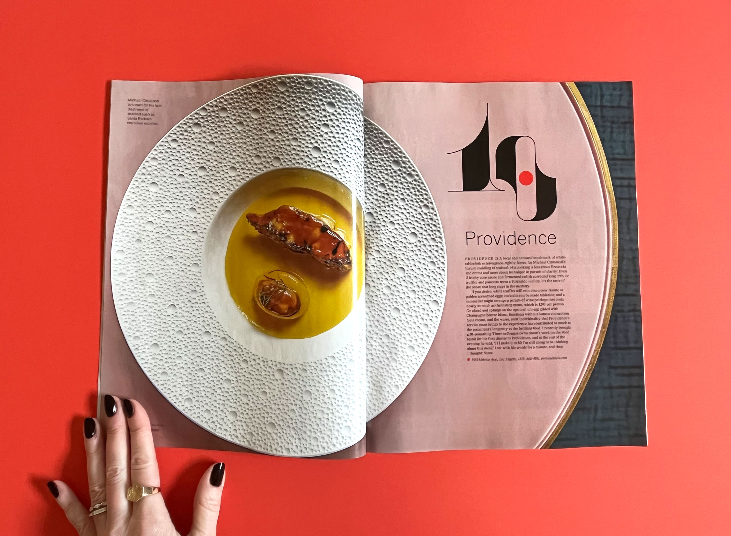

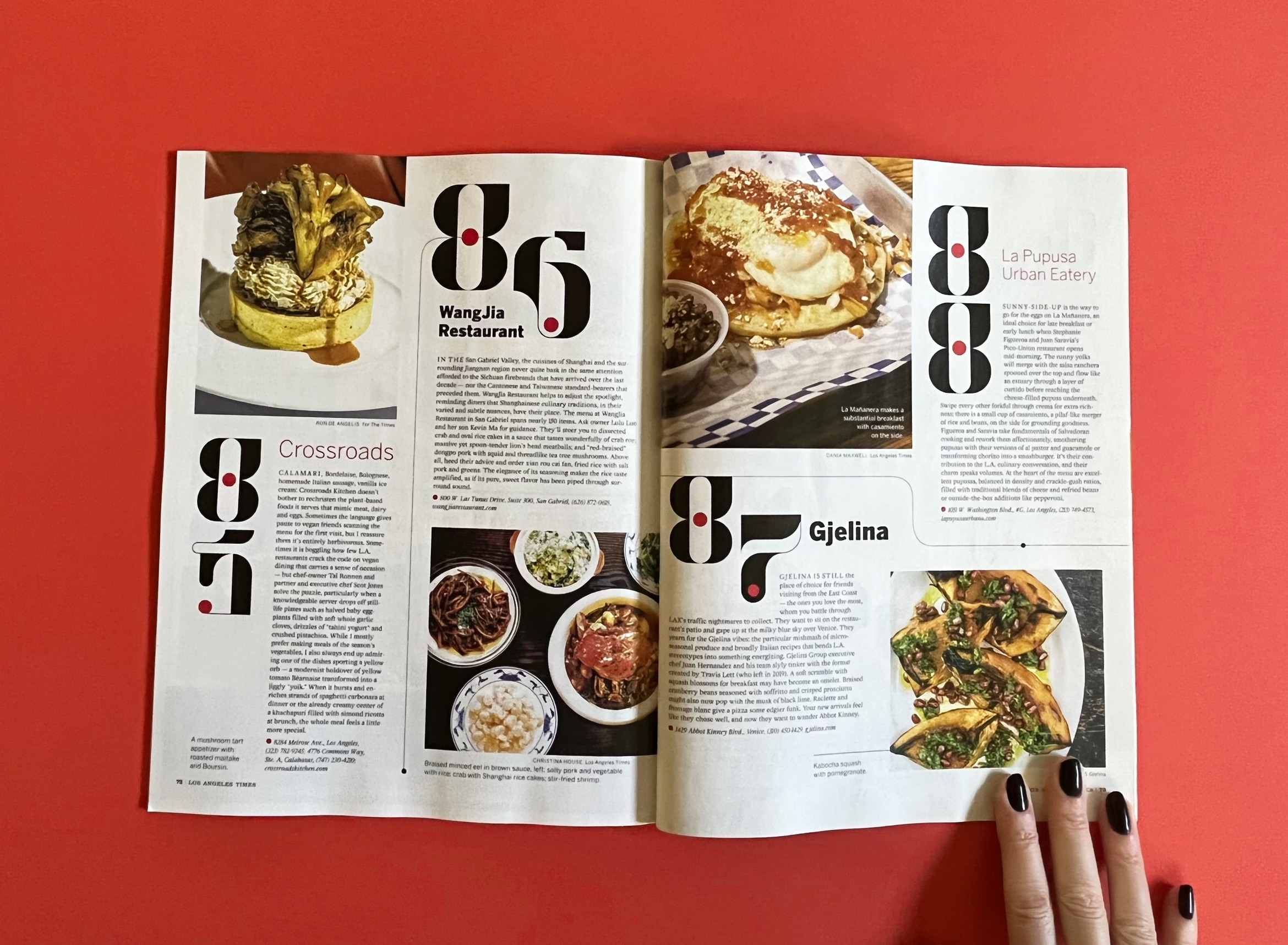
Icons of a cocktail, fork, knife and spoon in the same Messymod illustration style were used for signage at the food event. And as a little surprise, they distinguish each of the 3 magazine cover spines.
Creative Director: Amy King
Design Director: Taylor Le
Art Director: Kay Scanlon
Motion Design: Li Anne Liew
Photographers: Mariah Tauger, Ricardo DeAratanha, Myung J. Chun, Kirk McKoy, Calvin B. Alagot, Jay L. Clendenin, Dania Maxwell, Christina House, Stephanie Breijo, Ron De Angelis, Shelby Moore, Silvia Razgova, Annie Noelker, Yasara Gunawardena, Dylan + Jeni, Carter Hiyama, Katrina Frederick
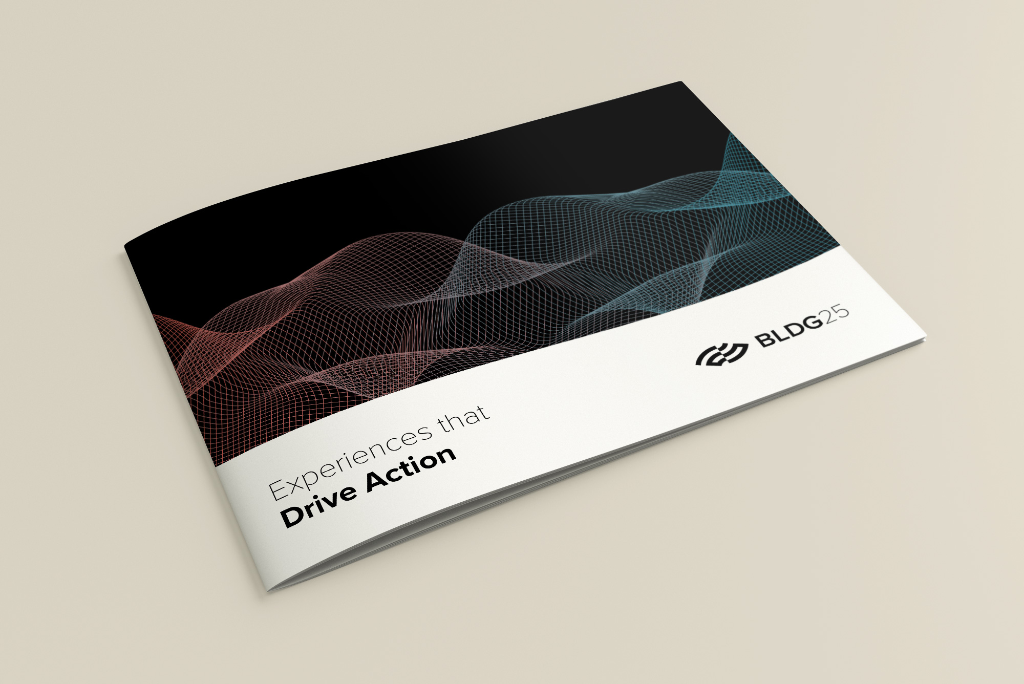
BLDG25 experience design
technology / brand identity / website
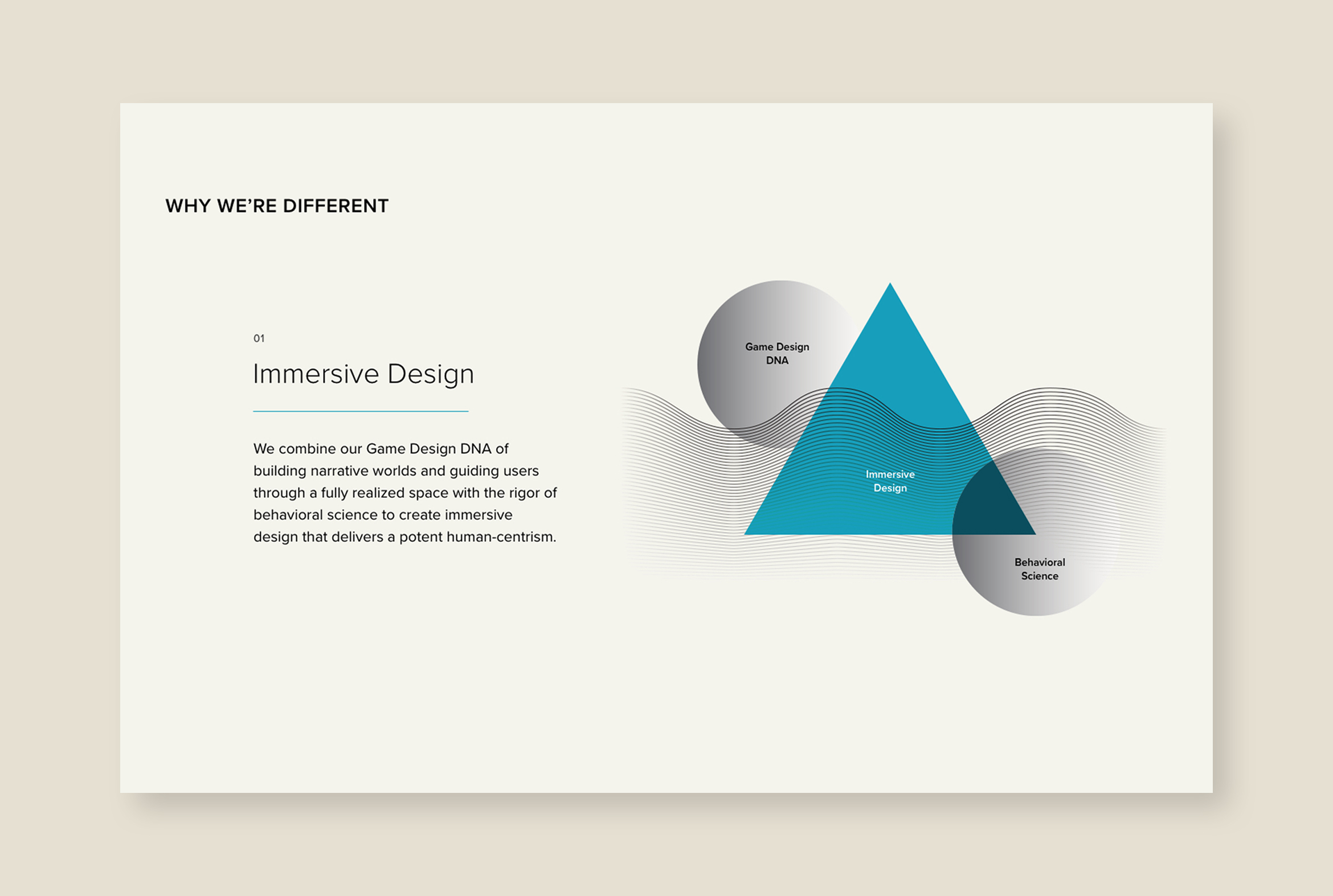
BLDG25 is where game design meets behavioral science to deliver tech solutions
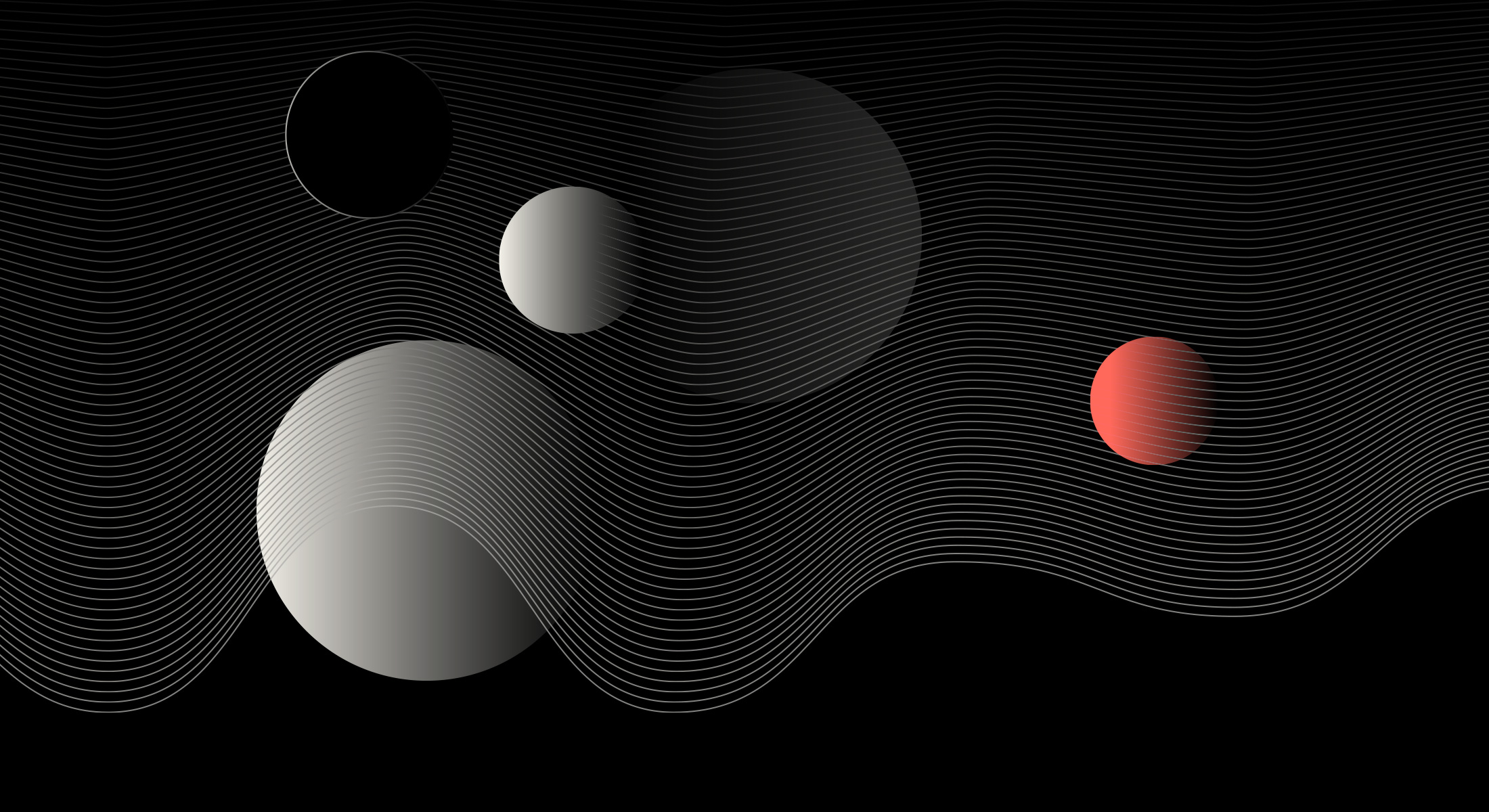
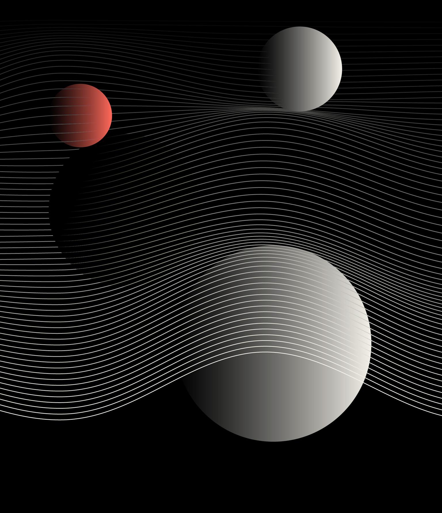
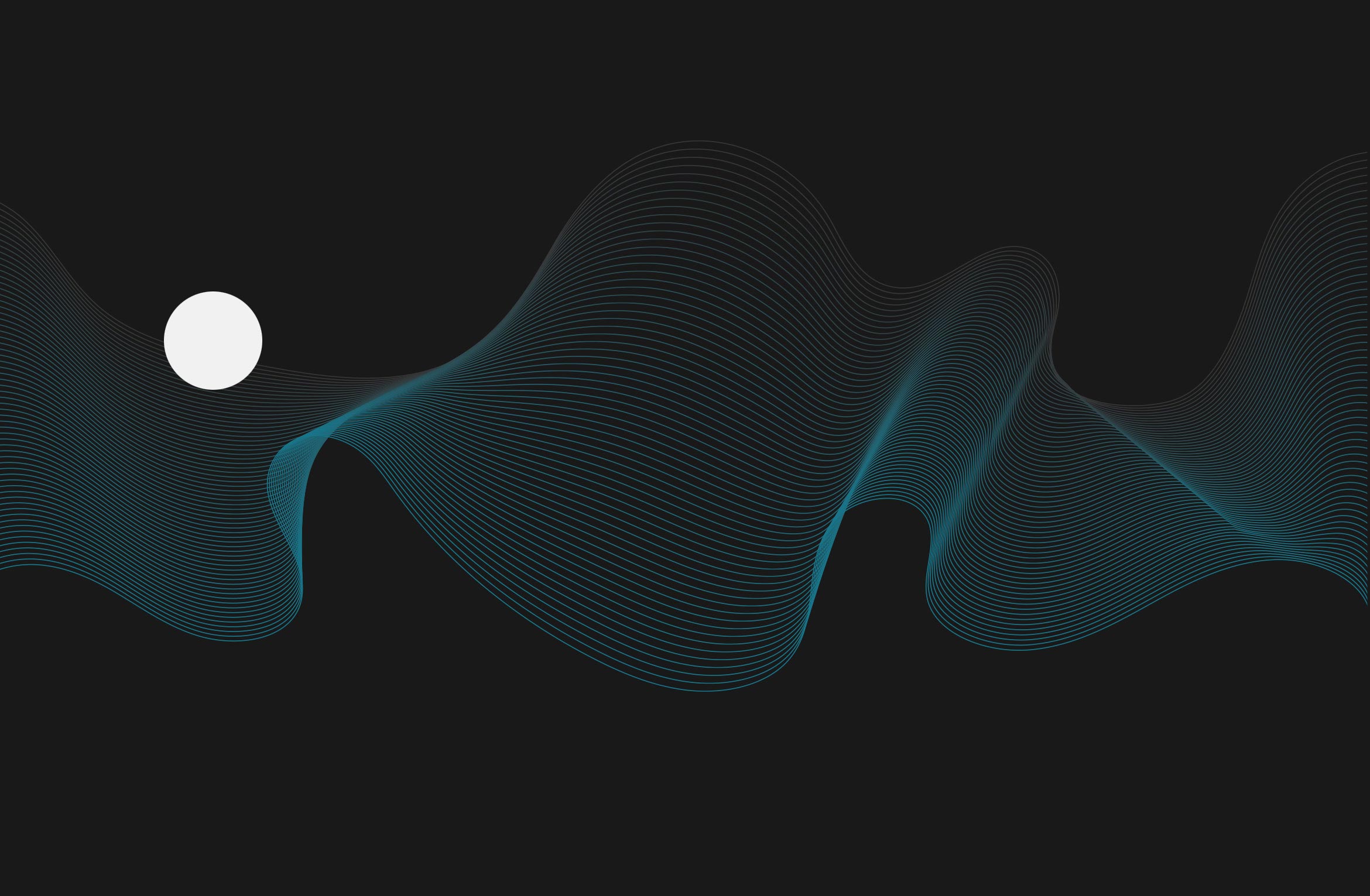
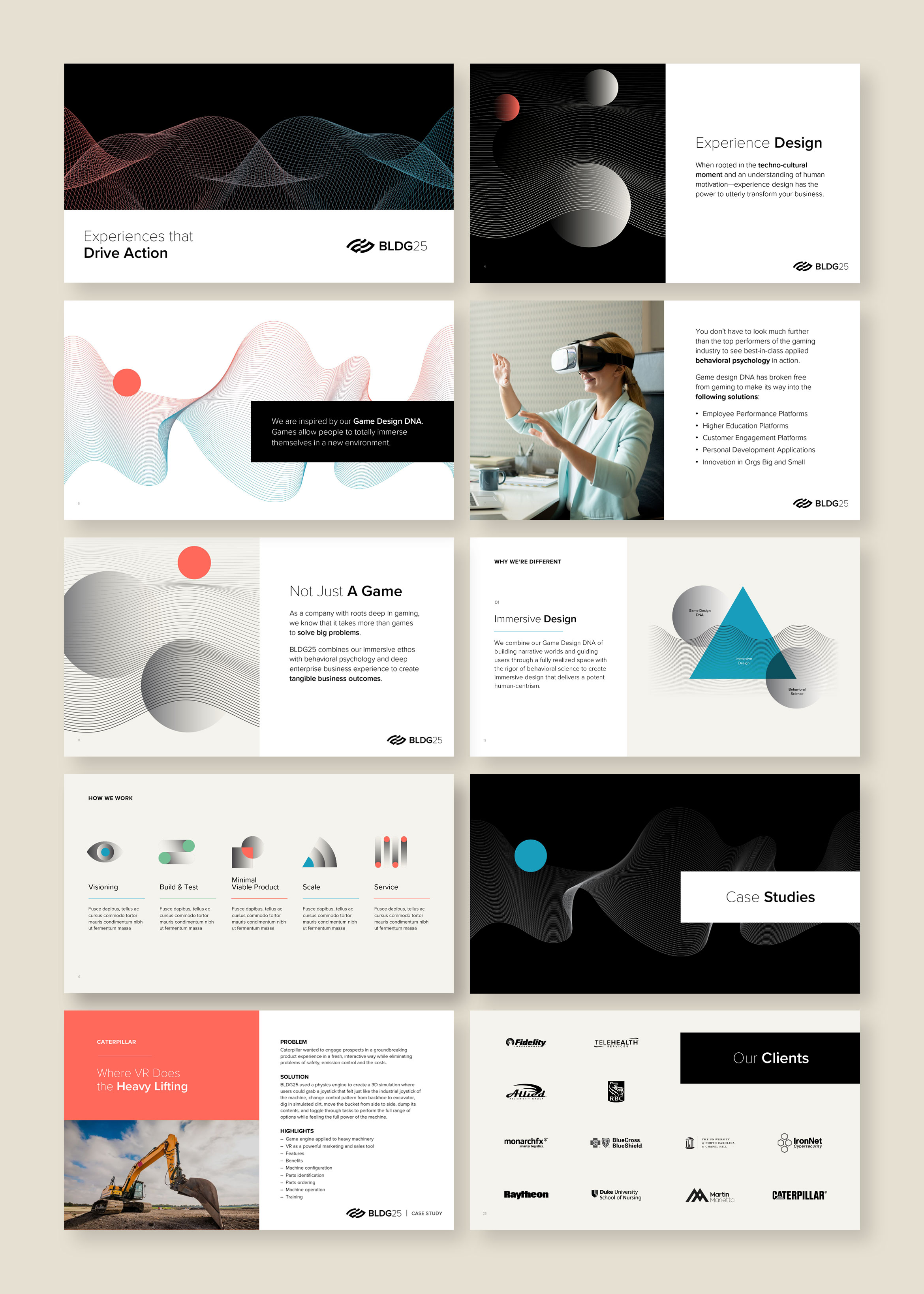
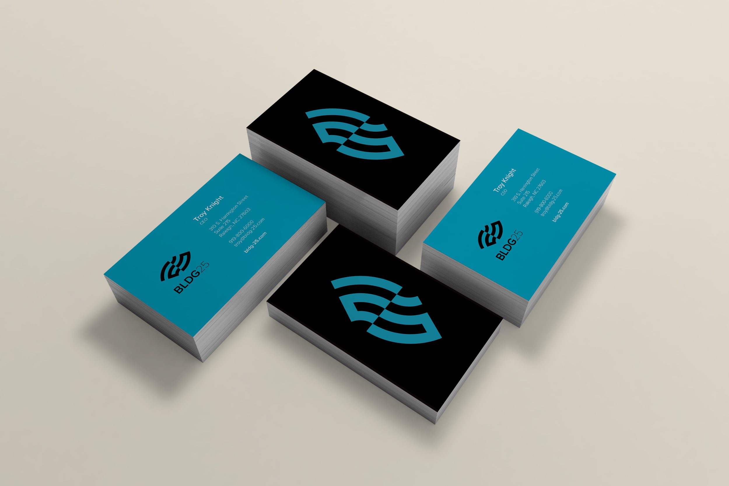
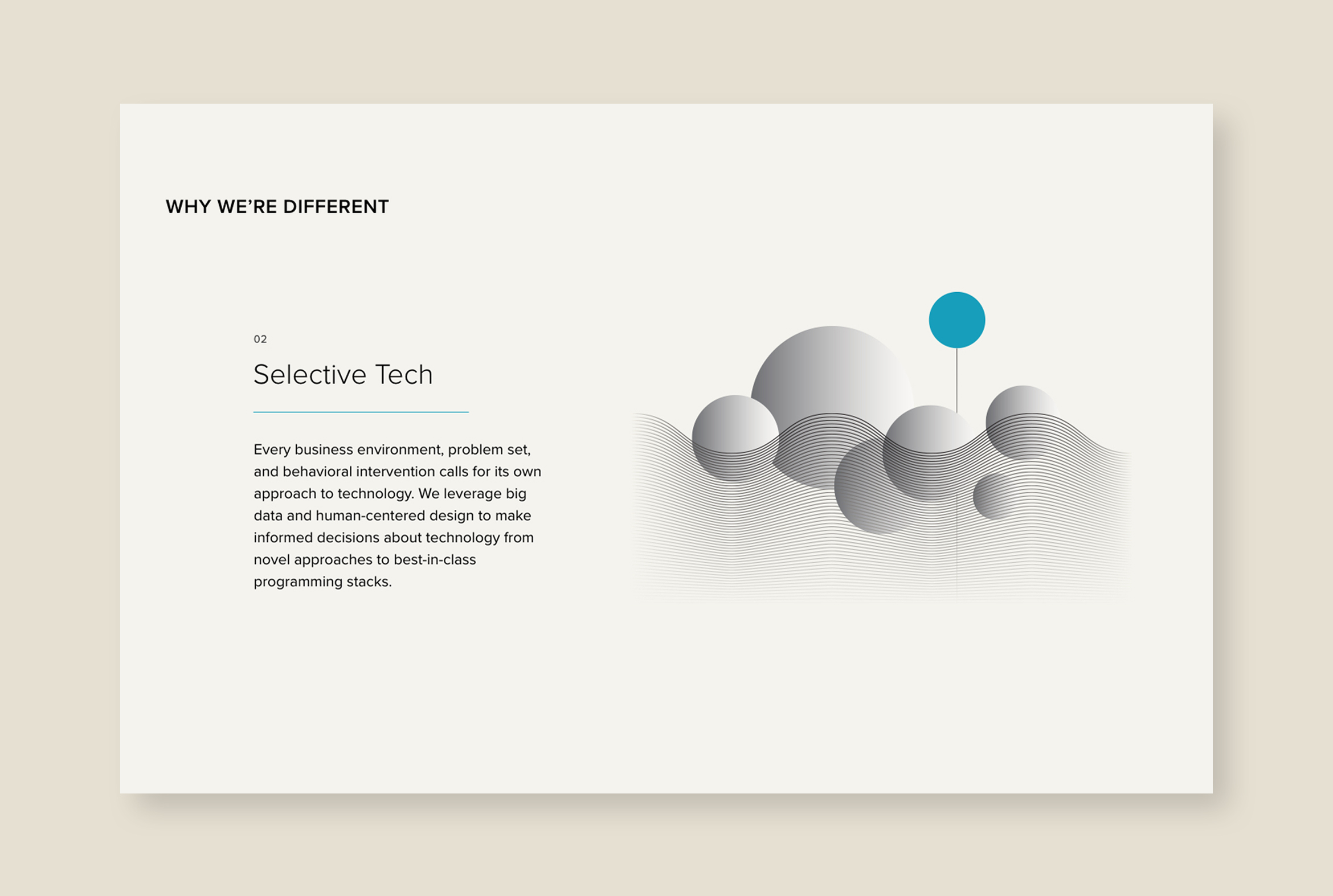
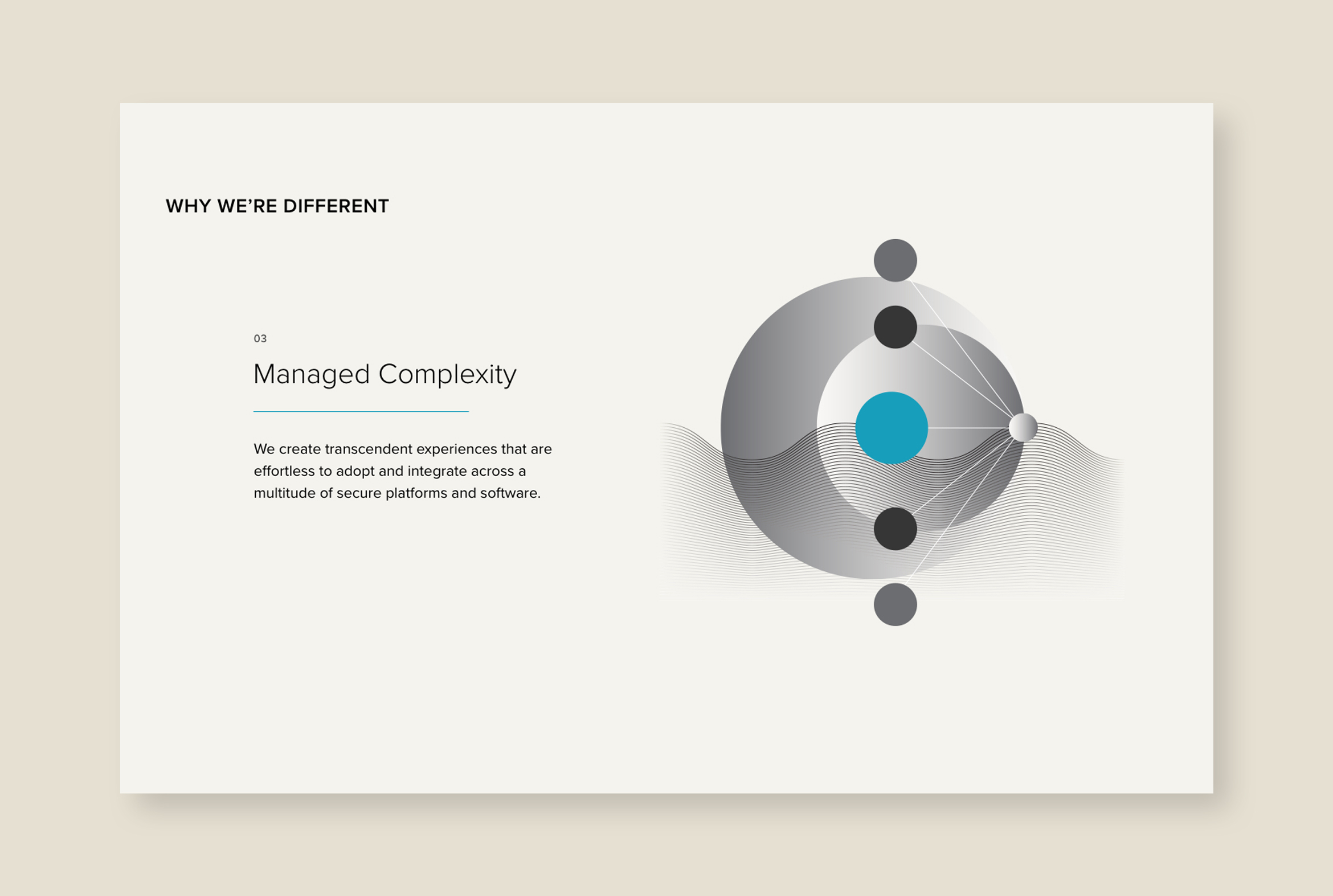
BLDG25 combines a background in creative game design with deep roots in enterprise product management to solve tomorrow’s big business challenges through customized software. We designed the identity to reflect both behavioral science and technology, allowing the viewer to interpret it on their own terms. It’s a play on opposites: light and dark, science and art, data analytics and creativity, innovation and practicality.
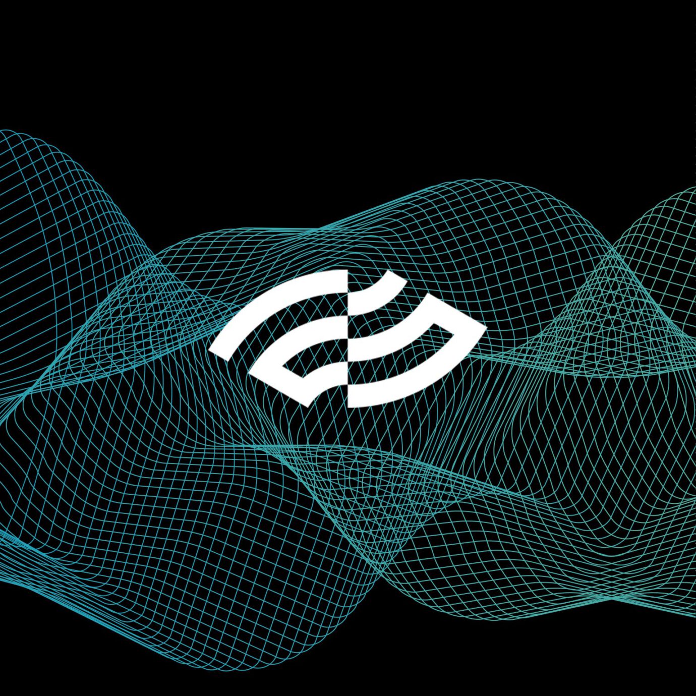
On the surface, the mark is an abstract number 25. The use of positive/negative lines bisected down the middle represents the left/right brain. It’s also an eye representing vision, insight and intelligence. A logo stinger animation really brings this idea to life.
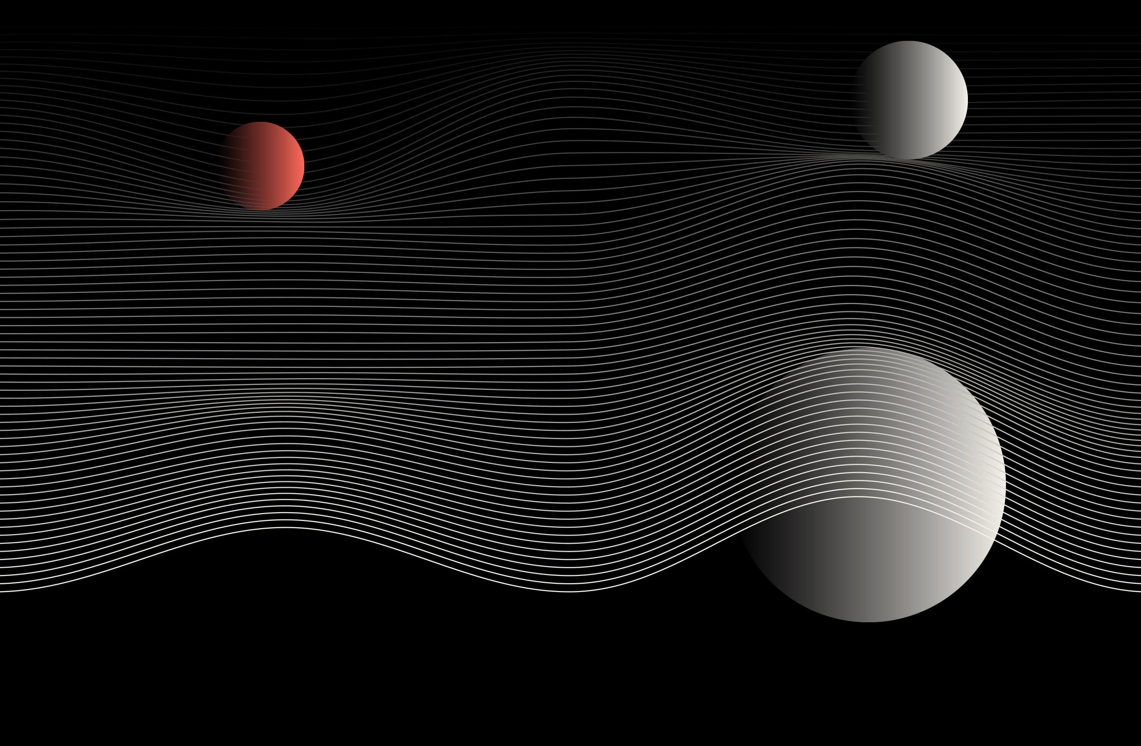
The use of mesh-like motifs is an homage to their gaming DNA, imagination and flexibility. Waves and spheres represent the transformational nature of their products, a paradigm shift that pulls the viewer into new and unexpected worlds.

Custom icons were designed to help describe intangible business concepts. Branded powerpoint templates were created using a vast library of icons, motifs and infographics for use by the BLDG25 team.
Deliverables:
- Brand Identity
- Brand Guidelines
- Visual System + Icons
- Web Design + Development
- Motion Graphics
- Collateral
A clean, responsive website describes the complexity of what BLDG25 does using immersive motion graphics, scroll effects and parallax infographics to draw the viewer in.
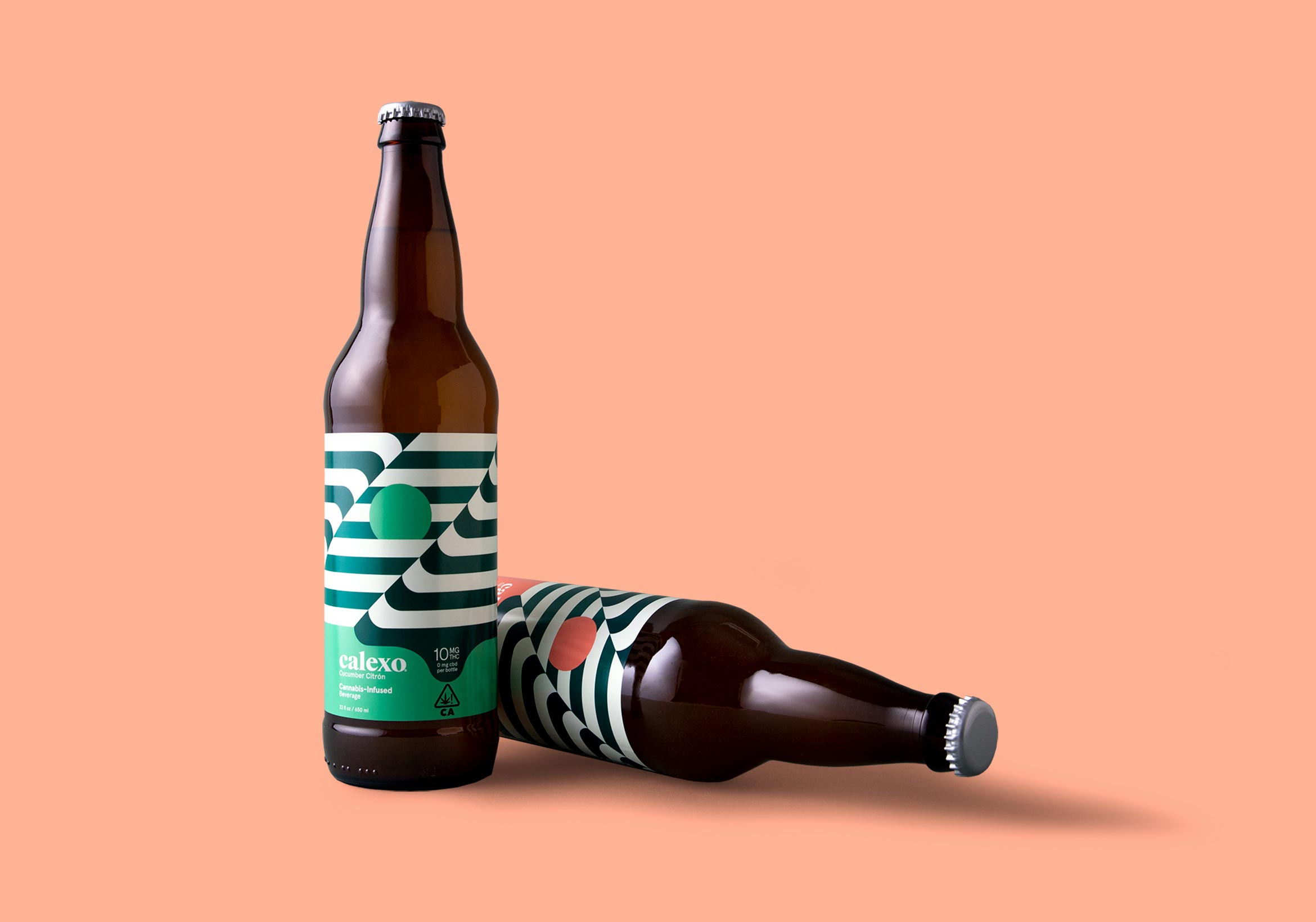
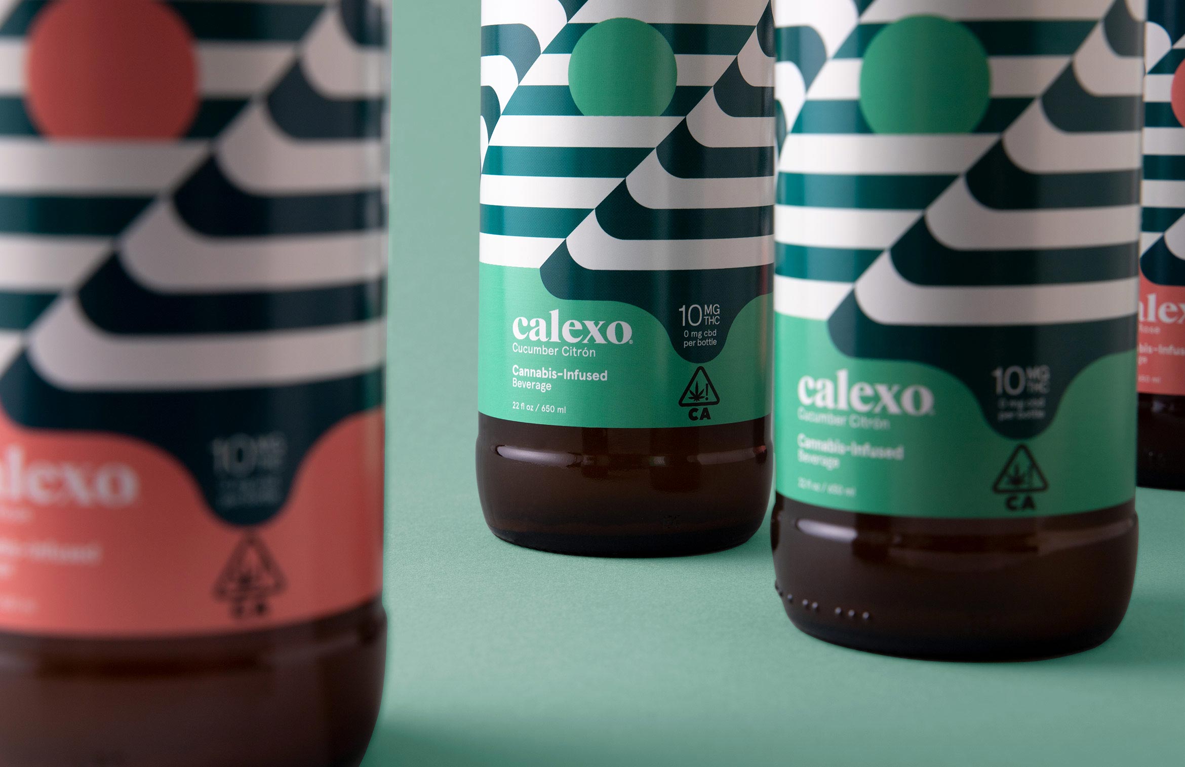
Calexo Cannabis Beverages
packaging design / brand identity
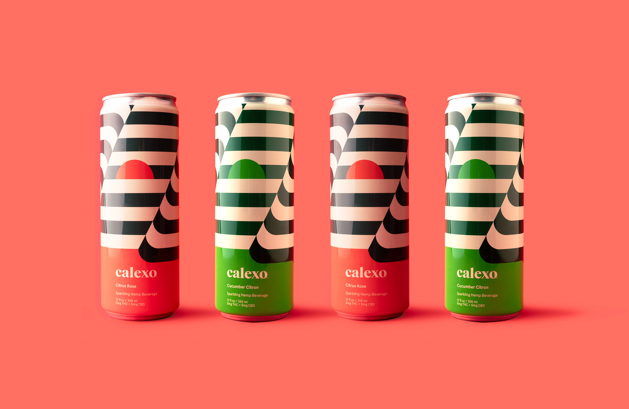
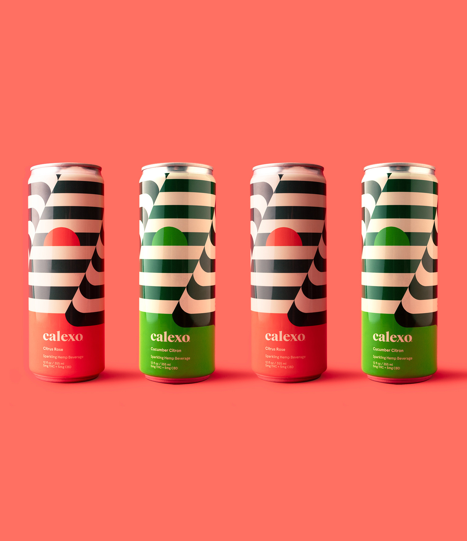
Calexo brings a smile to your mind in citrus rose or cucumber citron
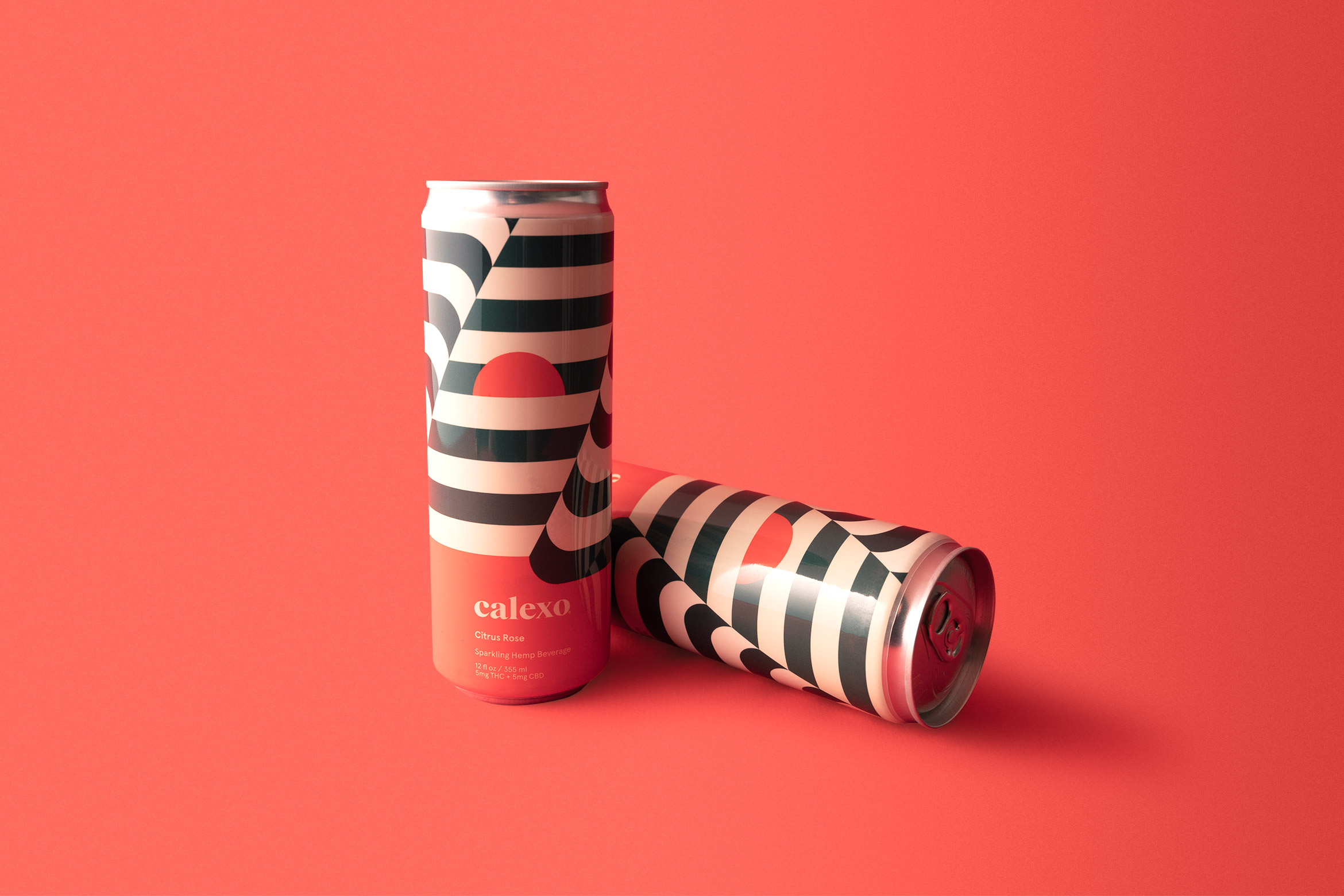
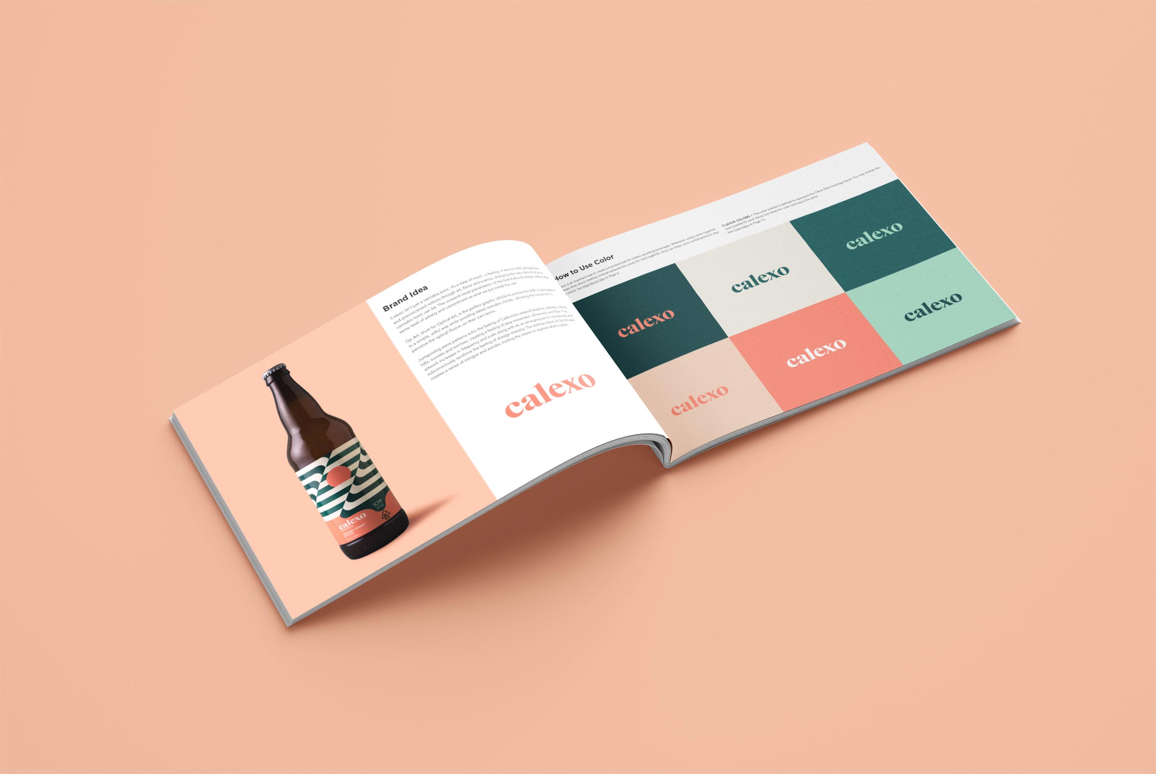
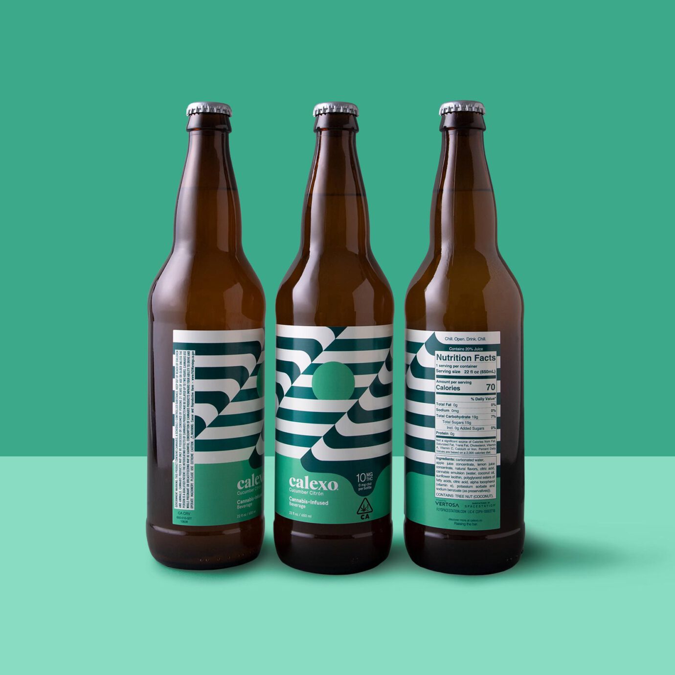
Calexo isn’t just another cannabis beverage, it’s a state of mind. It aims to shift perceptions and preconceived notions through art, flavor and science. Op Art “optical art” is the perfect graphic vehicle to portray this shift in a simple, artful way while avoiding dated cannabis clichés – allowing the consumer to perceive the illusion in the art on their own terms.
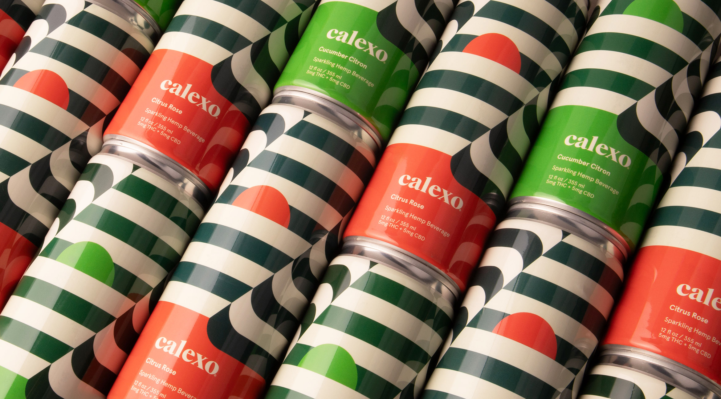
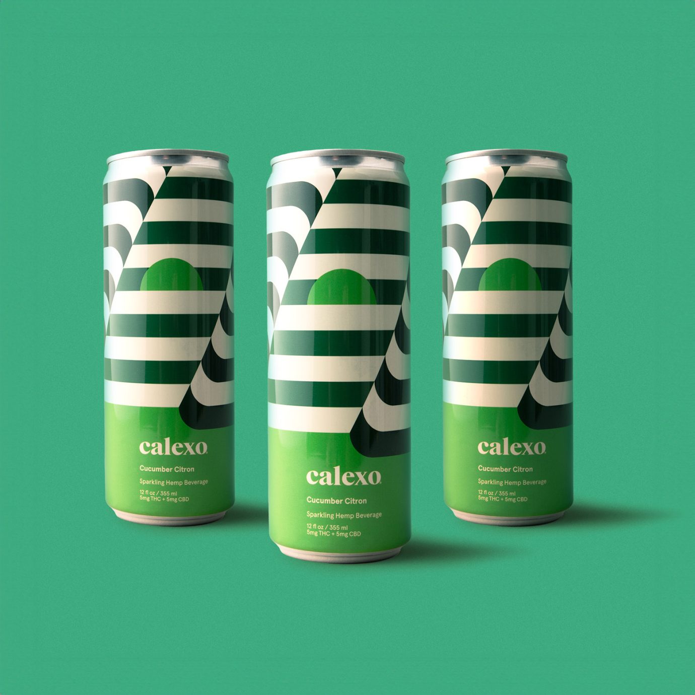
The new hemp beverage packaging is a 12 oz. can with a striped op-art wrap that continues seamlessly around. The first batch of cannabis-infused beverages were in a 22 oz. bottle with op-art labels. The sun is rising or setting depending on your mood.
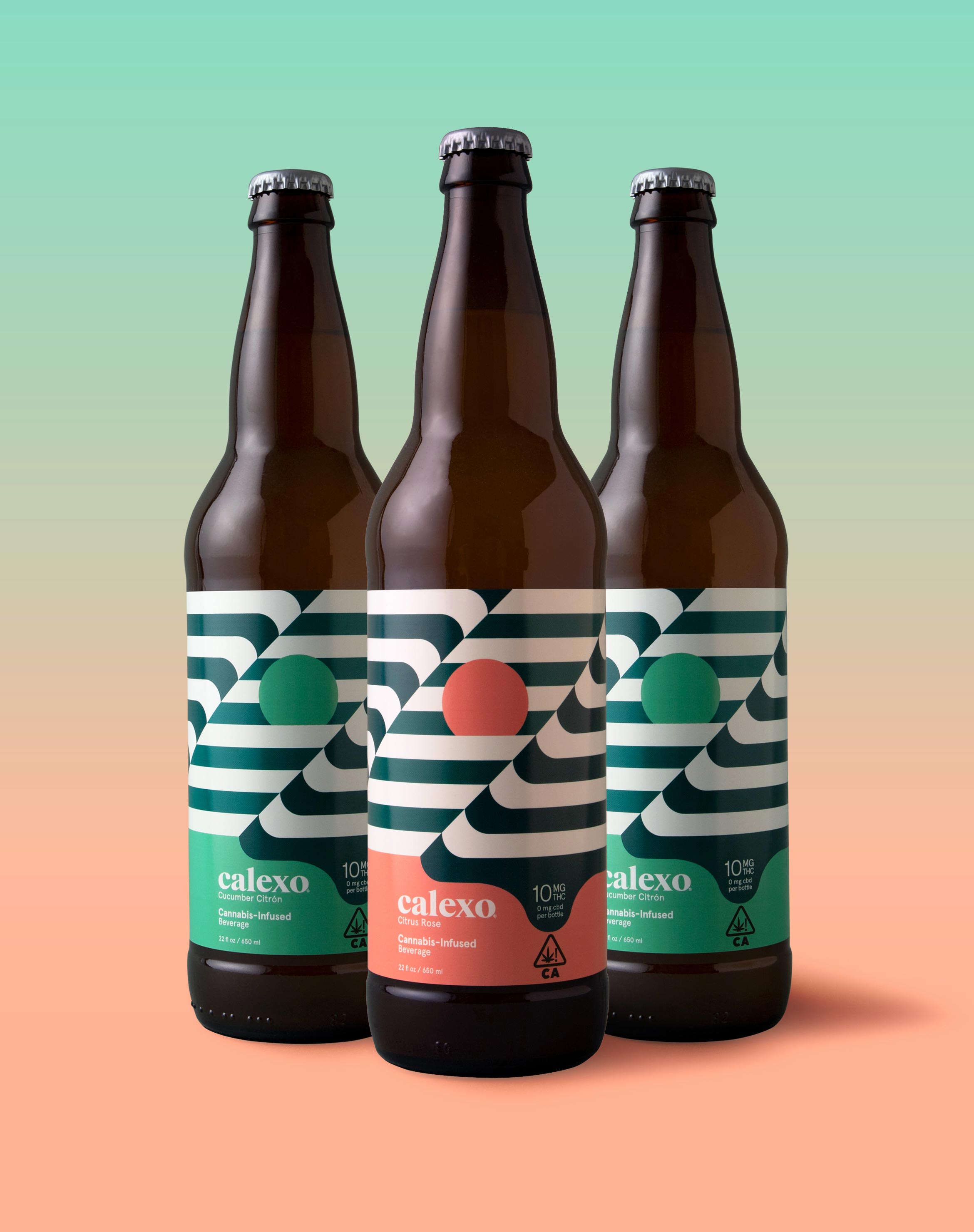
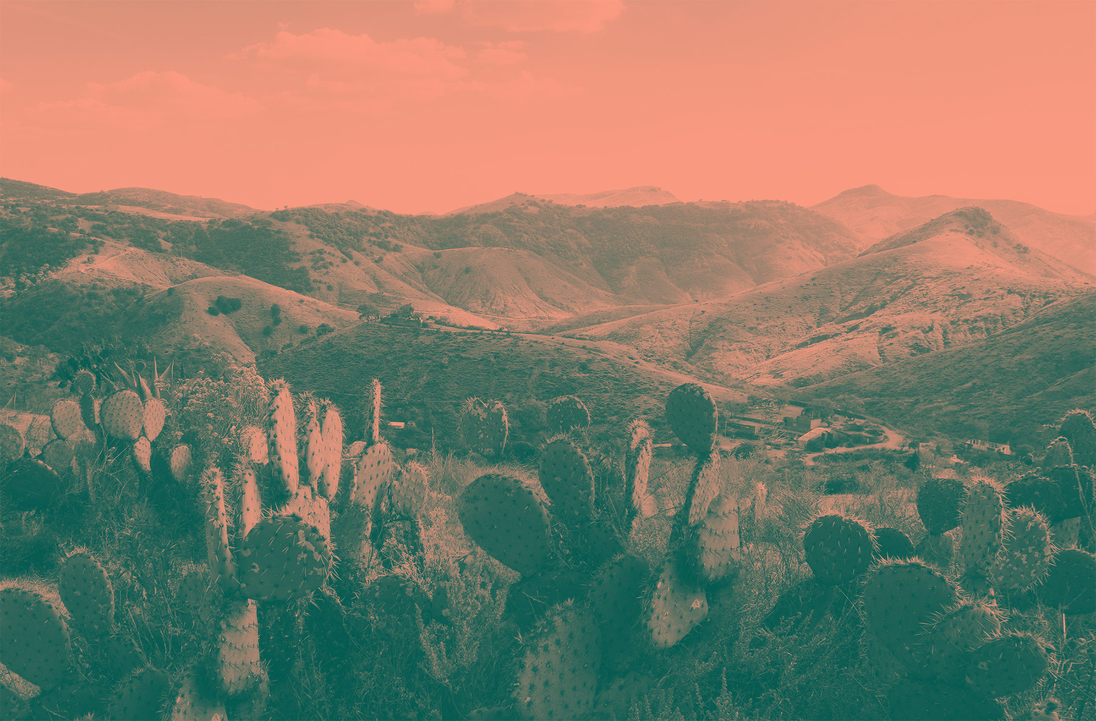
Capturing the laid-back feeling of the rolling hills, lapping water, brilliant sunsets and desert flora that defines the California and northern Mexico region, we applied a crisp, warm, color palette to both the brand and its unique flavor profiles.
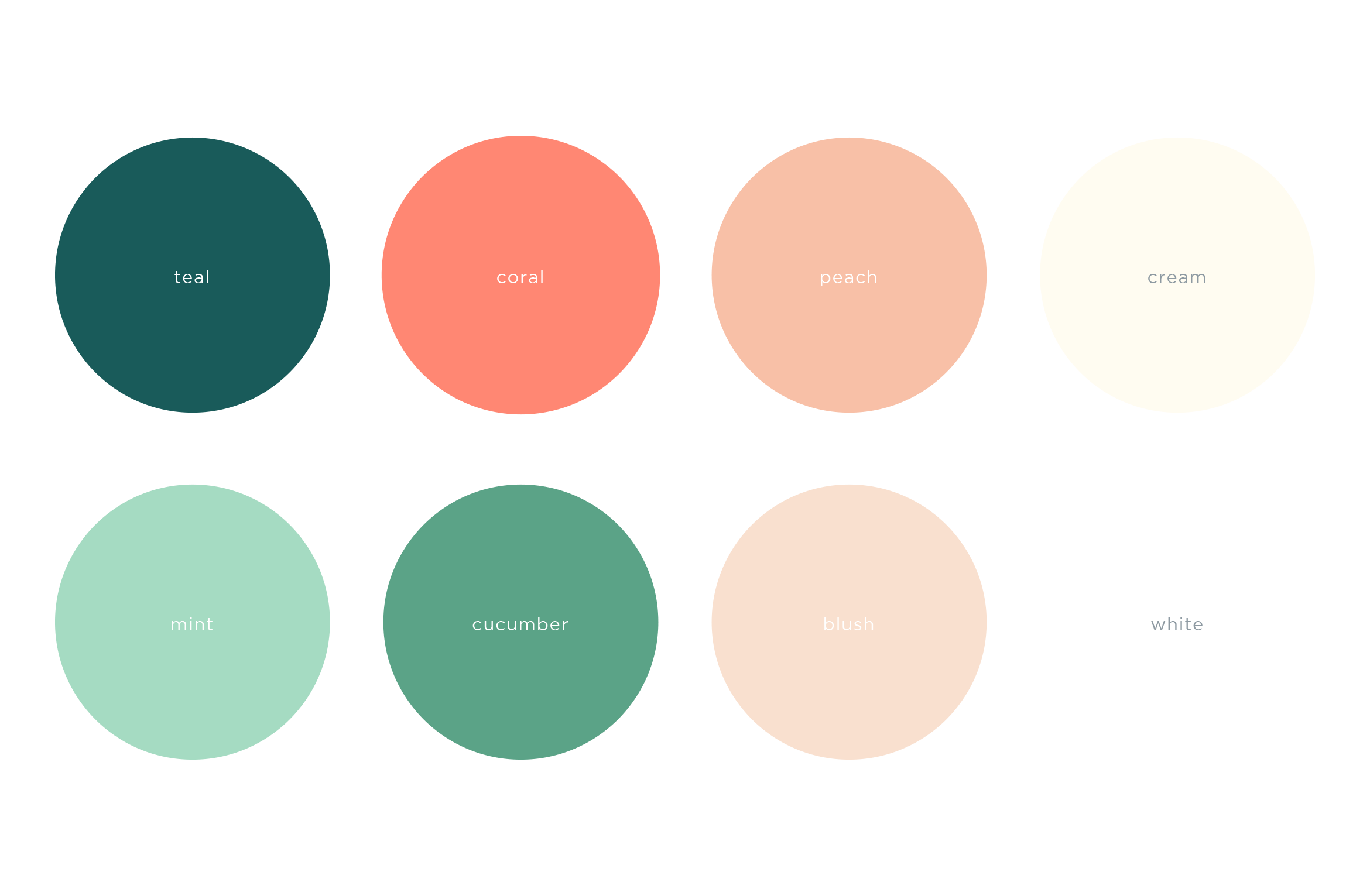
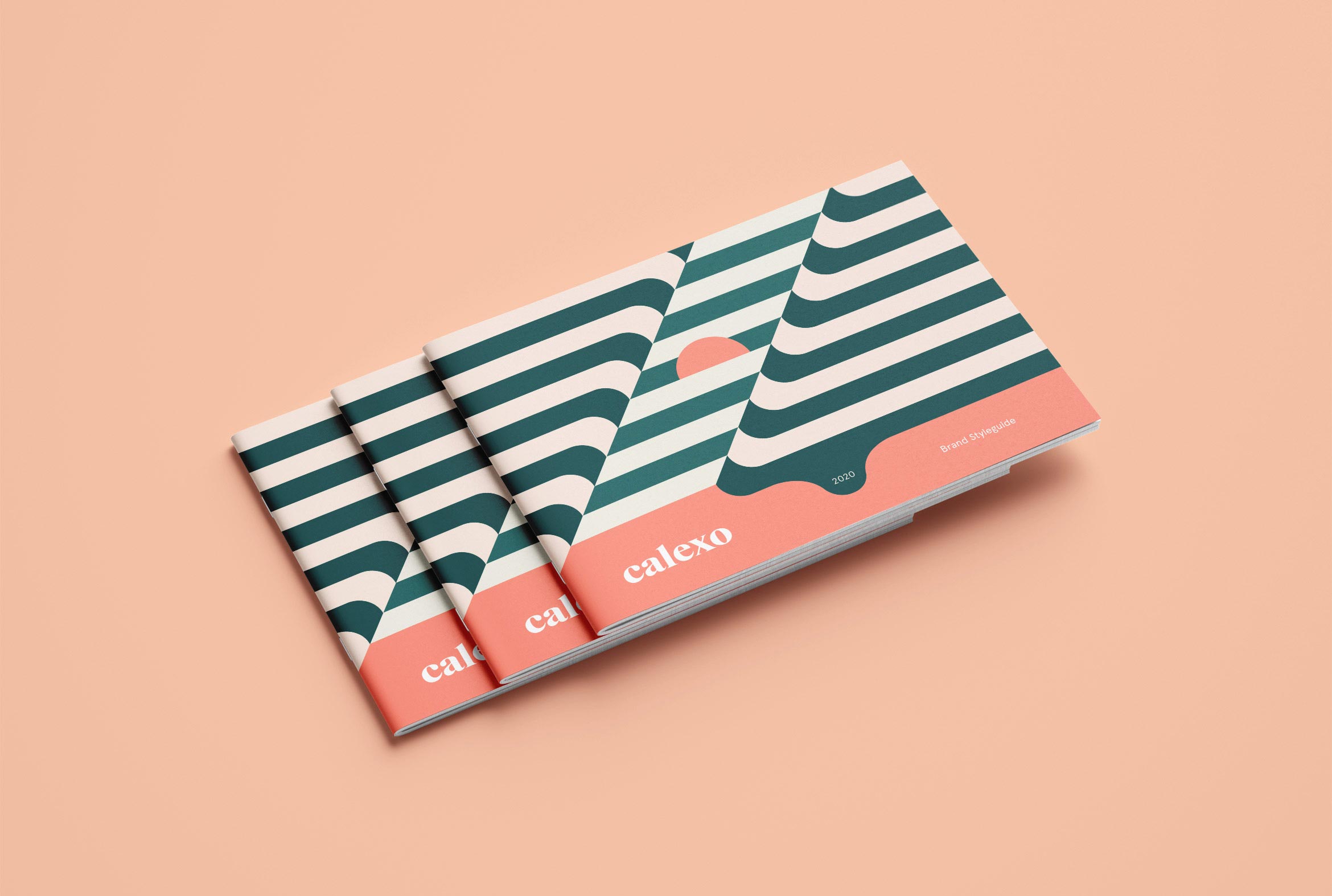
A Brand Styleguide keeps the visual identity cohesive by outlining rules for the logo, typography, color palette and graphic motifs.
Deliverables:
- Brand Identity
- Brand Guidelines
- Packaging Design
- Visual System
QORE Investment Advisory
Finance / Brand Identity / Visual System
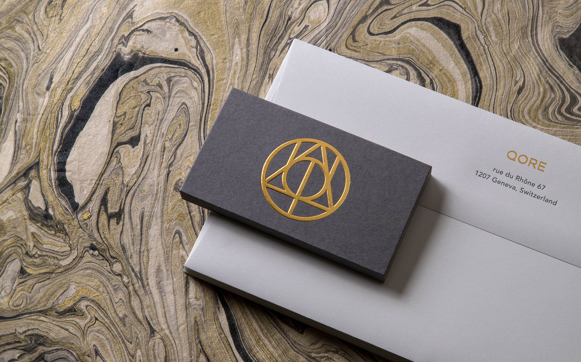
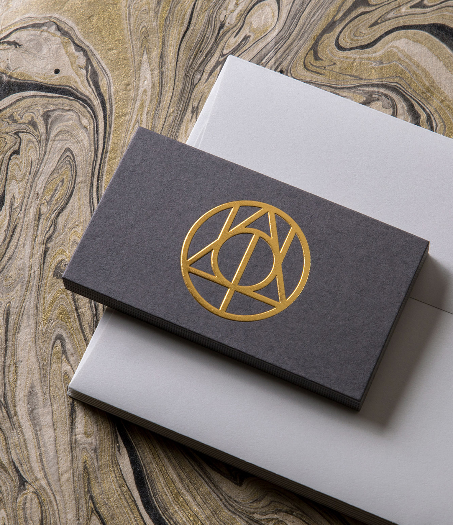
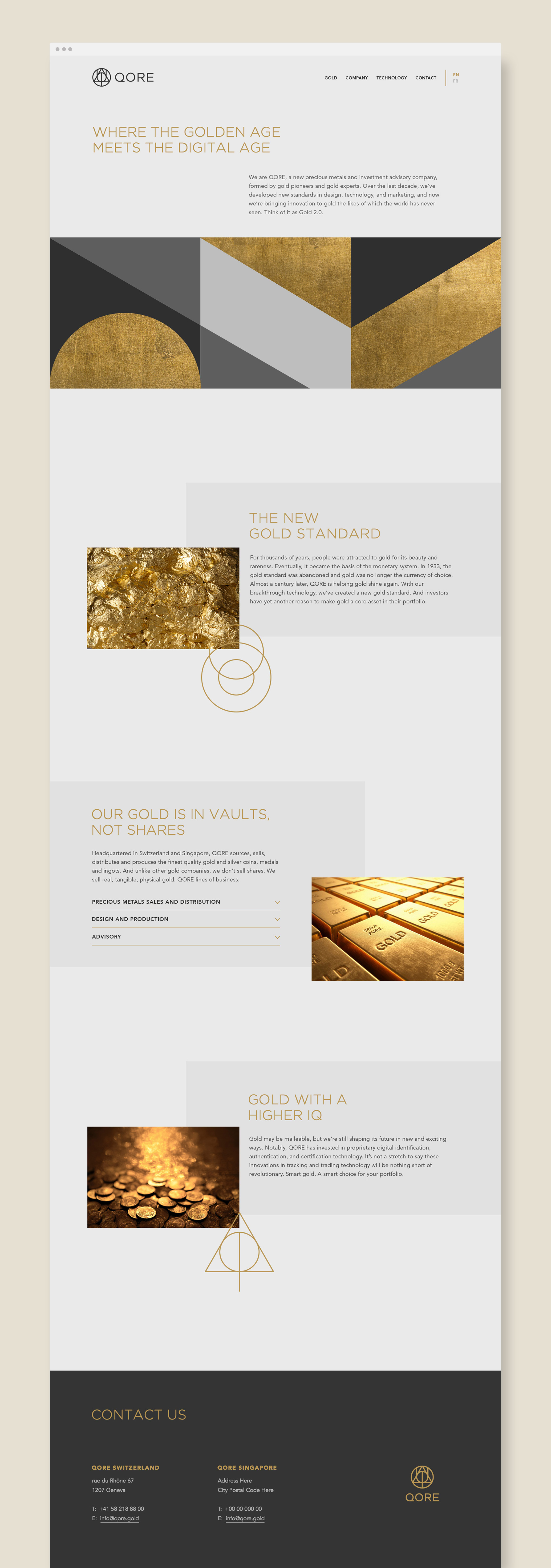
QORE is adding more value
to investment gold
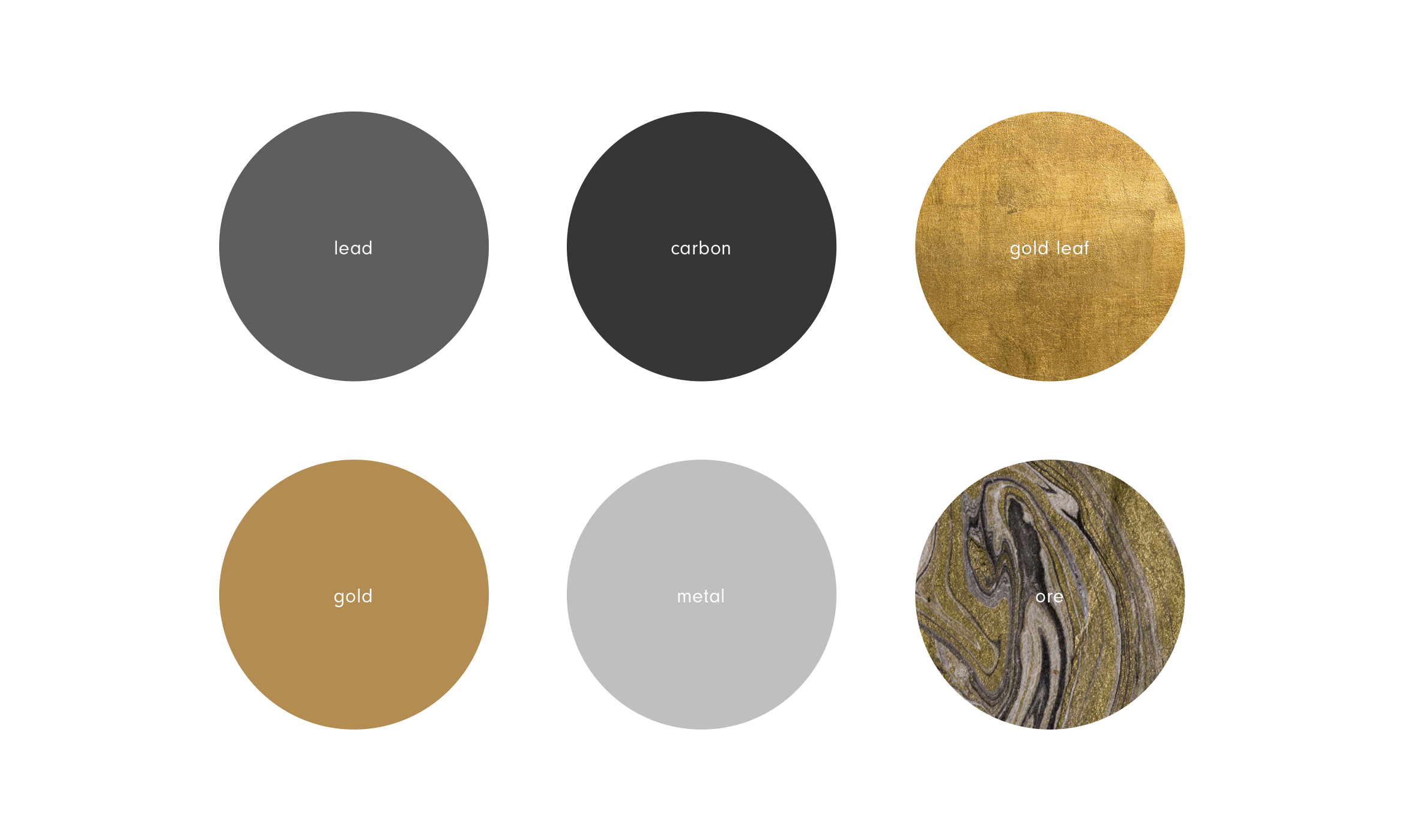
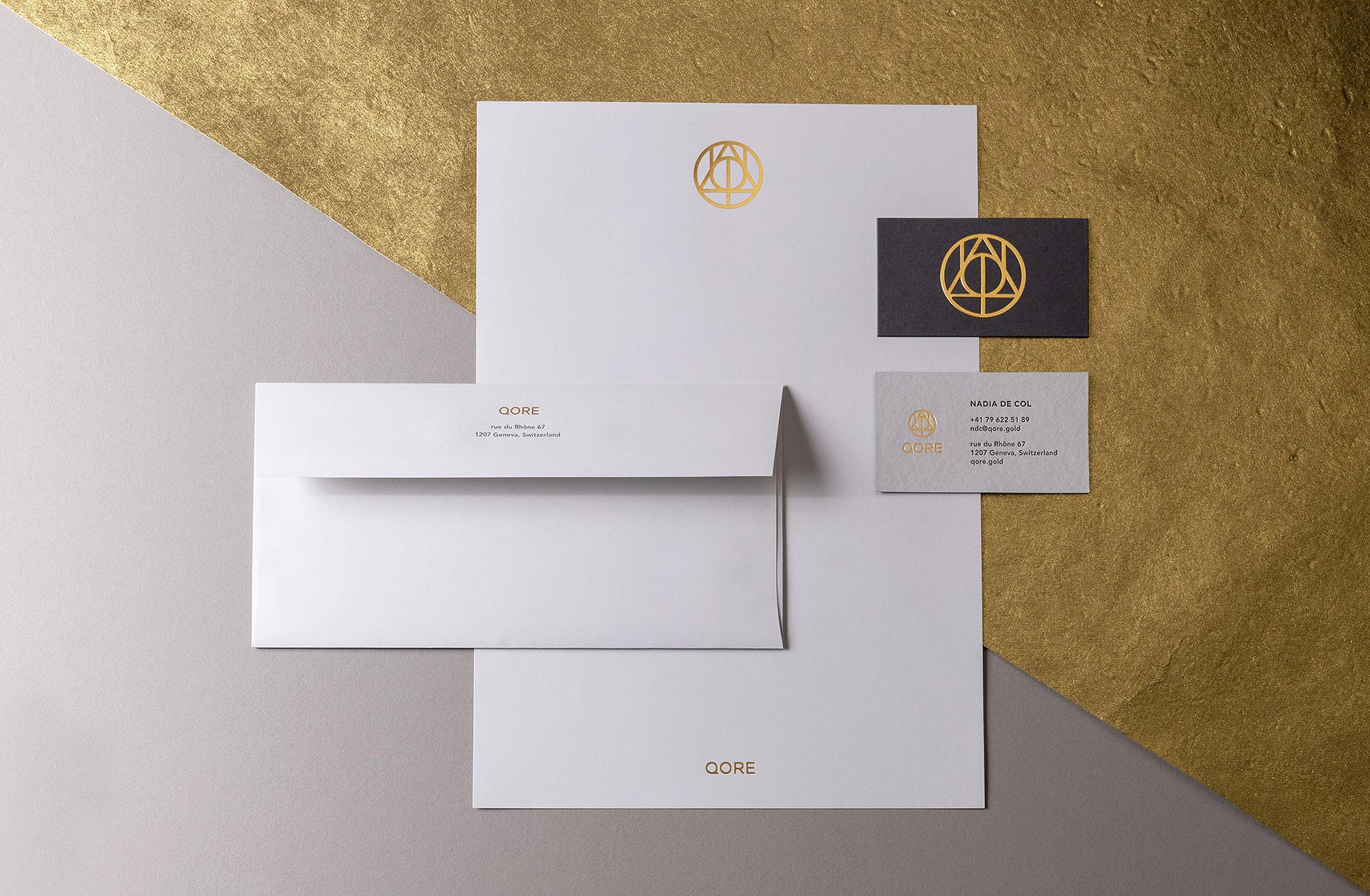
QORE is a Swiss-based precious metals and investment advisory formed by world-renowned gold experts. Over the last decade, they’ve developed new standards in design, technology, and marketing to modernize investment gold. The new brand identity reflects their core values of quality, creativity, innovation and infinite discovery through this precious metal.
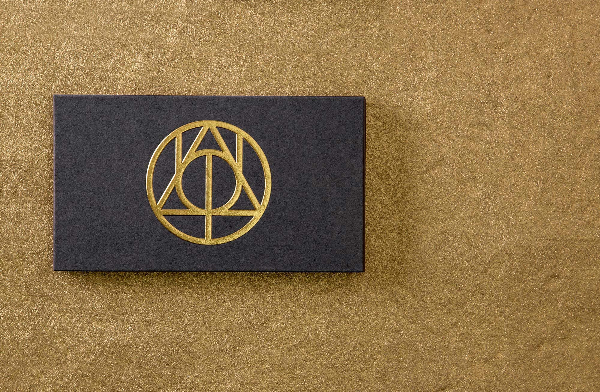
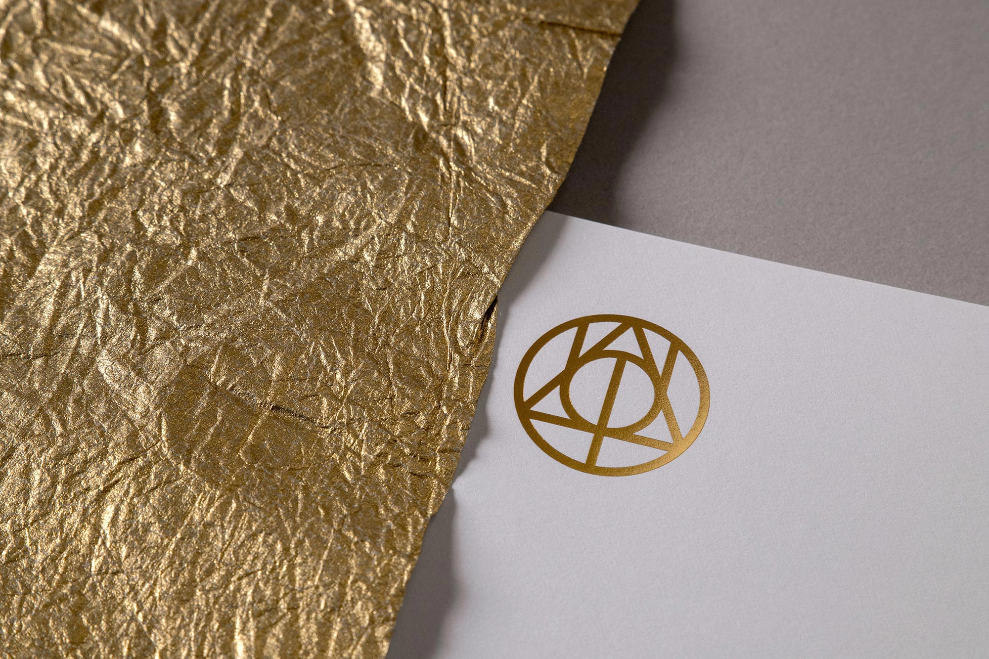
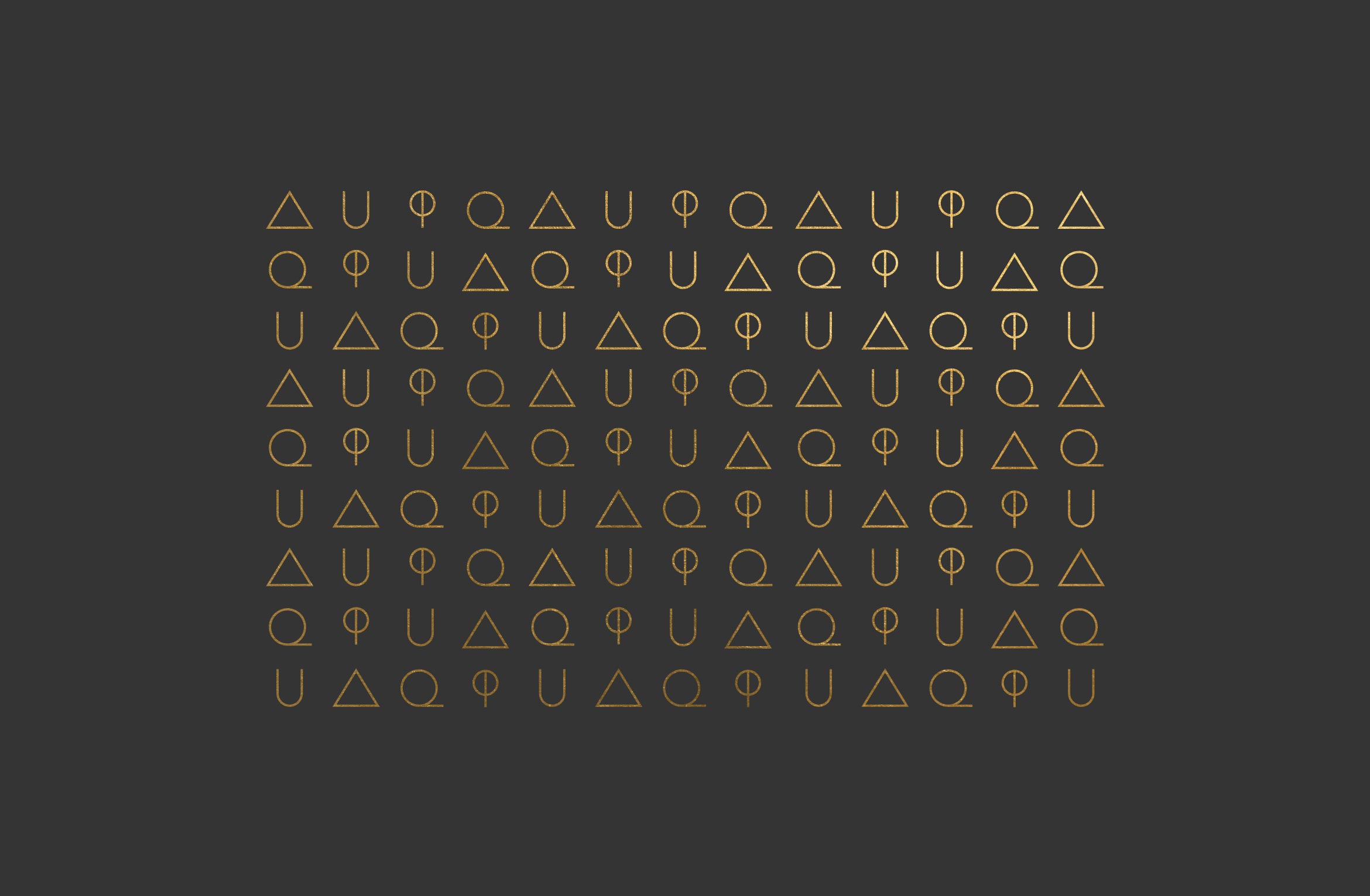
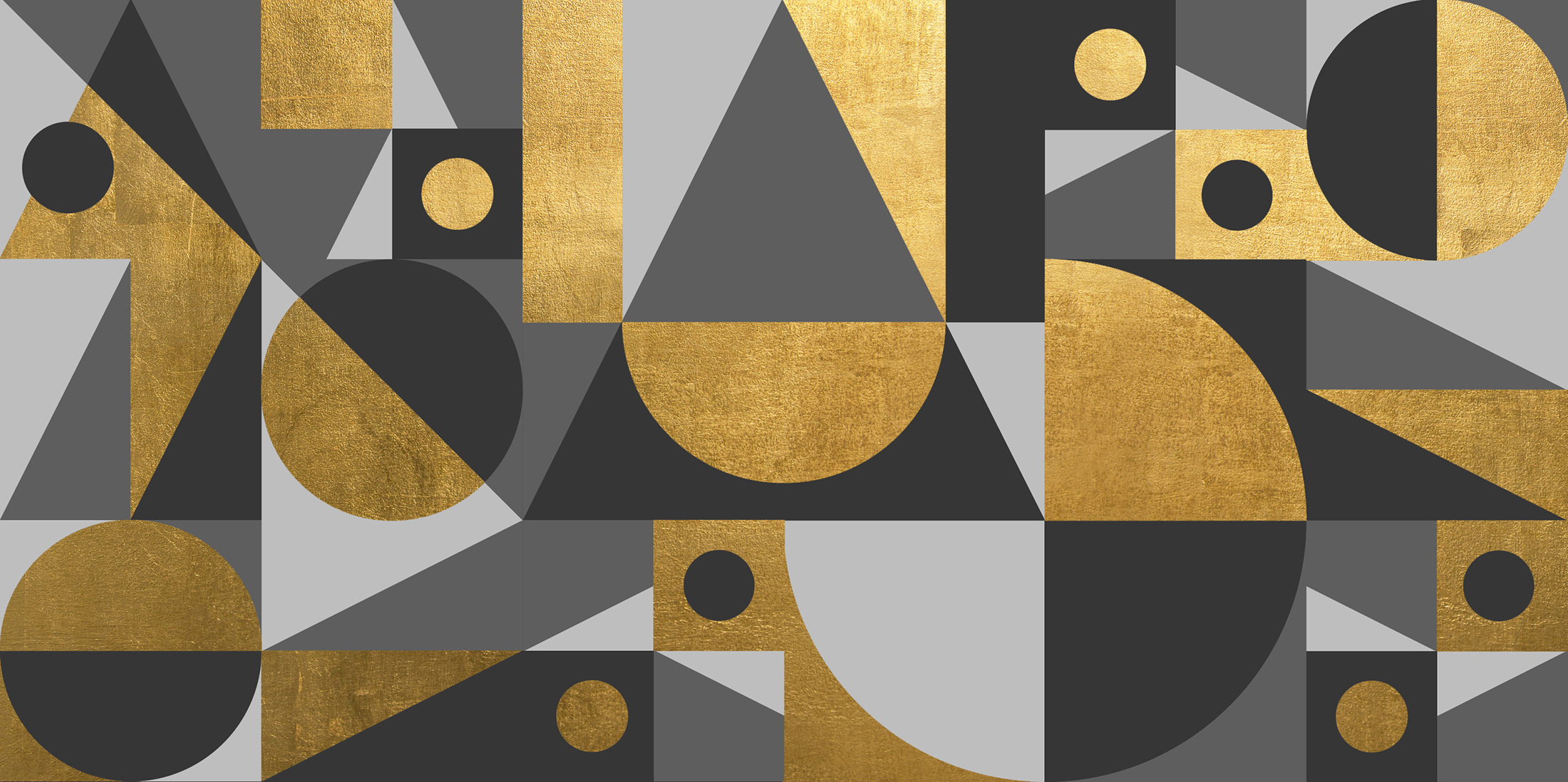
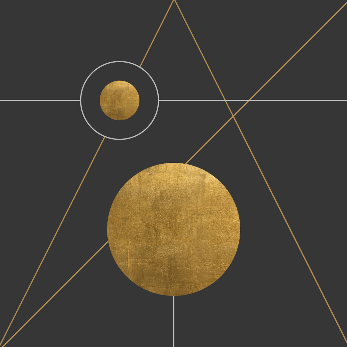
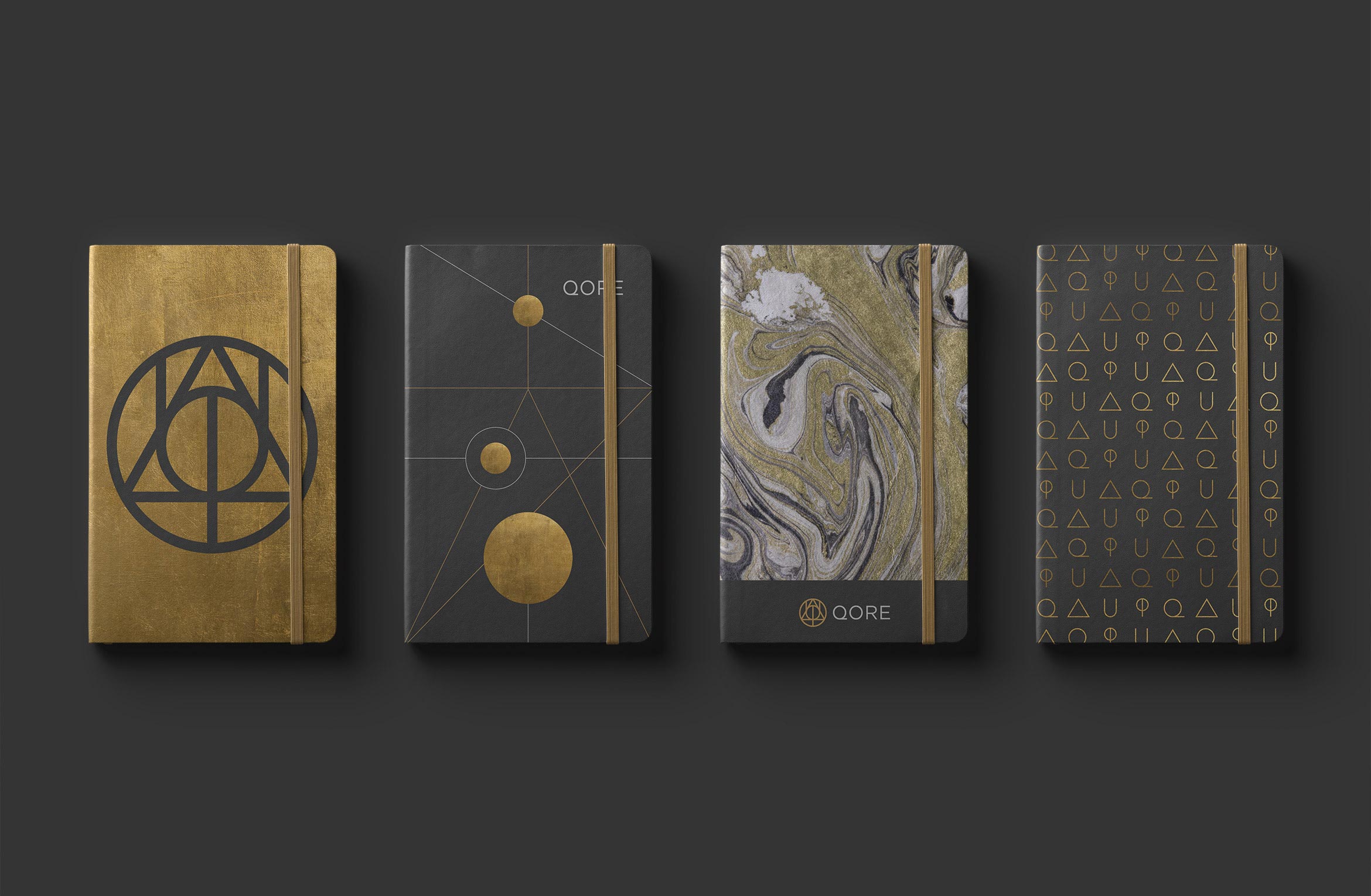
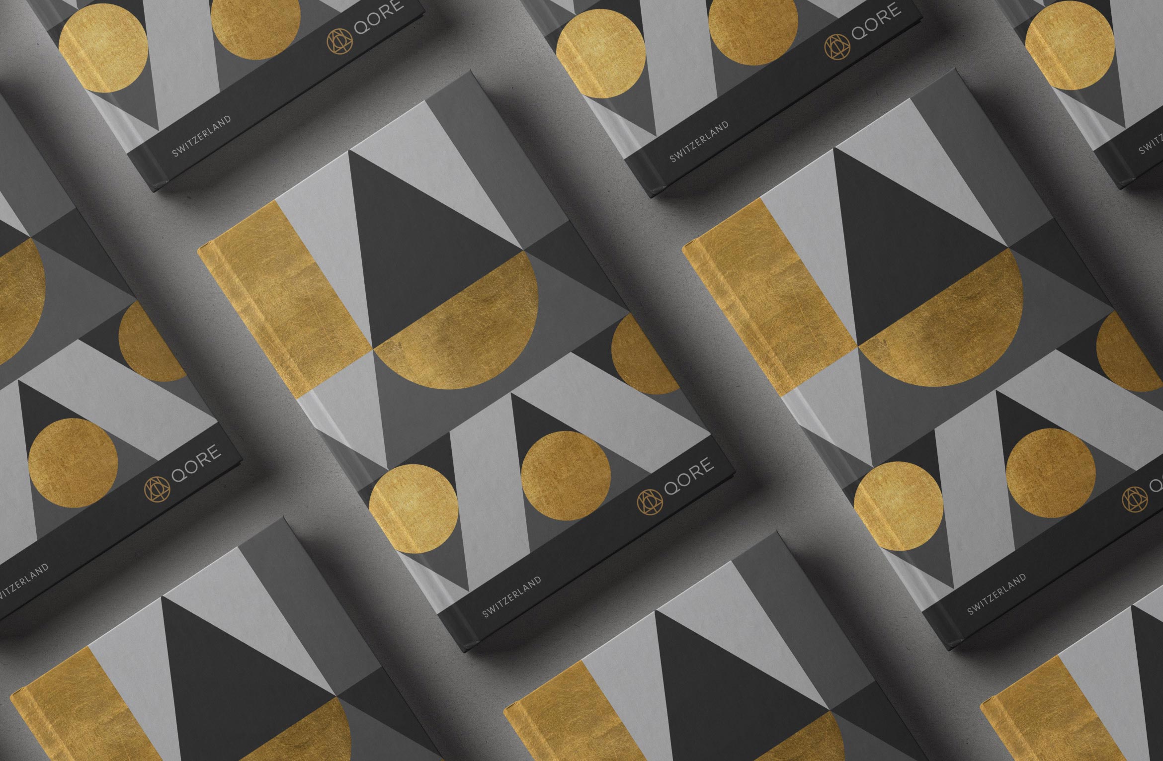
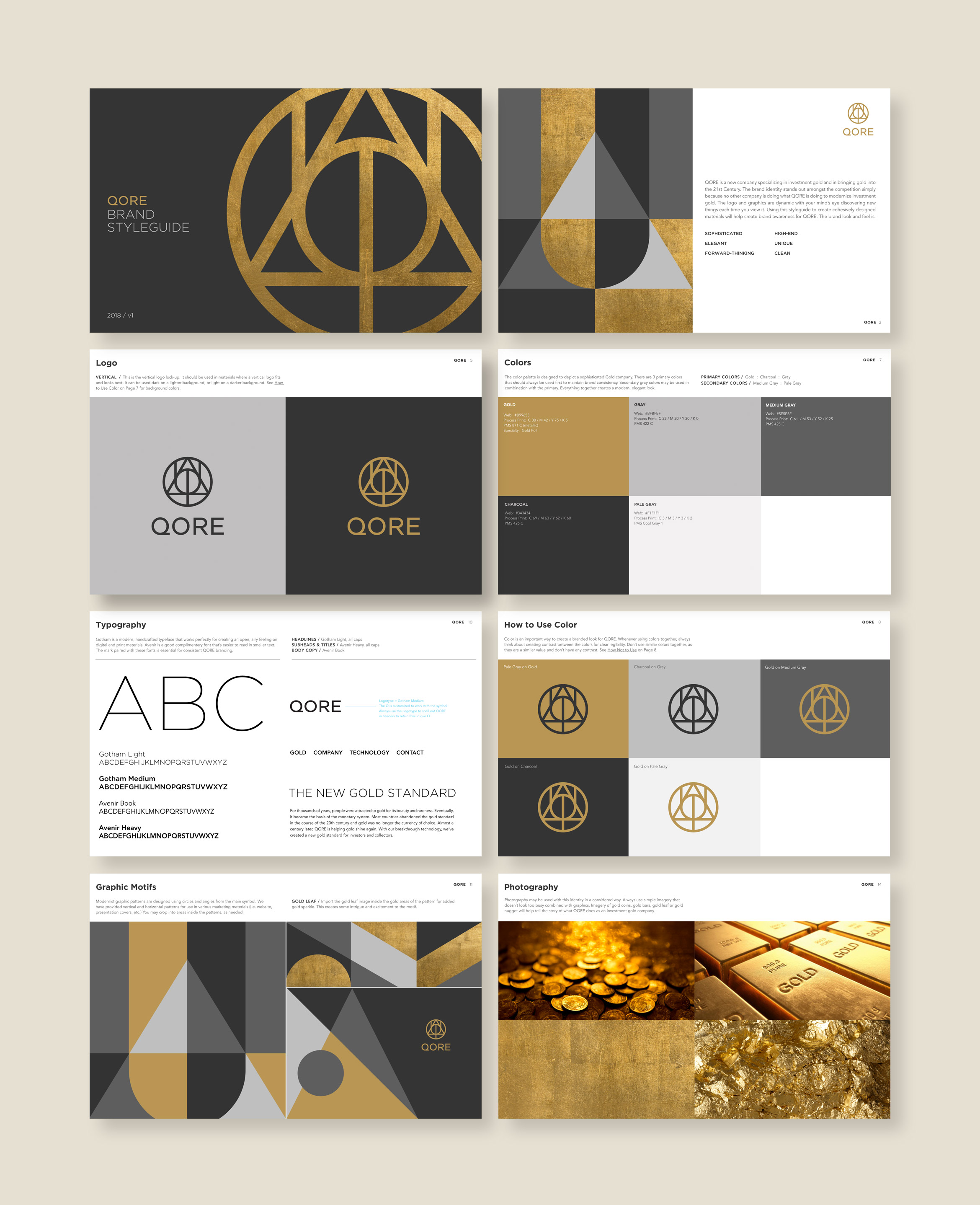
The mark is composed of three symbols that echo sacred geometry and have a guild-like quality. Geometric shapes like triangles, circles and lines can be pulled out to configure endless motifs and supergraphics that extend the brand’s visual system.
AU: Periodic Table
Phi: Symbol for Golden Ratio
Q: Qore
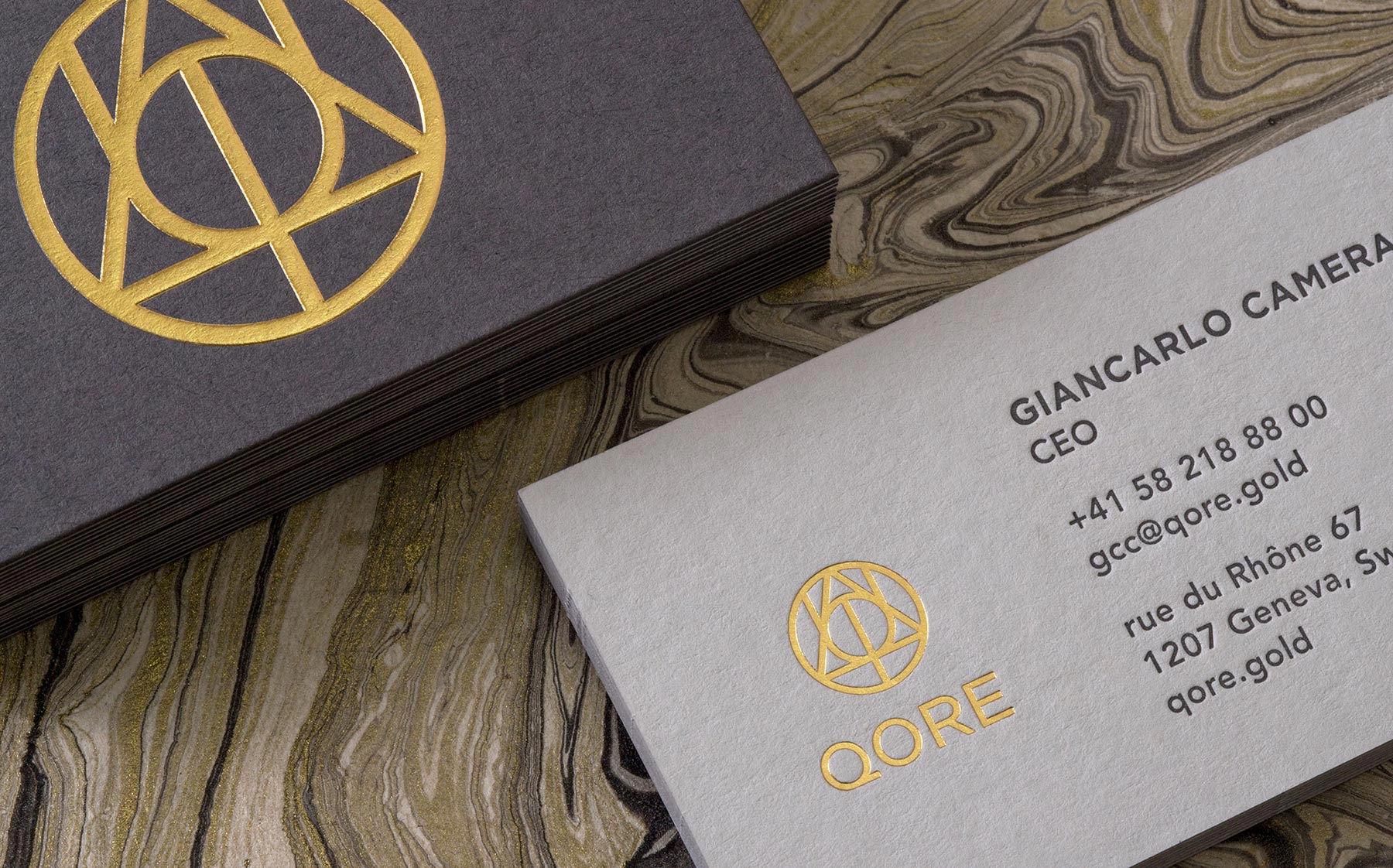
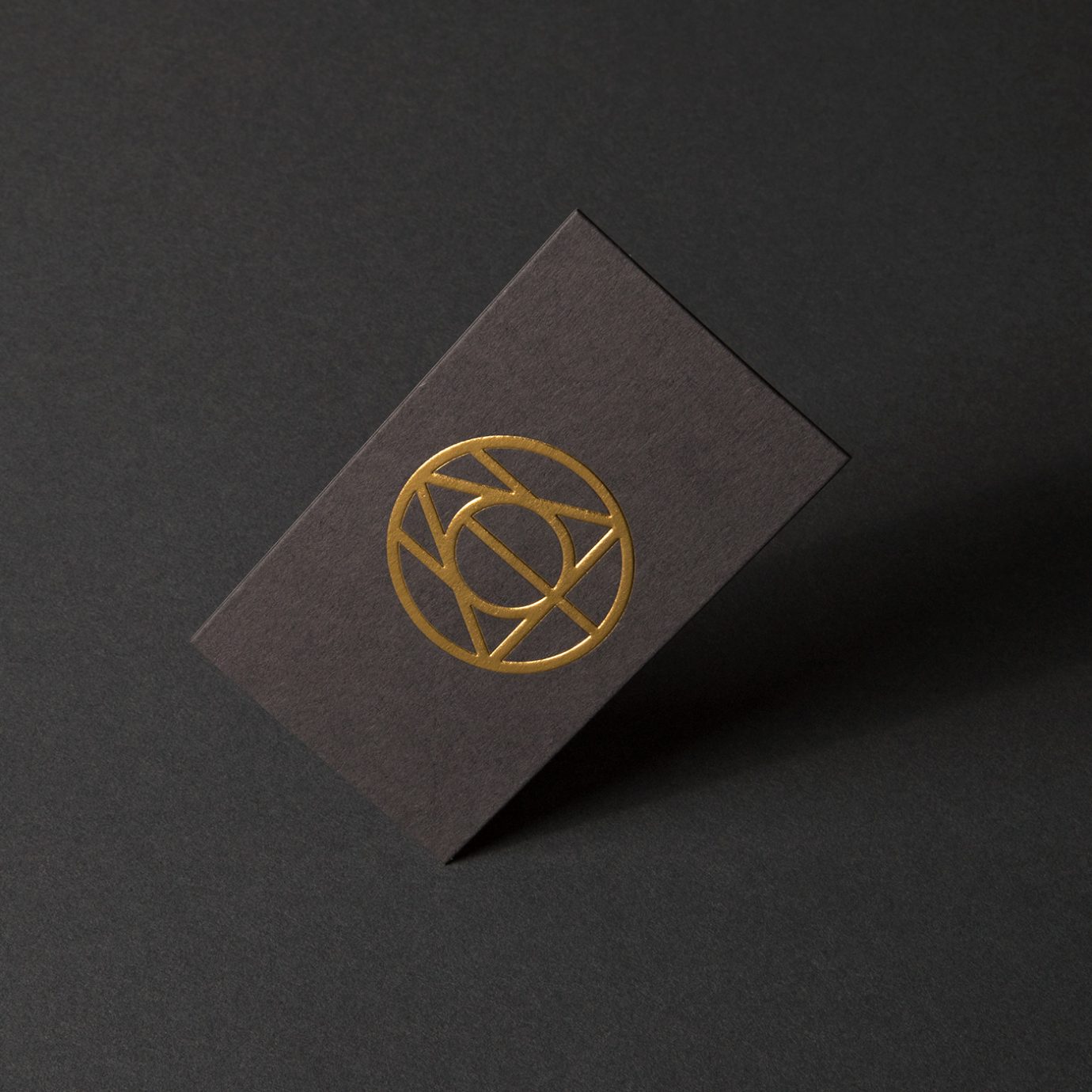
High-end business cards were printed using ColorPlan duplexed grey papers, letterpress and an embossed gold foil logo that feels like a gold coin. Matching Classic Crest Antique Gray and Gold Foil envelopes and letterhead round out the stationery suite.
Deliverables:
- Brand Identity
- Brand Guidelines
- Visual System
- Print Collateral
- Web Design
- Copywriting
A bilingual, single page website tells the story of what QORE has to offer using smart copy and collaged imagery. Animations of the logo and icons, paired with parallax layers adds a unique, modernist touch.
A Brand Styleguide outlines rules for logo lock-ups, color formulas, typography, how to work with graphic motifs and photography.
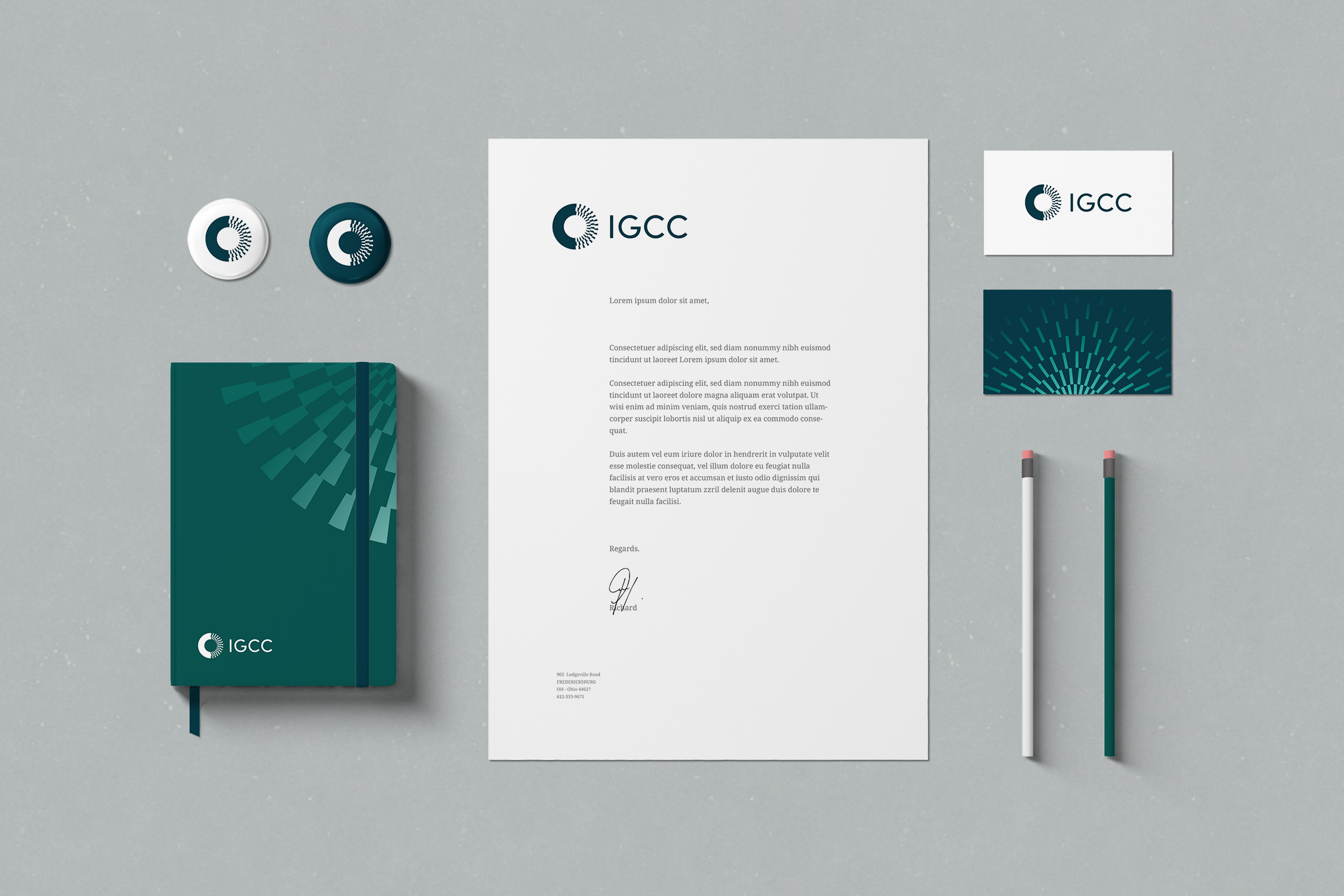
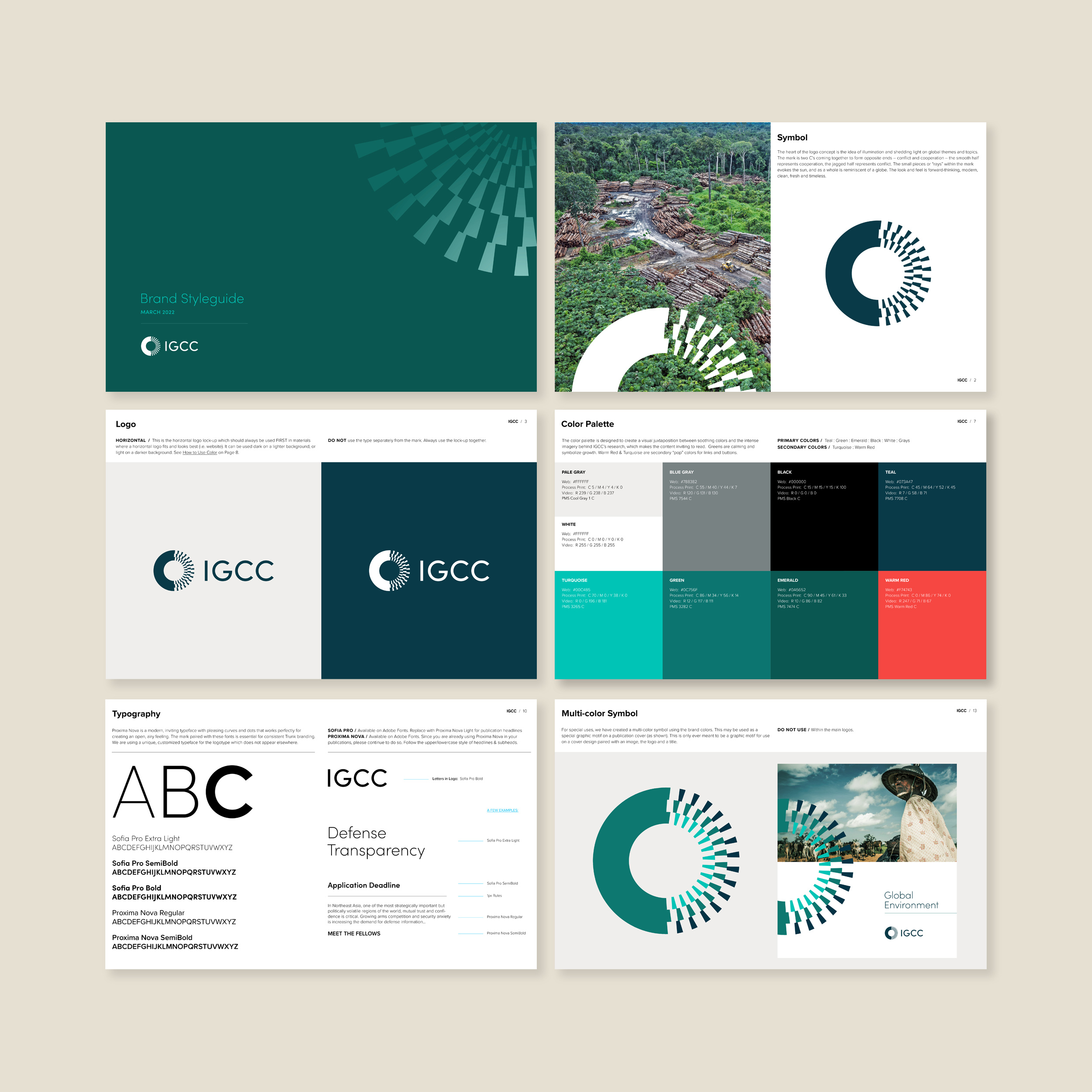
University of California IGCC
education / brand identity / website
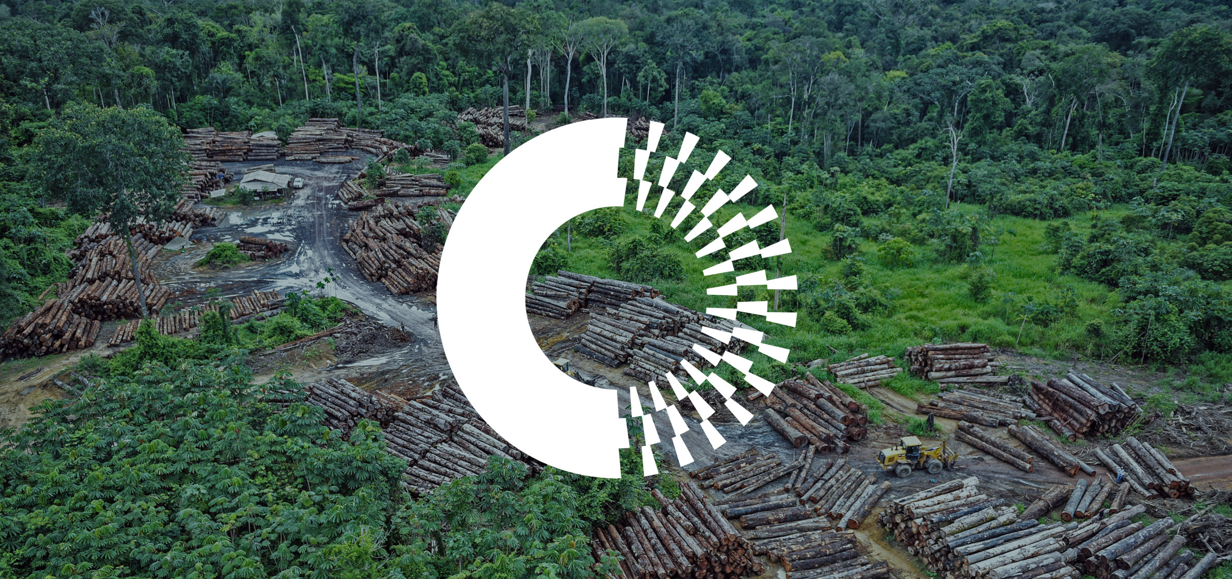
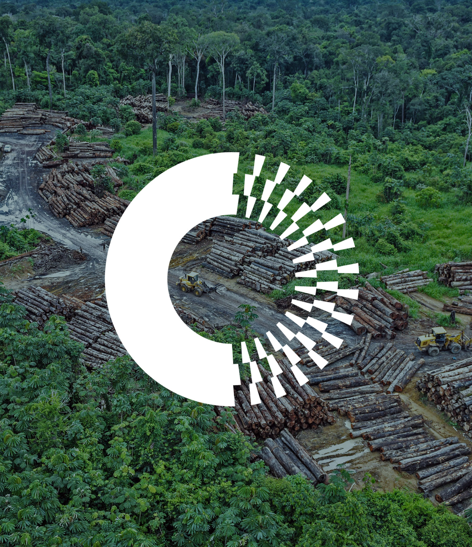
IGCC conducts research on global social science conflicts and cooperation
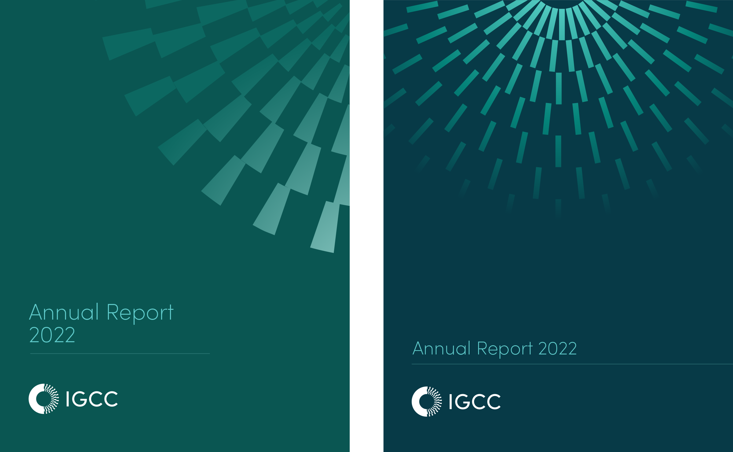
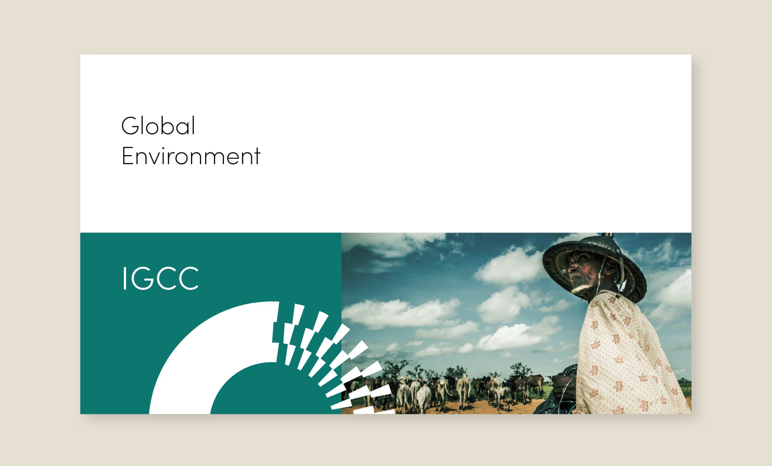
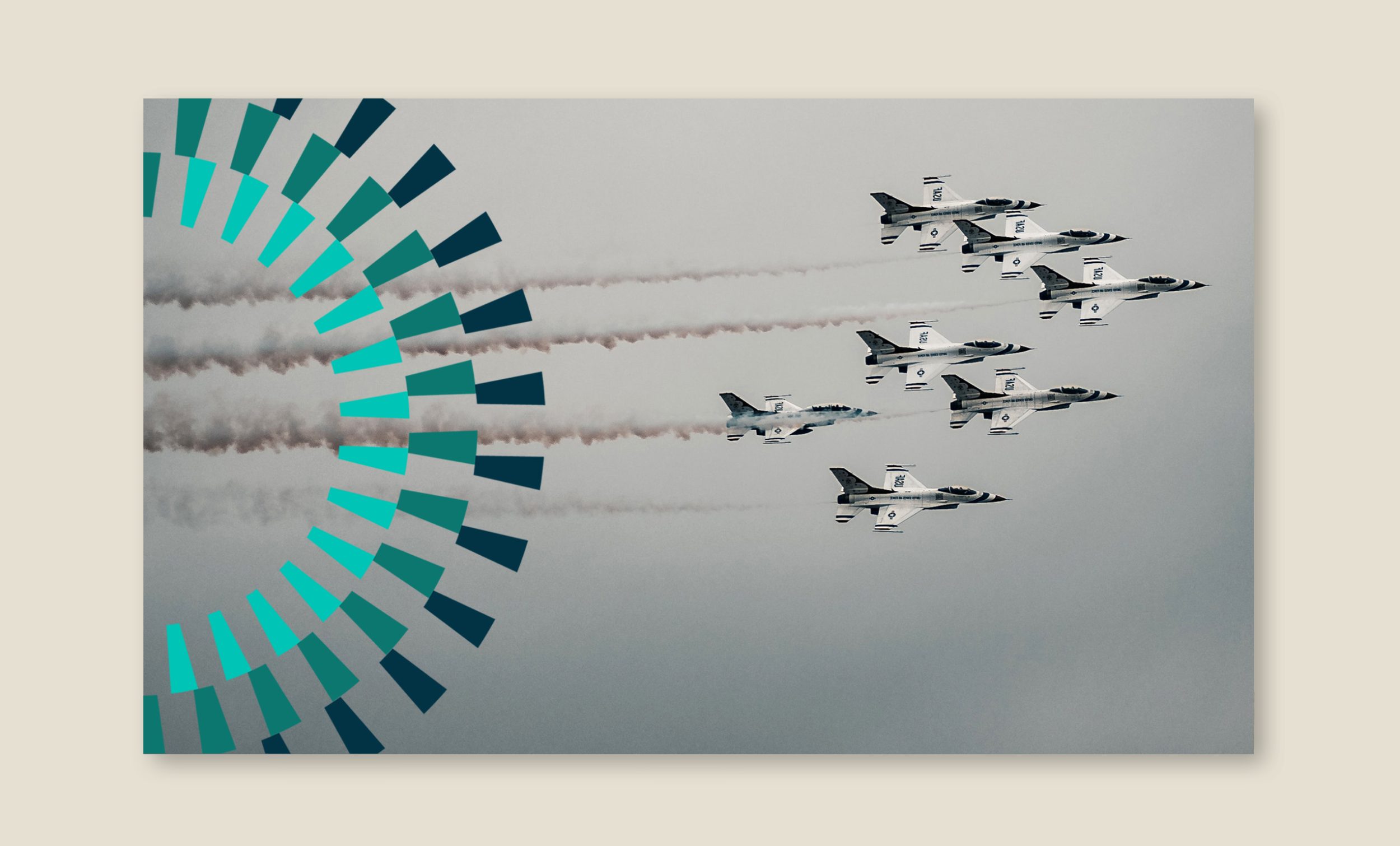
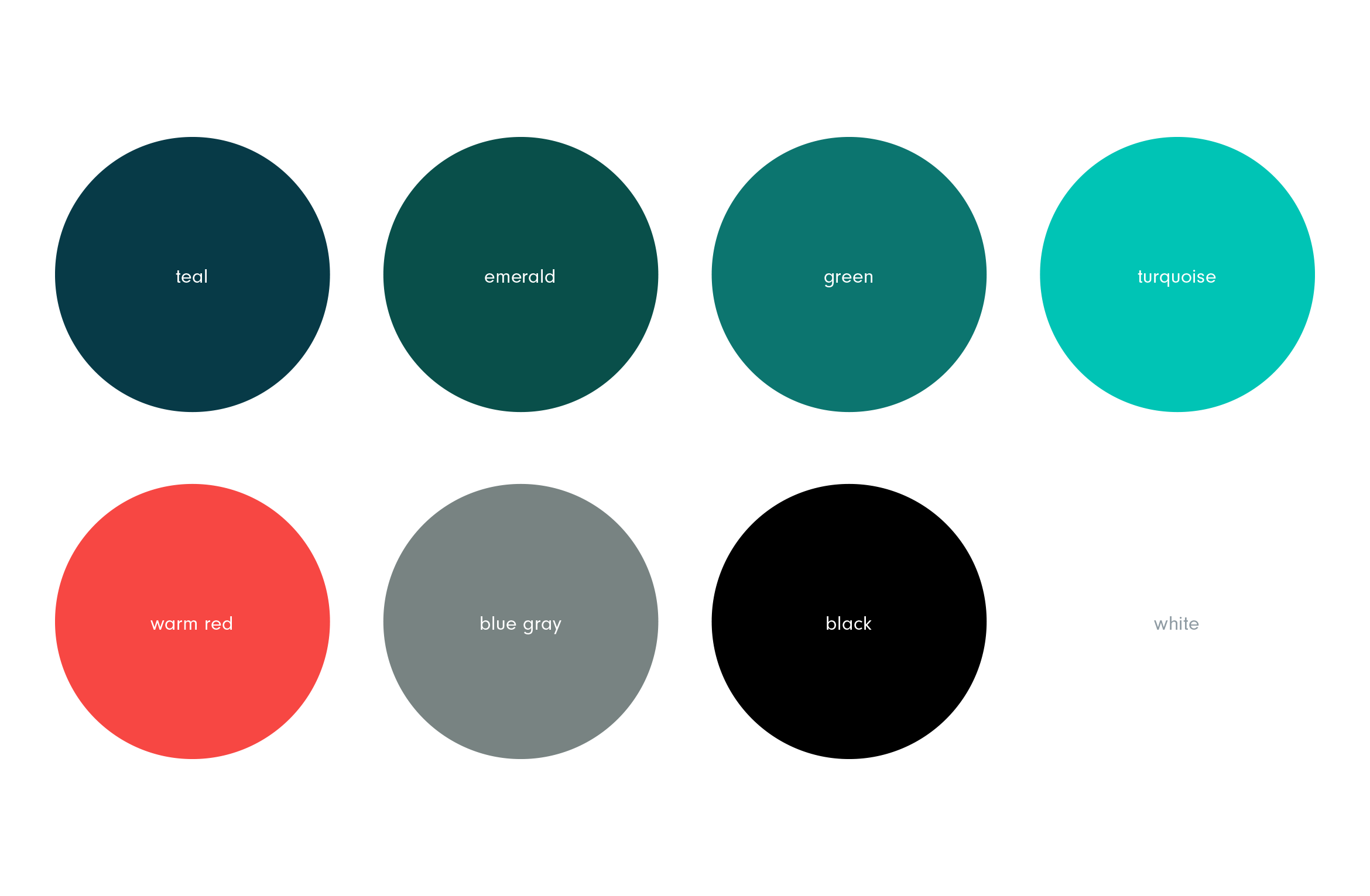
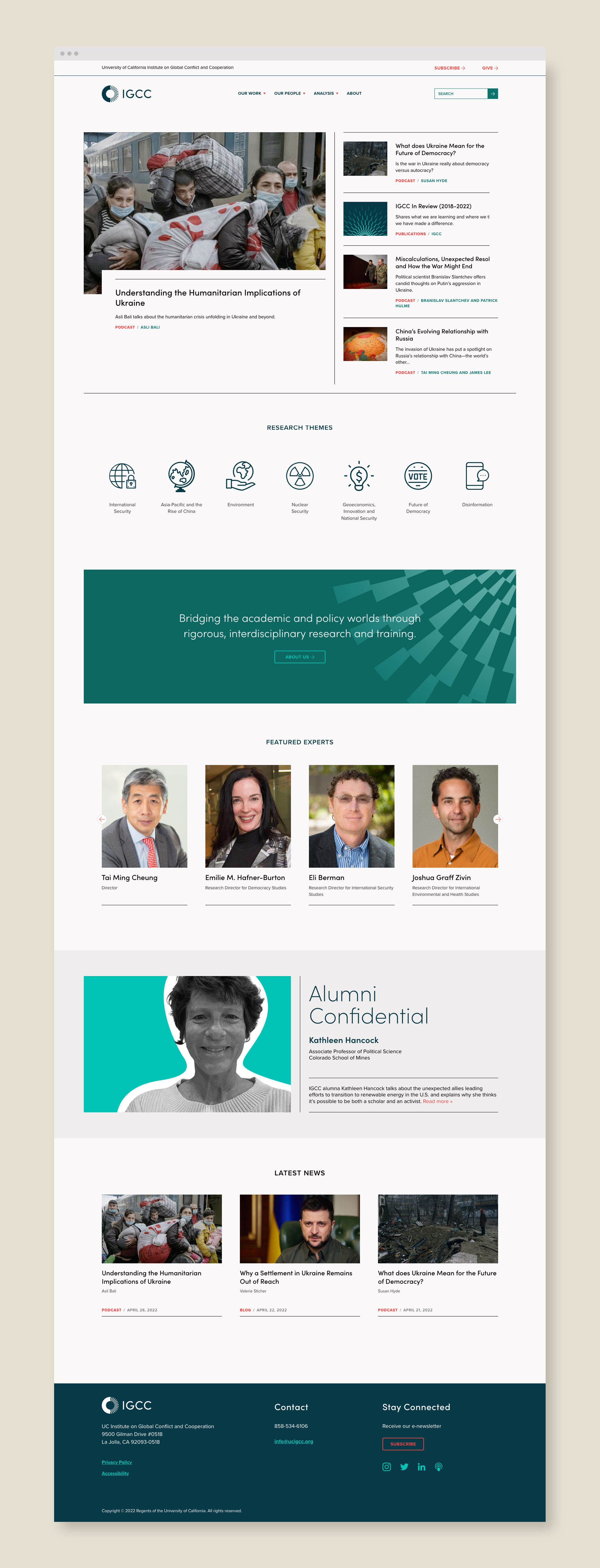
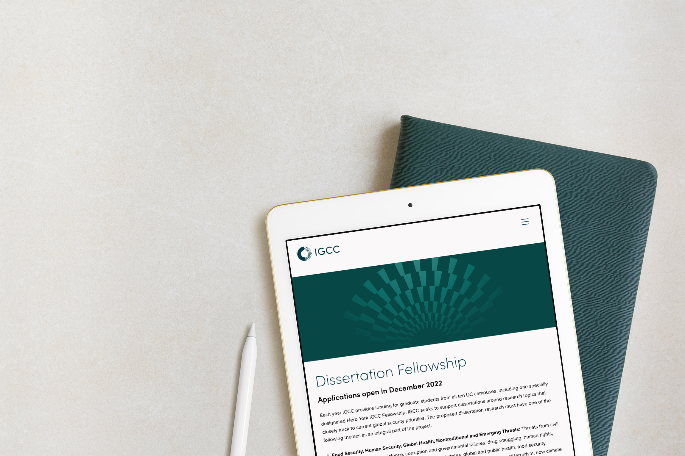
University of California Institute on Global Conflict and Cooperation–or UC IGCC–bridges the academic and policy worlds and conducts social science research on topics such as international security, geoeconomics, the future of democracy and the environment. They wanted to redesign and modernize their dated brand identity and website and separate them from the University of California’s brand look and feel.
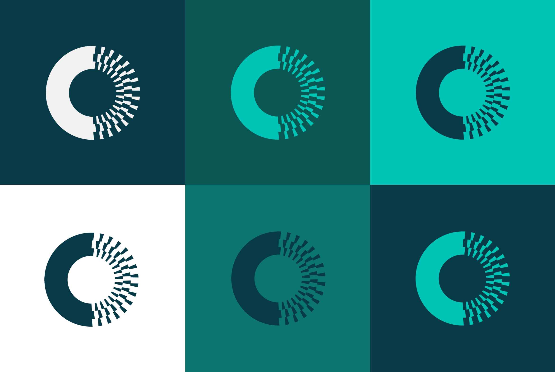
Using the “rays” from inside the mark as a graphic motif to help depict the idea of “illumination” on to challenging topics. The motif becomes a positive “light” overlapping intense photography. Motifs can be used on any marketing materials from blog posts to presentation covers to social media.
A responsive WordPress website was built to present their vast archive of content in a new way that was easy to use. It needed to feel modern and feature related experts and content on each page.
Deliverables:
- Brand Identity
- Brand Styleguide
- Visual System
- Website Design
- Web Development
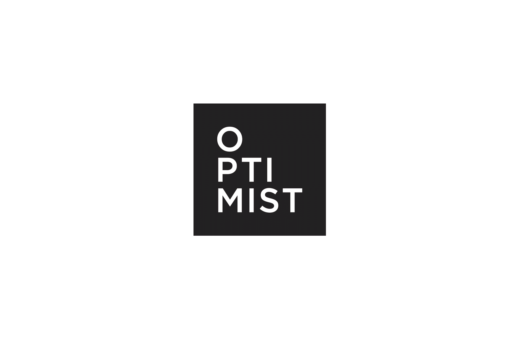
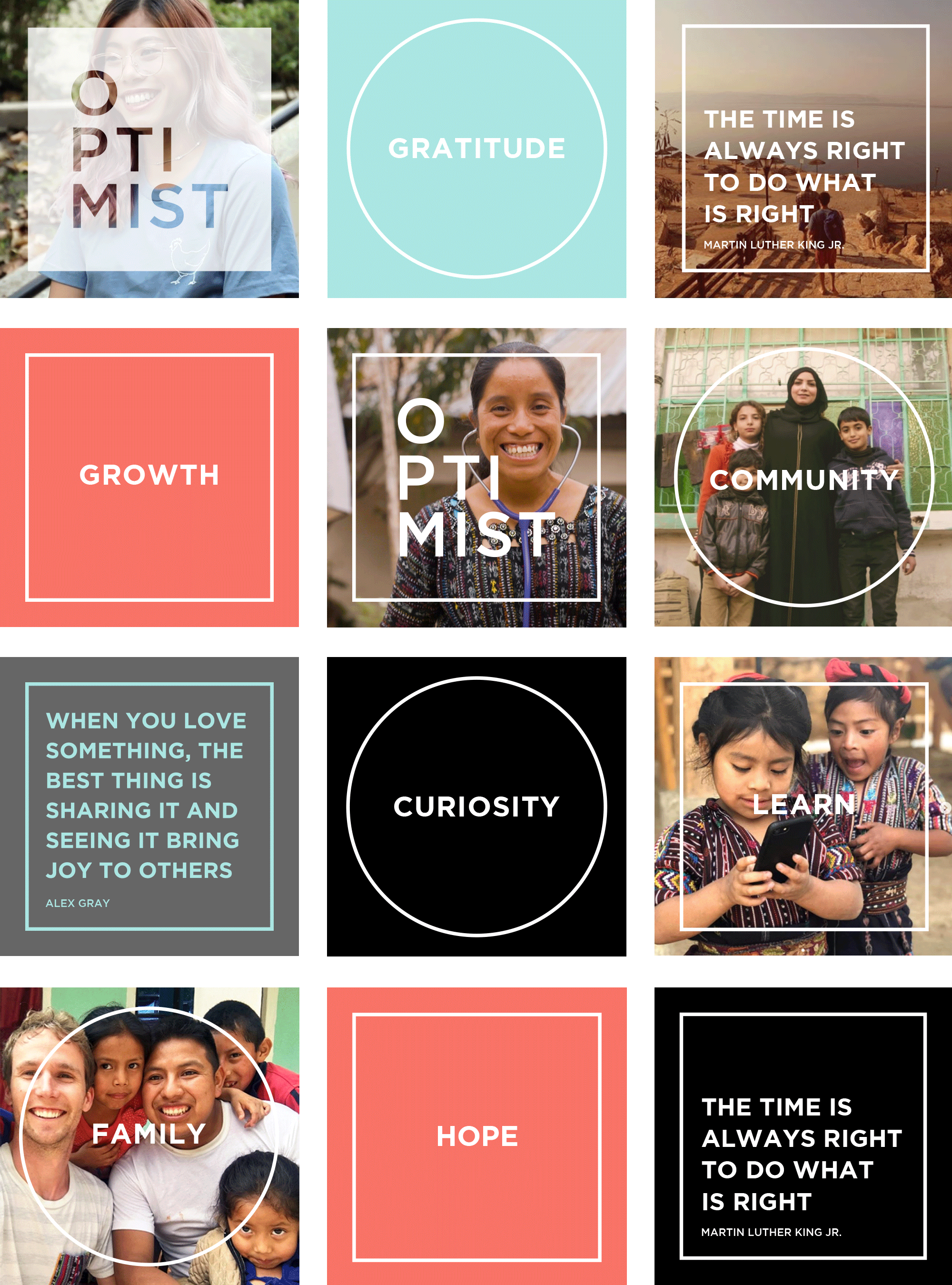
Optimist films
film production / brand identity
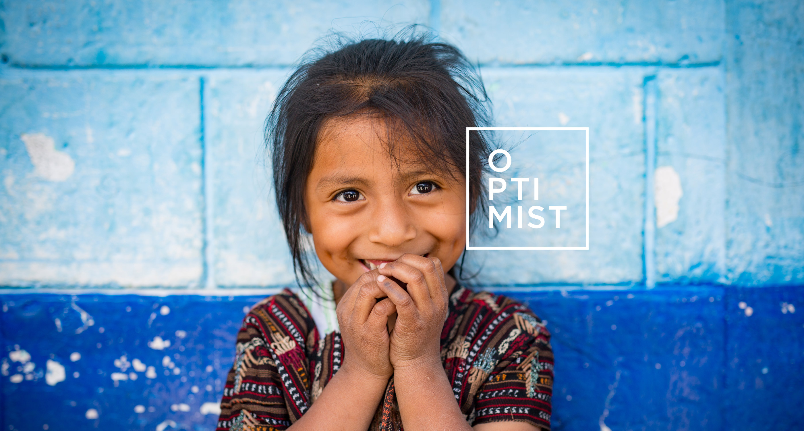
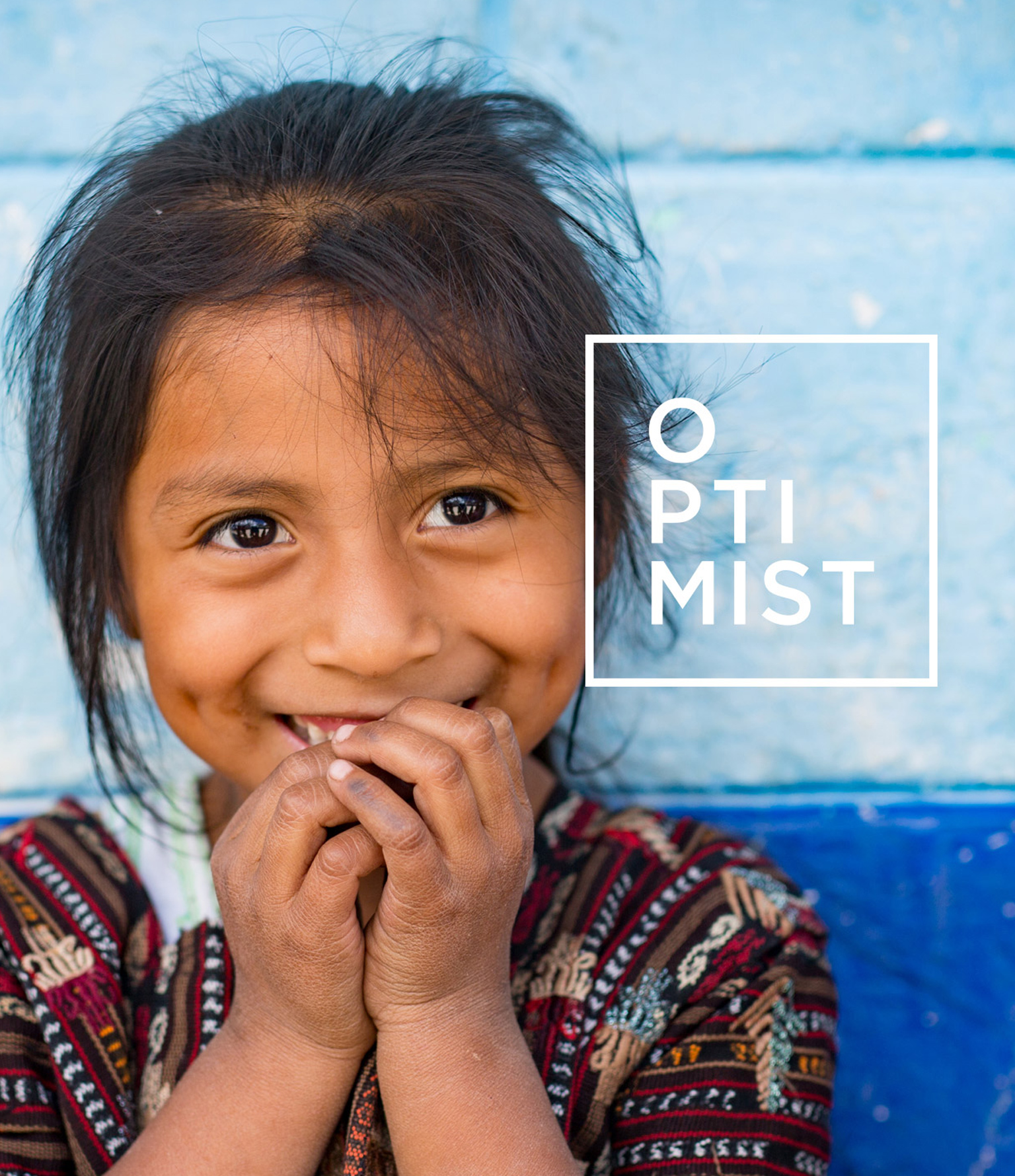
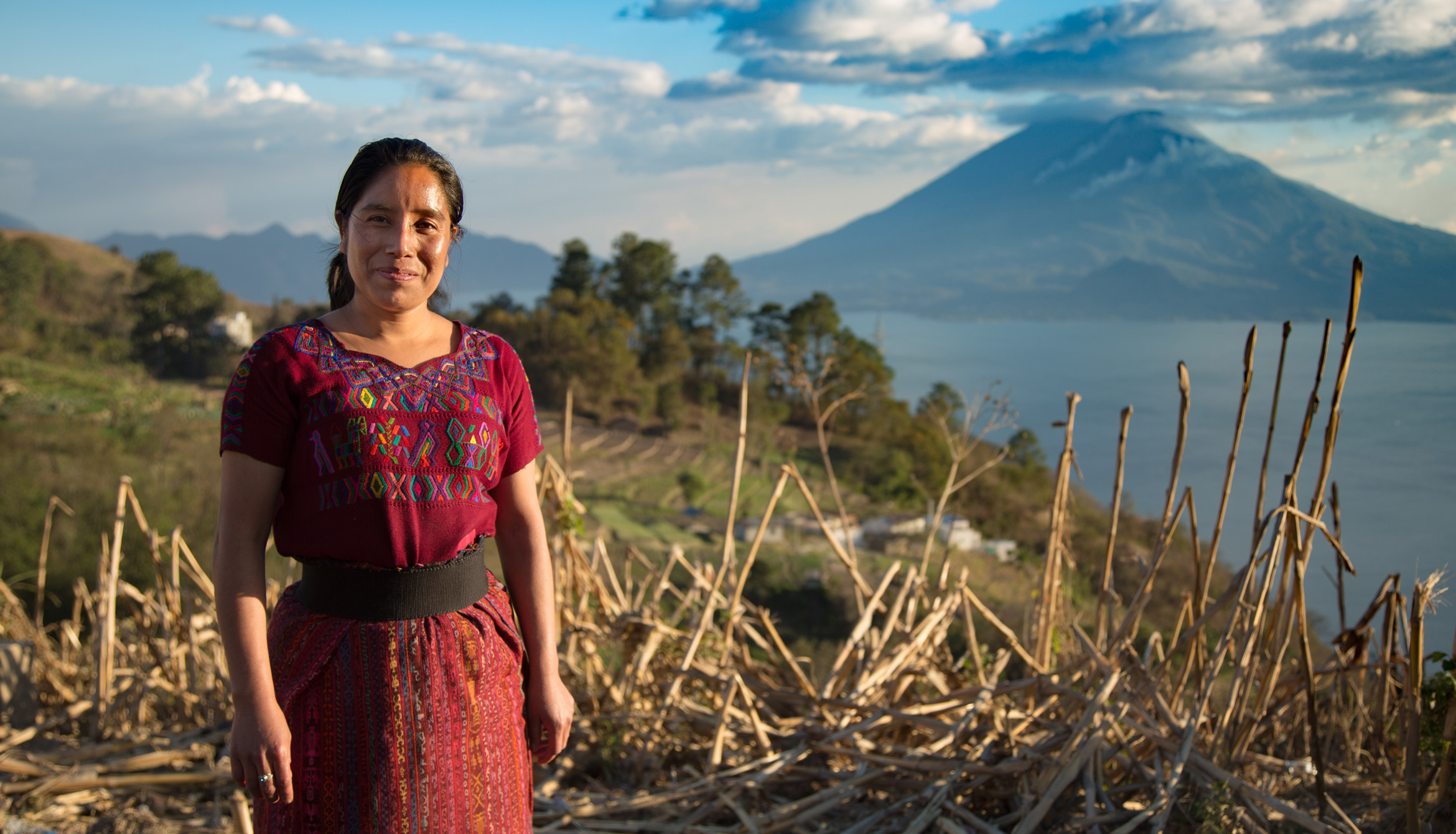
Optimist travels the world making non-profit films with impact
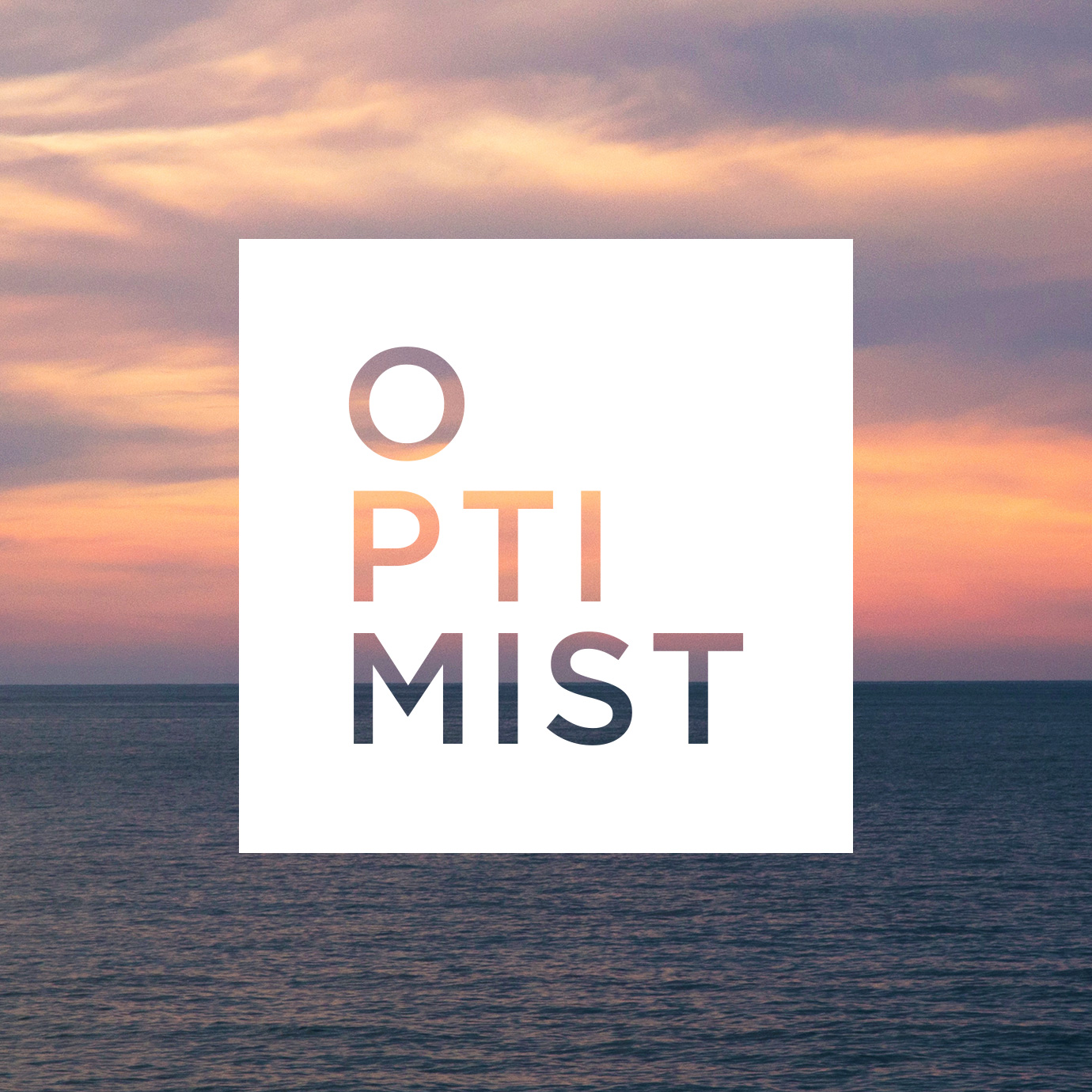
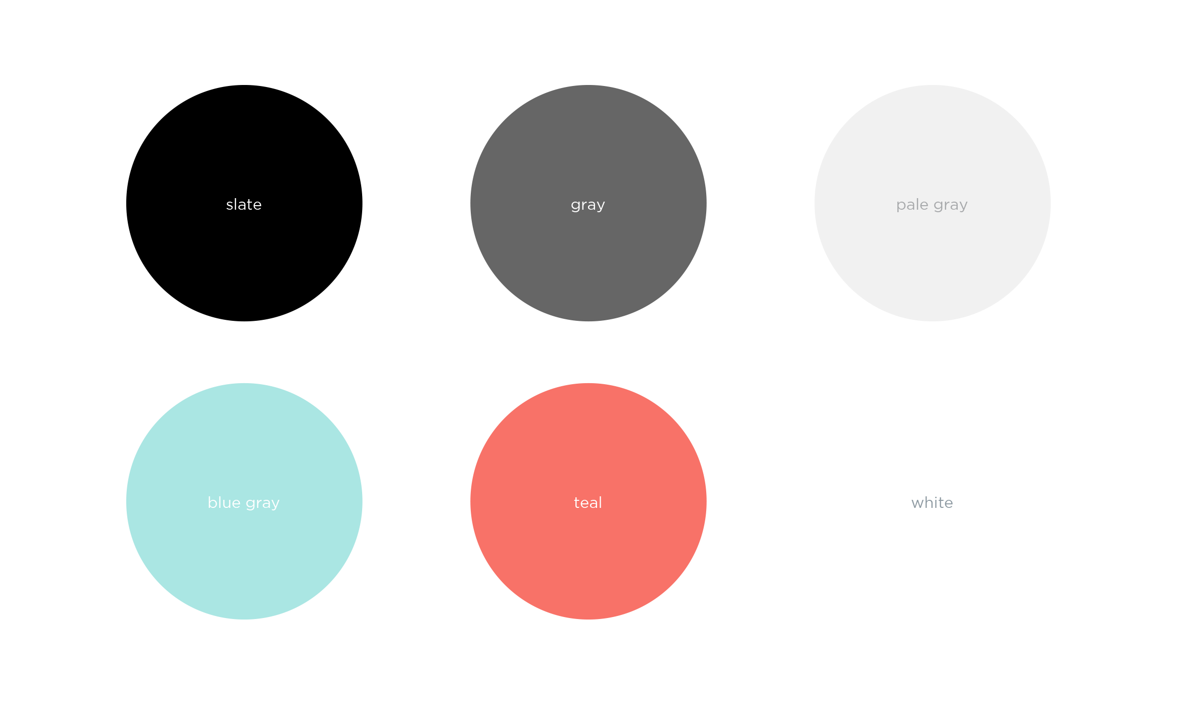
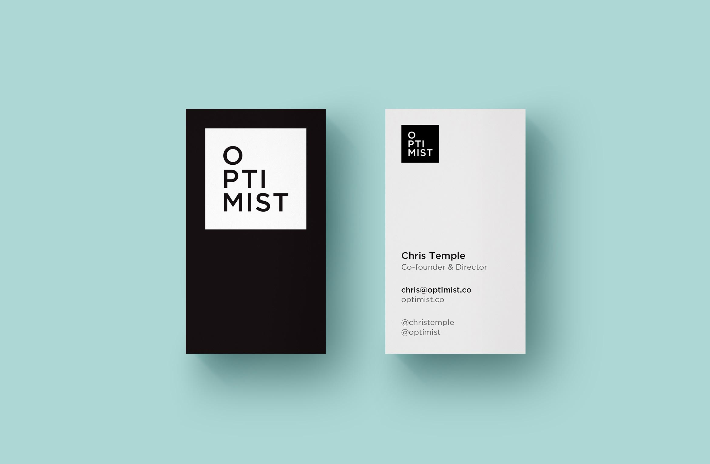
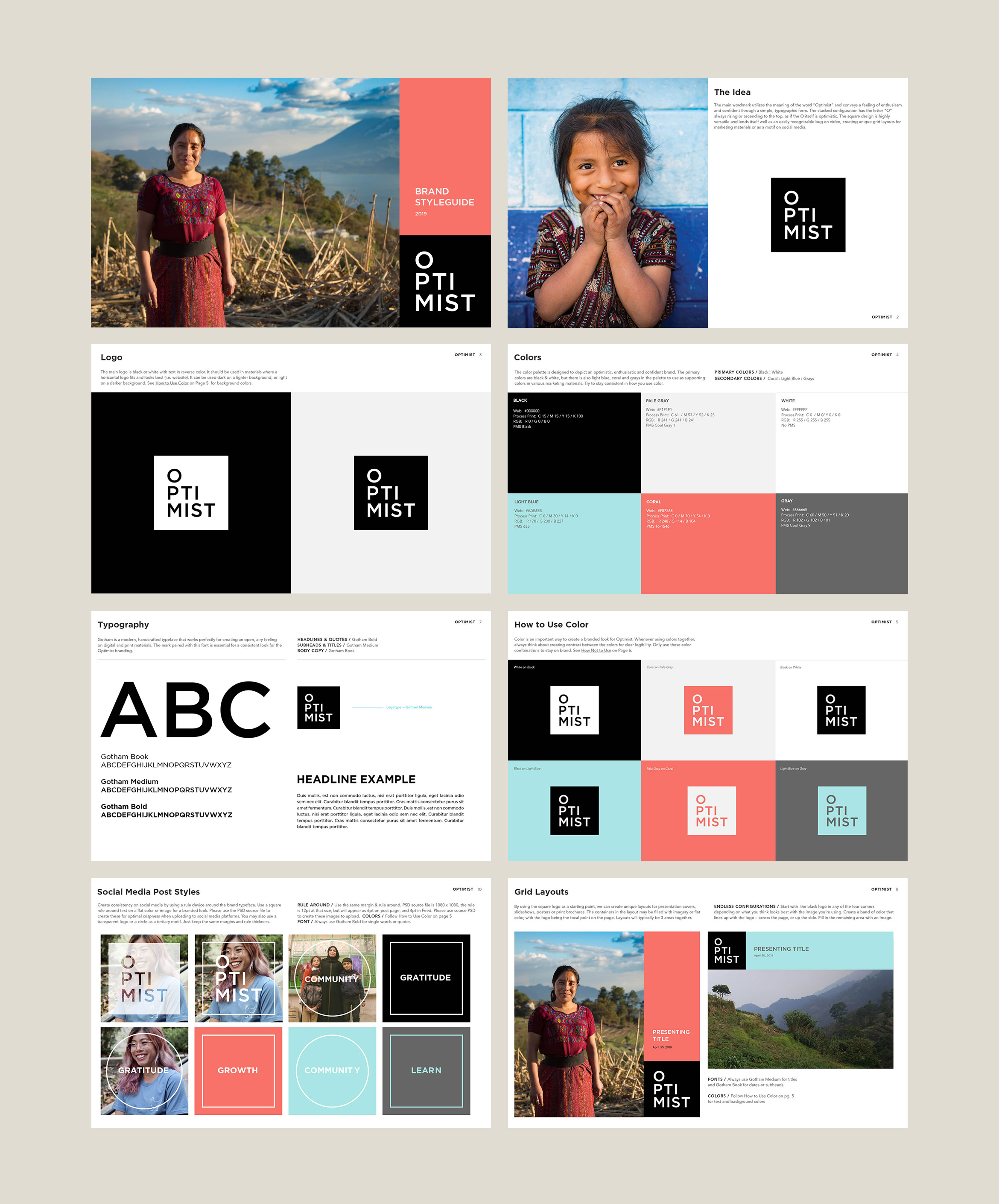
Formerly Living on One, these LA-based filmmakers create character-driven documentaries exploring complex issues through human stories and new perspectives. They changed their name and wanted an identity that felt modern, clean and instantly recognizable as an Optimist film. The word Optimist is stacked to look like its rising inside a simple square.
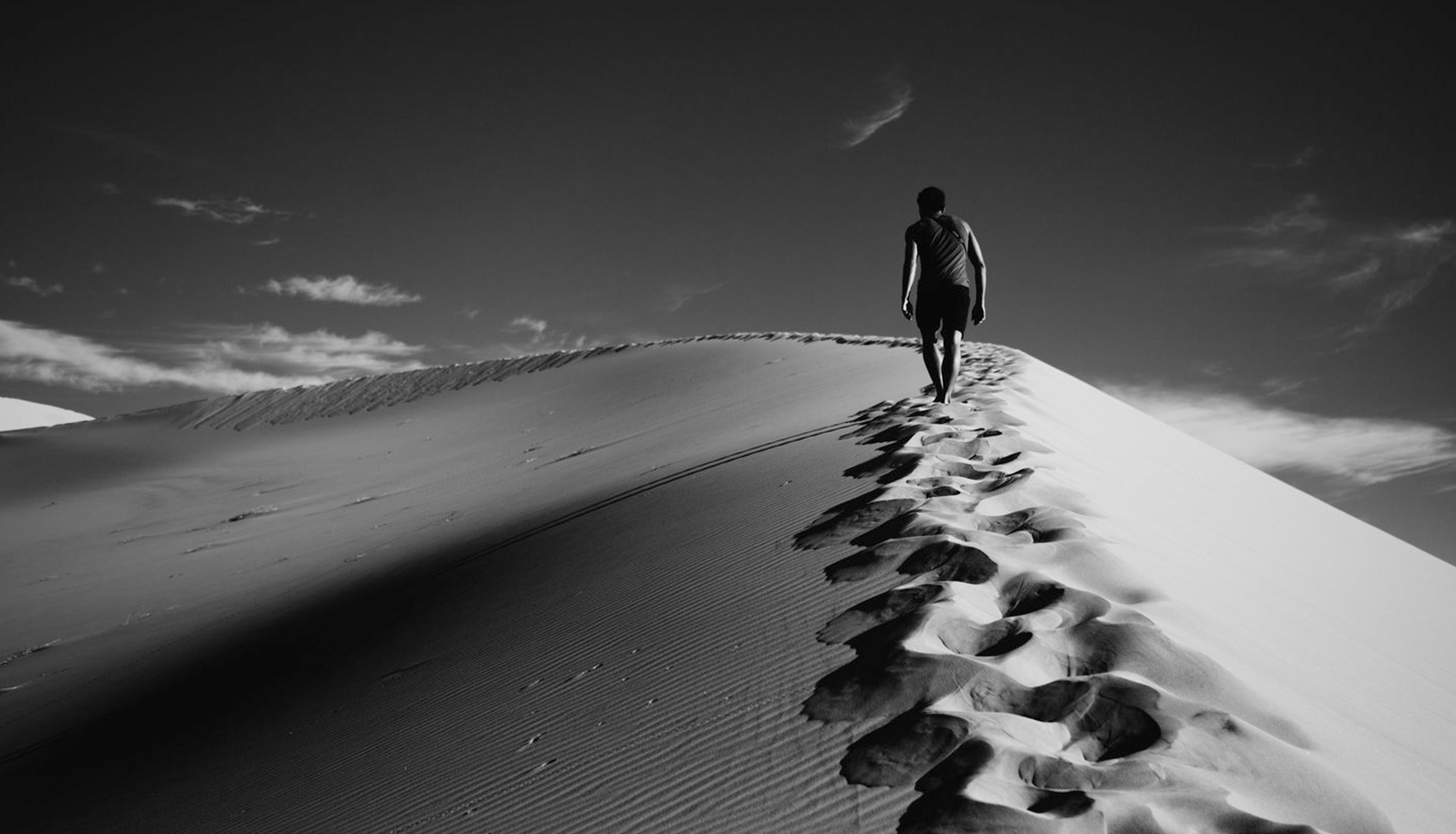
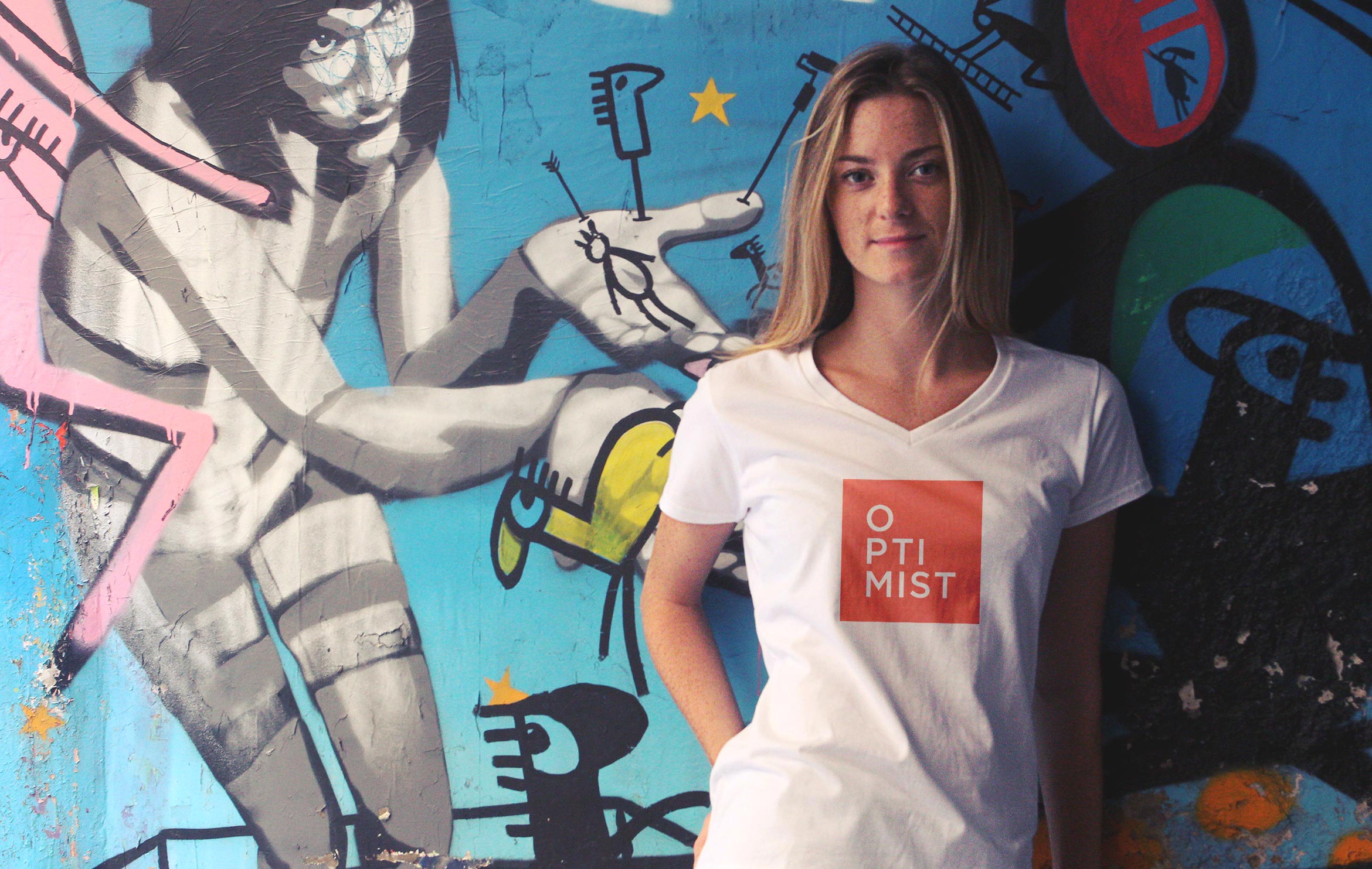
Video Branding was important to create a distinctive look for their content. The white logo was applied as a bug in the corner of all of their social media videos and theatrical films, as well as a clean and legible caption style using the same Gotham font.
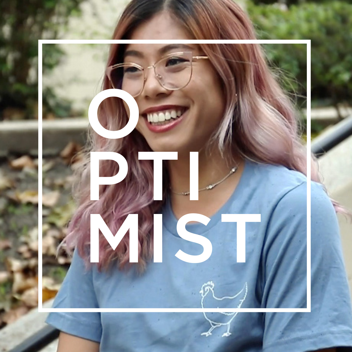
A branded visual design for Instagram is instantly recognizable as Optimist. Using quotes and aspirational words, we paired their photography with clean typography, and a supporting color palette and used square and circle motifs to highlight the message.
Deliverables:
- Brand Identity
- Brand Guidelines
- Video Branding
- Social Media Assets
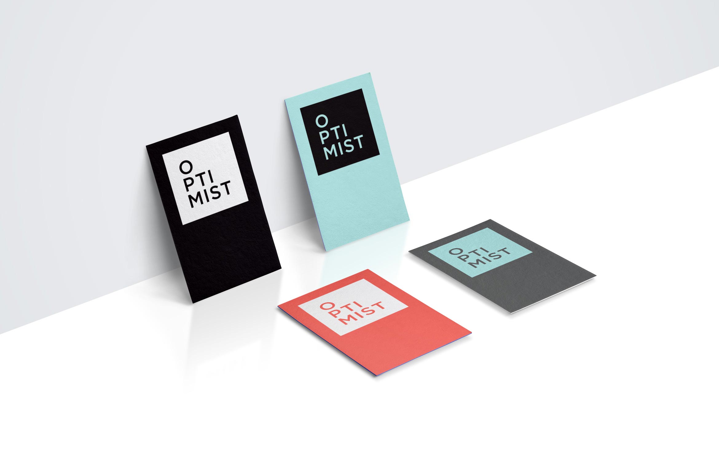
- Business Cards
- Promotional Swag
Brand Styleguide outlines rules and guidelines for the logo, color palette, typography and graphics. The in-house content team will use this to create branded social media posts for a cohesive look.
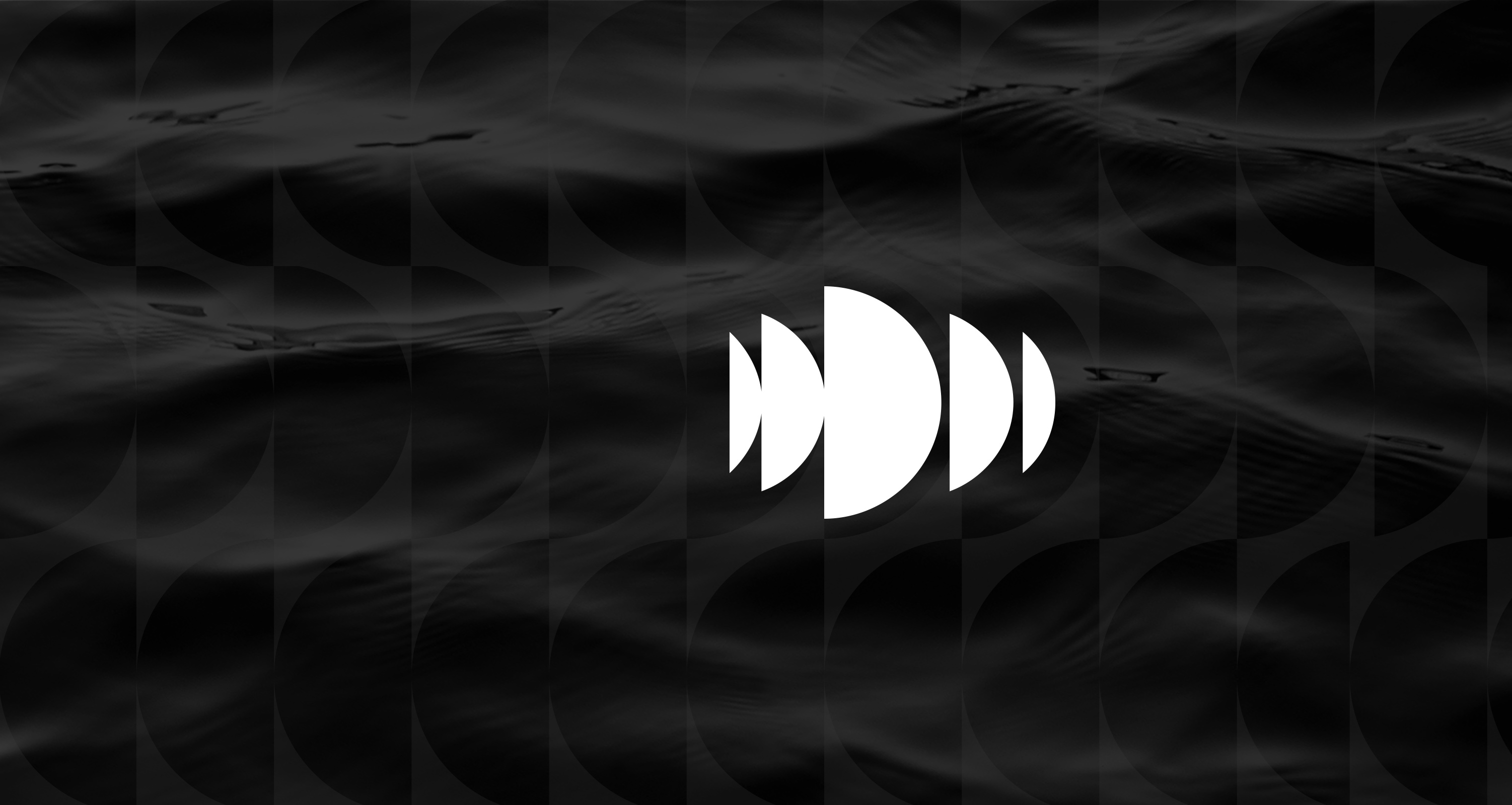
Demarest production
arts & media / brand identity / print

Demarest empowers great ideas in film and technology to deliver content
Demarest is a unique film and television production company that also invests in technologies that create and deliver premium content across all mediums. They wanted to remove the “films” from their name and redesign their identity to better reflect their innovative business model.
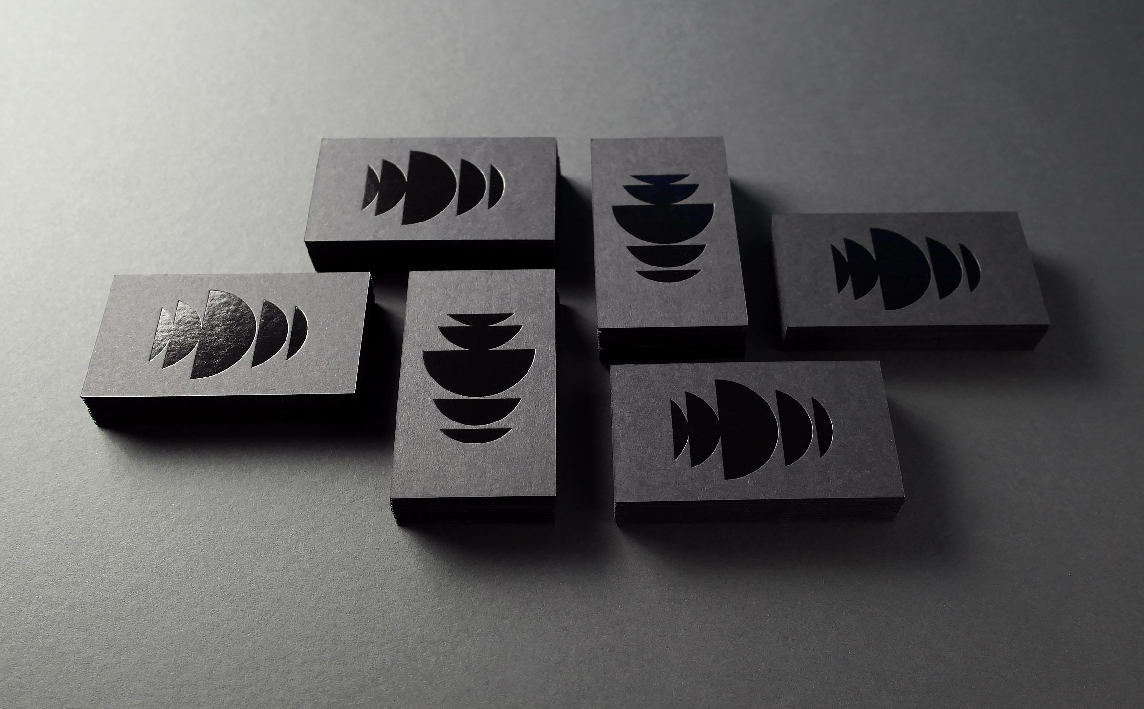
The mark is composed of bisected circles that echo the letter “D”, creating an innovative wave pattern that’s full of motion and energy reminiscent of light refracting on dark water.
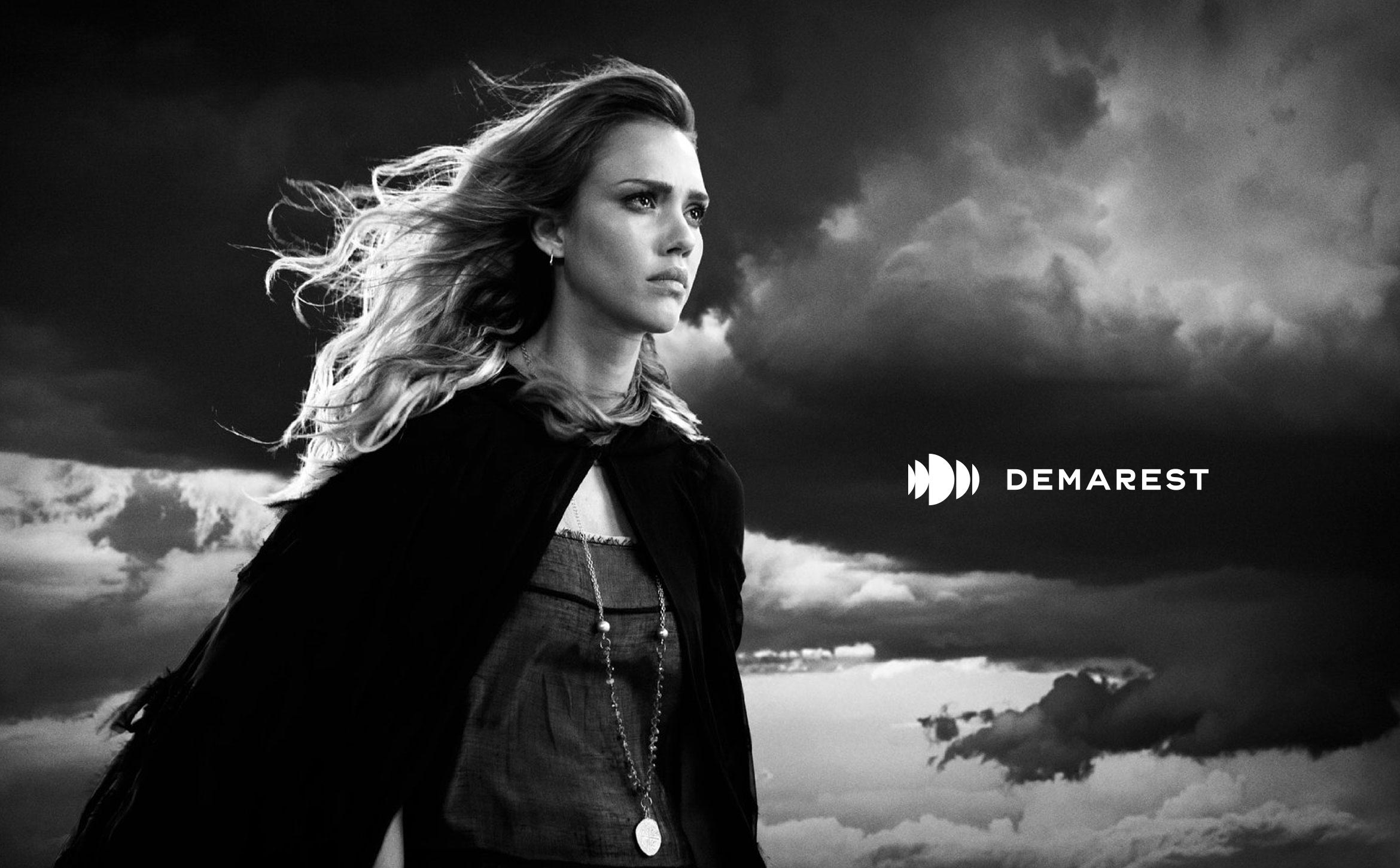
The name Demarest means “of the swamp” in French. Images of water and nature combined with pattern motifs evoke a mysterious place where ideas are born. Moody images help bring a responsive WordPress site to life.


Deliverables:
- Brand Identity
- Brand Styleguide
- Website Design
- Business Cards
- Content Creation
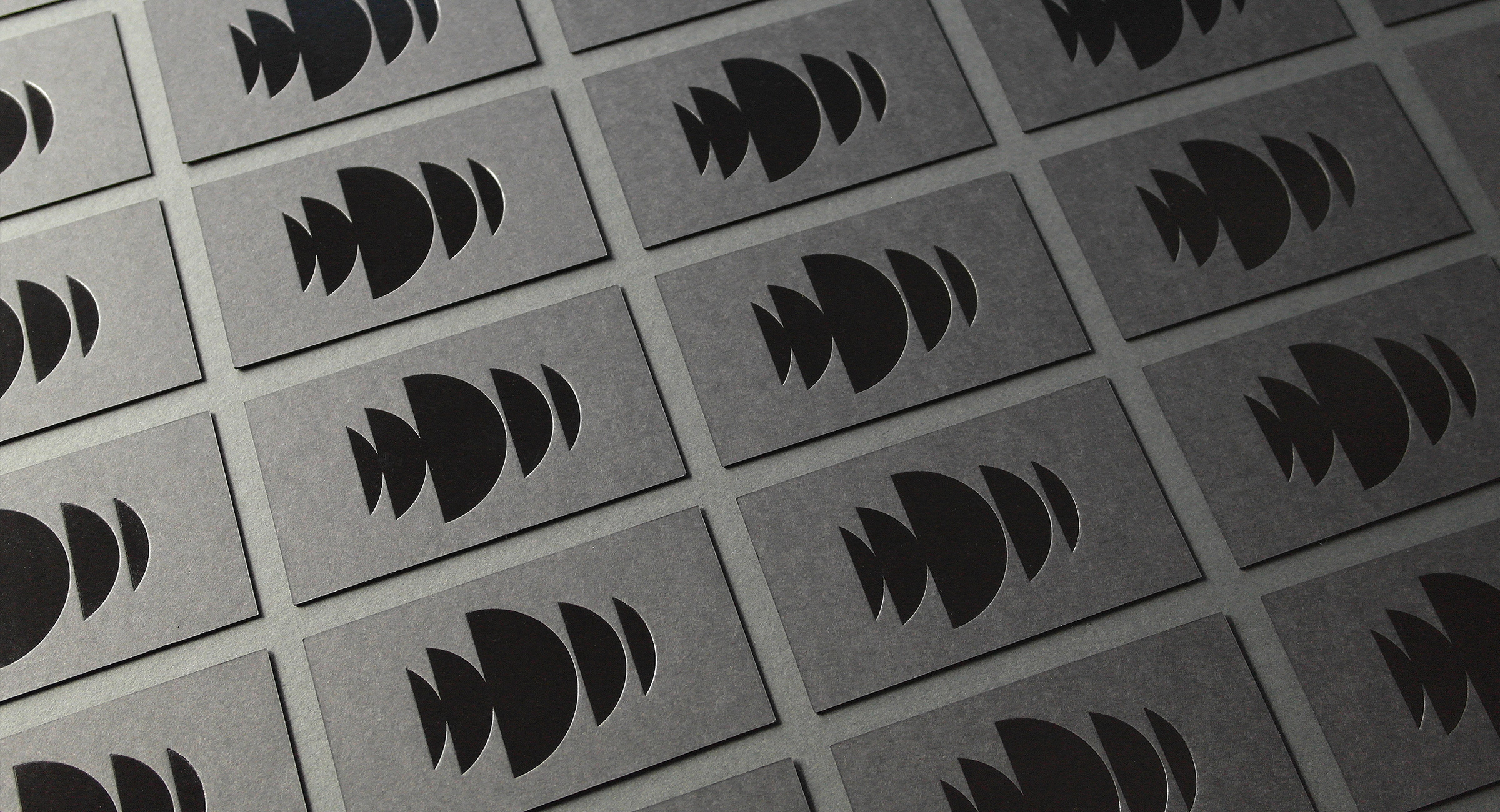
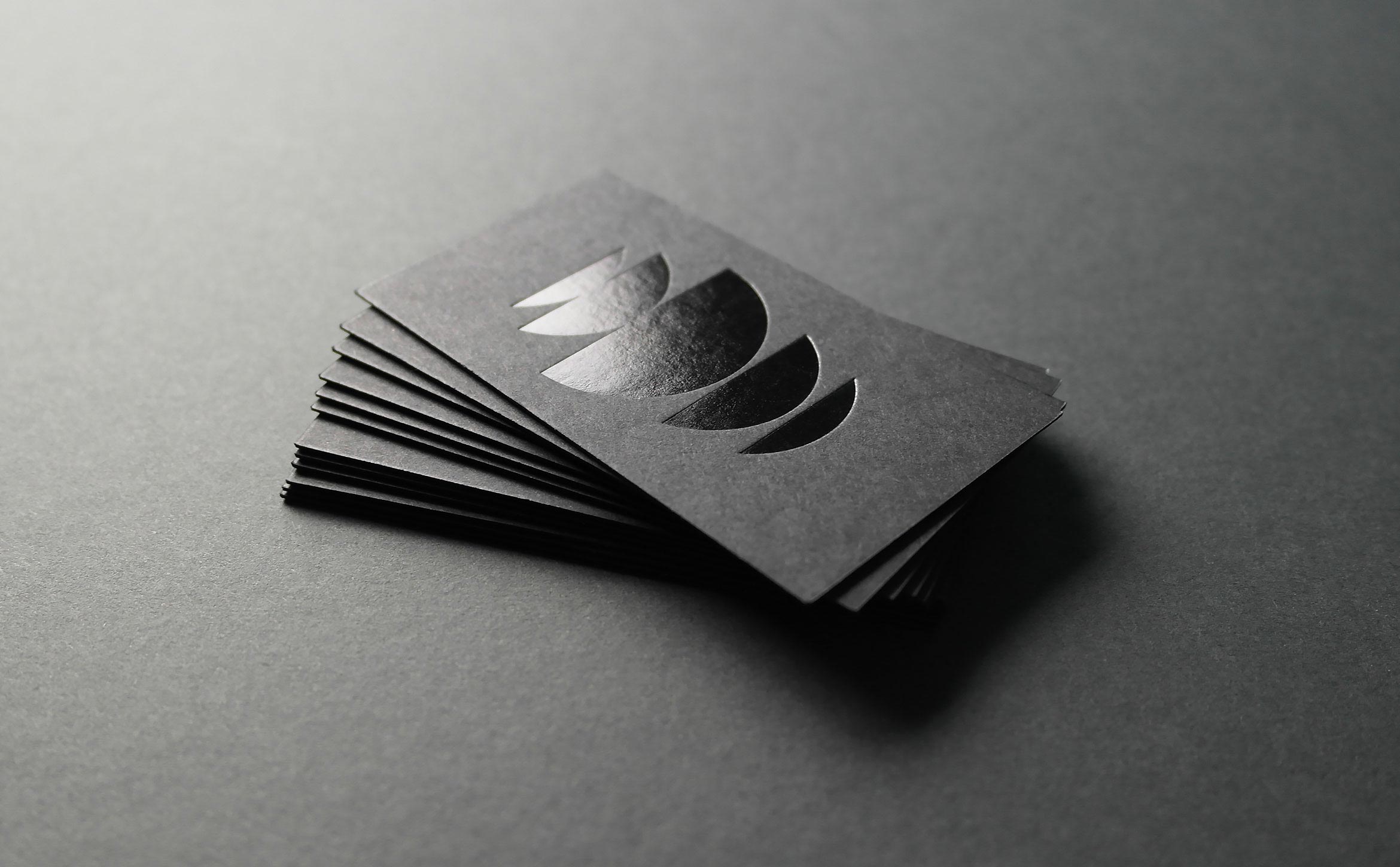
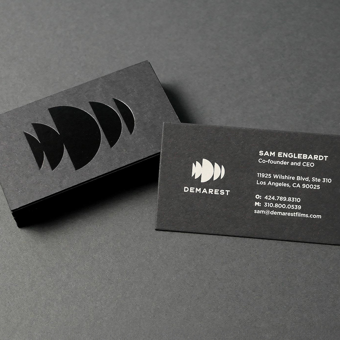
We designed dark and mysterious business cards for the team. Cards are printed using duplexed French Muscletone stock with black foil embossed on the front and silkscreened pale gray ink on the back.
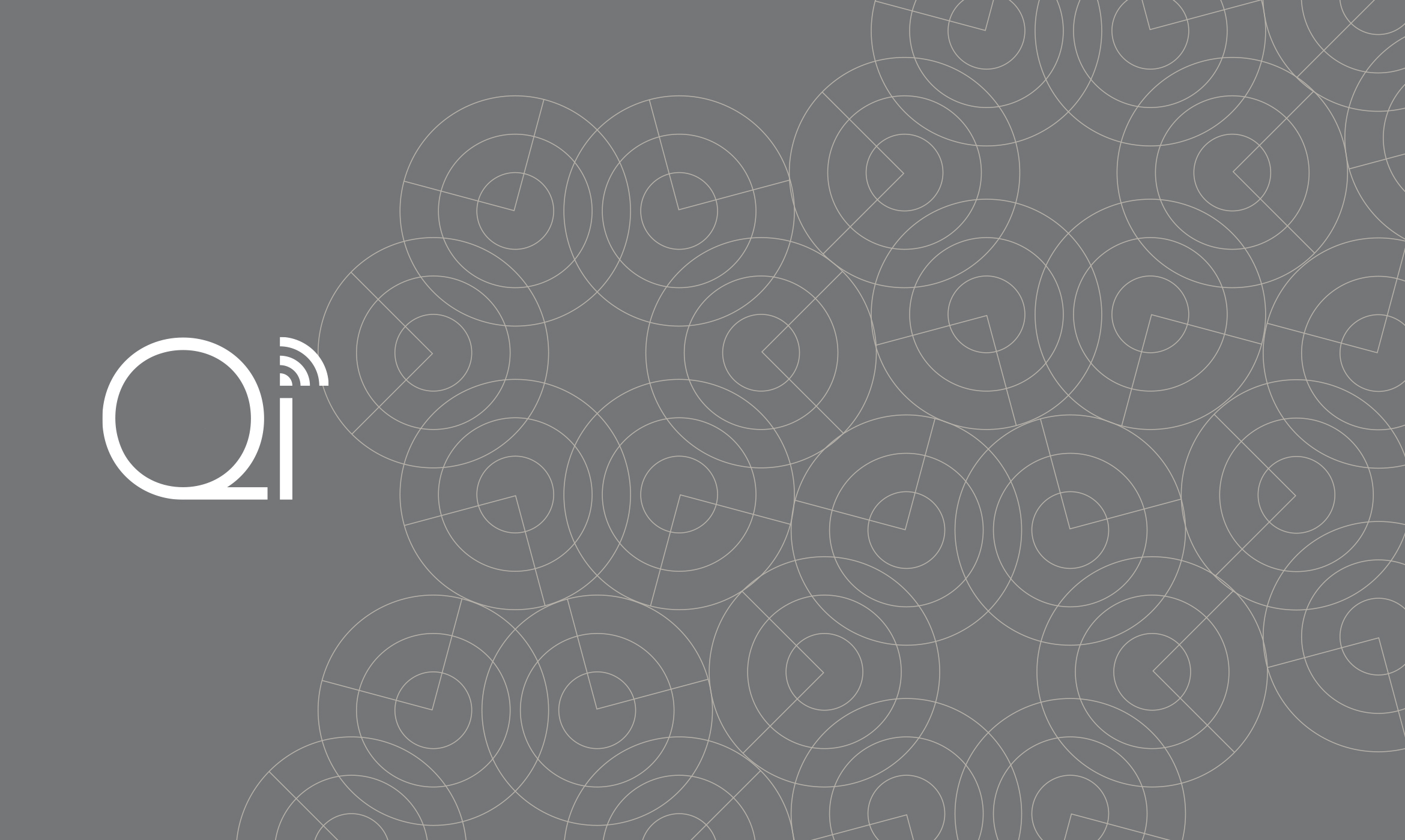
Qualcomm Institute
technology / brand refresh / website

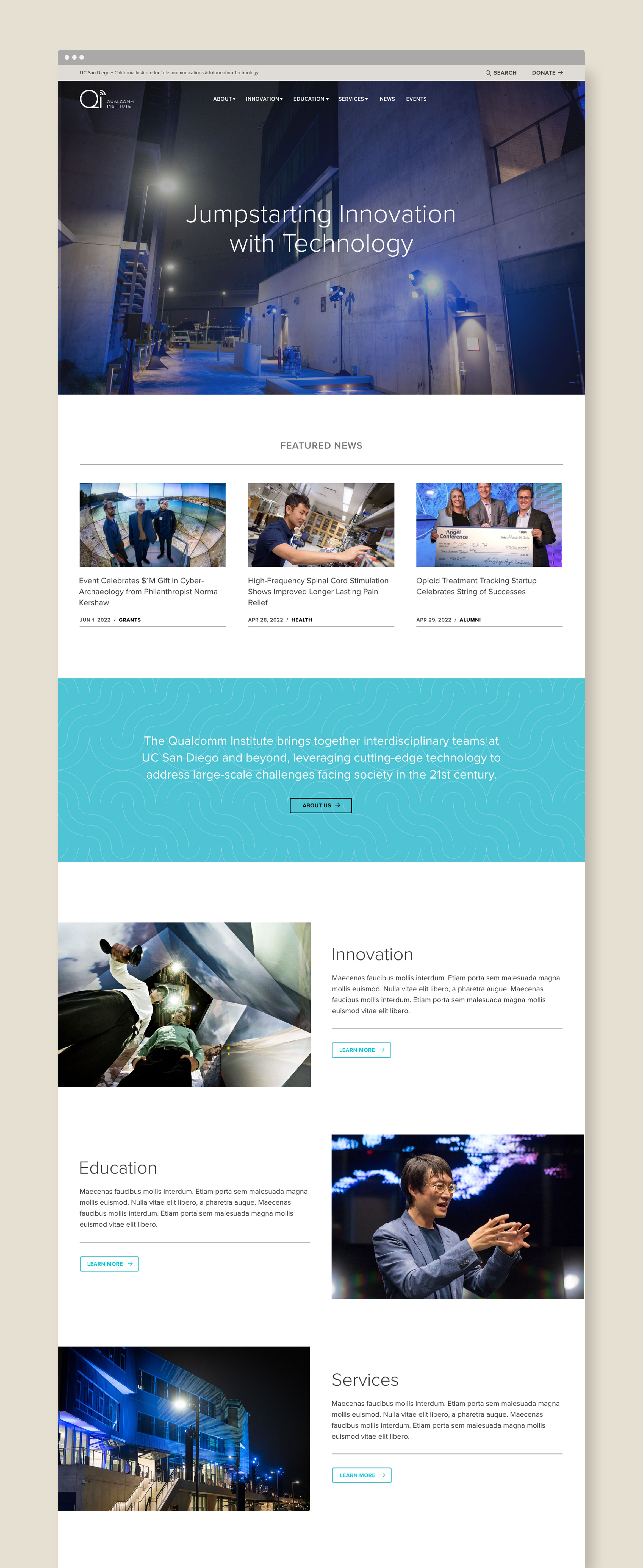
Qualcomm Institute jumpstarts innovation with technology and research
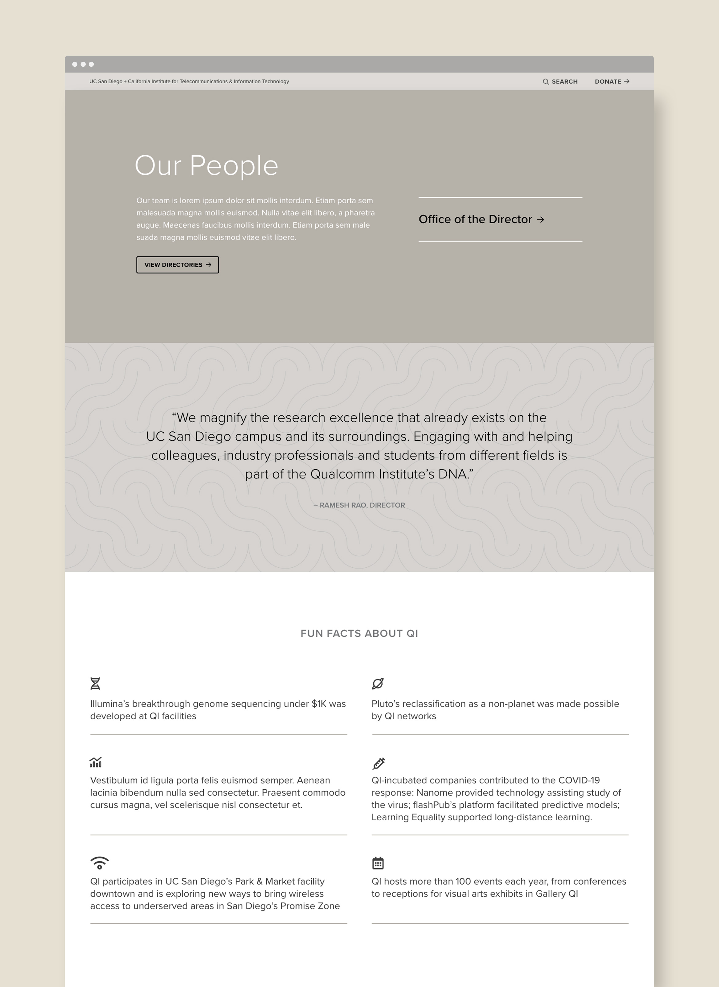
The Qualcomm Institute (QI) is a nonprofit research organization bringing together teams from all different cutting-edge technologies at UC San Diego. Founded in 2000, QI wanted to keep their existing mark, but refresh the visual identity and color palette to feel separate from the University of California’s yellow and blue branding. We started with an updated logo lock-up that feels cleaner, more organized-looking and easier to read.
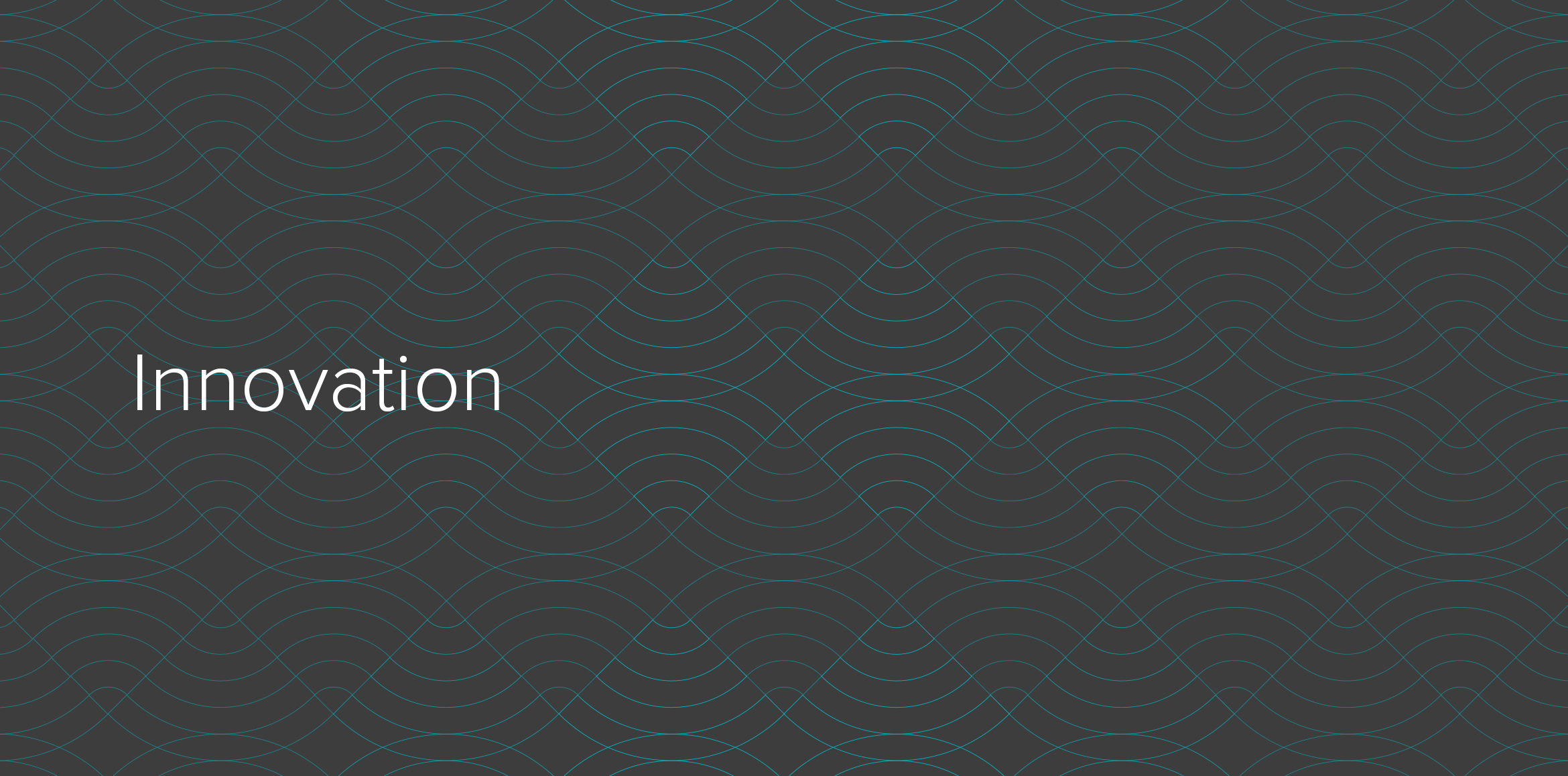
A visual system of graphic motifs was created using the circle and wave from the QI mark as the main geometry. Various color combinations create hero banners for the website and blog.

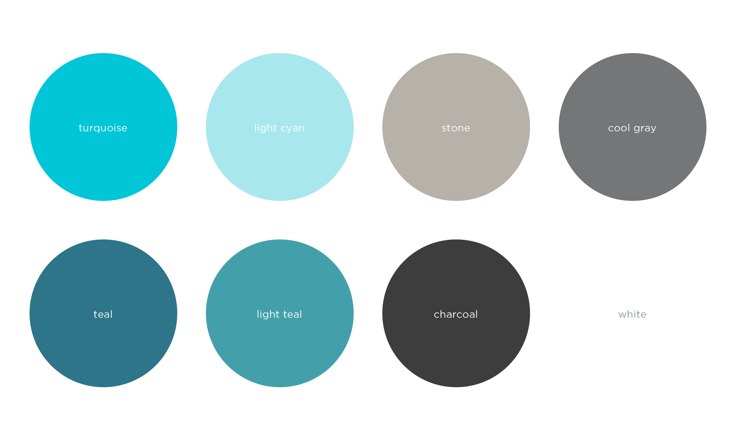
Working with the existing UC San Diego brand colors, we focused on the turquoise, stone and cool gray and added teal for a monochromatic look. The feeling is both confident and contemporary.
After an extensive site audit and wireframing phase, we completely redesigned their existing website. The result is well organized, easy to navigate and incorporates the new color palette.

Deliverables:
- Brand Refresh
- Visual System
- Web Design
- Web Development
- Content Creation
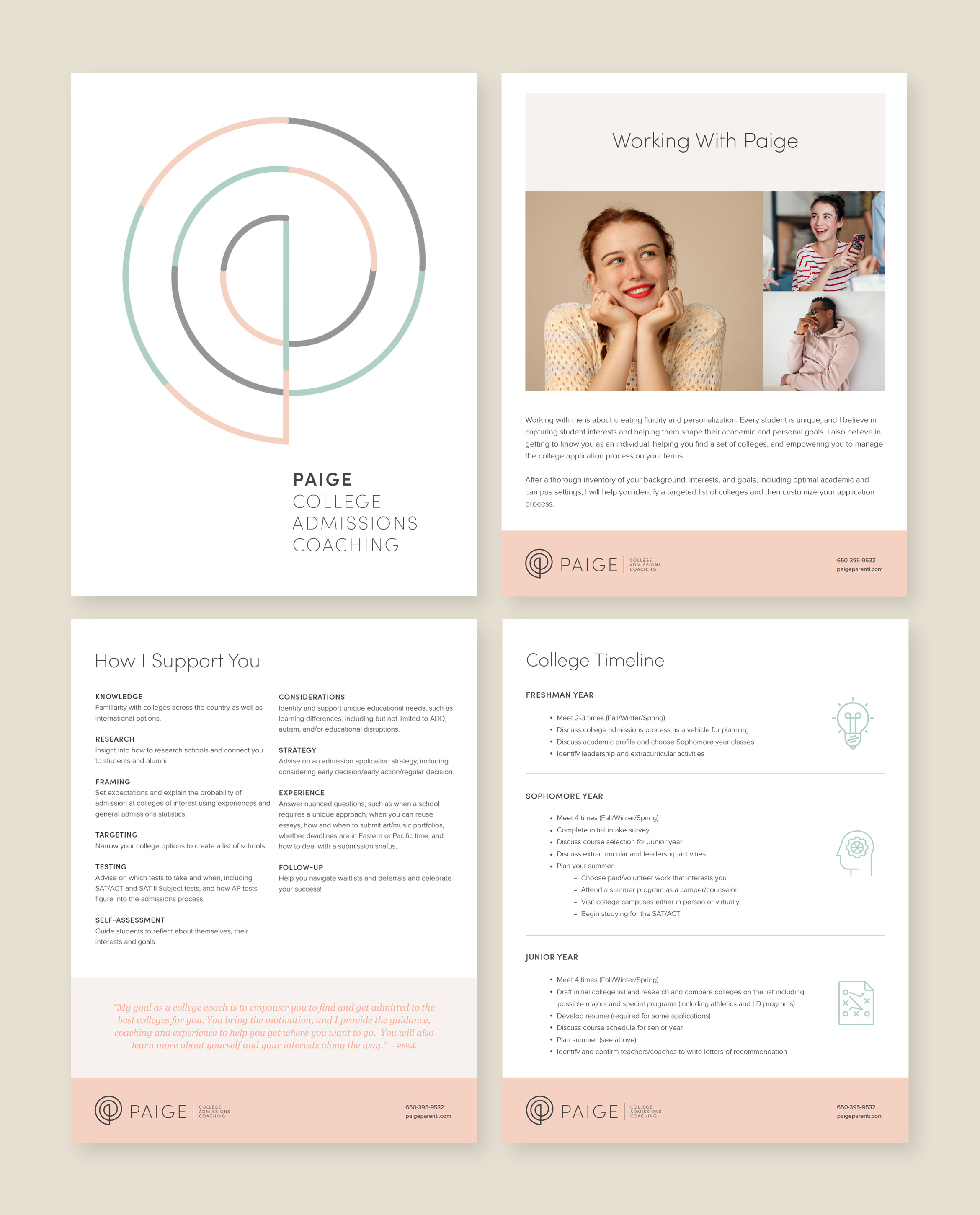
Paige Parenti college coach
service / brand identity / website


Paige is a college admissions coach with a mission to empower every student
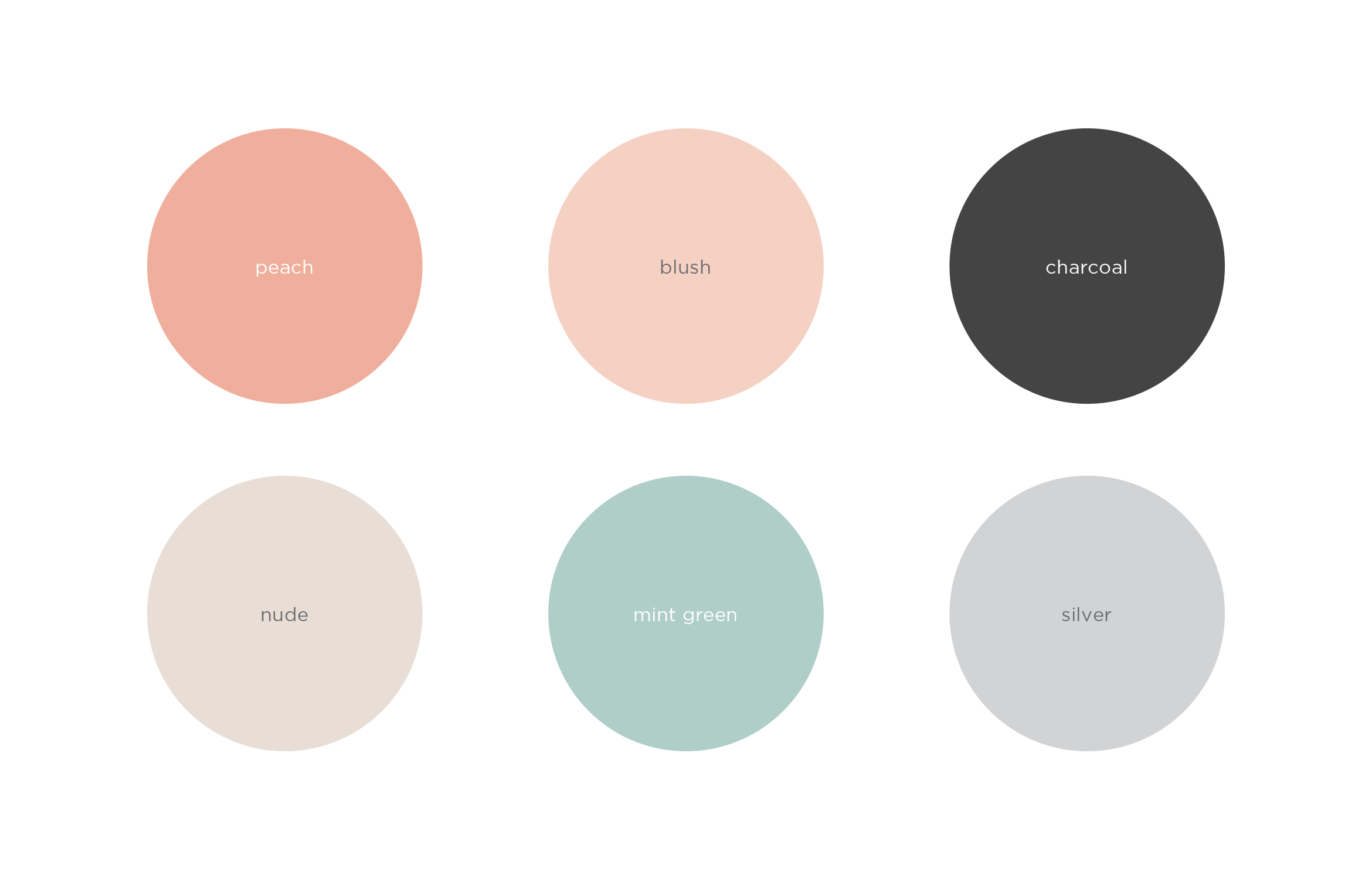
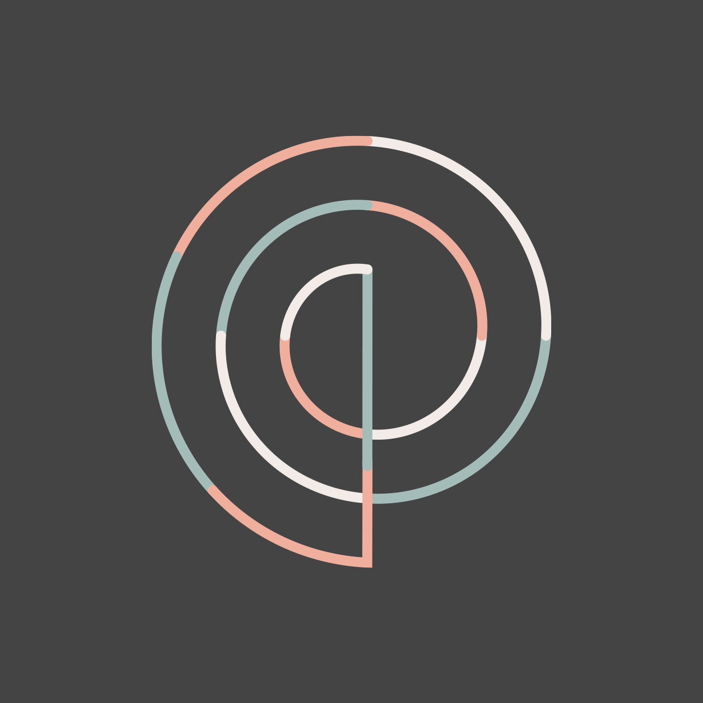
Paige helps every student find the right college for them, guides them through the admissions process, and sets them up for success. To appeal to Gen Z, and their parents, the company name was updated and the brand redesign focuses on the personal attention she gives to every student. The result is a clean and inviting look and feel using warm, soothing colors
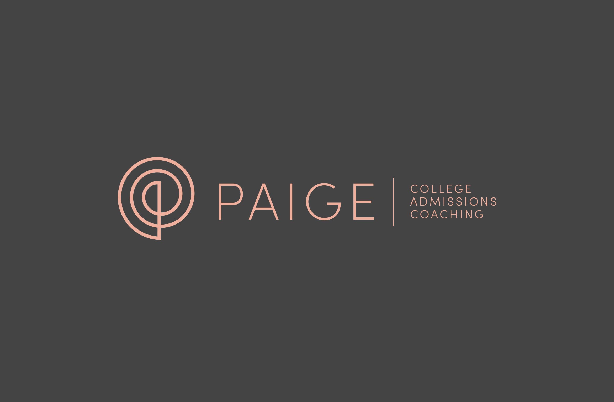

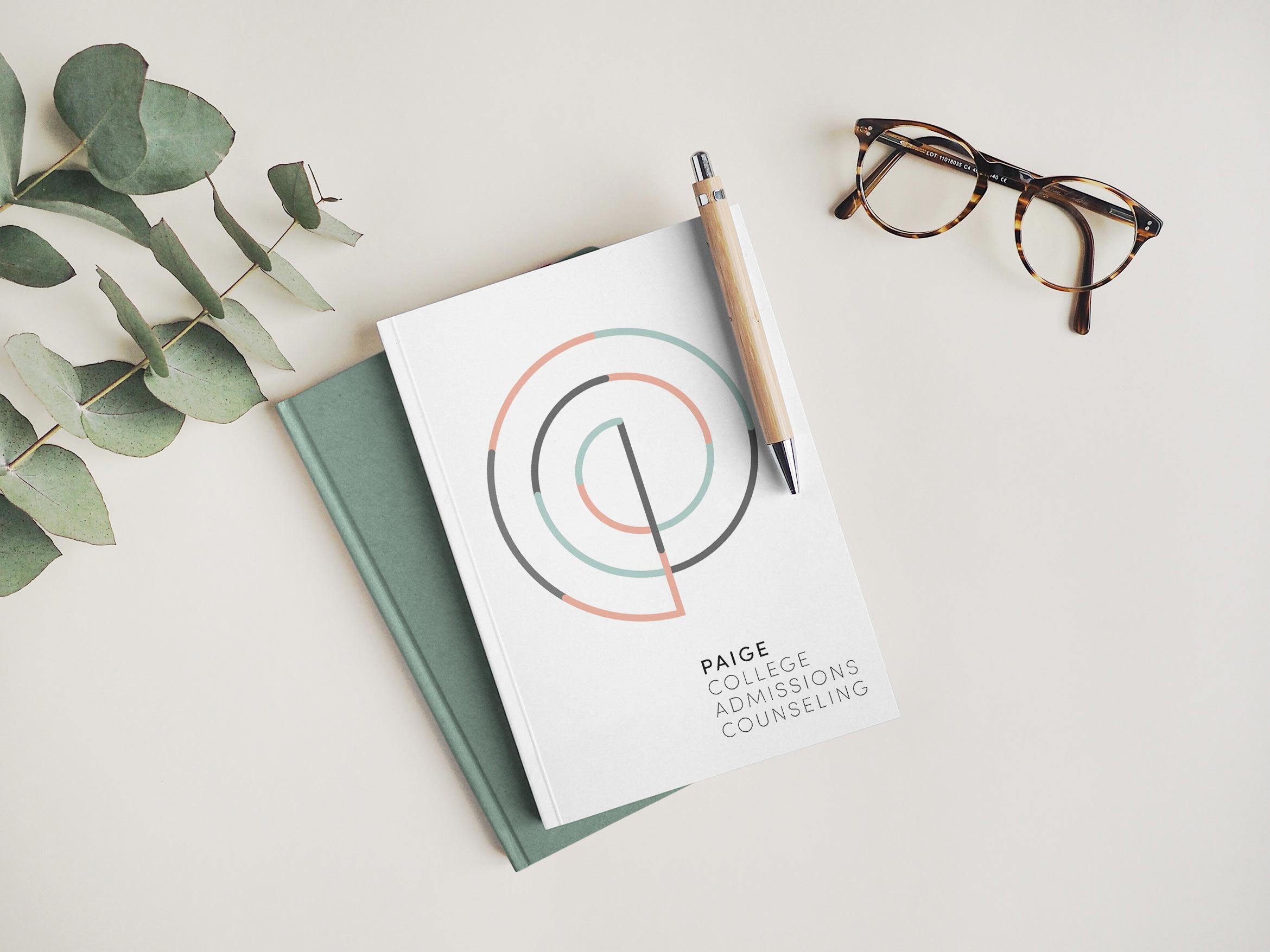
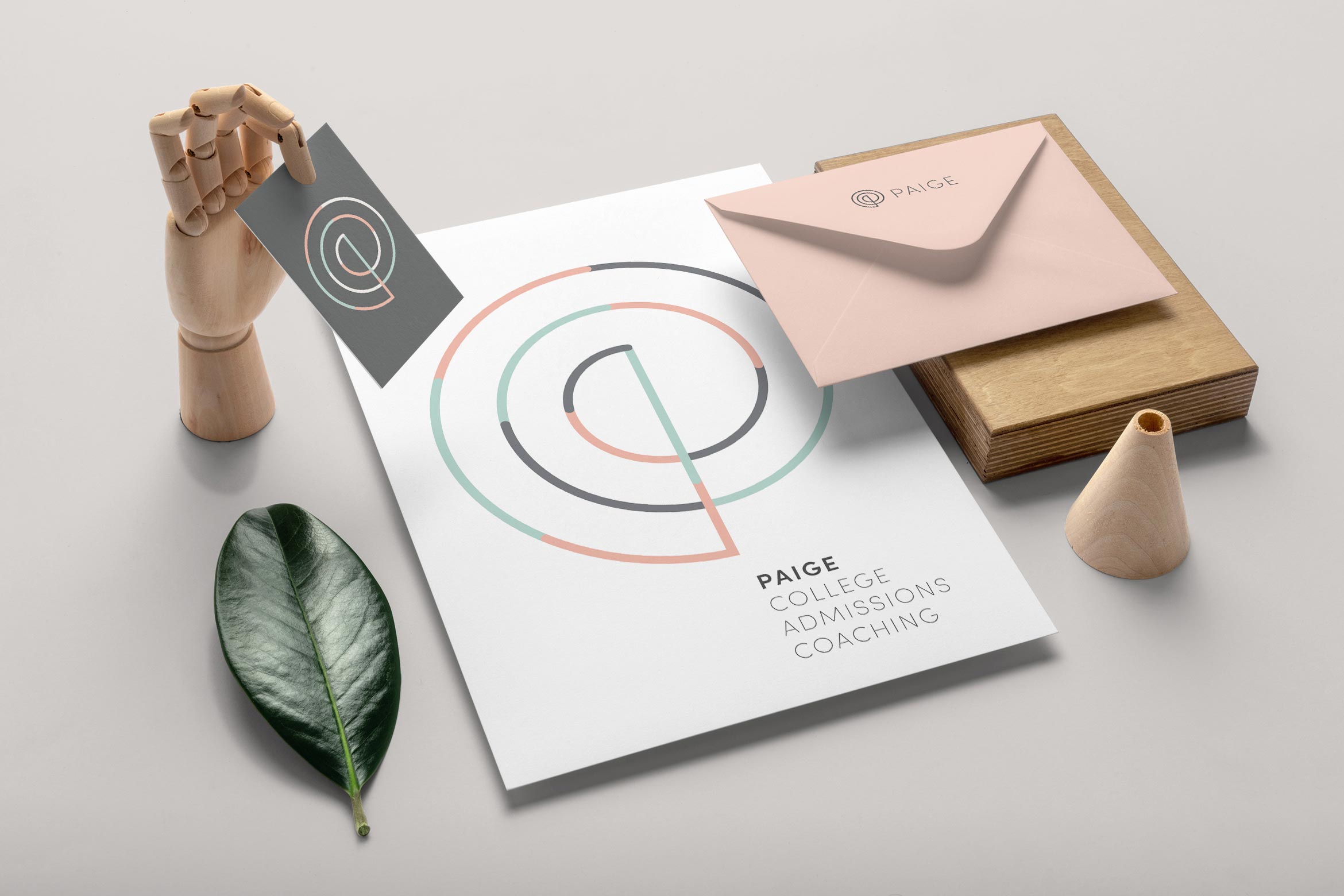
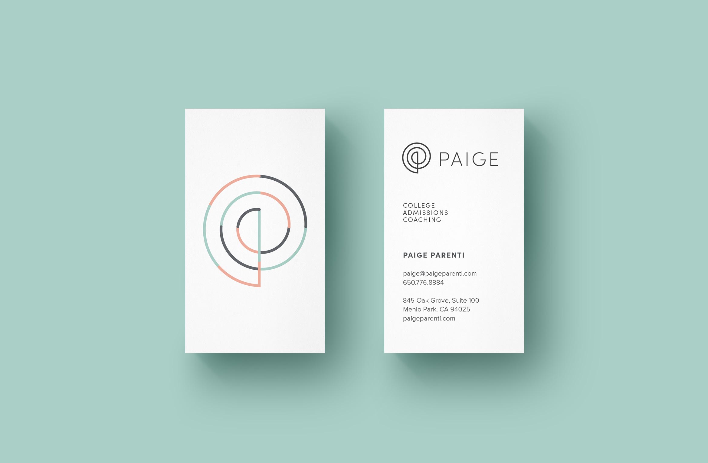
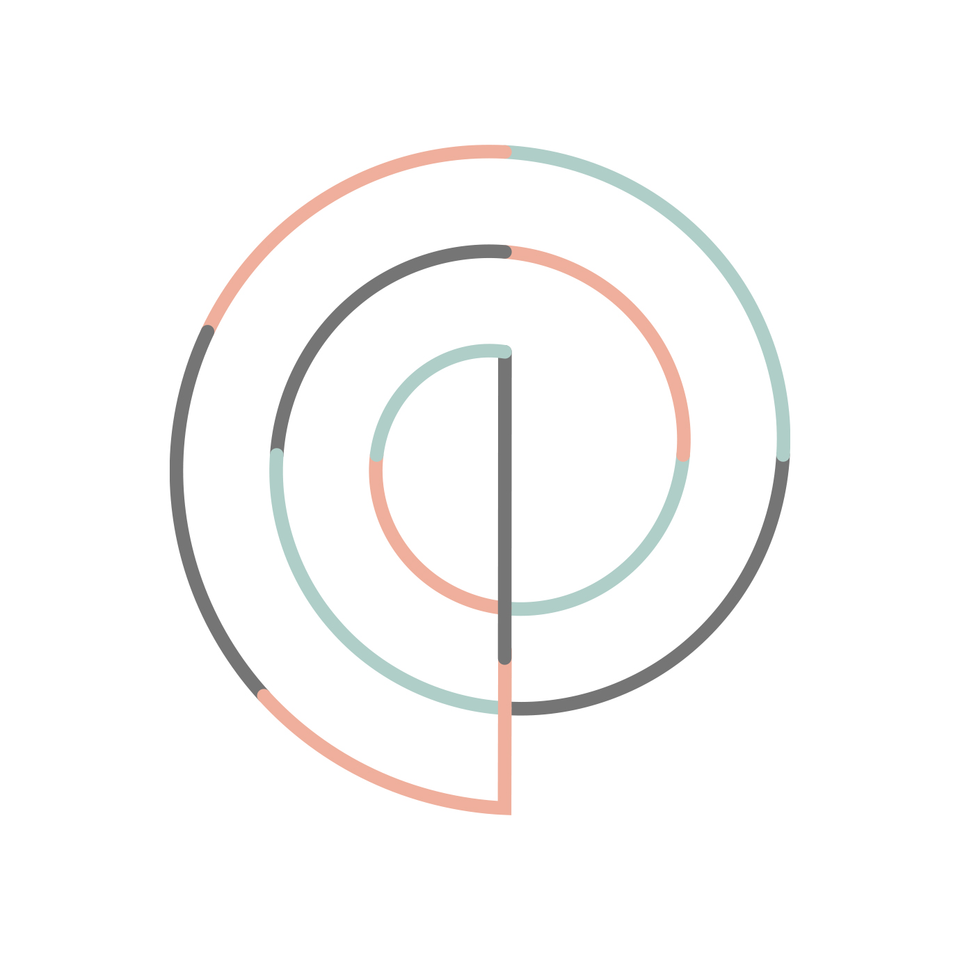
The elegant P monogram is inspired by the Golden Spiral, a sacred geometric symbol that represents higher learning and infinite possibilities. A set of thin line icons compliment the thin lines in the logo.
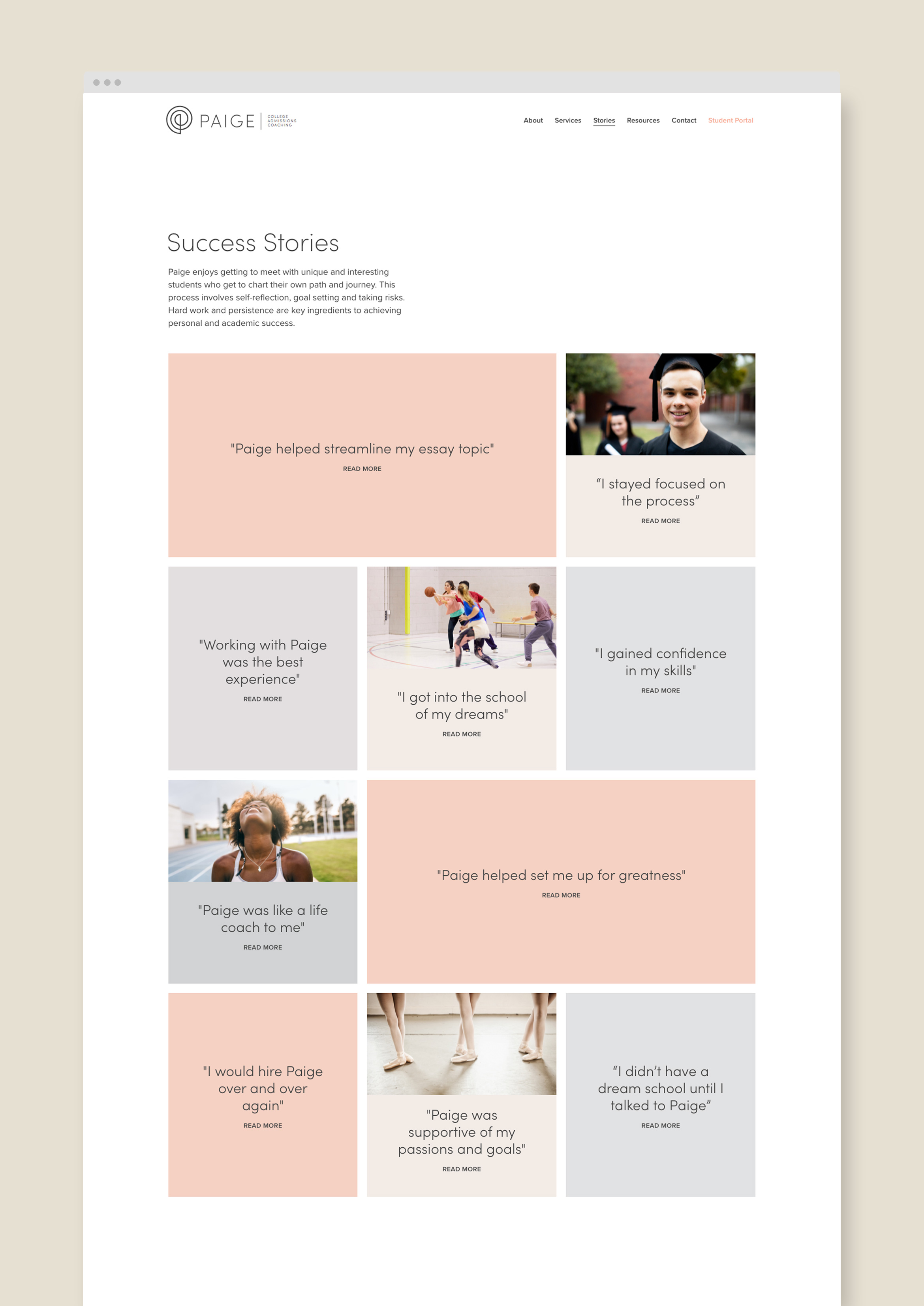
A customized website tells the story of Paige, her services and student stories to describe real-world results. The design is light and airy with easy bites of information and imagery, plus a student scheduling calendar and payment pathway.
Deliverables:
- Brand Identity
- Visual System
- Web Design
- Content Creation
- Digital Collateral
- Print Design