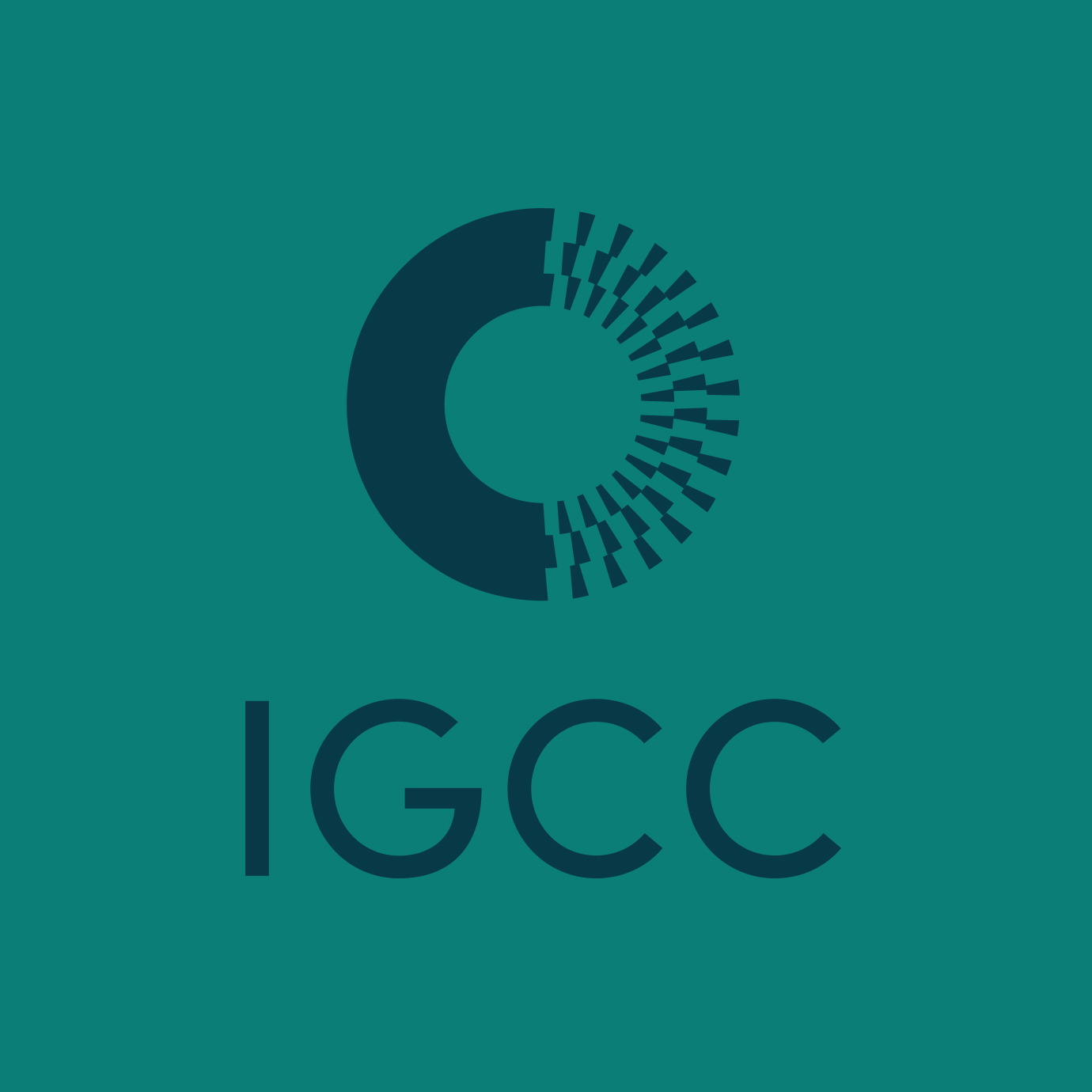
IGCC conducts research on global social science conflicts and cooperation
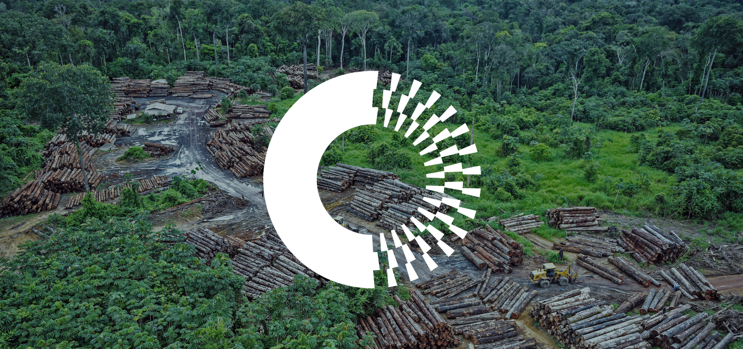
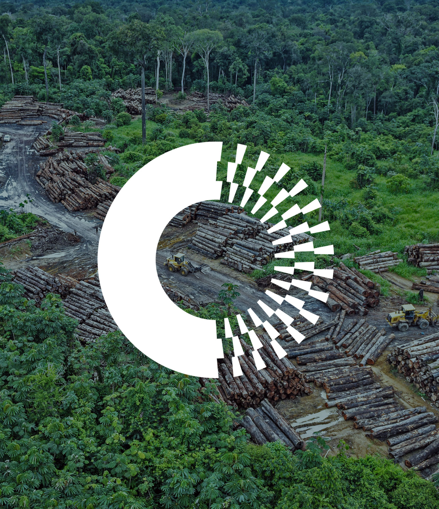
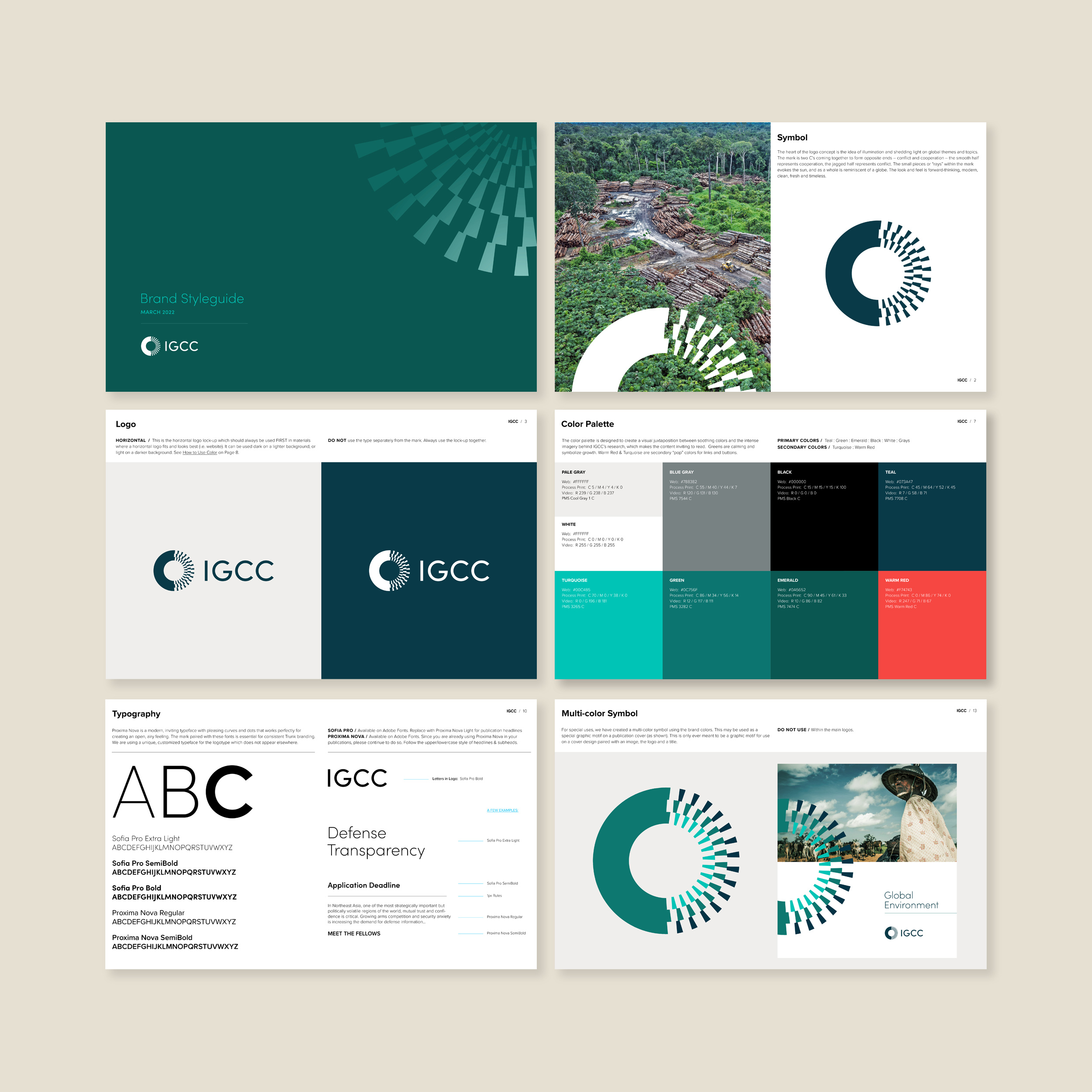
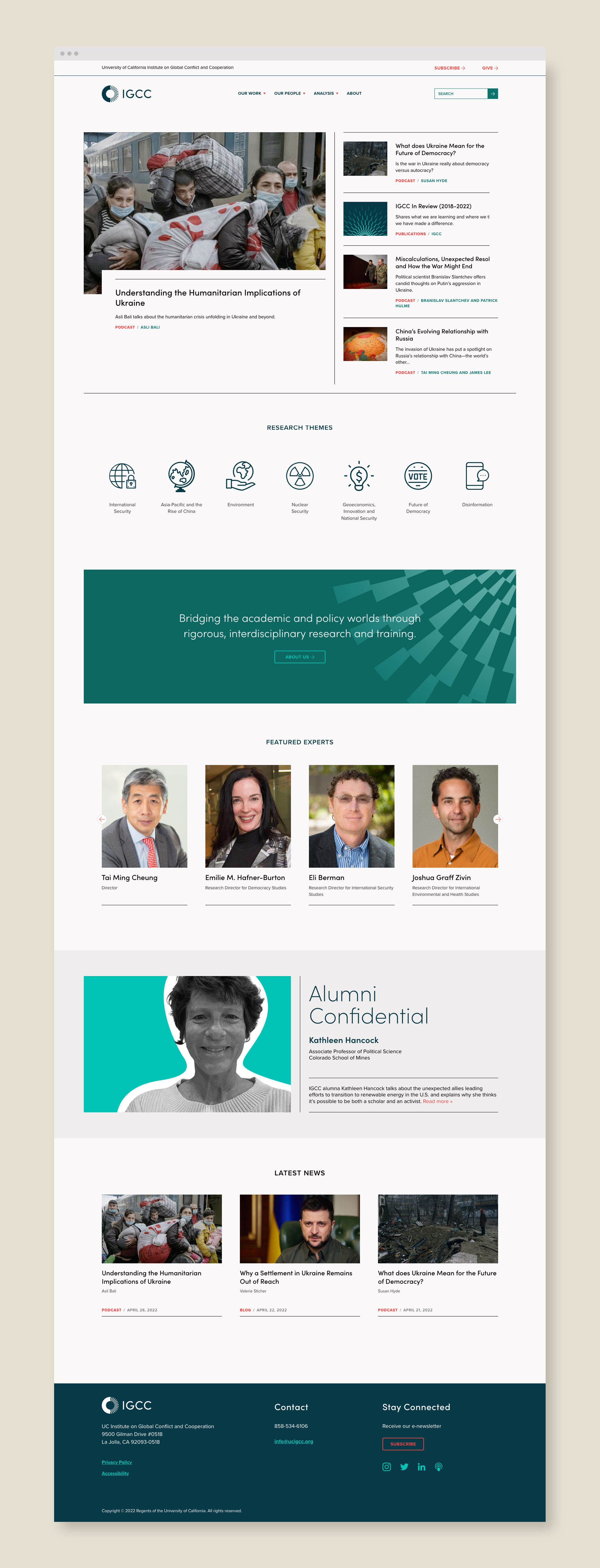
University of California Institute on Global Conflict and Cooperation–or UC IGCC–bridges the academic and policy worlds and conducts social science research on topics such as international security, geoeconomics, the future of democracy and the environment. They wanted to redesign and modernize their dated brand identity and website and separate them from the University of California’s brand look and feel.
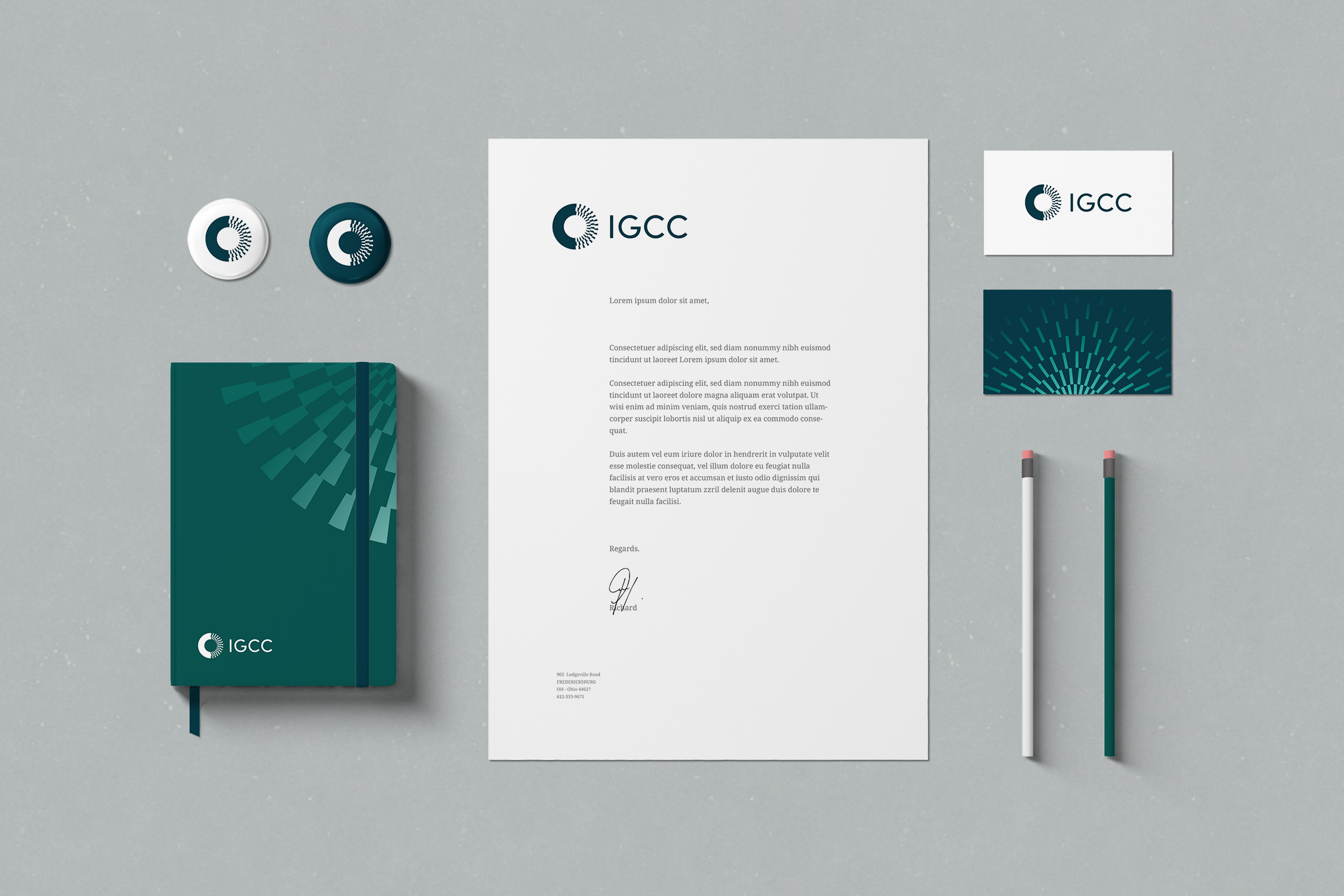
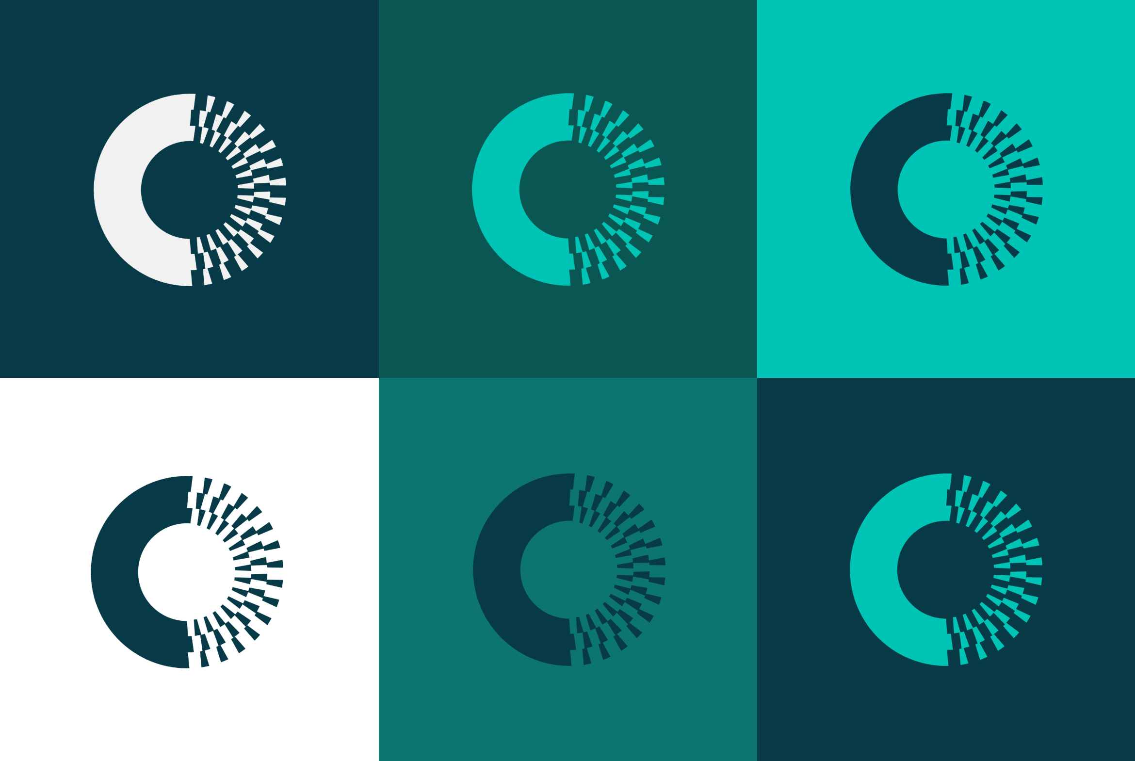
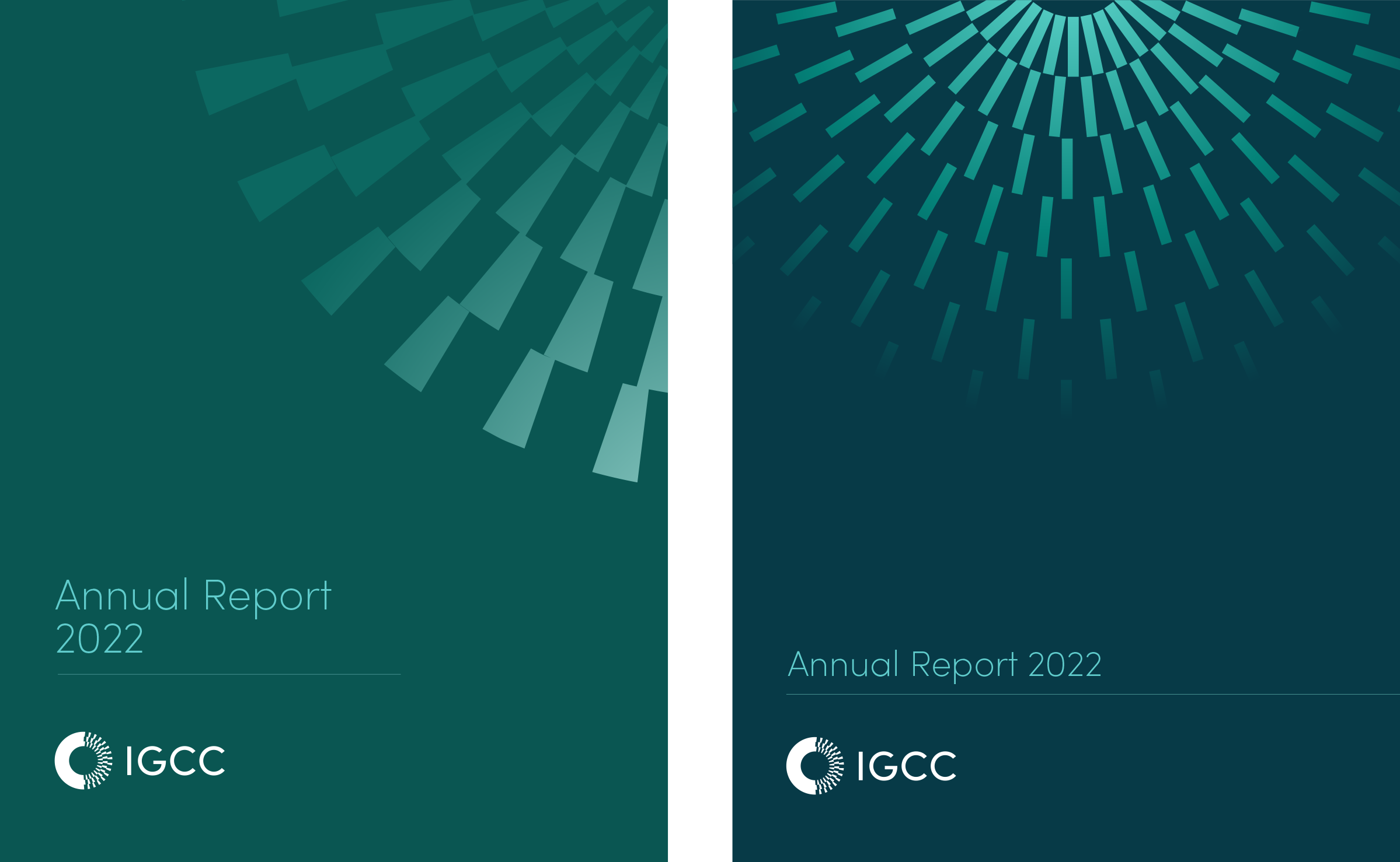
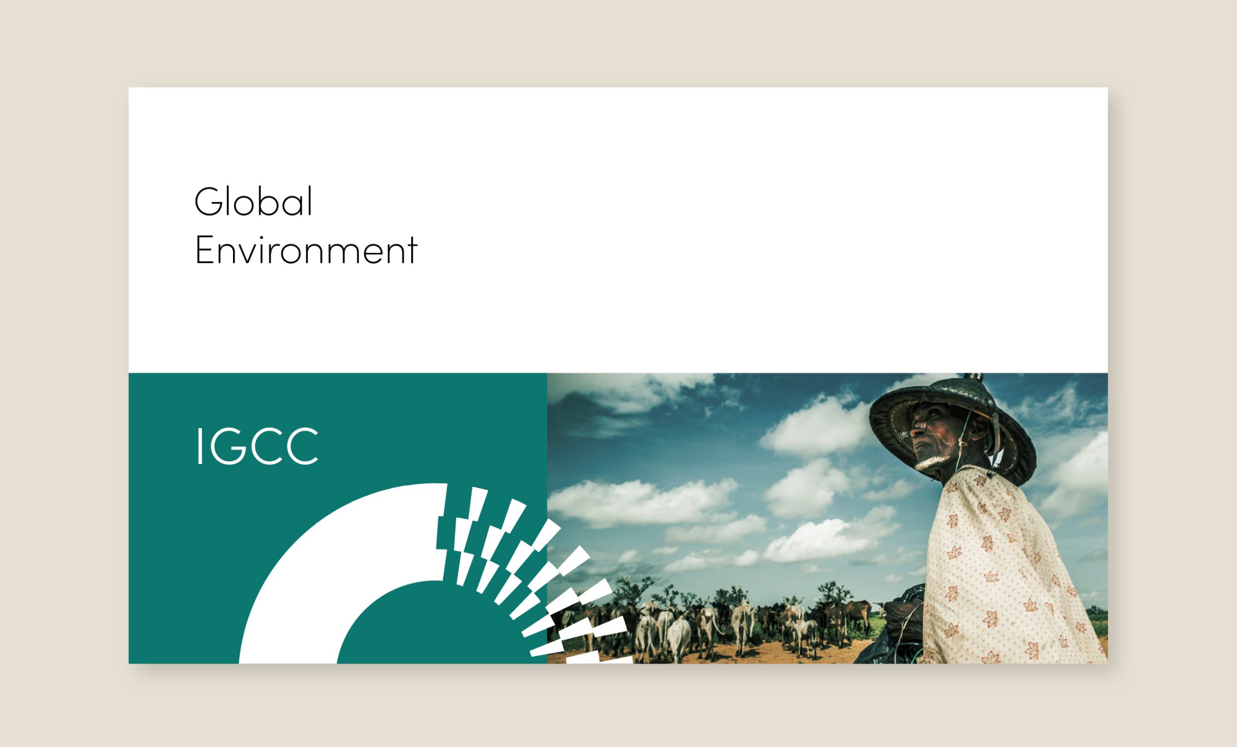
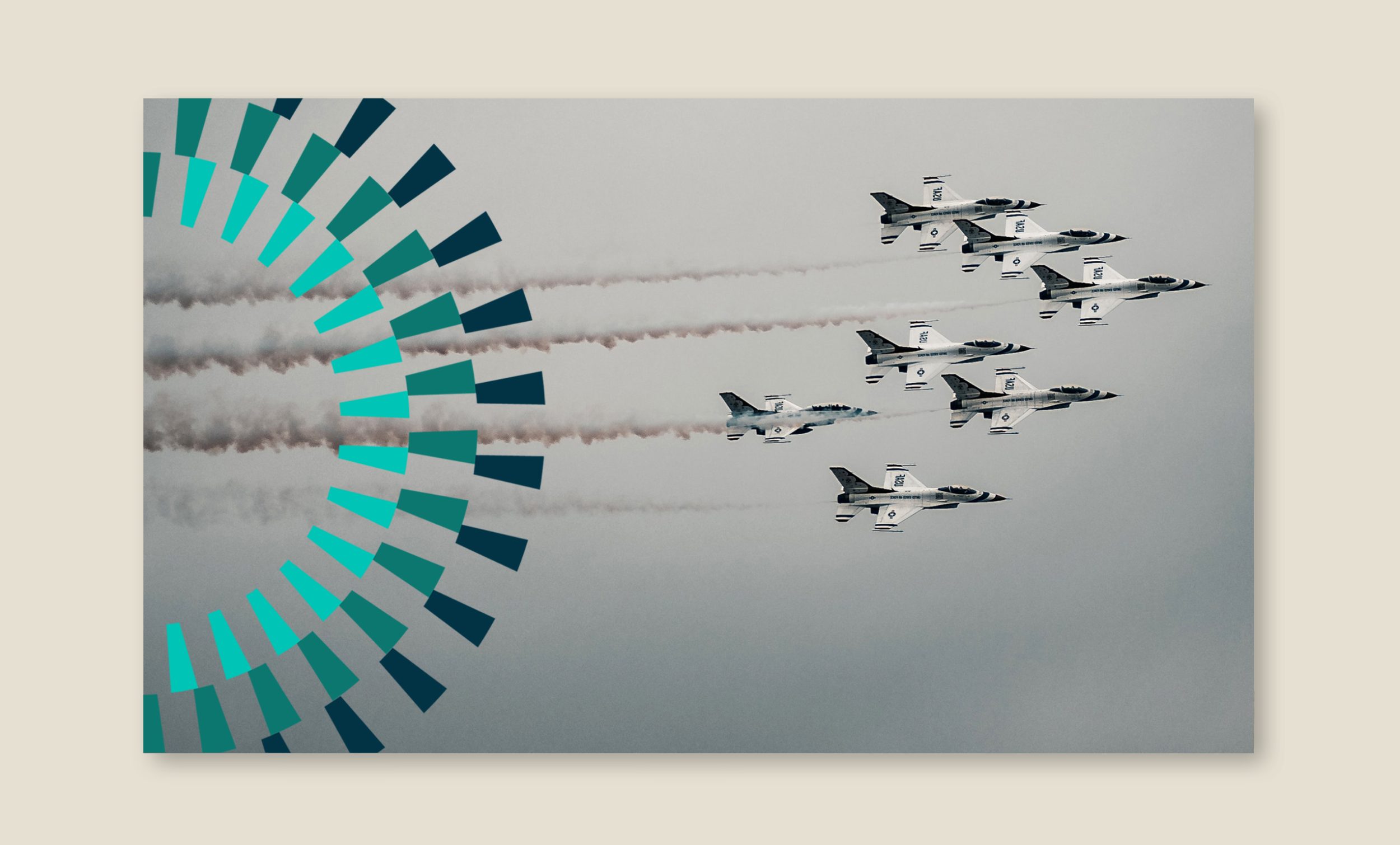
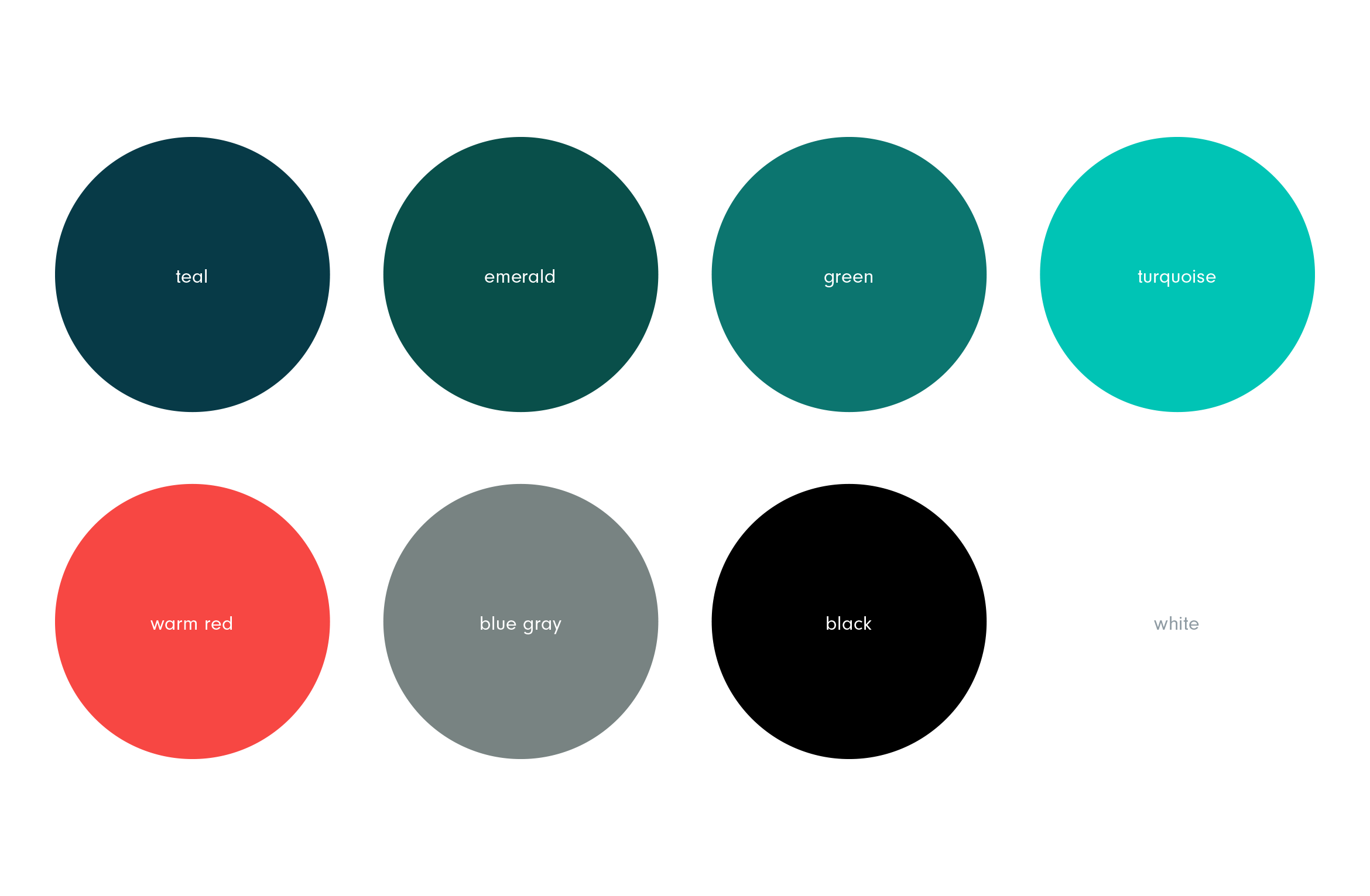
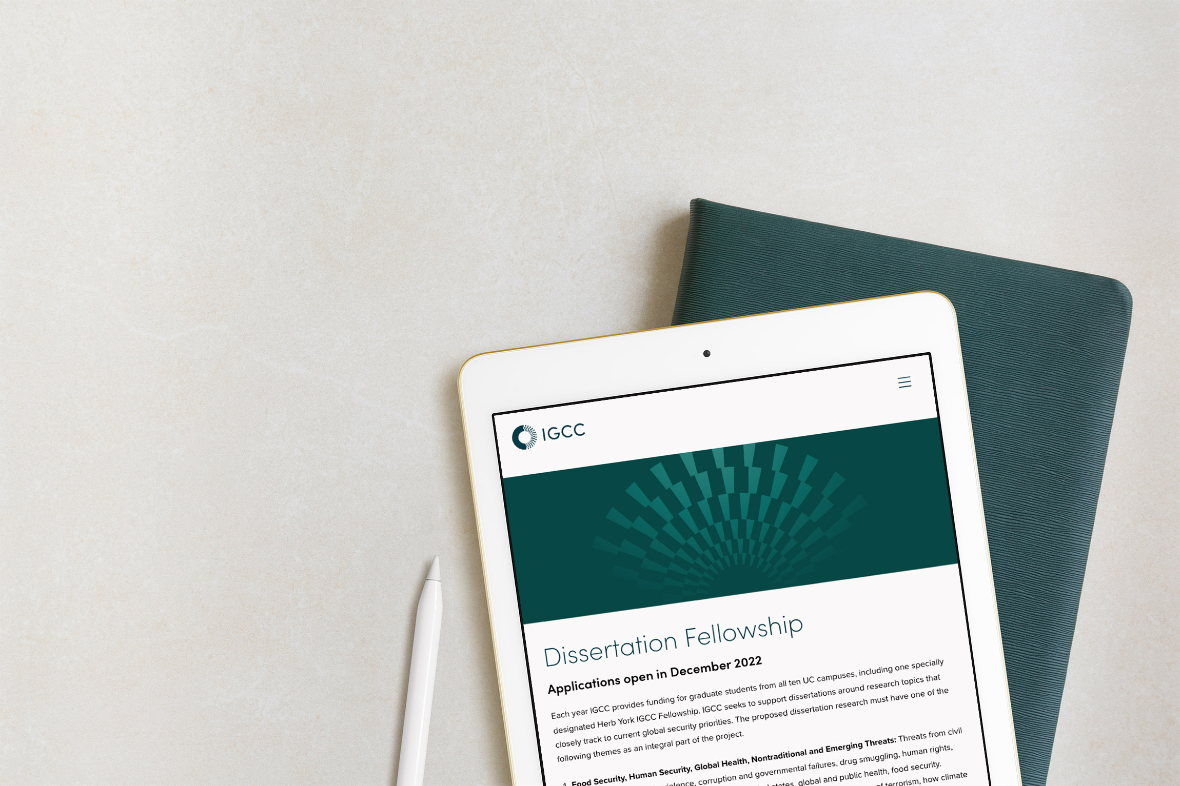
Using the “rays” from inside the mark as a graphic motif to help depict the idea of “illumination” on to challenging topics. The motif becomes a positive “light” overlapping intense photography. Motifs can be used on any marketing materials from blog posts to presentation covers to social media.

A responsive WordPress website was built to present their vast archive of content in a new way that was easy to use. It needed to feel modern and feature related experts and content on each page.
Deliverables:
- Brand Identity
- Brand Styleguide
- Visual System
- Website Design
- Web Development
Paige Parenti college coach
service / brand identity / website


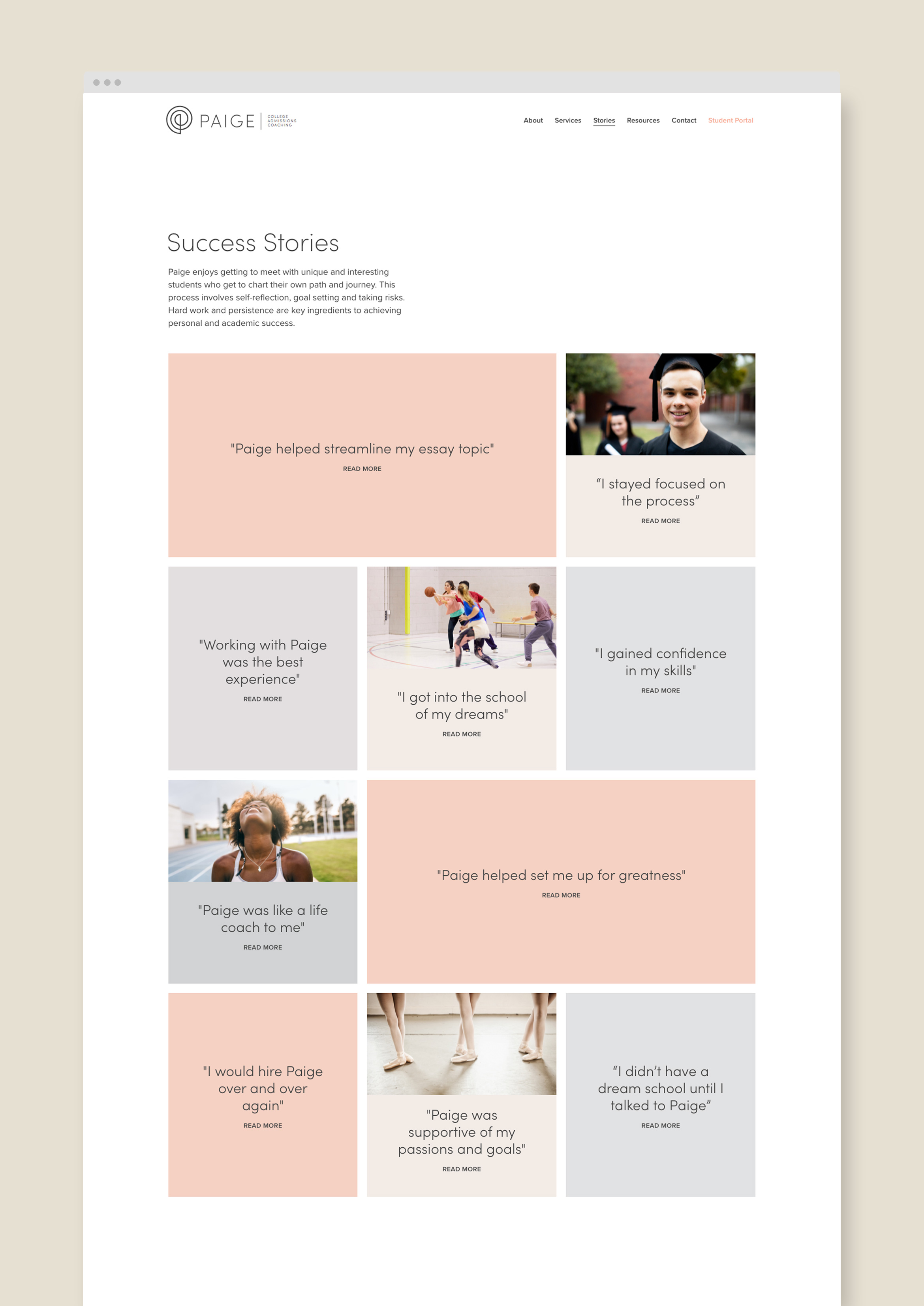
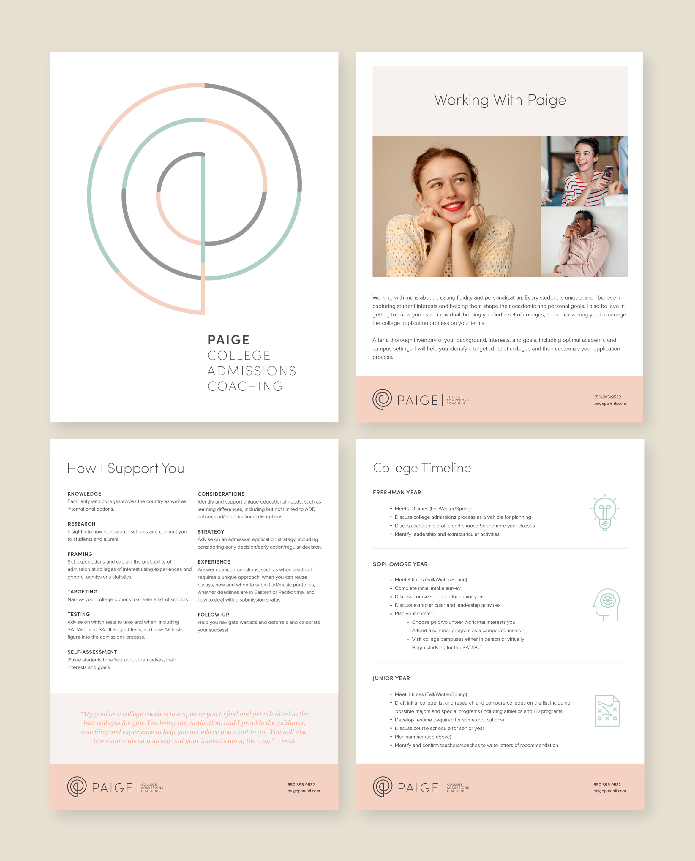
Paige is a college admissions coach with a mission to empower every student
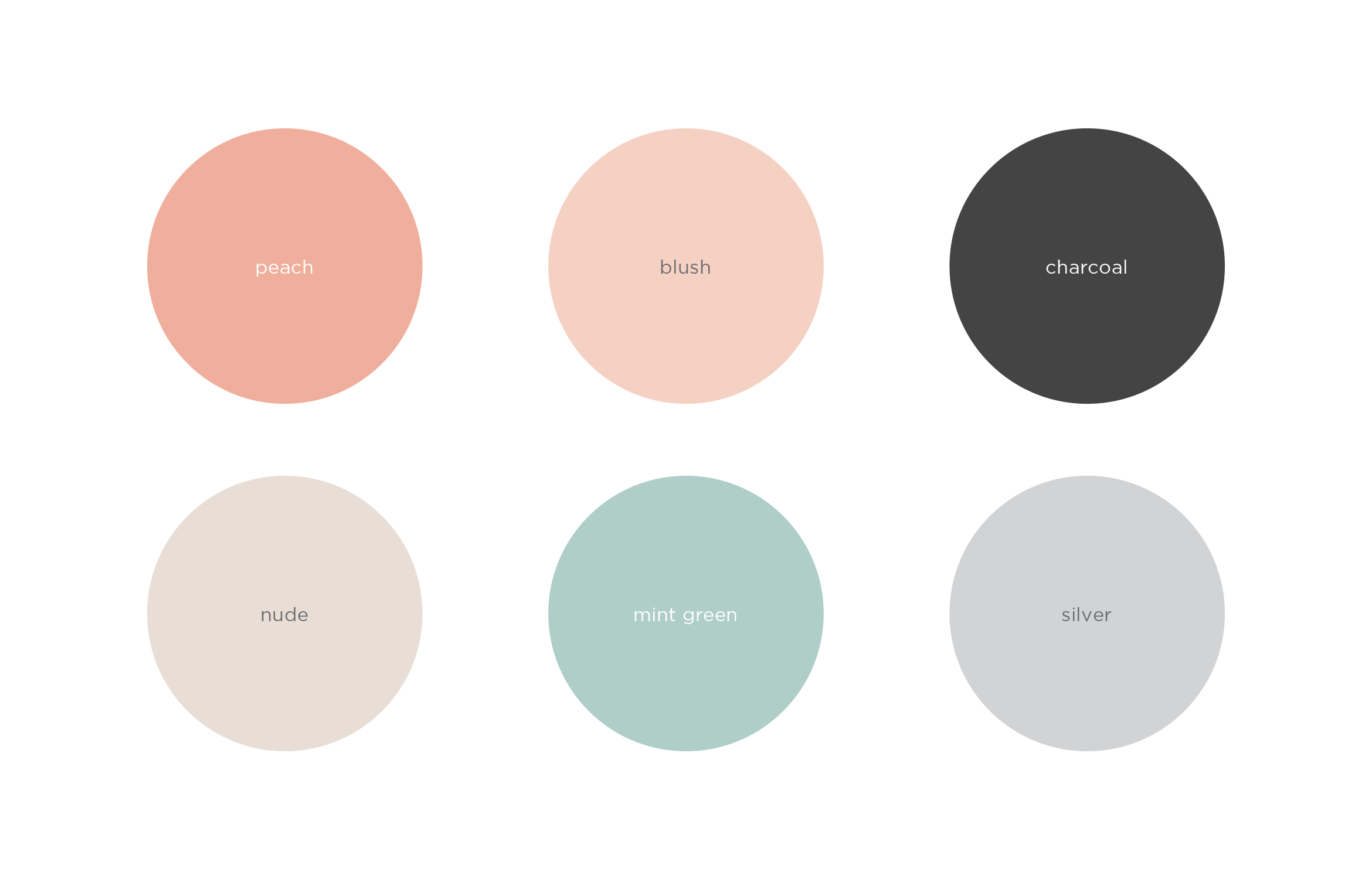
Paige helps every student find the right college for them, guides them through the admissions process, and sets them up for success. To appeal to Gen Z, and their parents, the company name was updated and the brand redesign focuses on the personal attention she gives to every student. The result is a clean and inviting look and feel using warm, soothing colors
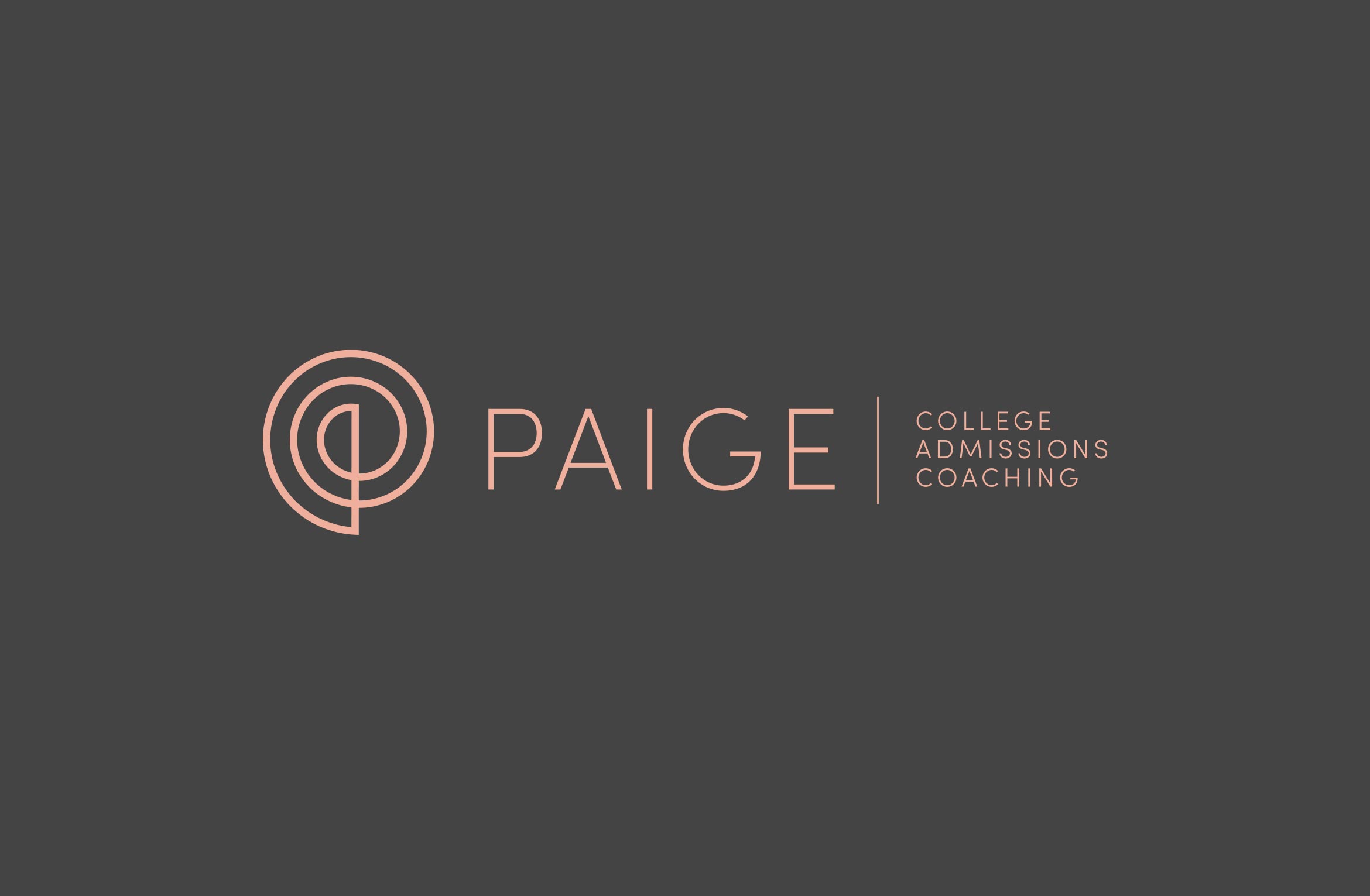

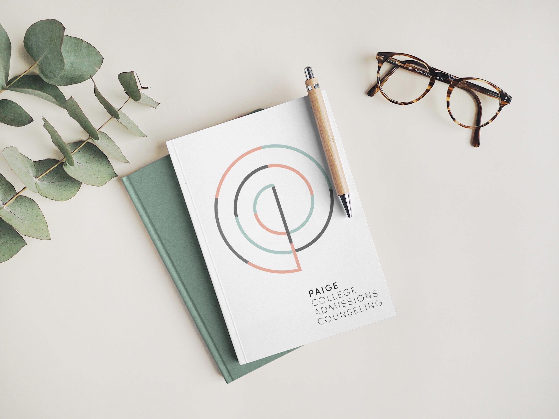
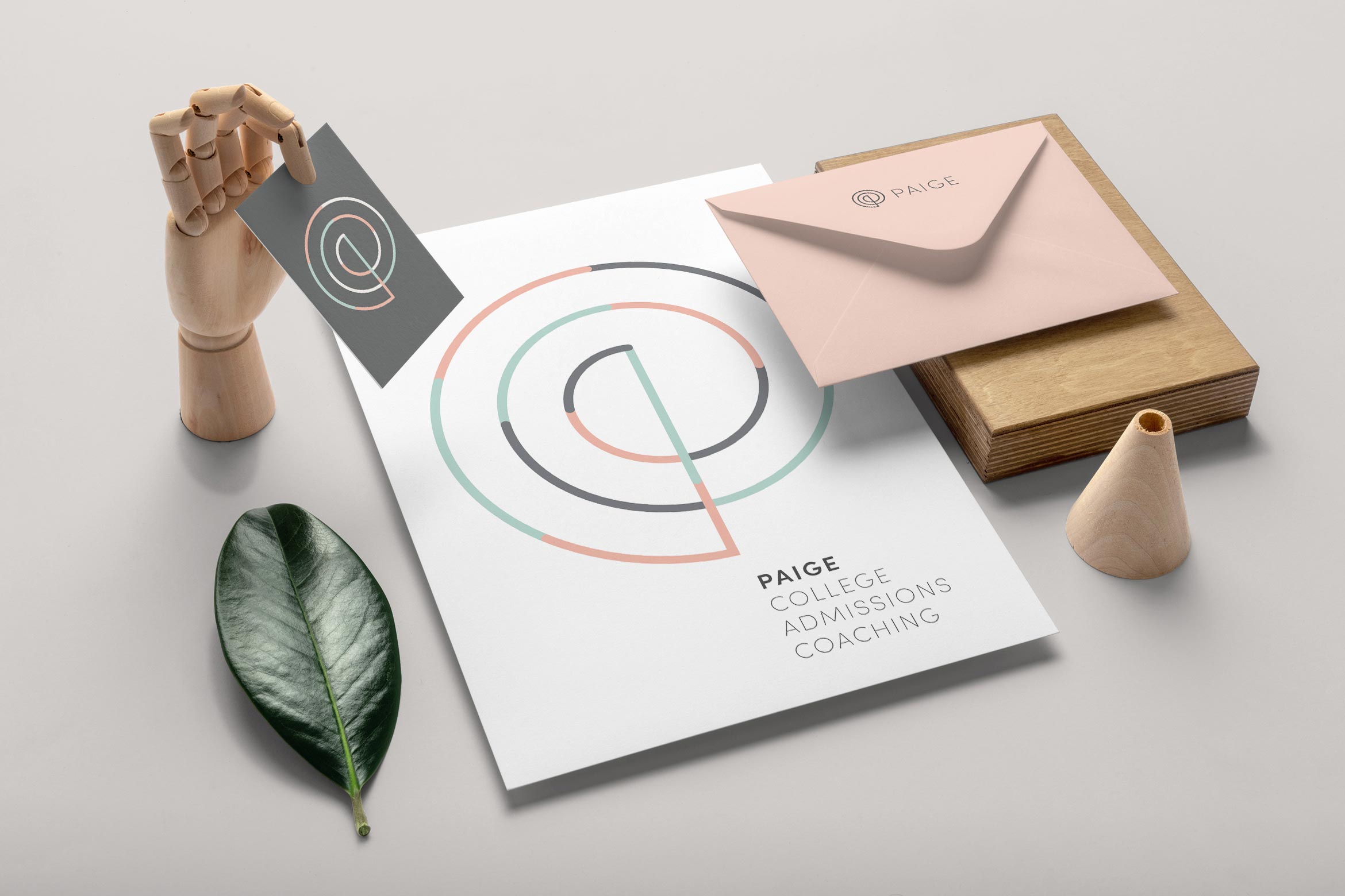
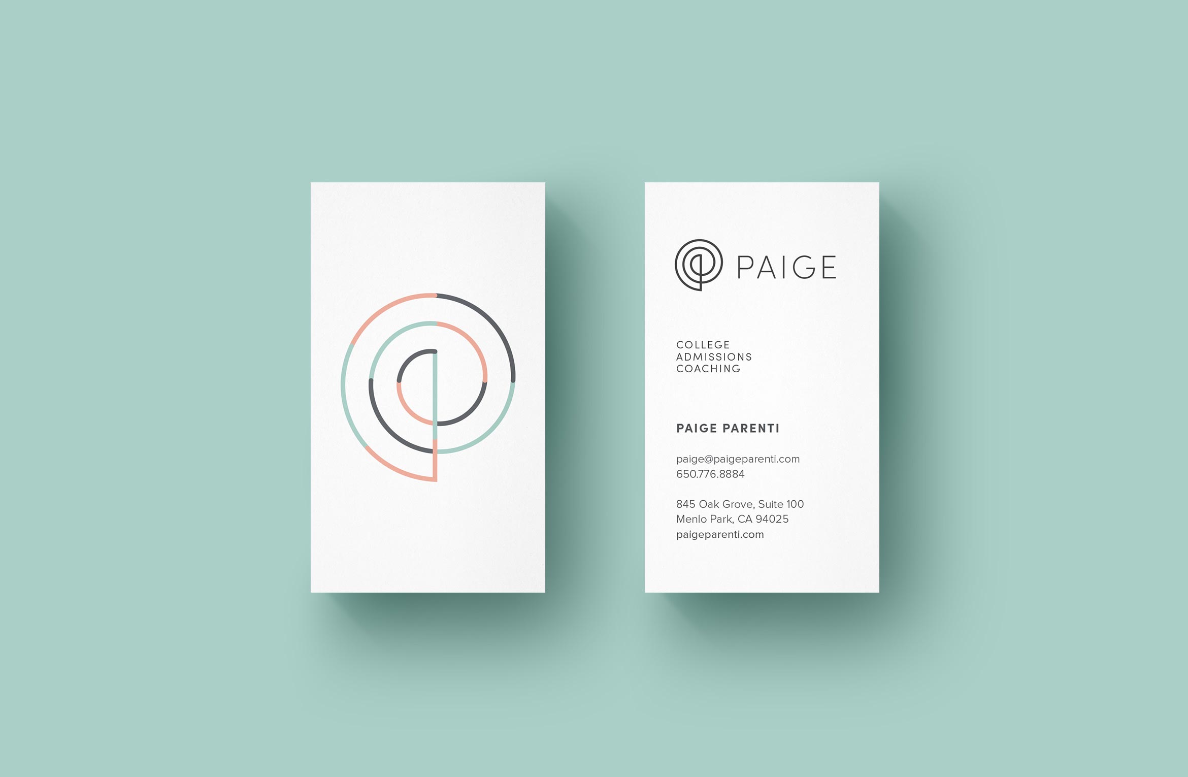
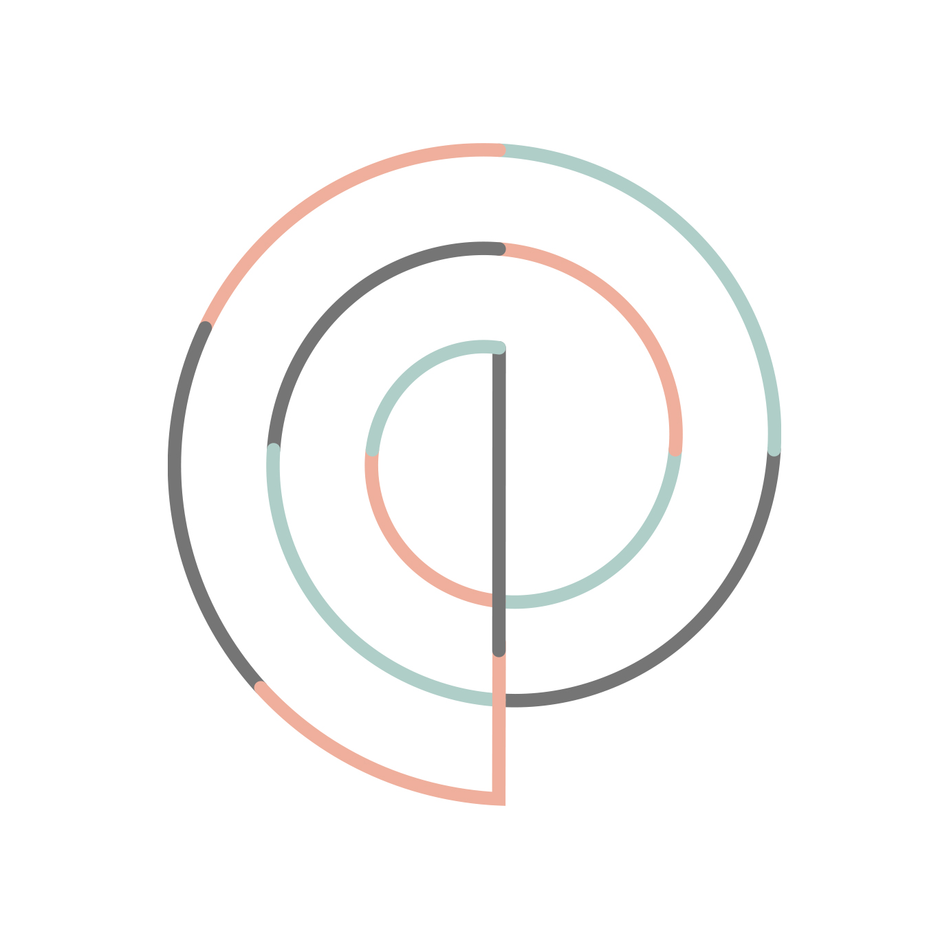
The elegant P monogram is inspired by the Golden Spiral, a sacred geometric symbol that represents higher learning and infinite possibilities. A set of thin line icons compliment the thin lines in the logo.
A customized website tells the story of Paige, her services and student stories to describe real-world results. The design is light and airy with easy bites of information and imagery, plus a student scheduling calendar and payment pathway.

Deliverables:
- Brand Identity
- Visual System
- Web Design
- Content Creation
- Digital Collateral
- Print Design
UCHRI Horizons of the Humanities
education / visual identity system
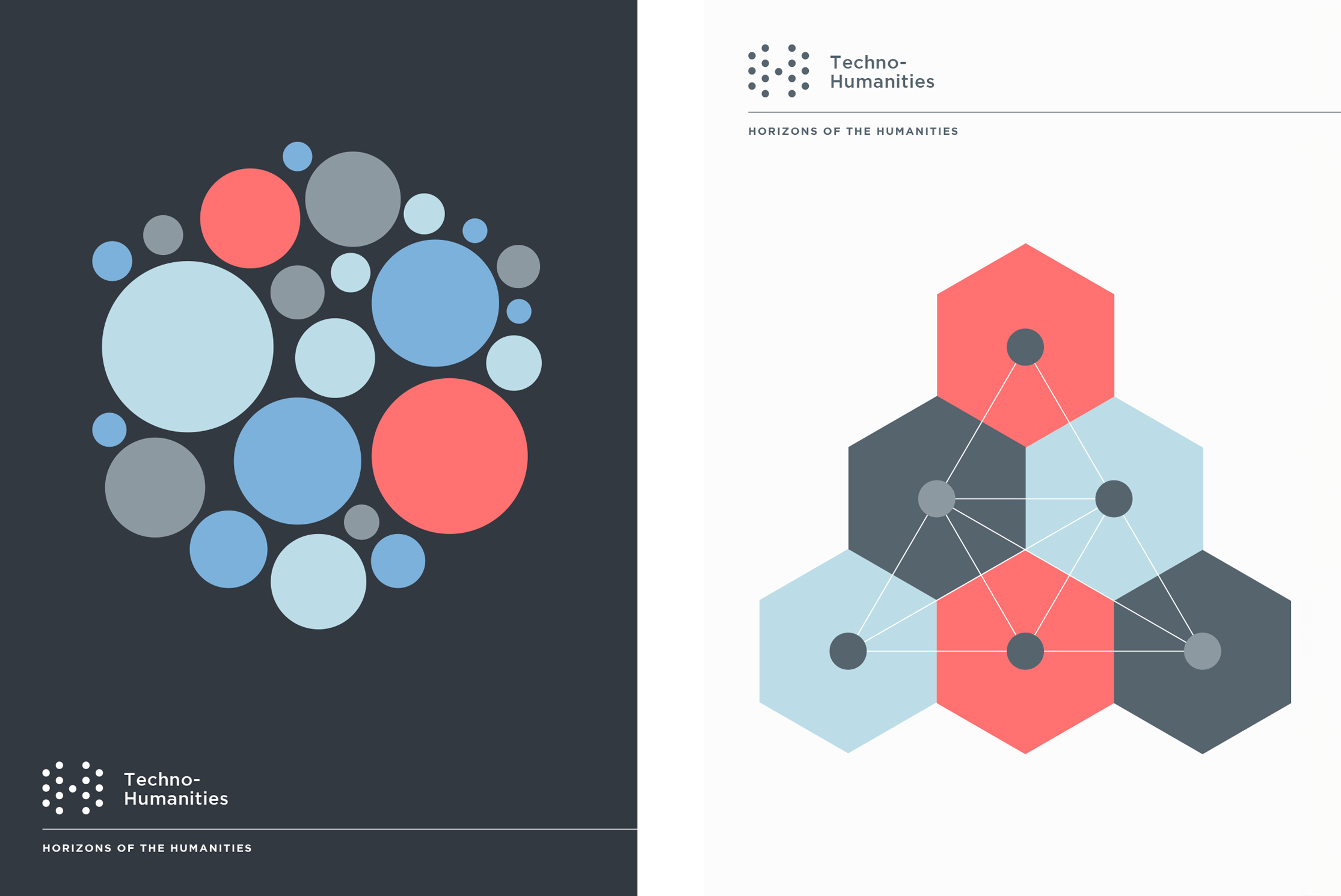
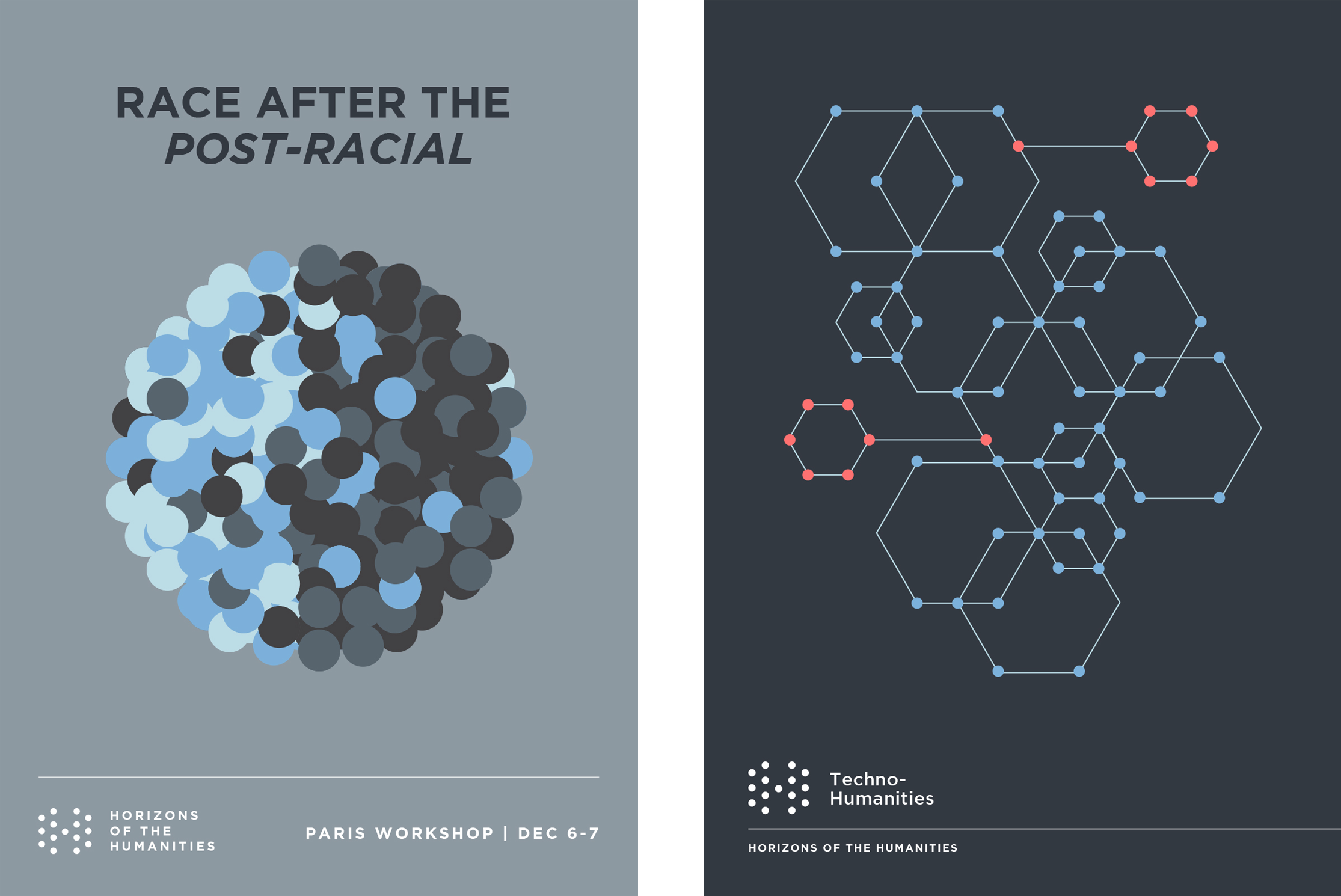
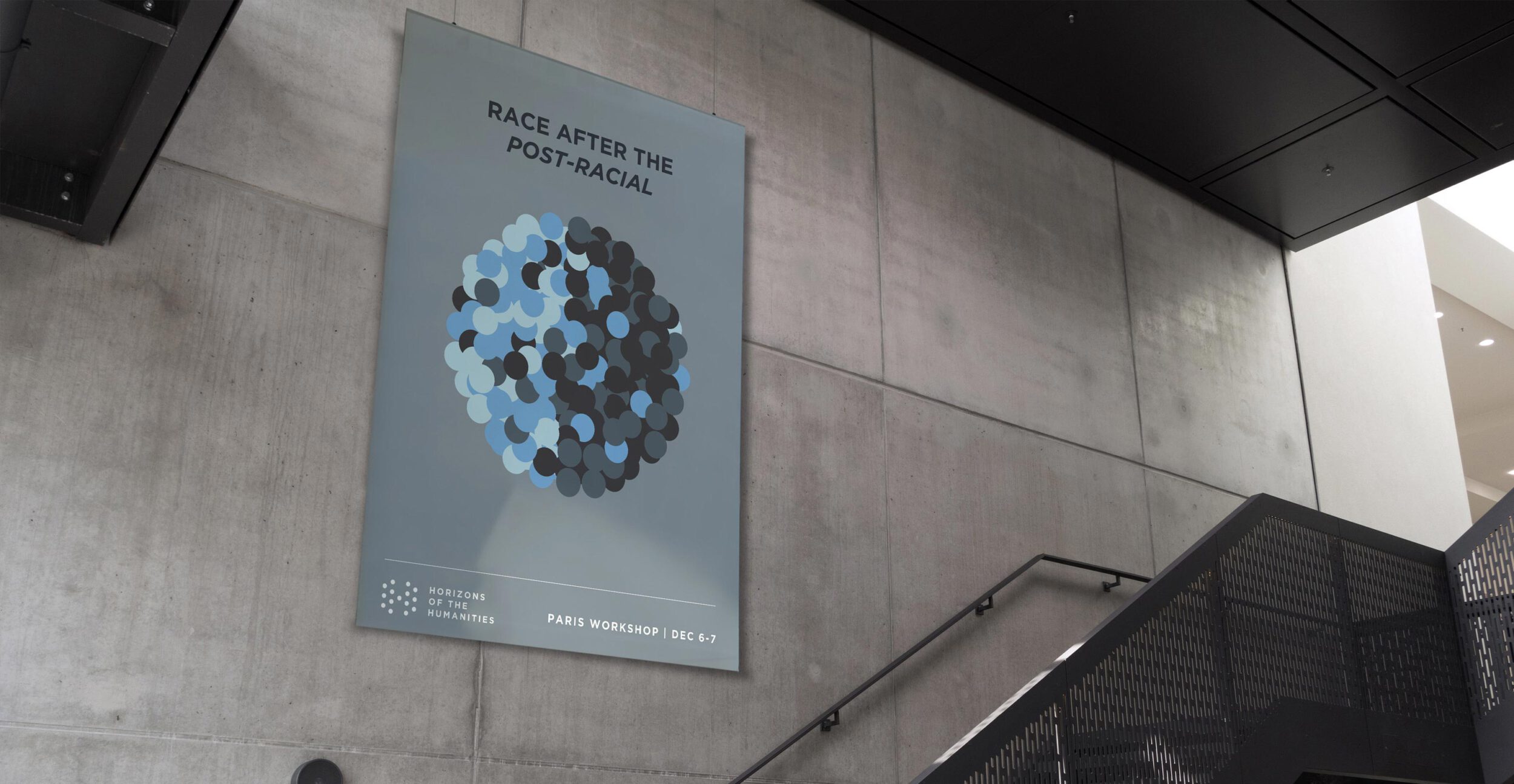
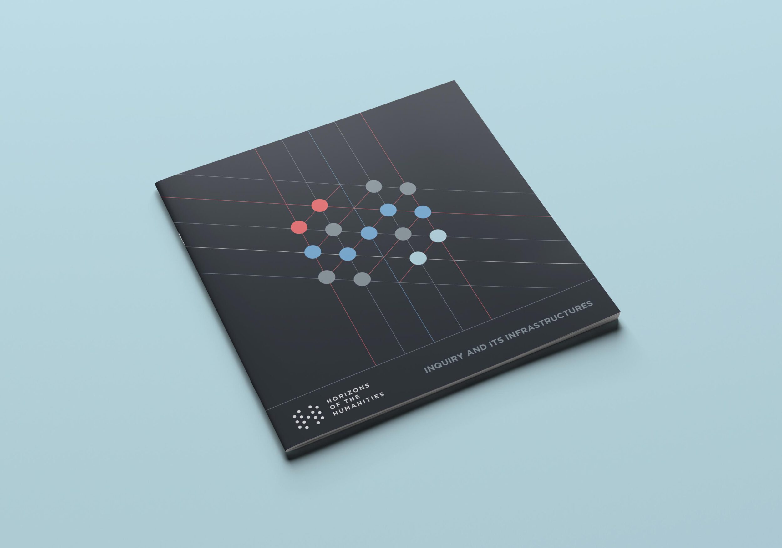
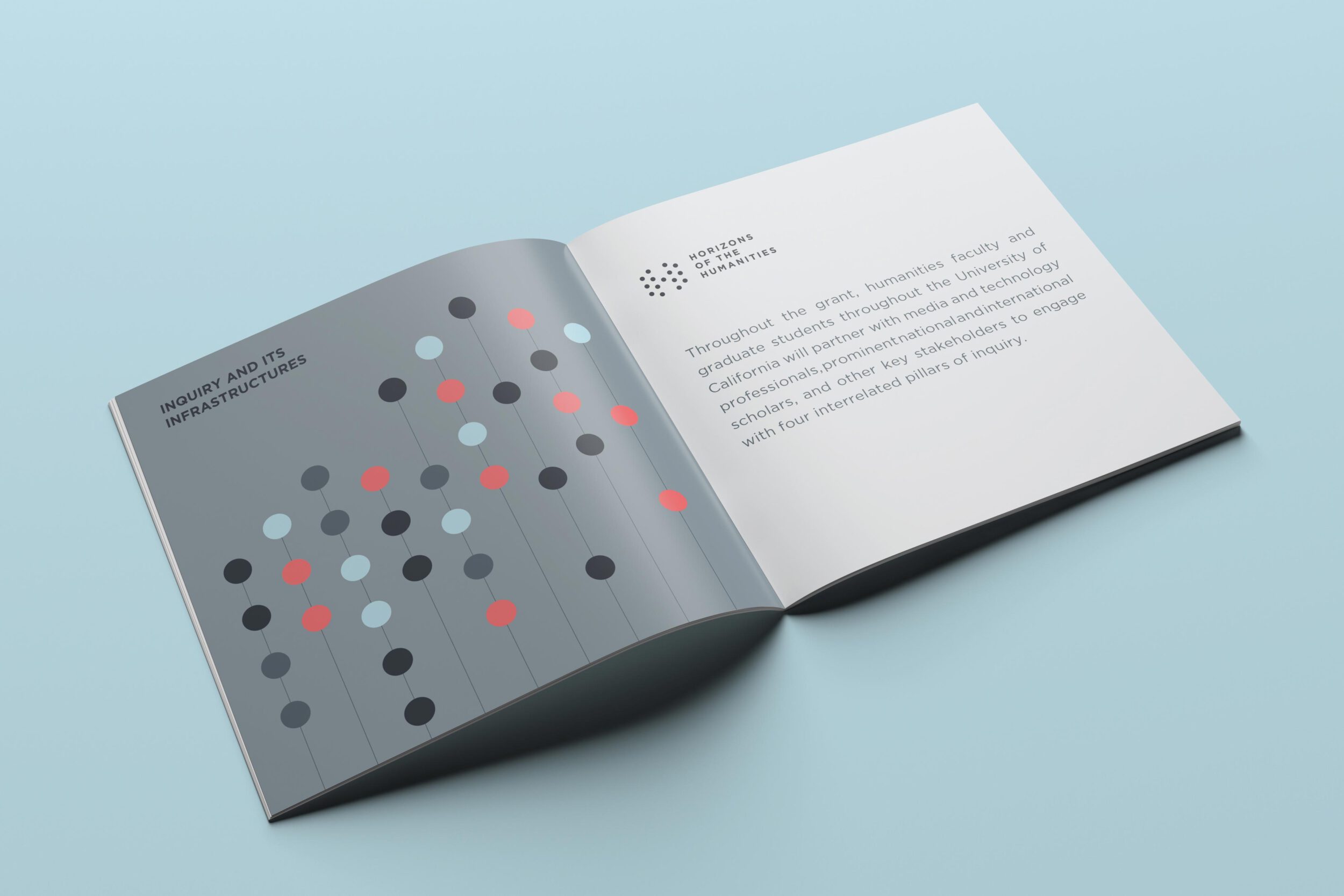
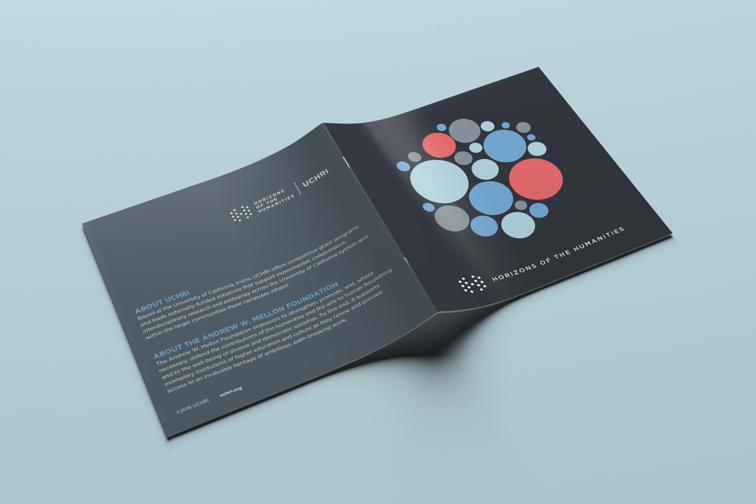
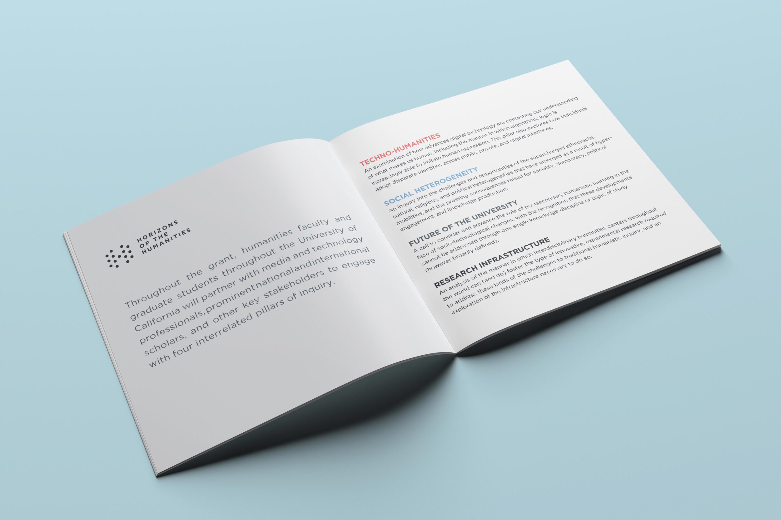
Horizons of the Humanities is an initiative that researches how technology affects humanity
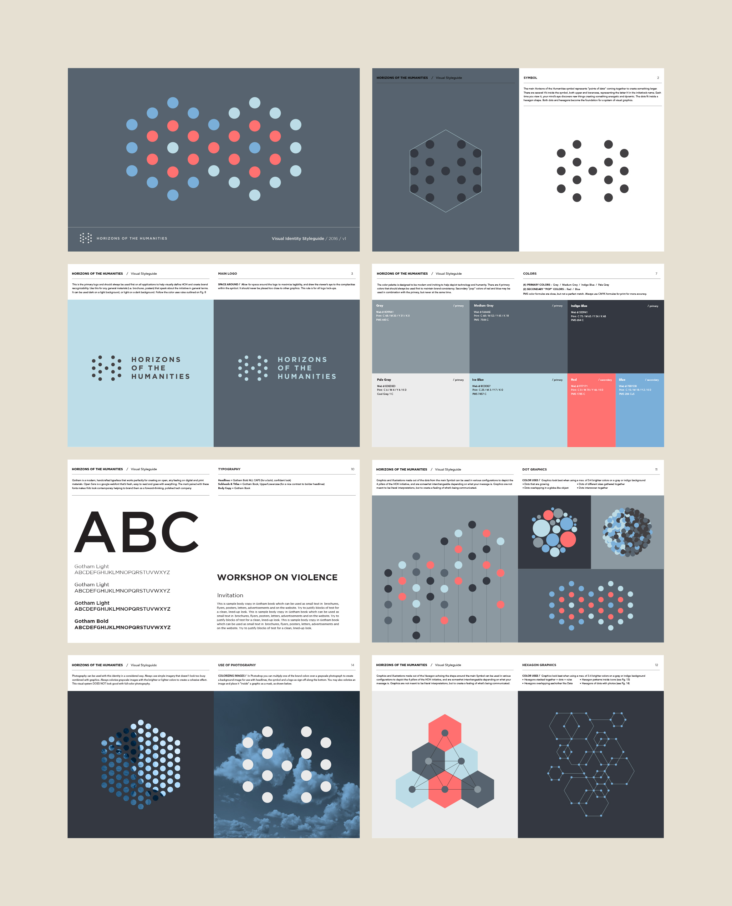
University of California Humanities Research Institute (UCHRI) needed a visual identity for a new initiative called Horizons of the Humanities that explores ideas around technology, social media and how it affects humanity. No one else has brought these ideas together in the same way and they wanted a dynamic, varied system they could use for materials over the course of their 3-year Mellon grant.
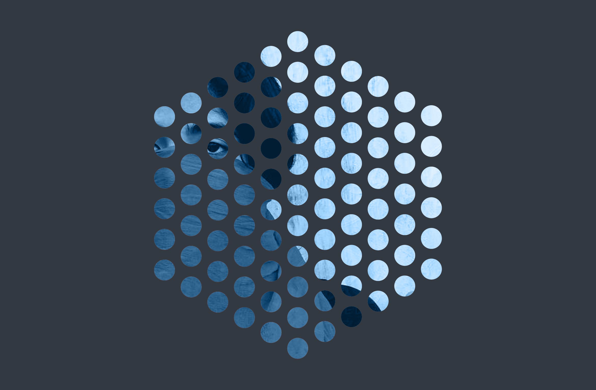
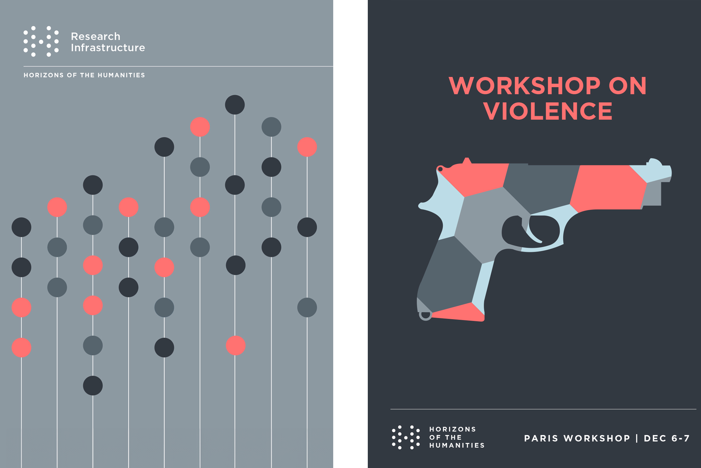
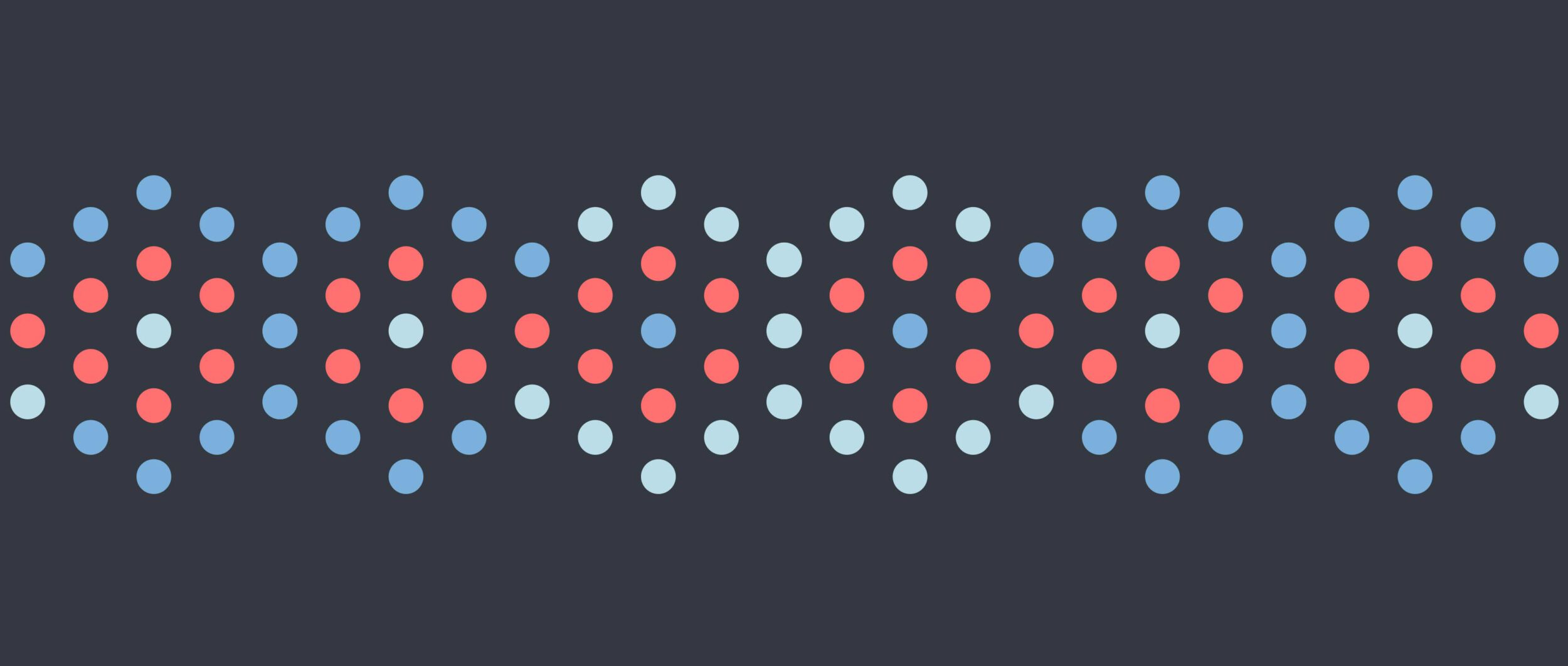
Creating an H out of “data points”, the dots from the logo can be used to create a multitude of illustrations in dynamic colors for different aspects of the initiative. Hexagon shapes can be used overlapping, inside recognizable icons or as a vessel for photography.
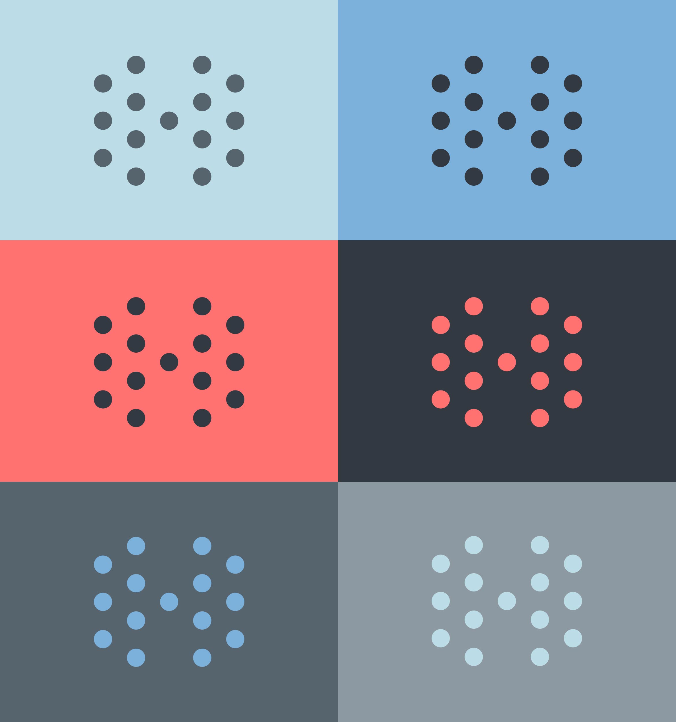
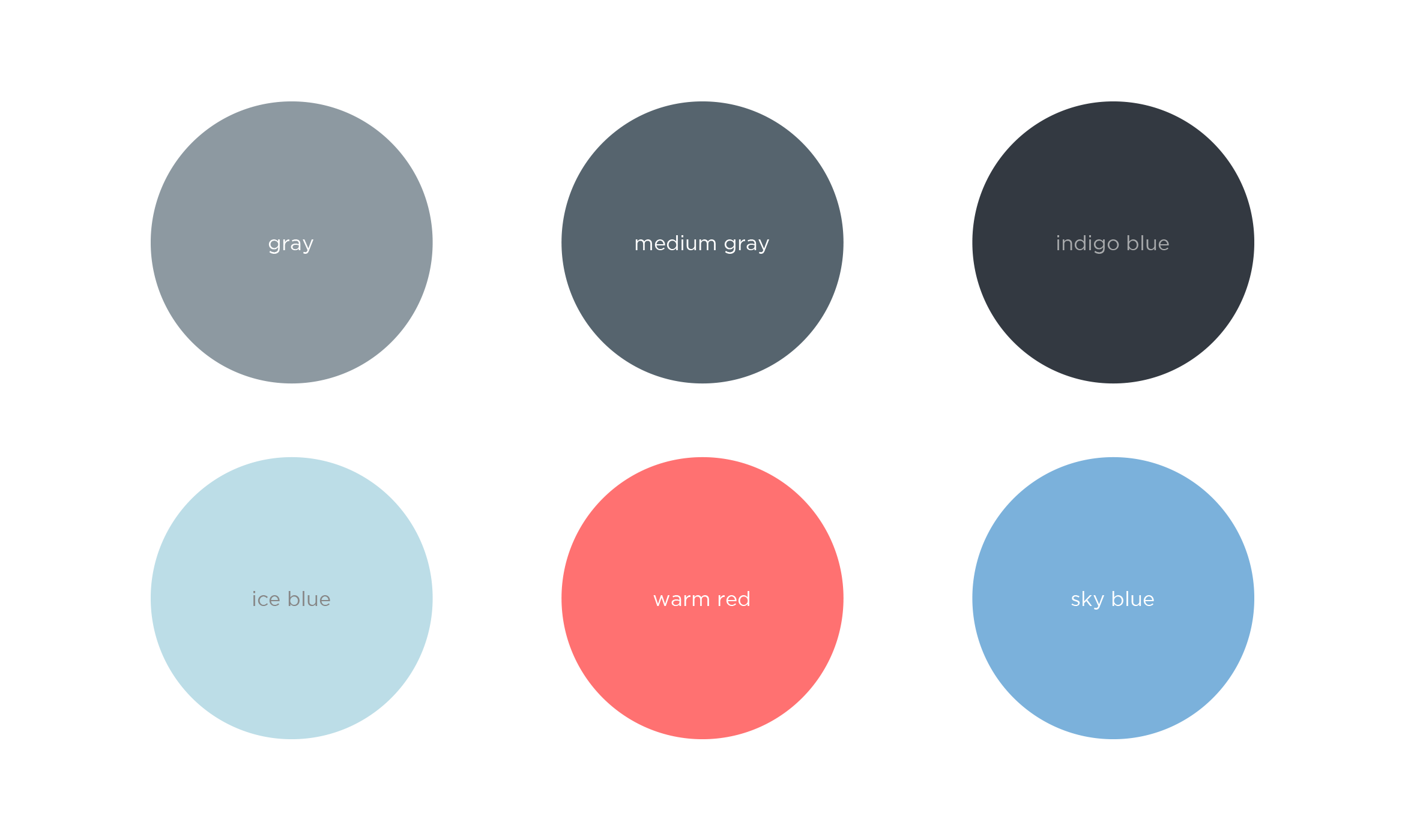
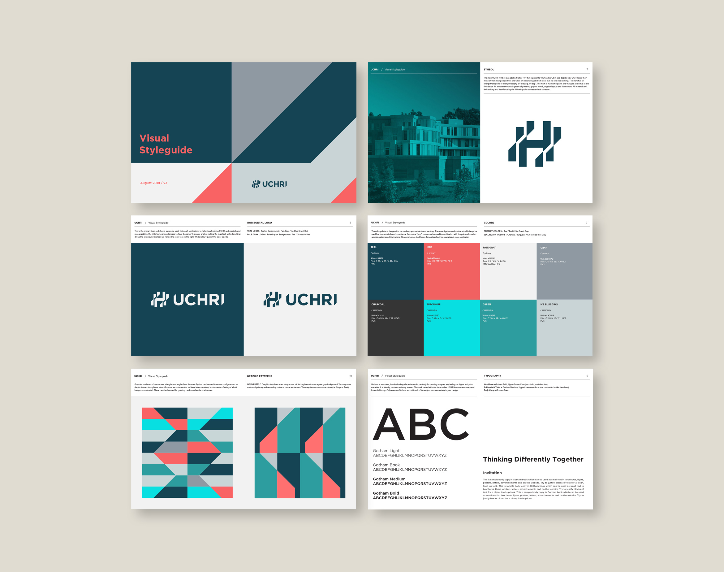
A Brand Styleguide outlines rules for the visual system including logo lock-ups, color formulas, typography, photography applications and graphic motifs. UCHRI will use the guide when designing posters, web assets and brochures in-house.

Deliverables:
- Brand Identity
- Brand Guidelines
- Visual System
- Logo Lock-ups
- Print Collateral
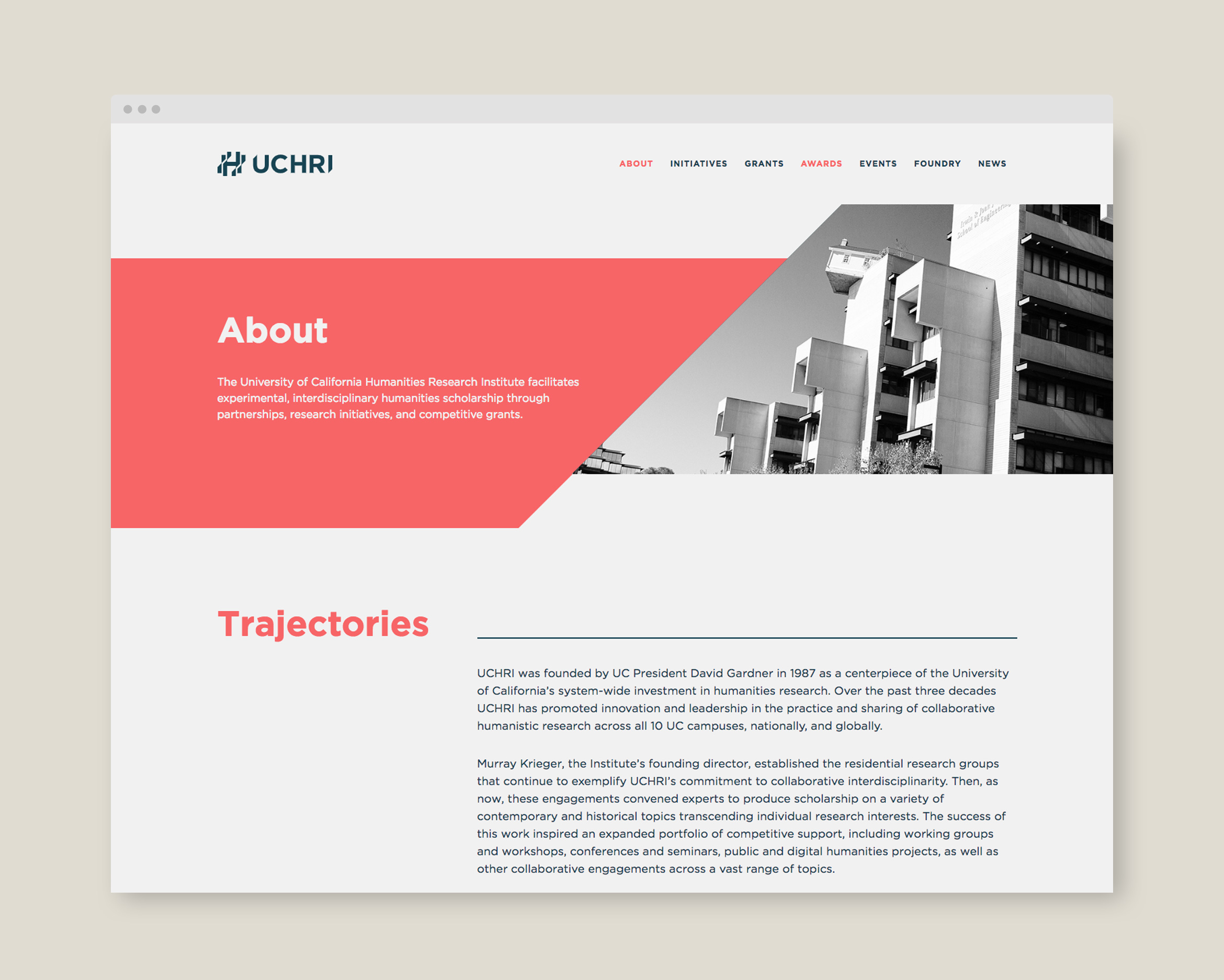
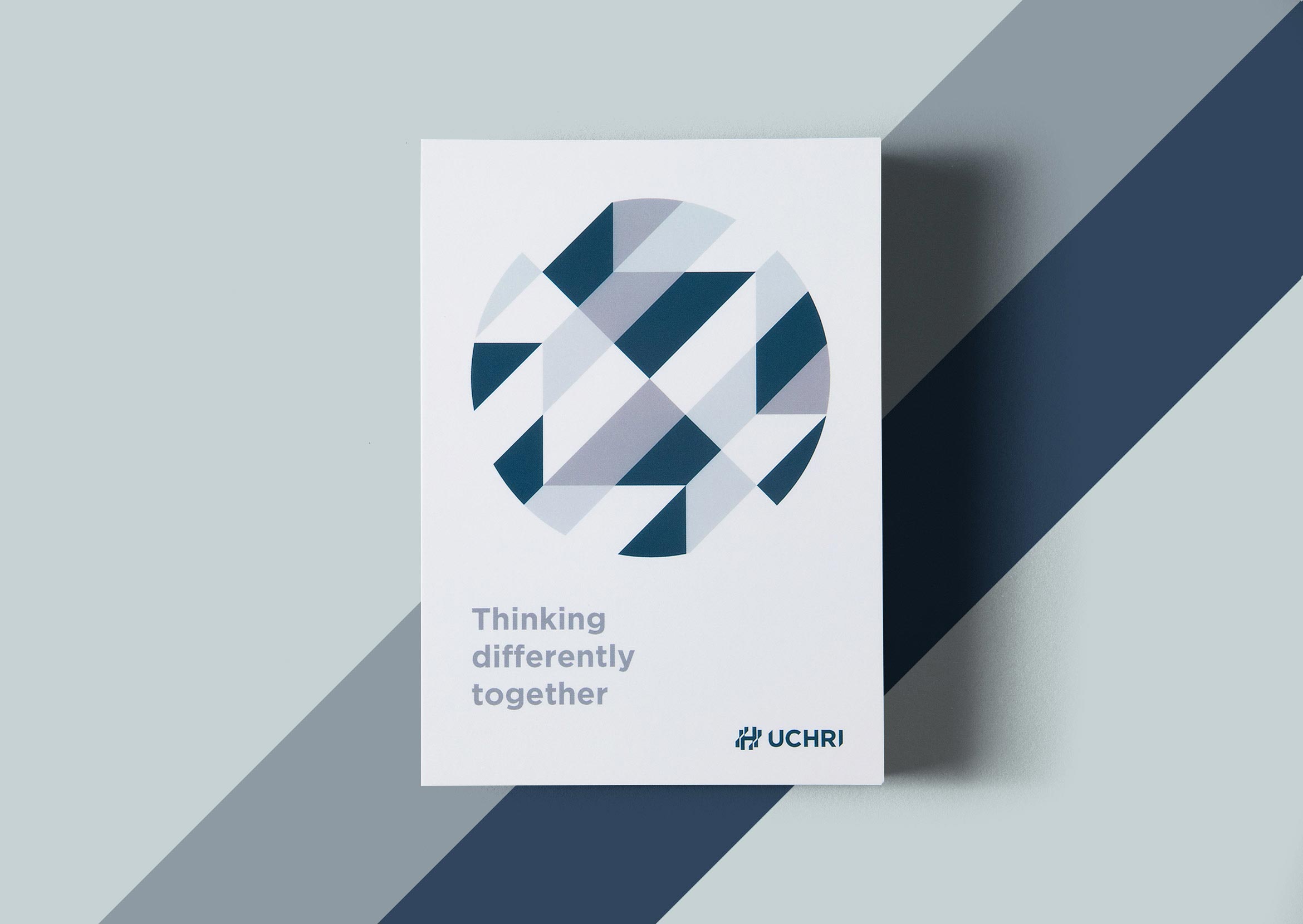
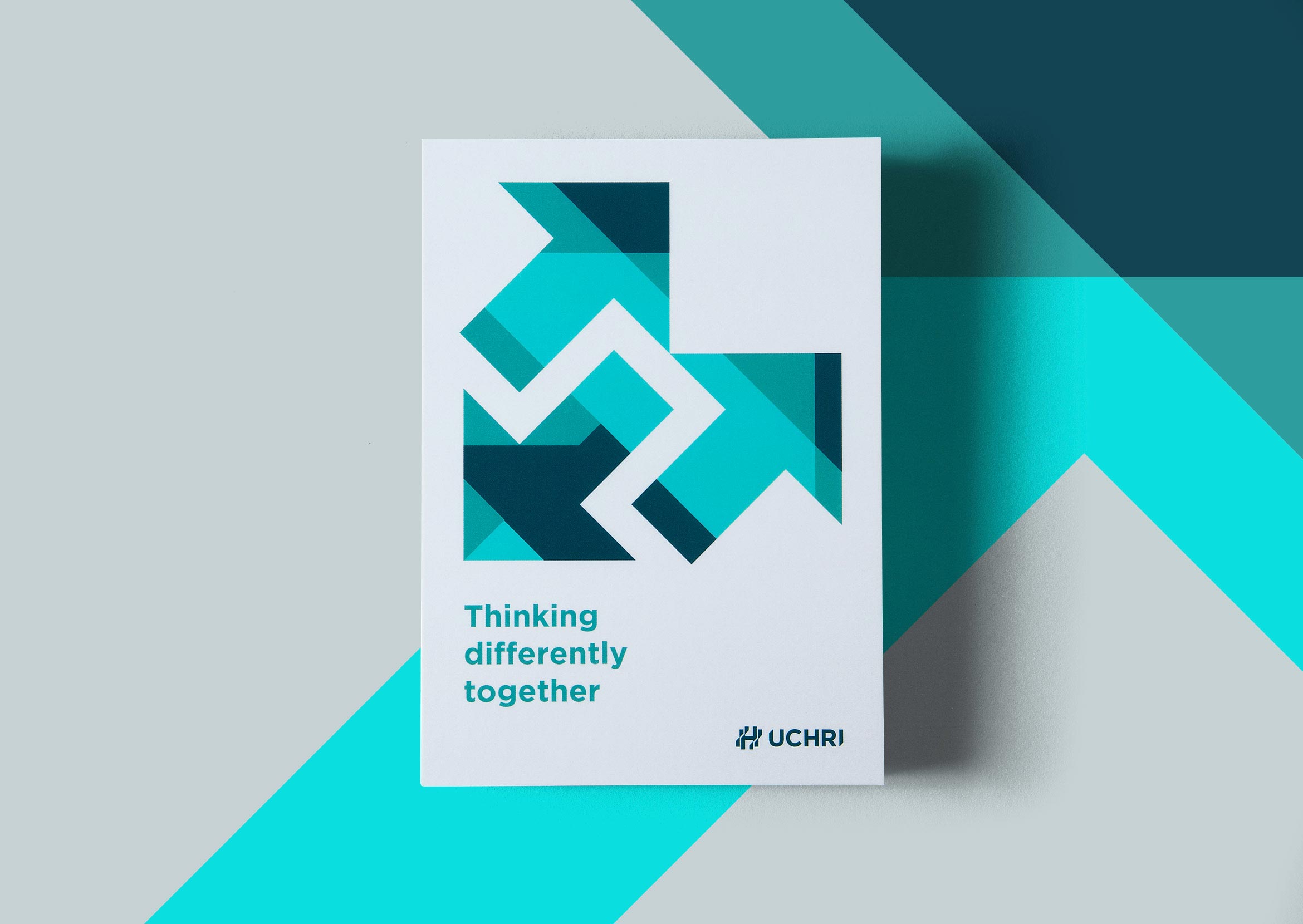
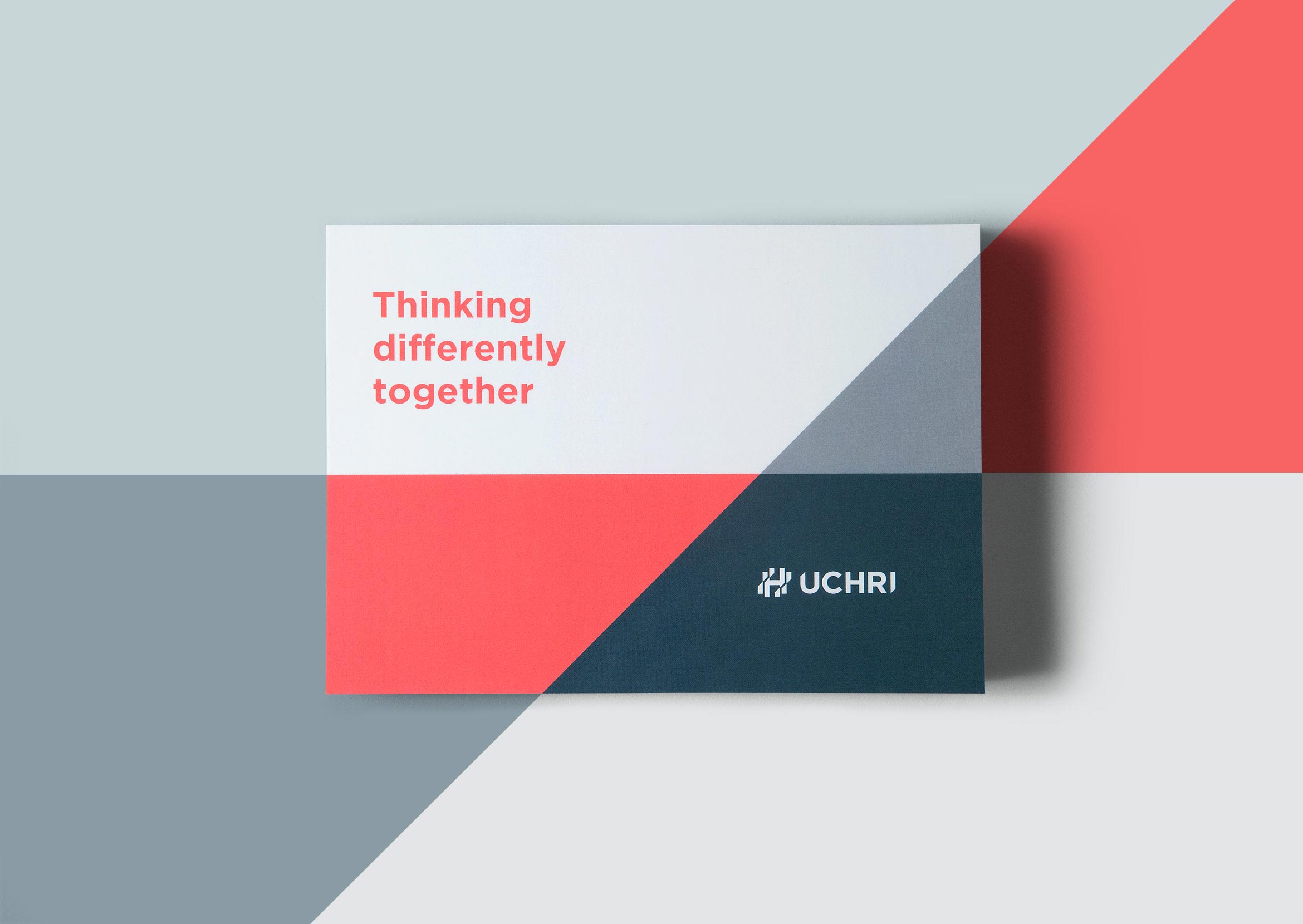
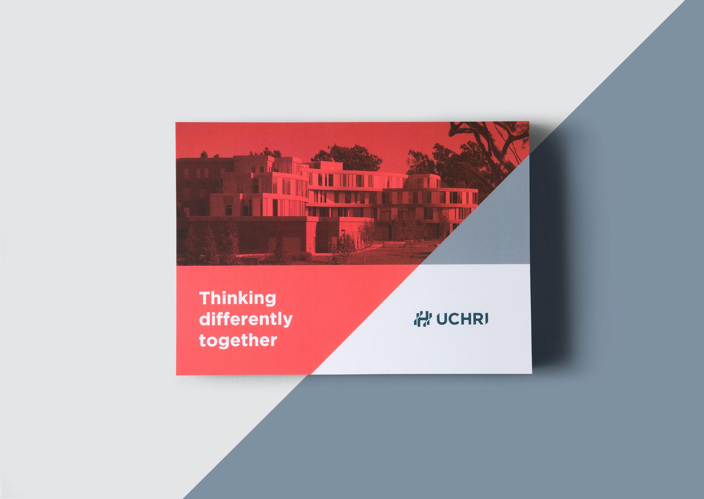
UC Humanities Research Institute
cultural institution / brand identity
UCHRI inspires critical thinking and brings different points of view together.
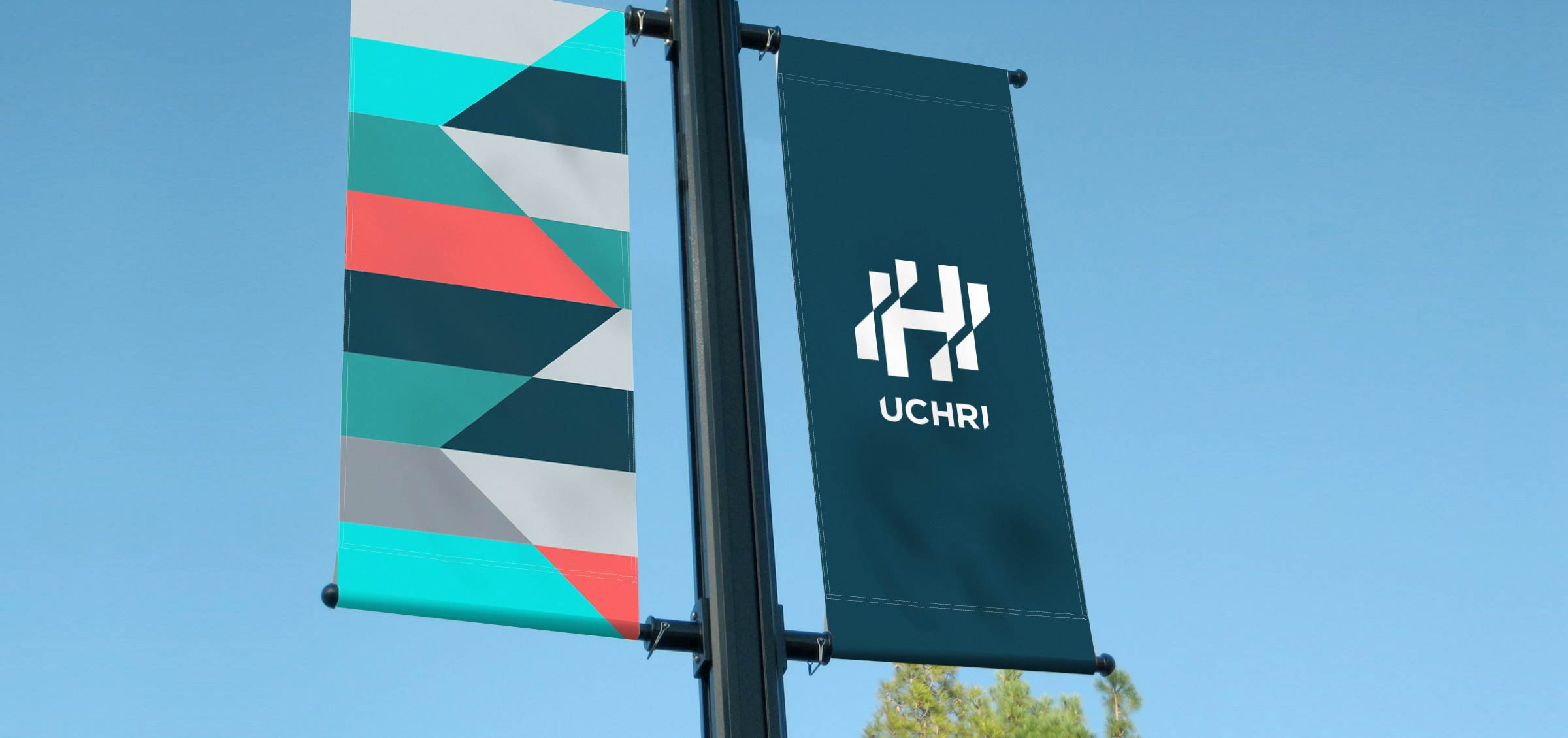
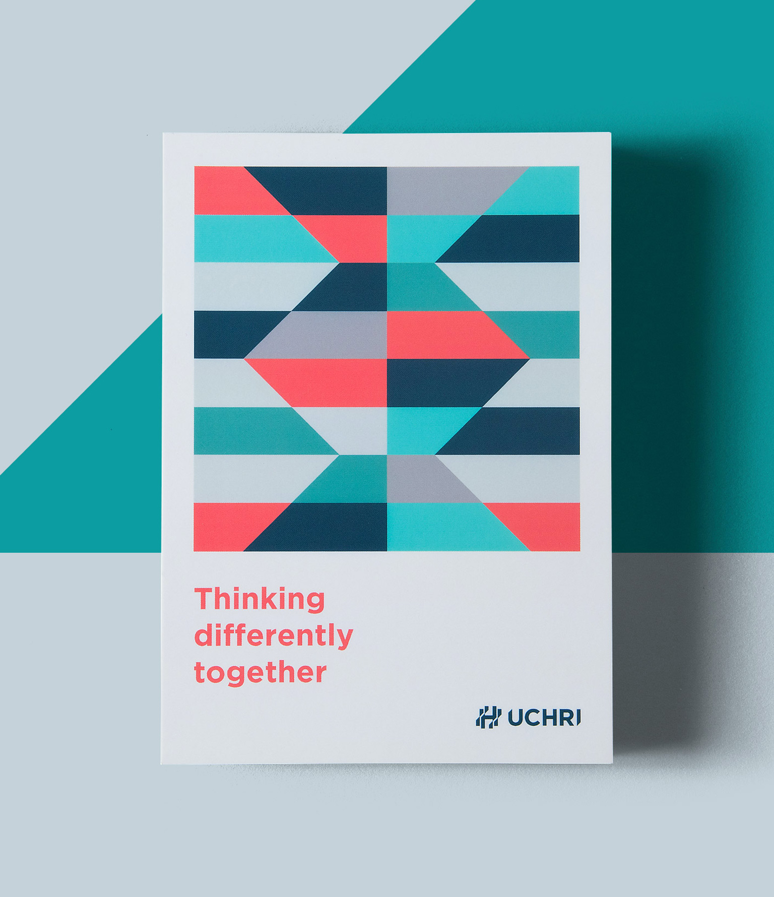
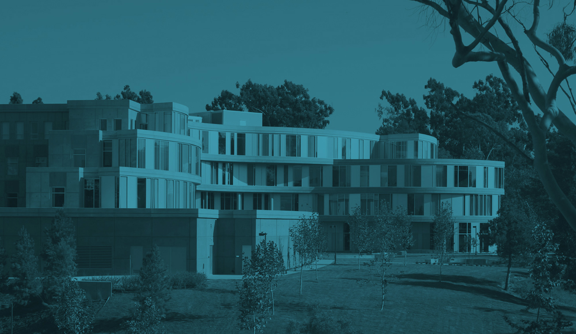
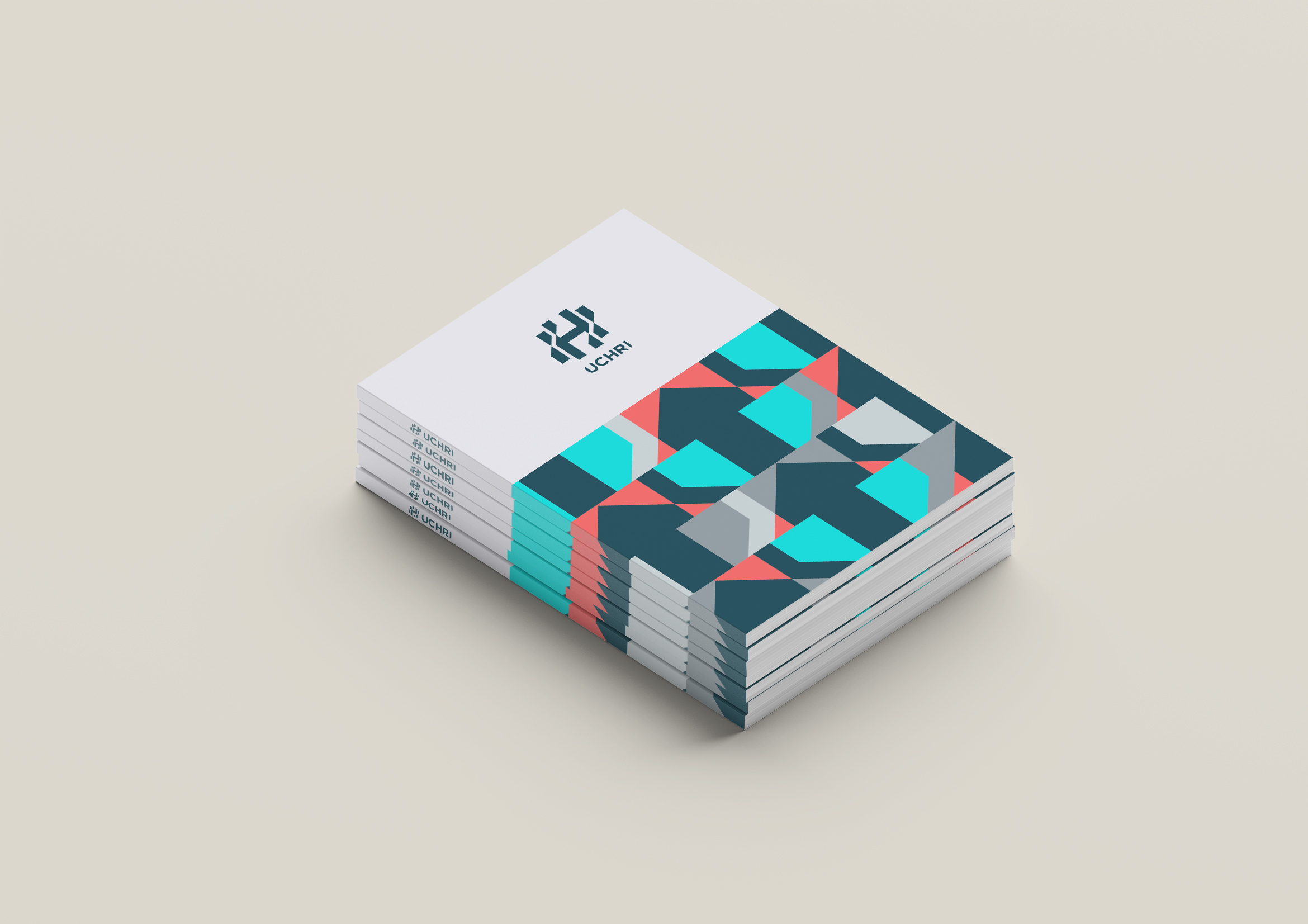
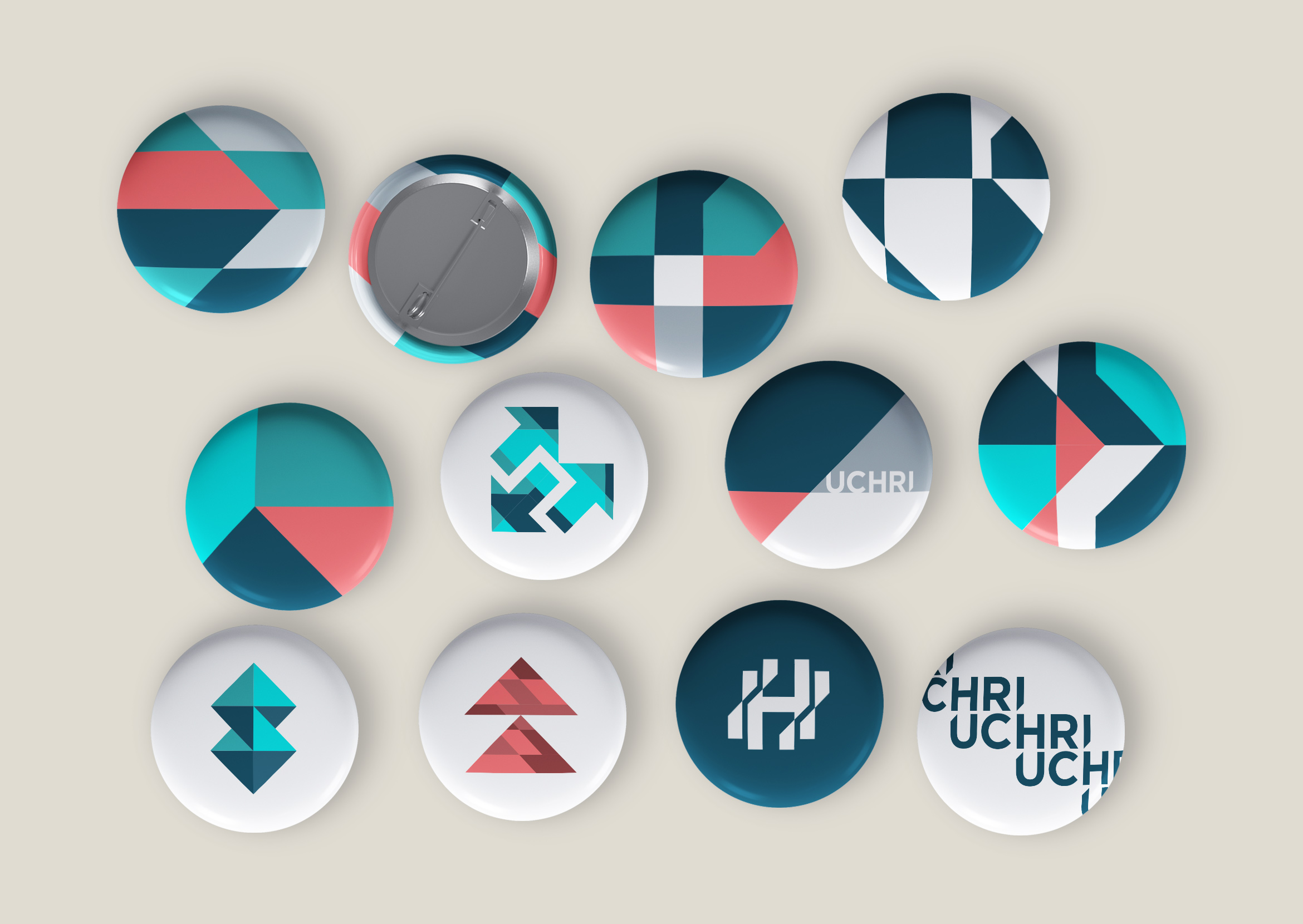
The University of California Humanities Research Institute facilitates experimental, interdisciplinary scholarships through research initiatives and grants. We redesigned their visual identity to be more contemporary, helping to showcase their groundbreaking research and points of view. Angles in the “H” monogram depict collaboration, movement and new lines of thought.
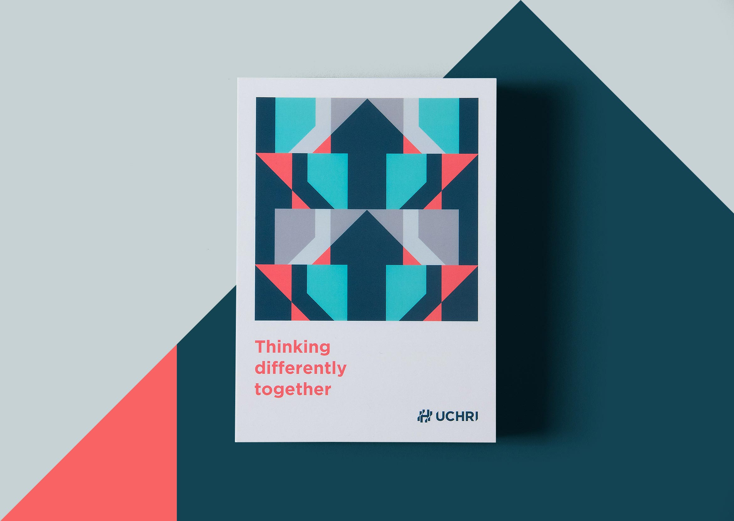
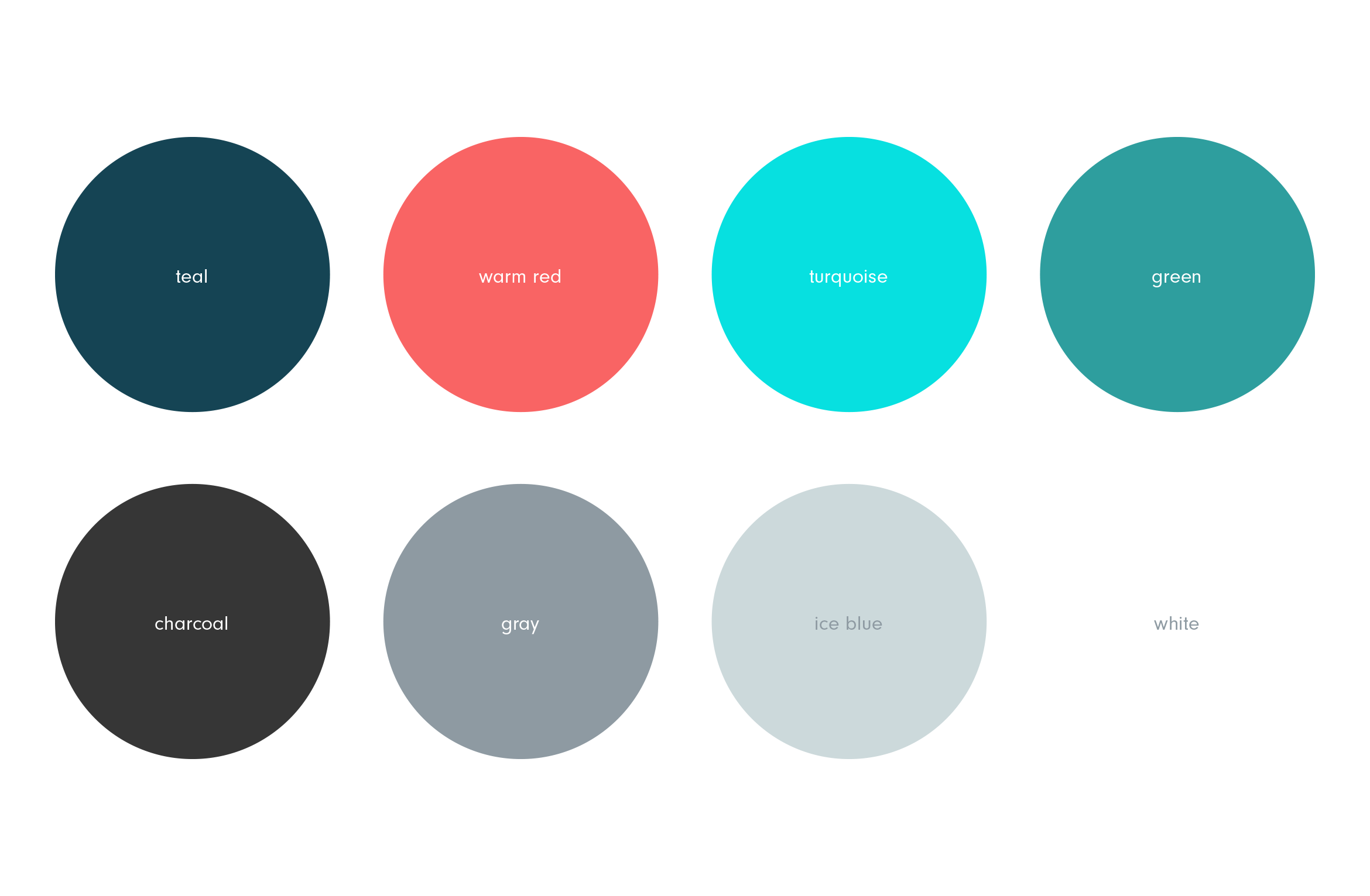
We expanded their existing teal color palette to include lively and approachable colors that reflect their dynamic works. A visual system of abstract patterns, super graphics and design templates allow the in-house team to design materials as needed.
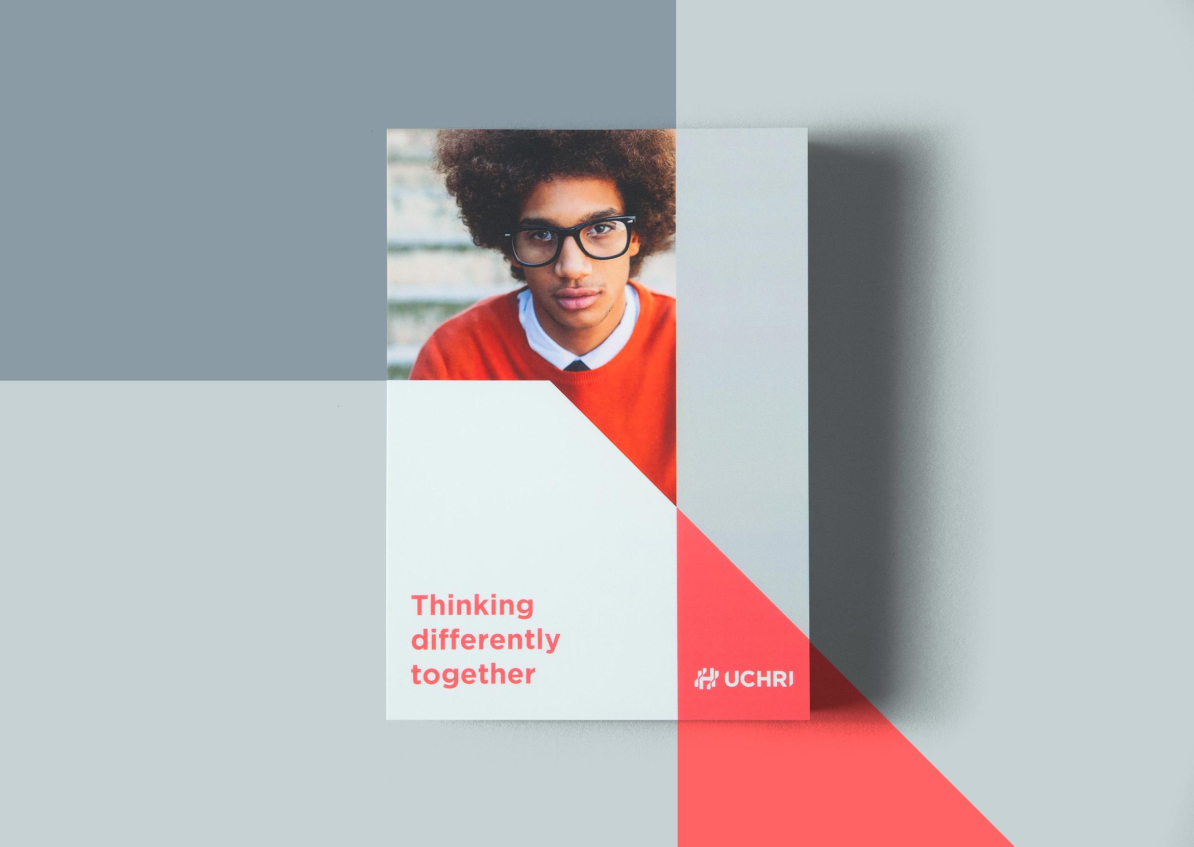
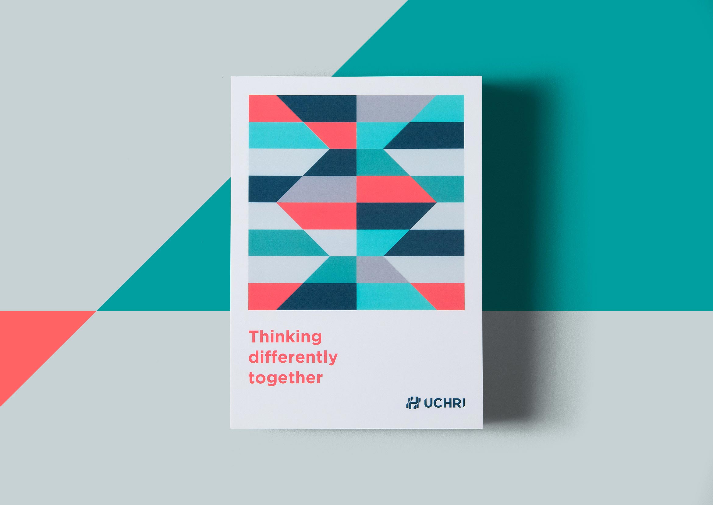
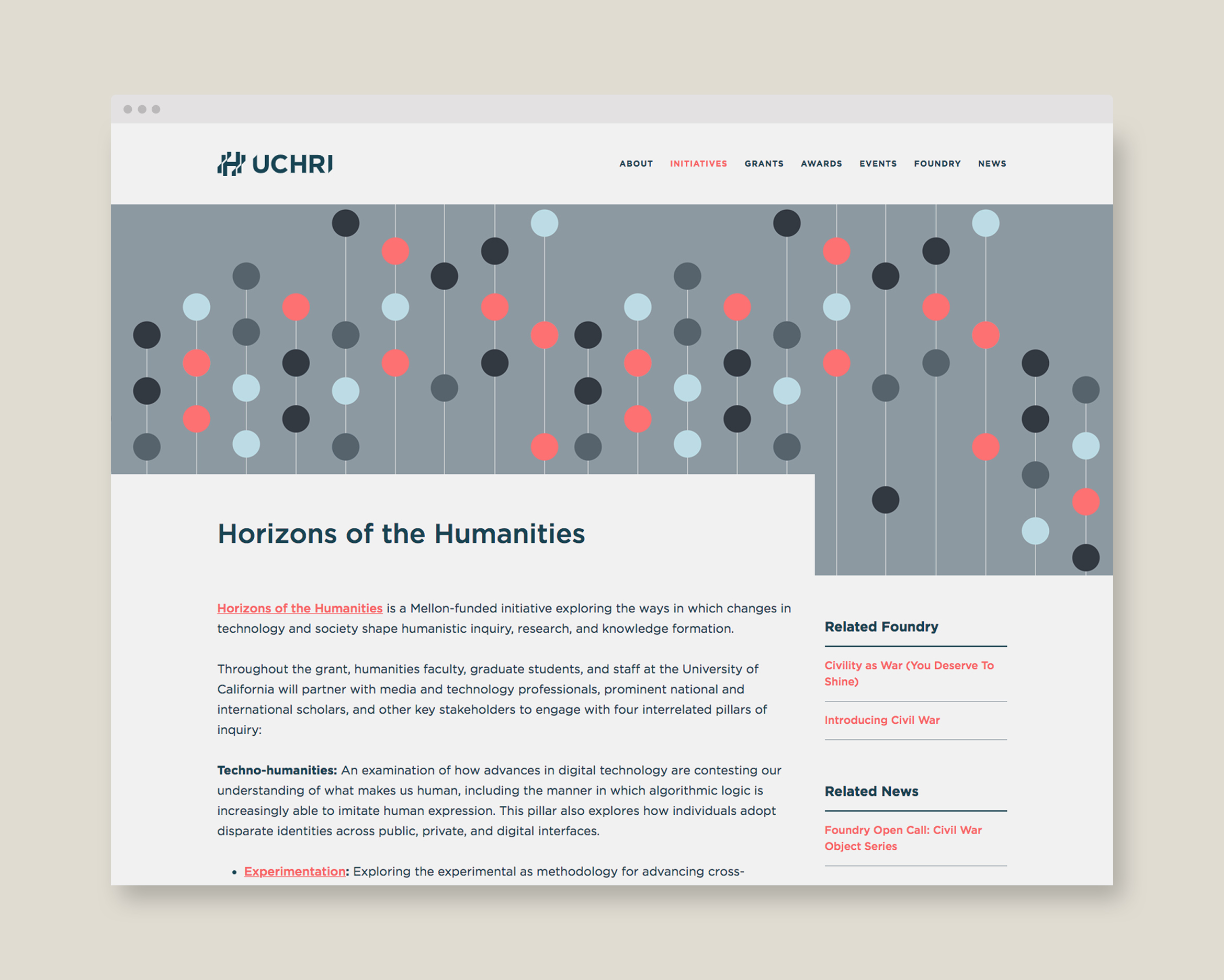
The website was redesigned to feel modern and easy to navigate through their vast array of content. Angled shapes are collaged throughout to reflect the geometry of the logo.

Deliverables:
- Brand Identity
- Brand Styleguide
- Visual System
- Website Design
- Print Collateral
- Promotional Items

A Brand Styleguide with rules for the logo, typography, color palette and graphic motifs allows the in-house design team to retain brand cohesion on all materials they design.