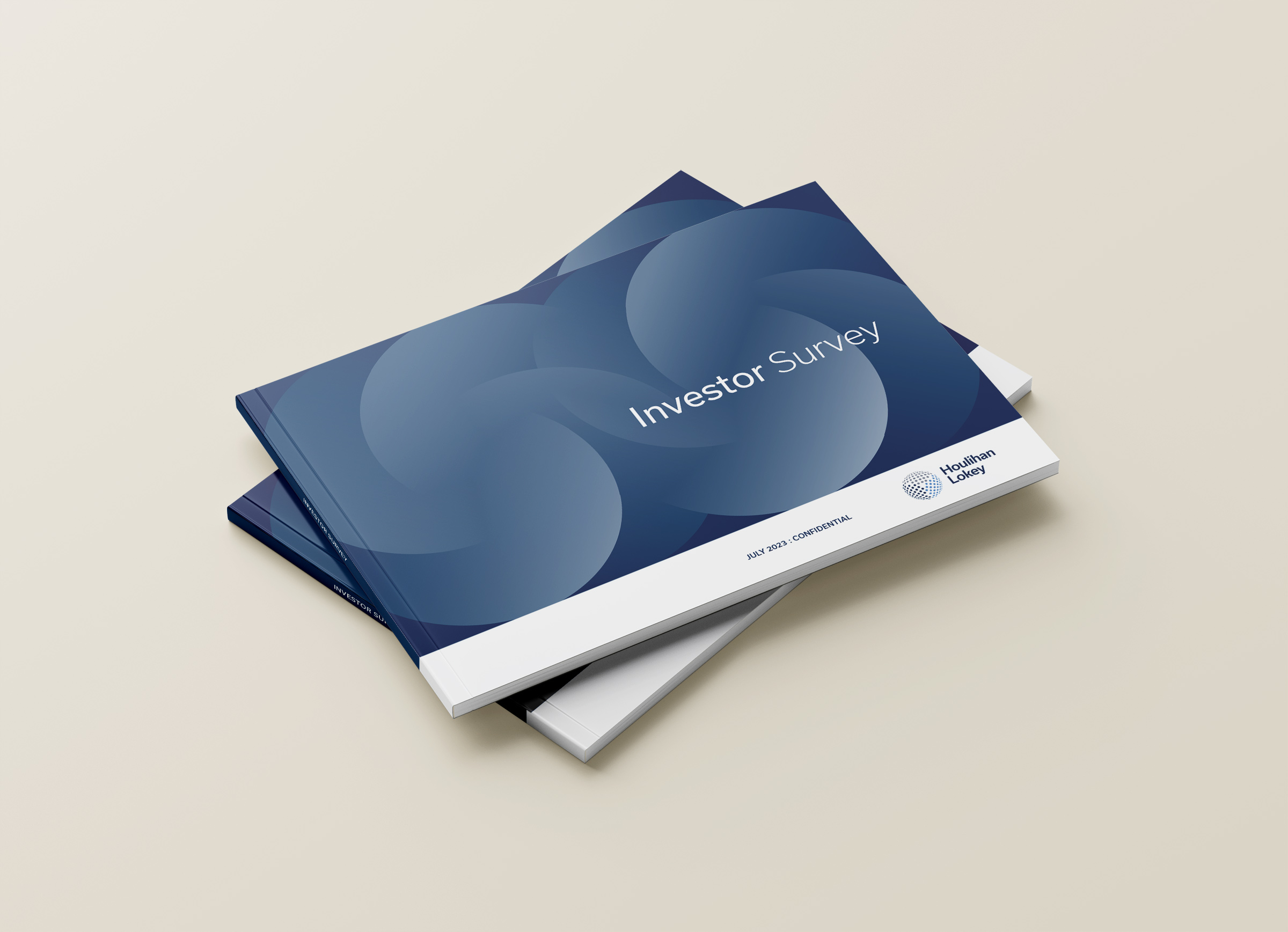
Houlihan Lokey is a global investment bank with a modern edge
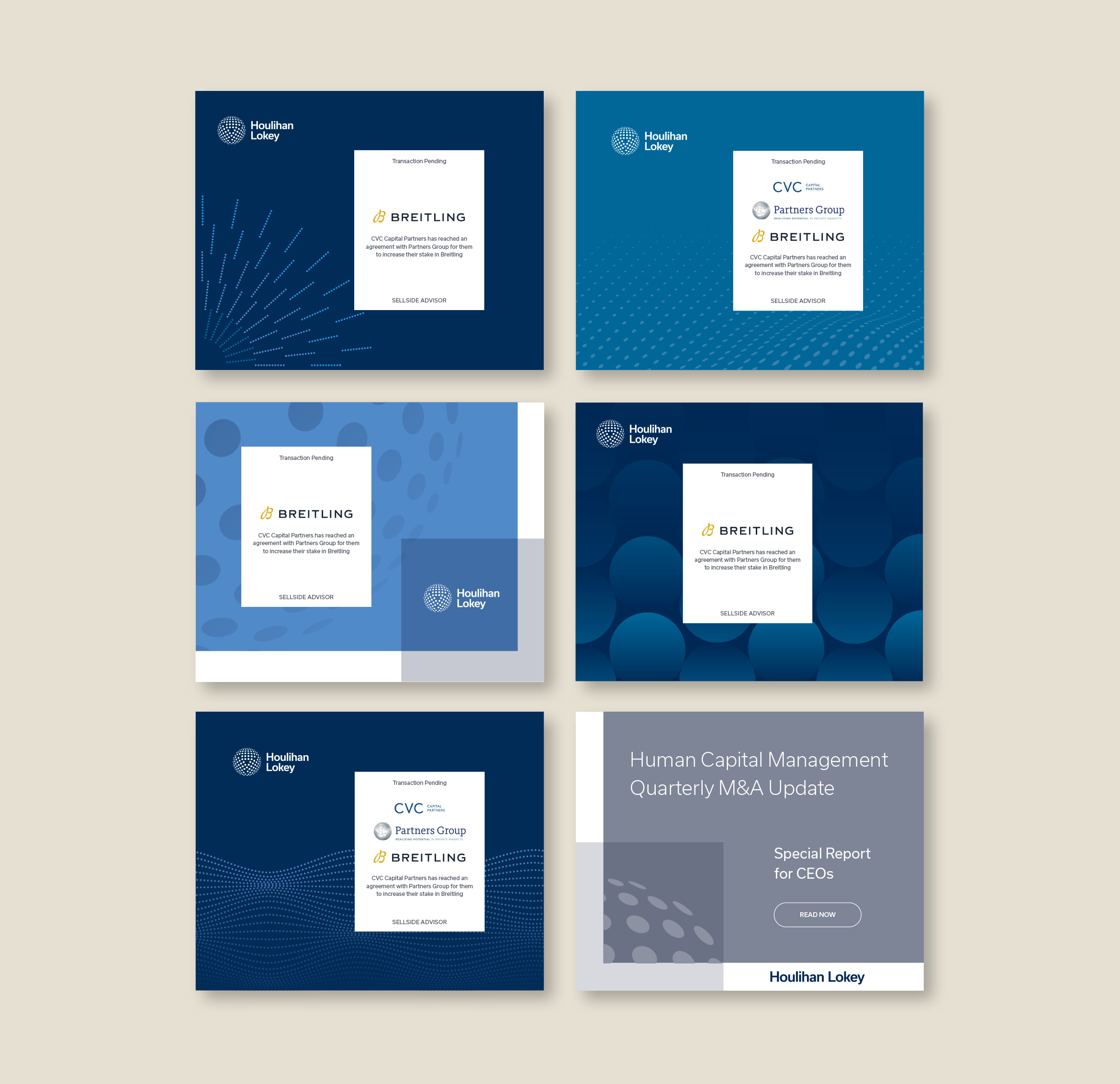
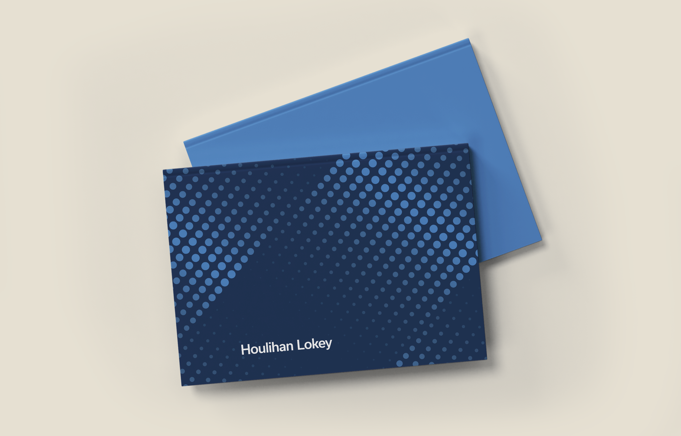
Houlihan Lokey is a leading global investment bank with expertise in mergers & acquisitions. Working with their existing logo we created a visual design system with a vast library of graphic motifs and applications. Clean, modern graphics pair nicely with images of their worldwide locations. The dynamic and flexible system works across all marketing touchpoints from the website to social media.

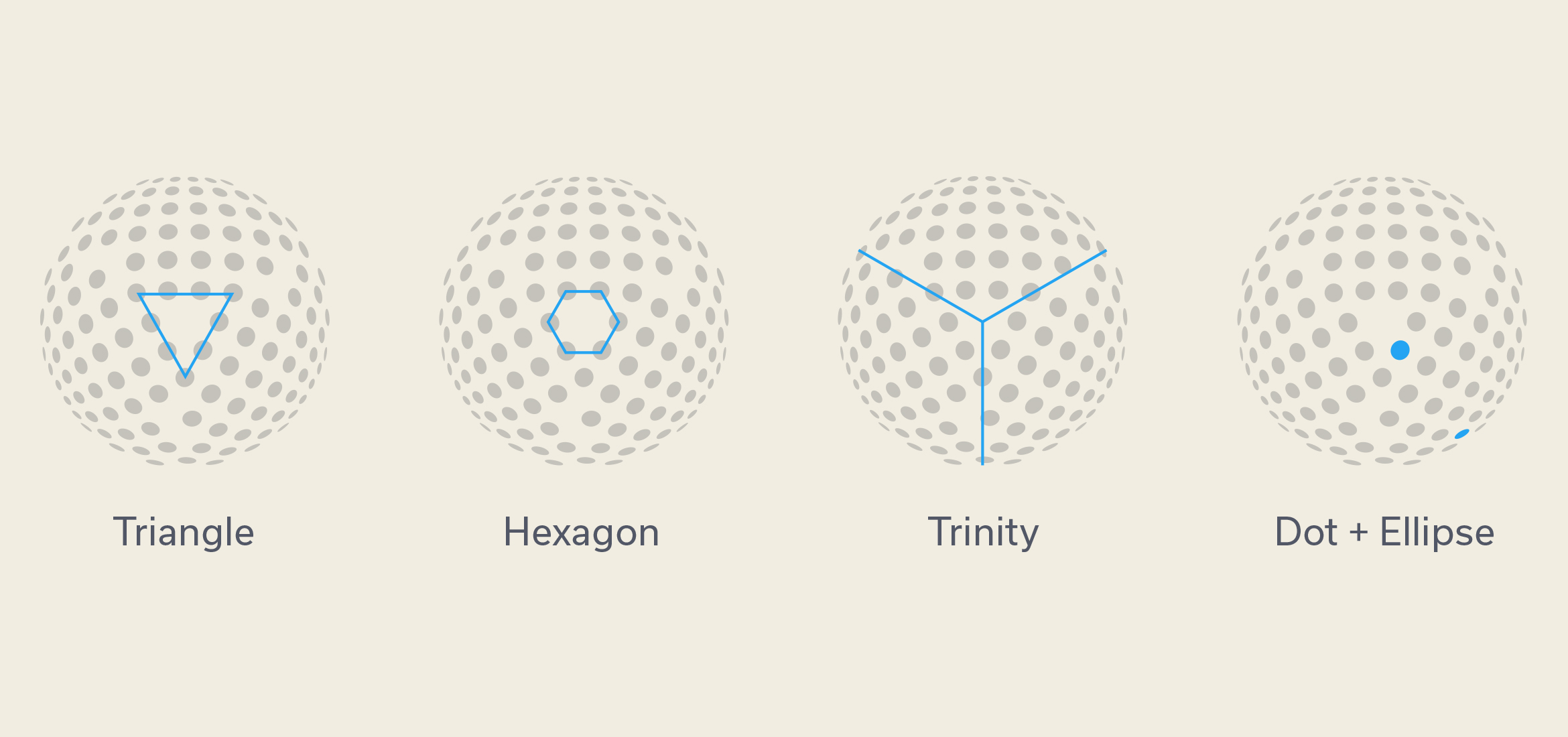

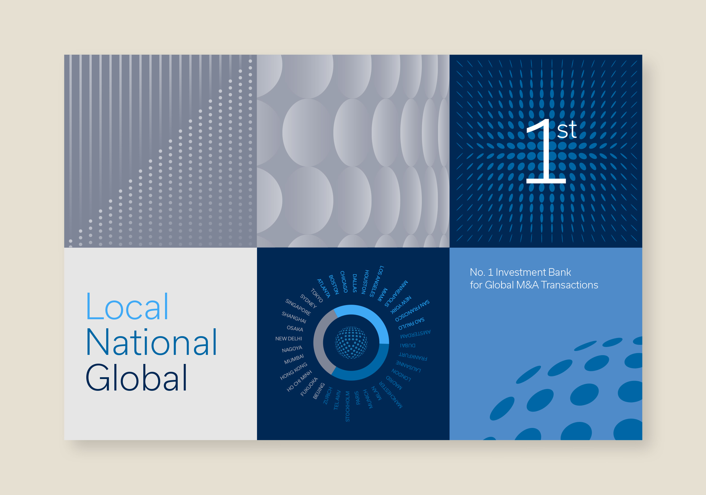
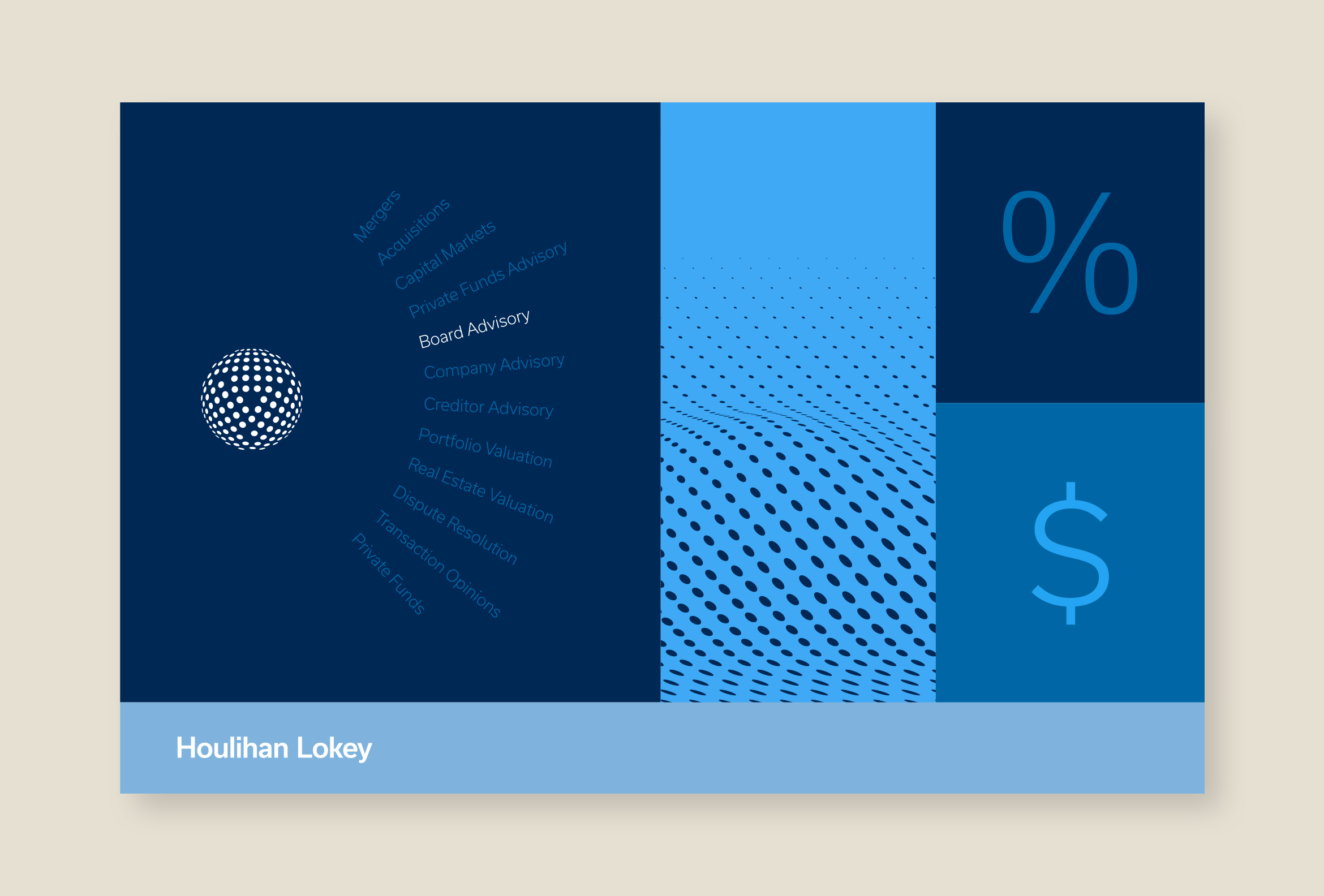
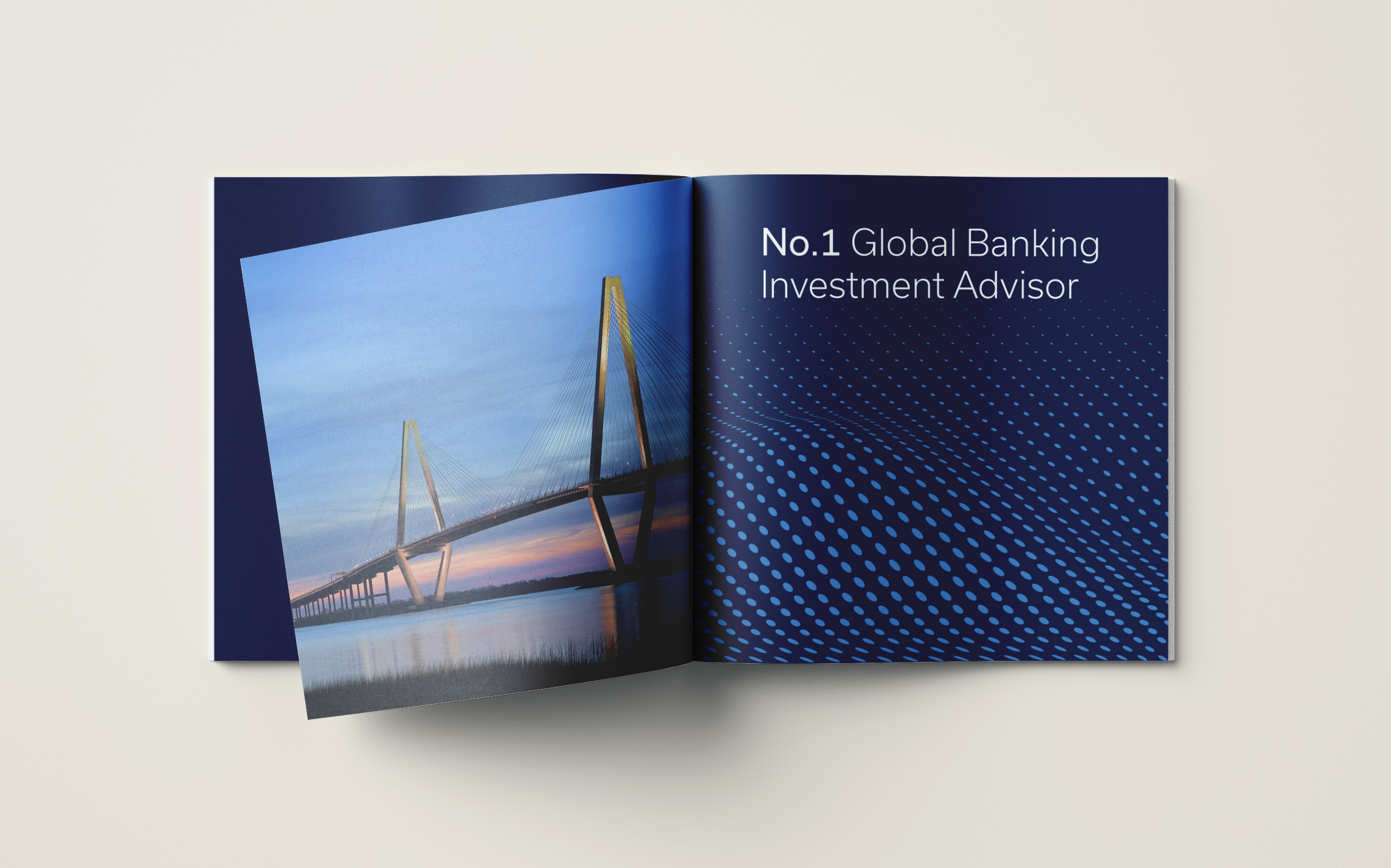
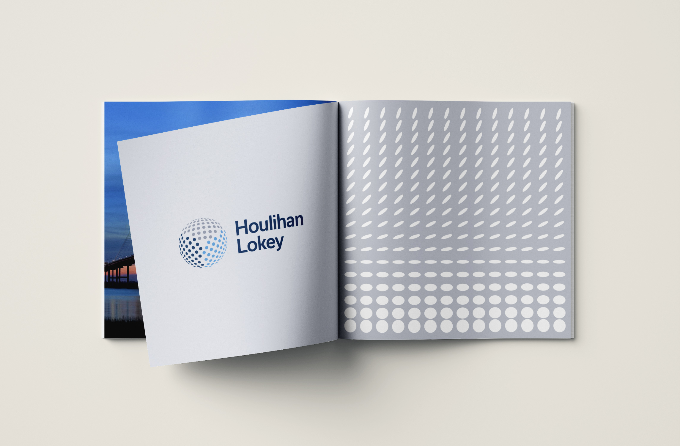
Shapes found inside the “trinity” globe were used to create flowing waves, currents, halftone patterns and geometric and dimensional motifs. By using the DNA from the logo itself, the visual identity feels like a cohesive system and creates an abstract depiction of intangible financial concepts.

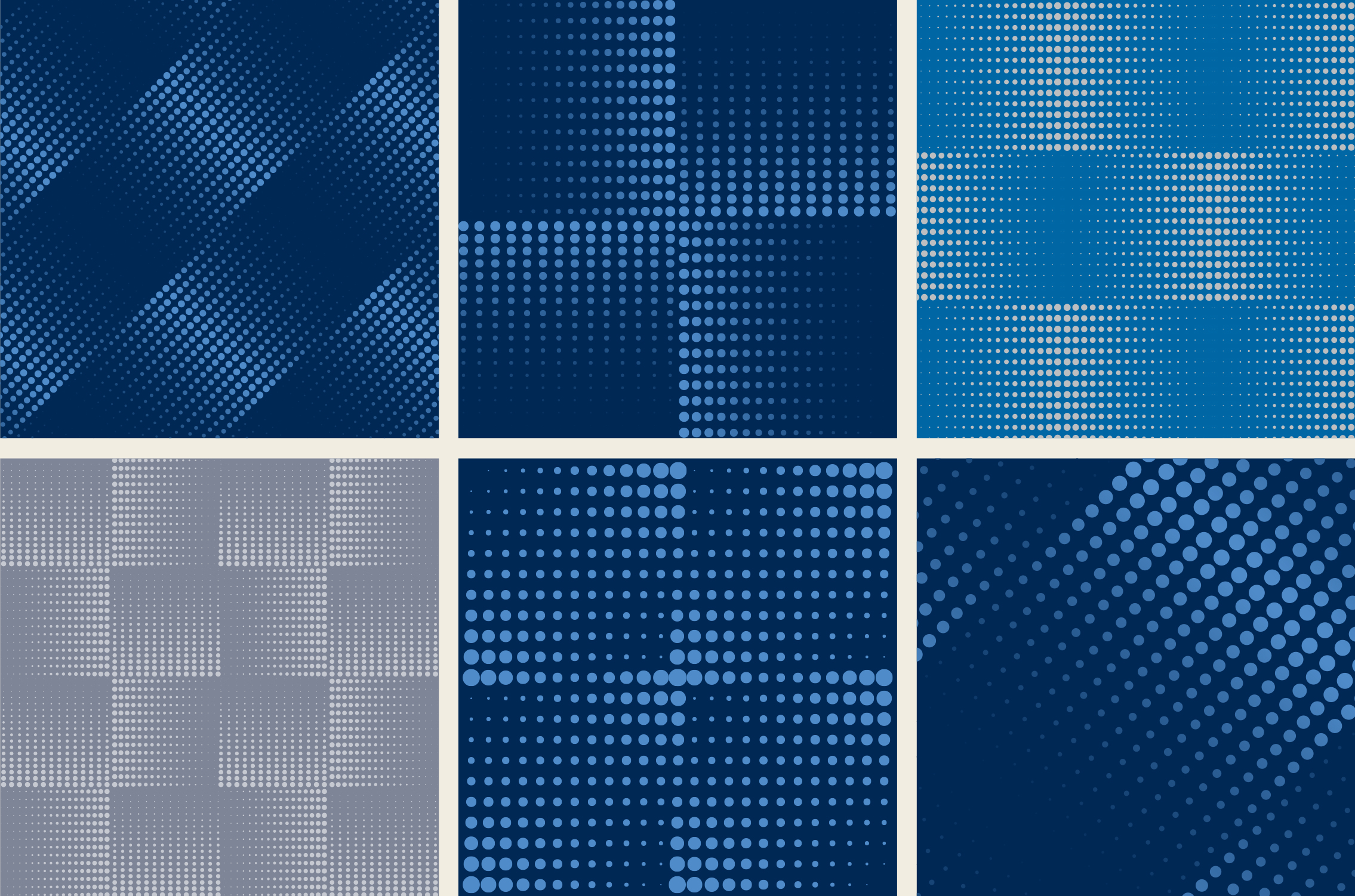

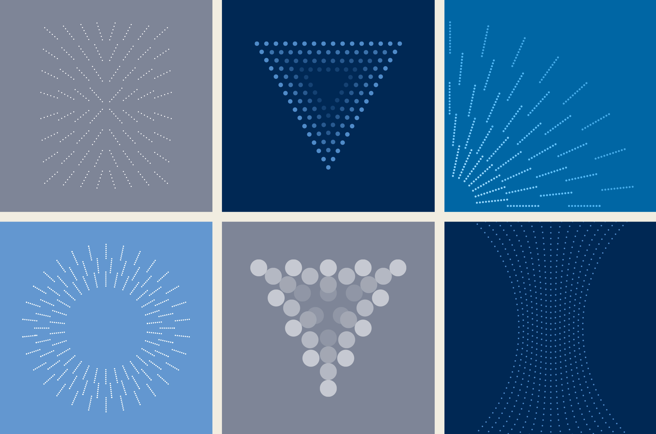
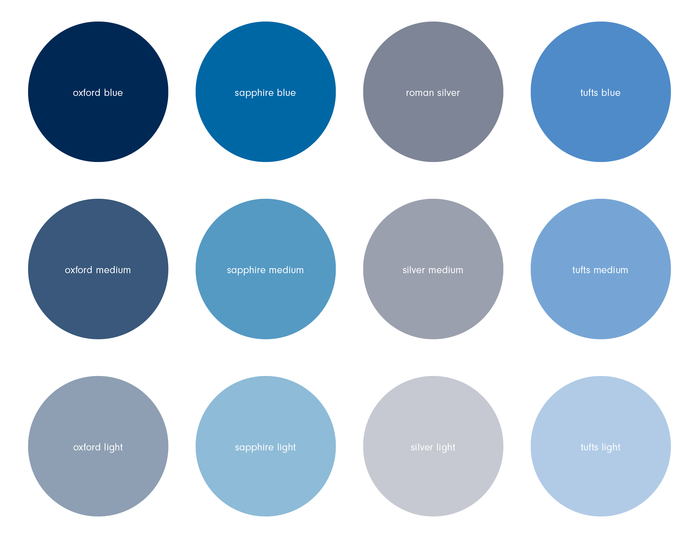
Using Houlihan Lokey’s existing brand color palette, we extended it by adding tints of the primary colors. Seen in the various graphic motifs and gradients, it helps create a depth and sophistication to their otherwise corporate colors.

The visual system allows for endless ways of combining the design elements in unique ways so that any piece of corporate communication looks and feels like it comes from Houlihan Lokey.
LinkedIn is the primary social media platform Houlihan Lokey uses for posting news. We created a library of custom, branded posts for various things like deal announcements, market report downloads and new hires around the globe.
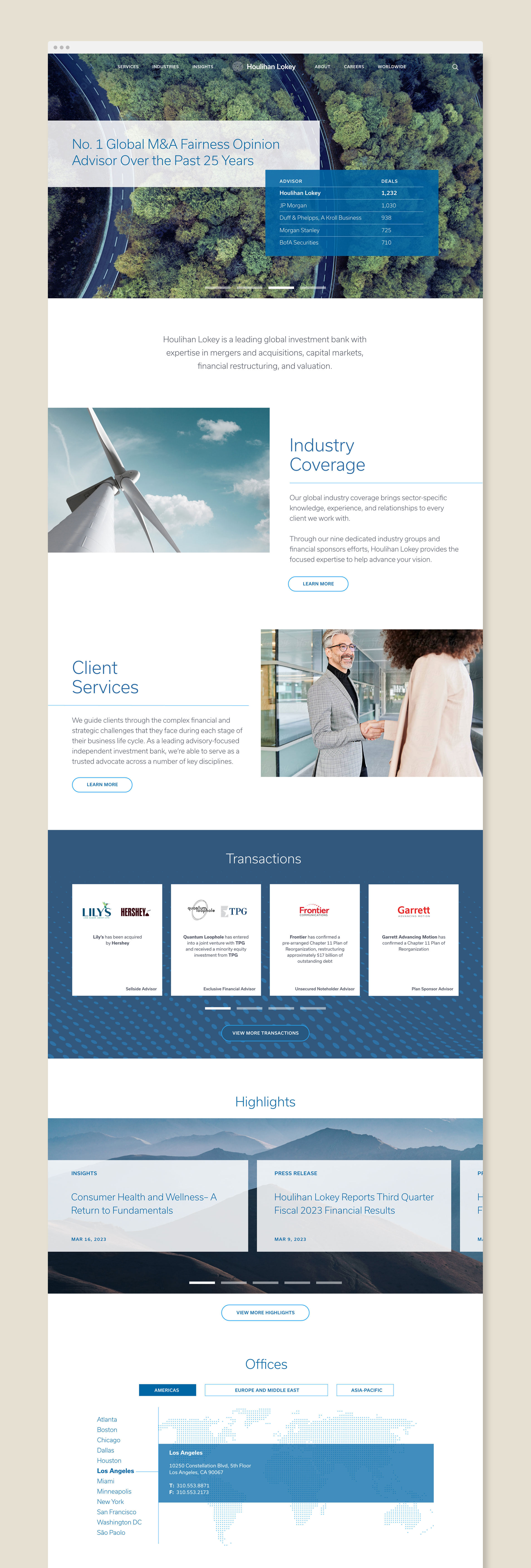
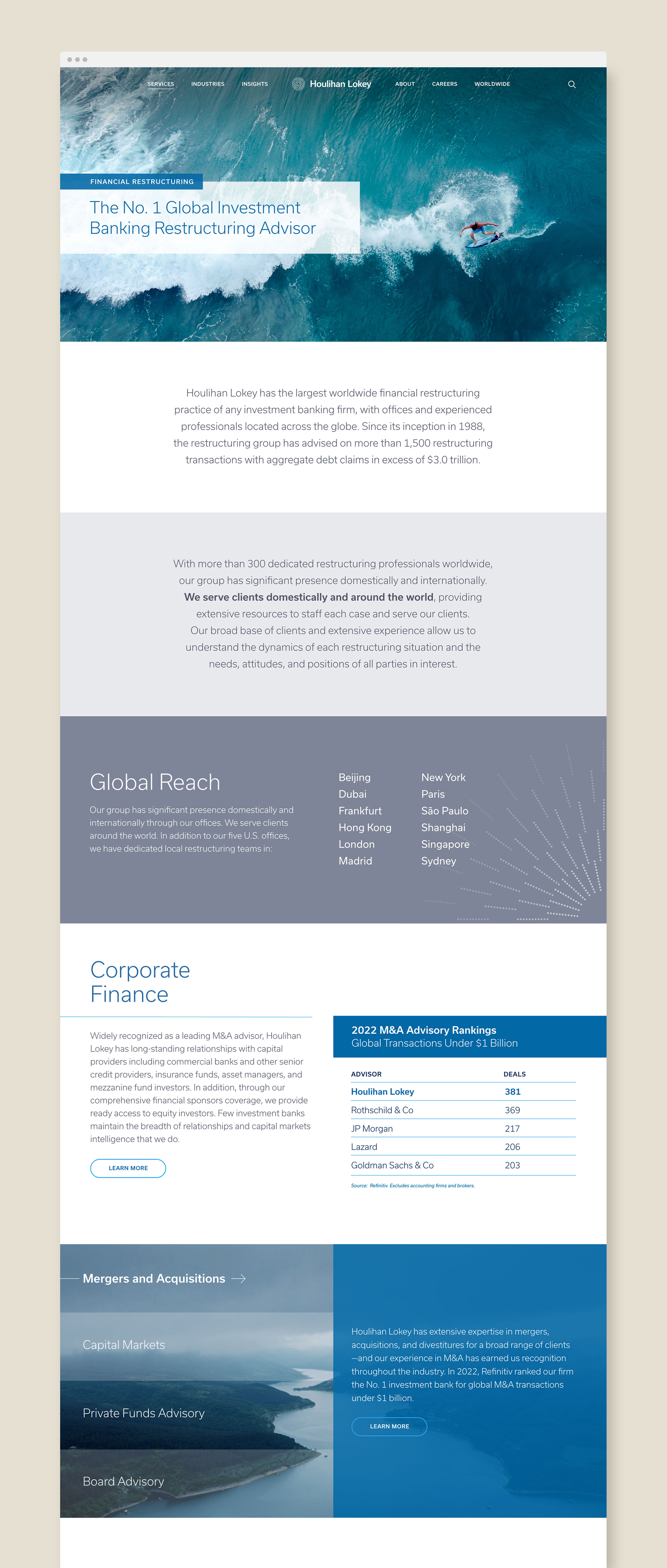
Nature photography of mountains, bridges, roads, oceans and rivers are a great way to illustrate the ideas of global market fluctuations and increasing wealth. It’s also a nice juxtaposition to the clean lines of data charts and M&A bank information.
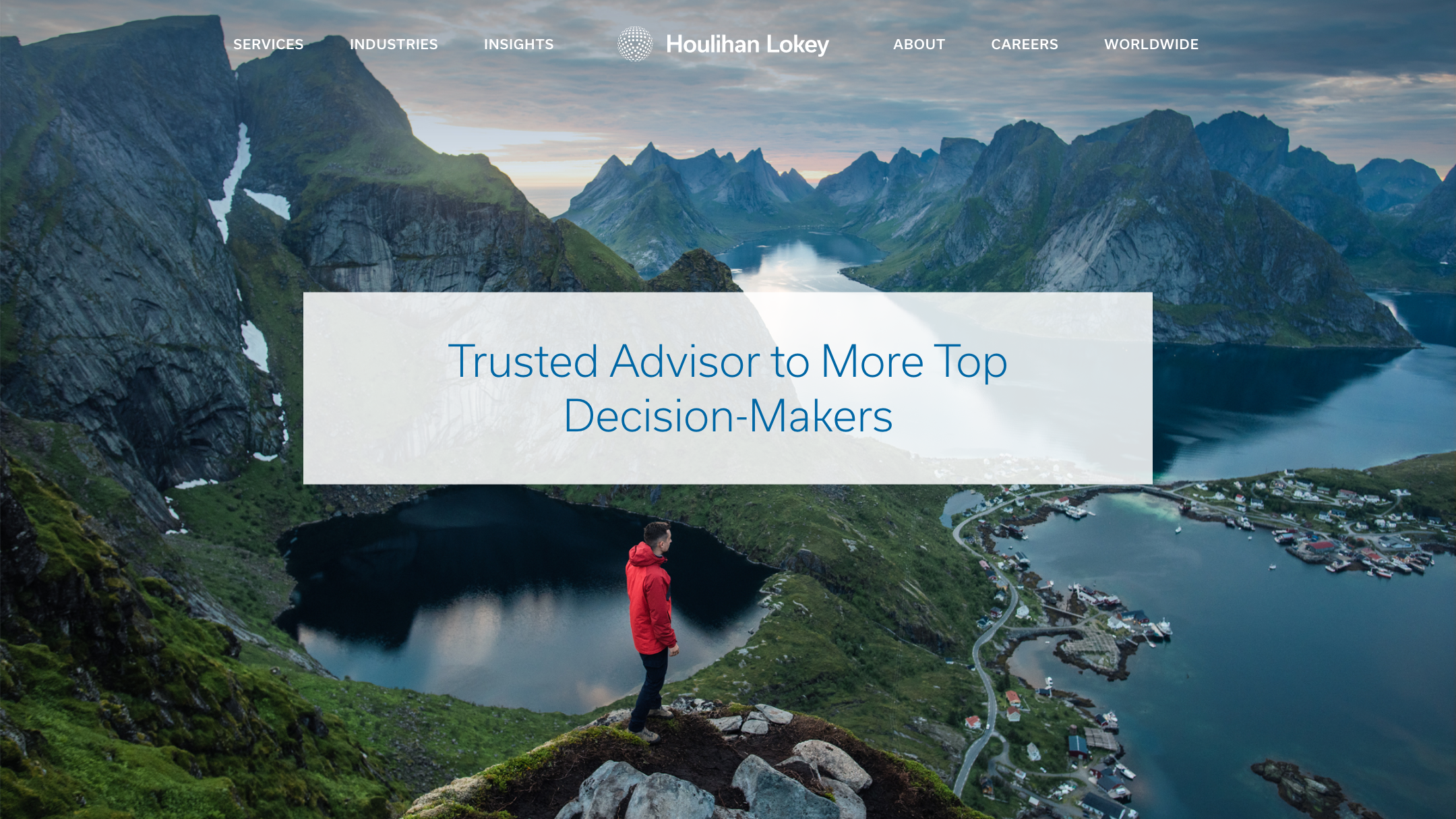
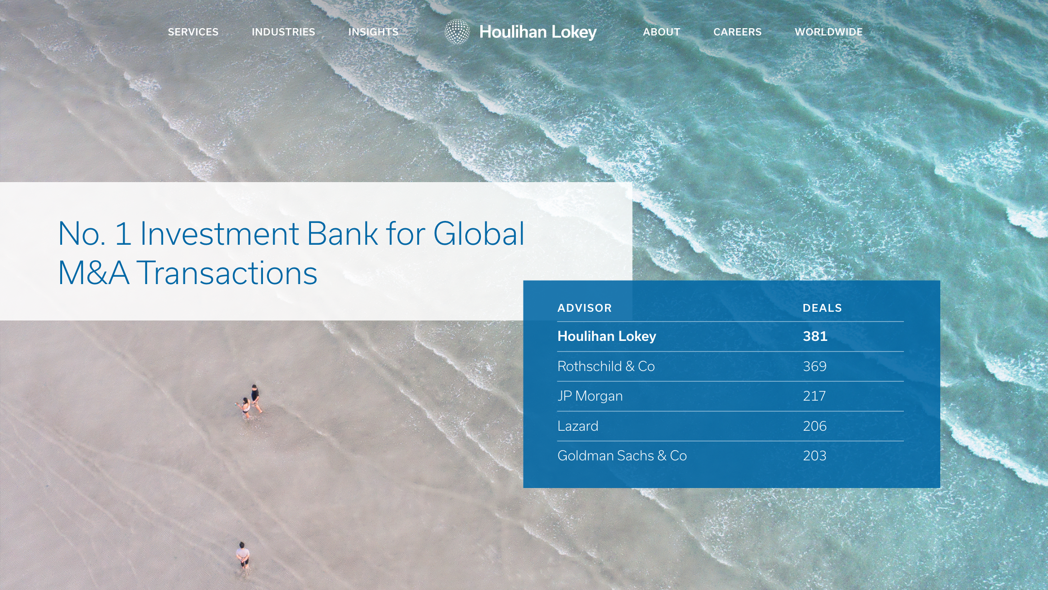
Working with Houlihan Lokey’s in-house developers, we designed the website to combine the graphics and majestic imagery to present their detailed information and global rankings charts in a clean, concise way that’s easy to navigate.

Deliverables:
- Visual Design System
- Extended Color Palette
- Website Design
- Social Media Design
- Collateral Design
Paige Parenti college coach
service / brand identity / website


Paige is a college admissions coach with a mission to empower every student
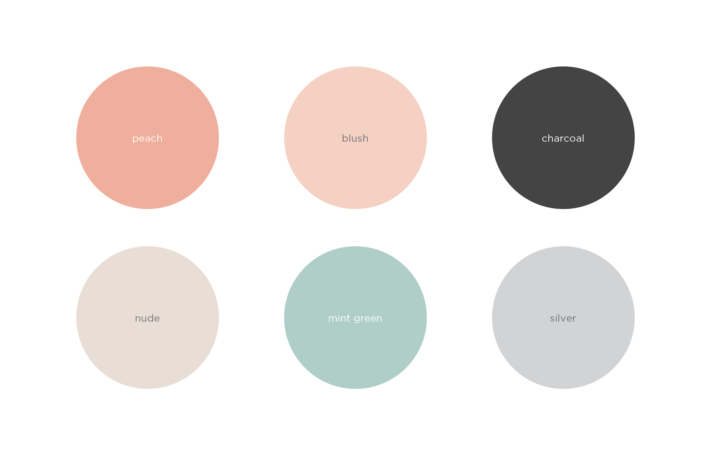
Paige helps every student find the right college for them, guides them through the admissions process, and sets them up for success. To appeal to Gen Z, and their parents, the company name was updated and the brand redesign focuses on the personal attention she gives to every student. The result is a clean and inviting look and feel using warm, soothing colors
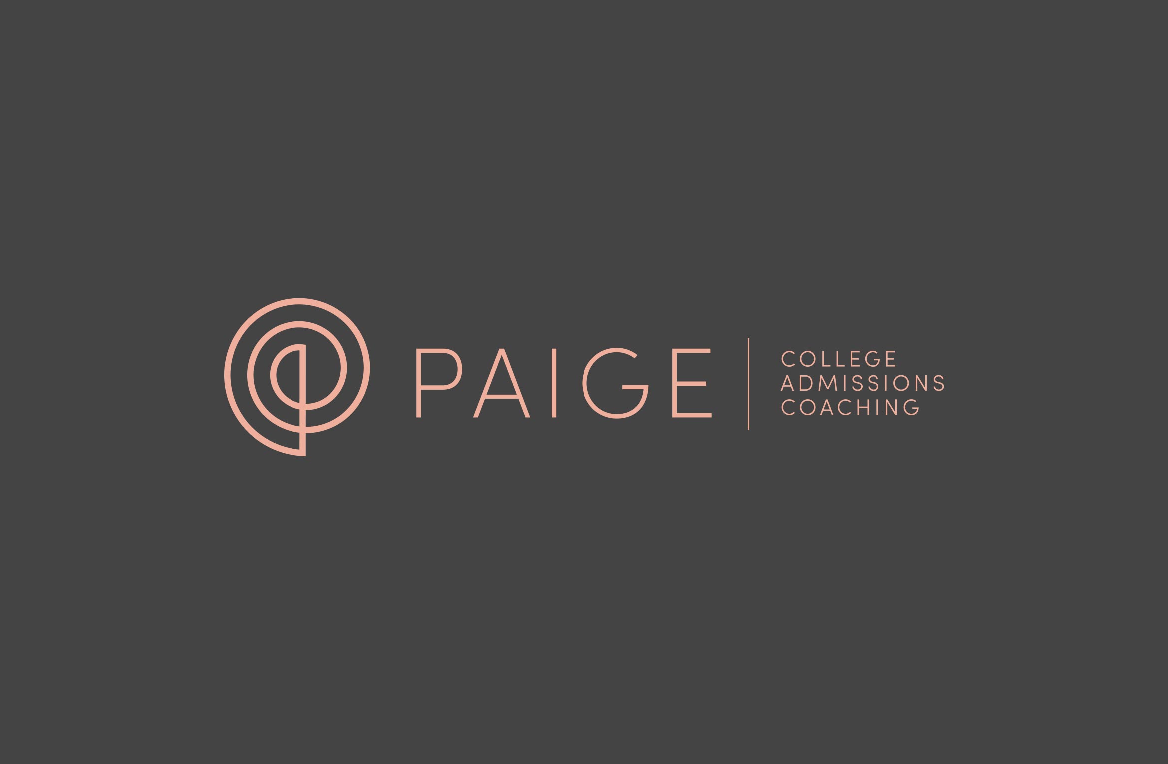

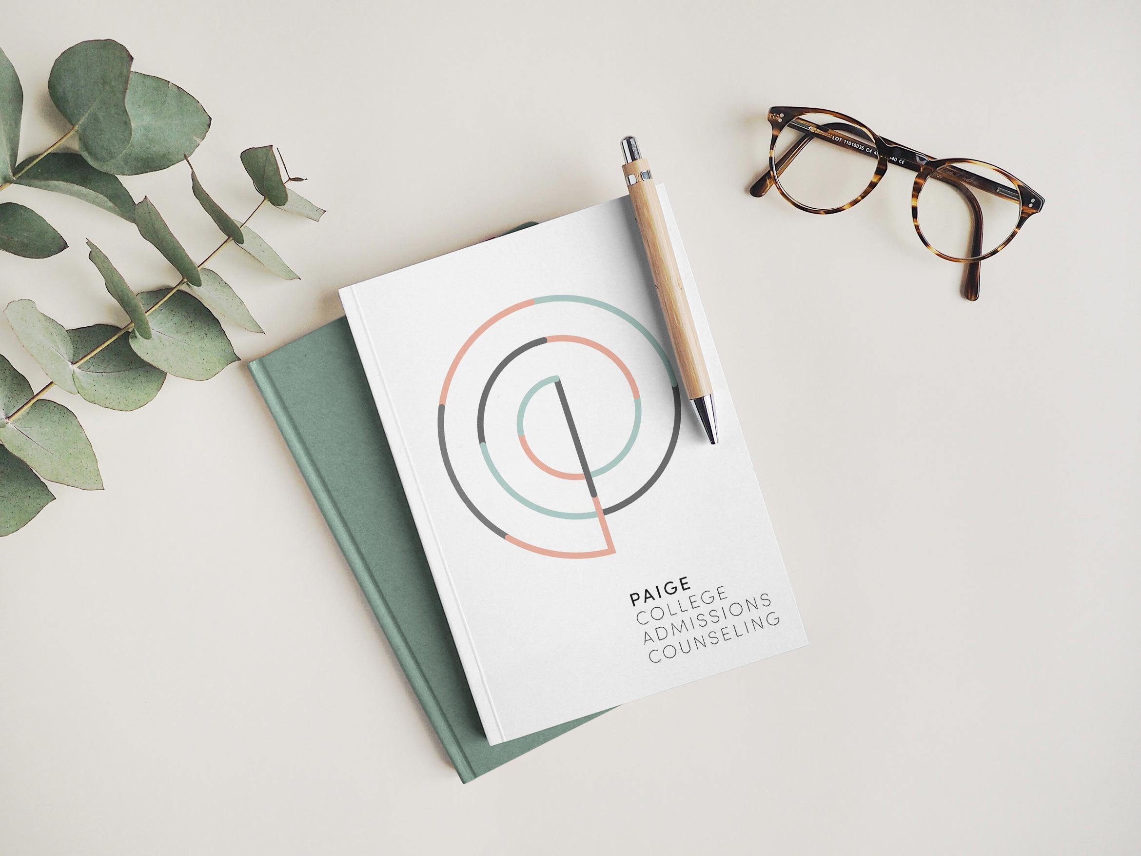
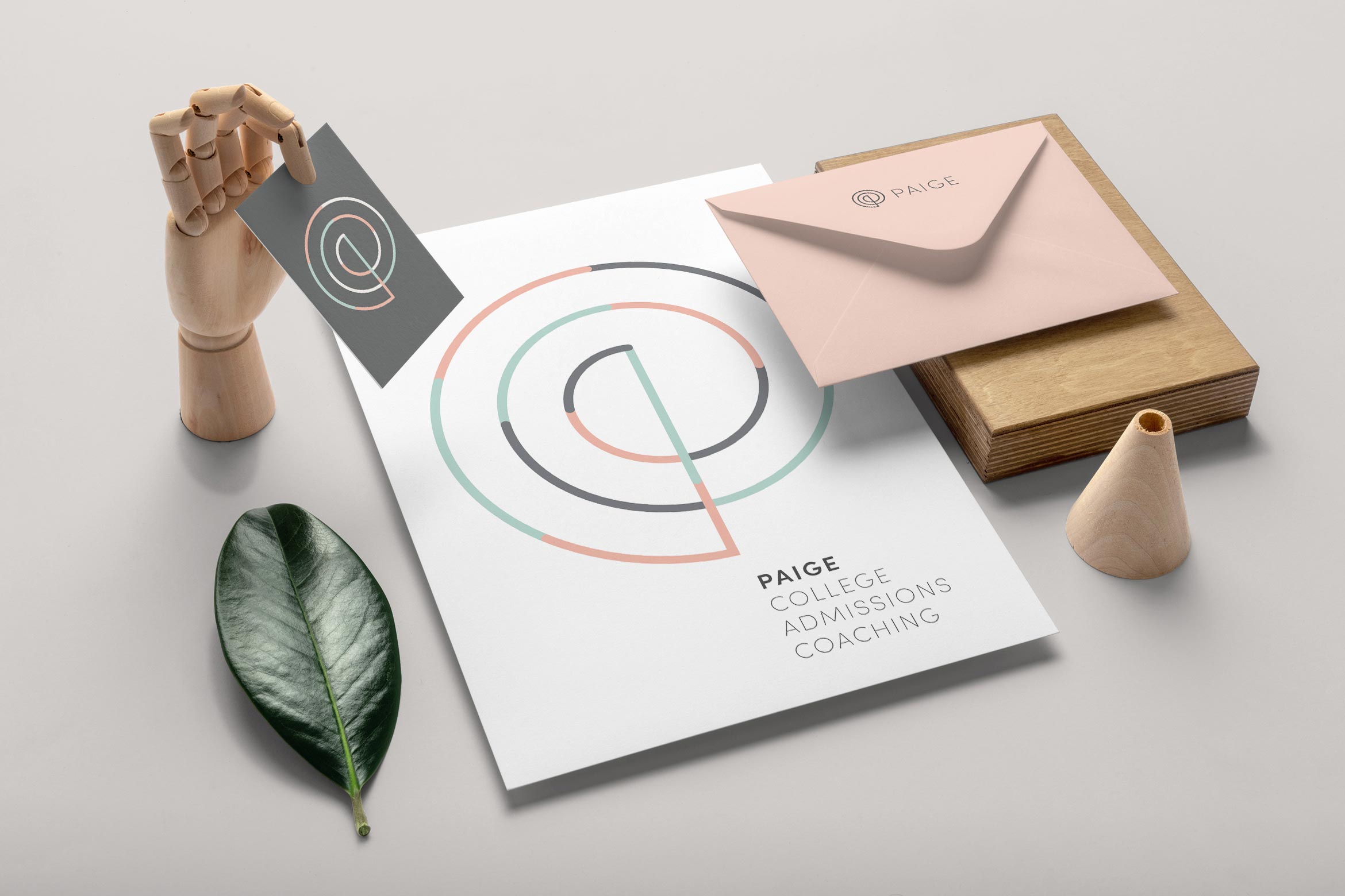
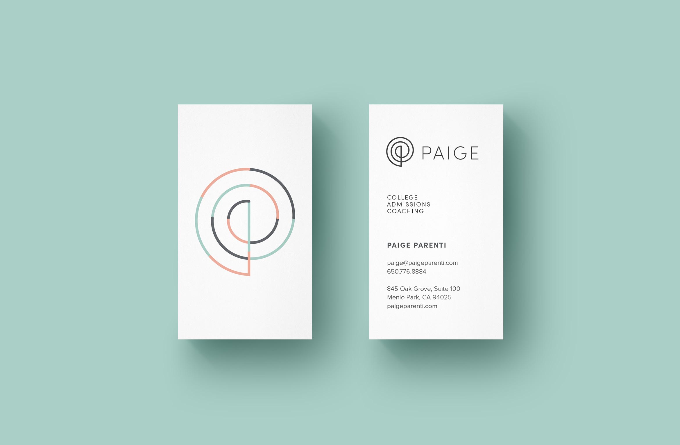

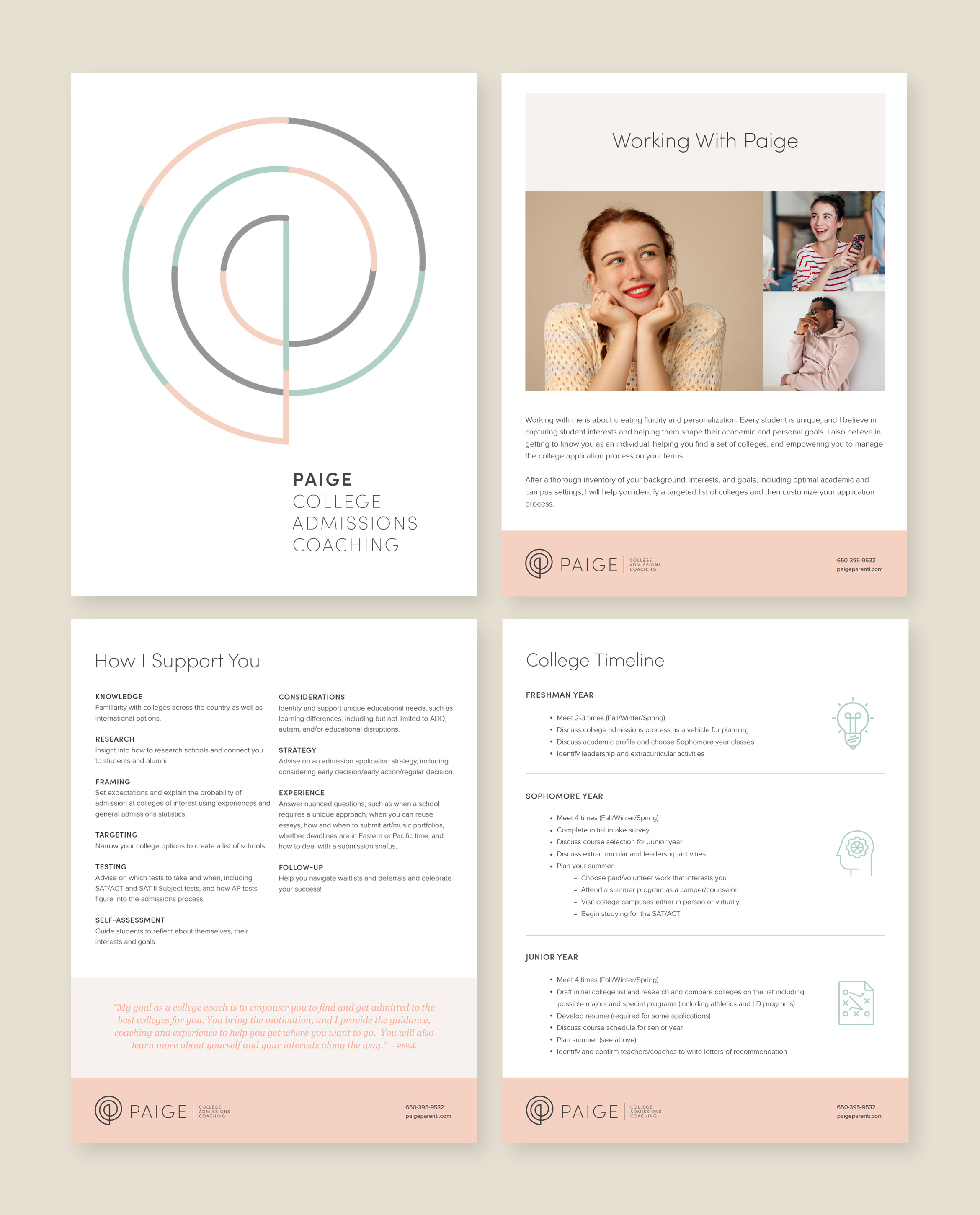
The elegant P monogram is inspired by the Golden Spiral, a sacred geometric symbol that represents higher learning and infinite possibilities. A set of thin line icons compliment the thin lines in the logo.
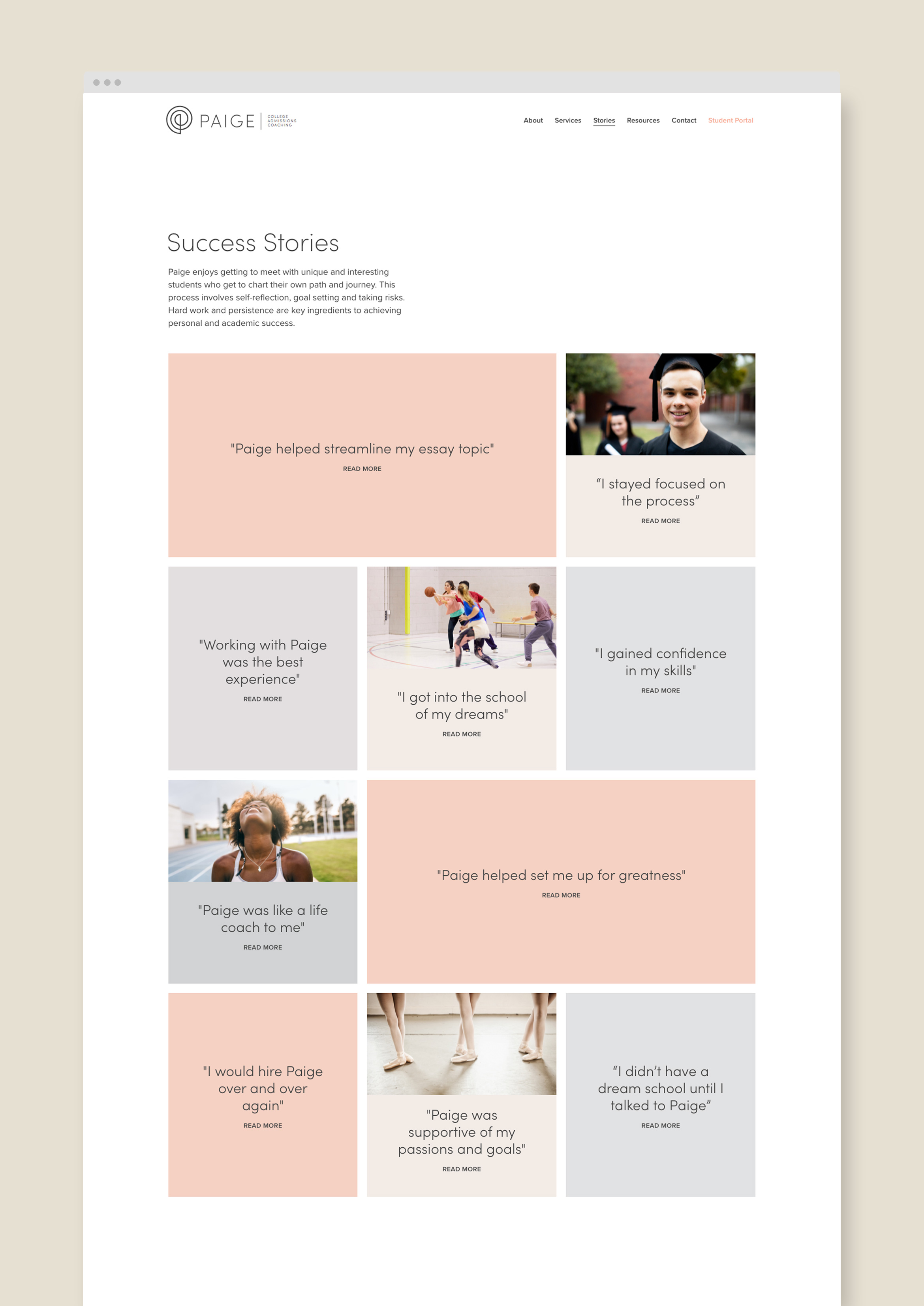
A customized website tells the story of Paige, her services and student stories to describe real-world results. The design is light and airy with easy bites of information and imagery, plus a student scheduling calendar and payment pathway.

Deliverables:
- Brand Identity
- Visual System
- Web Design
- Content Creation
- Digital Collateral
- Print Design
Hughes Estate Sales
services / brand identity / website / print collateral / signage
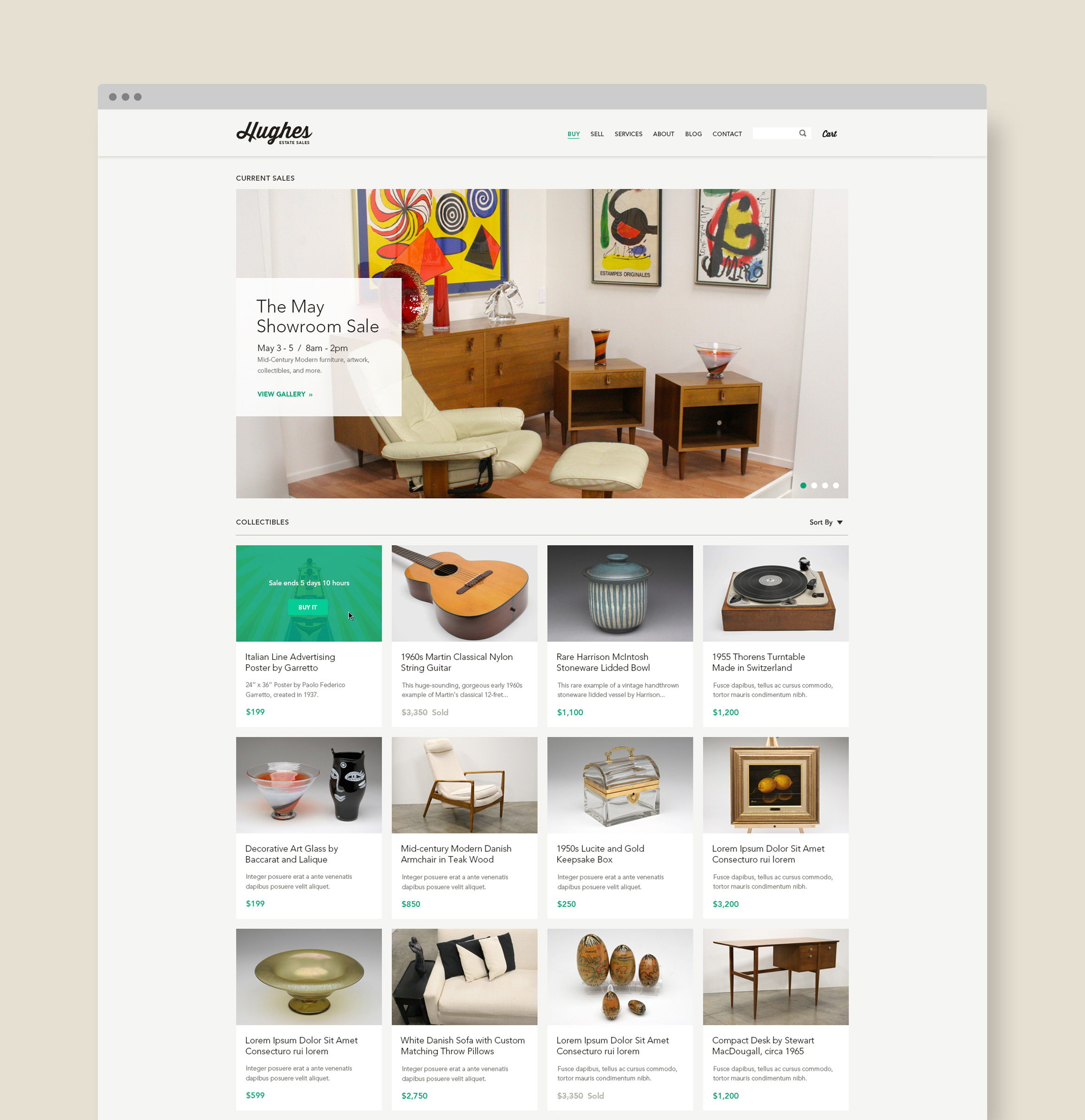
Hughes is the premier estate sales and antique auction resource in SoCal
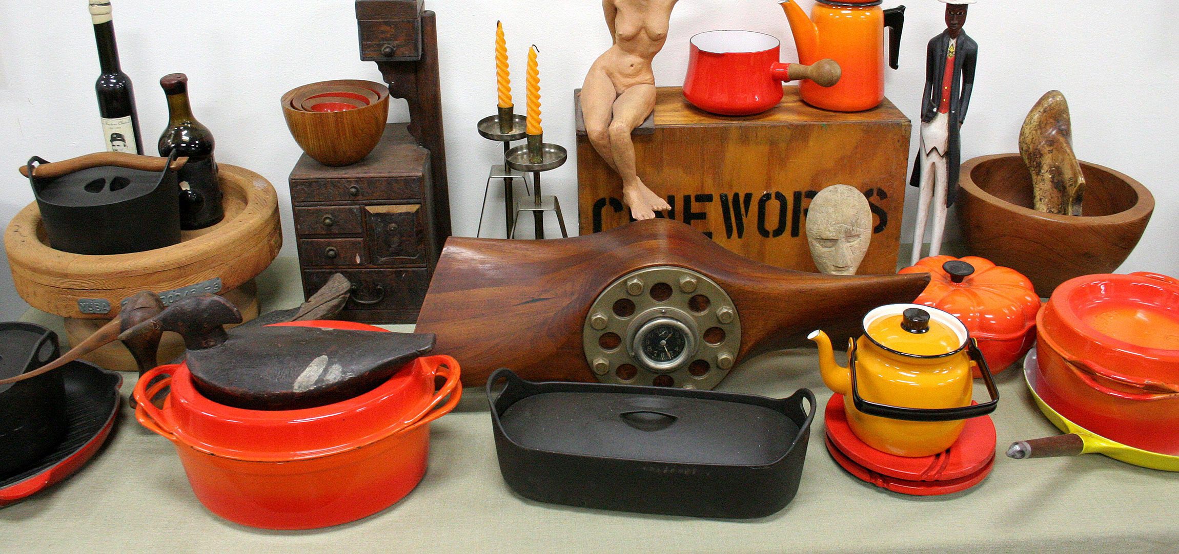
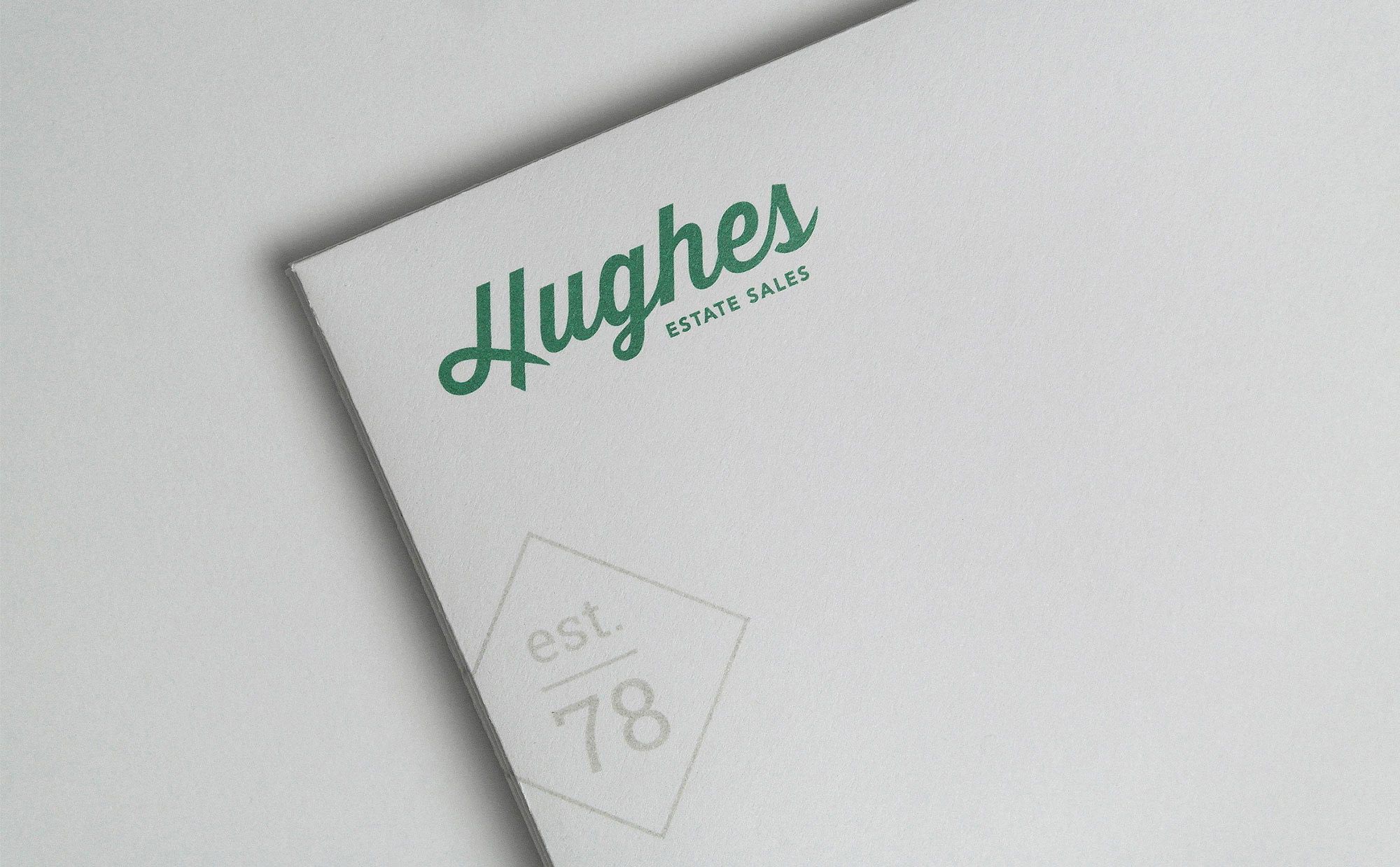
Since 1978, Hughes has been the premier estate sale resource in the southern California region. They wanted to modernize their brand identity and create a responsive e-commerce site that expands their business model to include online sales and auctions. The logotype combines a contemporary yet classic look that echoes their past and moves them into the future.
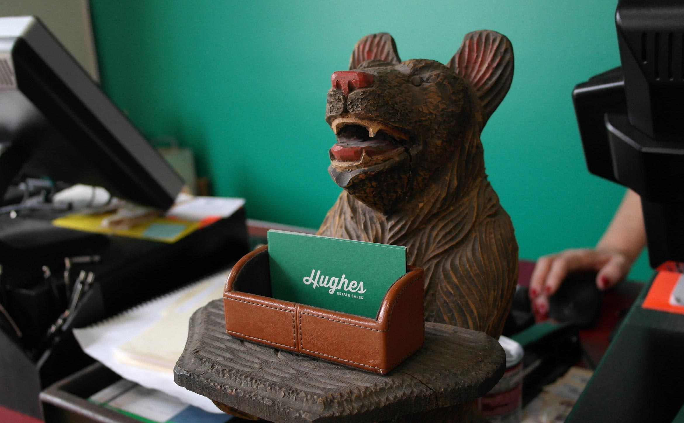
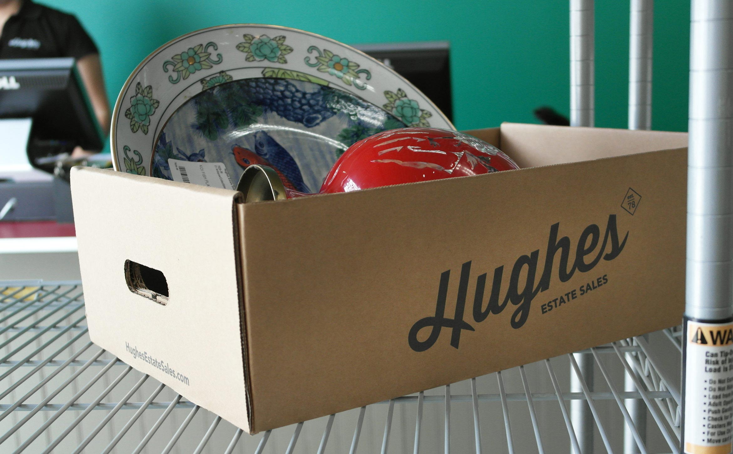
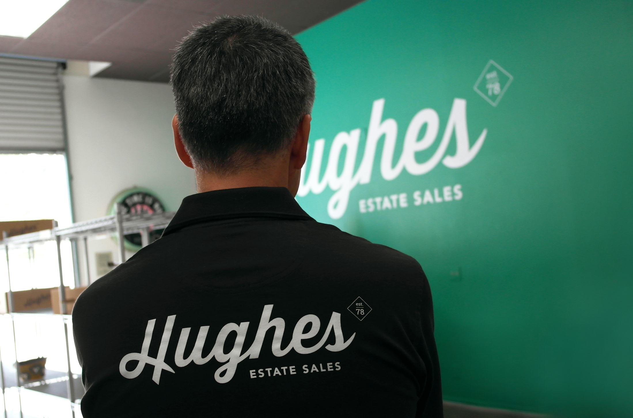
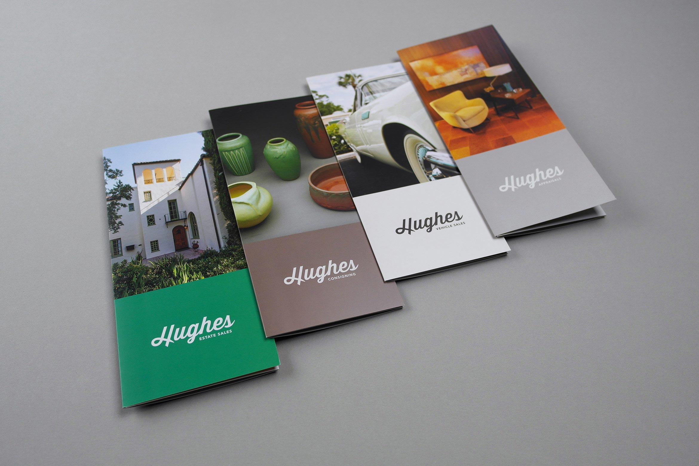
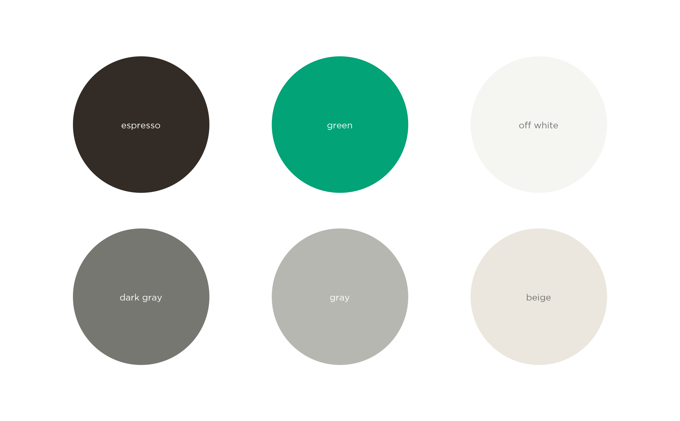
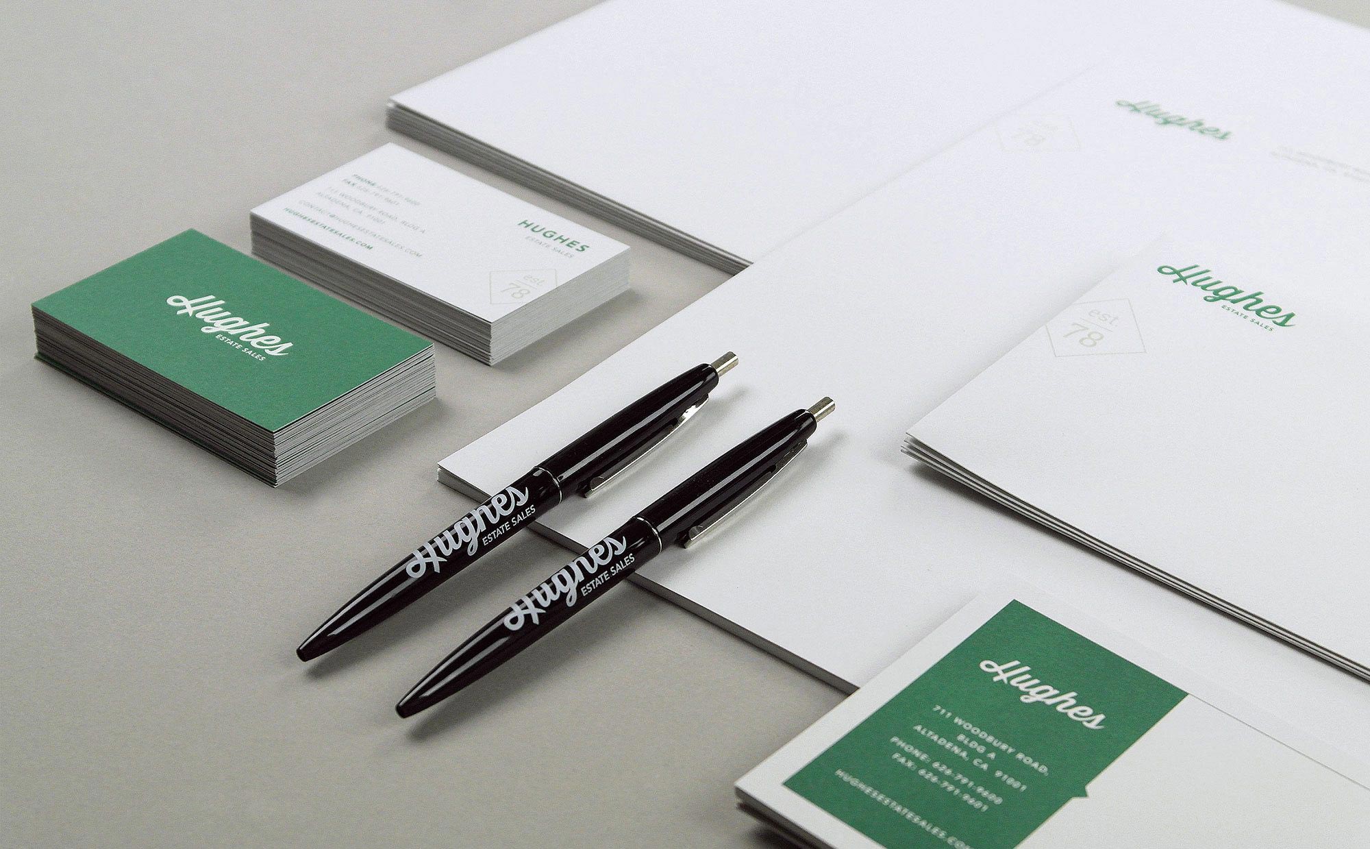
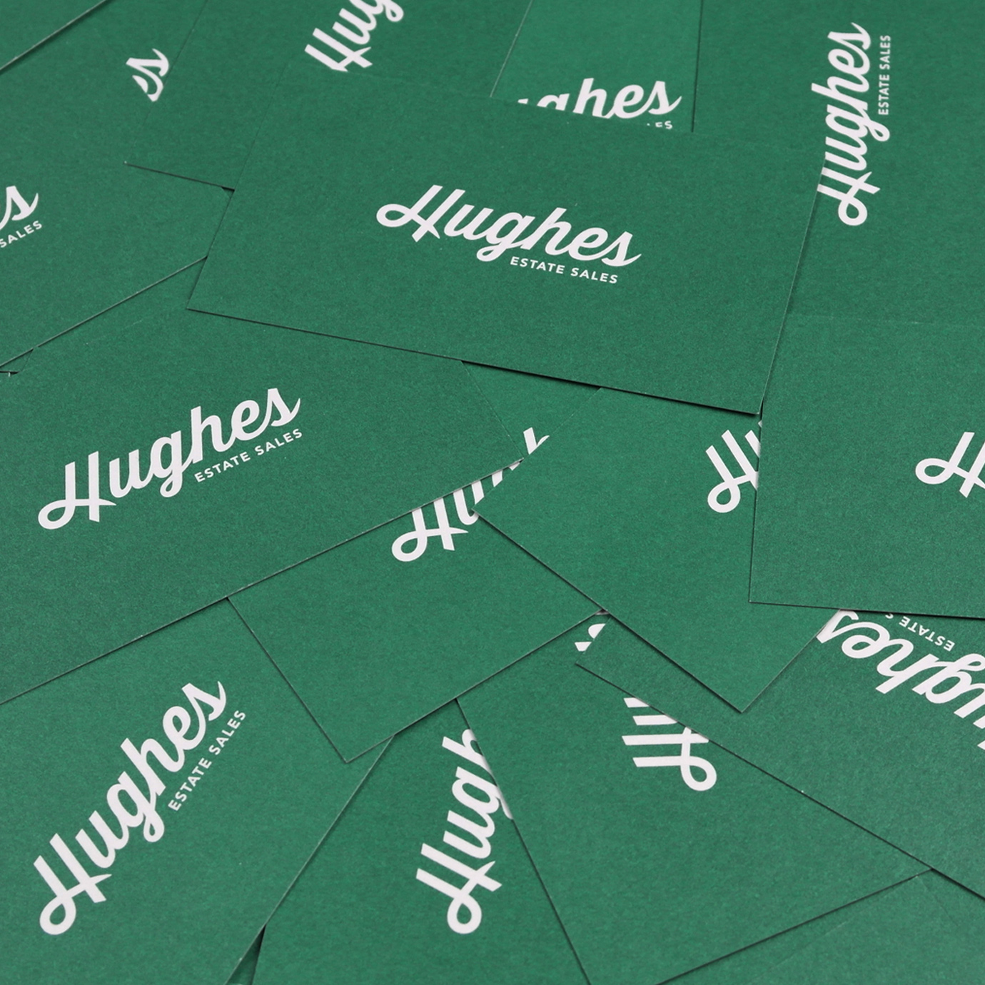
From brochures, stationery, signage, boxes and uniforms, we crafted an end-to-end branding solution that carries Hughes into the next generation. An ownable green evokes stability and trust and is easily recognizable as Hughes.
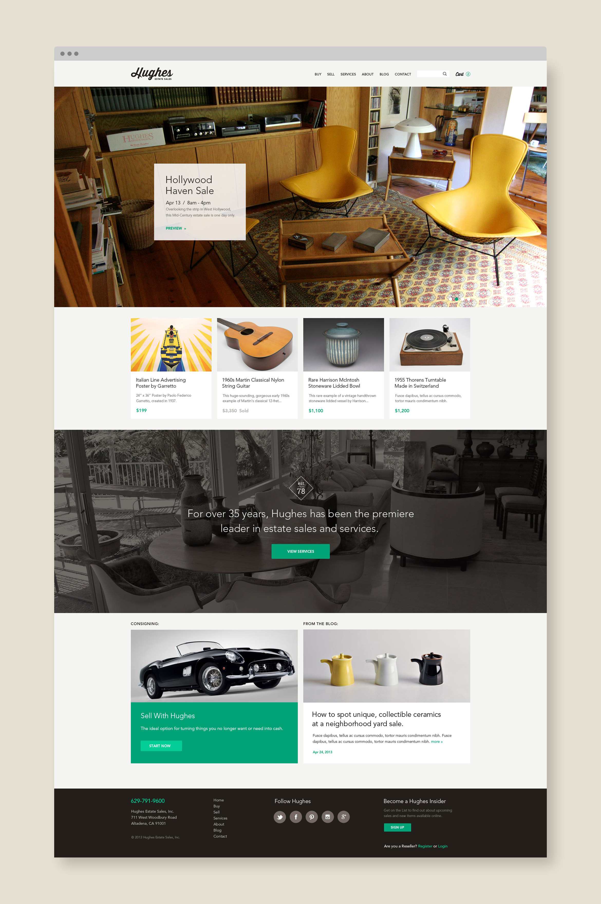
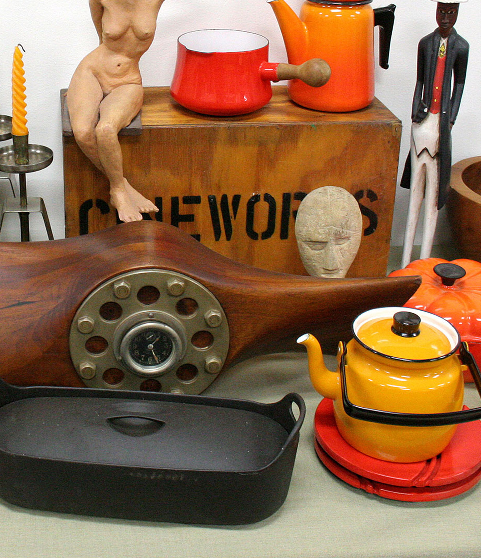
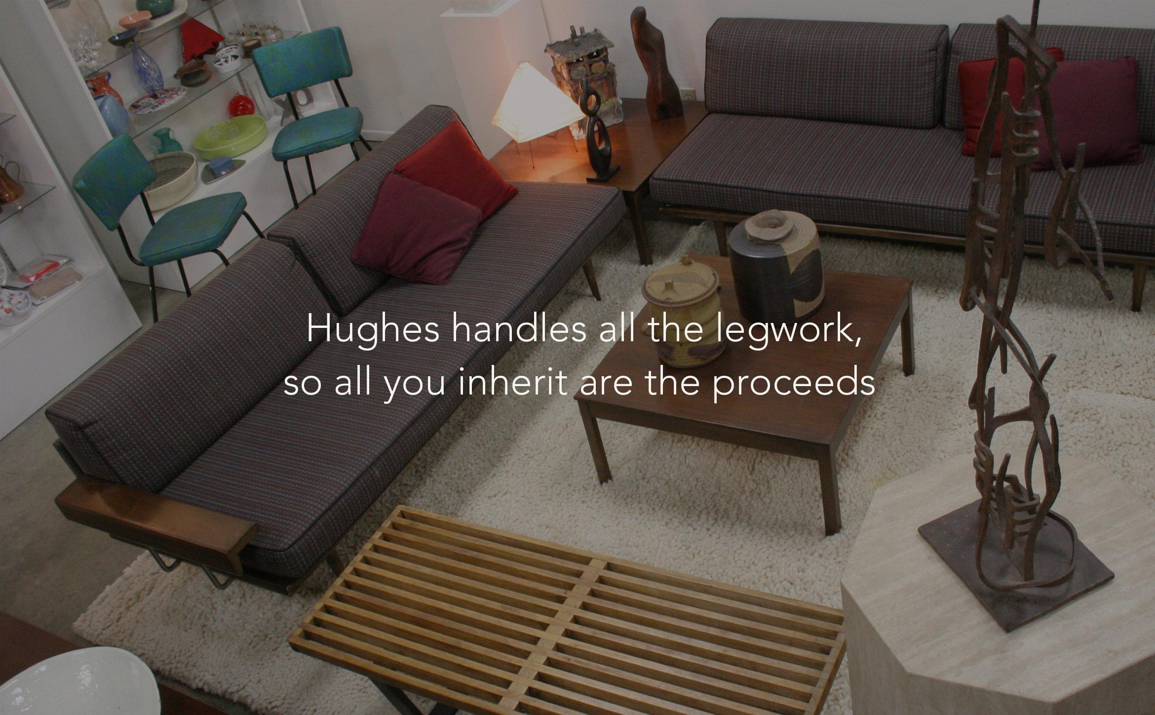
Appealing to both buyers and sellers, we built a responsive site is part slick brochure, part e-commerce. Using their library of captivating images of furniture, antiques and ephemera, the user becomes immersed in shopping and finding treasures.
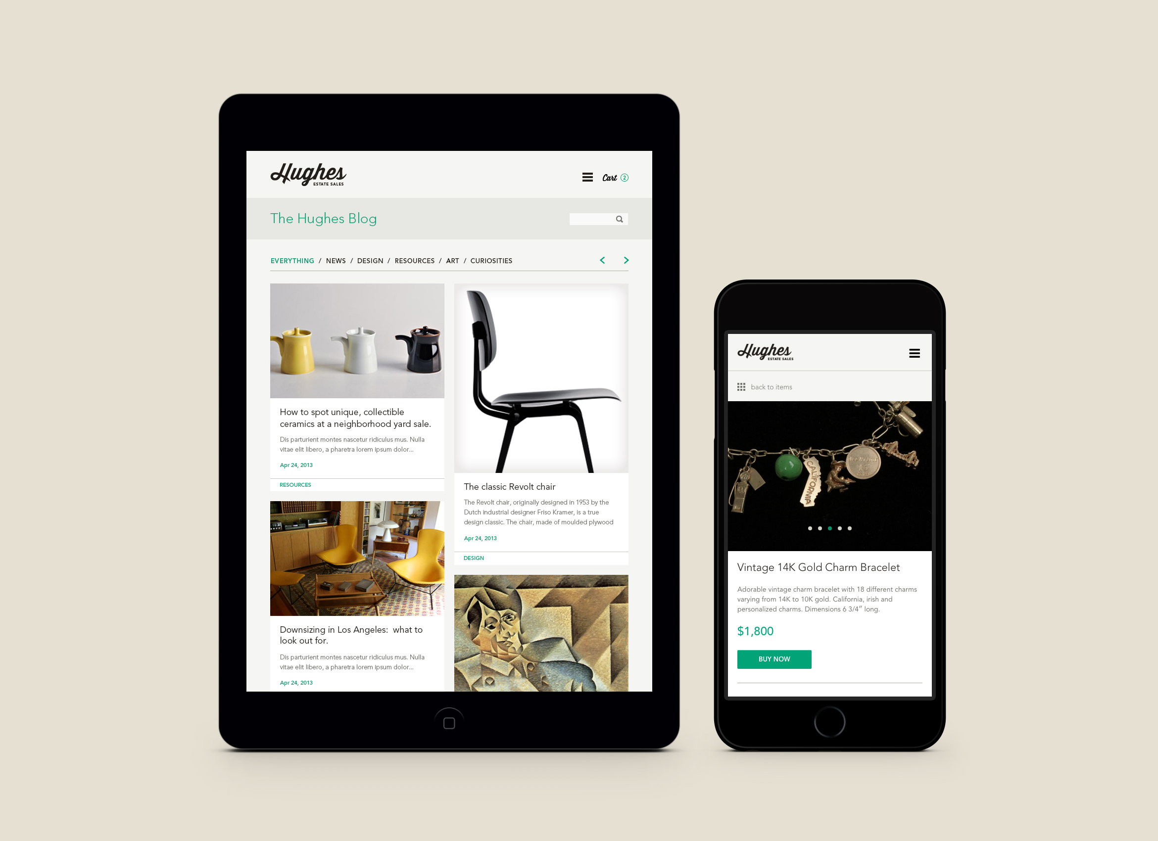
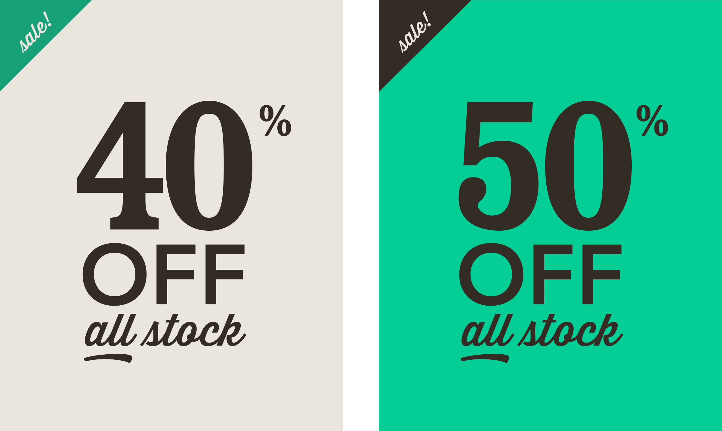
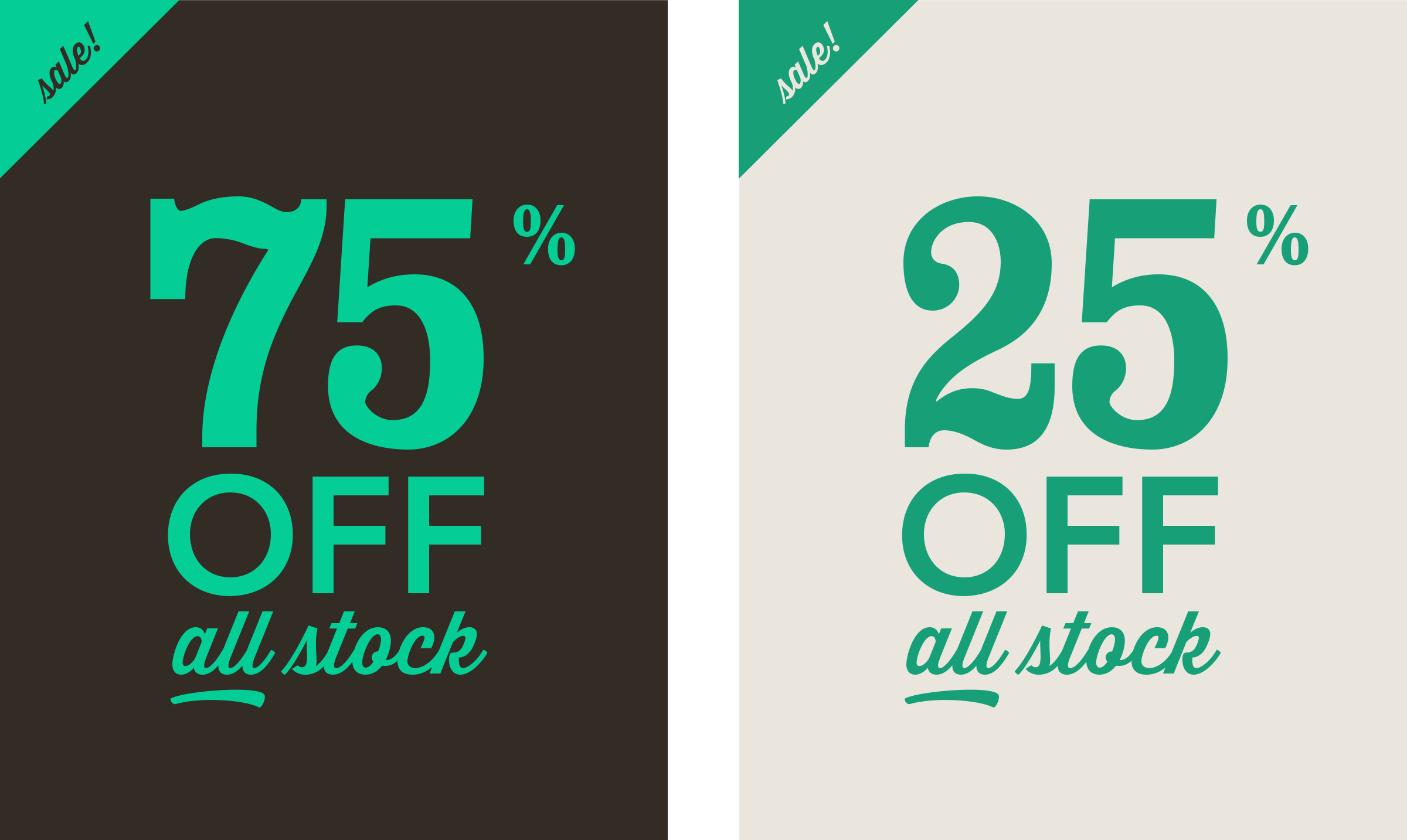
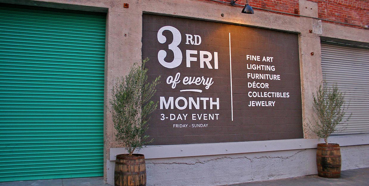
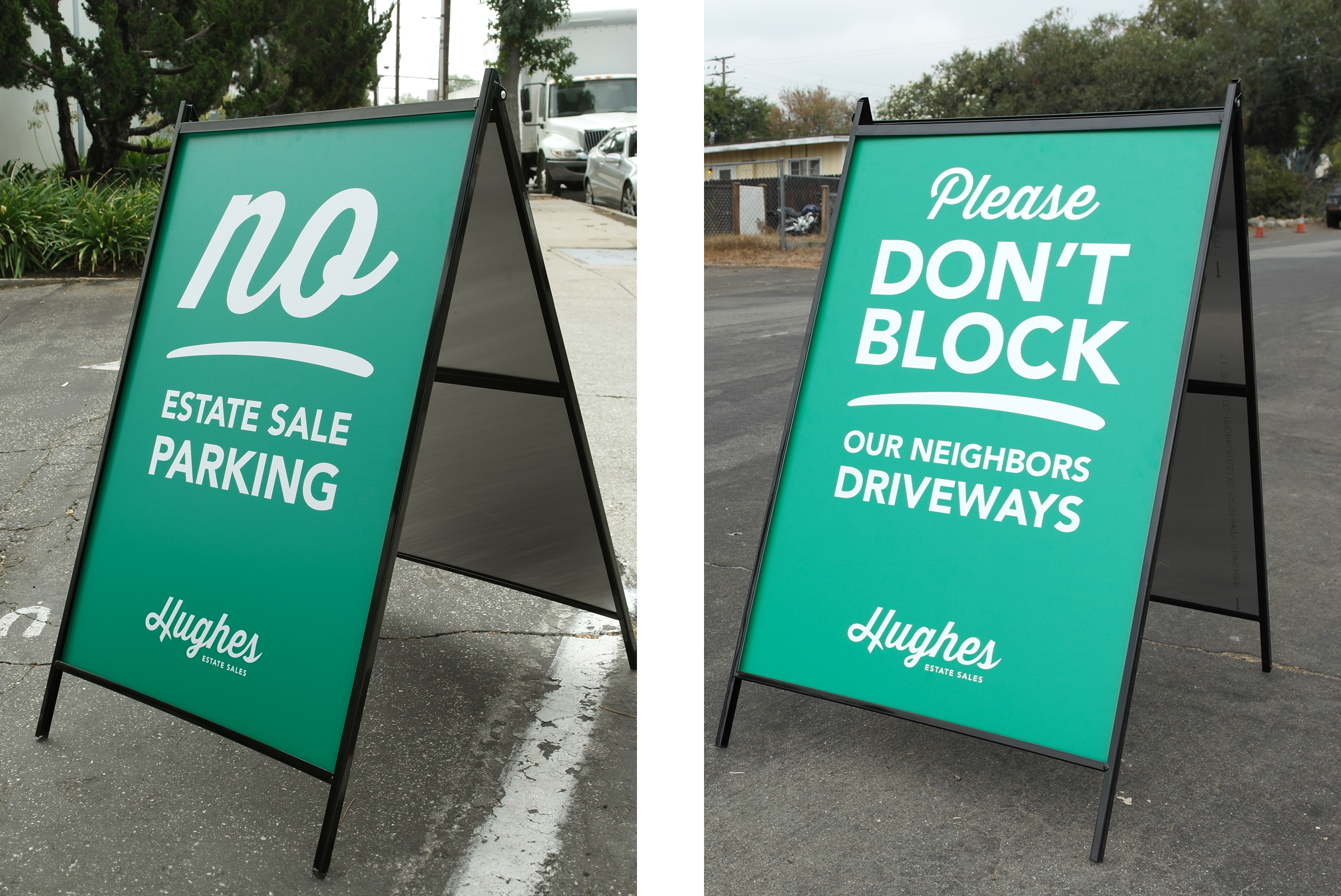
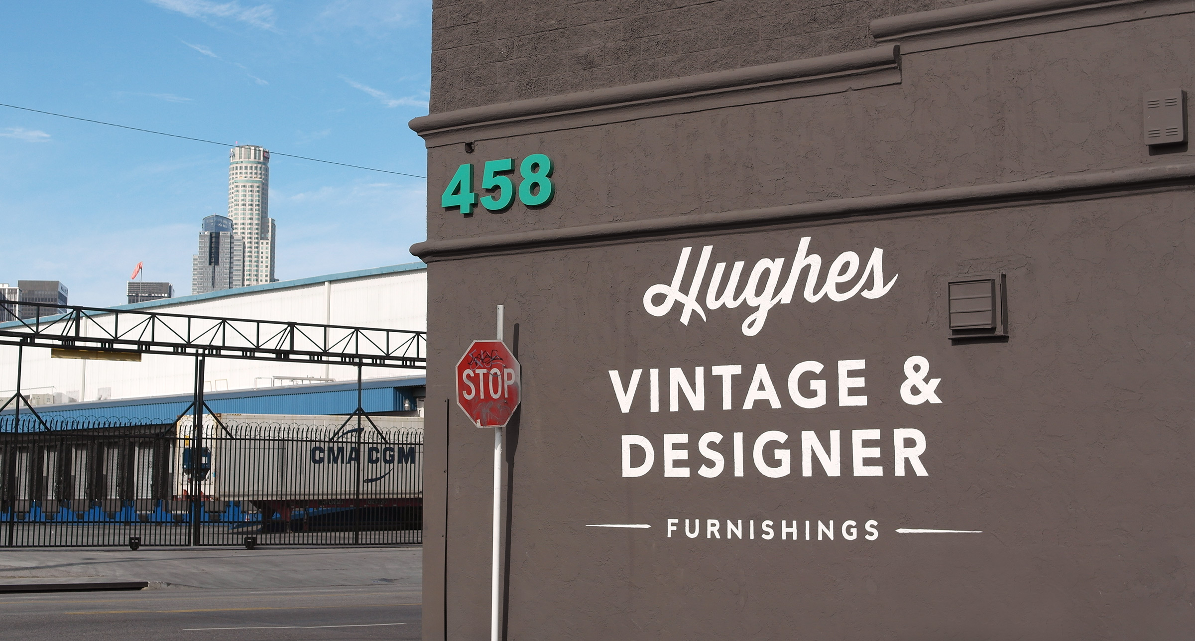
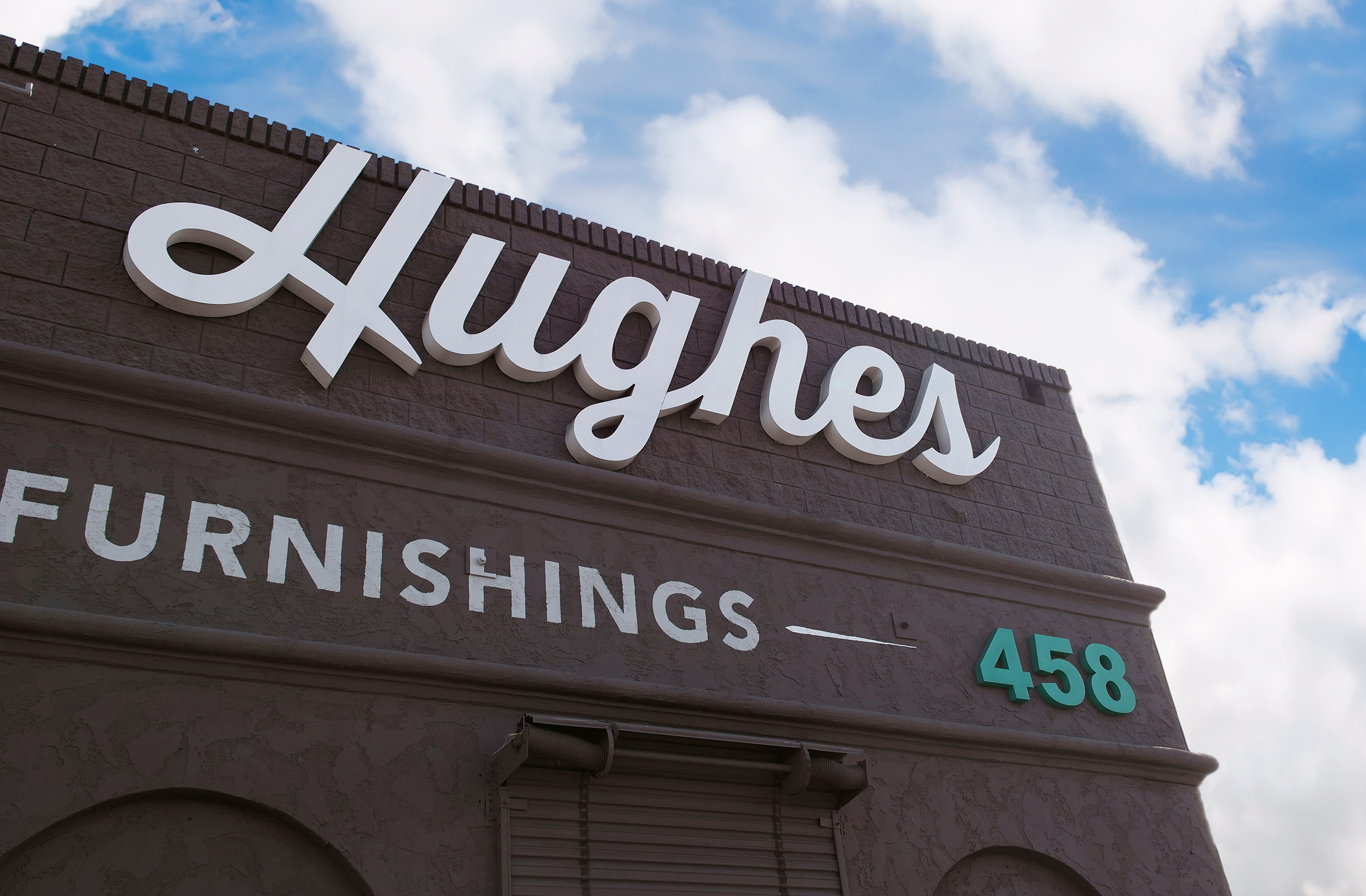
Vintage-style typography is used to create various indoor and outdoor signage for both the Altadena and Downtown LA Showrooms. Discount graphics are used in sale emails to their vast list of customers.

Deliverables:
- Brand Identity
- Brand Guidelines
- Website Design
- Web Development
- Print Collateral Design
- Signage
J+R Group
service / brand identity / website / print
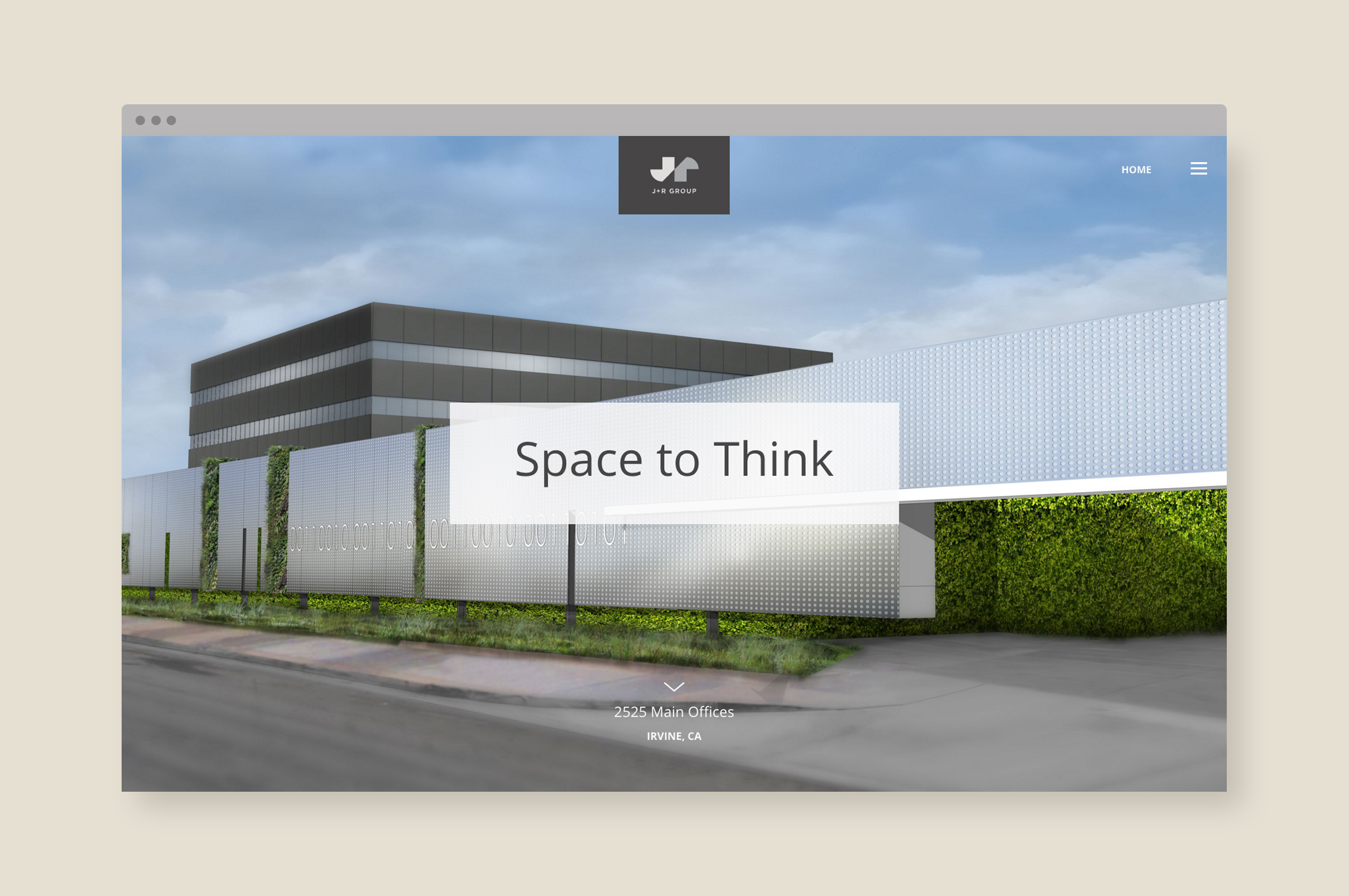
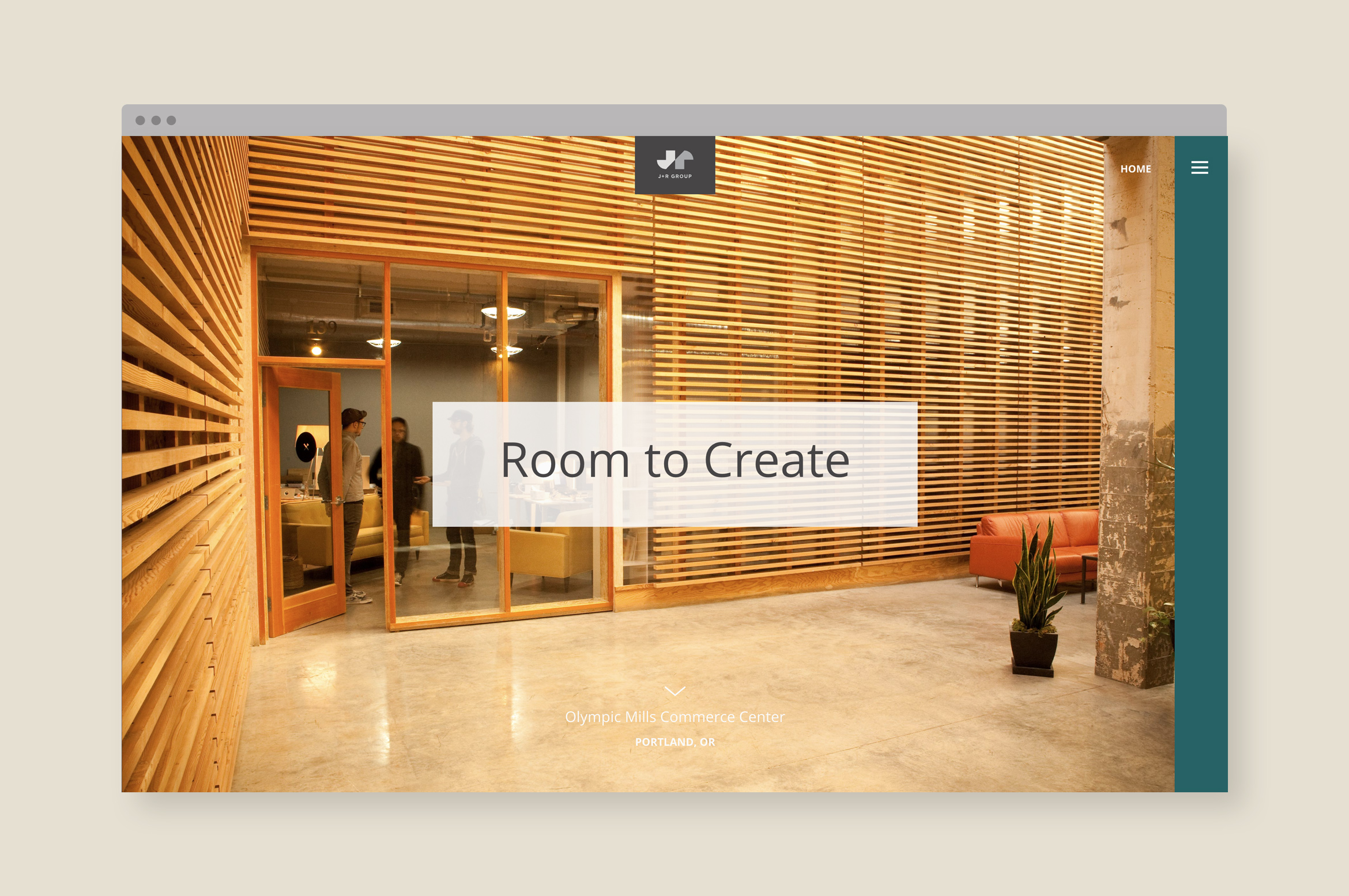
J+R Group sparks innovation through their commercial and residential properties
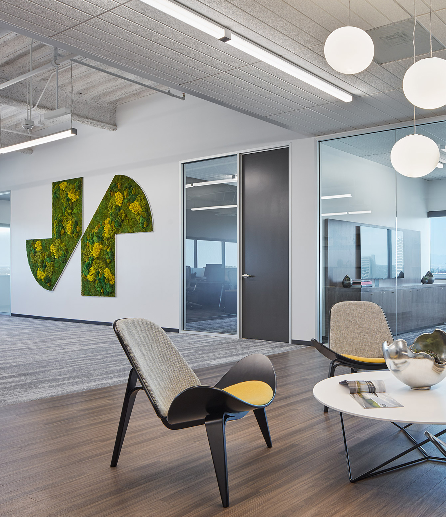
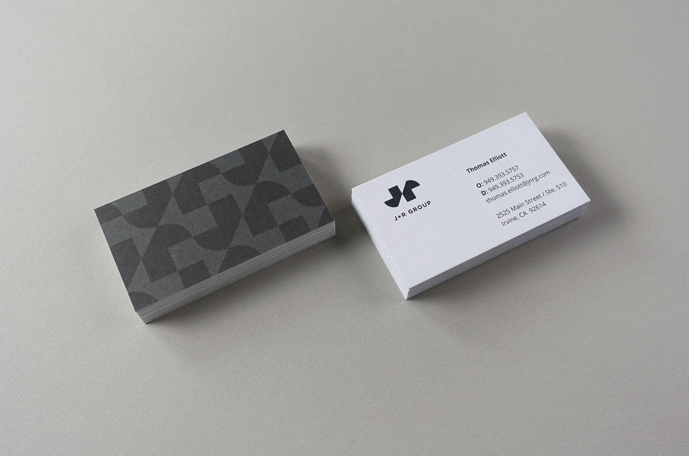
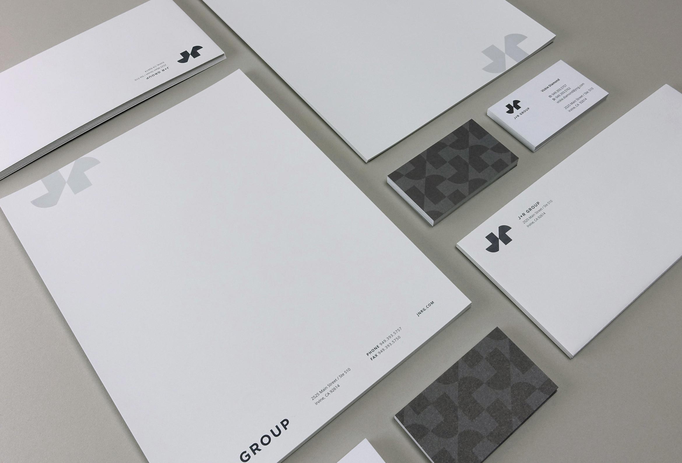
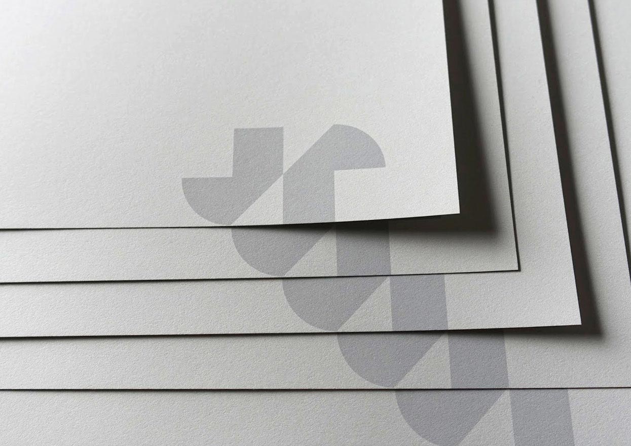
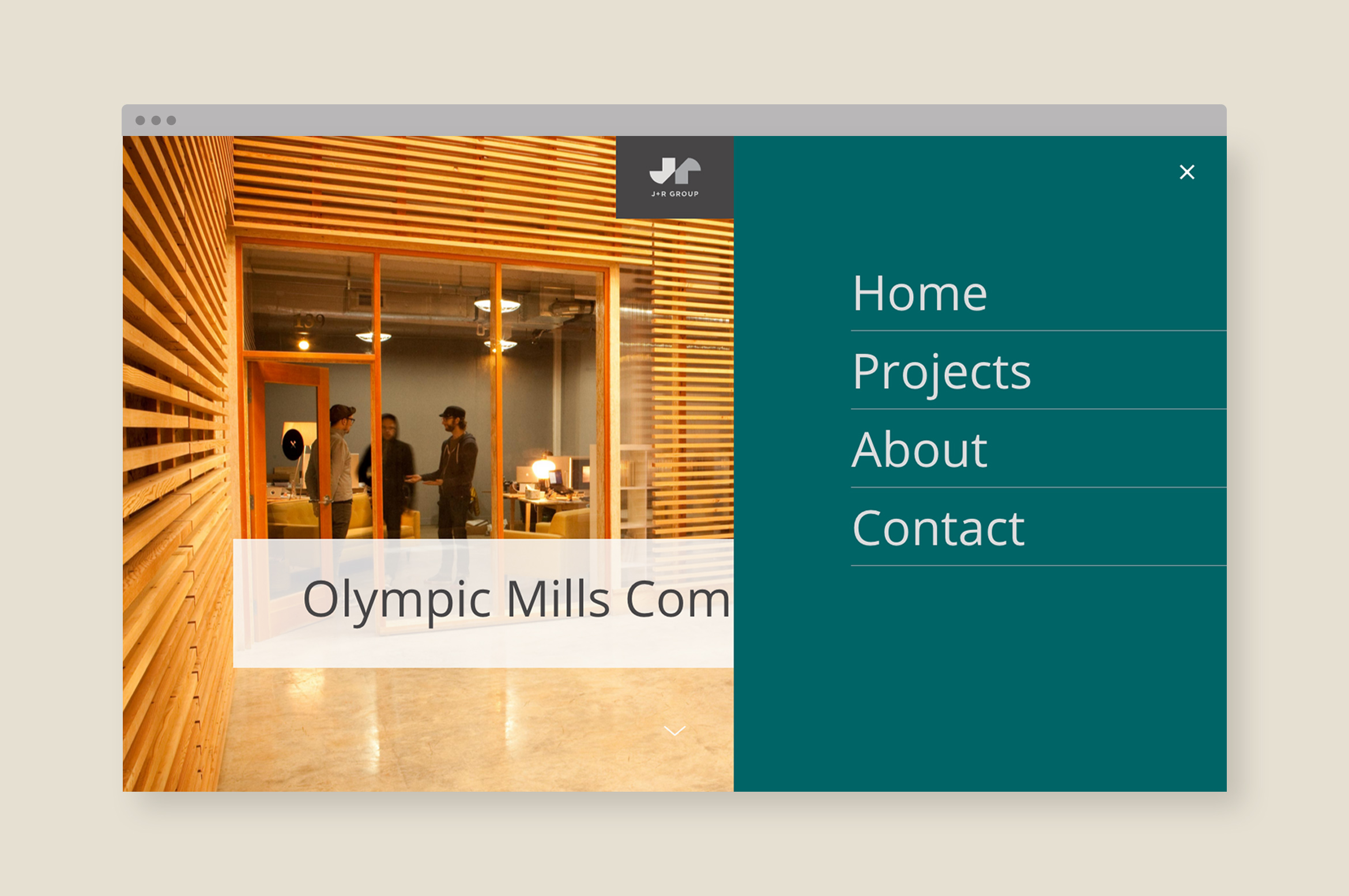
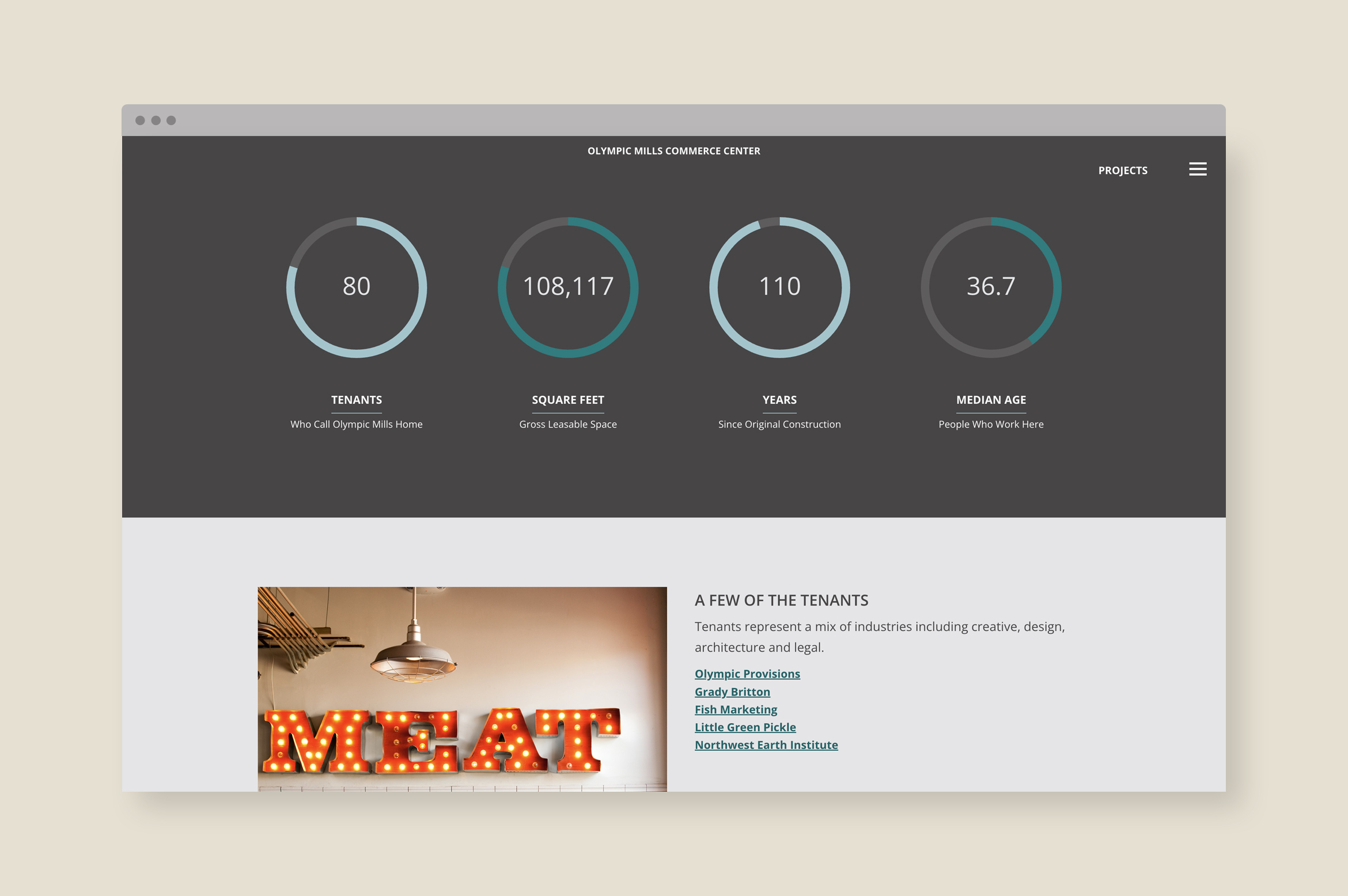
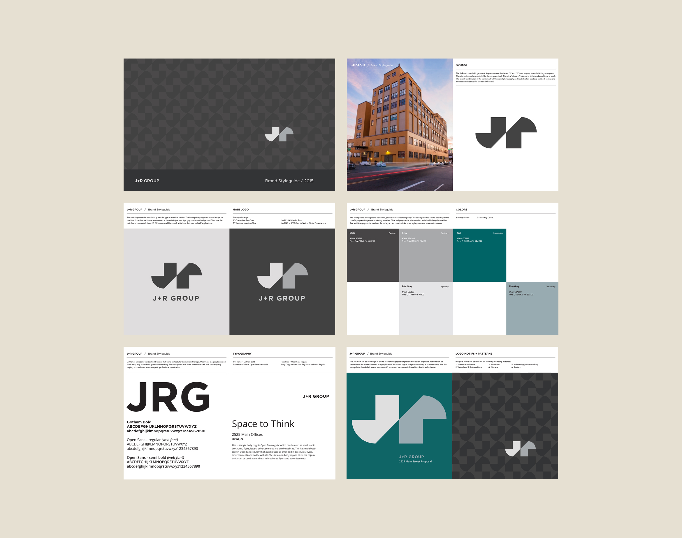
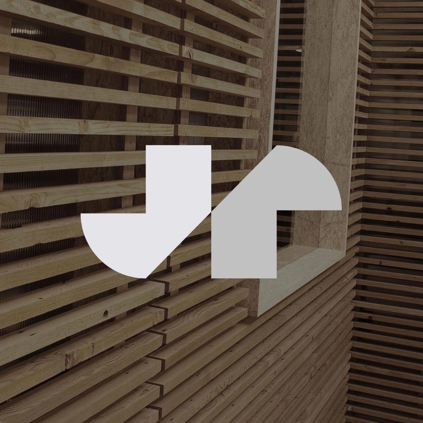
J+R Group cultivates commercial and residential properties across the Pacific Northwest and Southern California, offering sustainable and open design that helps shape their tenants’ creativity and vision. We designed their brand to be bold, energetic and polished like their philosophy. The geometric J and R letterforms create a mark that’s always moving forward and reflects their contemporary architecture style. Moss signage using the mark creates a branded environment in their own offices.
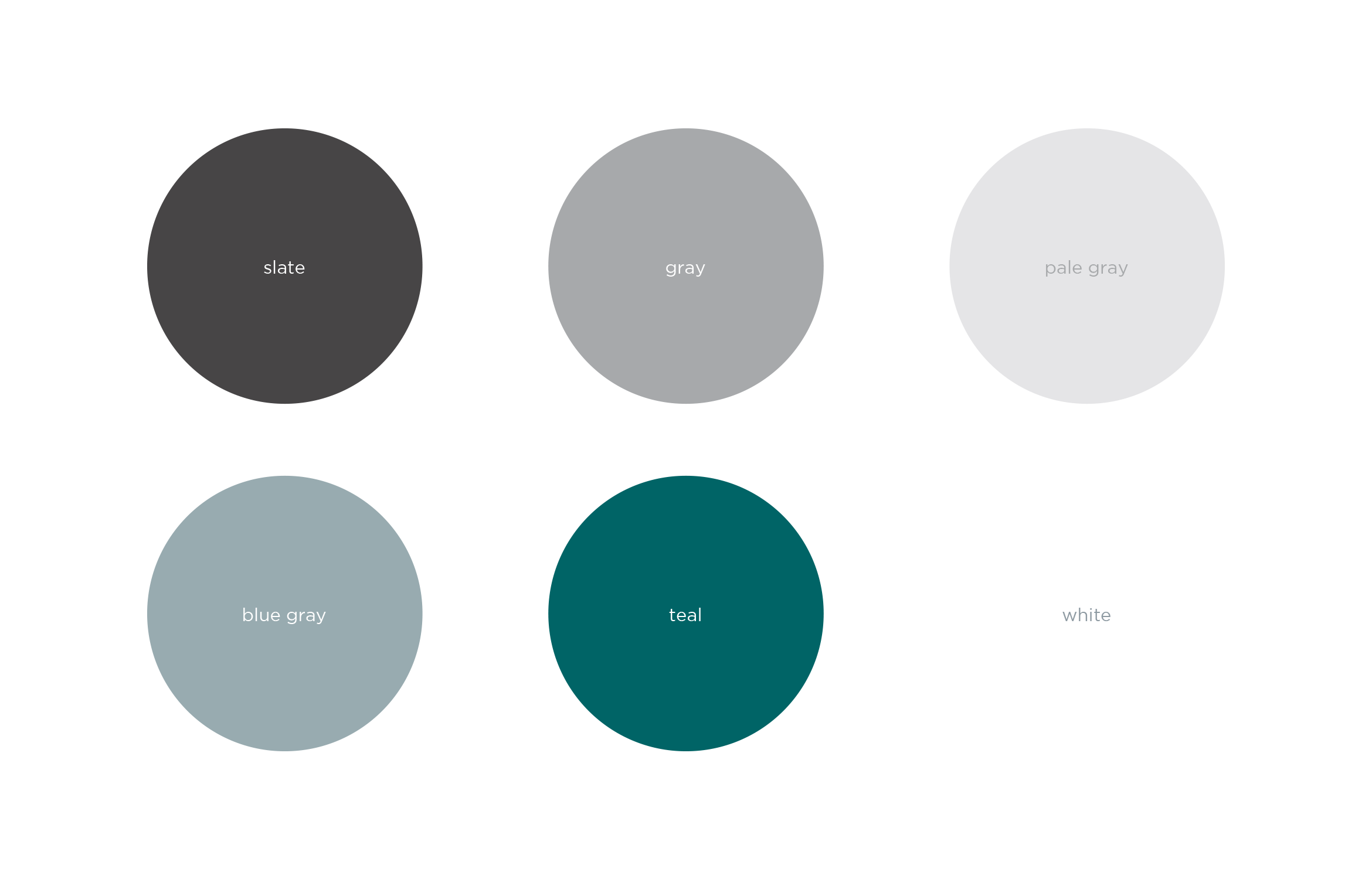
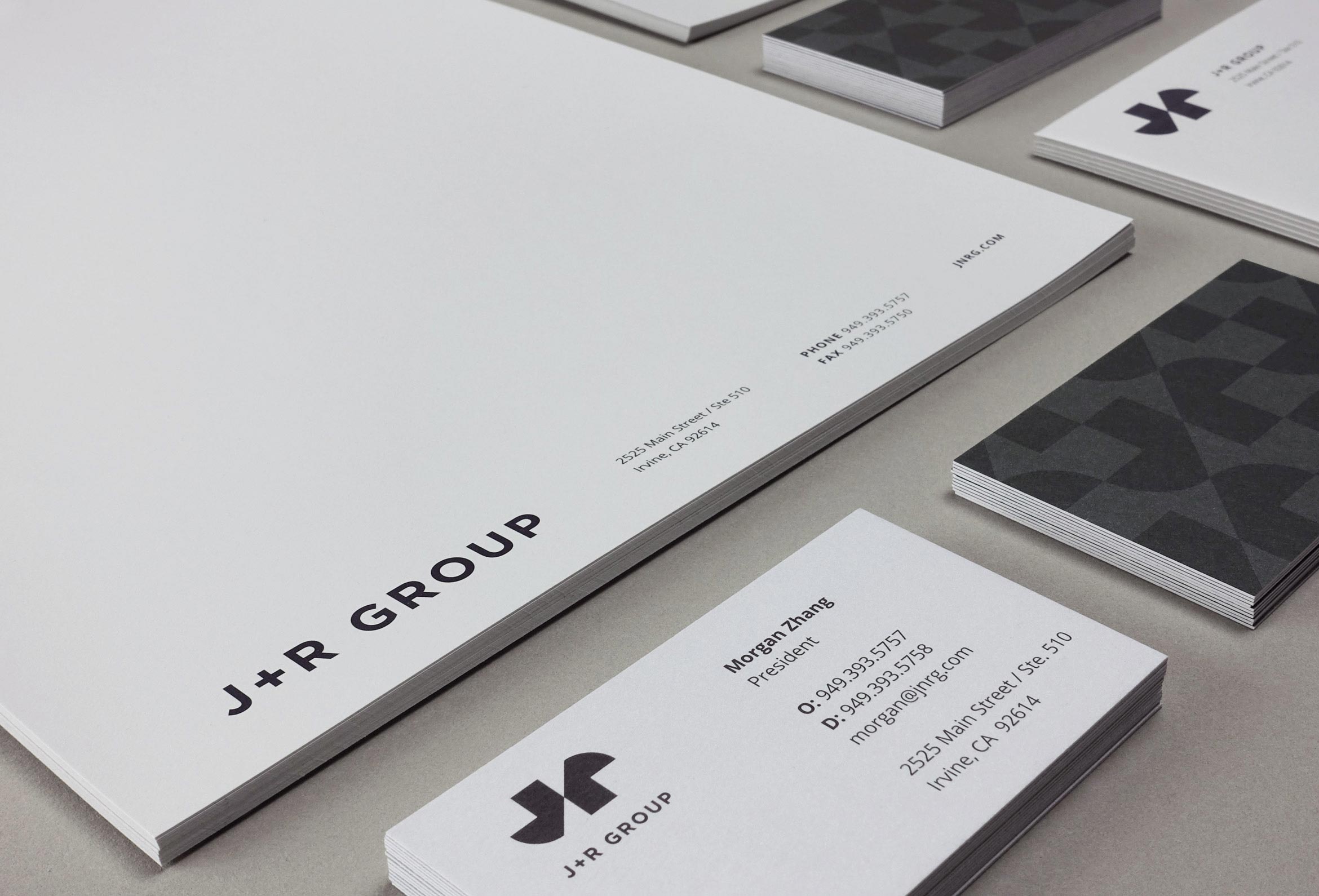
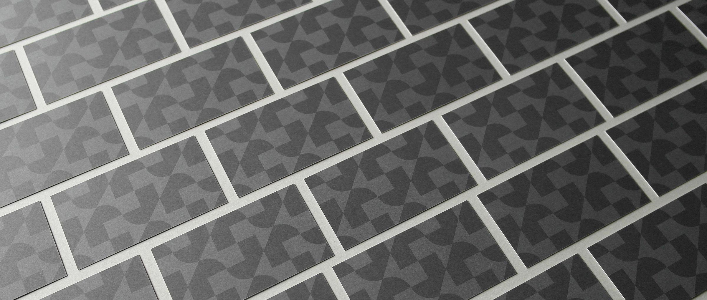
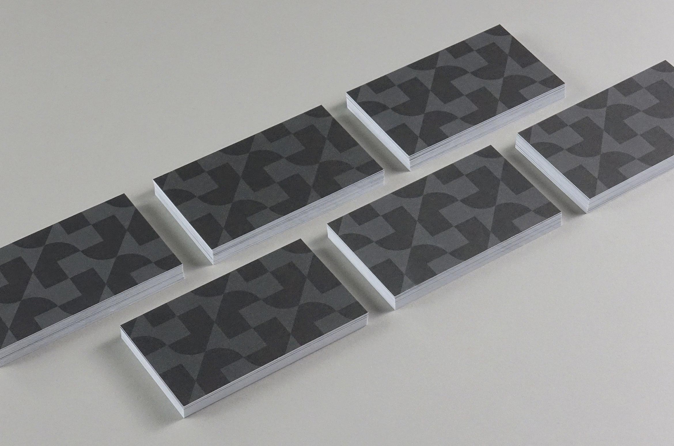
Corporate stationery was printed on antique gray paper using gray Pantone inks. A tone-on-tone repeating pattern on the cards creates a feeling of building which gives a striking first impression.
A dynamic website tells the story of each property through parallax animations, professional photography, renderings, property design details and data graphs.
A Brand Styleguide outlines rules for the identity system including logo lock-ups, color formulas, typography, photography and graphic motifs. The guide is an important tool in creating brand cohesion.
Deliverables:
- Brand Identity
- Brand Guidelines
- Corporate Stationery
- Website Design
- Web Development
- Copywriting
Tahiti.com vacations
service / brand identity / website


Tahiti.com is the premier destination for all things Tahiti
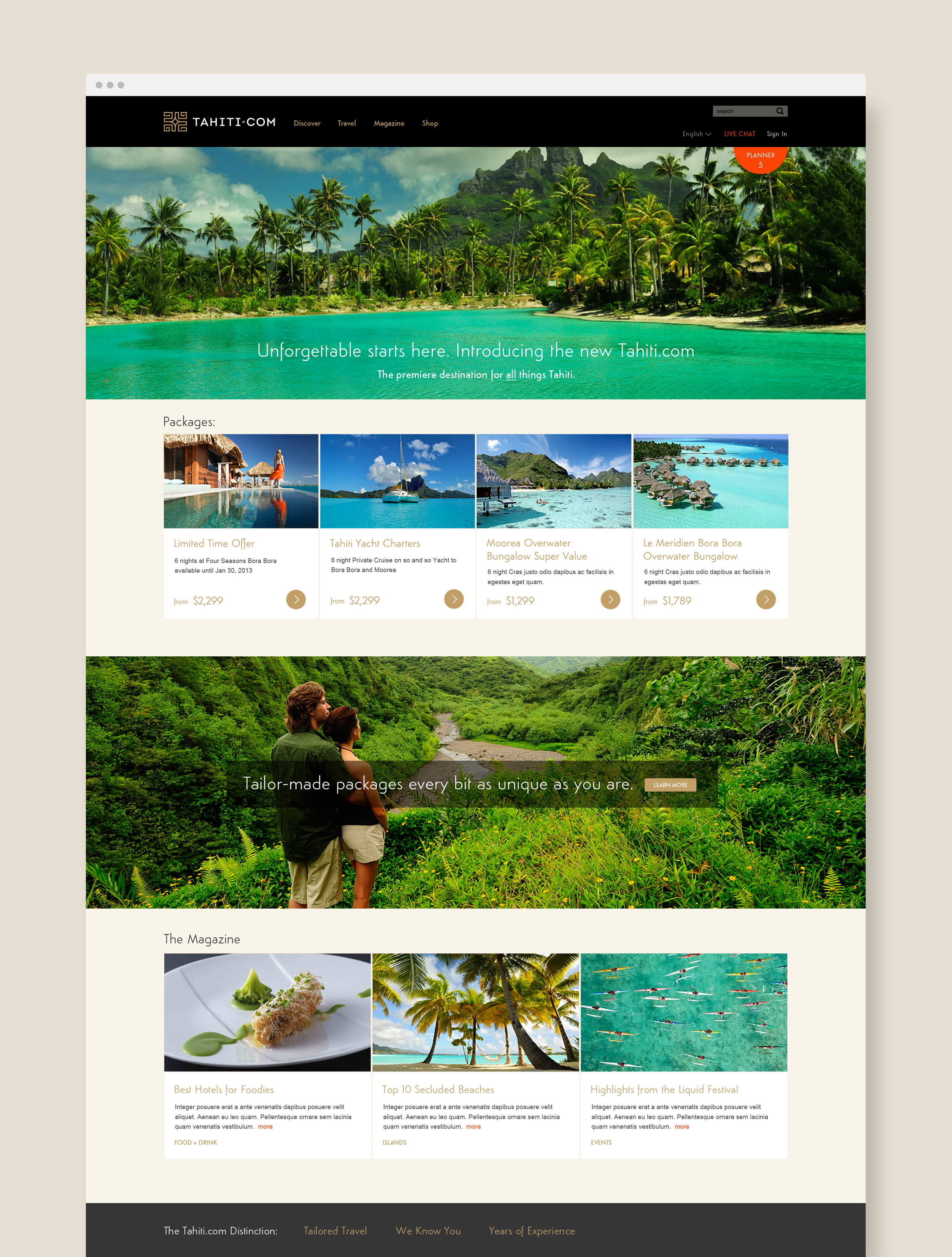
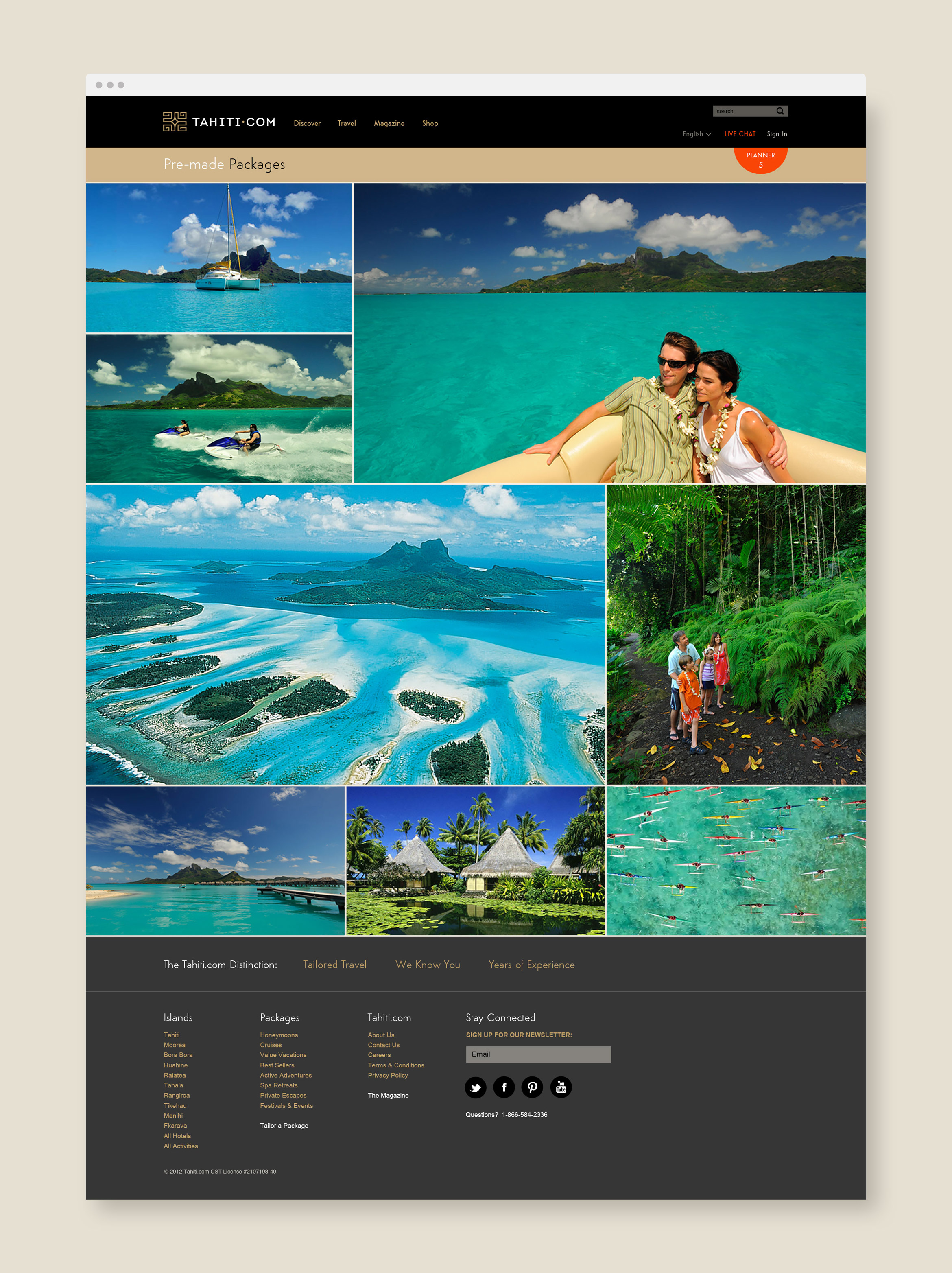
We partnered with The Branding Farm to rebrand and relaunch Tahiti.com, a premier travel destination that makes your dream Tahitian vacation come true. We focused on creating a sophisticated brand identity that appeals to an international market while maintaining a strong connection to Tahitian heritage.
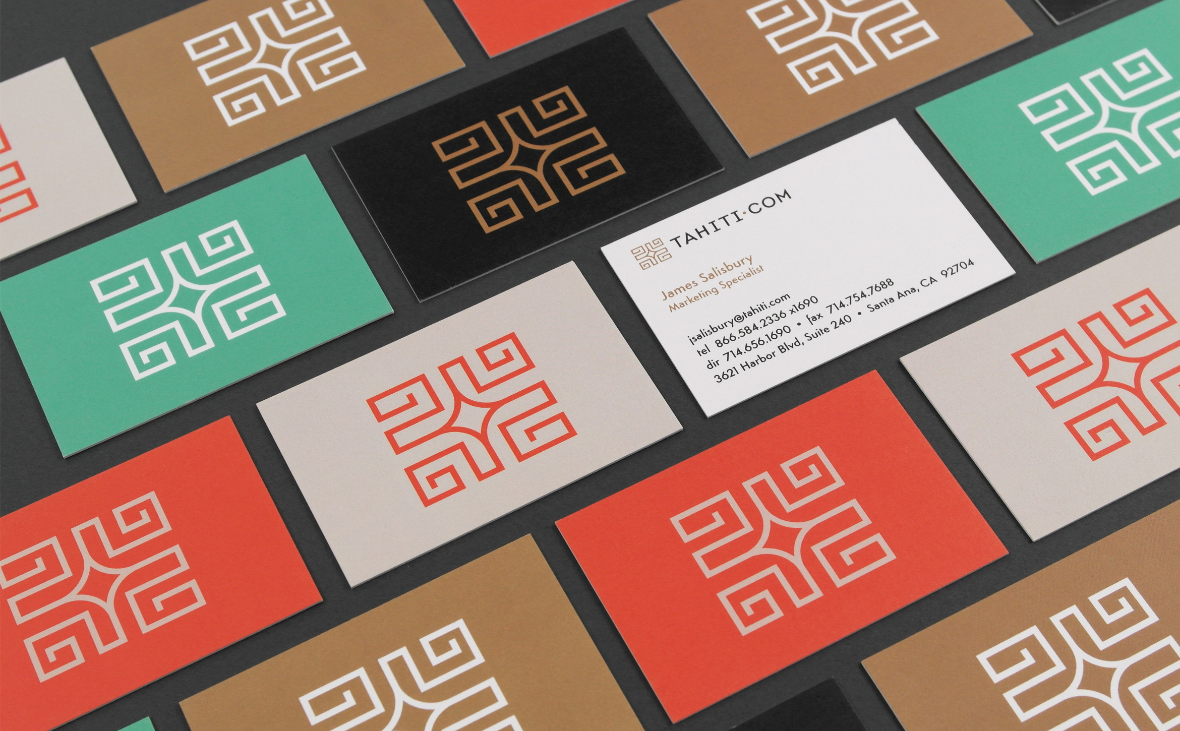
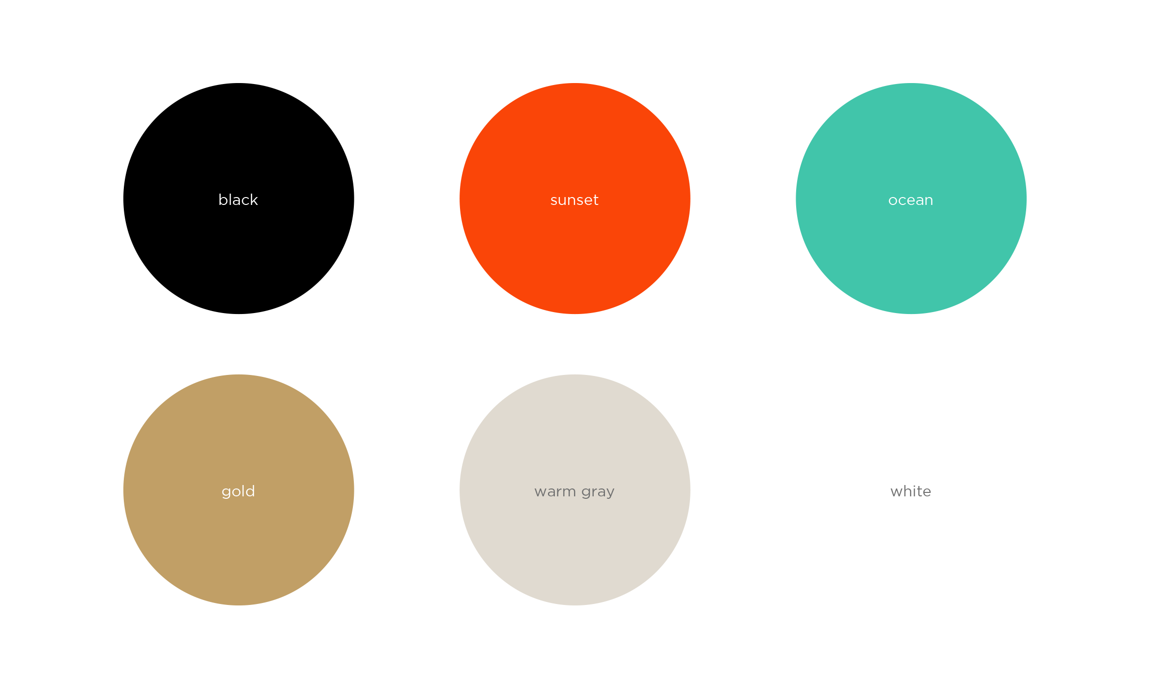
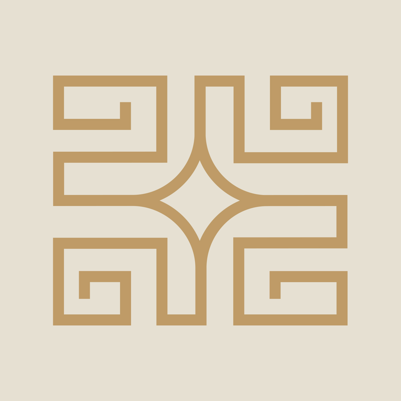
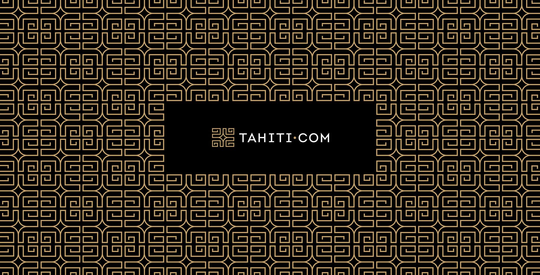
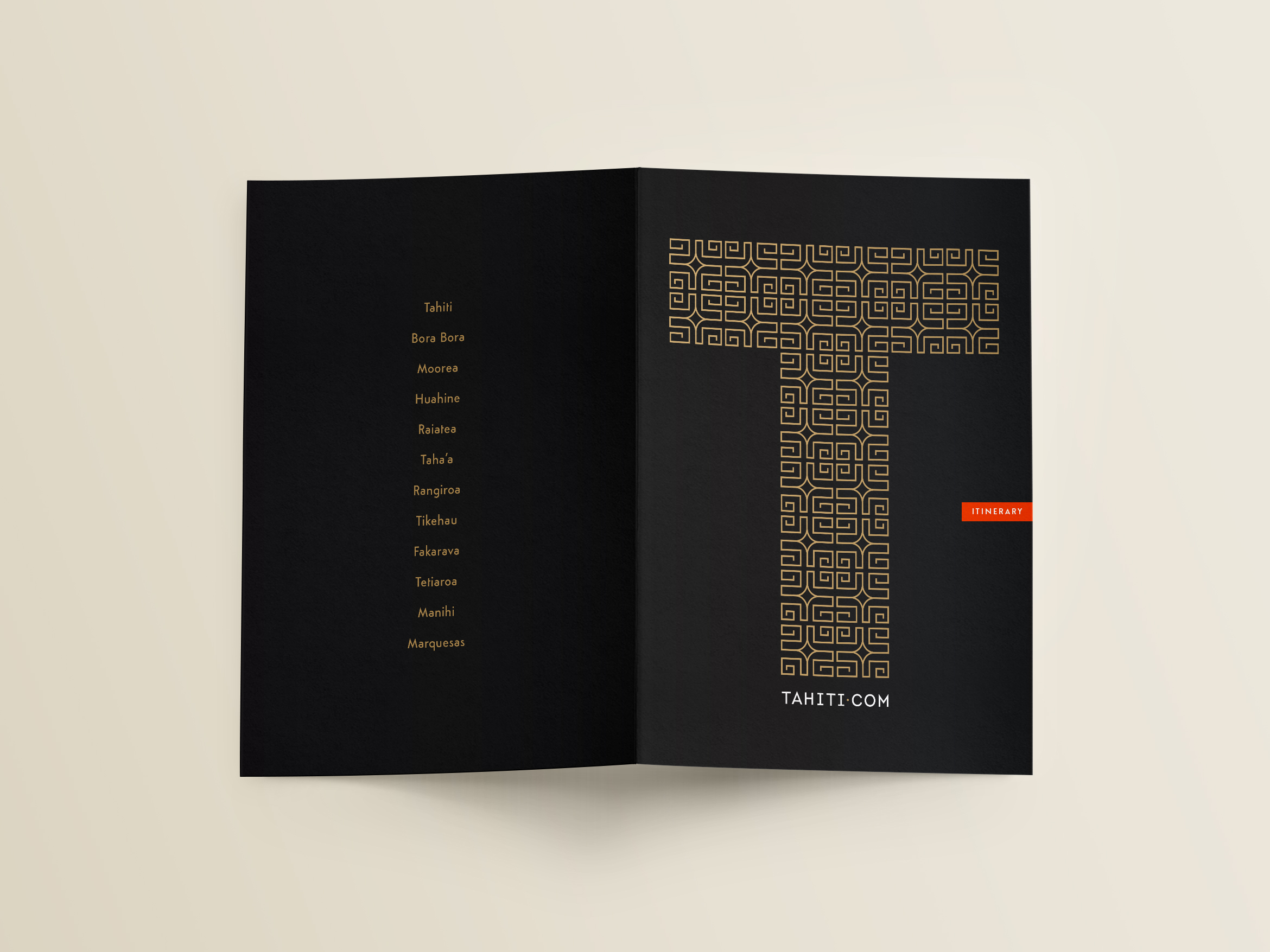
Inspired by the Marquesan Cross, the Polynesian symbol for harmony and balance, we crafted an upscale mark to help attract the affluent traveler. Black and gold represent luxury, orange represents sunsets and turquoise is the color of the ocean. The mark can also be used to create repeating patterns for use in various marketing materials.
The new site positions them as the premiere online destination to plan your Tahitian vacation through a high-end, immersive visual experience, and a simplified UX design. Travel research, planning and booking is a dream come true.
Deliverables:
- Brand Identity
- Brand Guidelines
- Website Design
- Business Cards
- Print Production
Joanna Poitier Interiors
service / brand identity / collateral
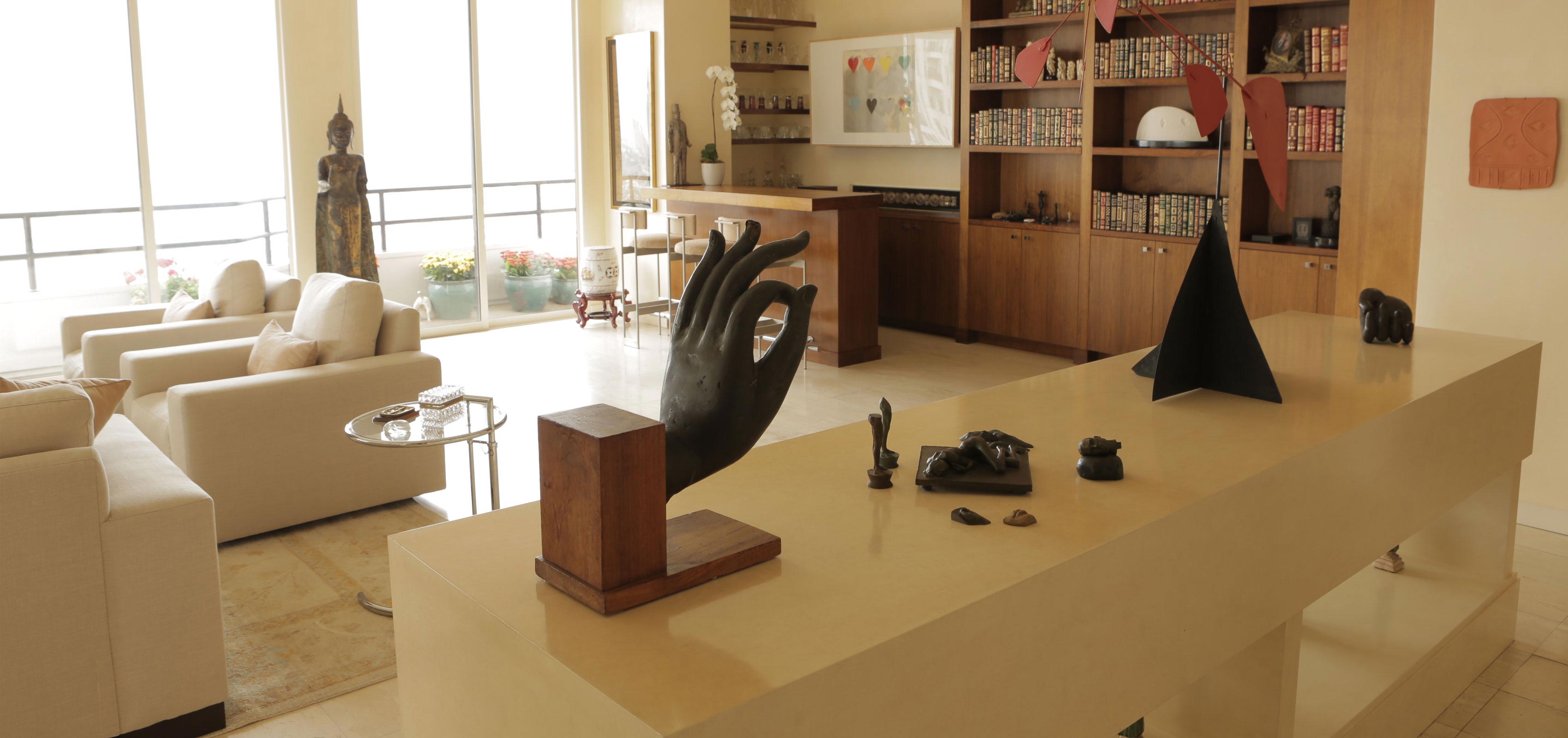
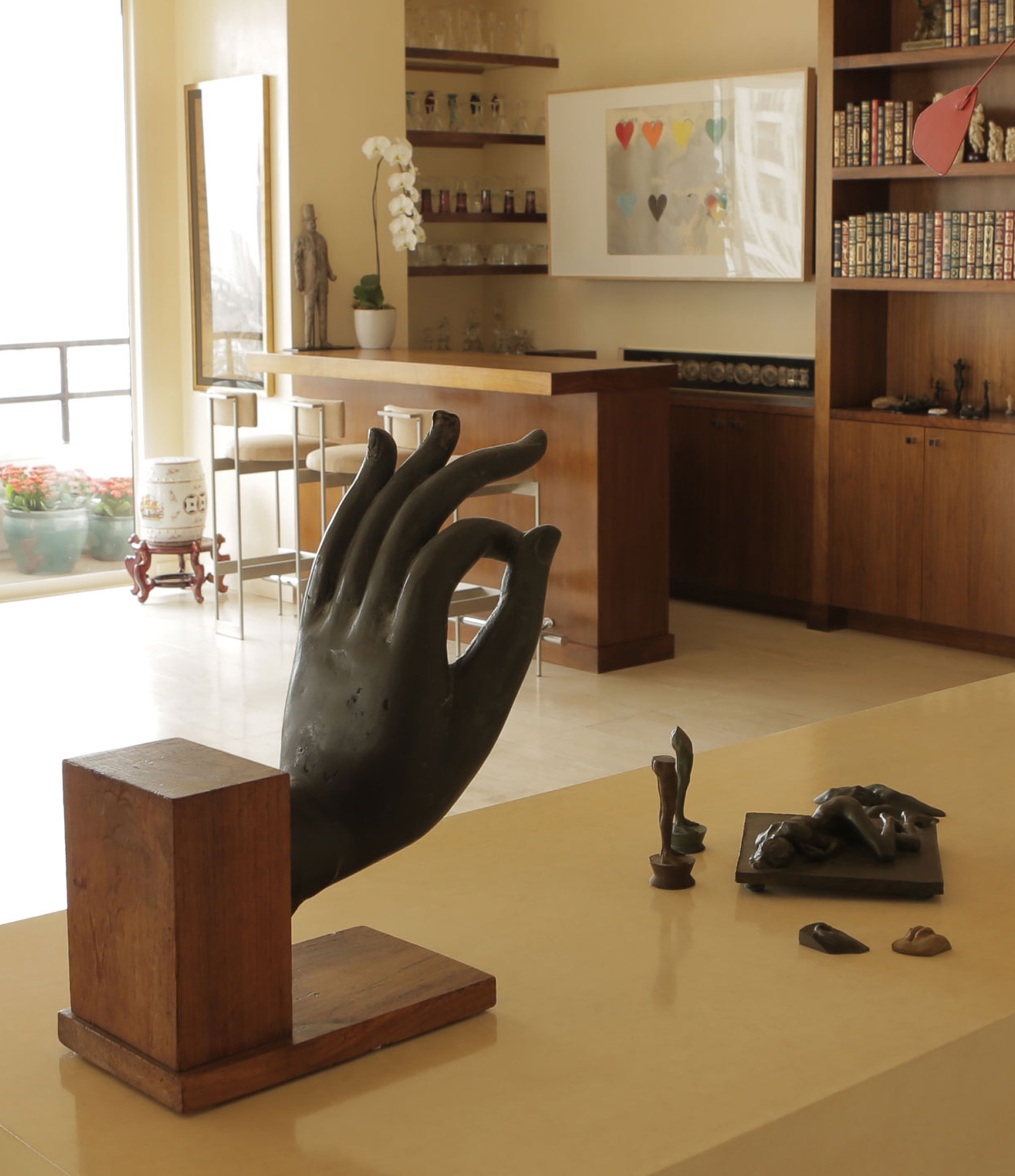
Joanna Poitier is an interior designer that is Hollywood’s best-kept secret
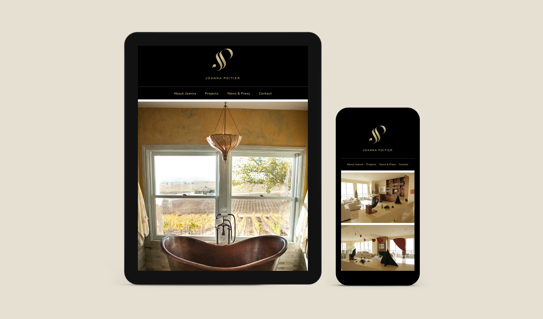
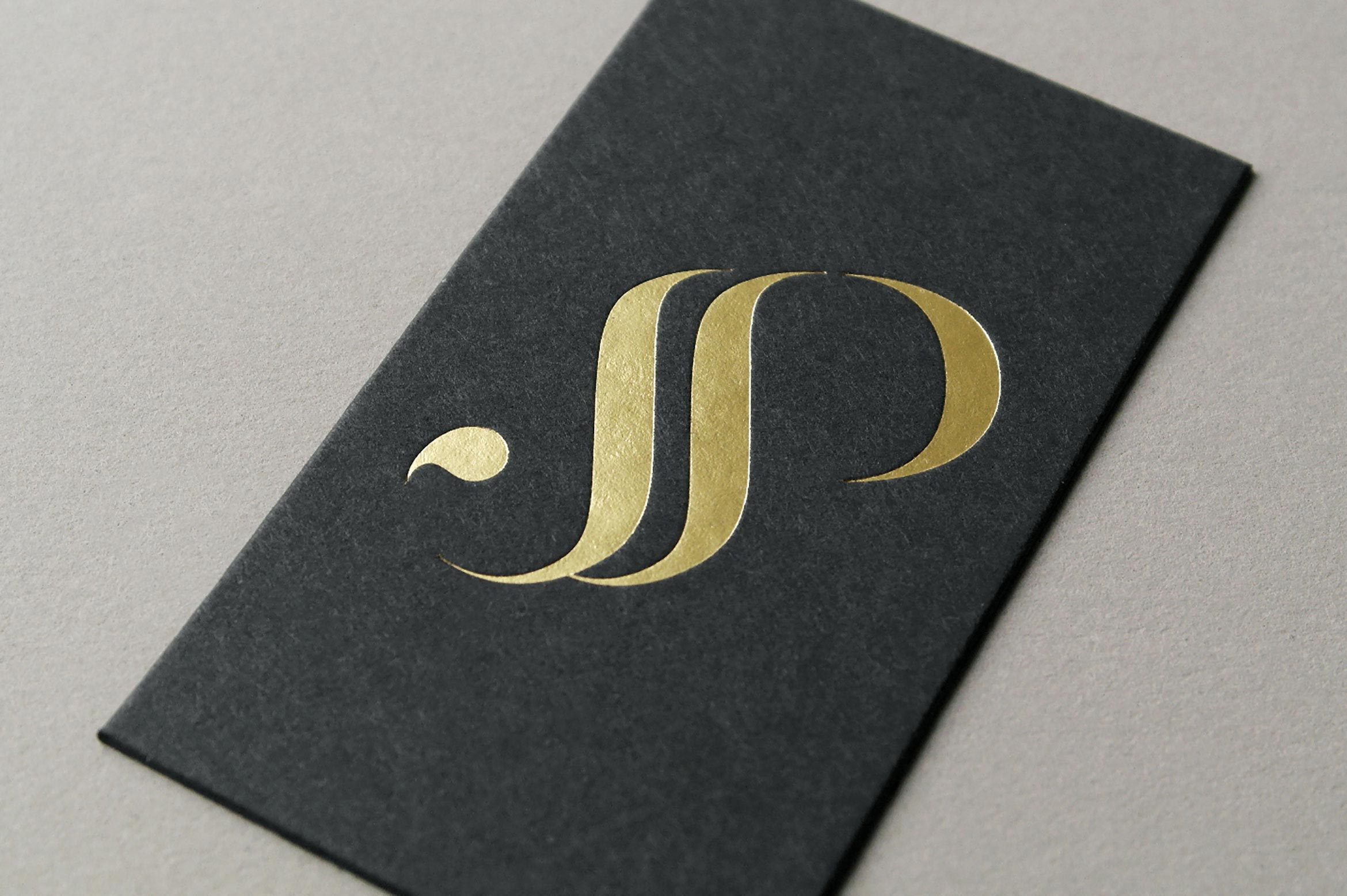
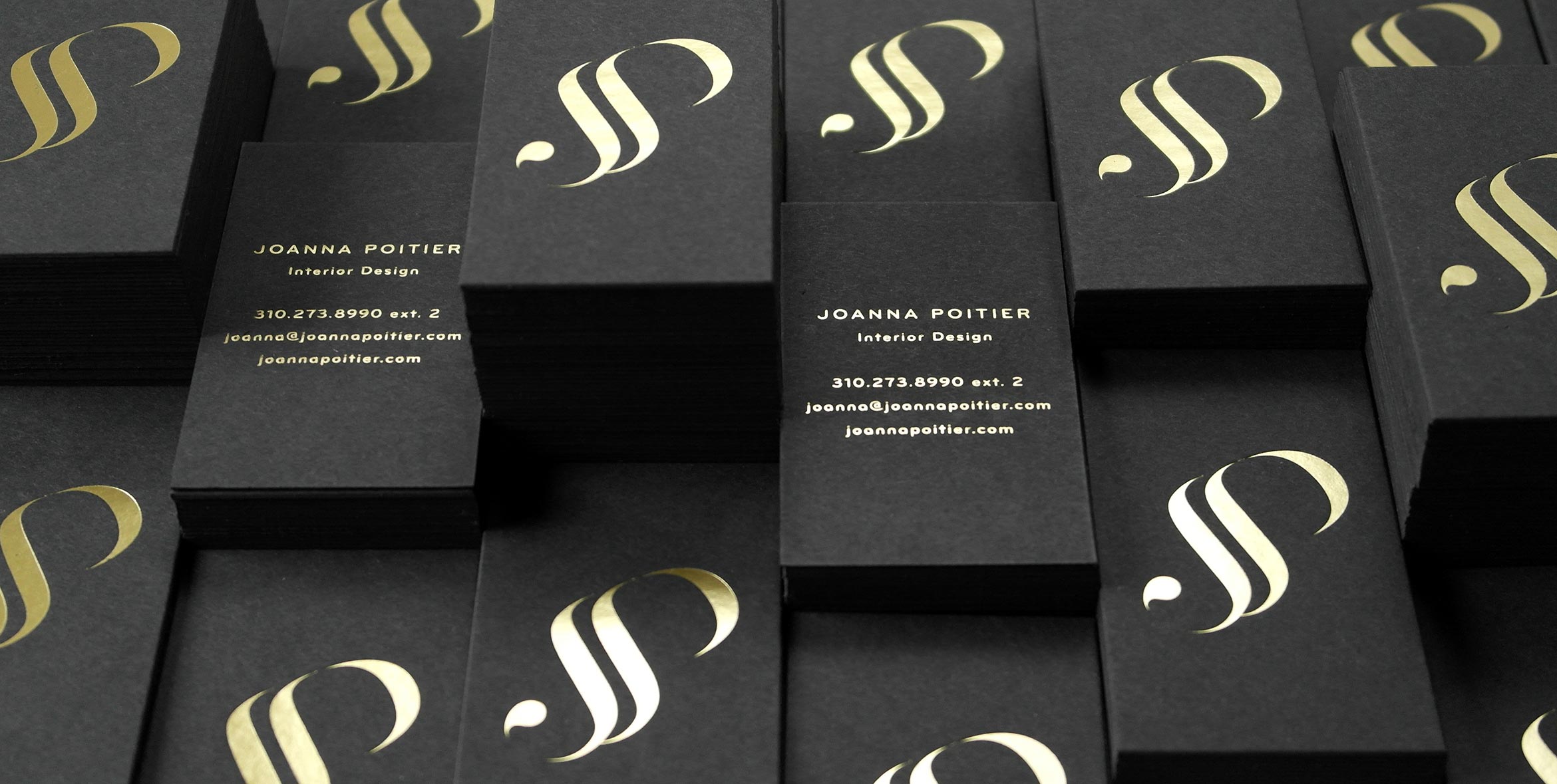
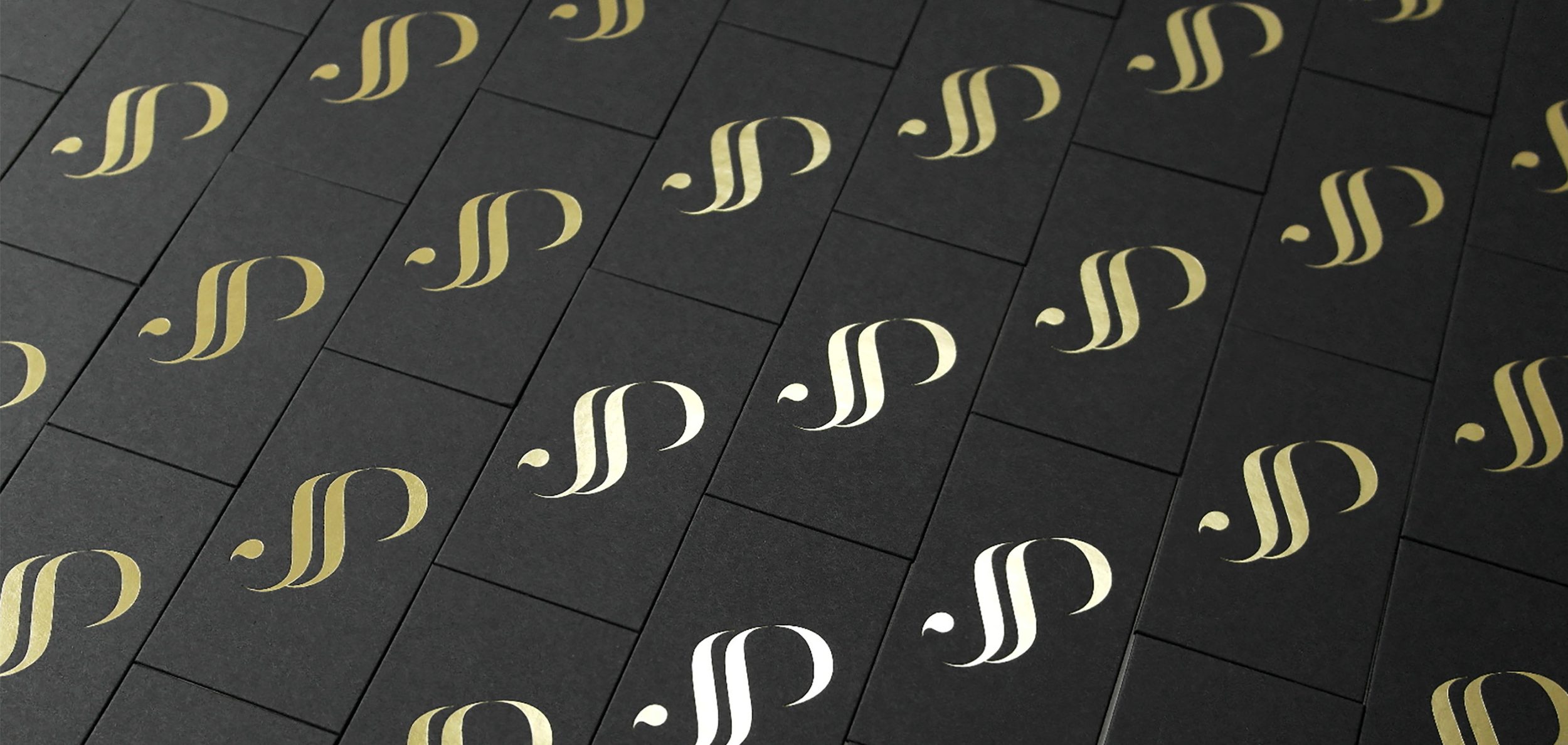
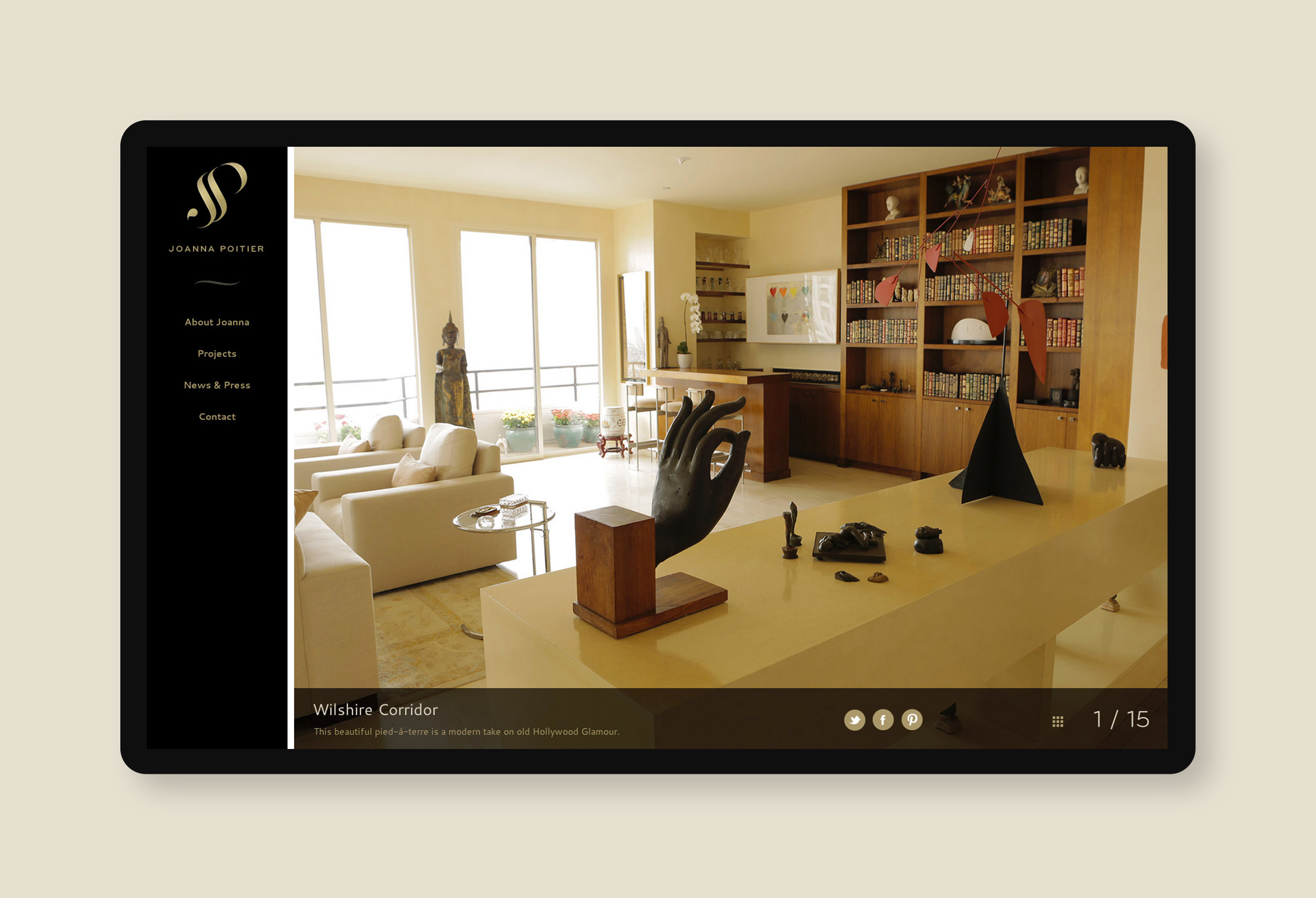
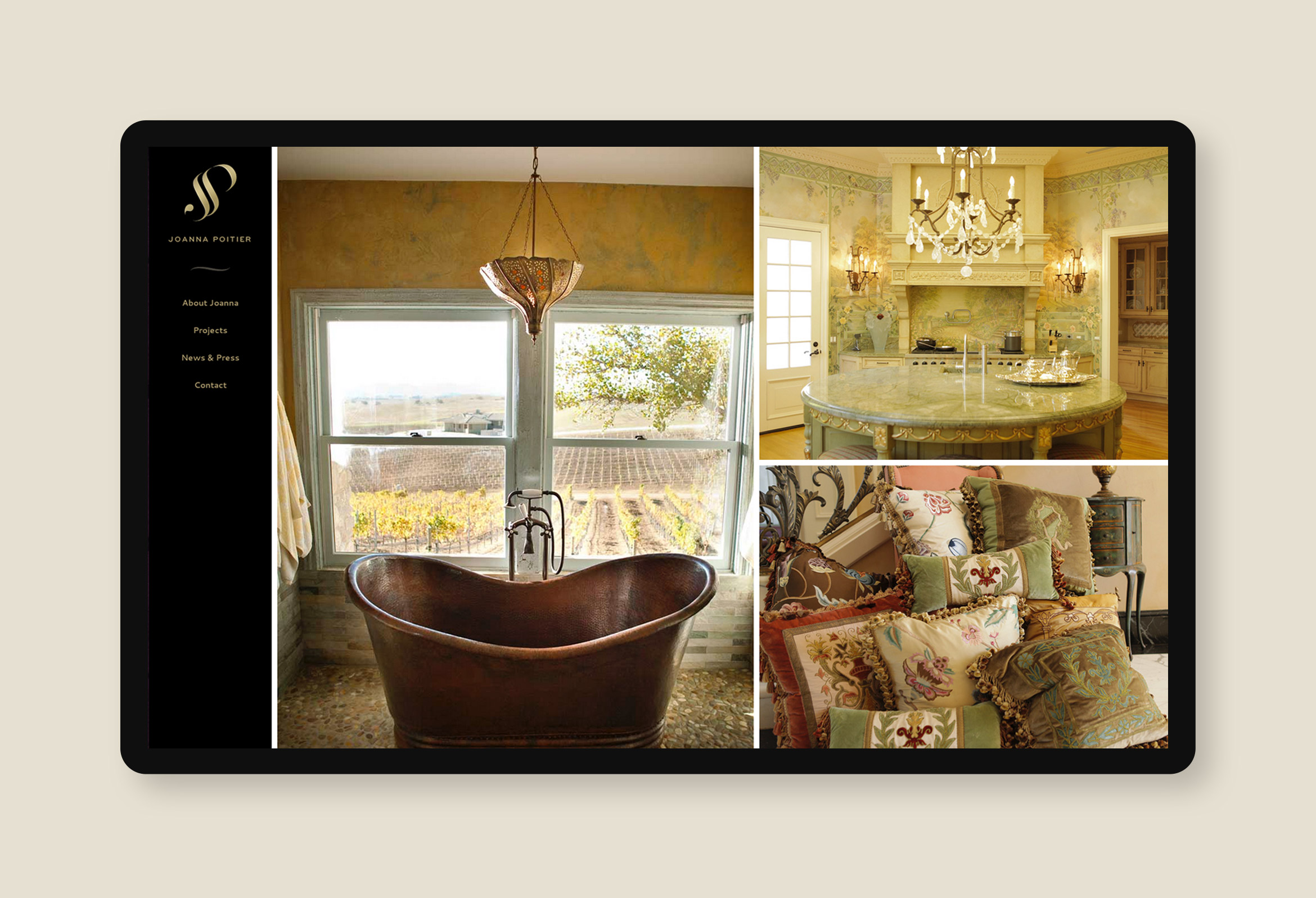
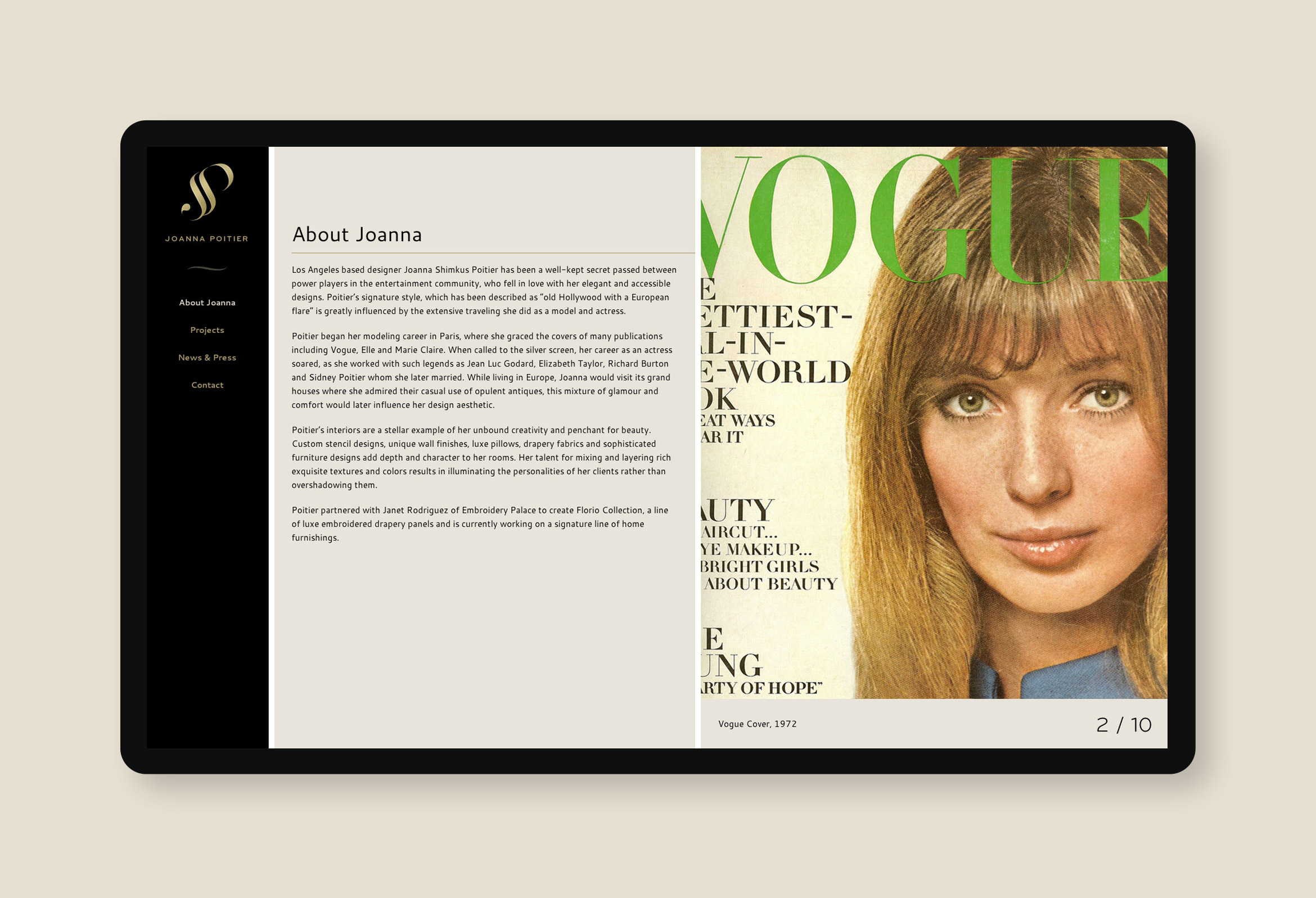
LA-based interior designer, Joanna Shimkus Poitier, has been Hollywood’s best-kept secret for years. Poitier’s signature style of “old Hollywood glamour with a European flare” required a contemporary and upscale online presence that also included her rich and storied past. We designed a unique “JSP” monogram that feels both high-end and timeless.
A full-browser responsive site uses photography of her interiors mixed with magazine covers from her acting and modeling days in Europe.
Deliverables:
- Brand Identity
- Web Design
- Web Development
- Business Card Design
- Print Production