Houlihan Lokey is a global investment bank with a modern edge
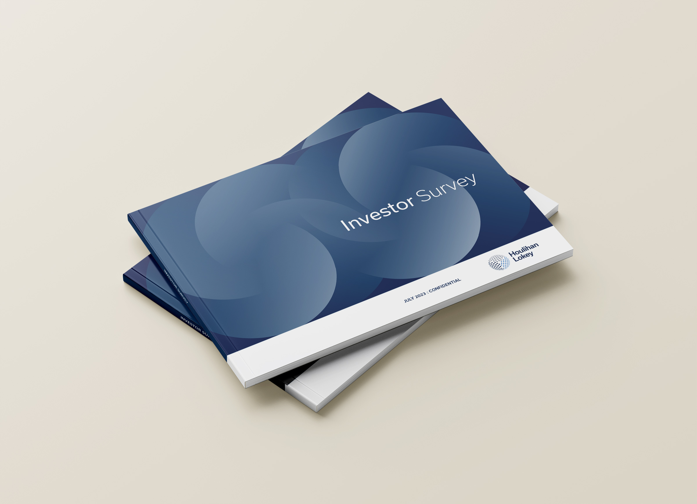
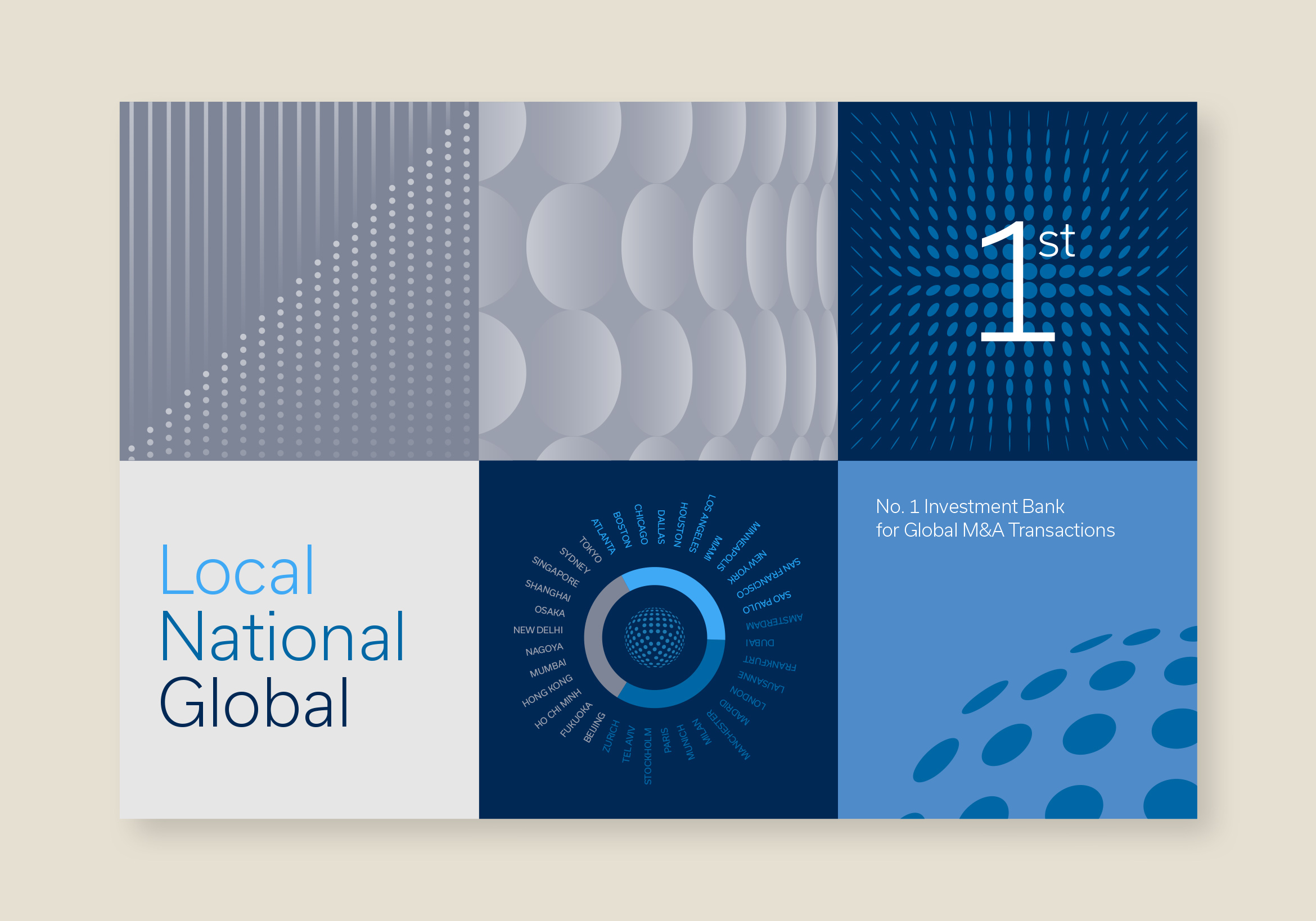
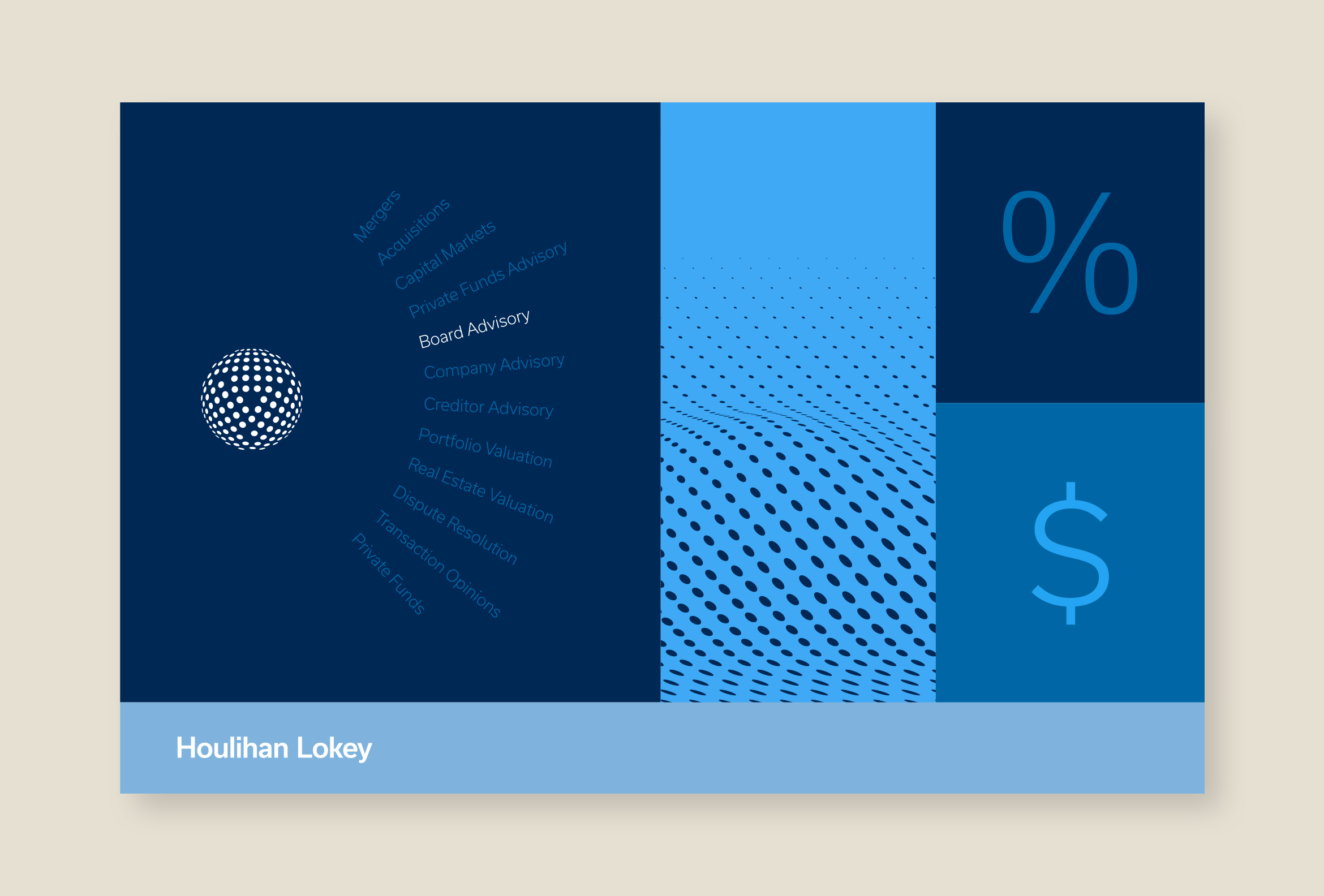
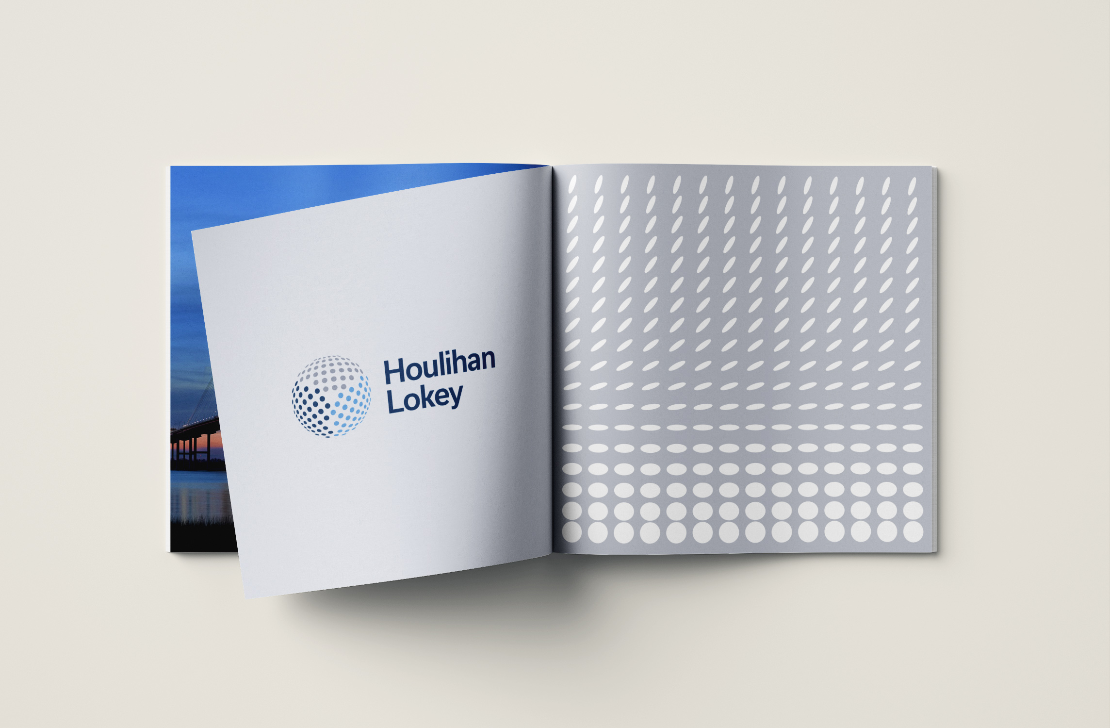
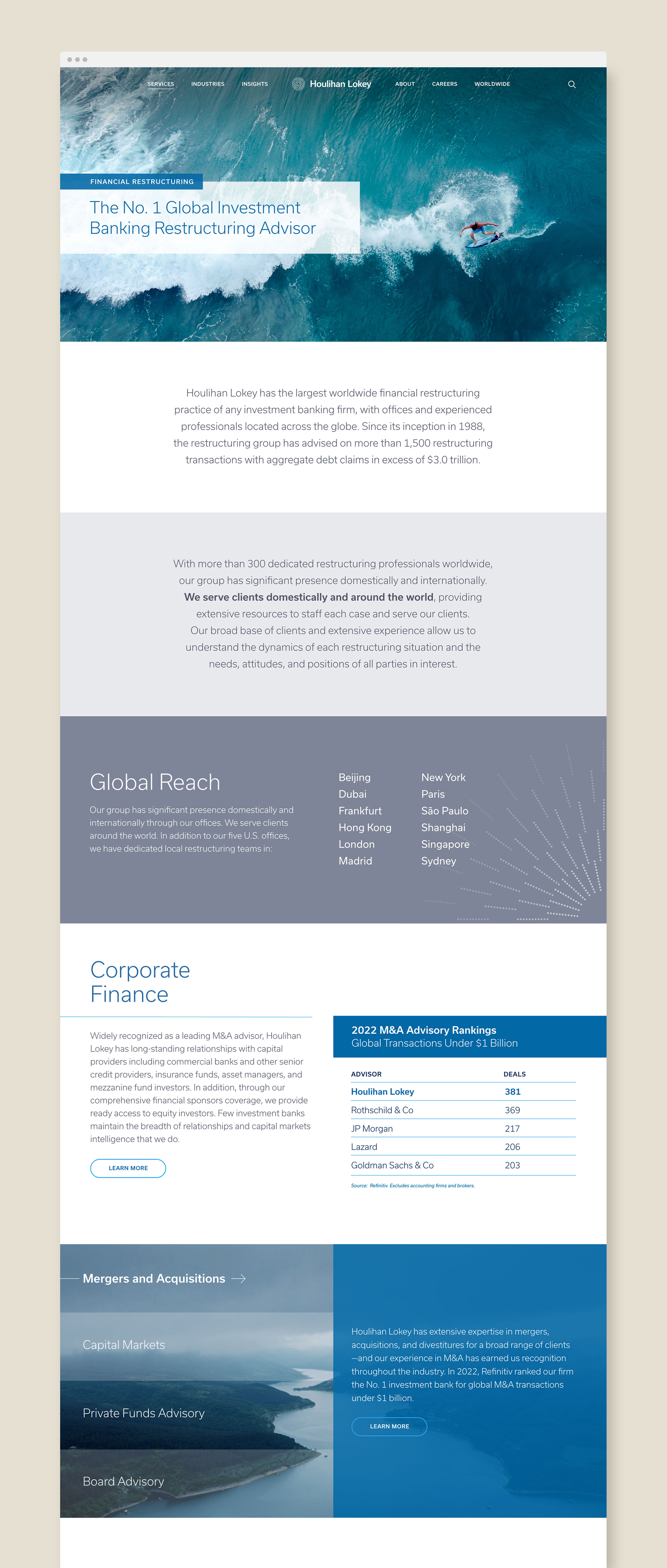
Houlihan Lokey is a leading global investment bank with expertise in mergers & acquisitions. Working with their existing logo we created a visual design system with a vast library of graphic motifs and applications. Clean, modern graphics pair nicely with images of their worldwide locations. The dynamic and flexible system works across all marketing touchpoints from the website to social media.


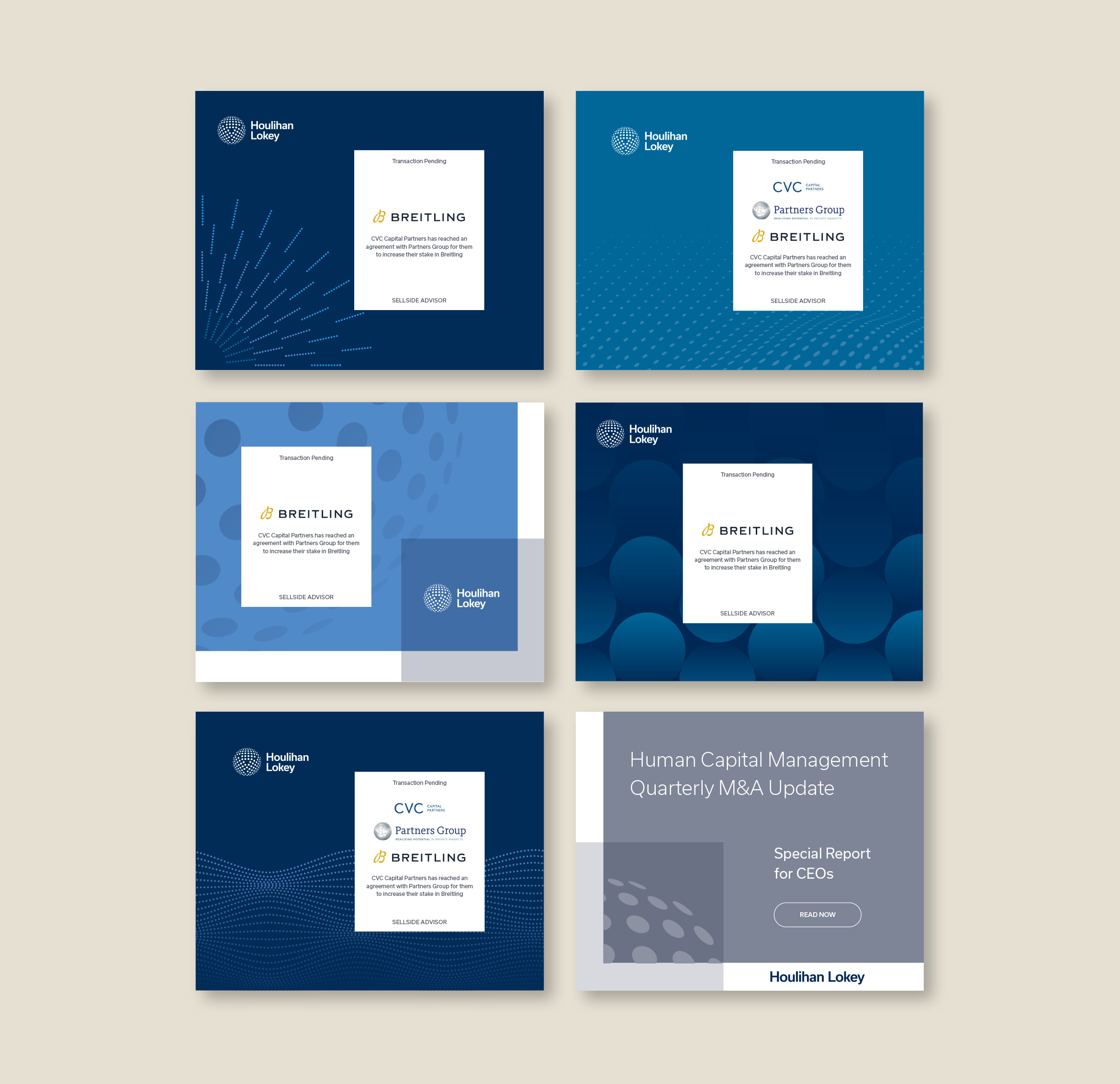
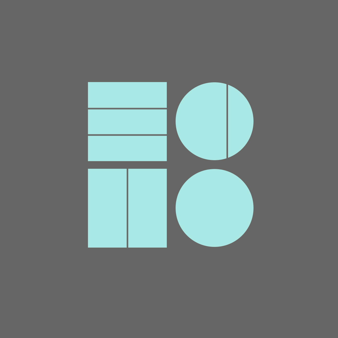
Shapes found inside the “trinity” globe were used to create flowing waves, currents, halftone patterns and geometric and dimensional motifs. By using the DNA from the logo itself, the visual identity feels like a cohesive system and creates an abstract depiction of intangible financial concepts.

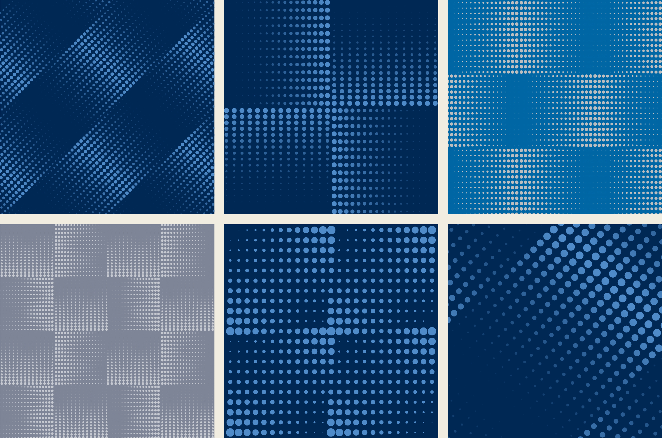

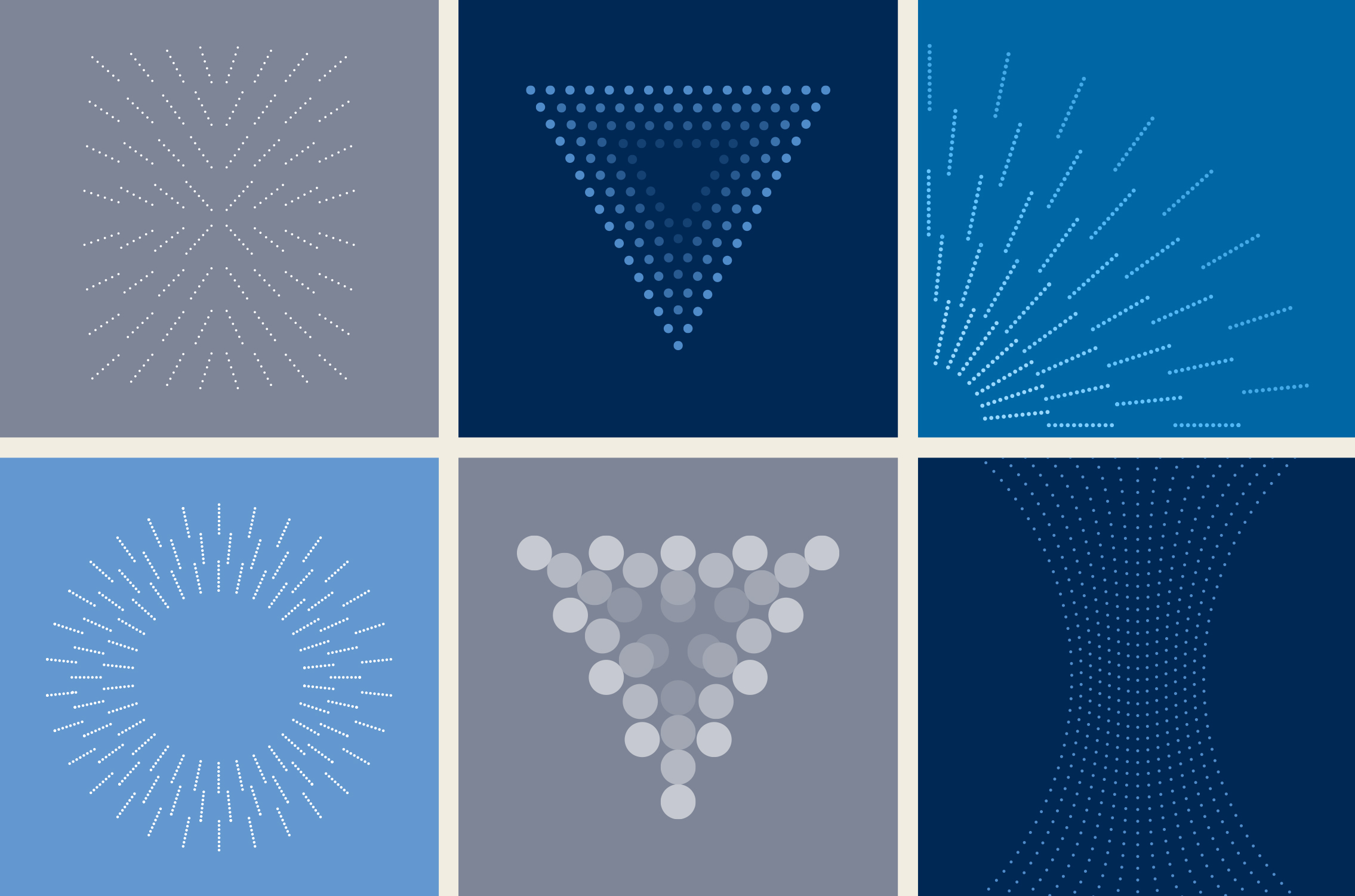
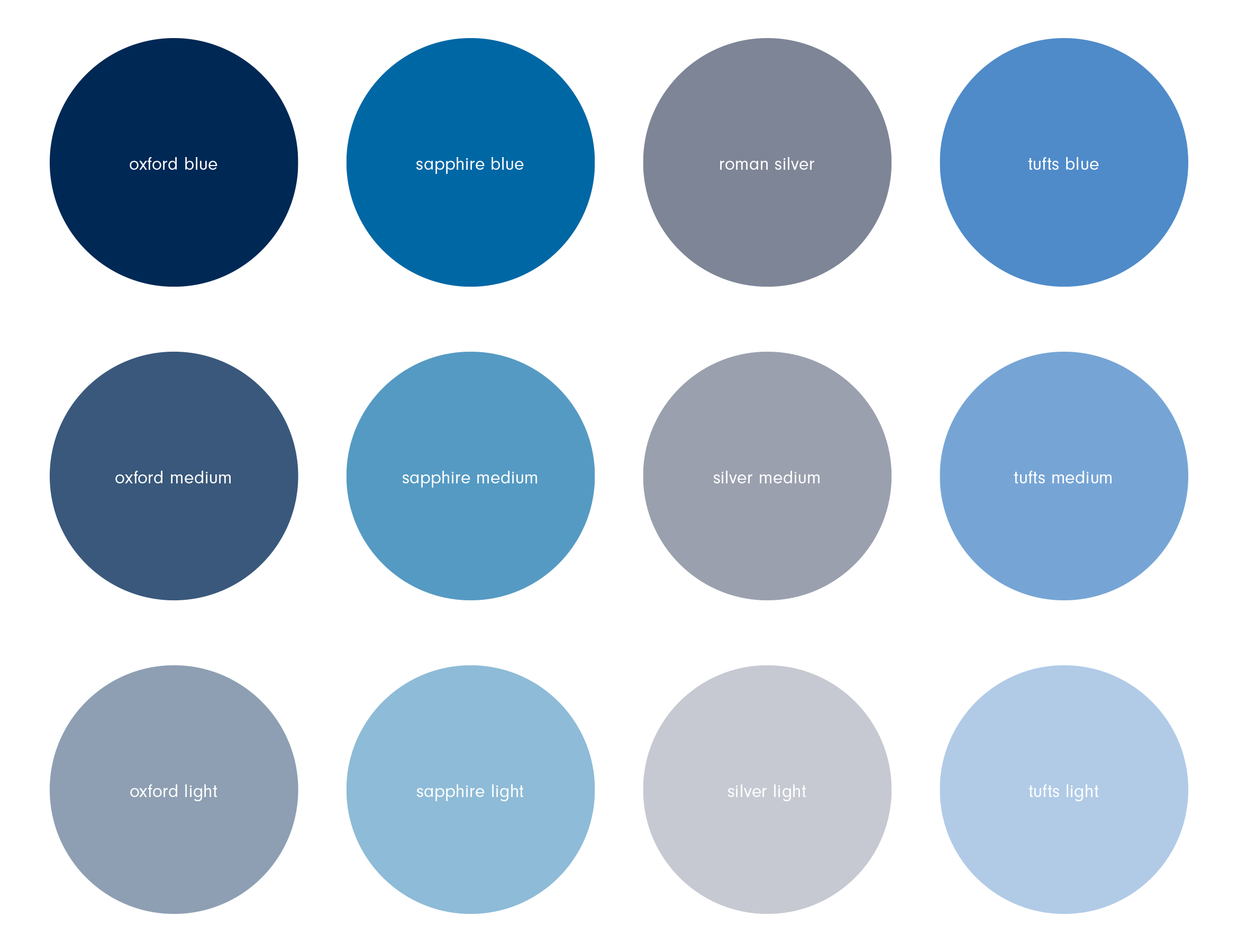
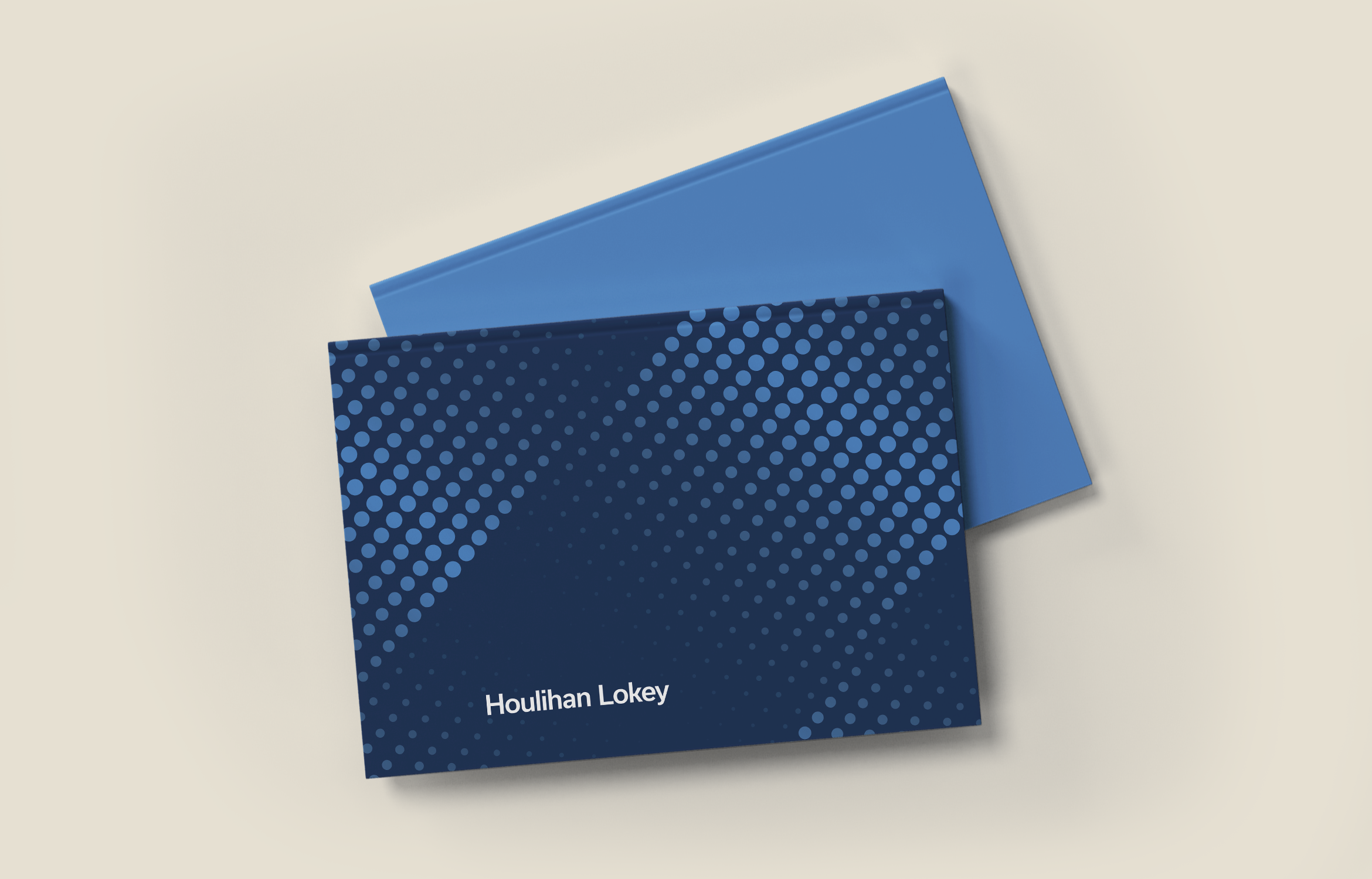
Using Houlihan Lokey’s existing brand color palette, we extended it by adding tints of the primary colors. Seen in the various graphic motifs and gradients, it helps create a depth and sophistication to their otherwise corporate colors.

The visual system allows for endless ways of combining the design elements in unique ways so that any piece of corporate communication looks and feels like it comes from Houlihan Lokey.
LinkedIn is the primary social media platform Houlihan Lokey uses for posting news. We created a library of custom, branded posts for various things like deal announcements, market report downloads and new hires around the globe.
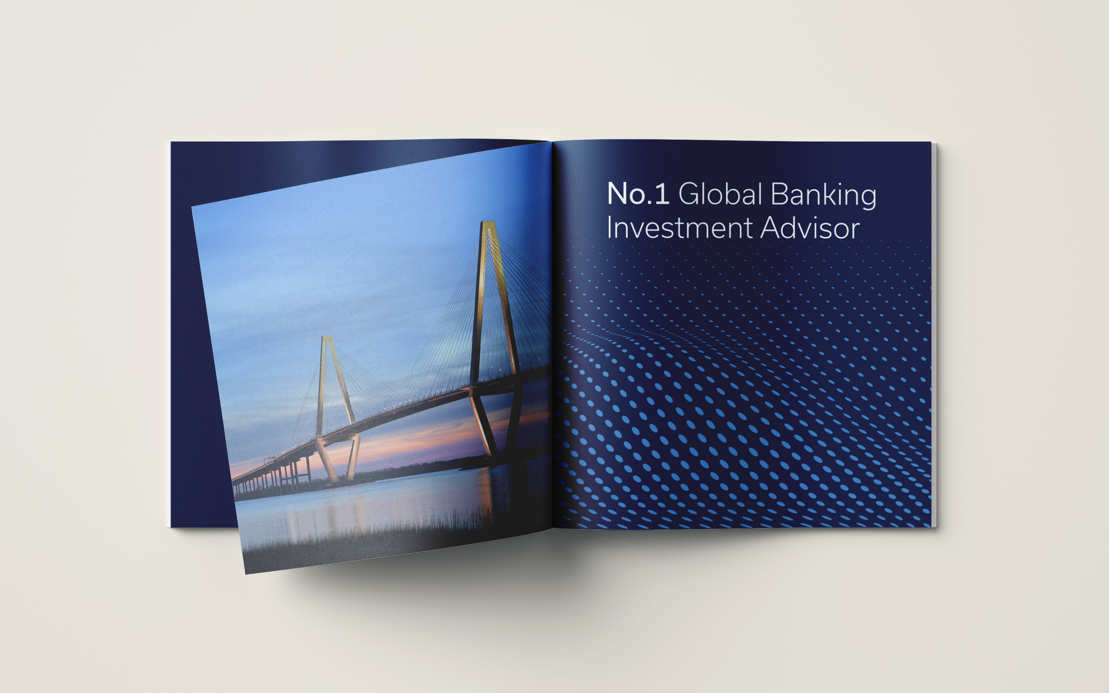
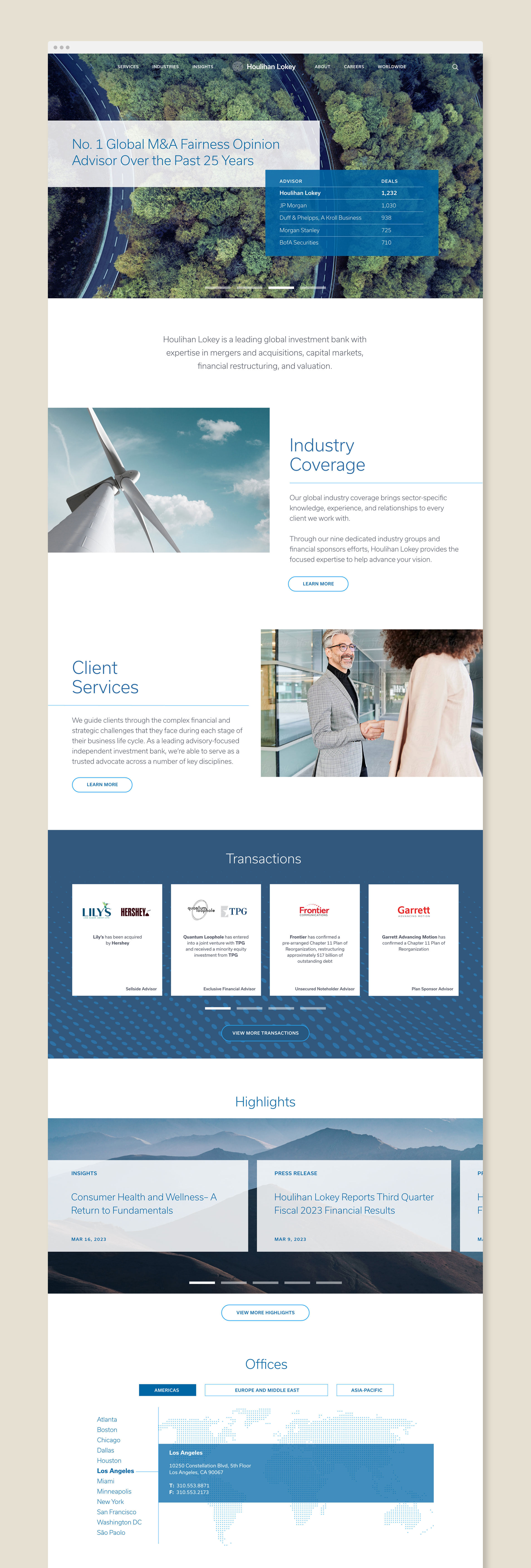
Nature photography of mountains, bridges, roads, oceans and rivers are a great way to illustrate the ideas of global market fluctuations and increasing wealth. It’s also a nice juxtaposition to the clean lines of data charts and M&A bank information.
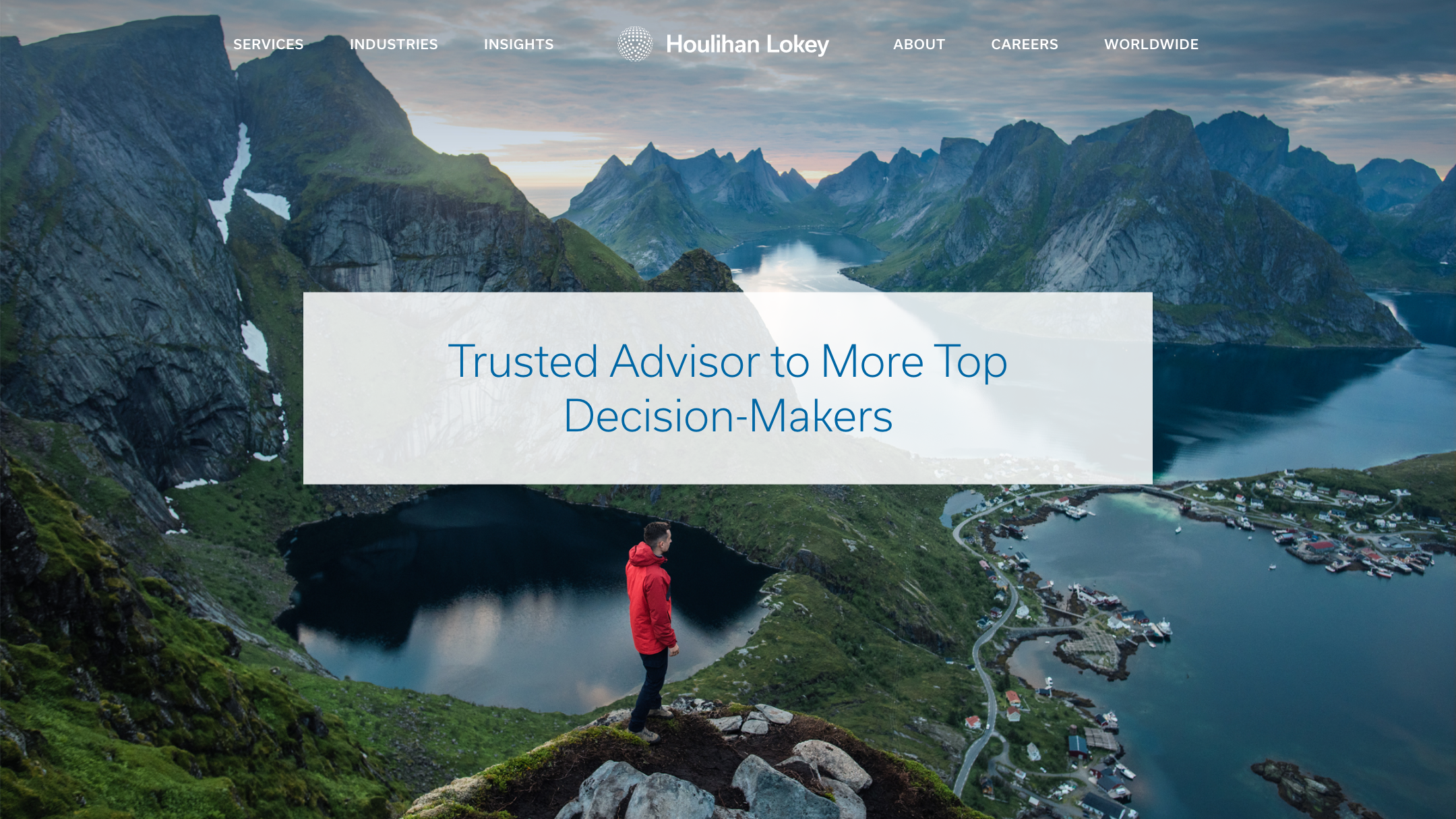
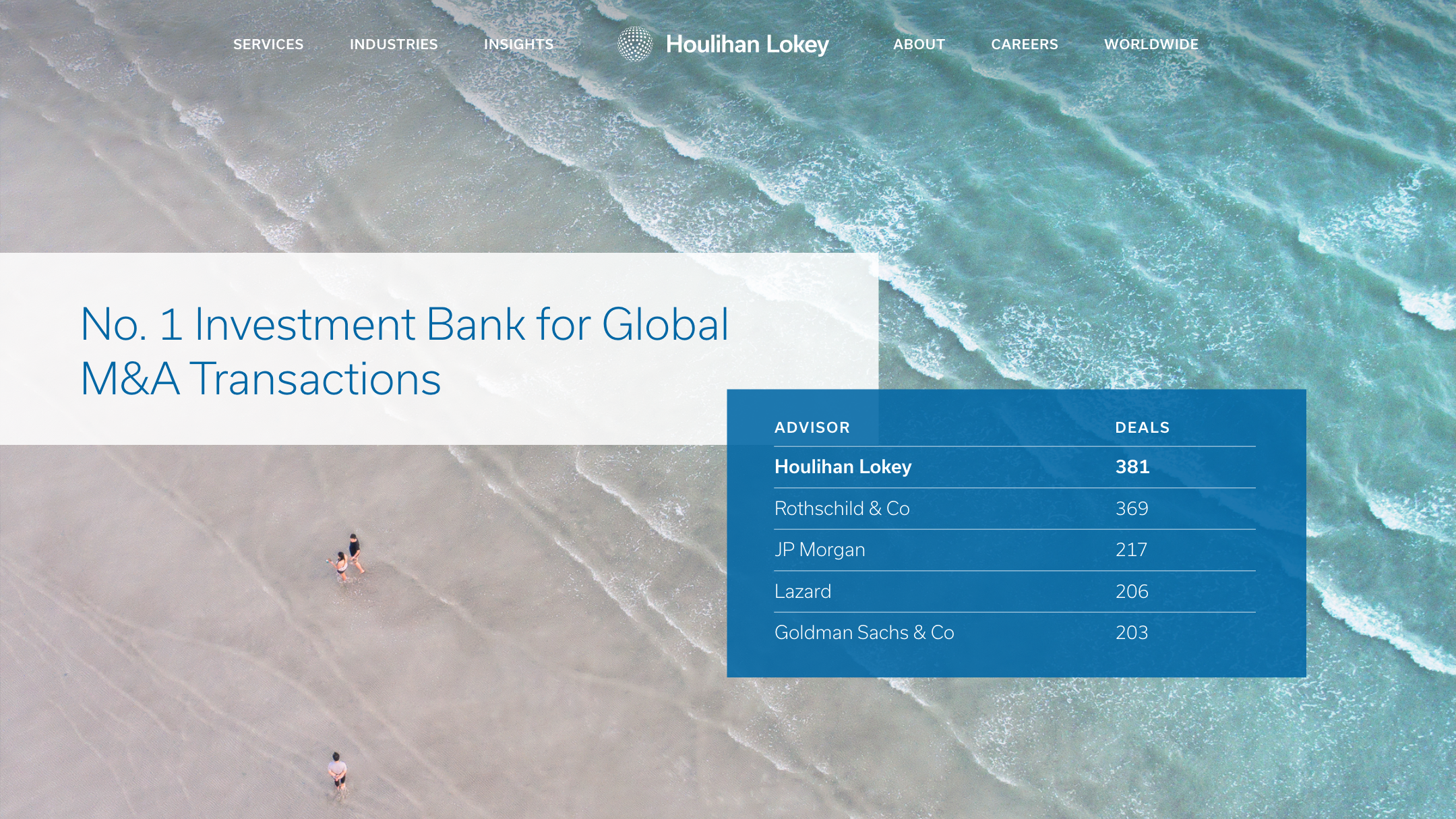
Working with Houlihan Lokey’s in-house developers, we designed the website to combine the graphics and majestic imagery to present their detailed information and global rankings charts in a clean, concise way that’s easy to navigate.

Deliverables:
- Visual Design System
- Extended Color Palette
- Website Design
- Social Media Design
- Collateral Design
QORE Investment Advisory
Finance / Brand Identity / Visual System
QORE is adding more value
to investment gold
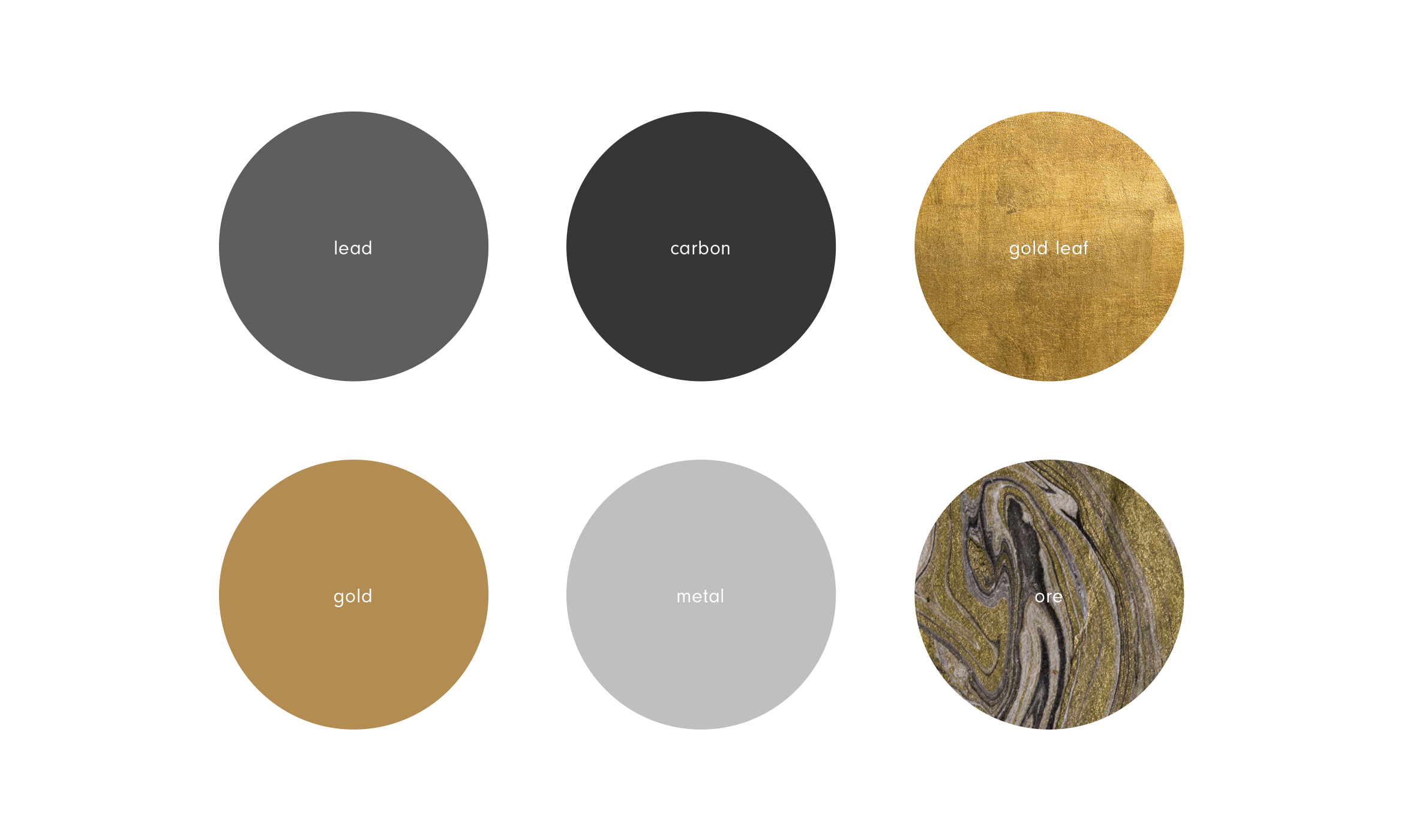
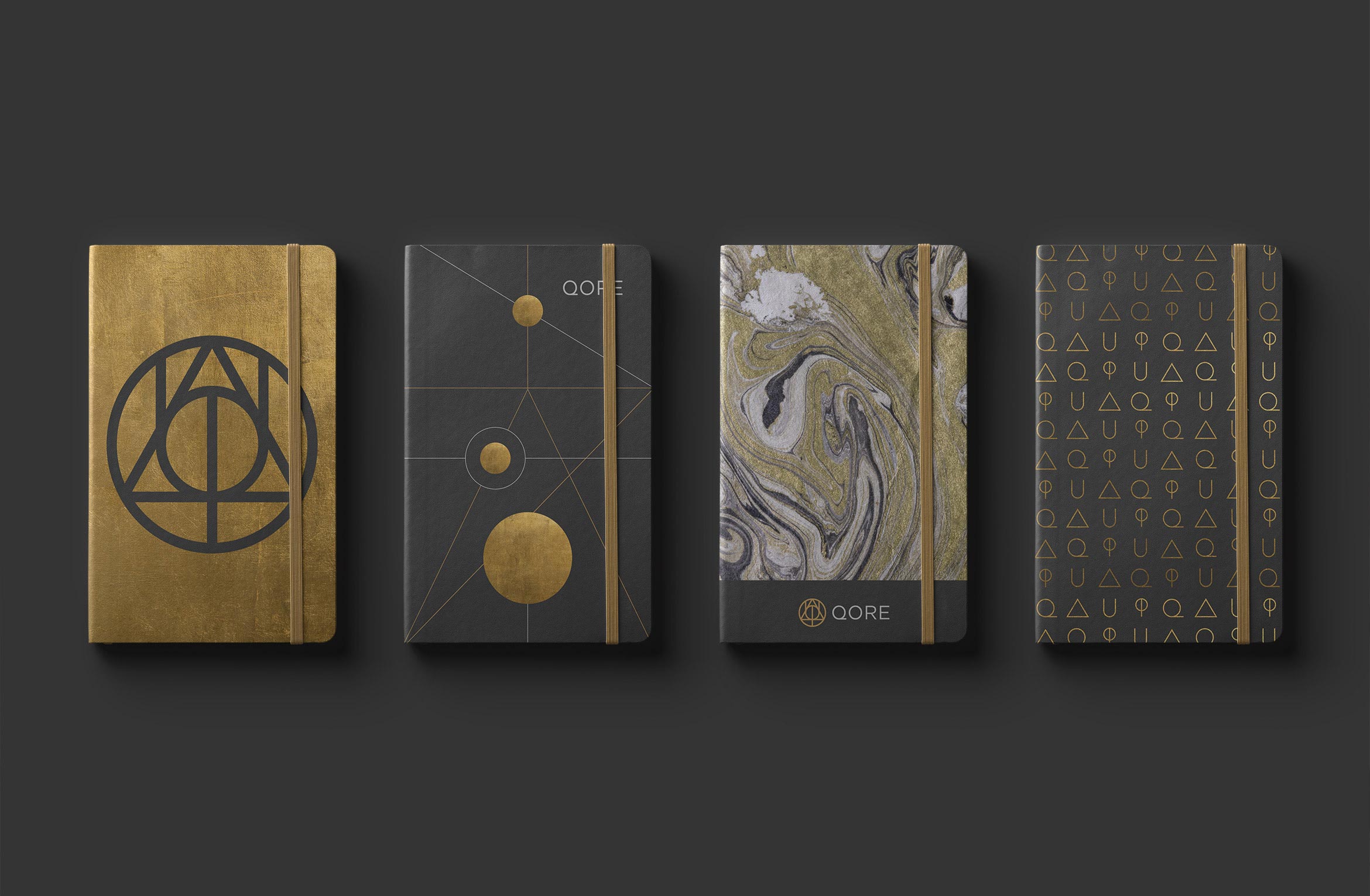
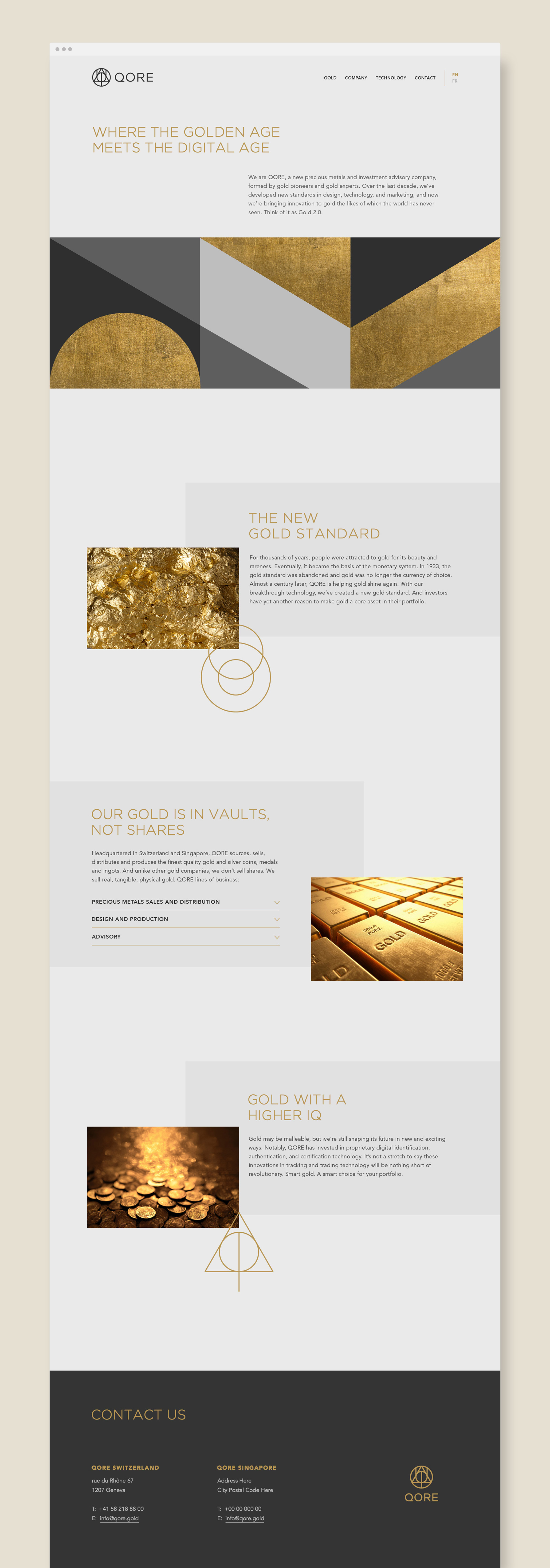
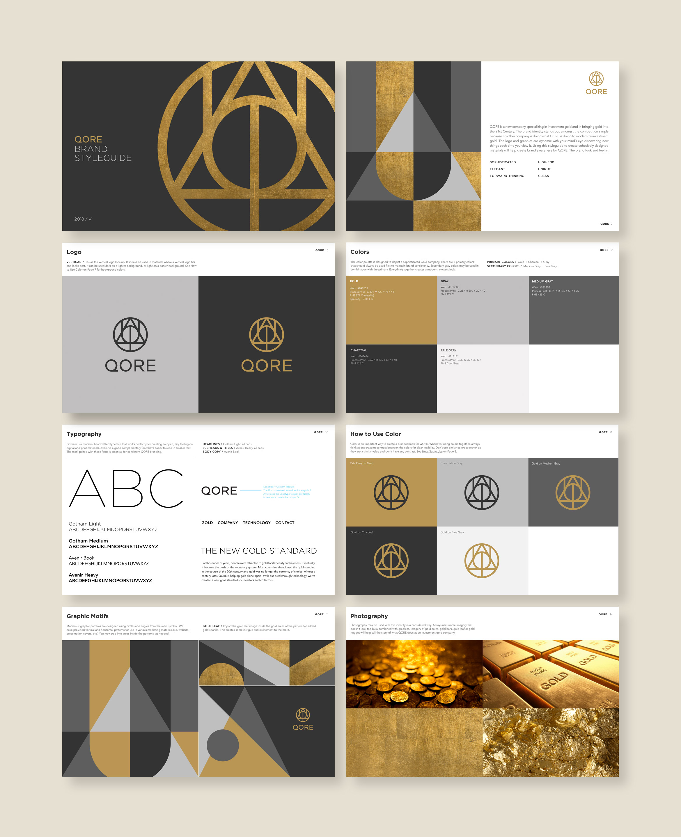
QORE is a Swiss-based precious metals and investment advisory formed by world-renowned gold experts. Over the last decade, they’ve developed new standards in design, technology, and marketing to modernize investment gold. The new brand identity reflects their core values of quality, creativity, innovation and infinite discovery through this precious metal.
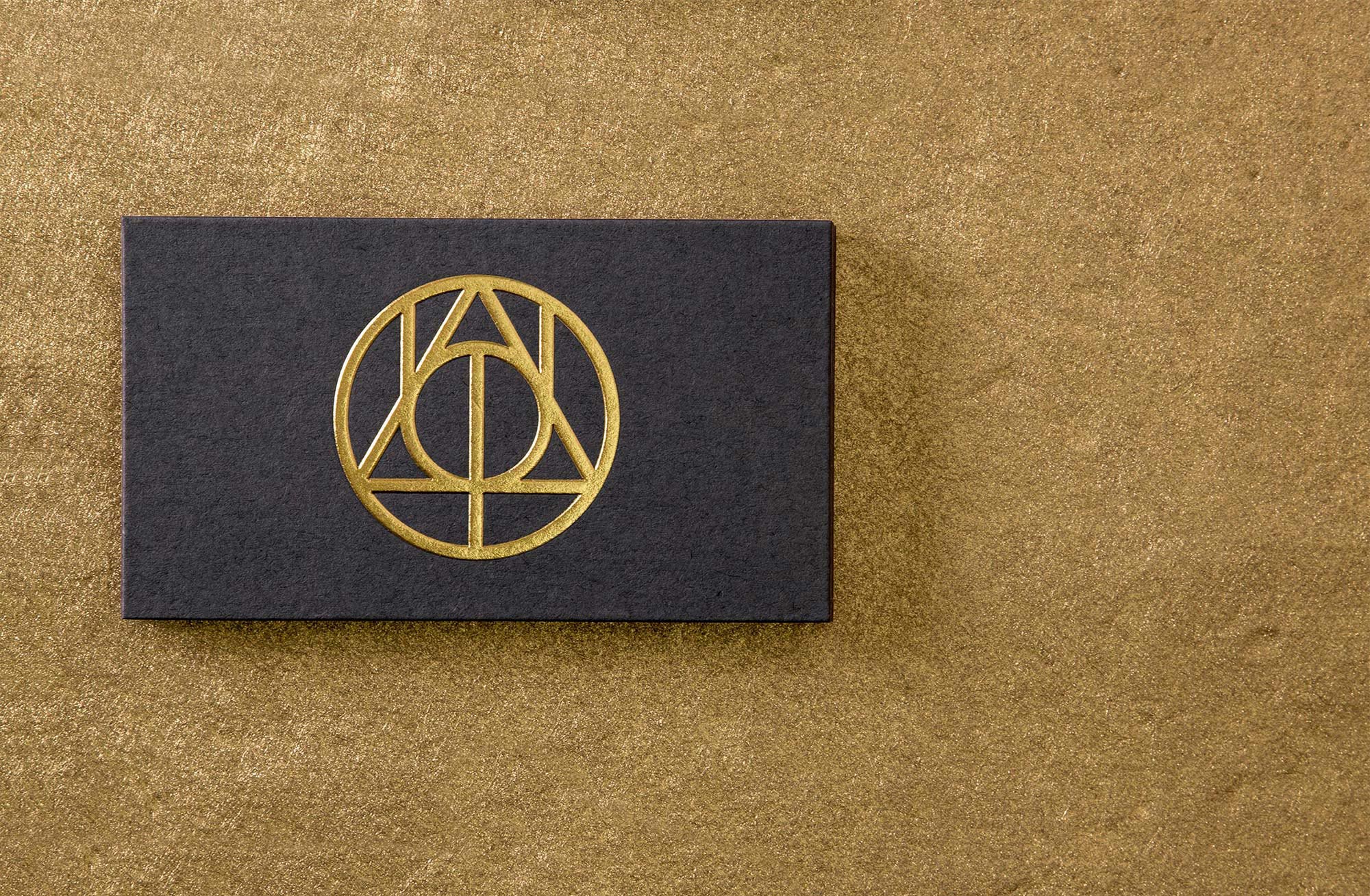
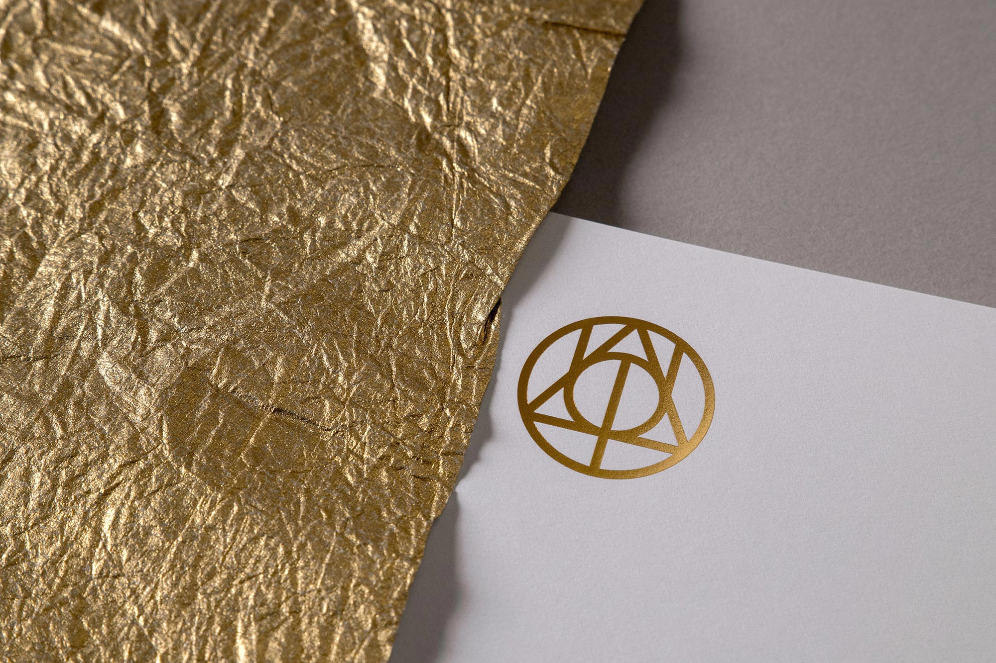
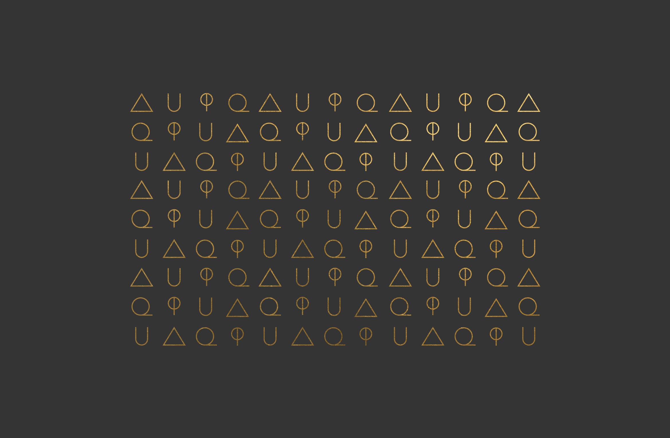
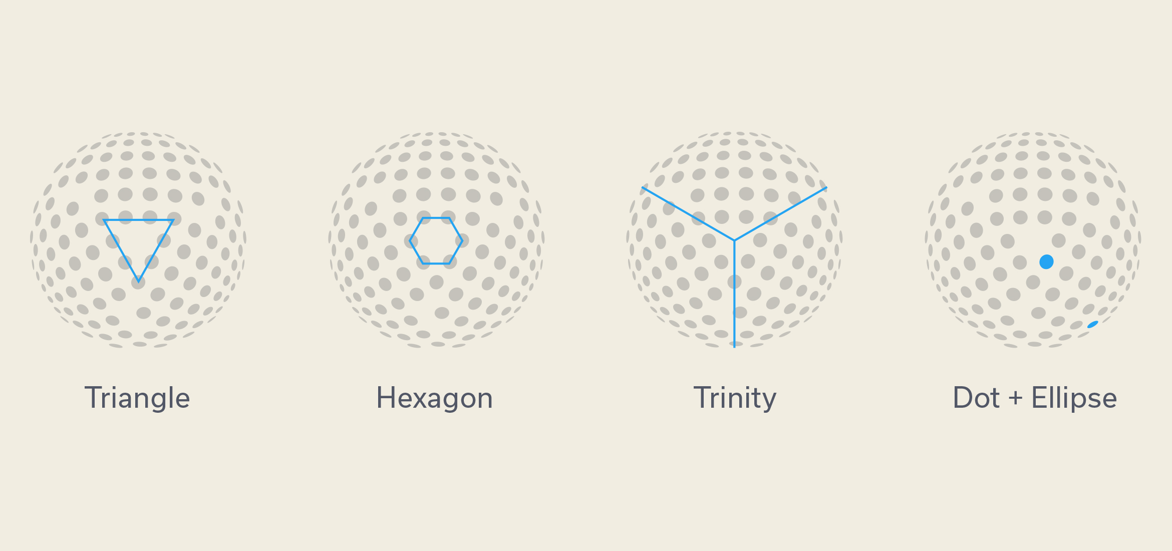
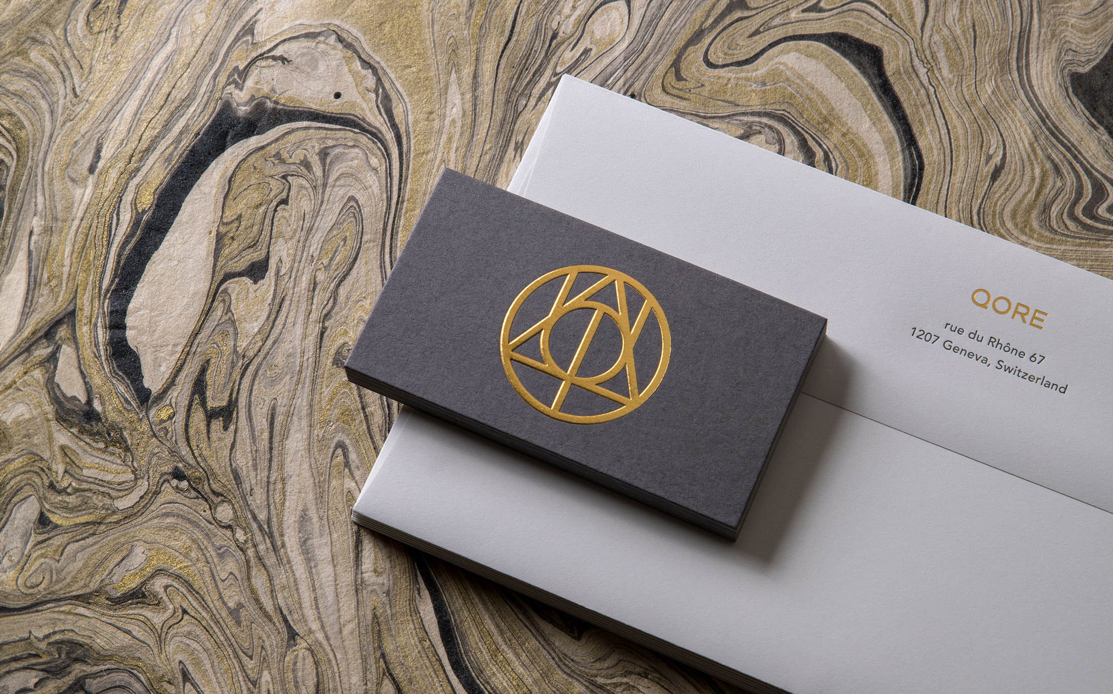
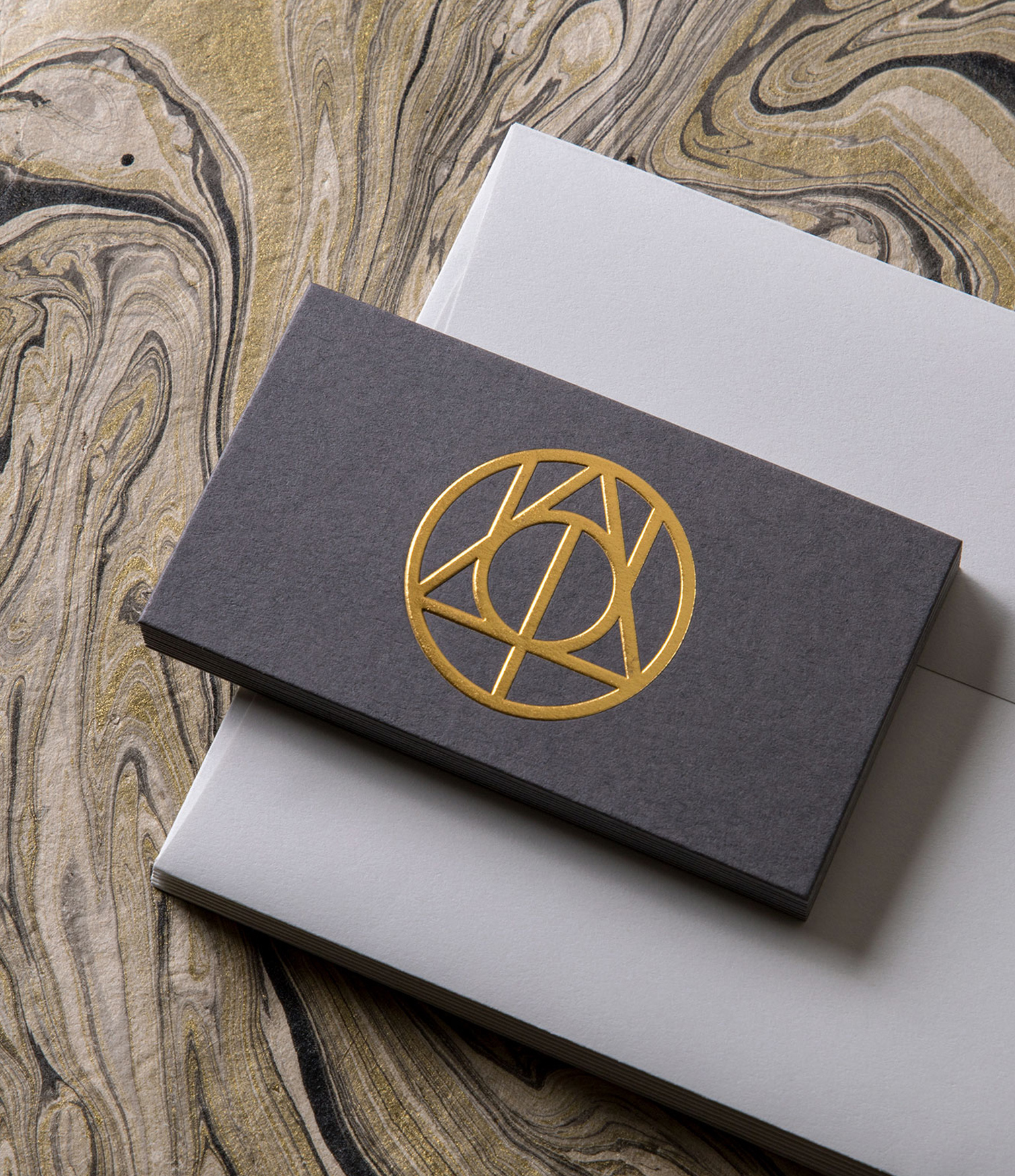
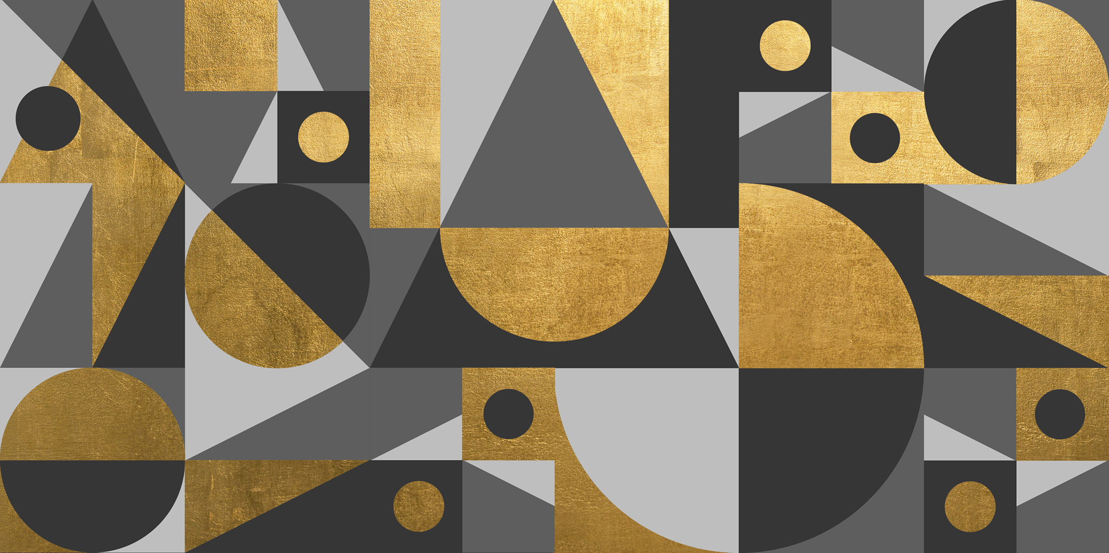
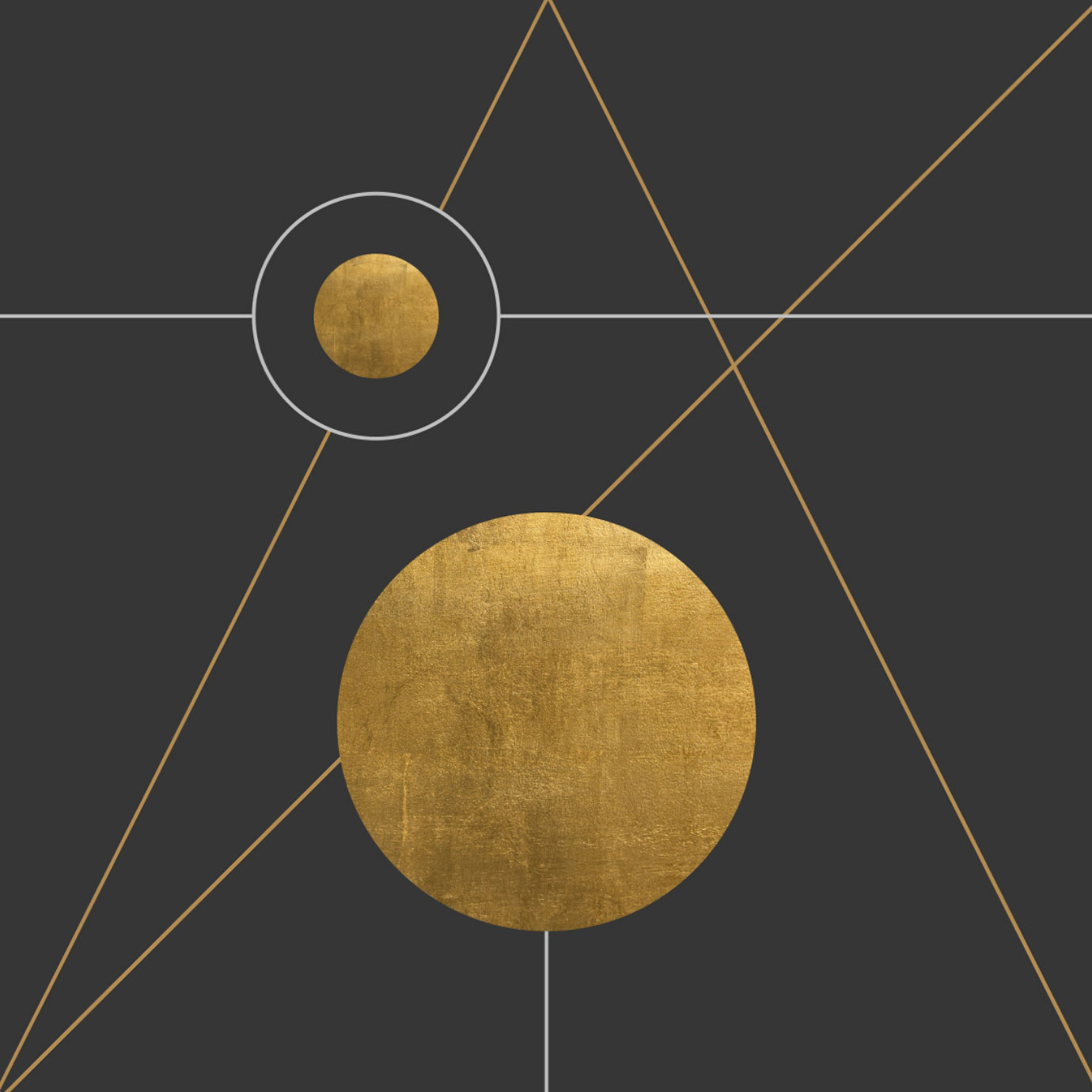
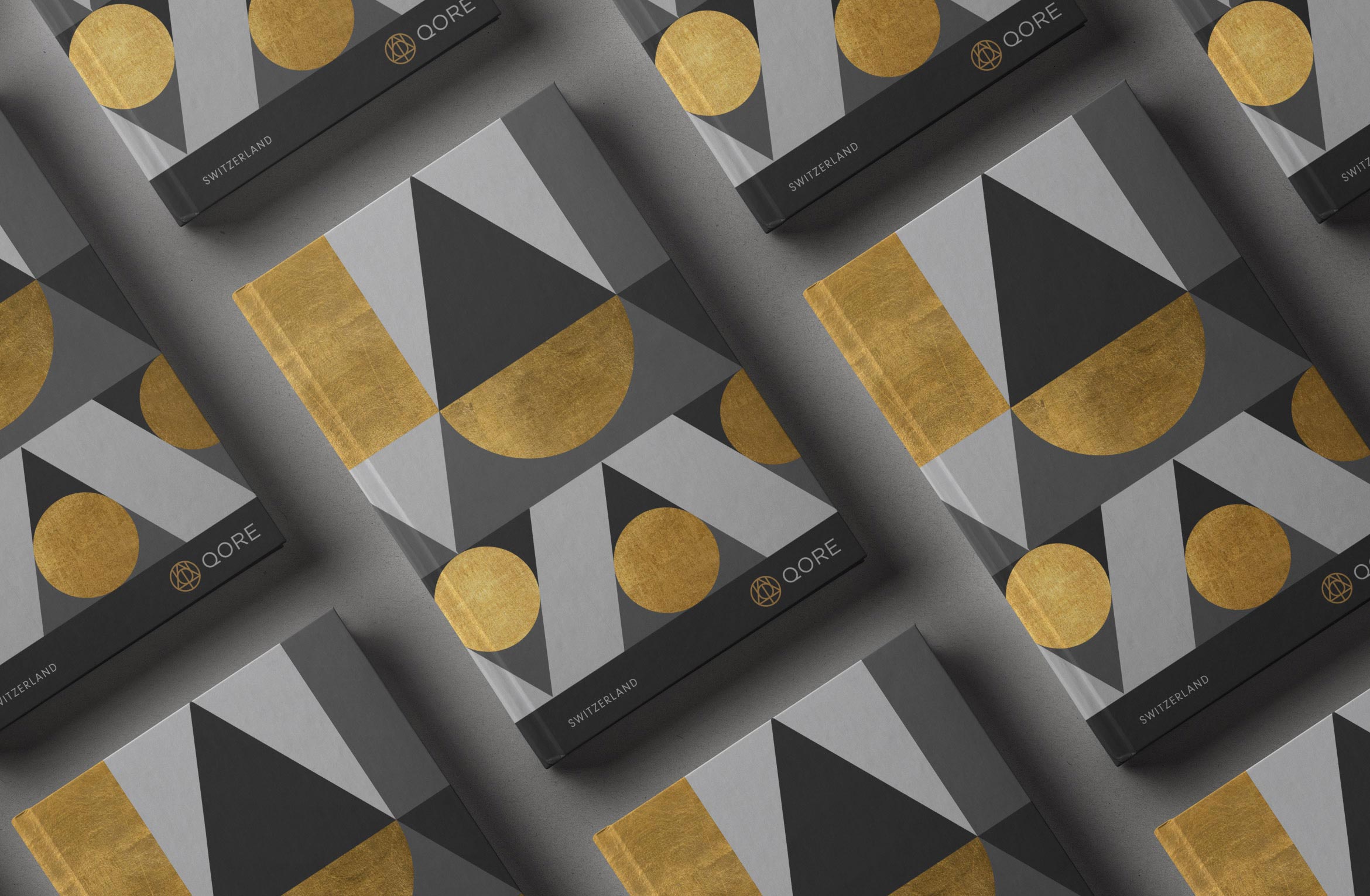
The mark is composed of three symbols that echo sacred geometry and have a guild-like quality. Geometric shapes like triangles, circles and lines can be pulled out to configure endless motifs and supergraphics that extend the brand’s visual system.
AU: Periodic Table
Phi: Symbol for Golden Ratio
Q: Qore
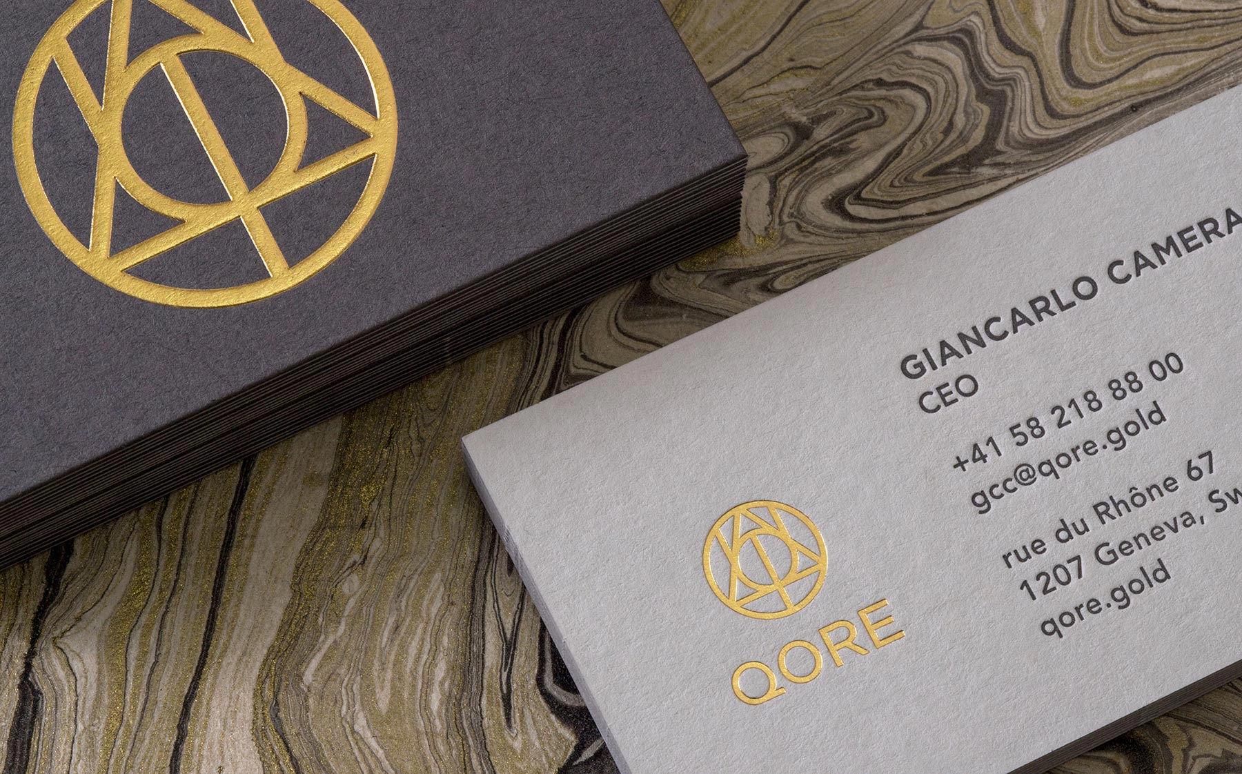
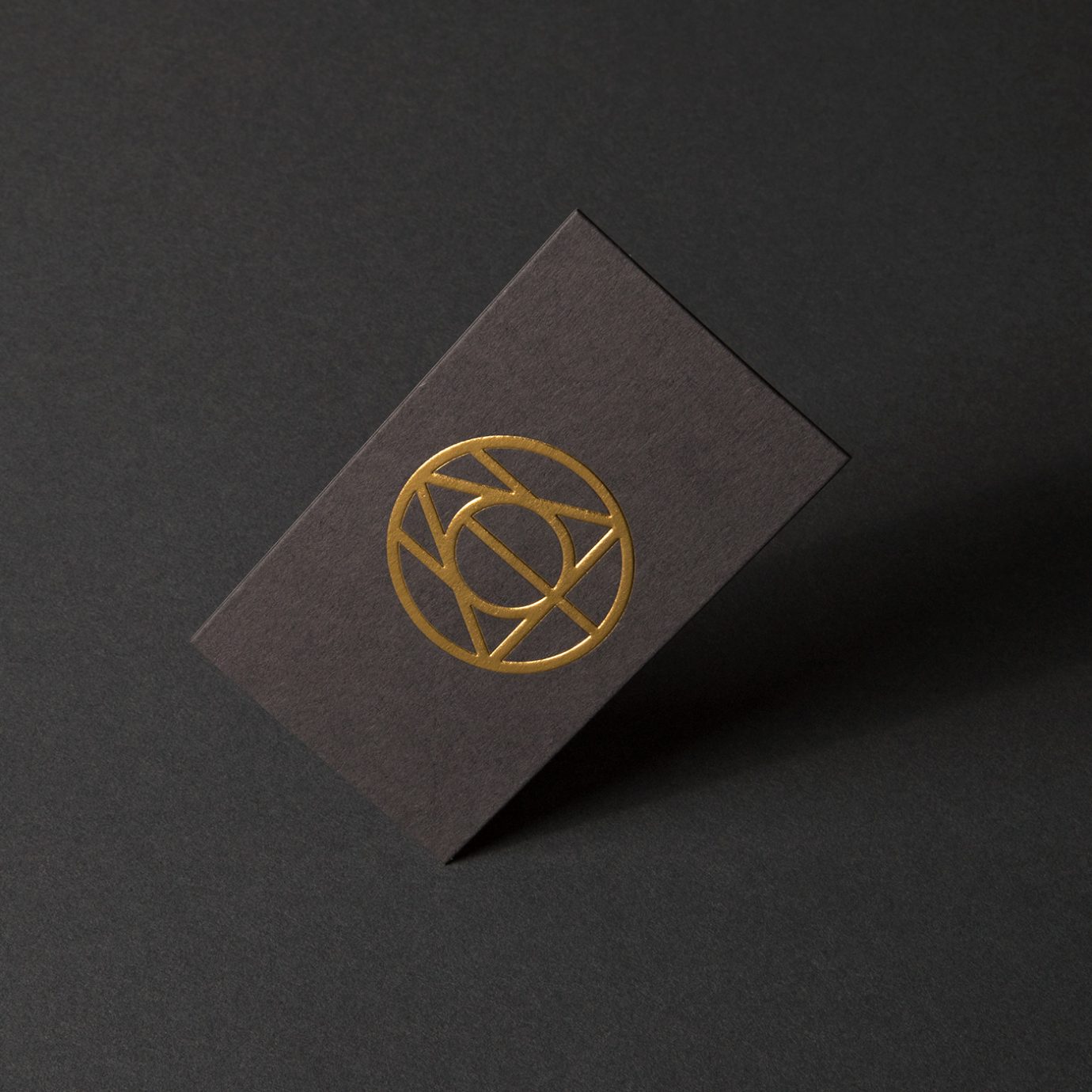
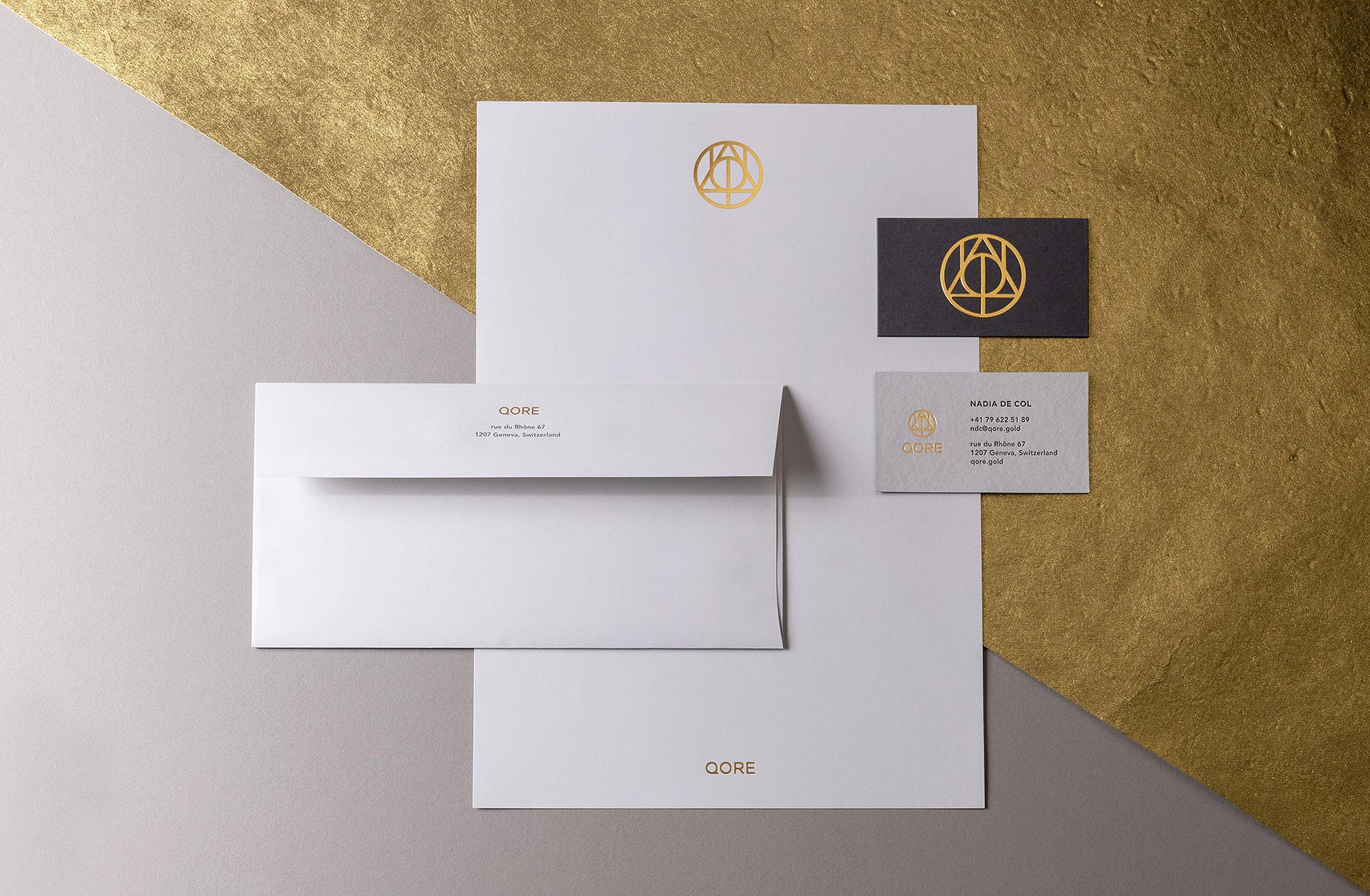
High-end business cards were printed using ColorPlan duplexed grey papers, letterpress and an embossed gold foil logo that feels like a gold coin. Matching Classic Crest Antique Gray and Gold Foil envelopes and letterhead round out the stationery suite.
Deliverables:
- Brand Identity
- Brand Guidelines
- Visual System
- Print Collateral
- Web Design
- Copywriting
A bilingual, single page website tells the story of what QORE has to offer using smart copy and collaged imagery. Animations of the logo and icons, paired with parallax layers adds a unique, modernist touch.
A Brand Styleguide outlines rules for logo lock-ups, color formulas, typography, how to work with graphic motifs and photography.
Caprock wealth management
finance / brand identity / website
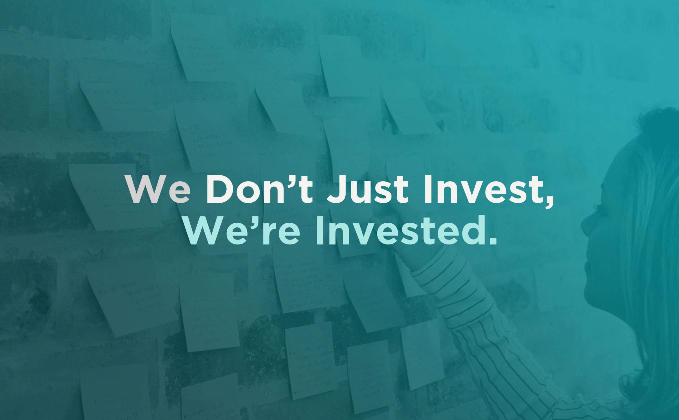
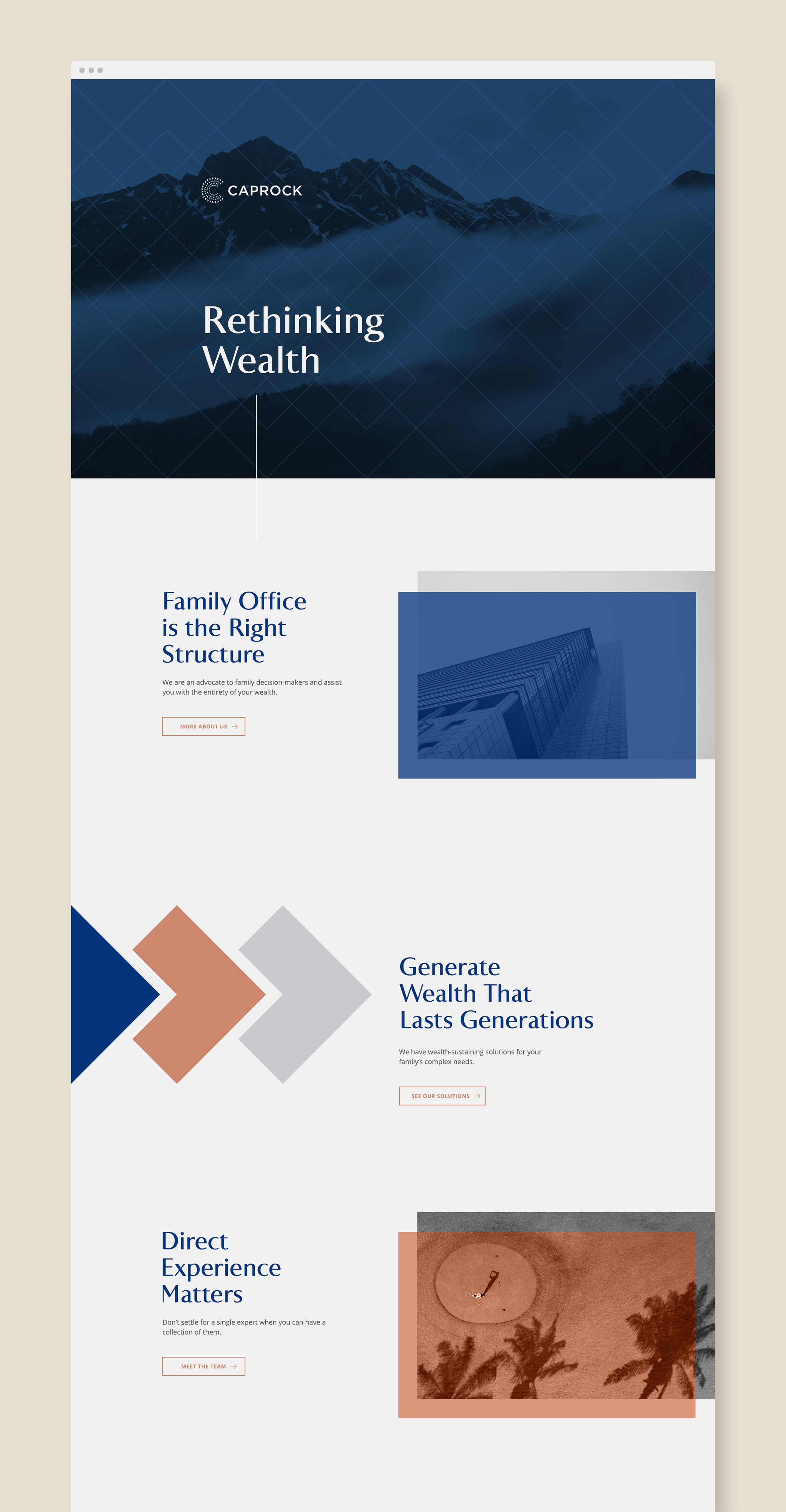
Caprock is a family office company rethinking wealth and impact investing
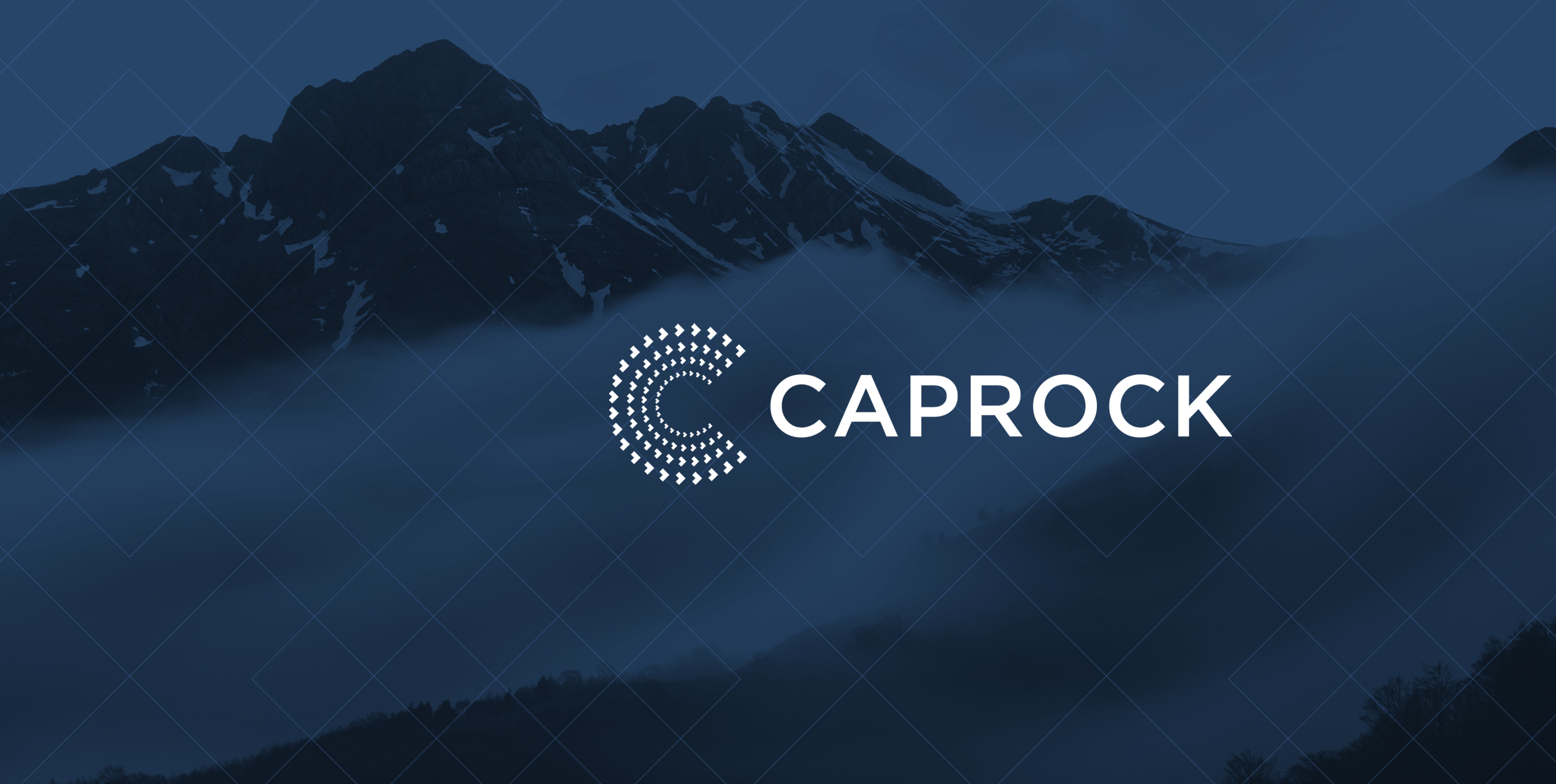
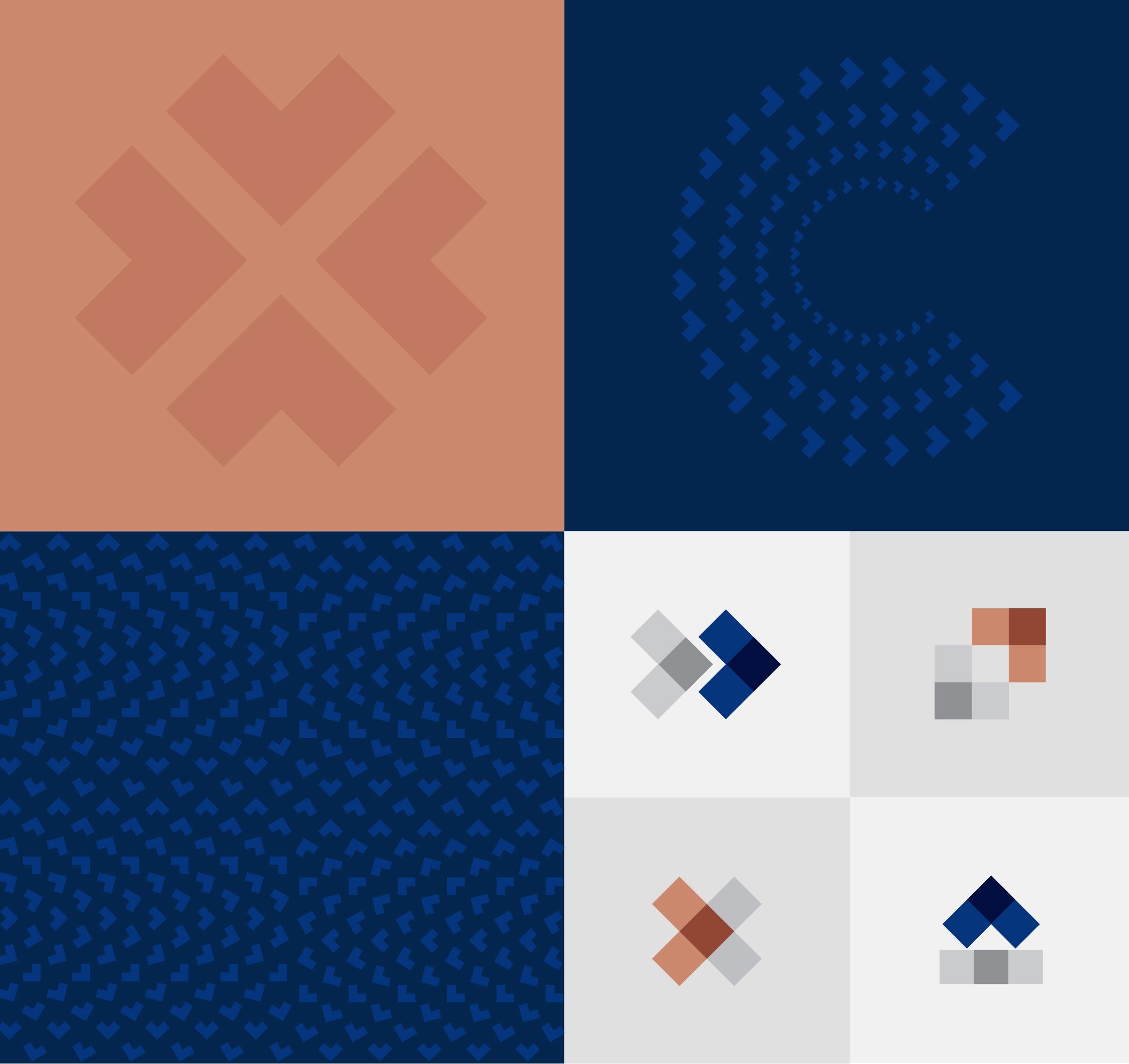
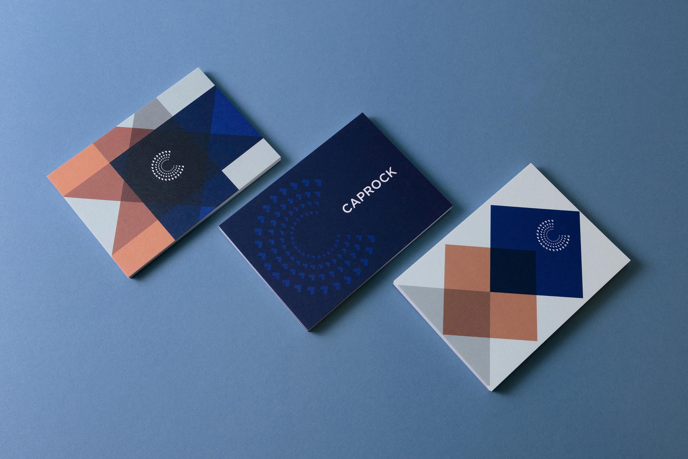
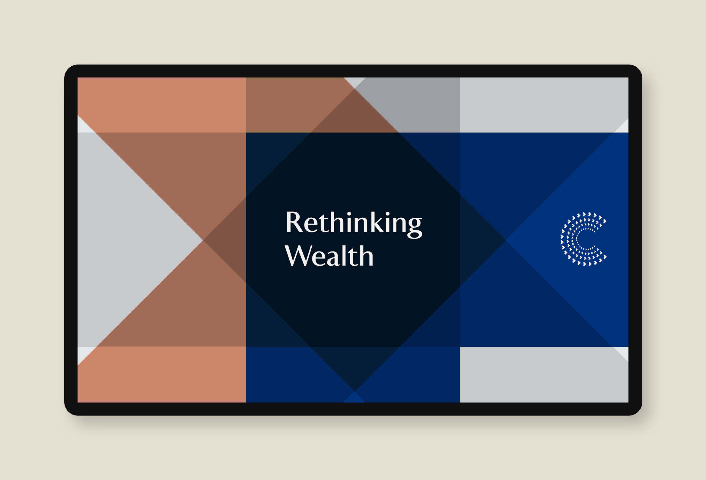
Caprock is a leader in managing family wealth with their personalized, hands-on approach. Pioneers in the impact investing space, they wanted to modernize their identity and create a cohesive visual system. To revitalize this decade-old brand, we started with a monogram “C” that’s always moving forward and speaks to financial growth and flexibility.
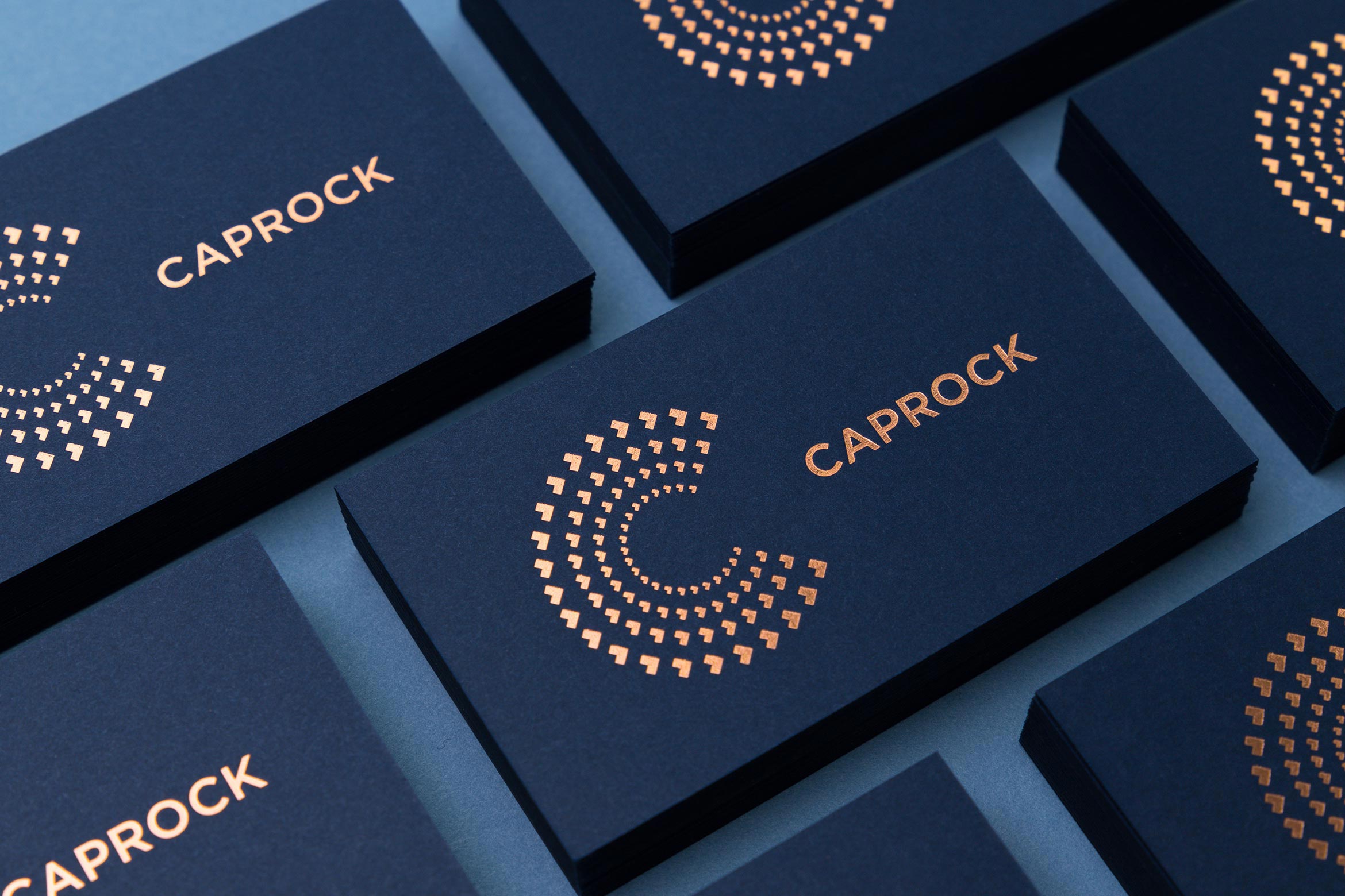
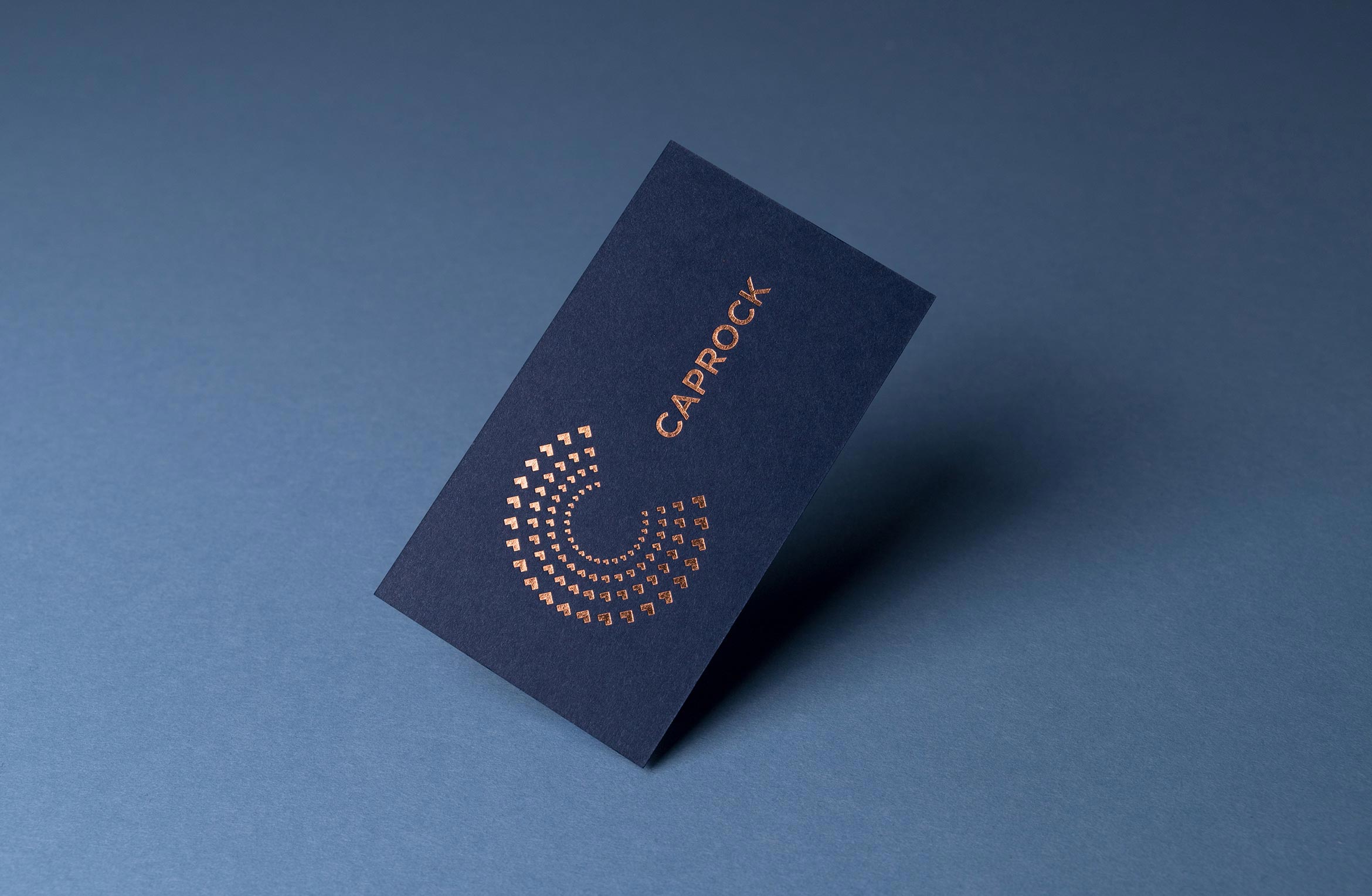
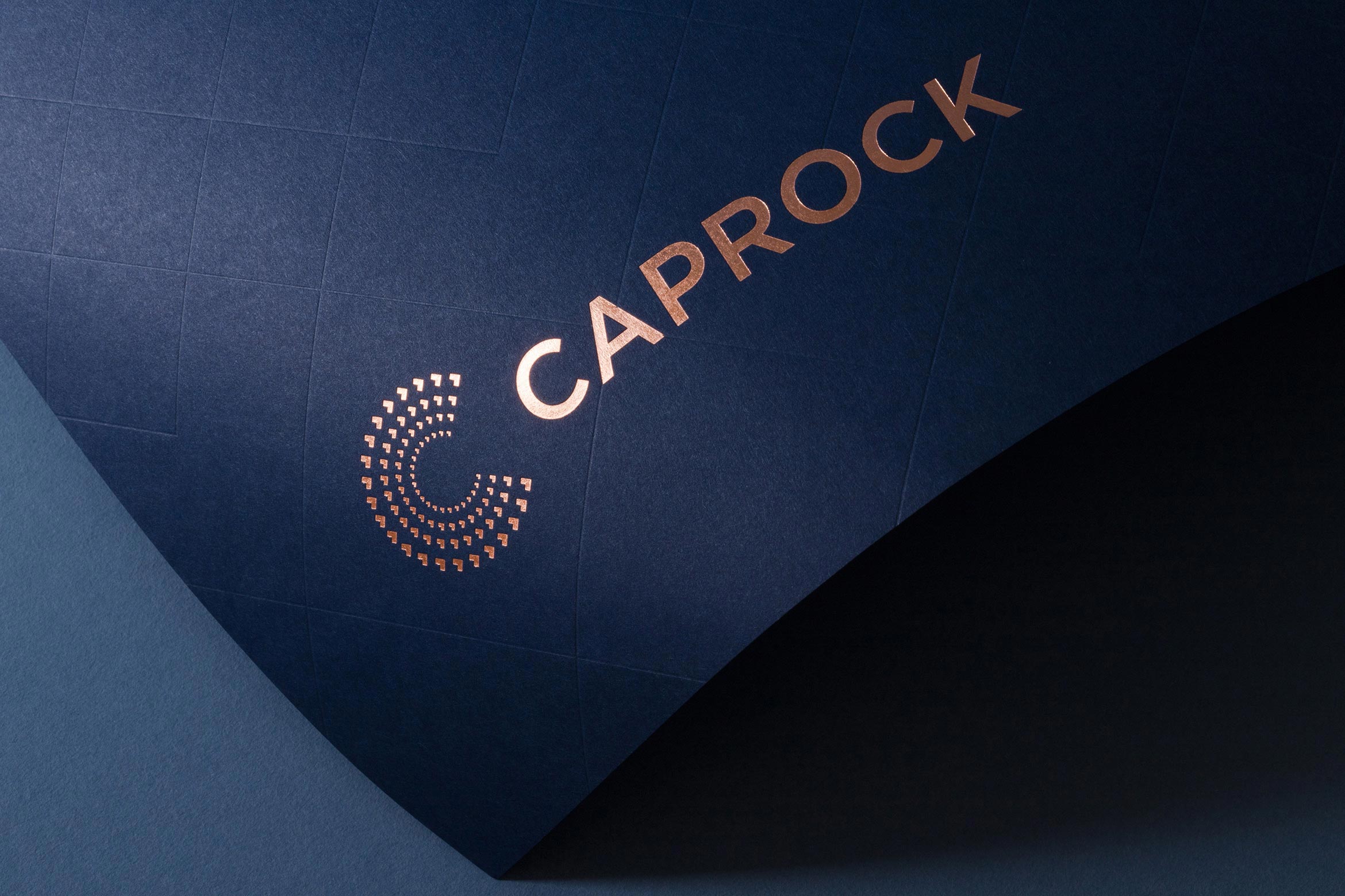
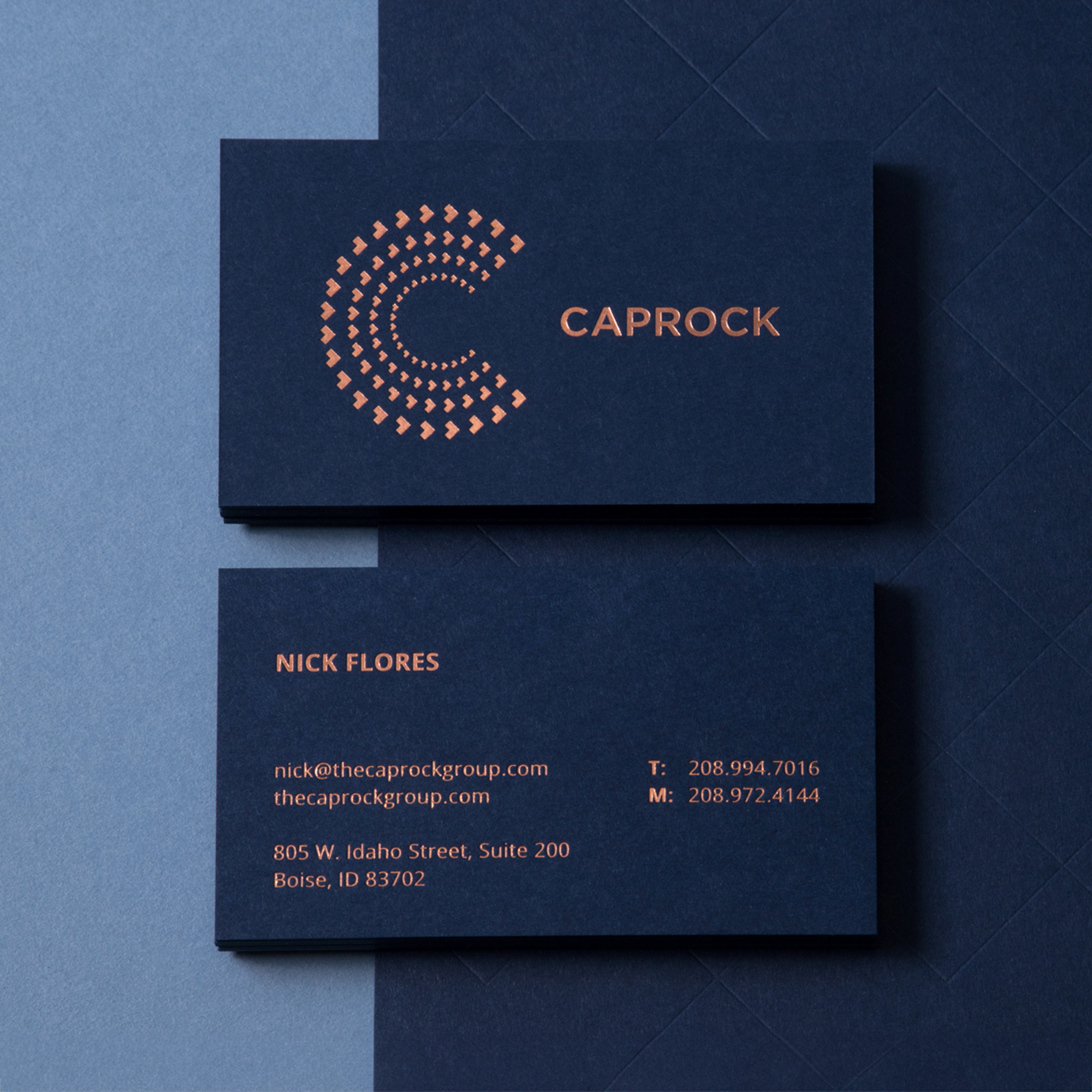
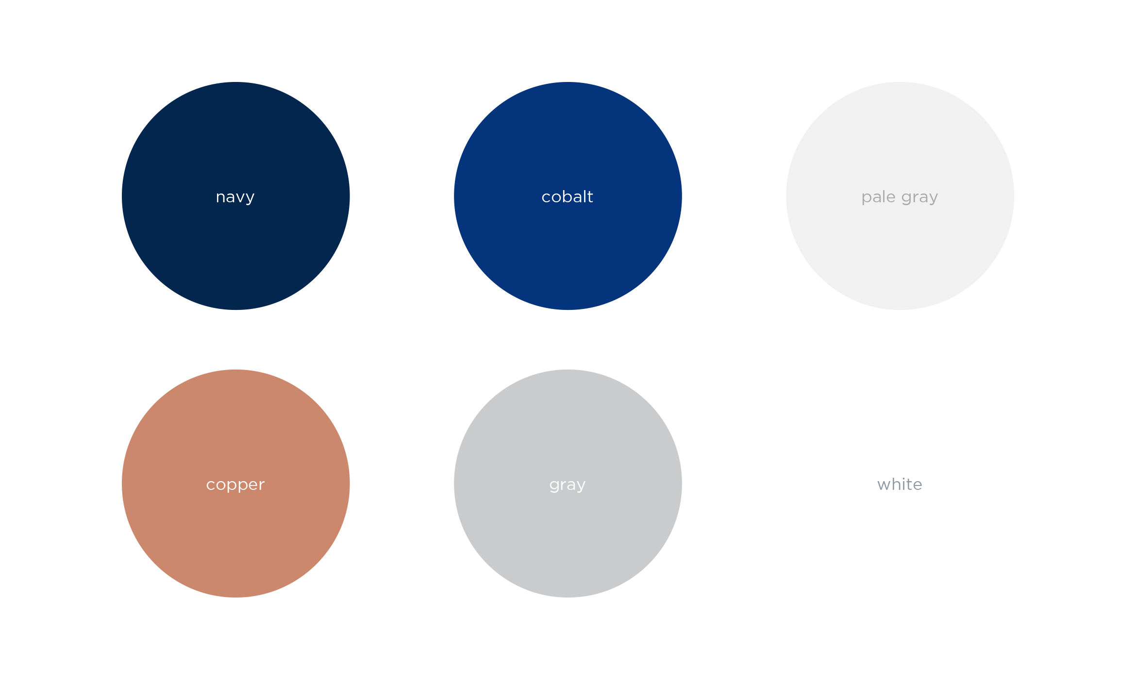
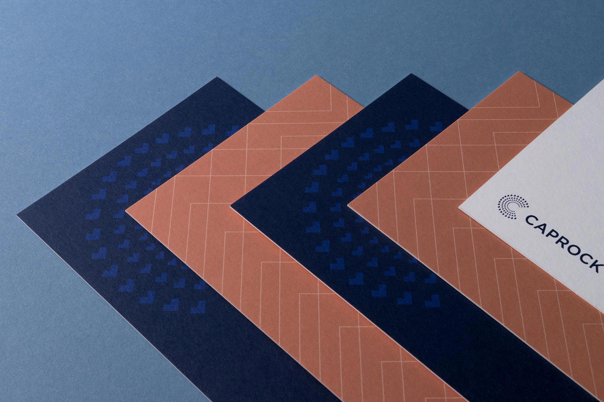
We kept their existing Navy and added copper to the color palette. Everything is printed on Colorplan patriot blue card stock, stamped with copper metallic foil that matches the color of shiny, new pennies. The arrows from the wordmark are used to create a visual system of forward-thinking patterns, motifs and icons.
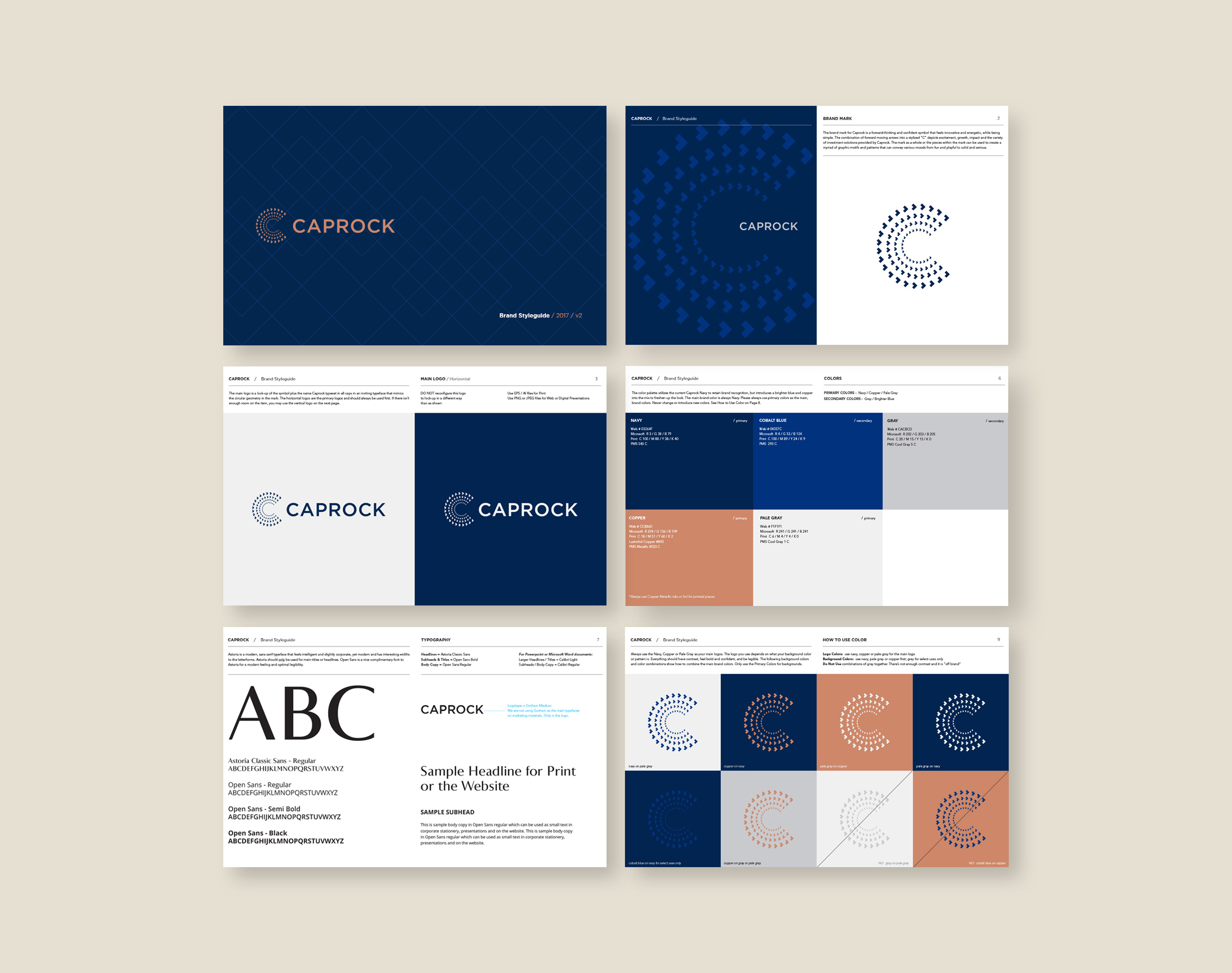
A Brand Styleguide keeps the identity cohesive by outlining rules for the logo, typography, color palette and graphic motifs.
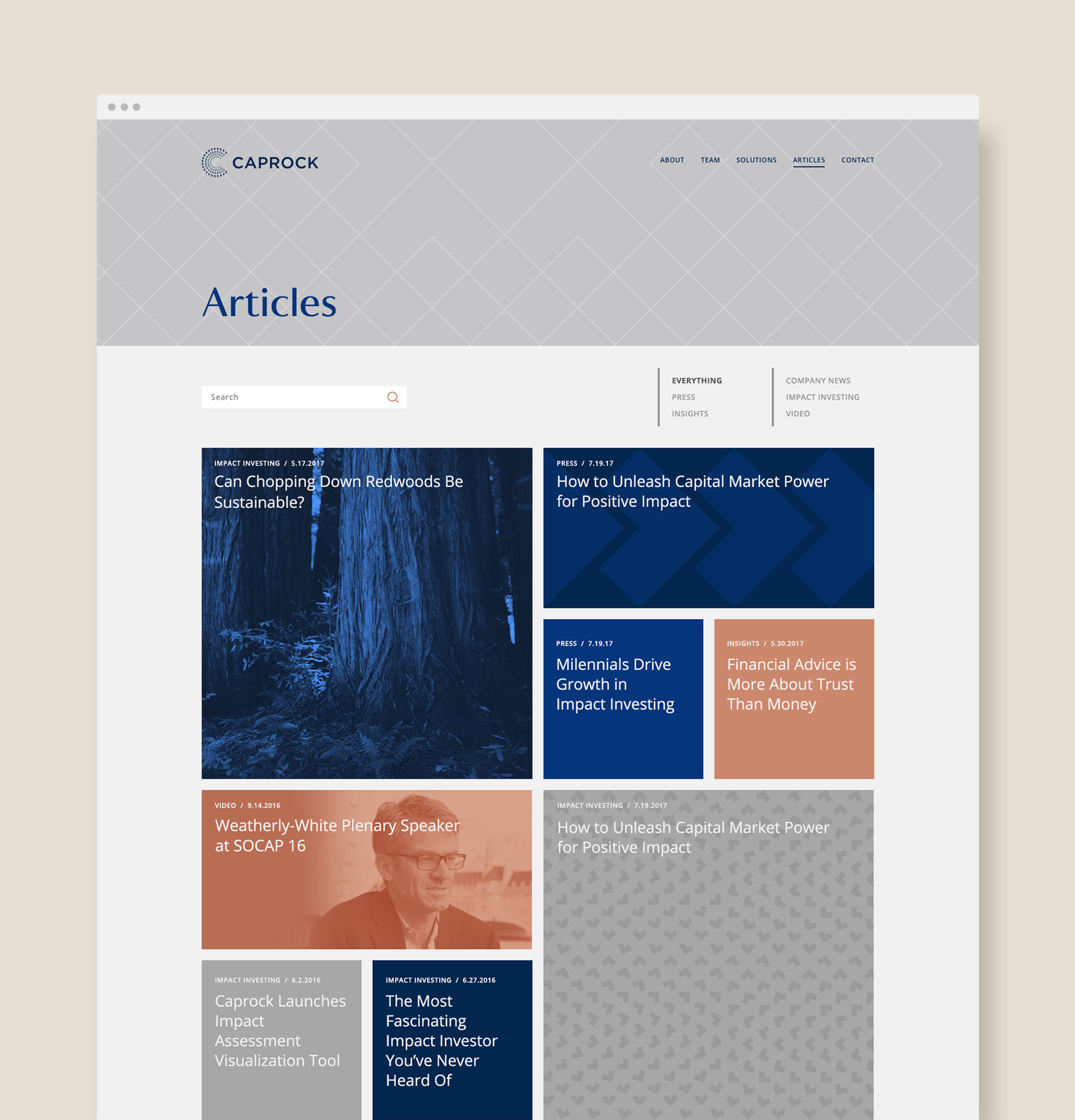
A customized, responsive website tells the story of Caprock using layered parallax graphics, immersive imagery and smart copy that gives a modern take on financial services.
Deliverables:
- Brand Identity
- Brand Guidelines
- Visual System
- Website Design
- Print Collateral
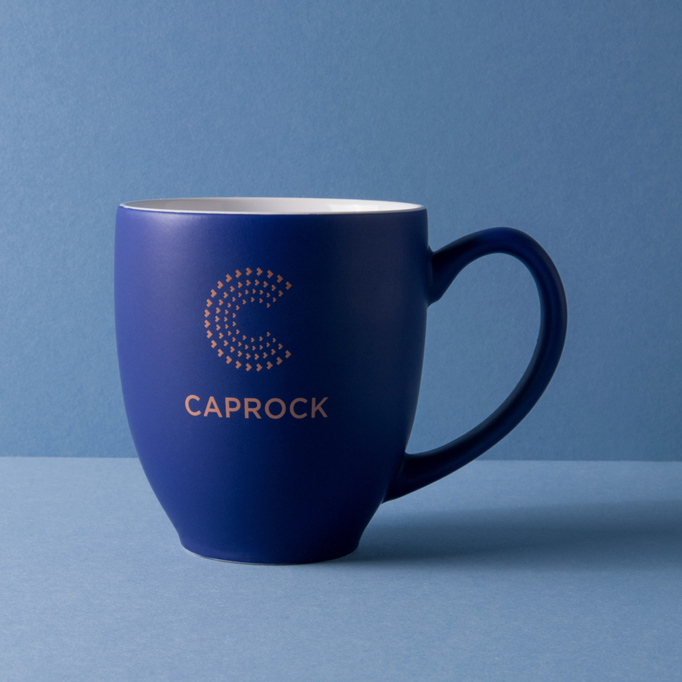
- Promotional Items
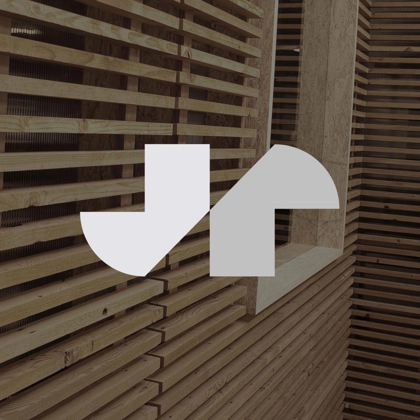
J+R Group
service / brand identity / website / print
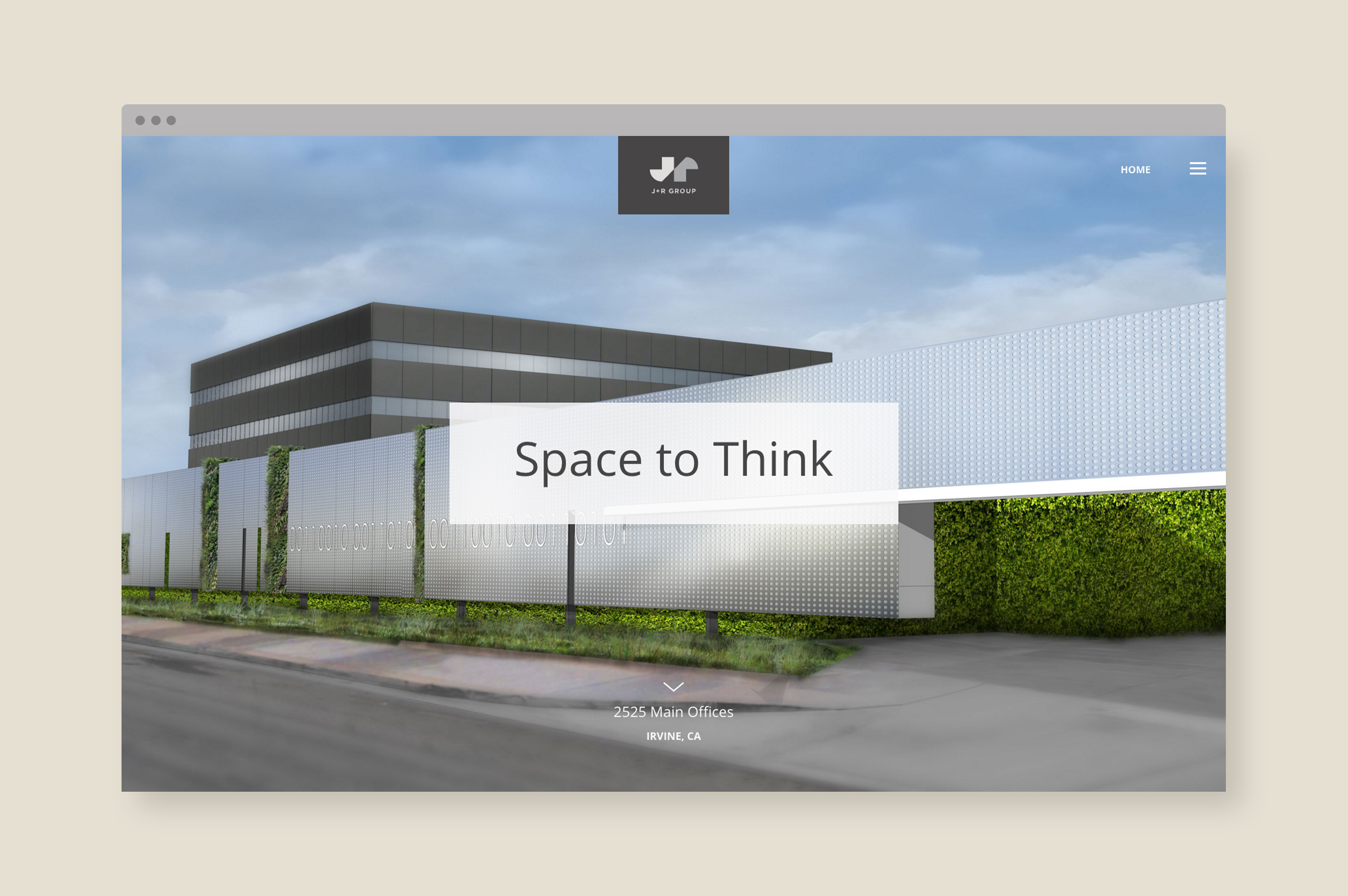
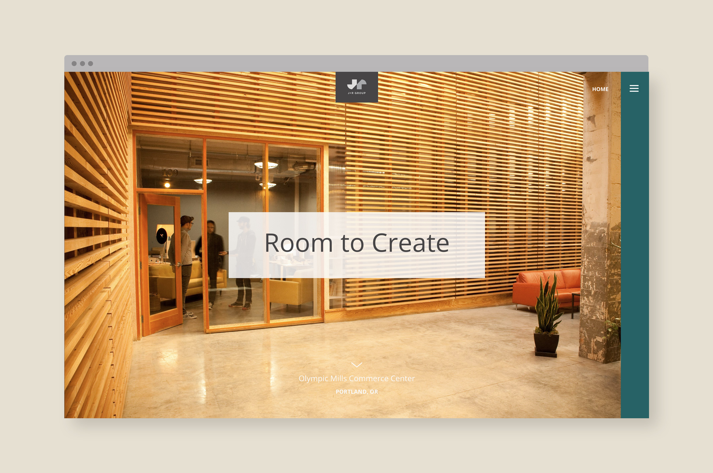
J+R Group sparks innovation through their commercial and residential properties
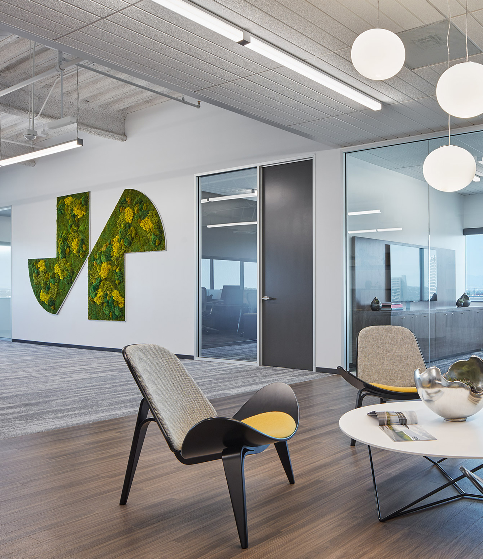
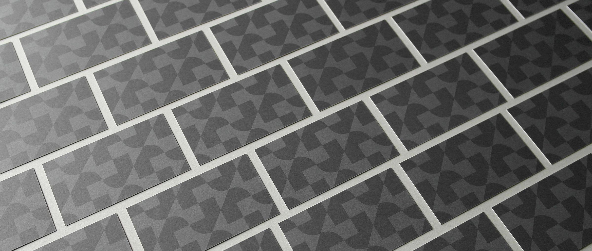
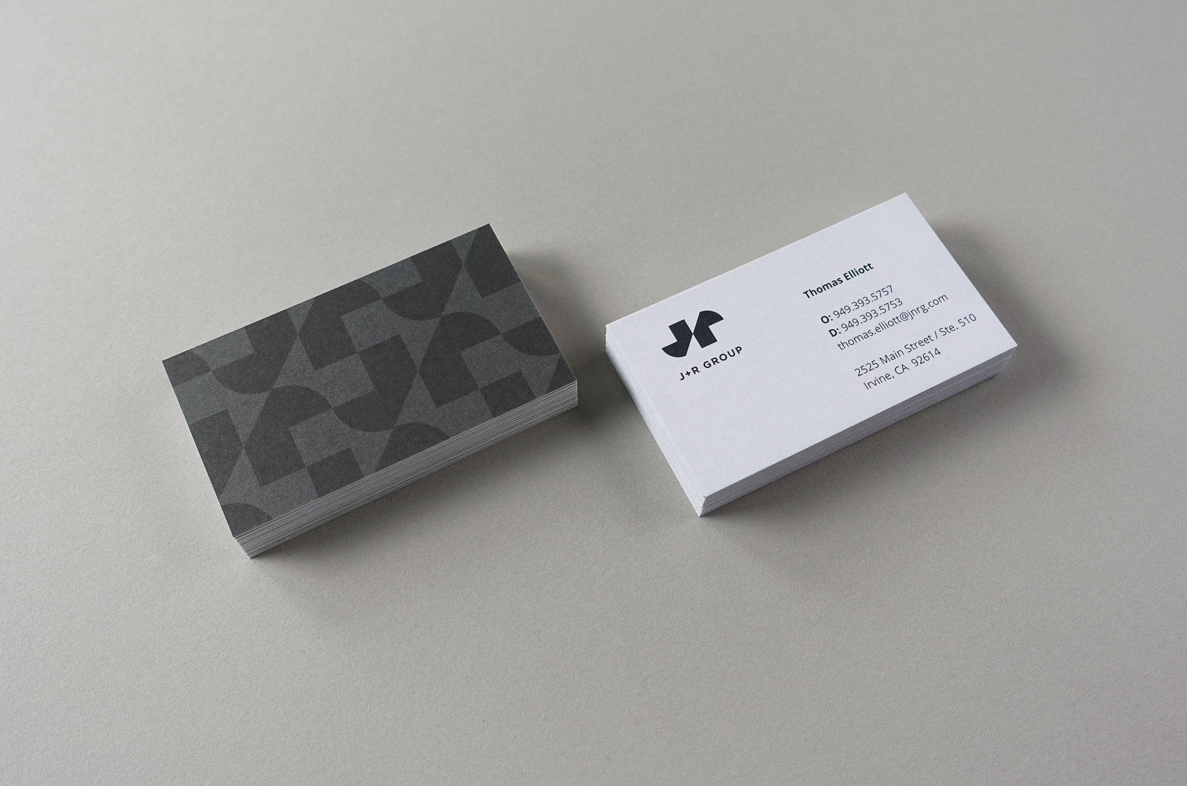
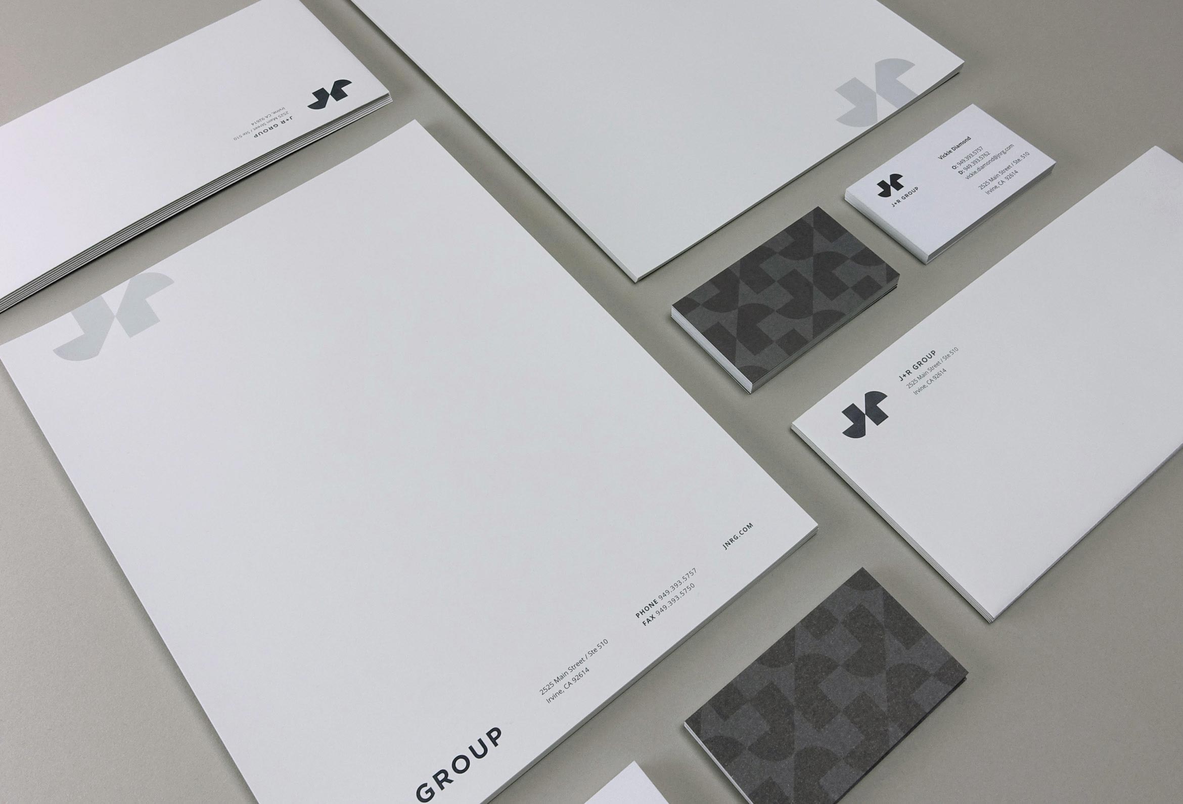
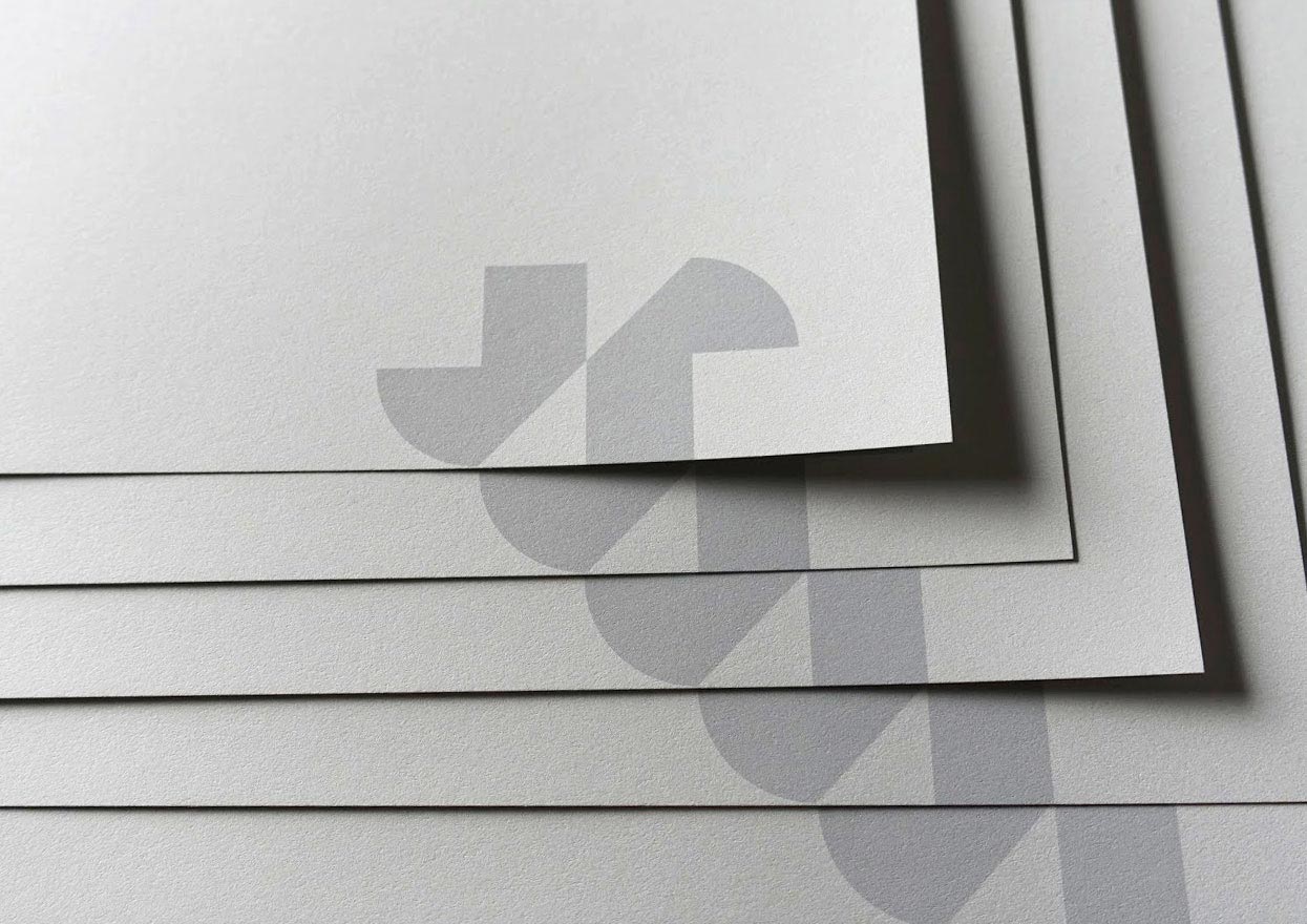
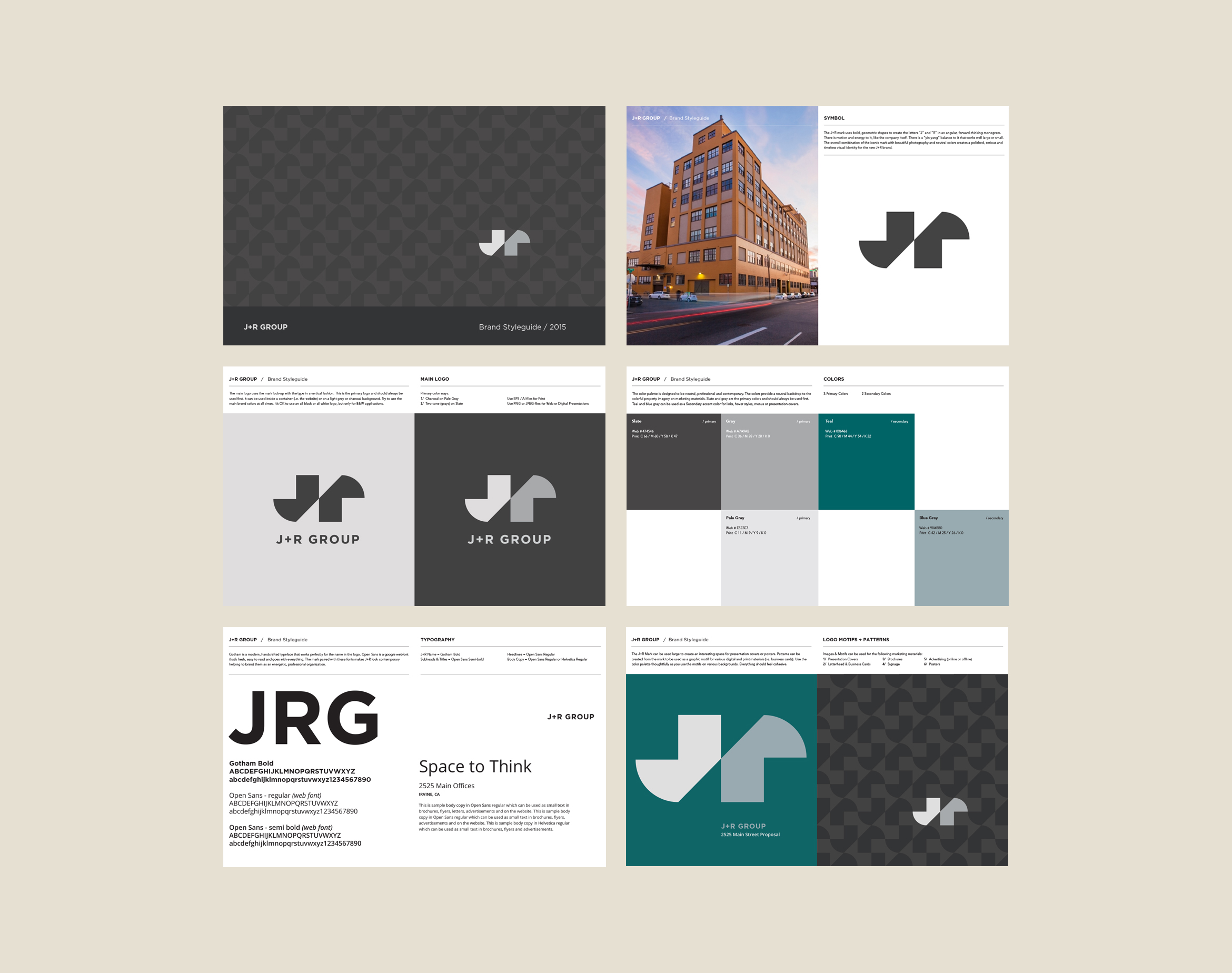
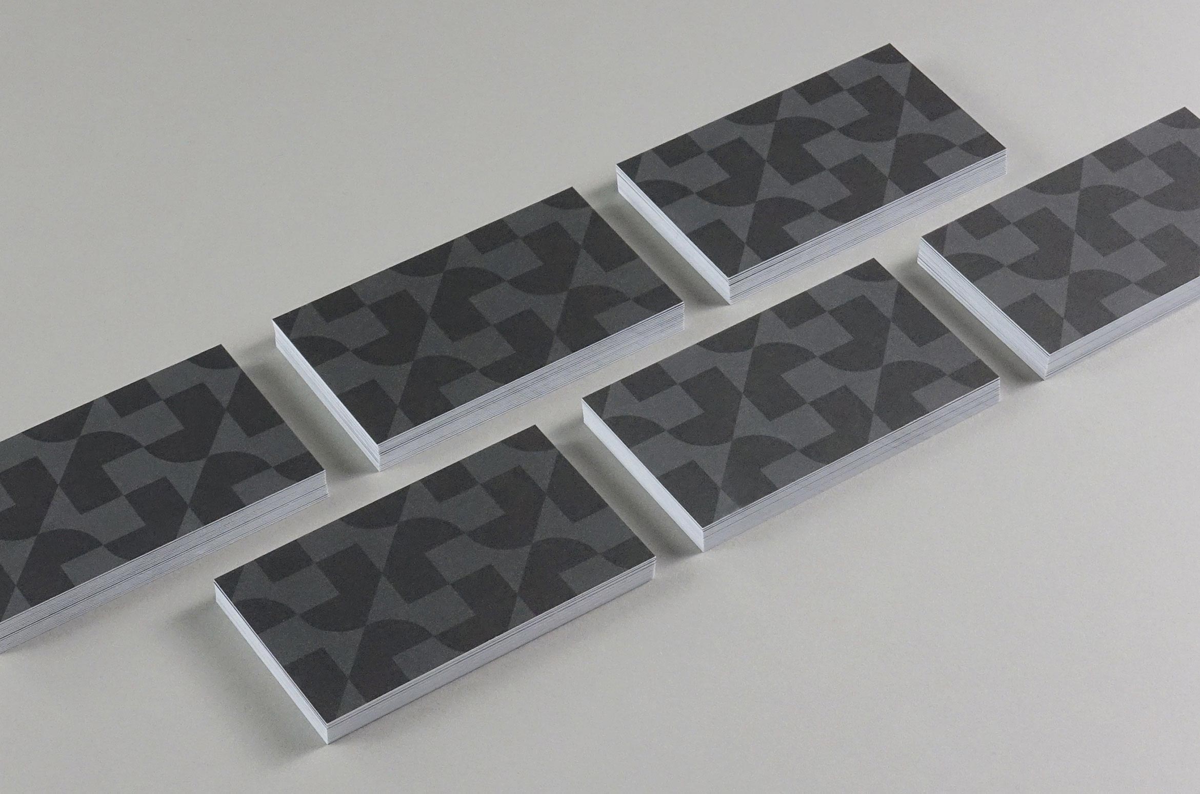
J+R Group cultivates commercial and residential properties across the Pacific Northwest and Southern California, offering sustainable and open design that helps shape their tenants’ creativity and vision. We designed their brand to be bold, energetic and polished like their philosophy. The geometric J and R letterforms create a mark that’s always moving forward and reflects their contemporary architecture style. Moss signage using the mark creates a branded environment in their own offices.
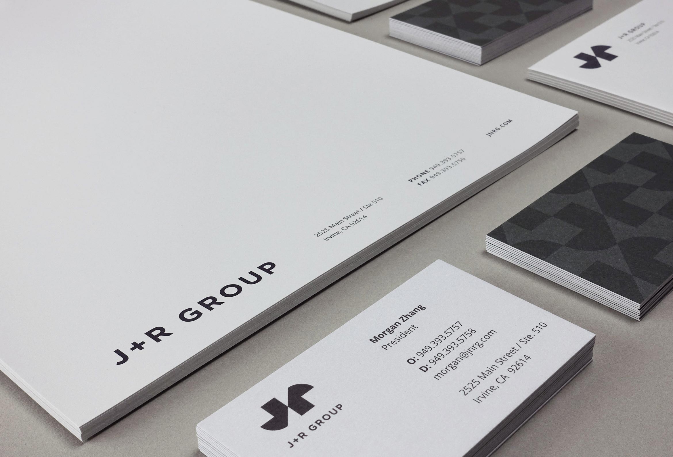
Corporate stationery was printed on antique gray paper using gray Pantone inks. A tone-on-tone repeating pattern on the cards creates a feeling of building which gives a striking first impression.
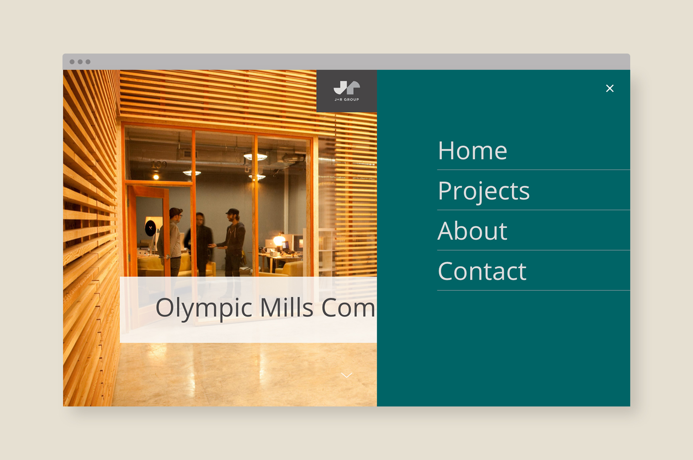
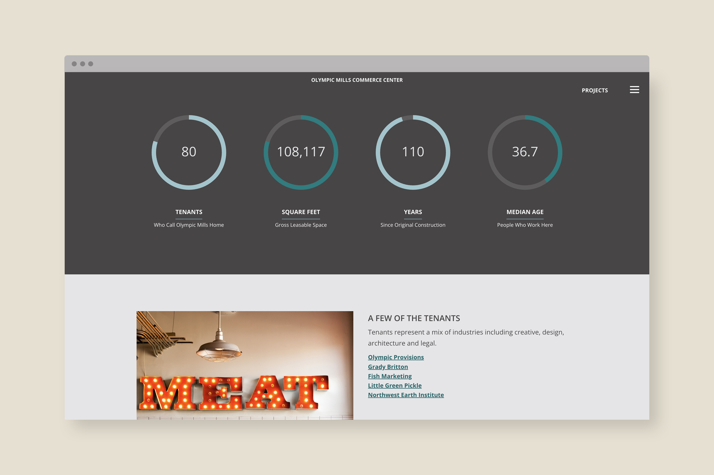
A dynamic website tells the story of each property through parallax animations, professional photography, renderings, property design details and data graphs.
A Brand Styleguide outlines rules for the identity system including logo lock-ups, color formulas, typography, photography and graphic motifs. The guide is an important tool in creating brand cohesion.
Deliverables:
- Brand Identity
- Brand Guidelines
- Corporate Stationery
- Website Design
- Web Development
- Copywriting
Echo Capital Group
finance / brand identity / collateral
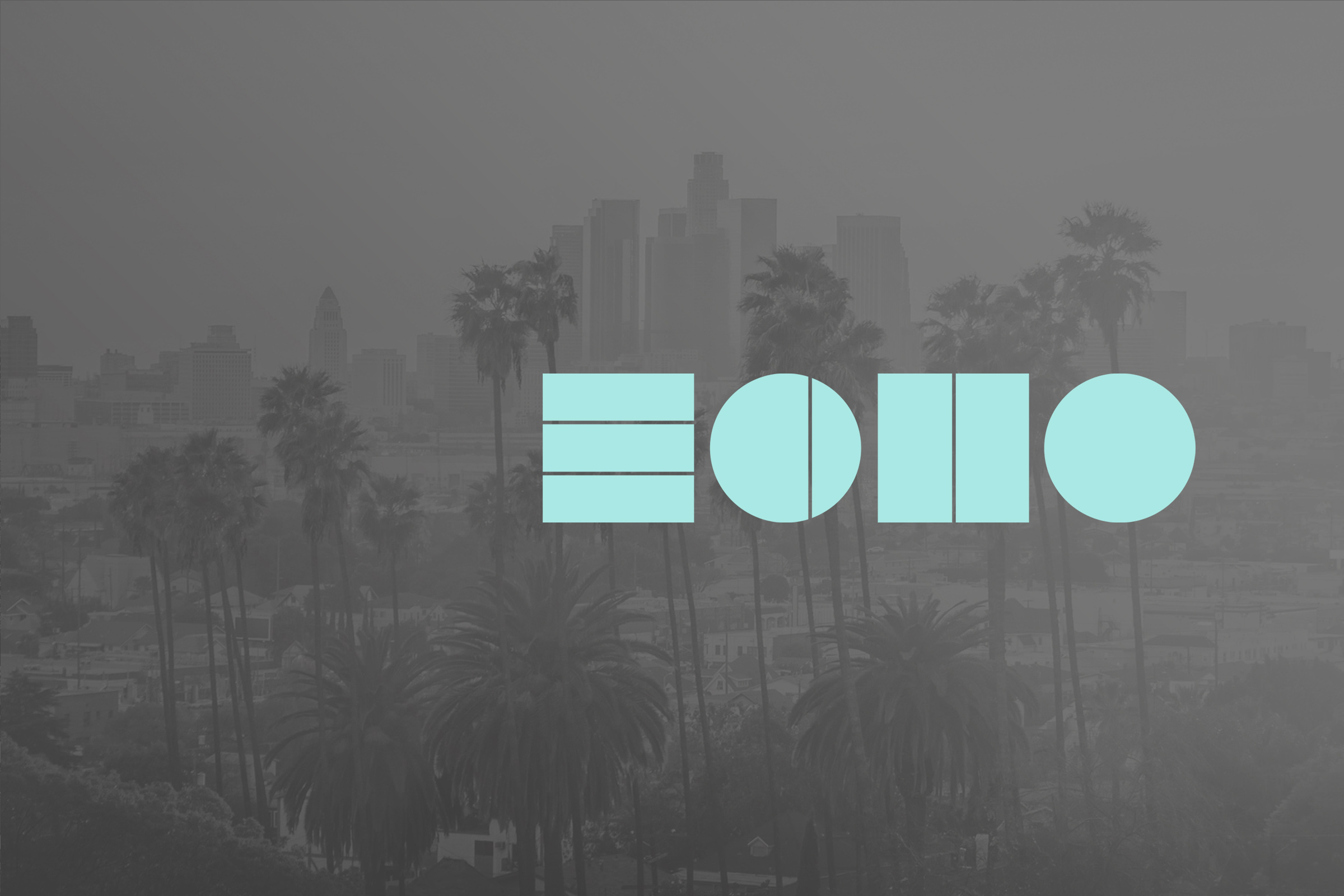
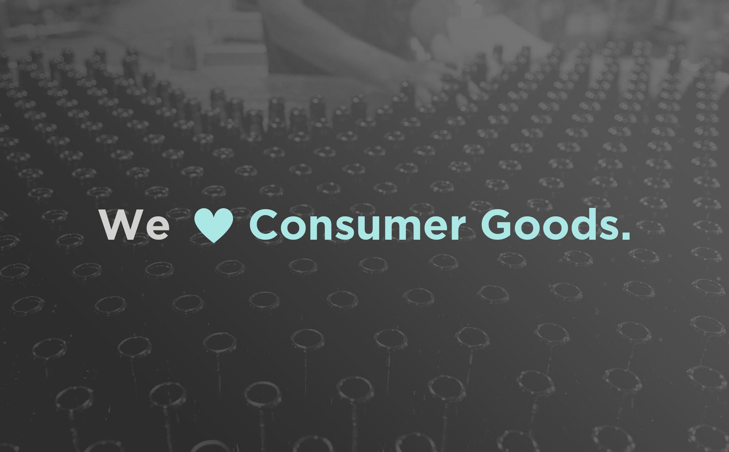
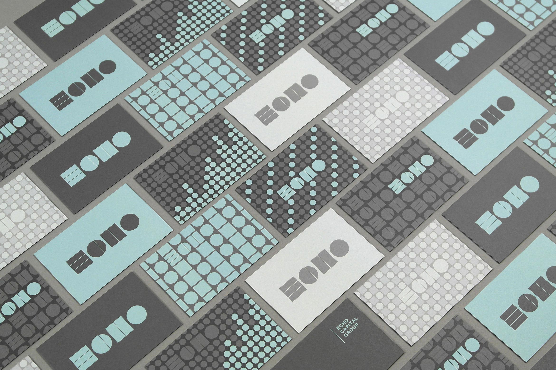
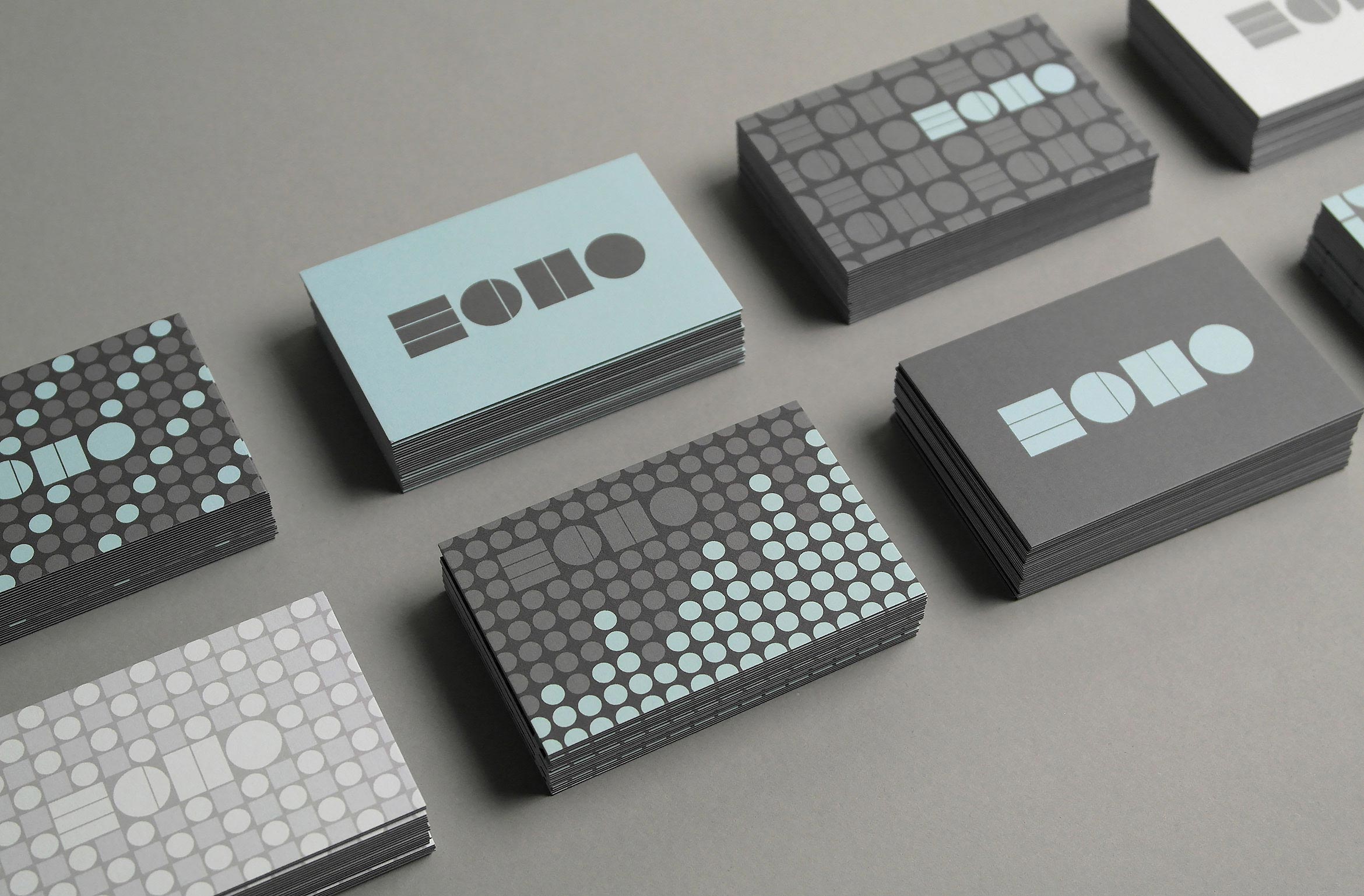
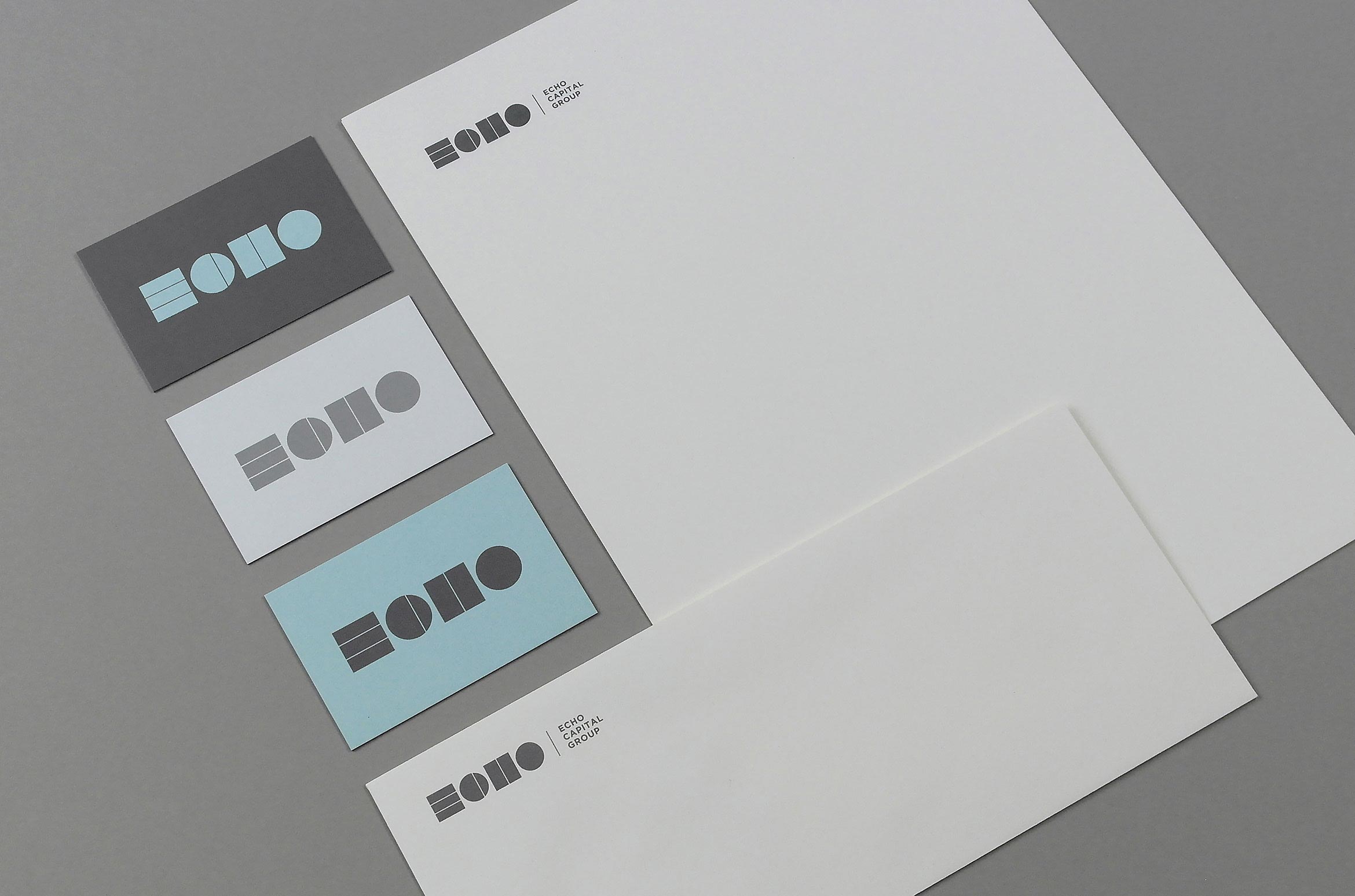
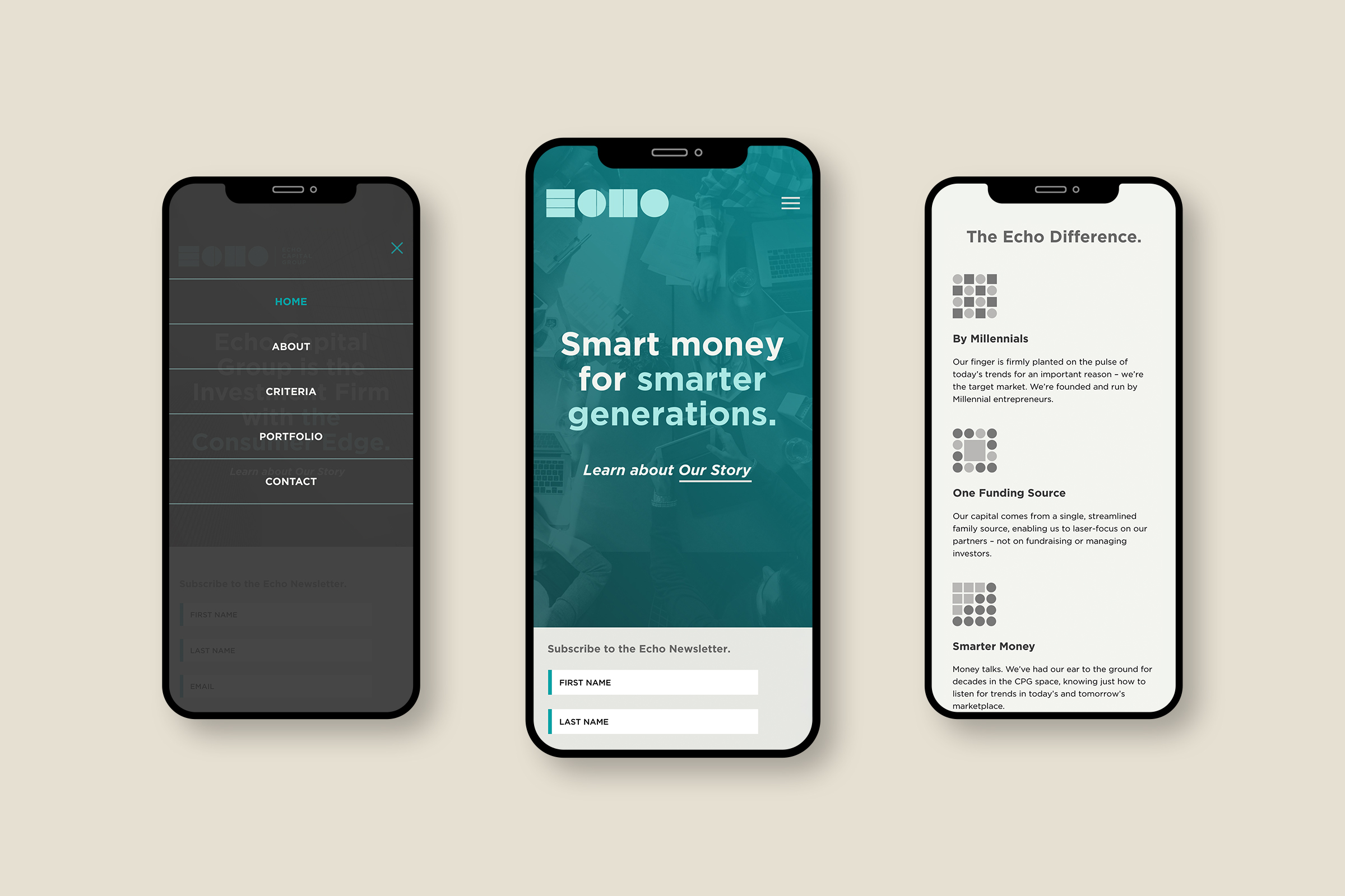
Echo Capital Group is an investment firm for Millennial entrepreneurs

Located in Denver and Los Angeles, Echo Capital Group is an Investment Firm for Millennial entrepreneurs in the Consumer Packaged Goods space. They wanted a brand identity that reflected their forward-thinking edge while maintaining a very professional image. The Avant-garde feeling stays away from “echo cliches” and gives them a unique presence in the financial industry.
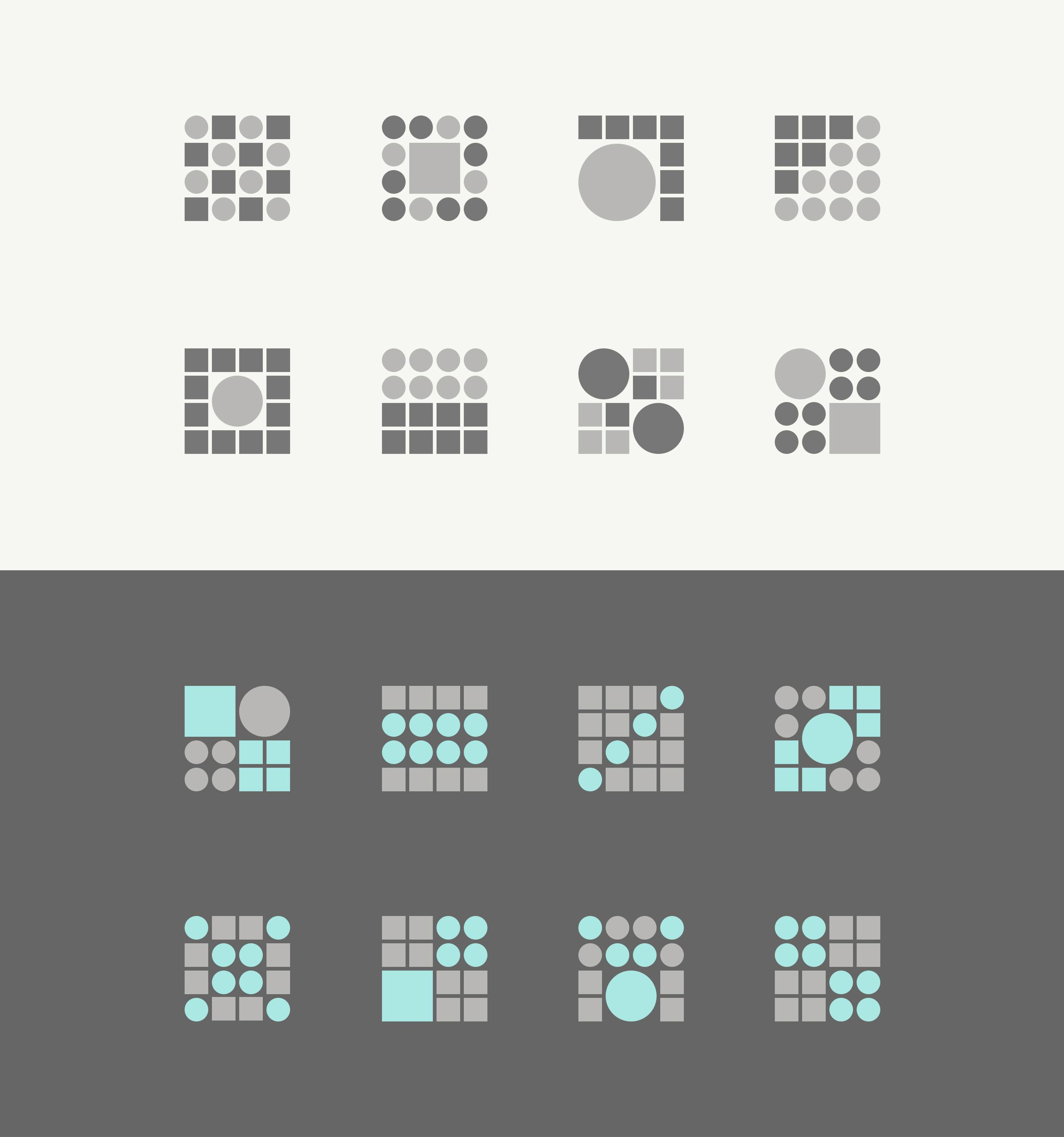
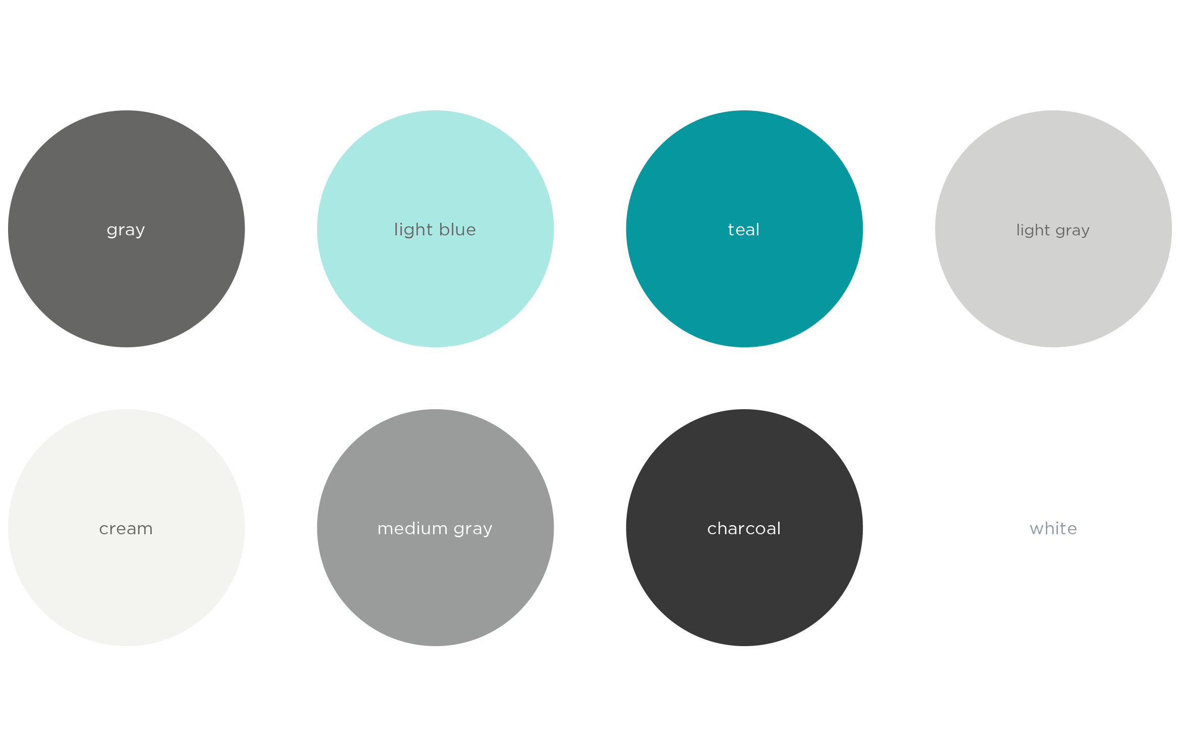
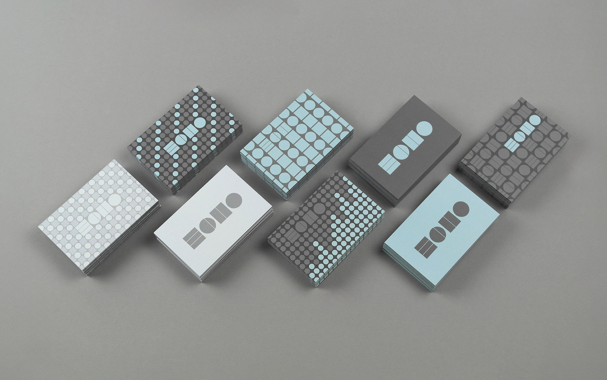
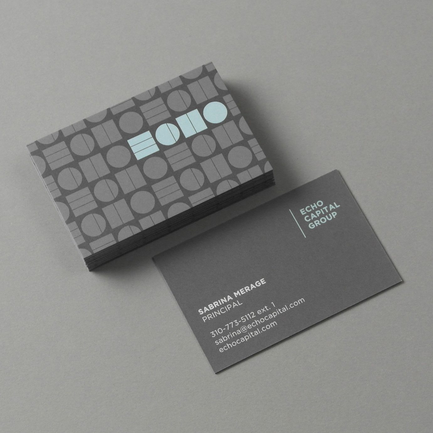
Simple shapes and unique colors create the repeating ECHO letterforms in the name, while the circles and squares lend themselves naturally to a system of patterns and icons. Together the visual identity feels like data, bar graphs or sums.
The responsive website utilizes scroll activated HTML5 animations, smart copy and immersive, entrepreneurial imagery colorized using the brand color palette.
Deliverables:
- Brand Identity
- Visual System
- Print Collateral
- Web Design
- Animated Icons
- Copywriting