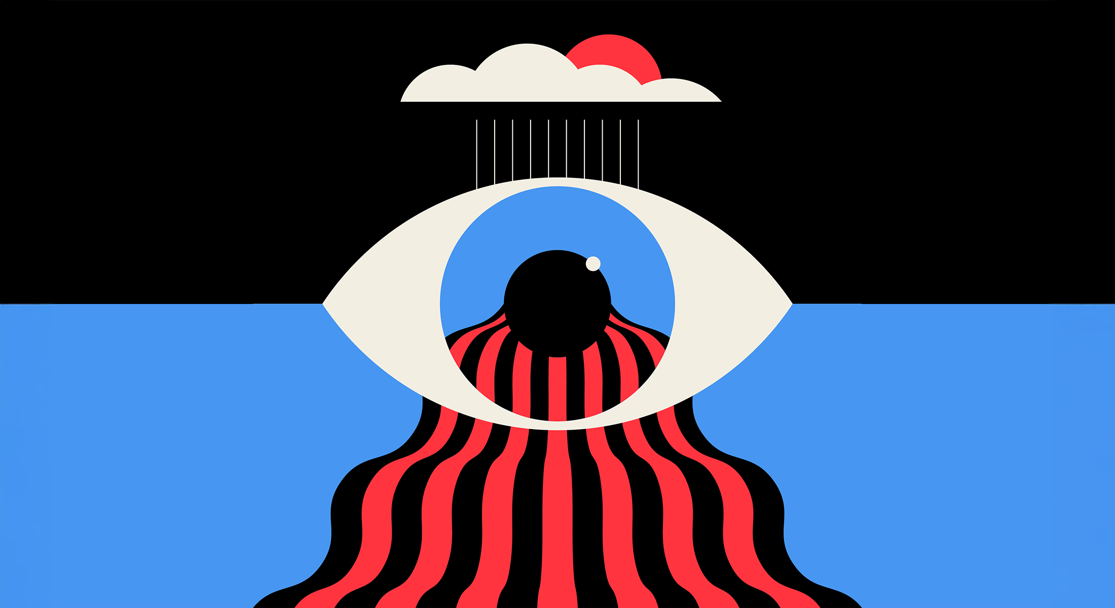
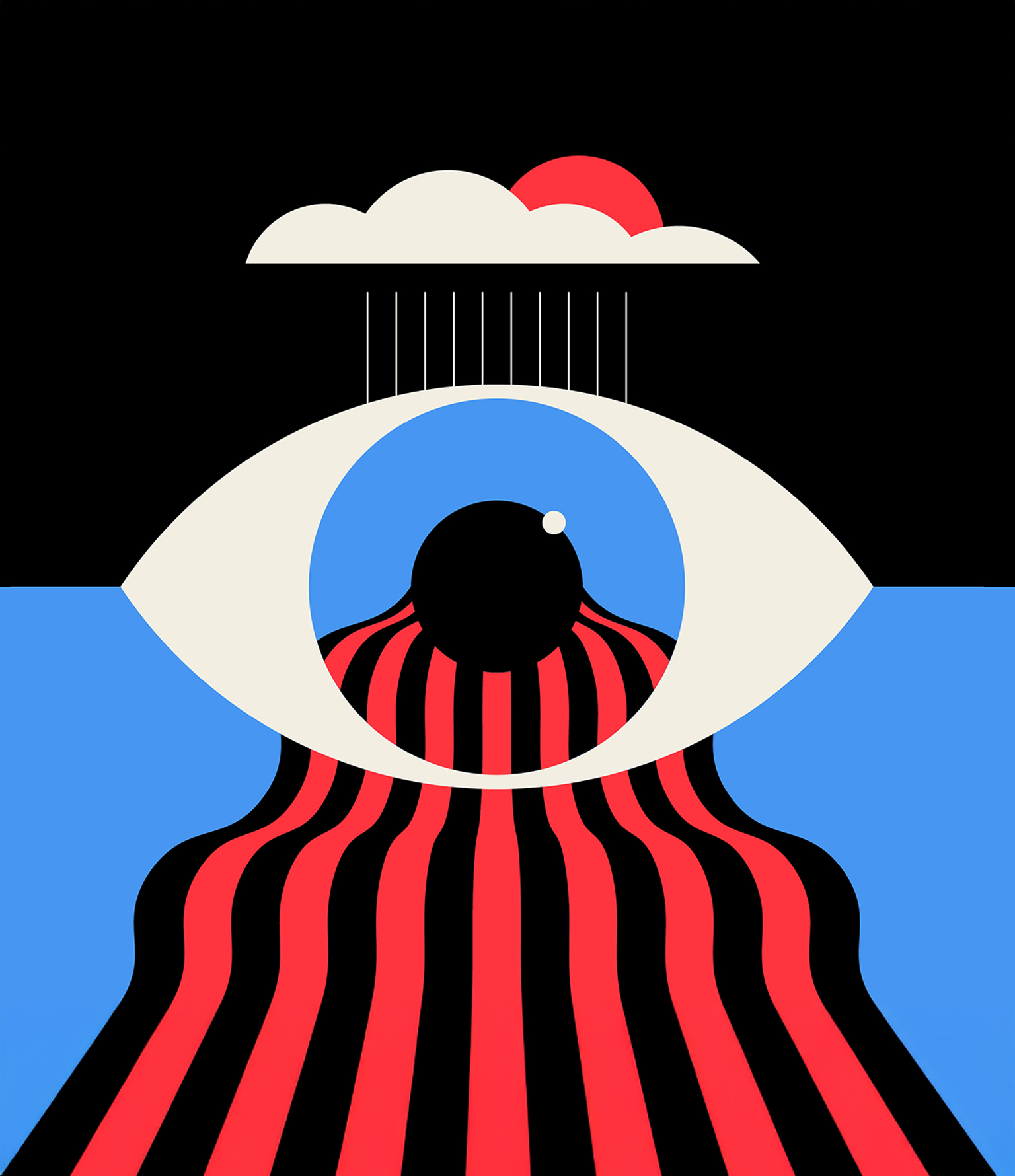
Lyric Video for a new song by OK Go
A Good, Good Day At Last by OK Go is about moving from darkness into light; from despair into hope. In this lyric video, illustrated by Adam G, dark and ominous artwork sets the scene of uncertainty and angst as the story transitions into something more colorful, vibrant and celebratory, becoming a good, good day at last.
Photo of OK Go by Piper Ferguson
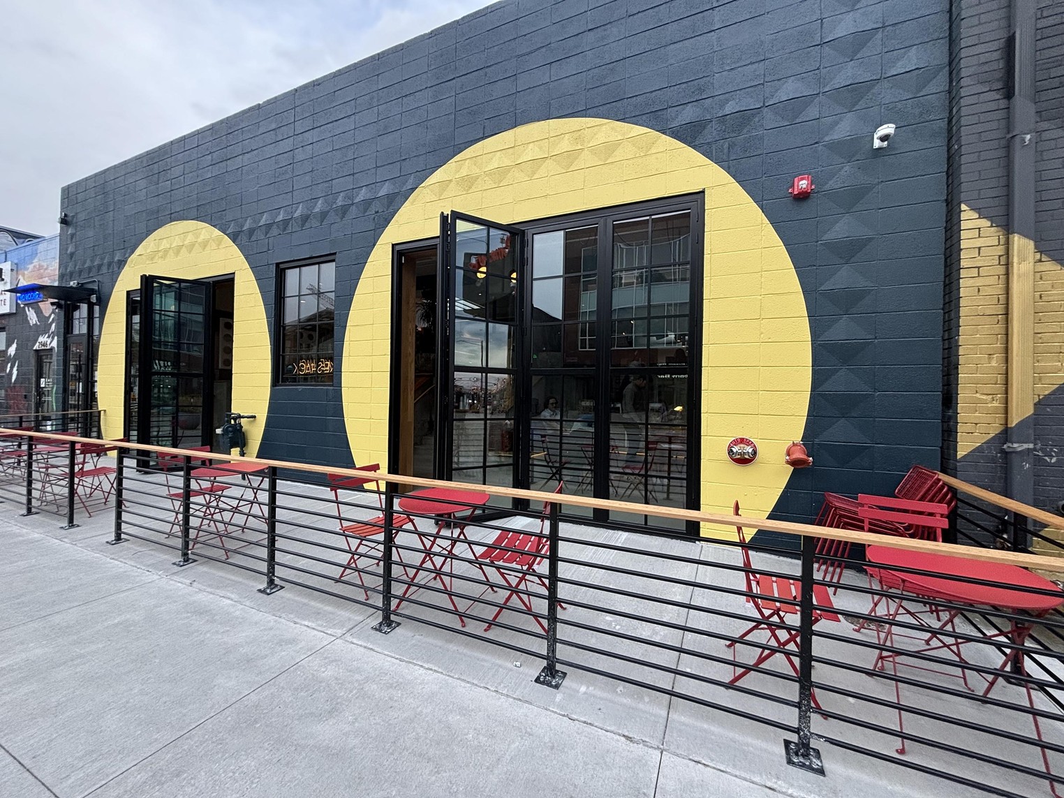
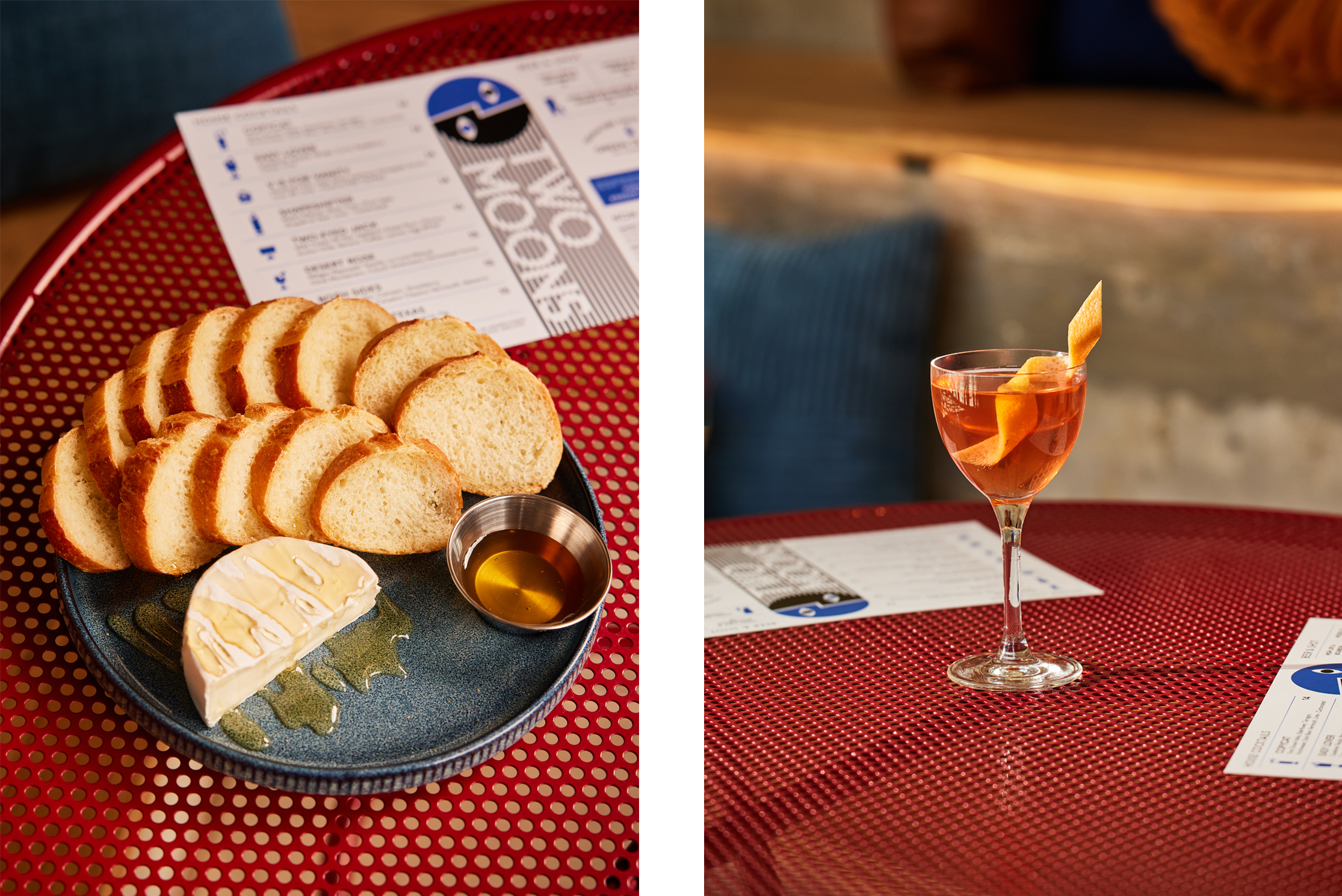
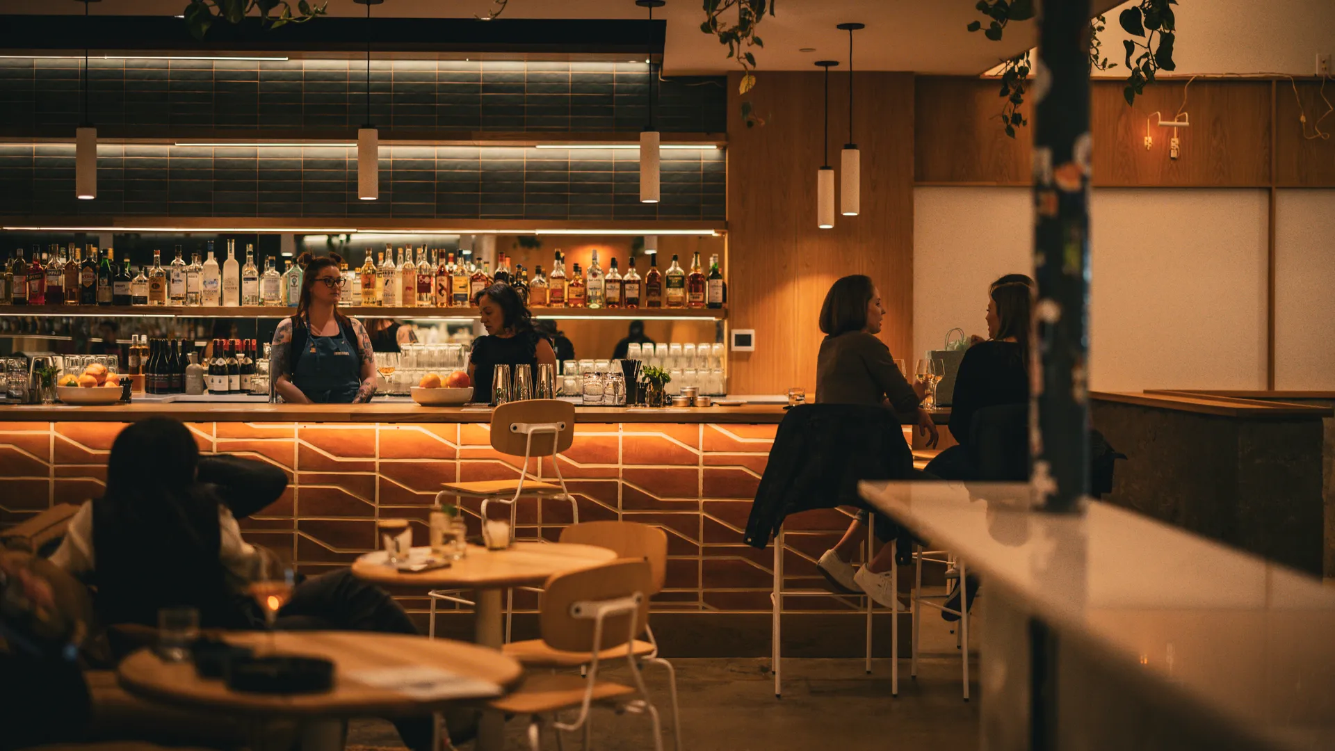
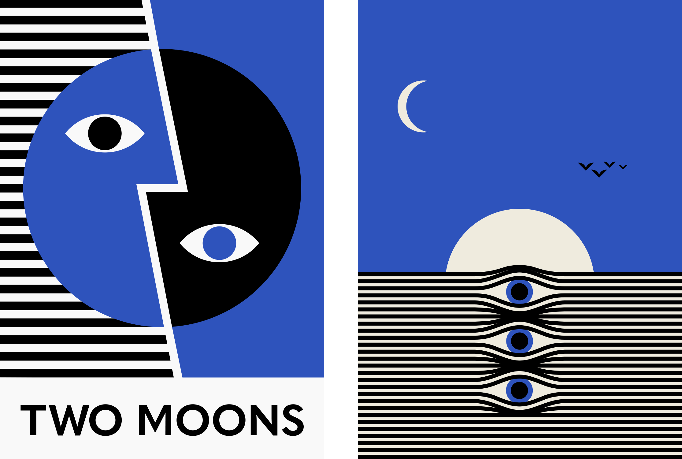
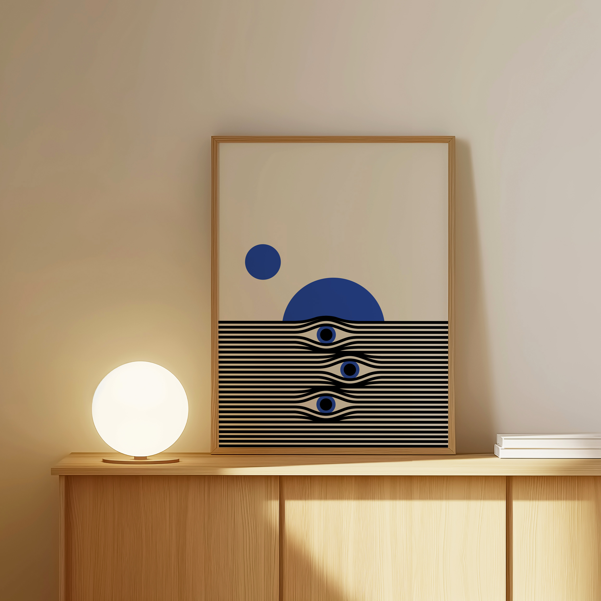
Two Moons Music Hall
Arts & Media / Brand Identity
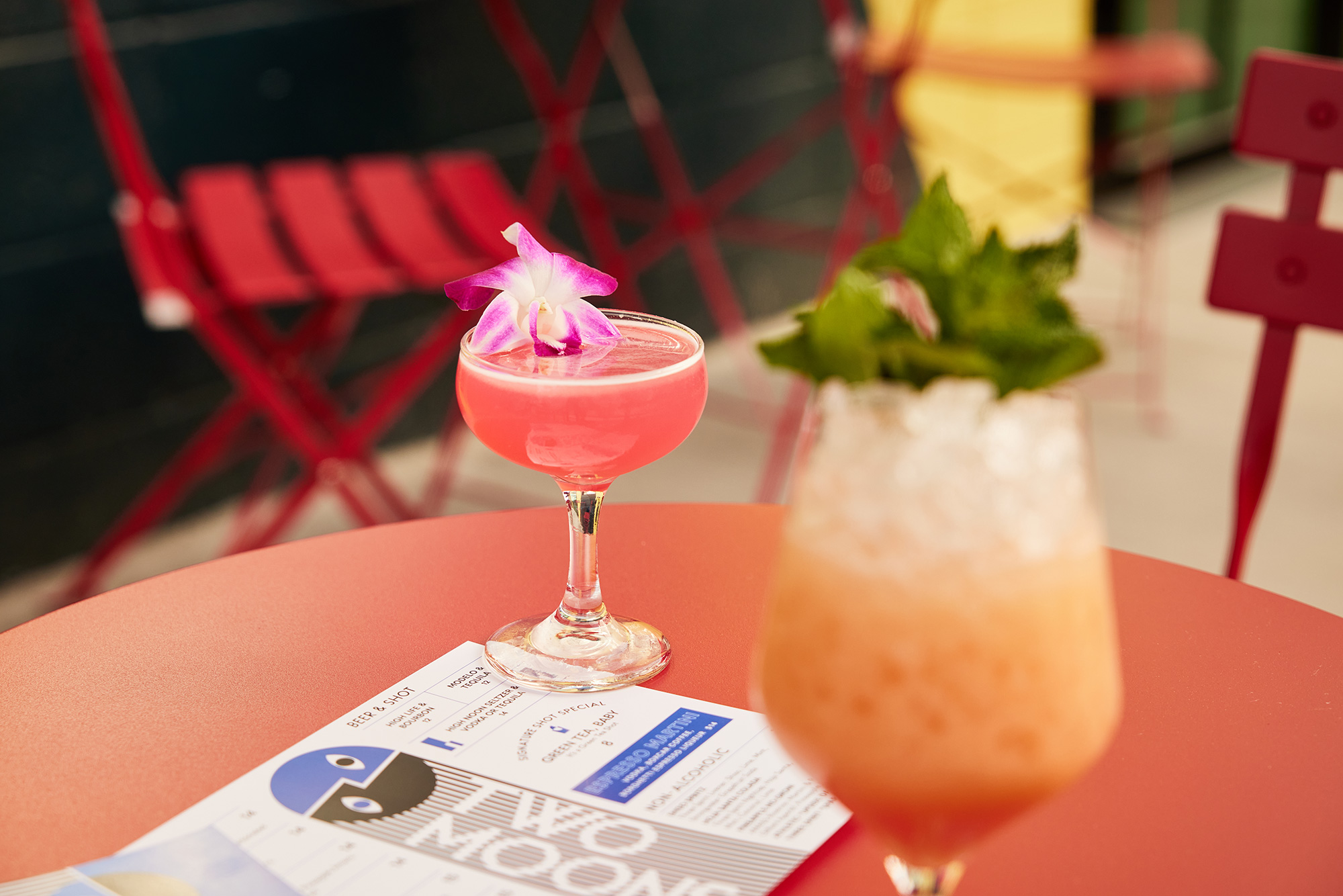
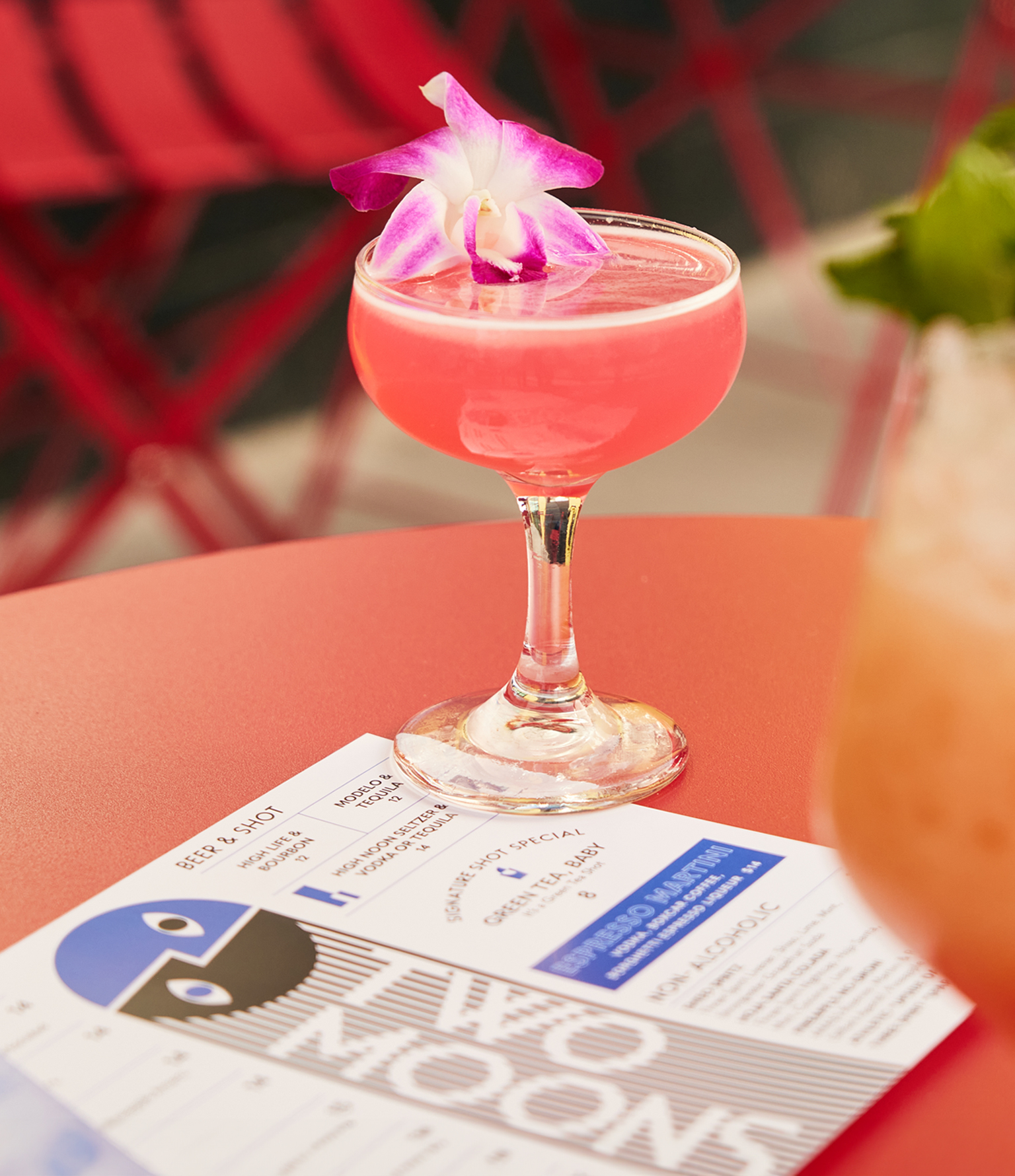
Two Moons is Denver’s new hotspot for live music and craft cocktails.
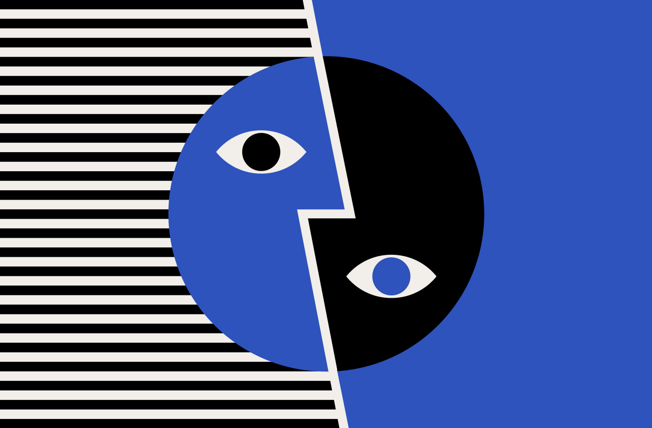
Two Moons Music Hall is a live music venue located in River North Arts District (RiNo) in Denver, CO. Pearl Street Hospitality transformed this former warehouse into a relaxed music lounge offering craft cocktails, coffee, light bites and featuring a diverse array of local indie artists all week long.
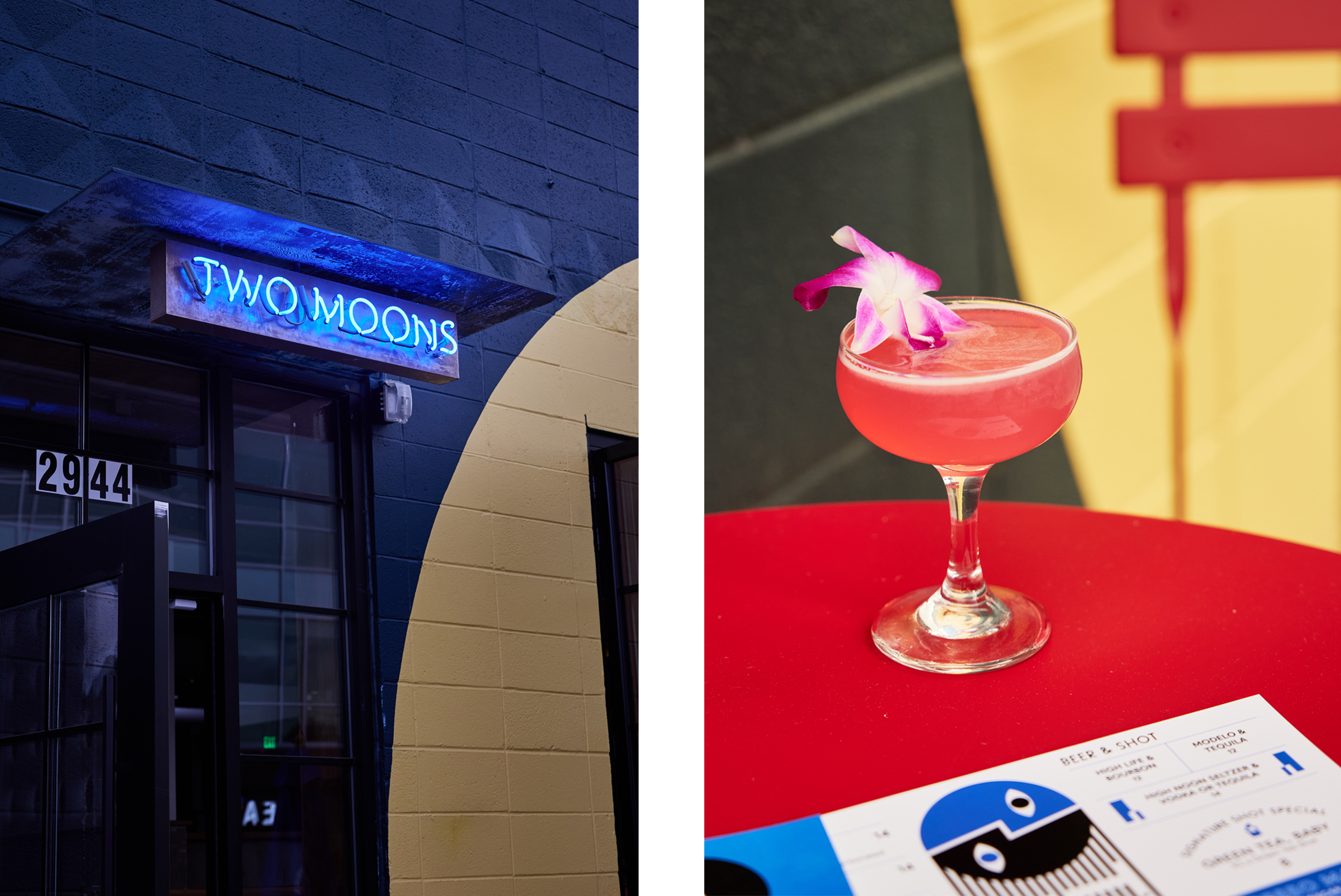
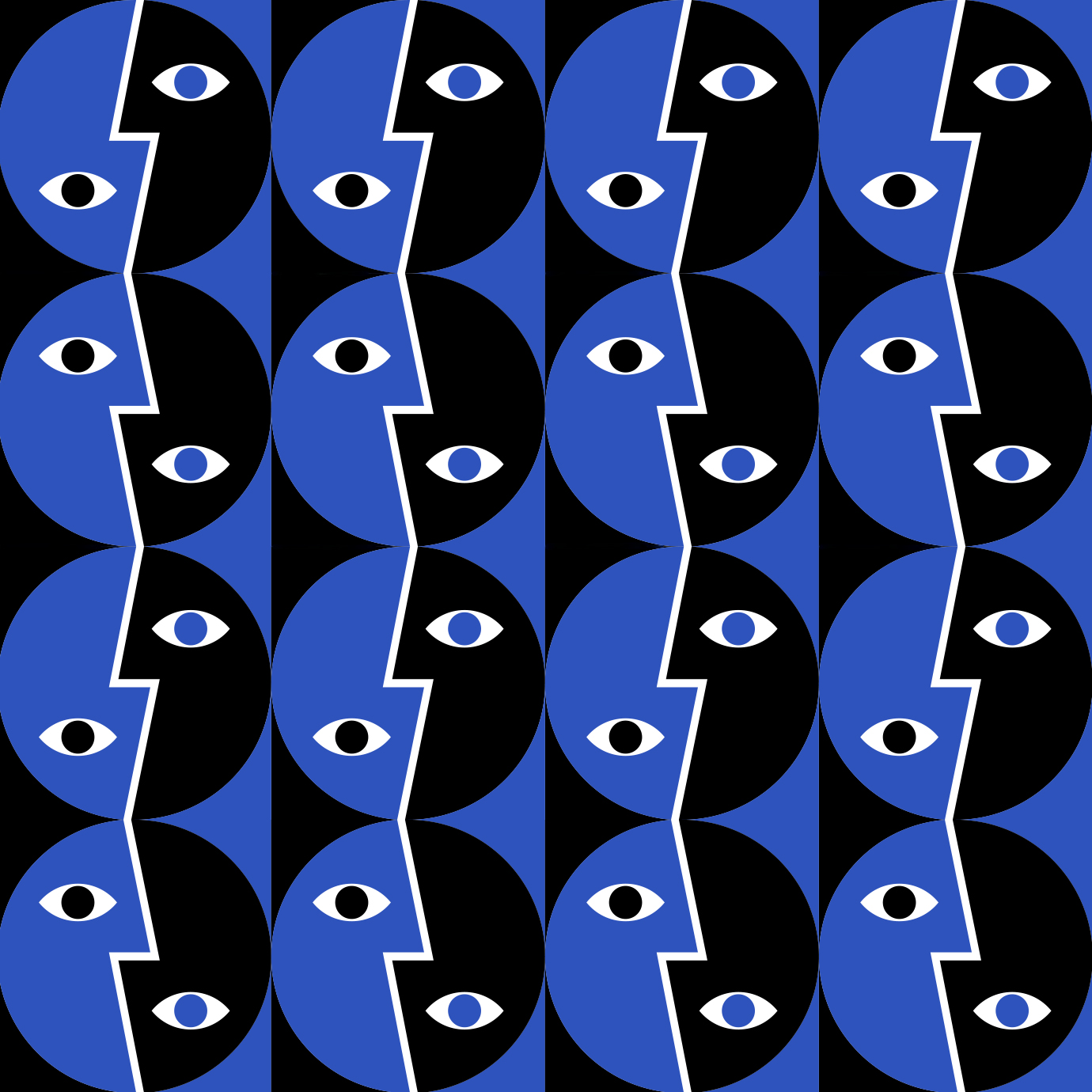
The brand identity features a stylized, modernist mark where two moons become one. Supporting graphics, patterns and fine art prints were also created to compliment the visual look for use on the menus, website and announcements.
Photography by Shawn Campbell
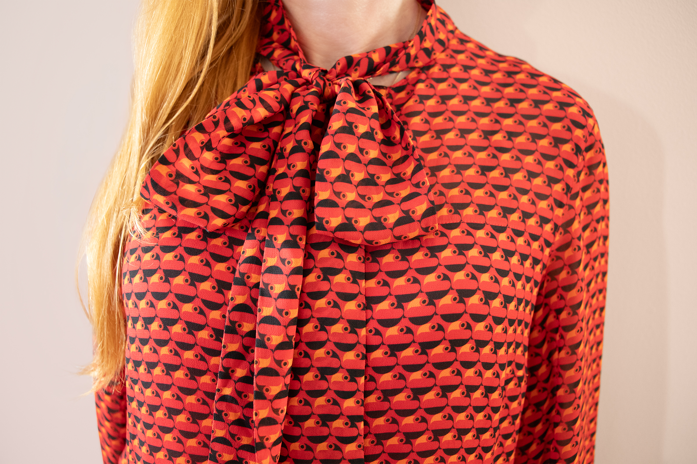
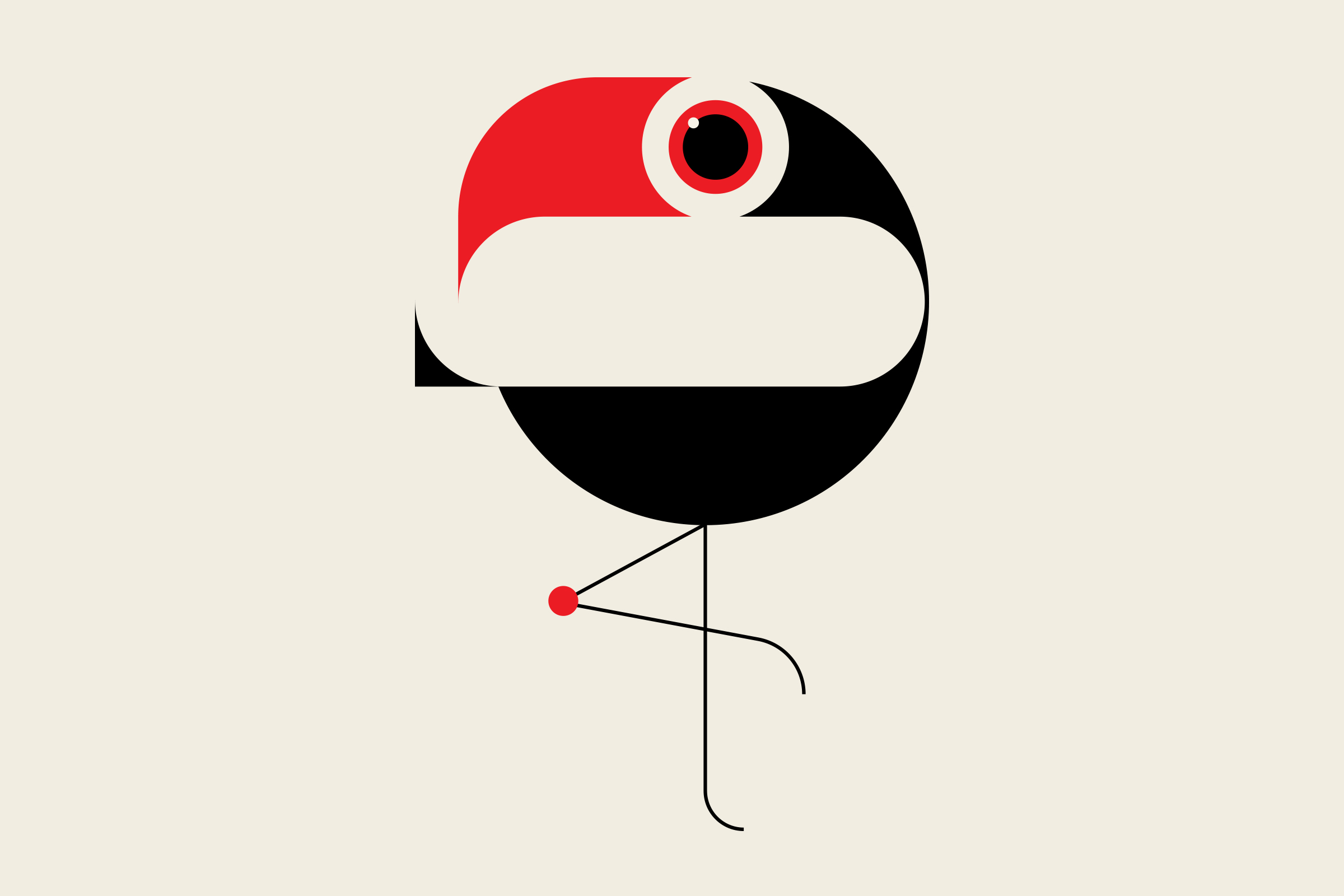
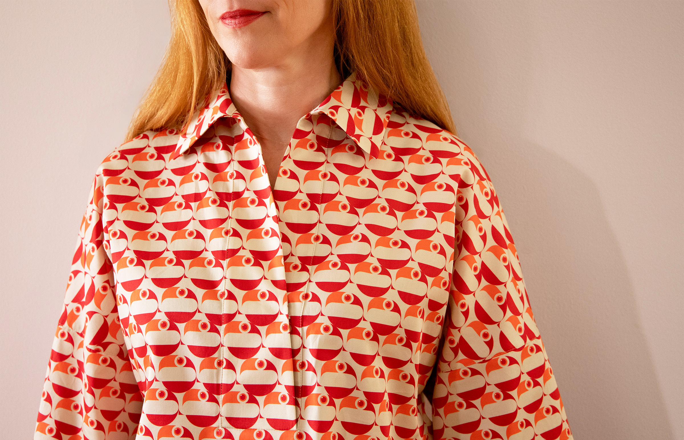
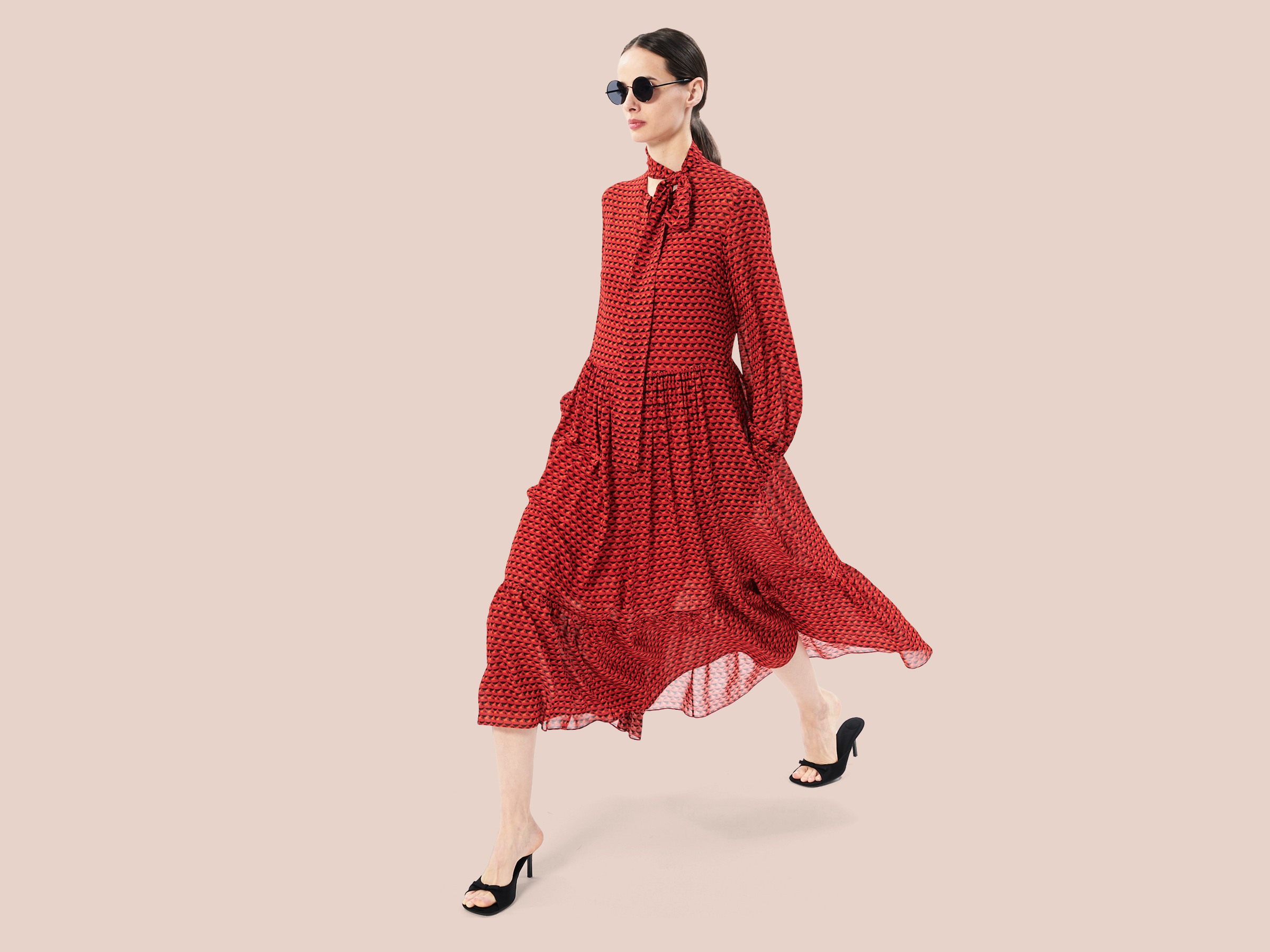
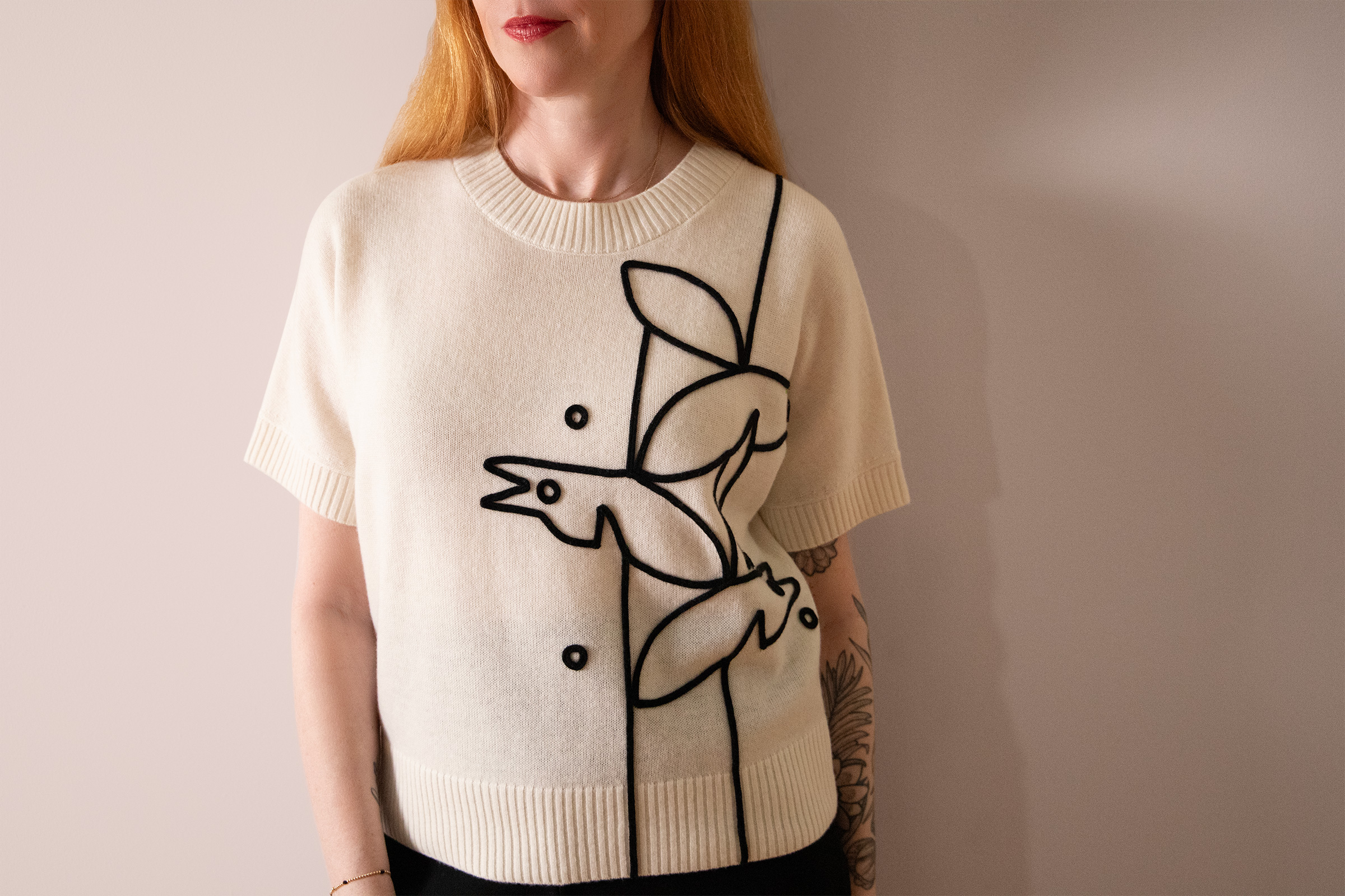
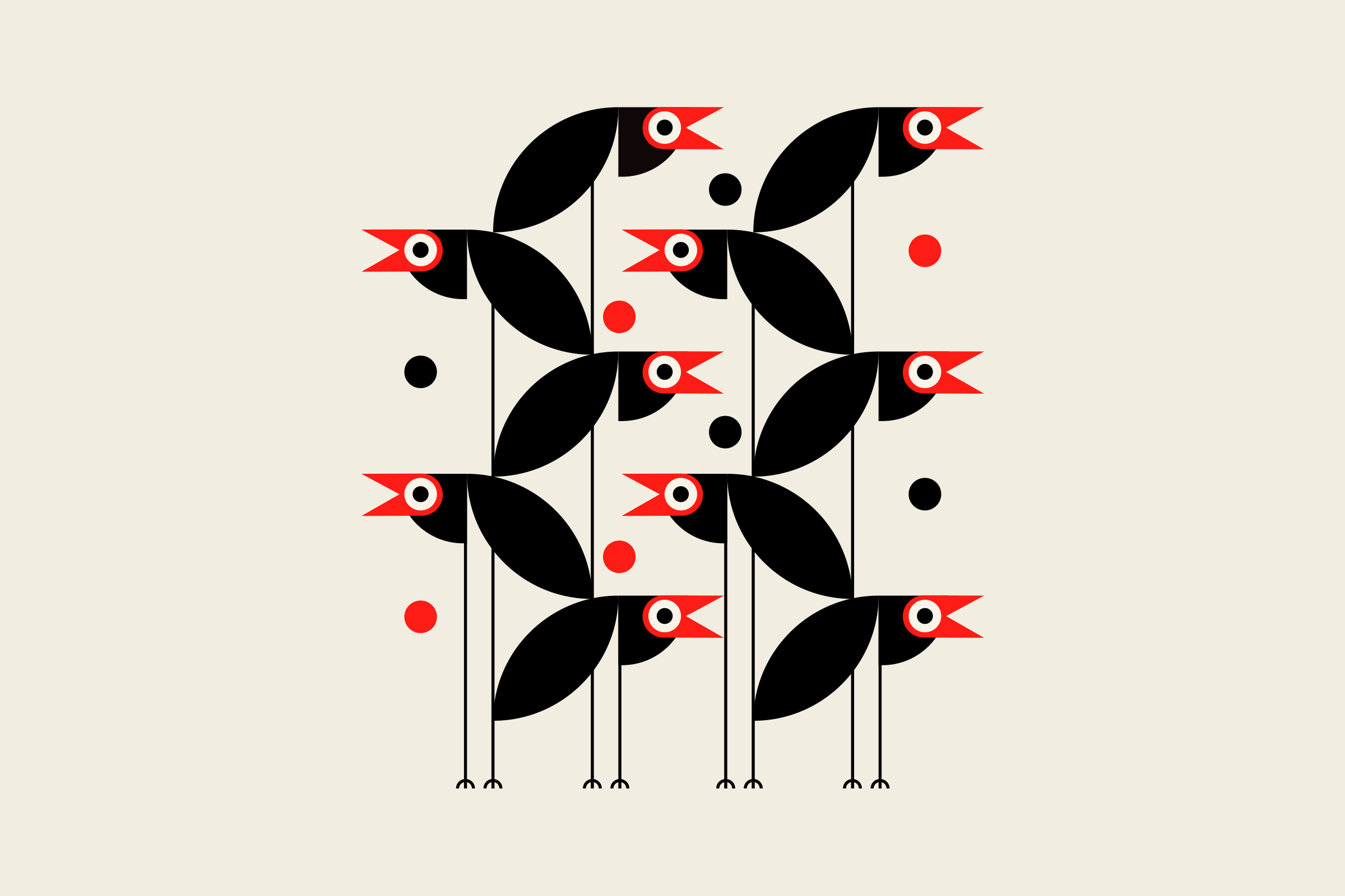
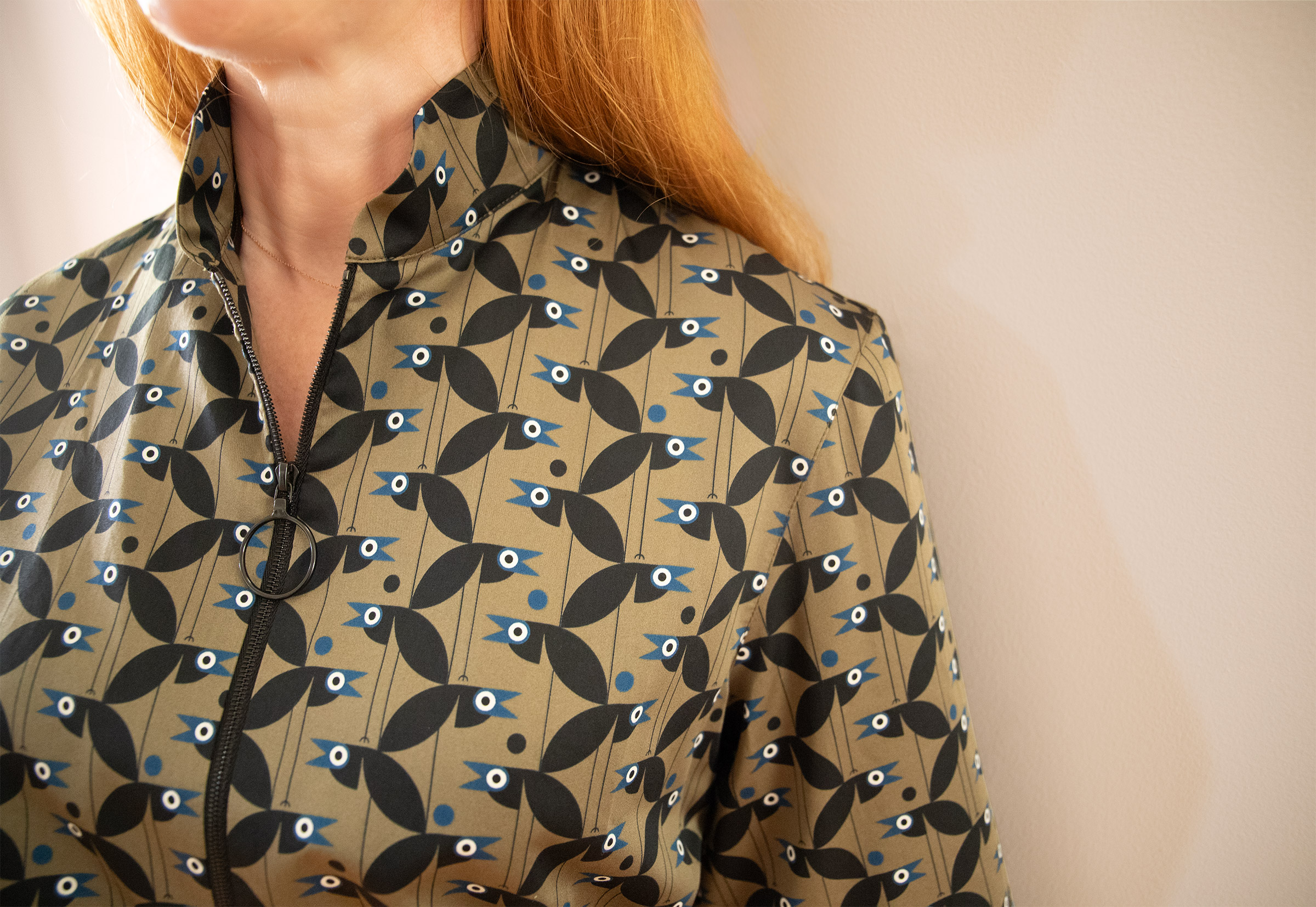
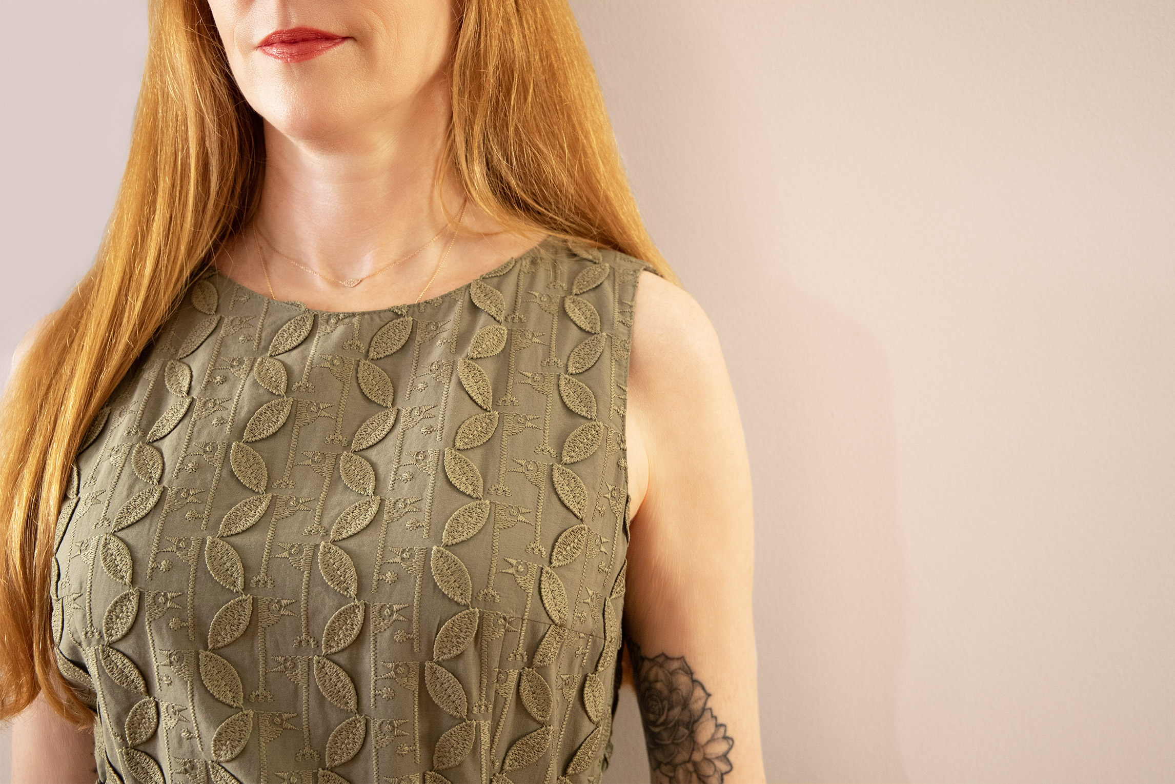
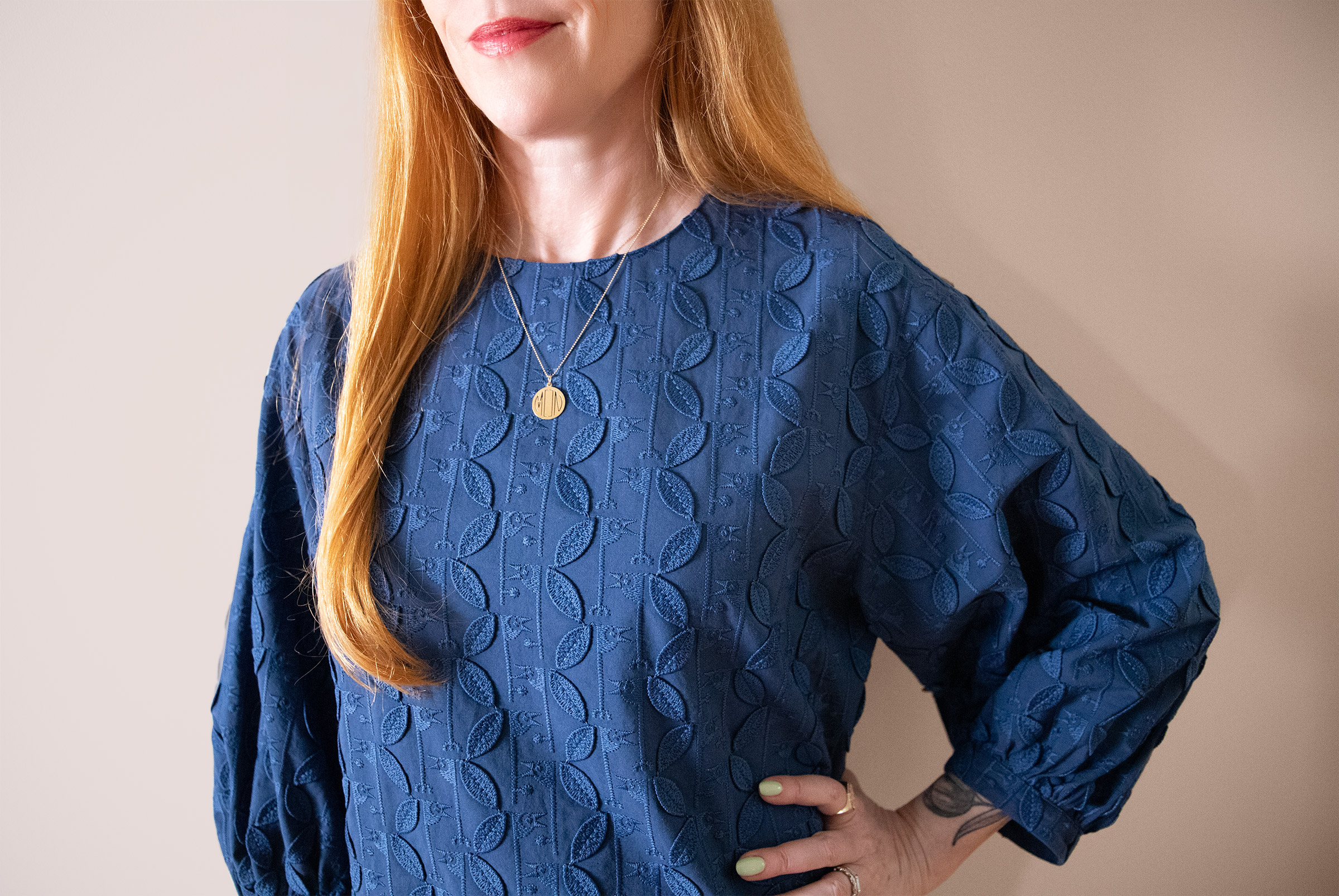
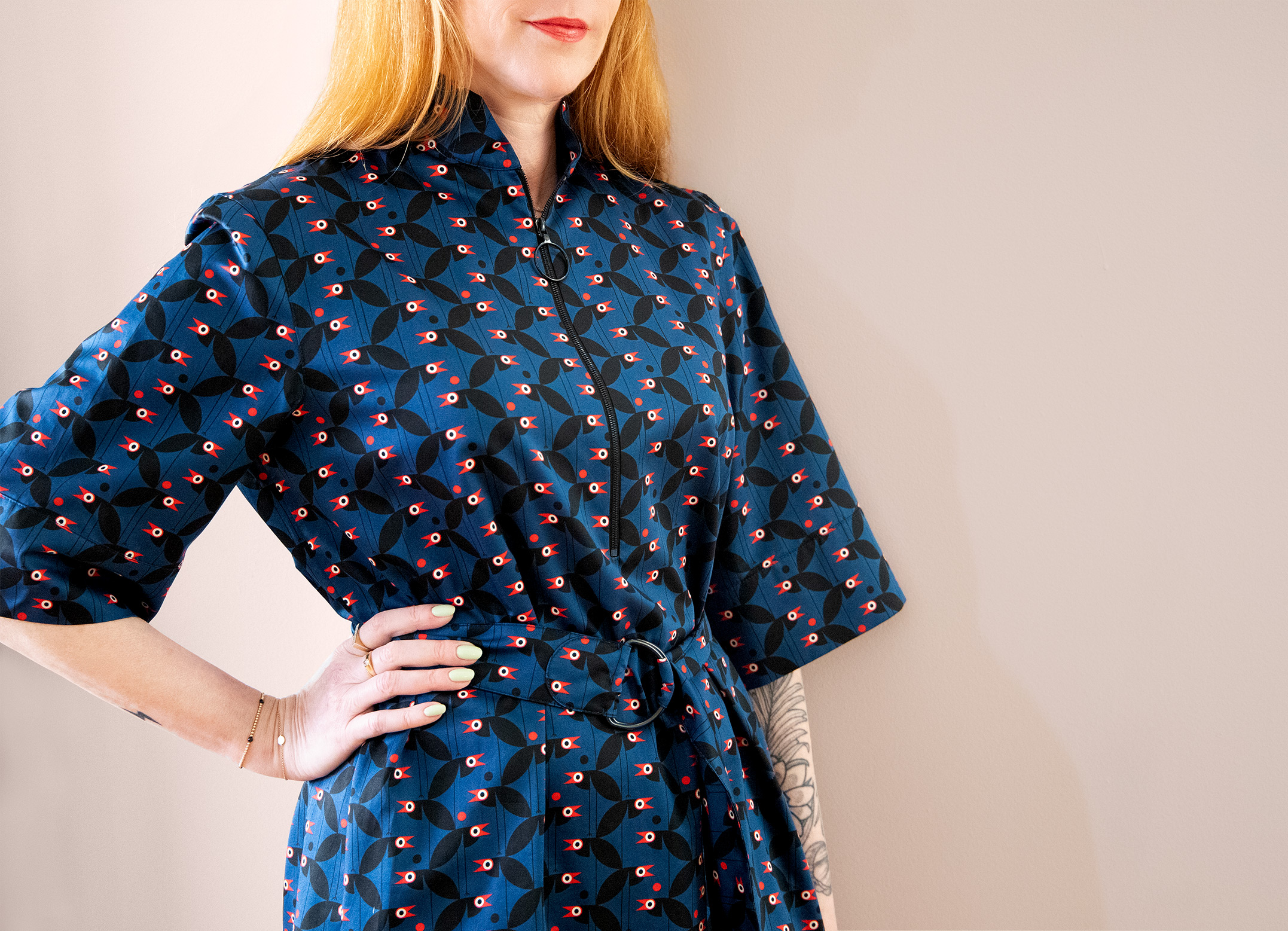
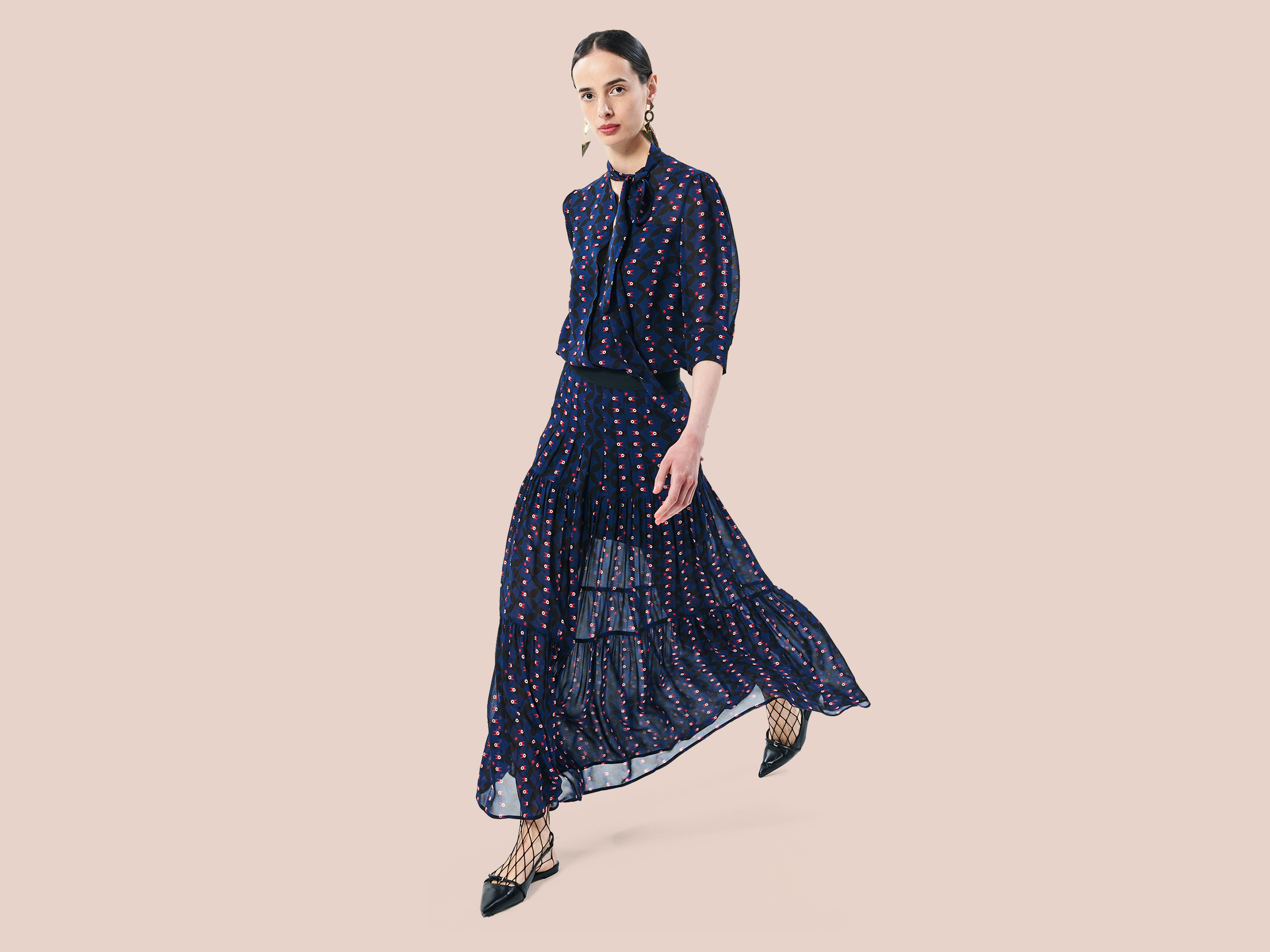
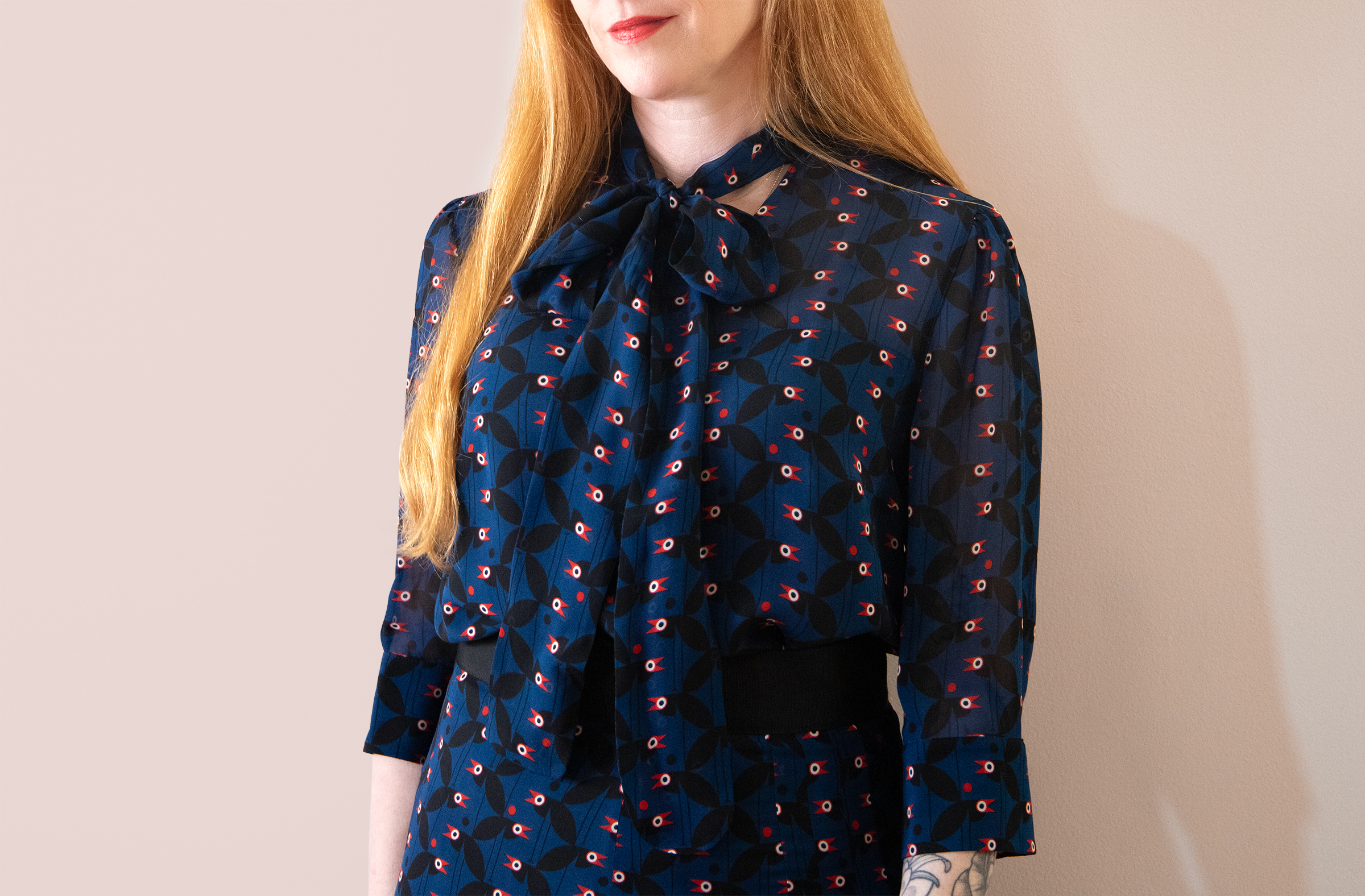
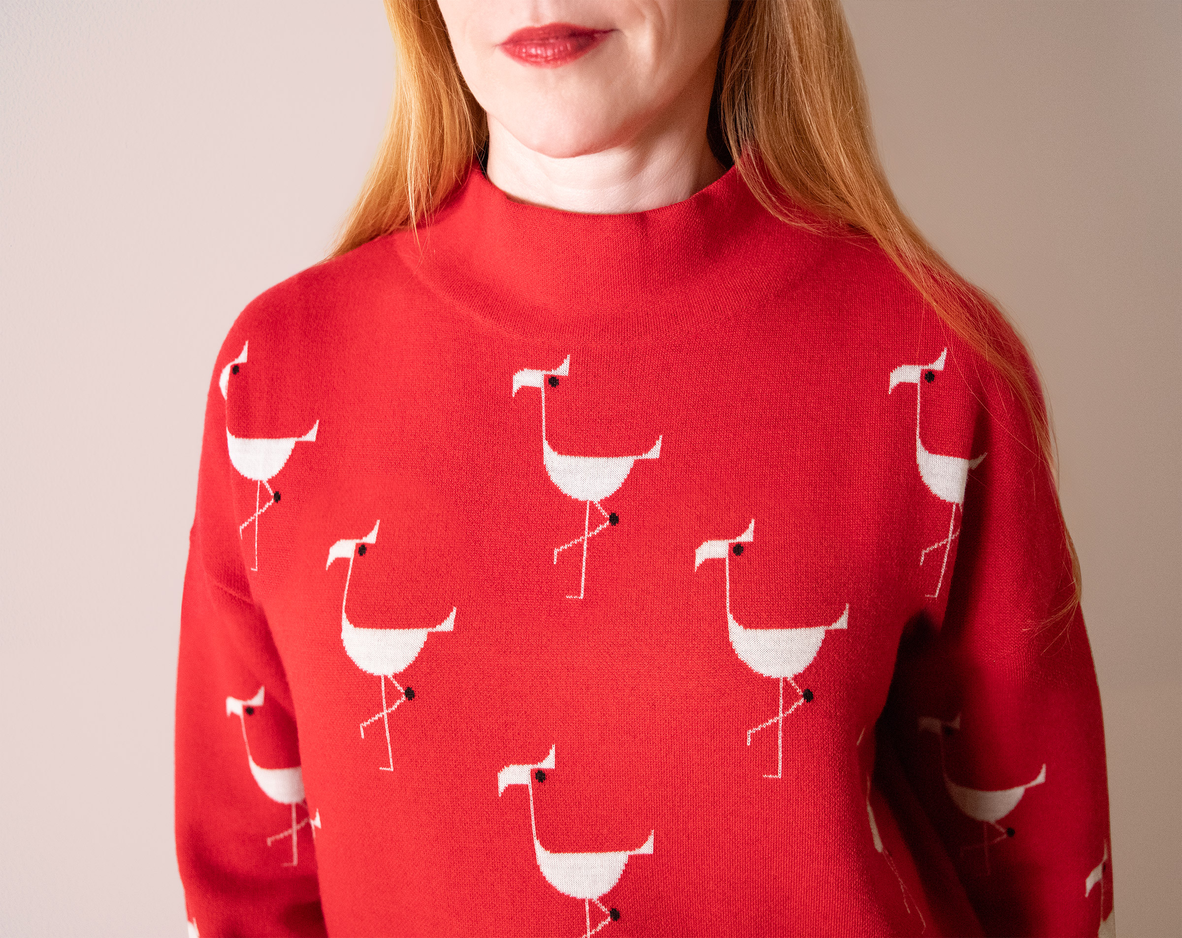
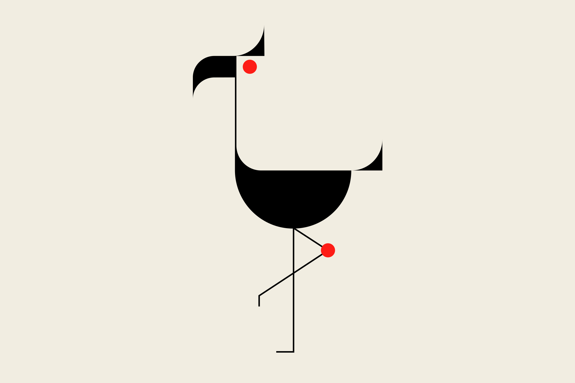
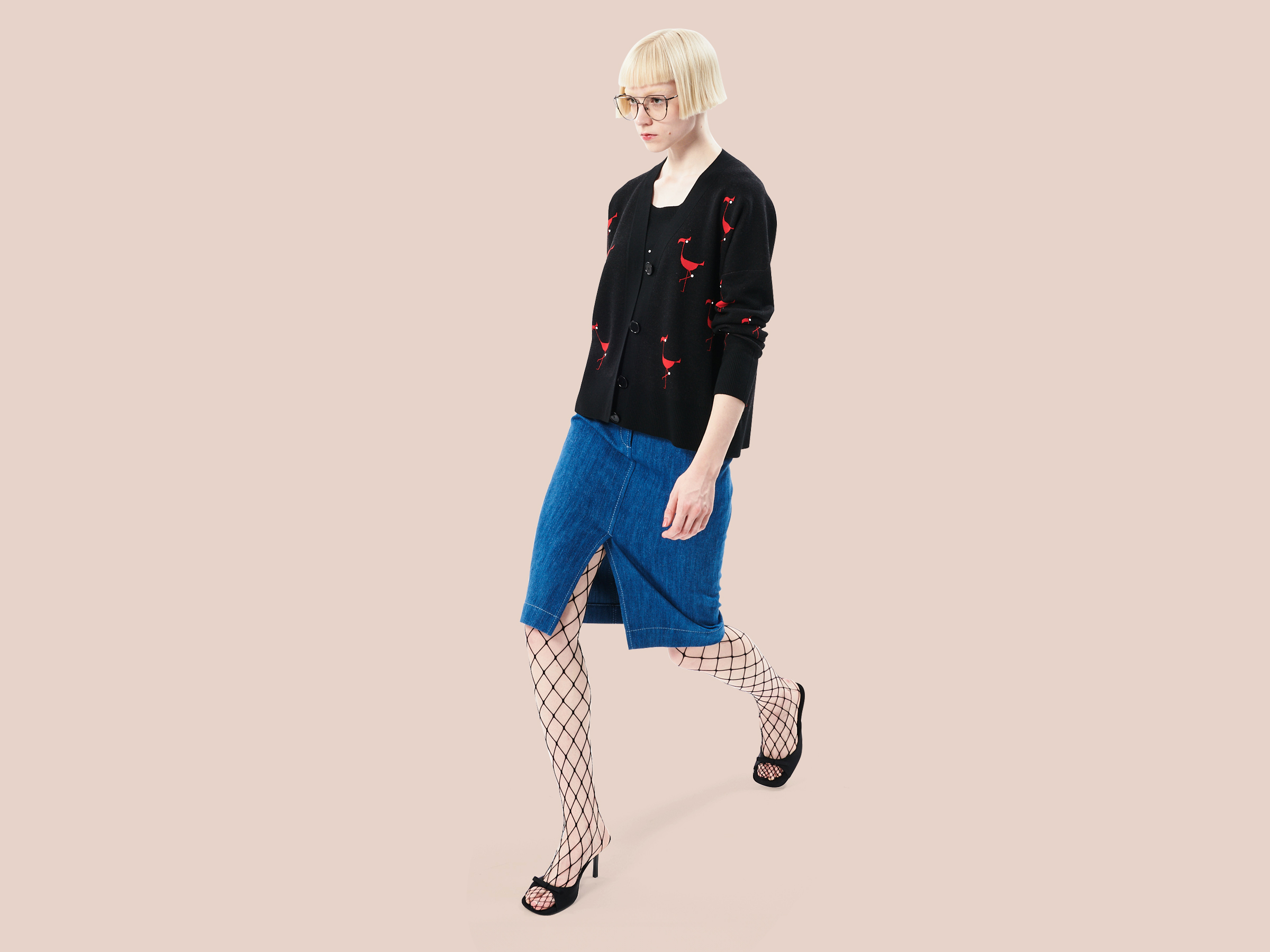
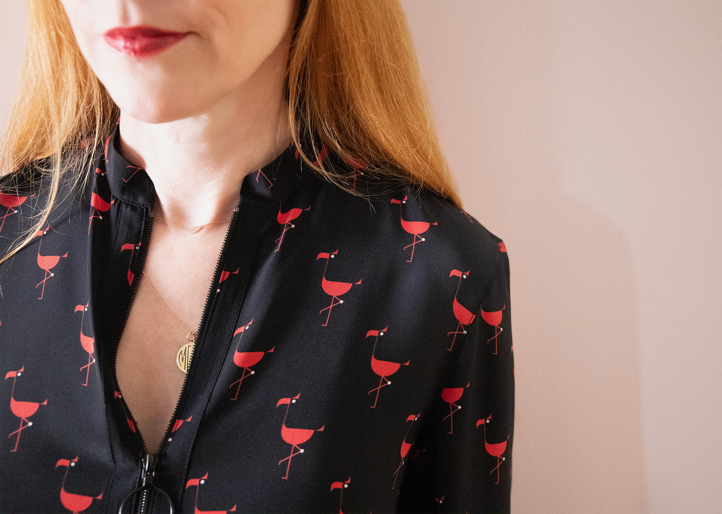
Akris punto resort 24
fashion / illustration
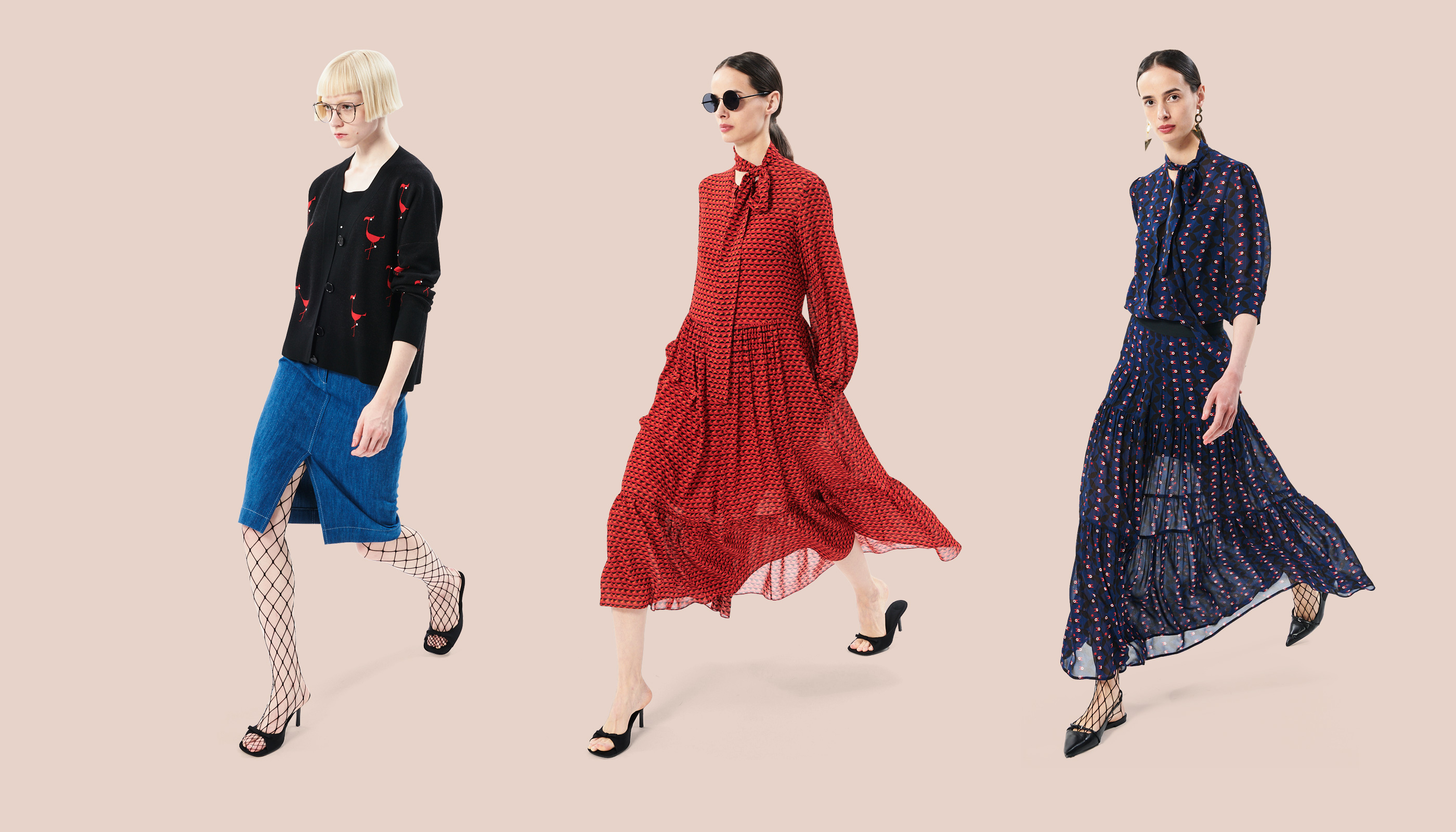
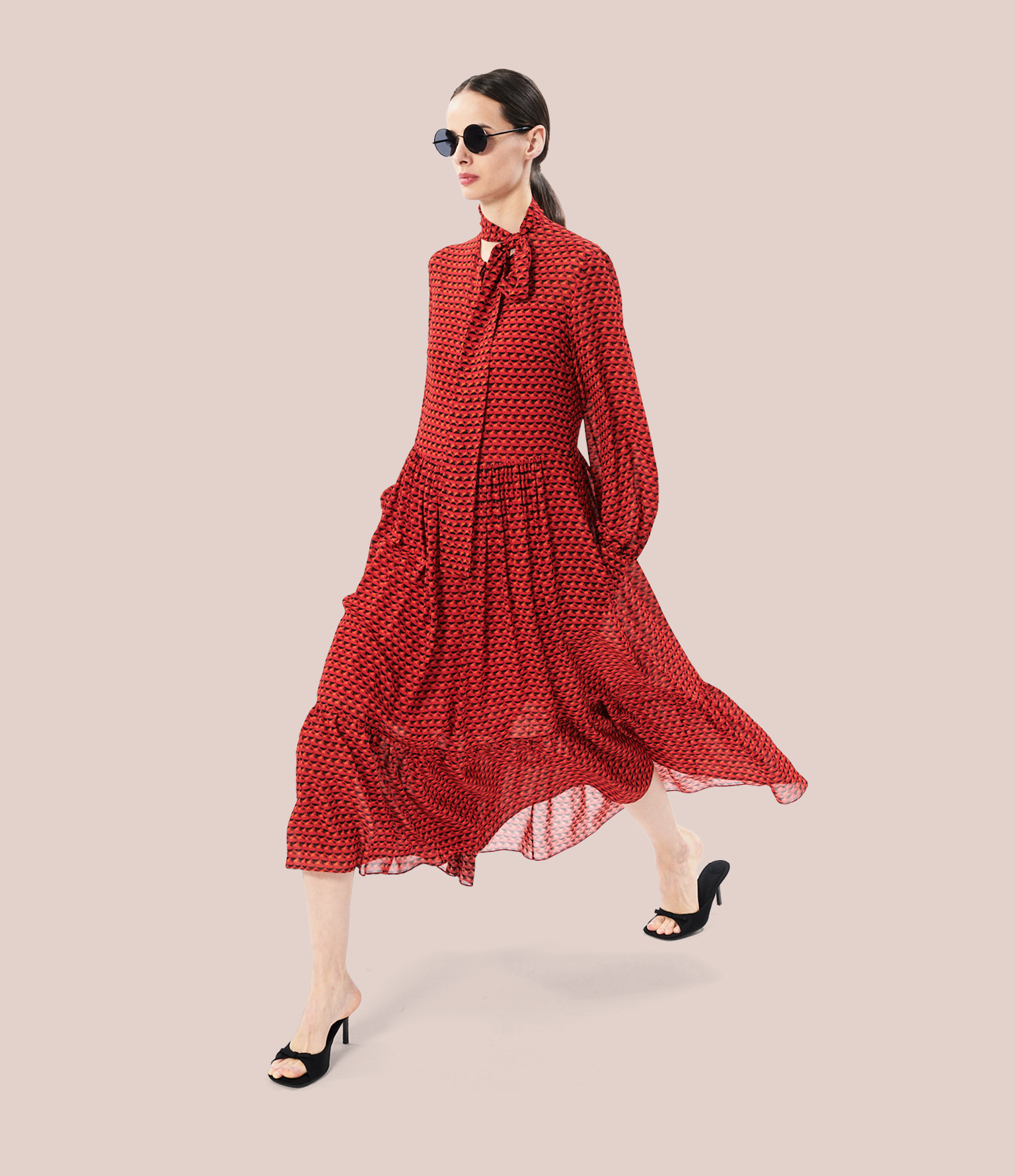
Akris Punto‘s playful prints and knitwear featuring our bird illustrations
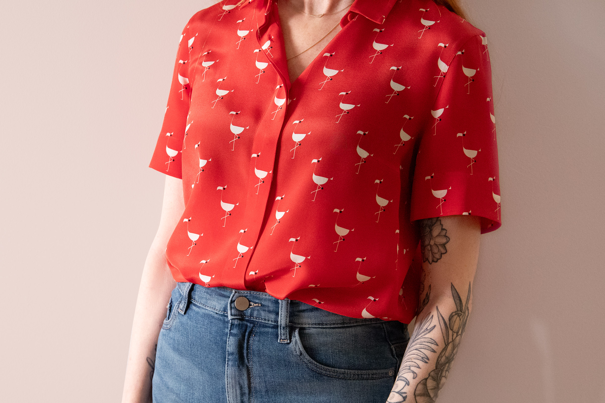
Akris is an international fashion house based in Switzerland that collaborated with us for their Akris Punto Resort 24 line. Pelican, Crows and Flamingo illustrations in our messymod style were turned into patterns printed on a collection of styles and on various luxury fabrics like poplin, viscose, georgette, and silk. Cashmere sweaters with bird appliqués and embroidered dresses round out the collection.
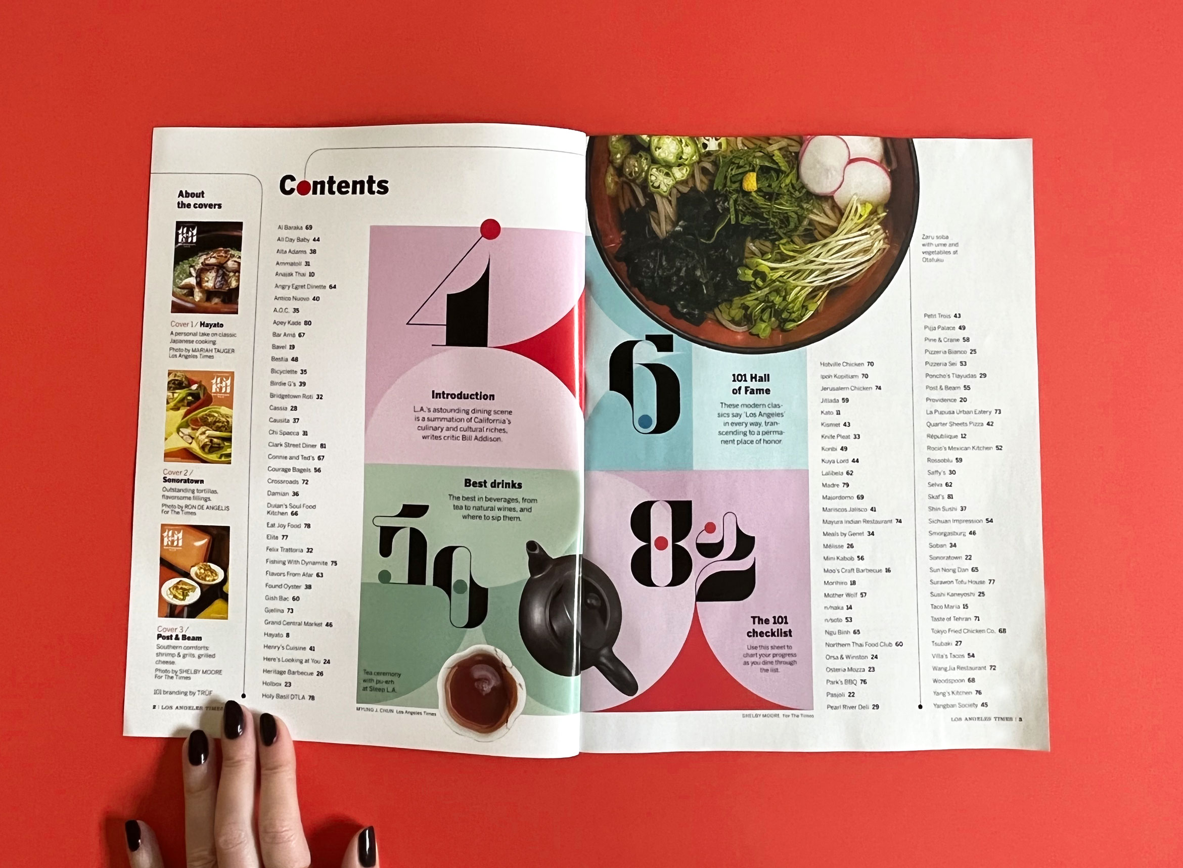
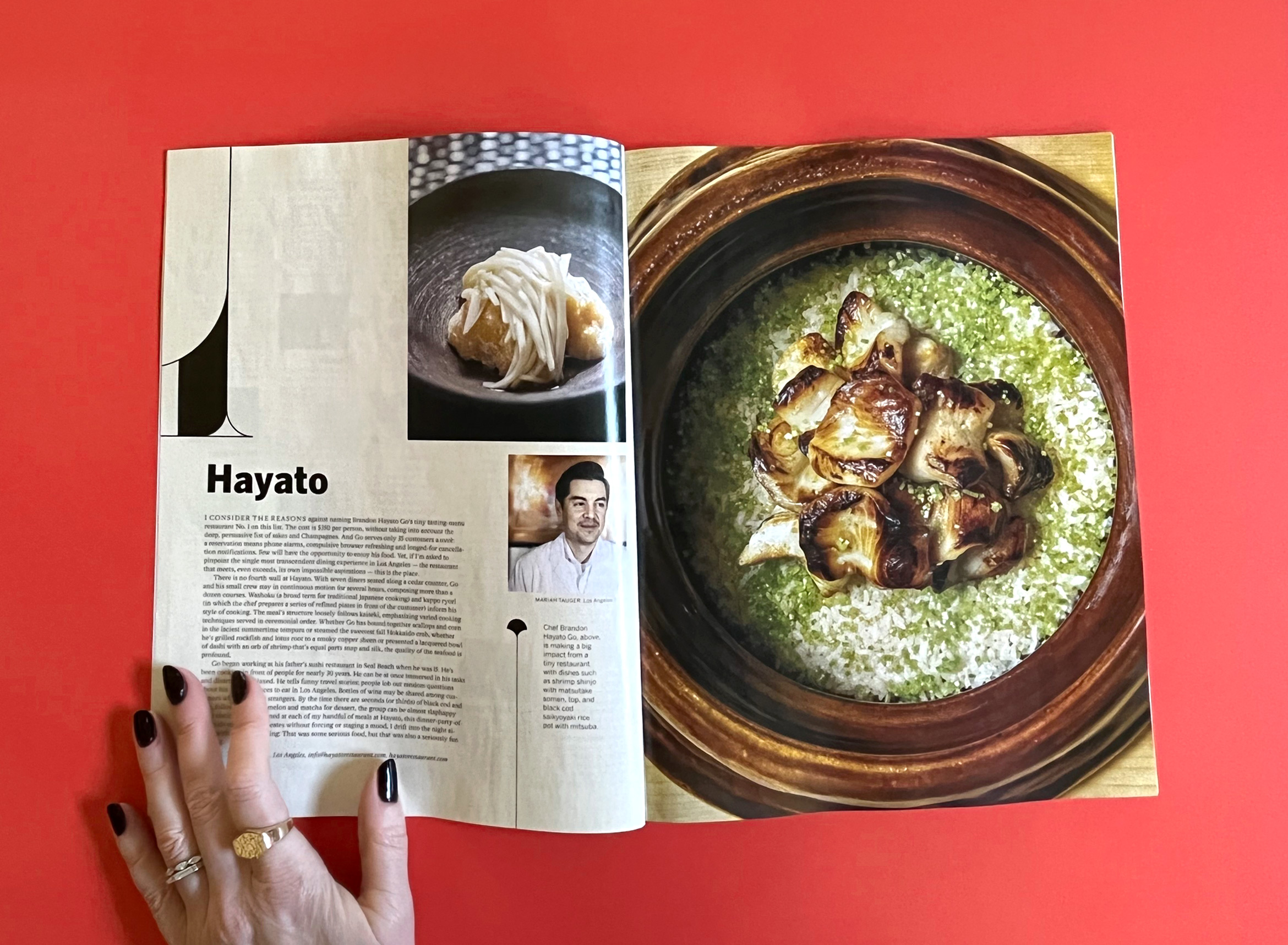
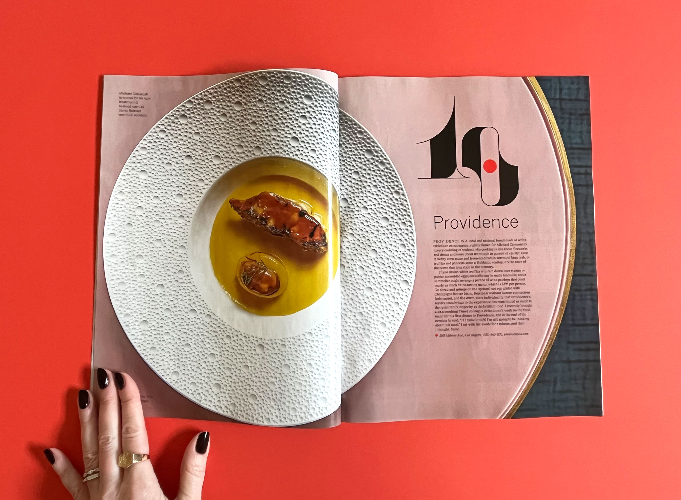
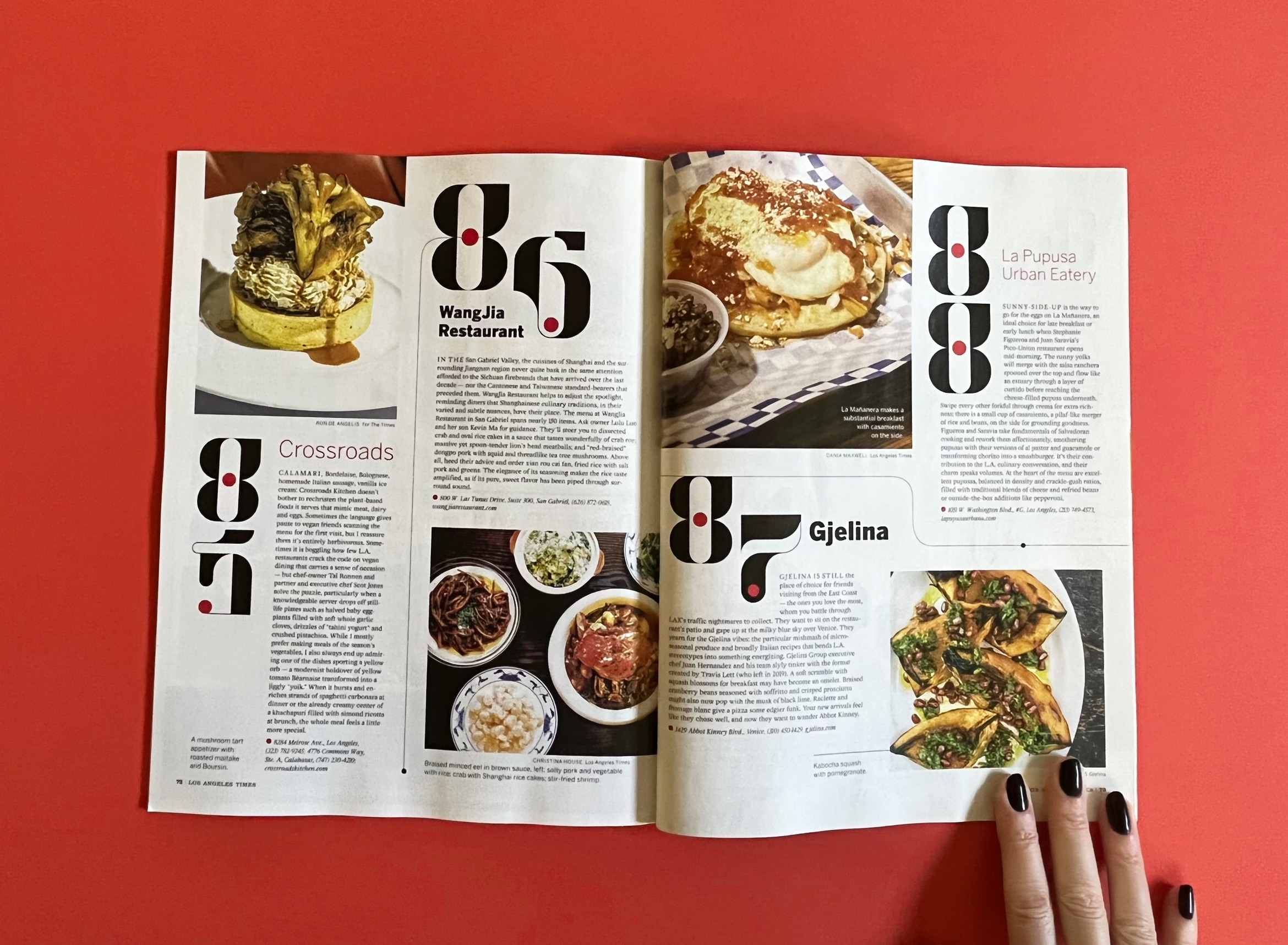
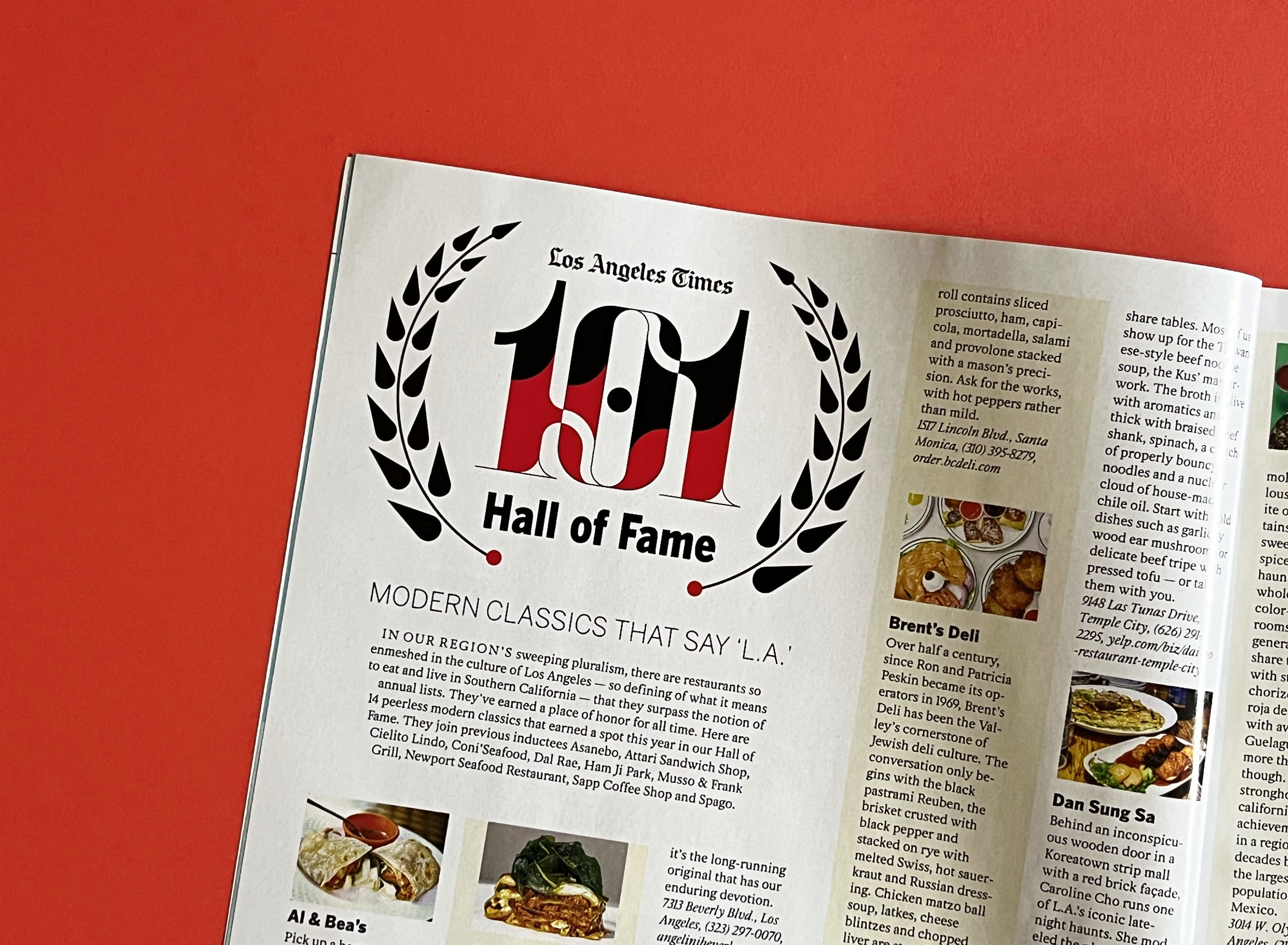
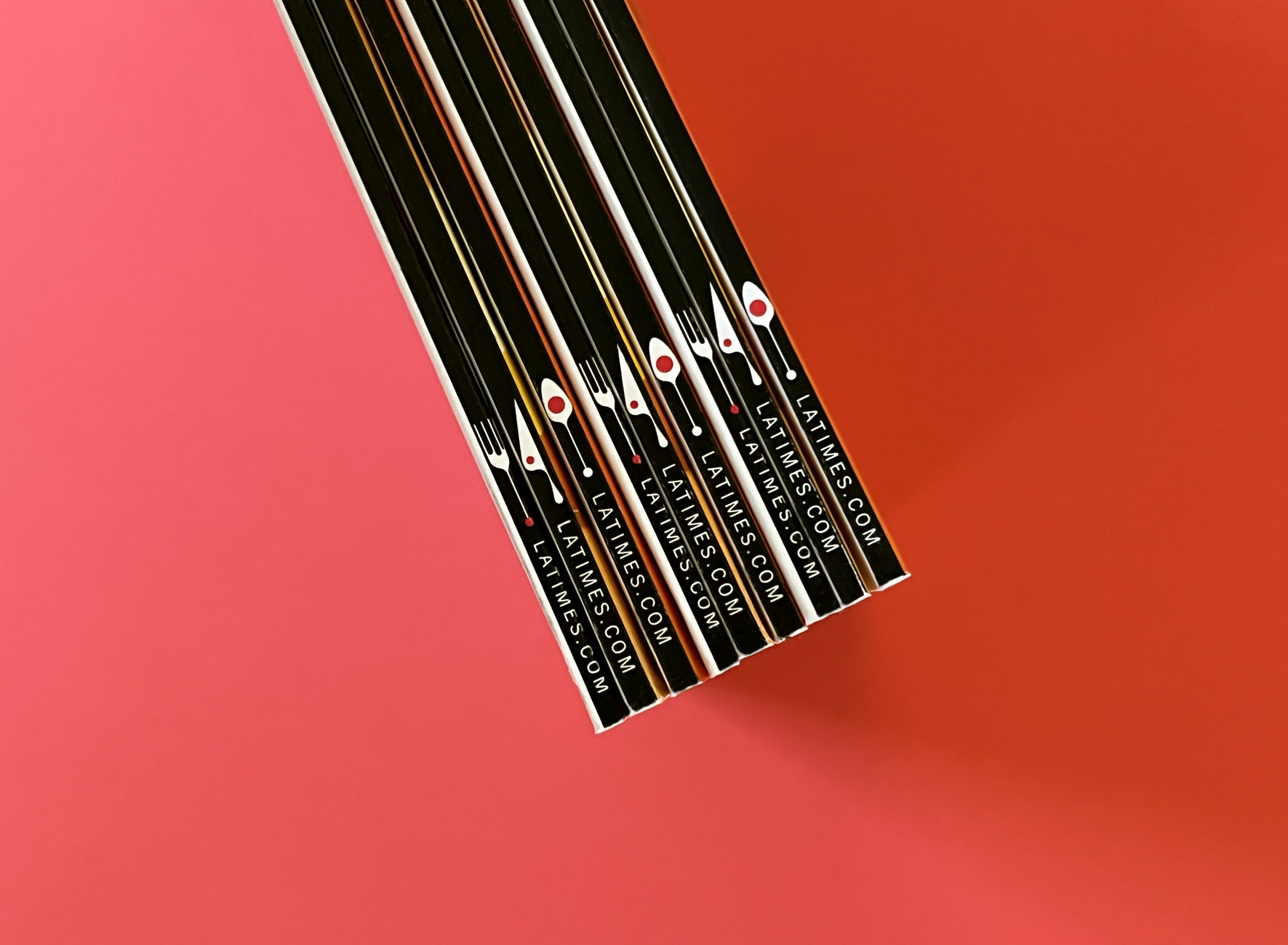
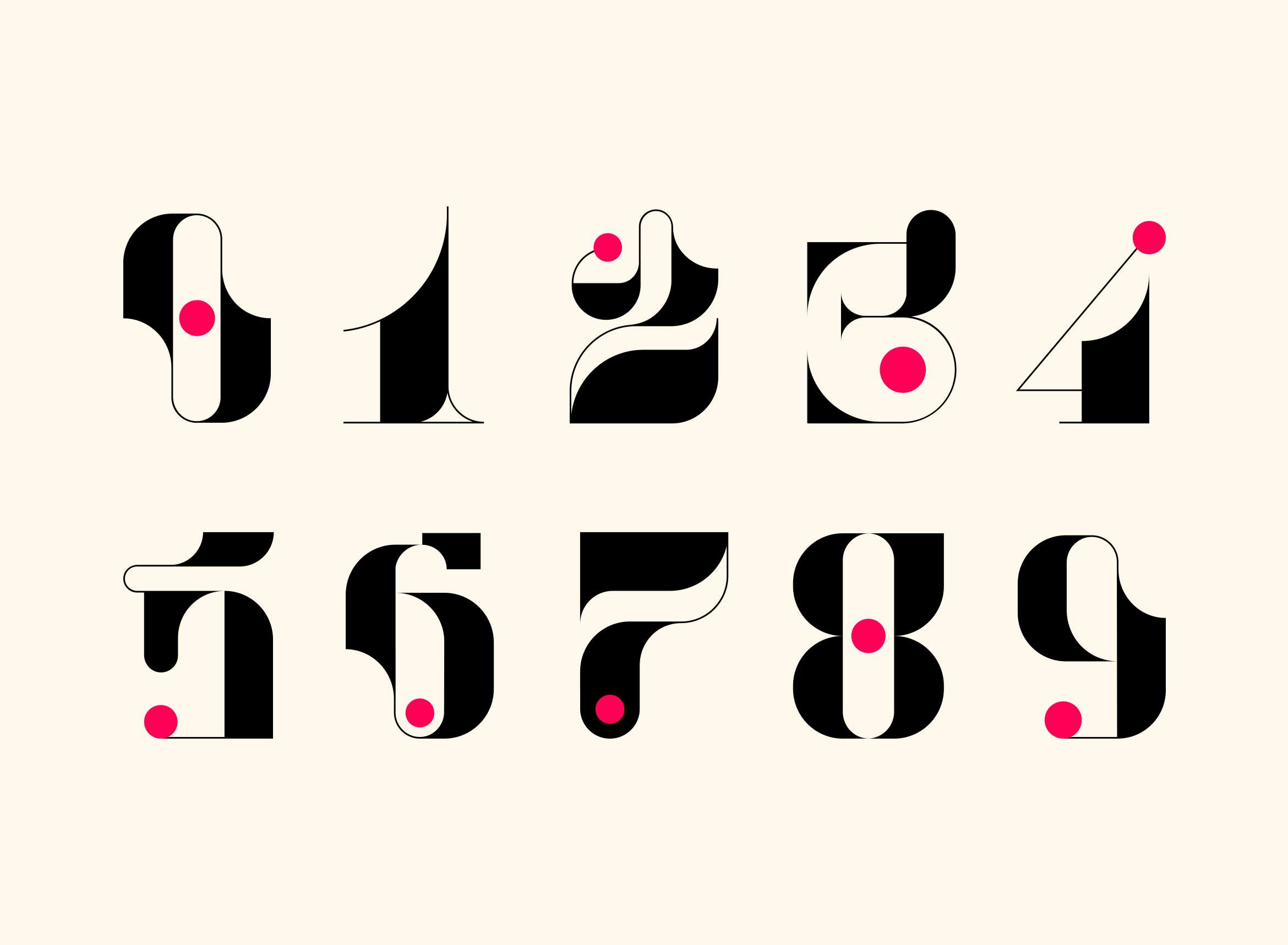
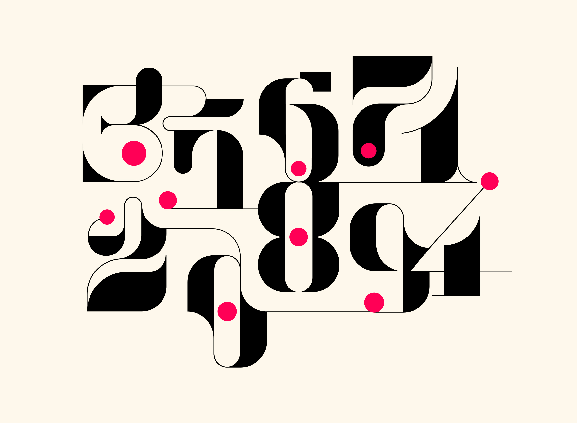
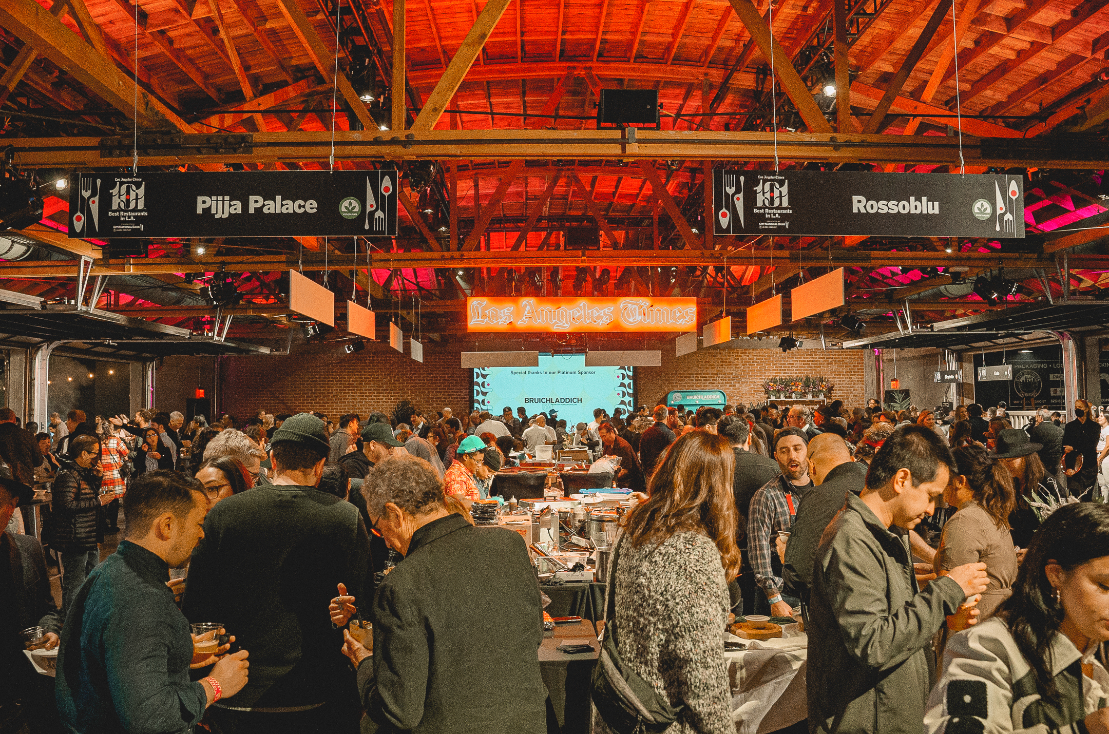
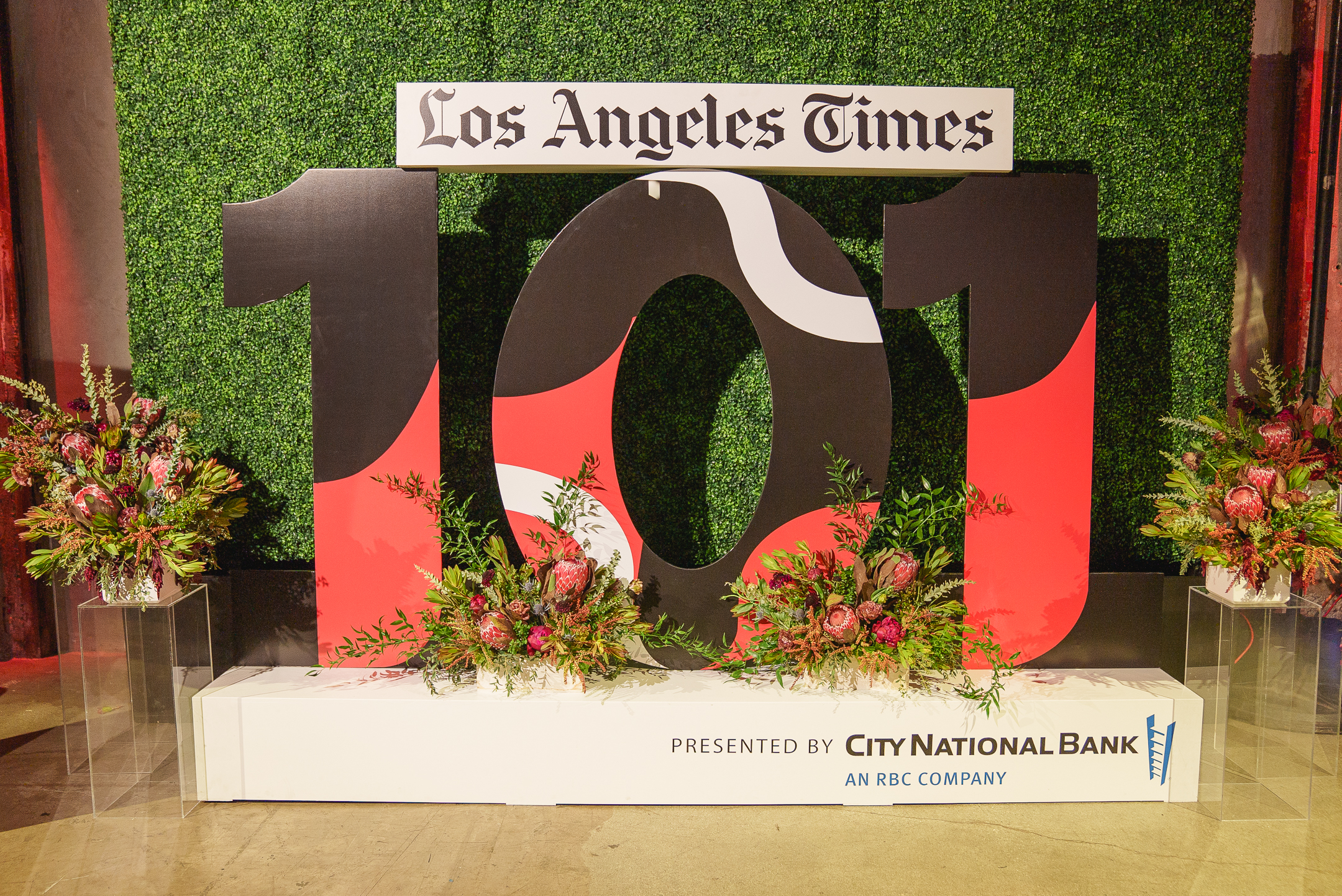
Los Angeles Times 101 Best List
branding / illustration
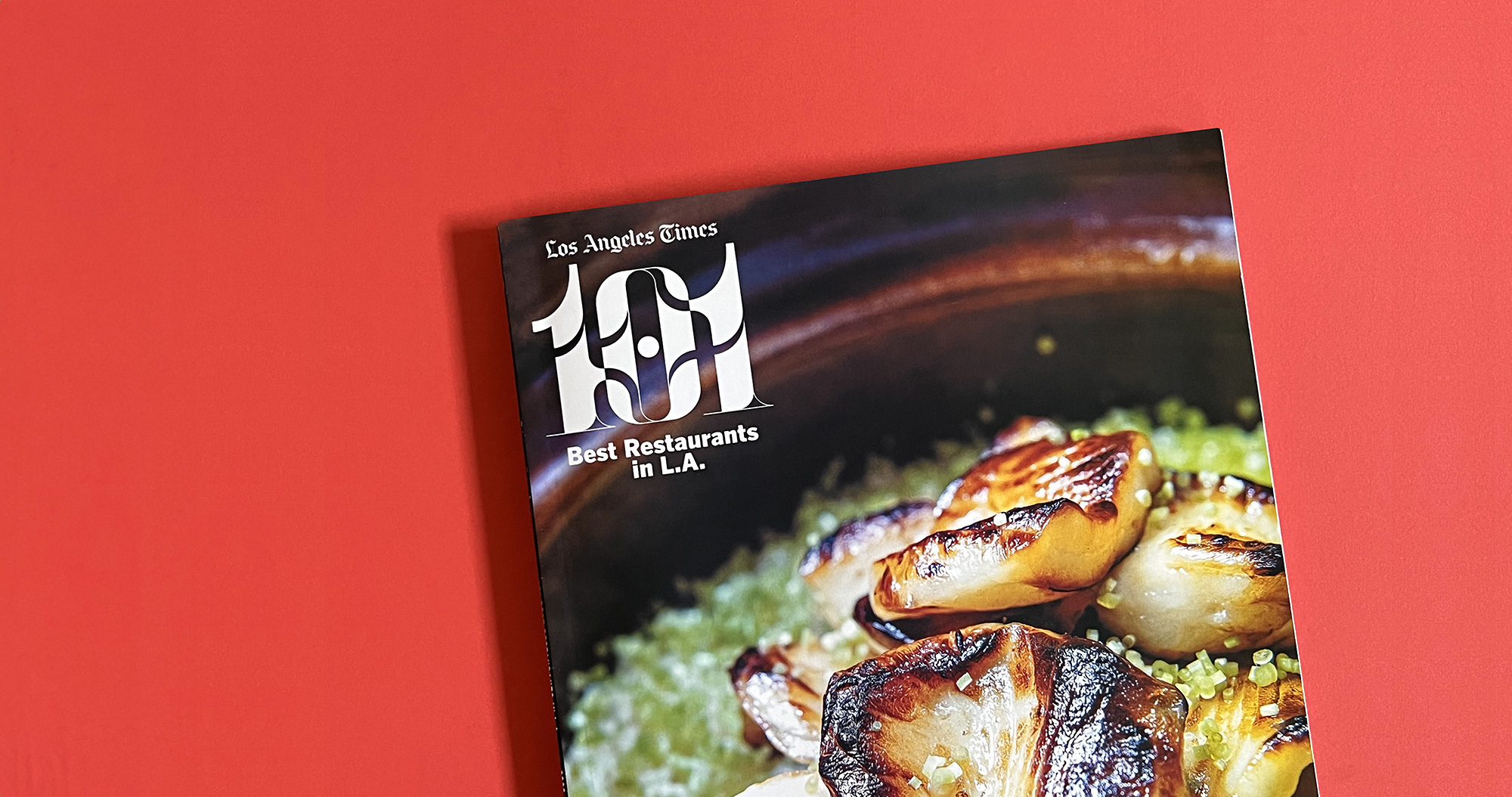
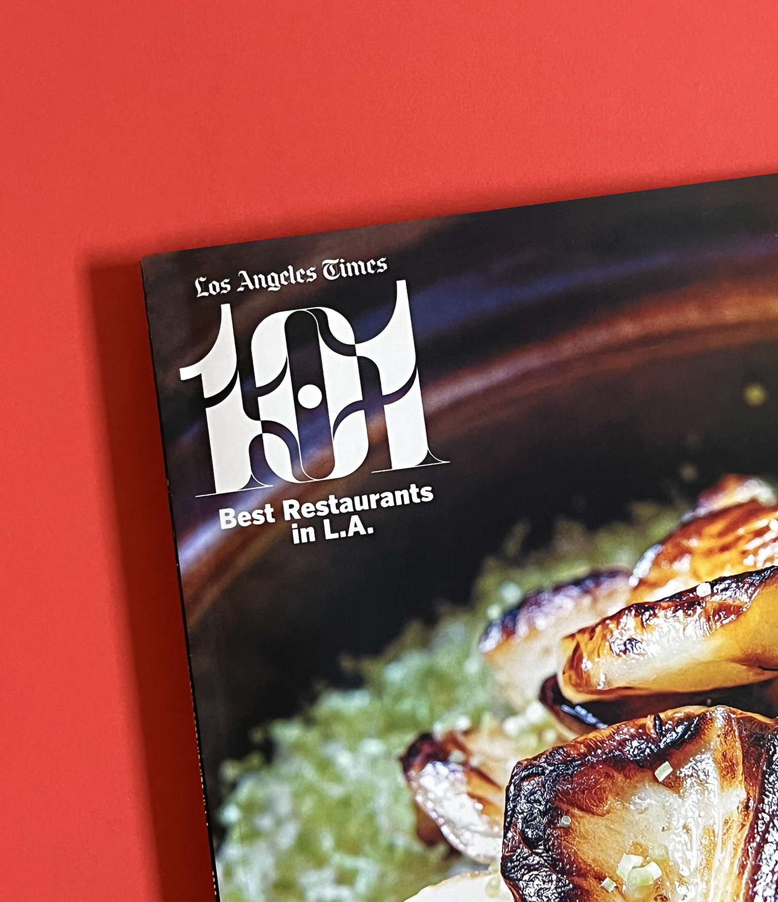
Los Angeles Times 101 Best Restaurants in LA List is Delicious
The Los Angeles Times asked us to design the visual identity for their annual 101 Best Restaurants list curated by restaurant critic Bill Addison. This year’s theme was “The Art of Food” which celebrates chefs as artists and focuses on their craft. We wanted to echo the idea of artistry and imagination through playful typography, icons and graphics and carry that theme through all print and digital materials and the live event itself.
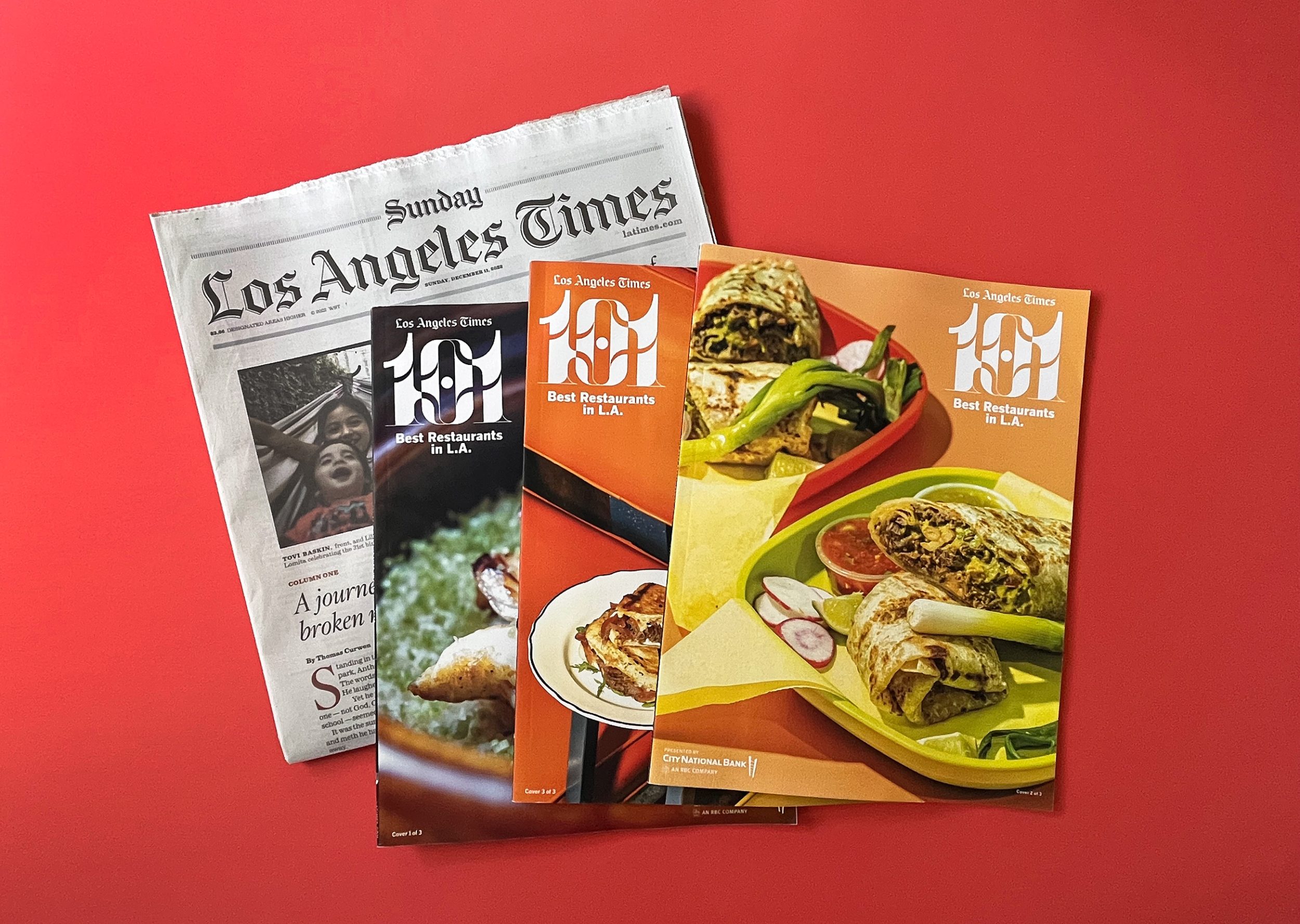
The 101 Best List can be viewed as an interactive microsite on the LA Times website, as well as a print magazine with three different covers arriving in that Sunday’s paper.
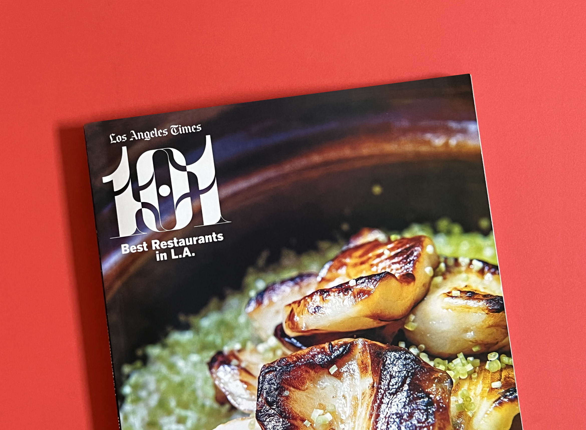
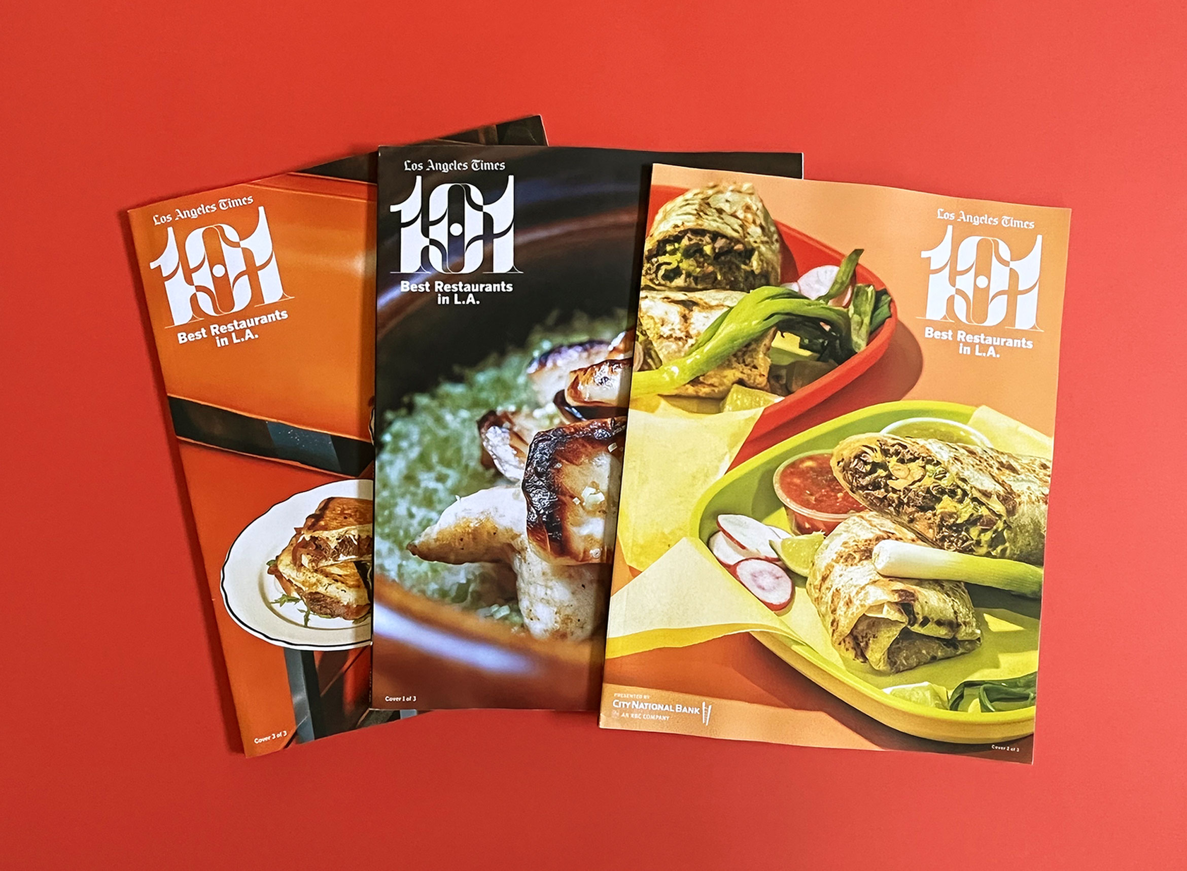

Icons of a cocktail, fork, knife and spoon in the same Messymod illustration style were used for signage at the food event. And as a little surprise, they distinguish each of the 3 magazine cover spines.
Creative Director: Amy King
Design Director: Taylor Le
Art Director: Kay Scanlon
Motion Design: Li Anne Liew
Photographers: Mariah Tauger, Ricardo DeAratanha, Myung J. Chun, Kirk McKoy, Calvin B. Alagot, Jay L. Clendenin, Dania Maxwell, Christina House, Stephanie Breijo, Ron De Angelis, Shelby Moore, Silvia Razgova, Annie Noelker, Yasara Gunawardena, Dylan + Jeni, Carter Hiyama, Katrina Frederick
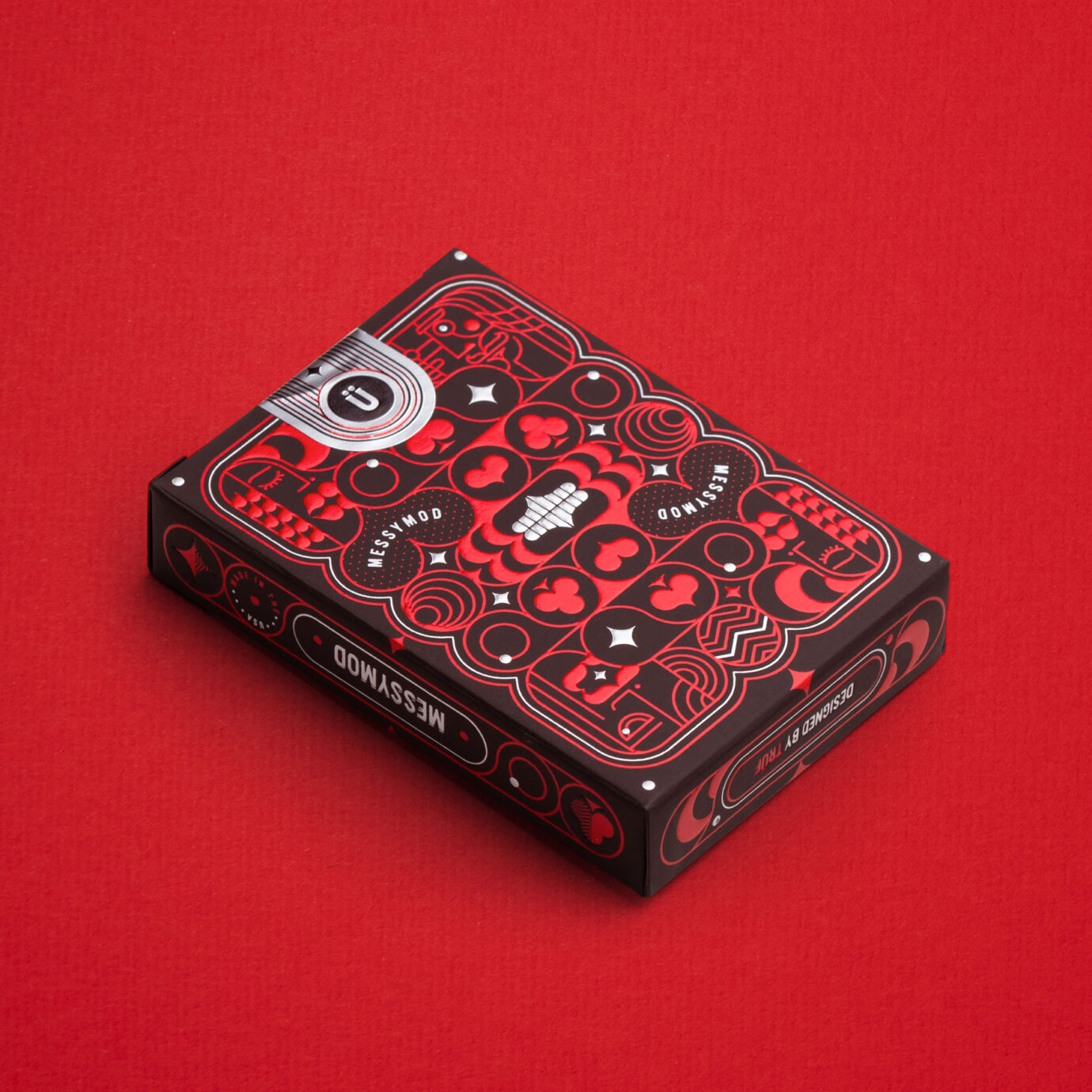
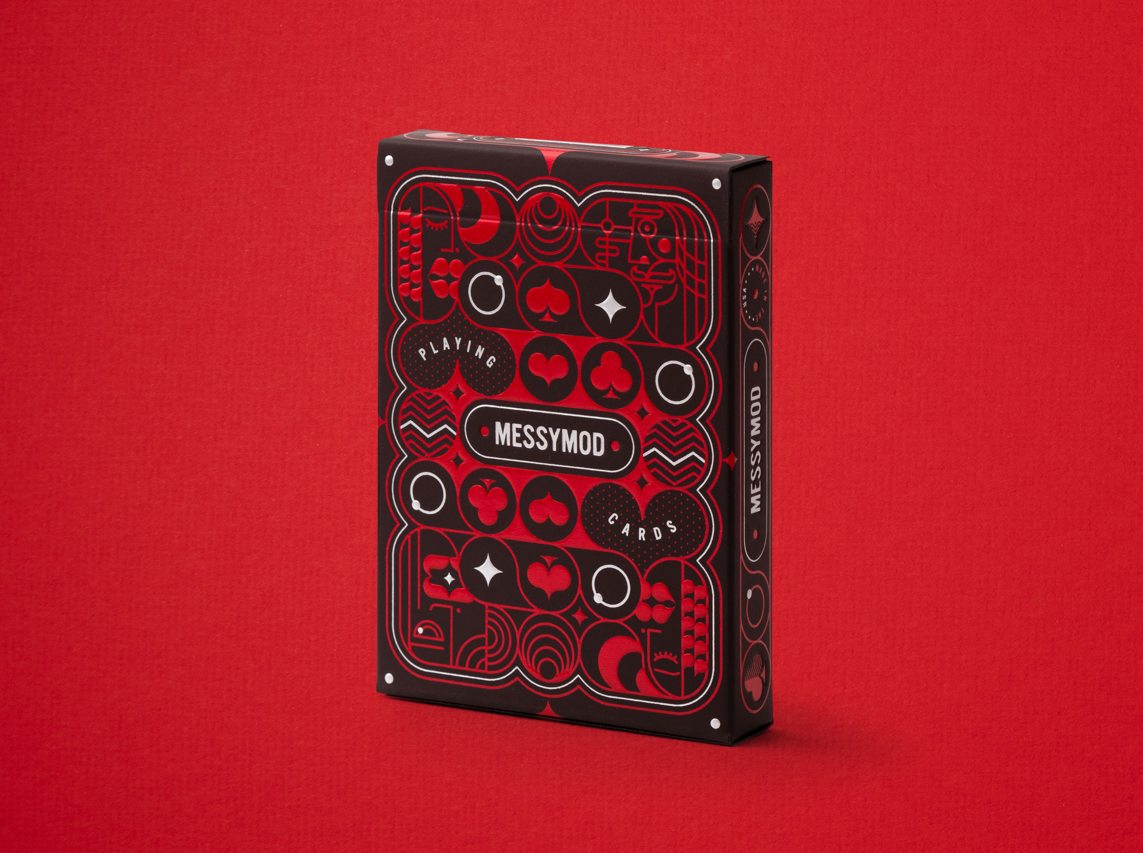
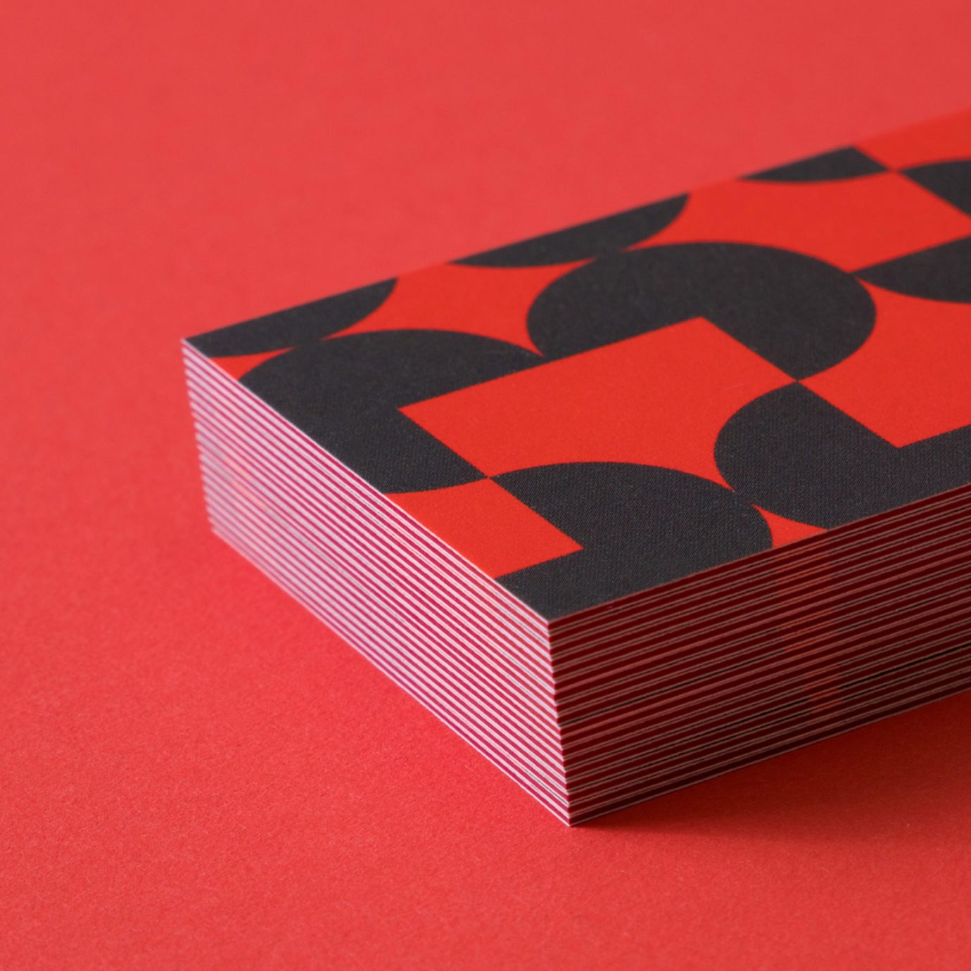
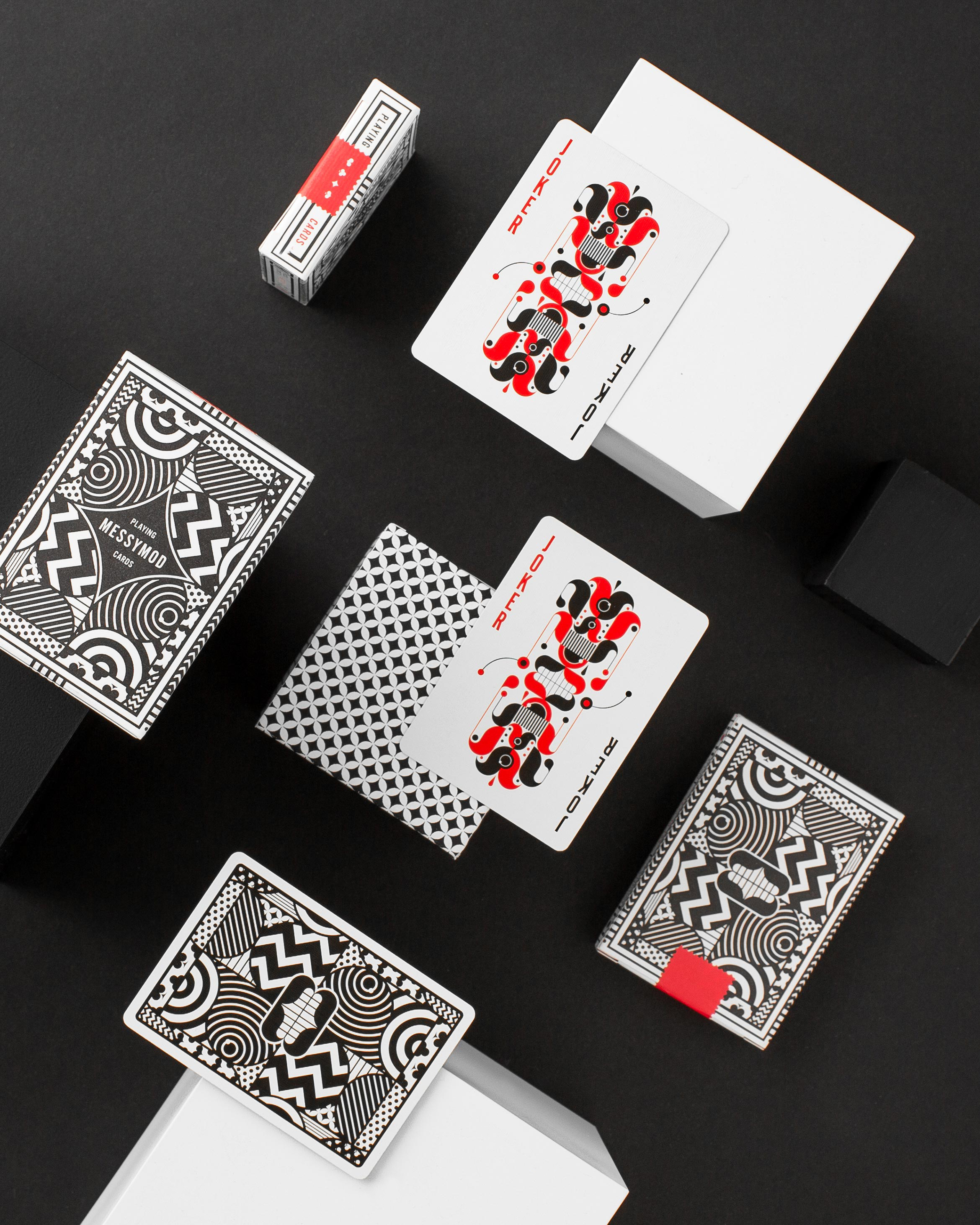
Art of Play edition 2 x TRÜF
illustration / packaging design
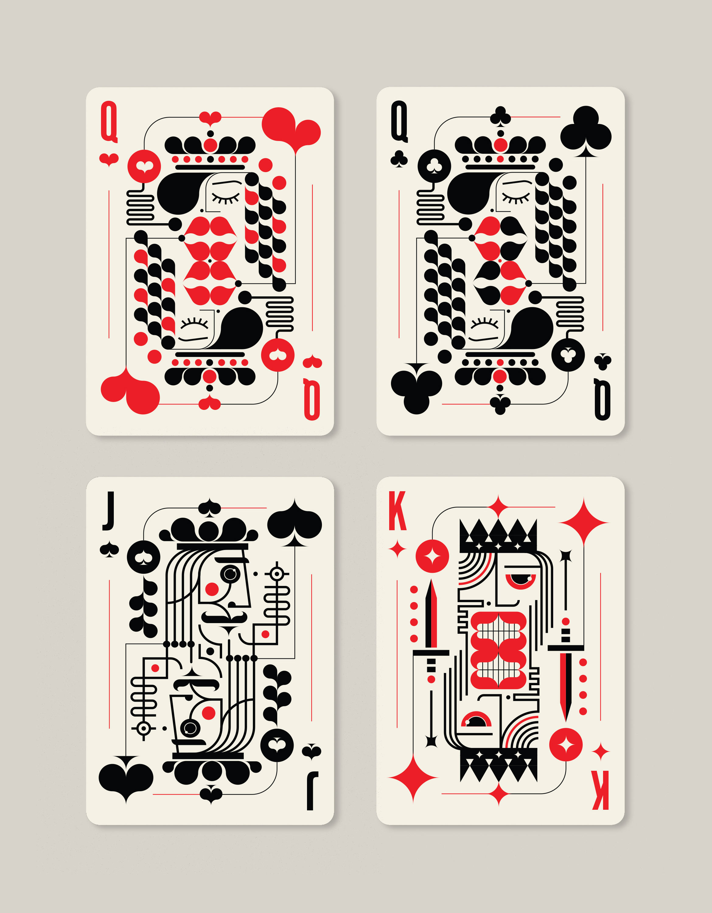
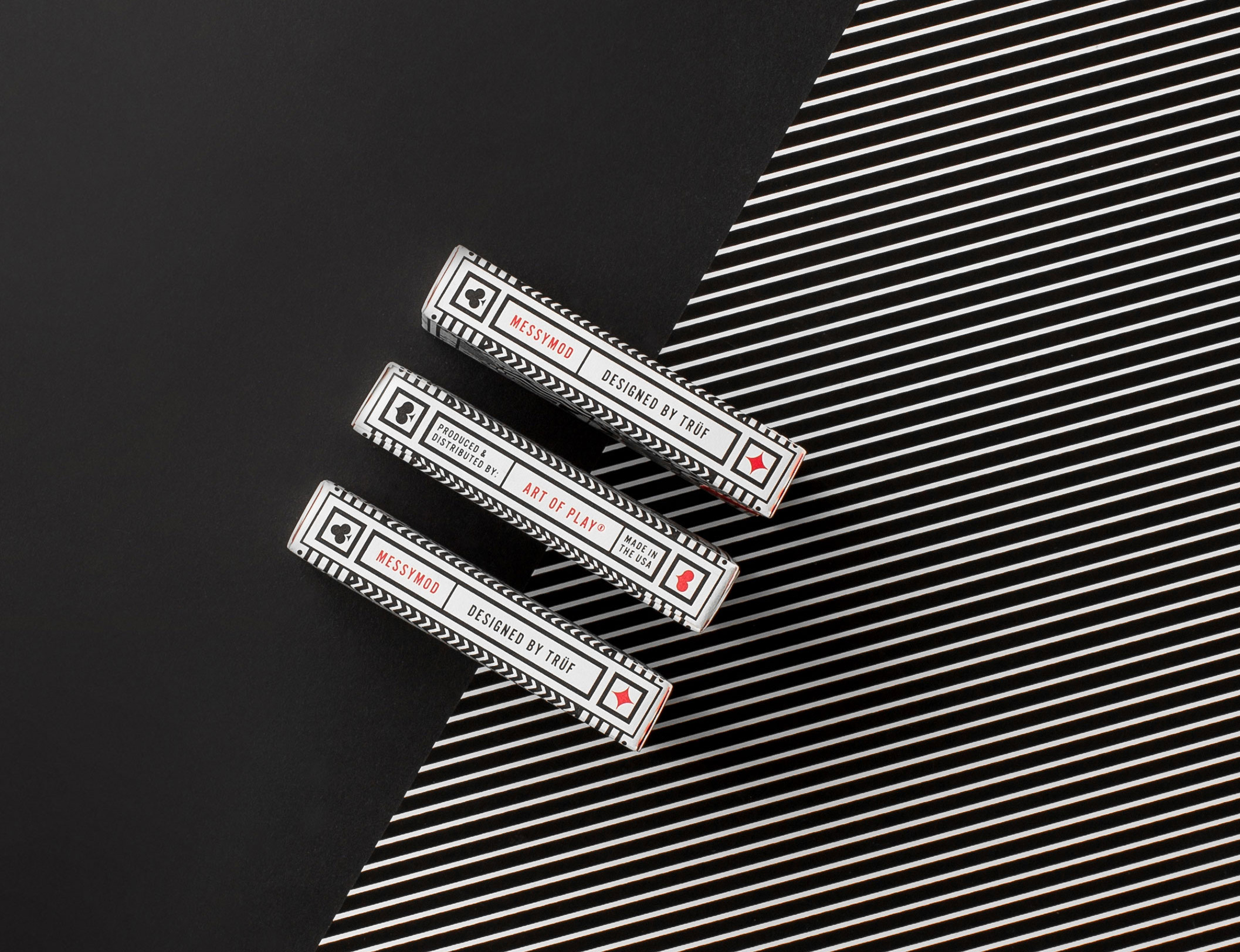
A 2nd edition of Messymod playing cards from Art of Play x TRÜF
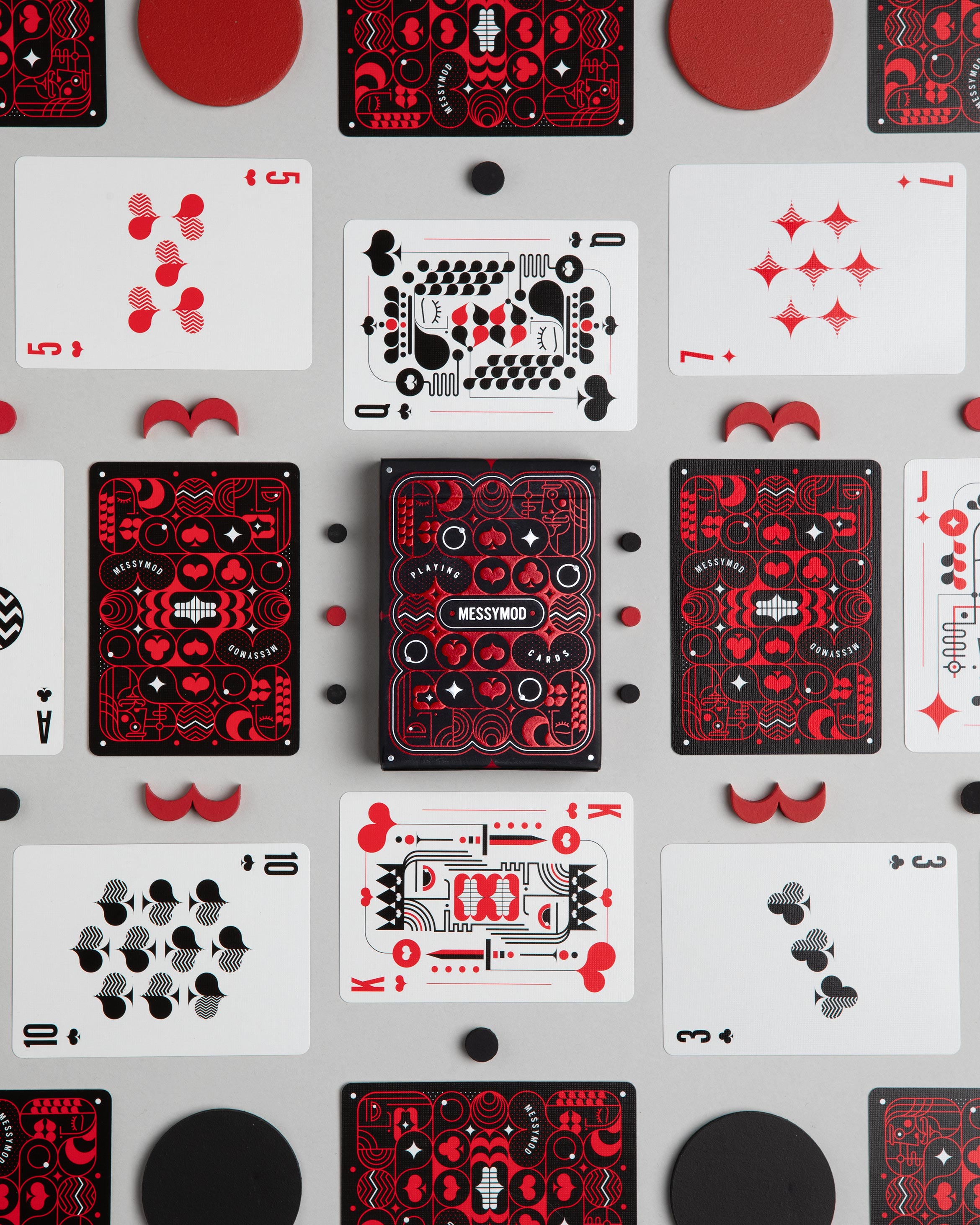
We were thrilled to learn that our first edition of Messymod Playing Cards were so popular they sold out. We collaborated with Art of Play for a new, second edition with a new box and back design. Keeping the same Messymod theme for the cards themselves, we created a package with even more elaborate and high-end touches including red foil, hits of silver foil and embossed red elements.
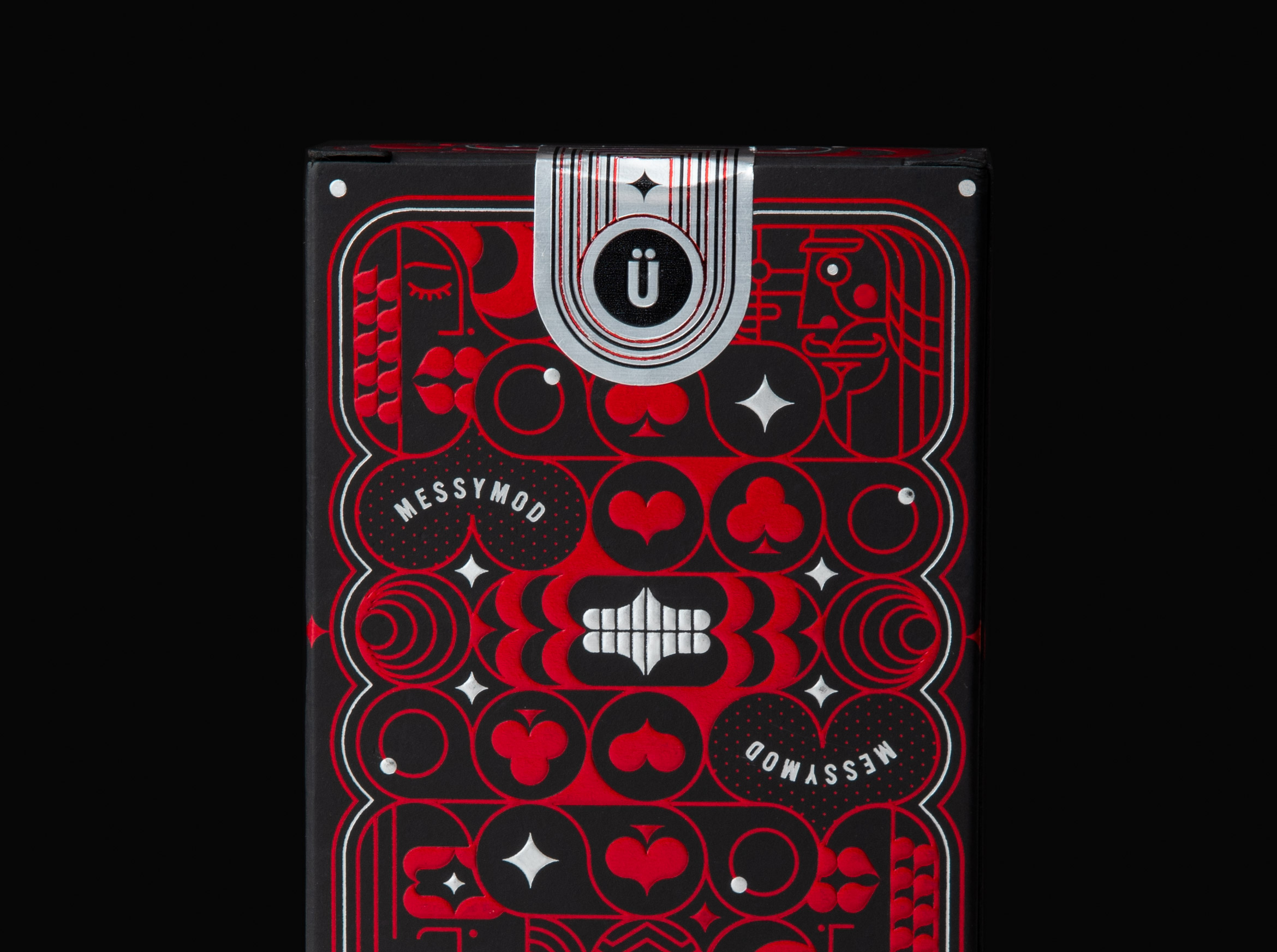
Art of Play x Messymod playing cards available as an Art + Play Bundle in our messymod shop. Get a deck bundled with a fine art print of your choice of King, Queen, Jack or Ace.
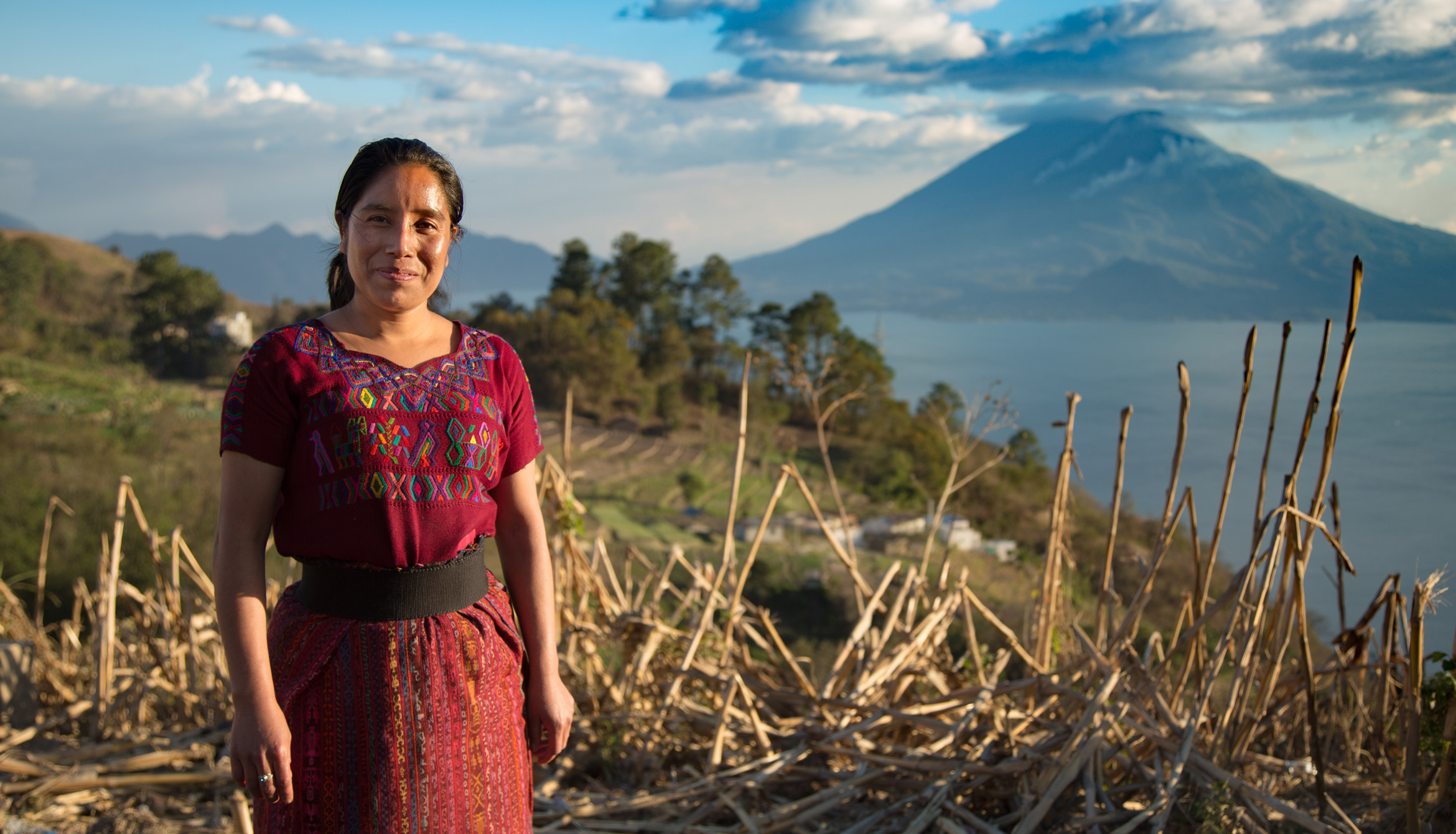
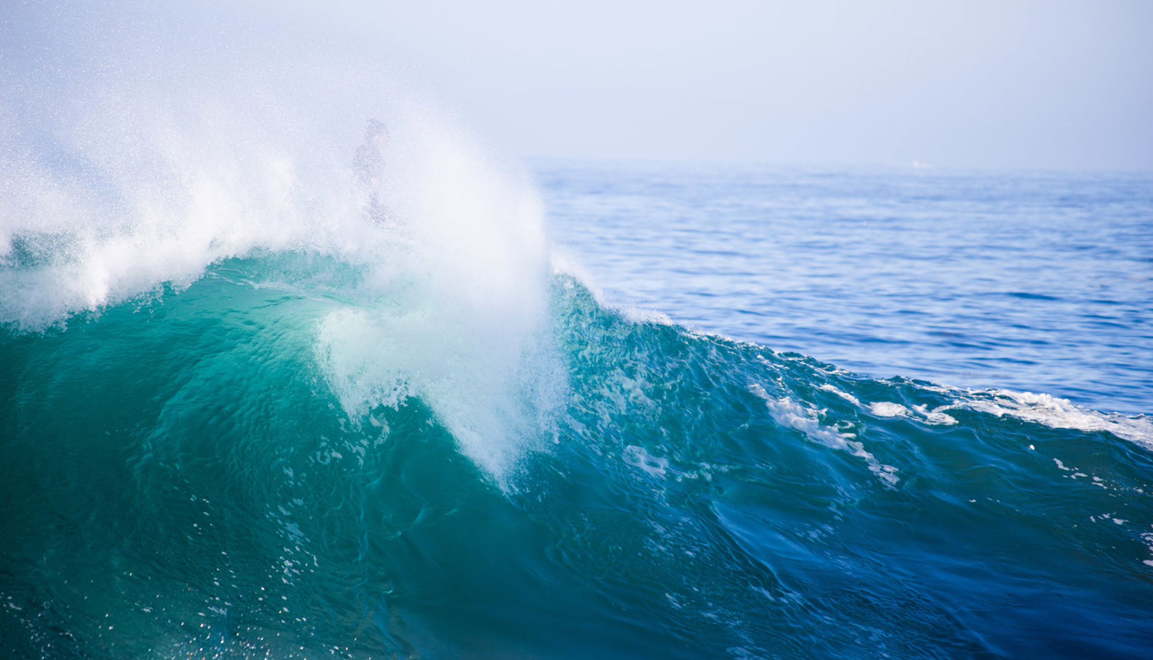
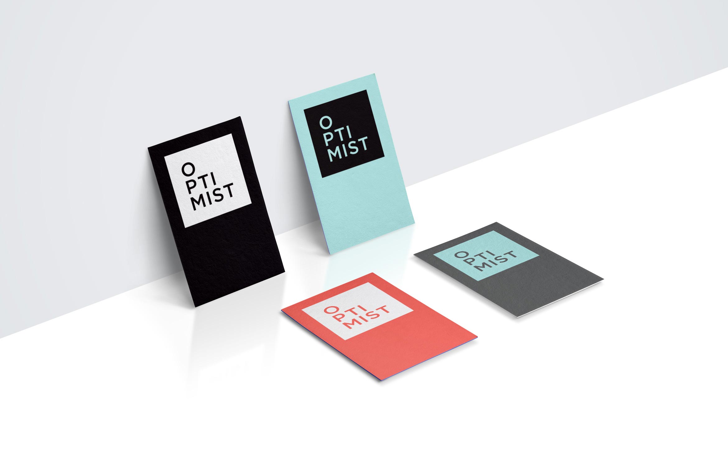
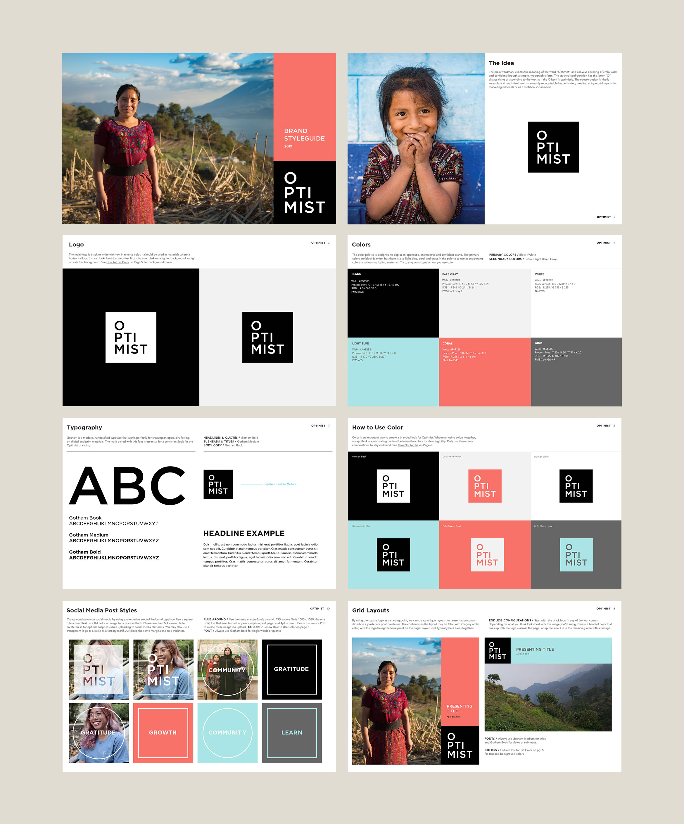
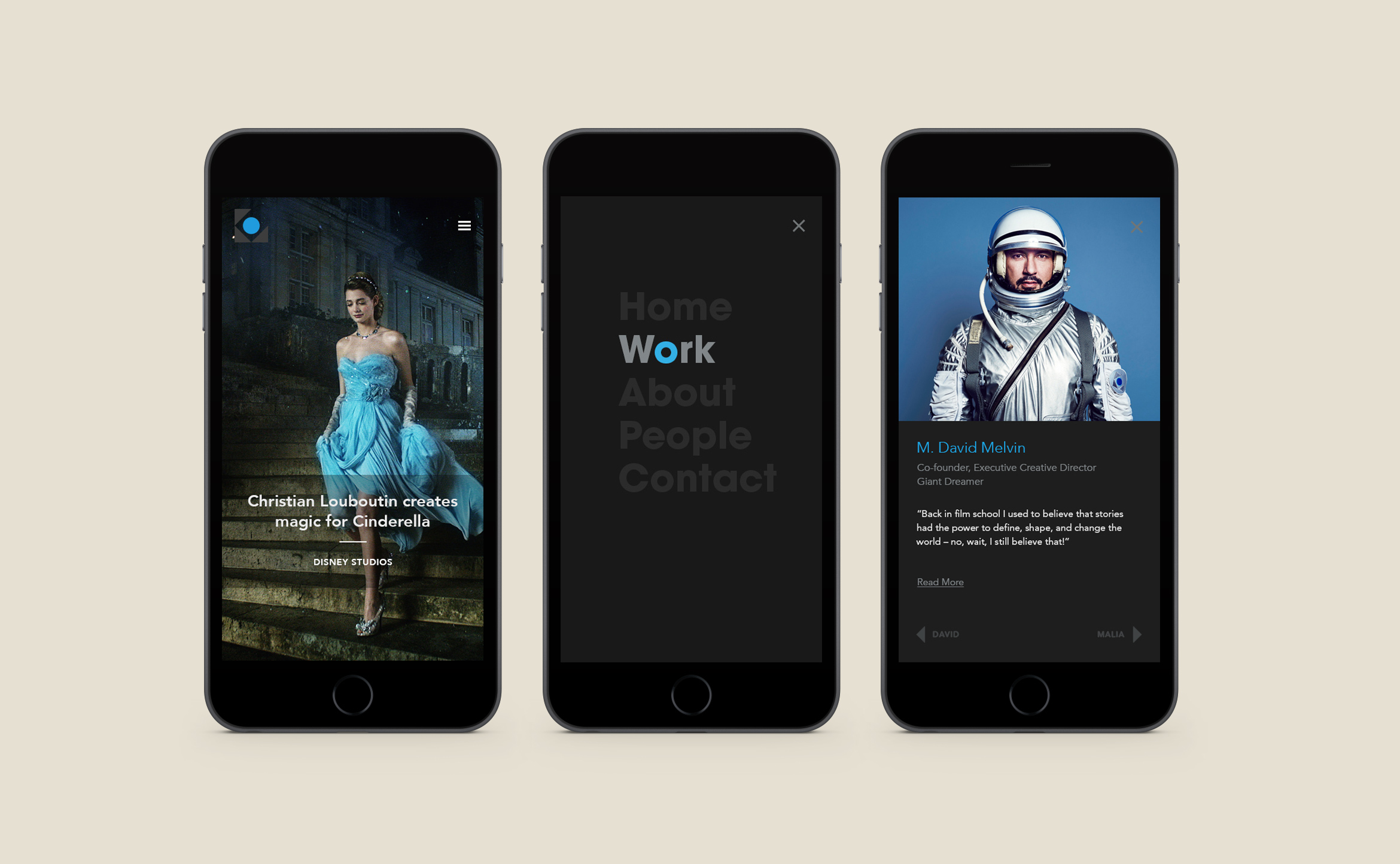
Optimist films
film production / brand identity
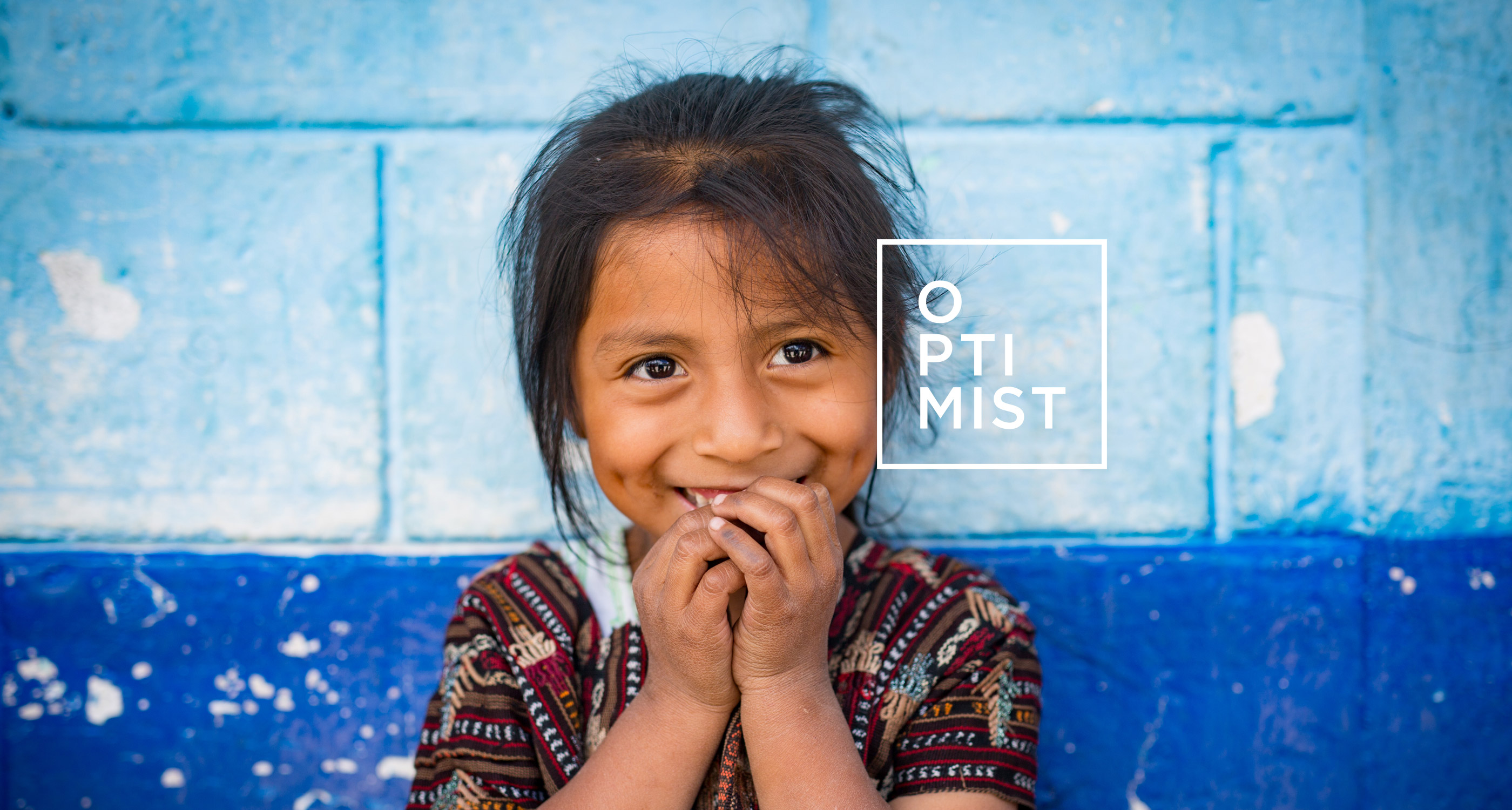
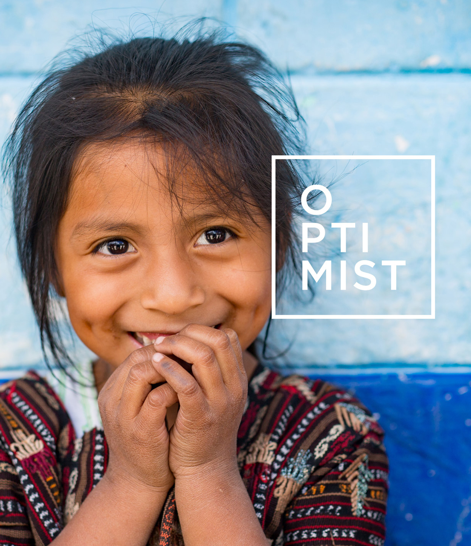
Optimist travels the world making non-profit films with impact
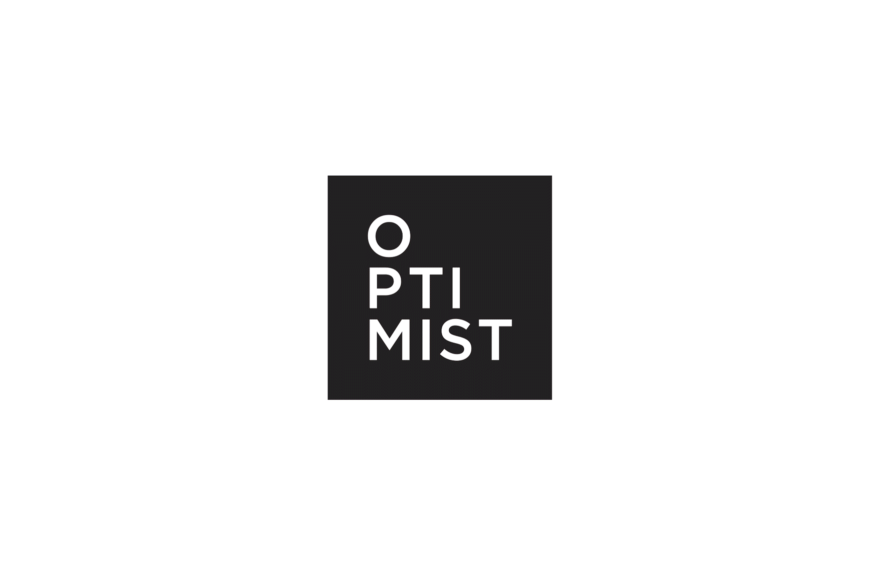
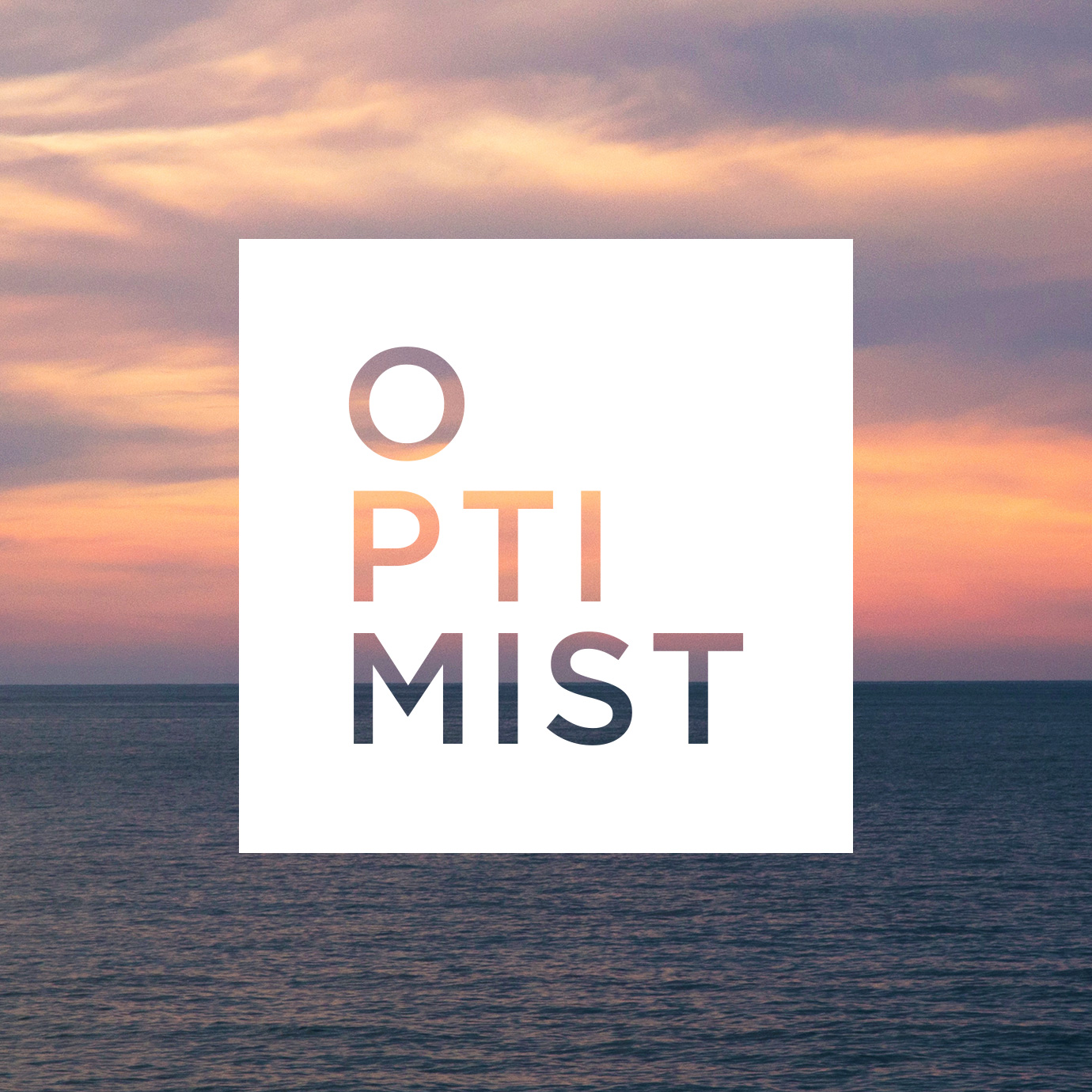
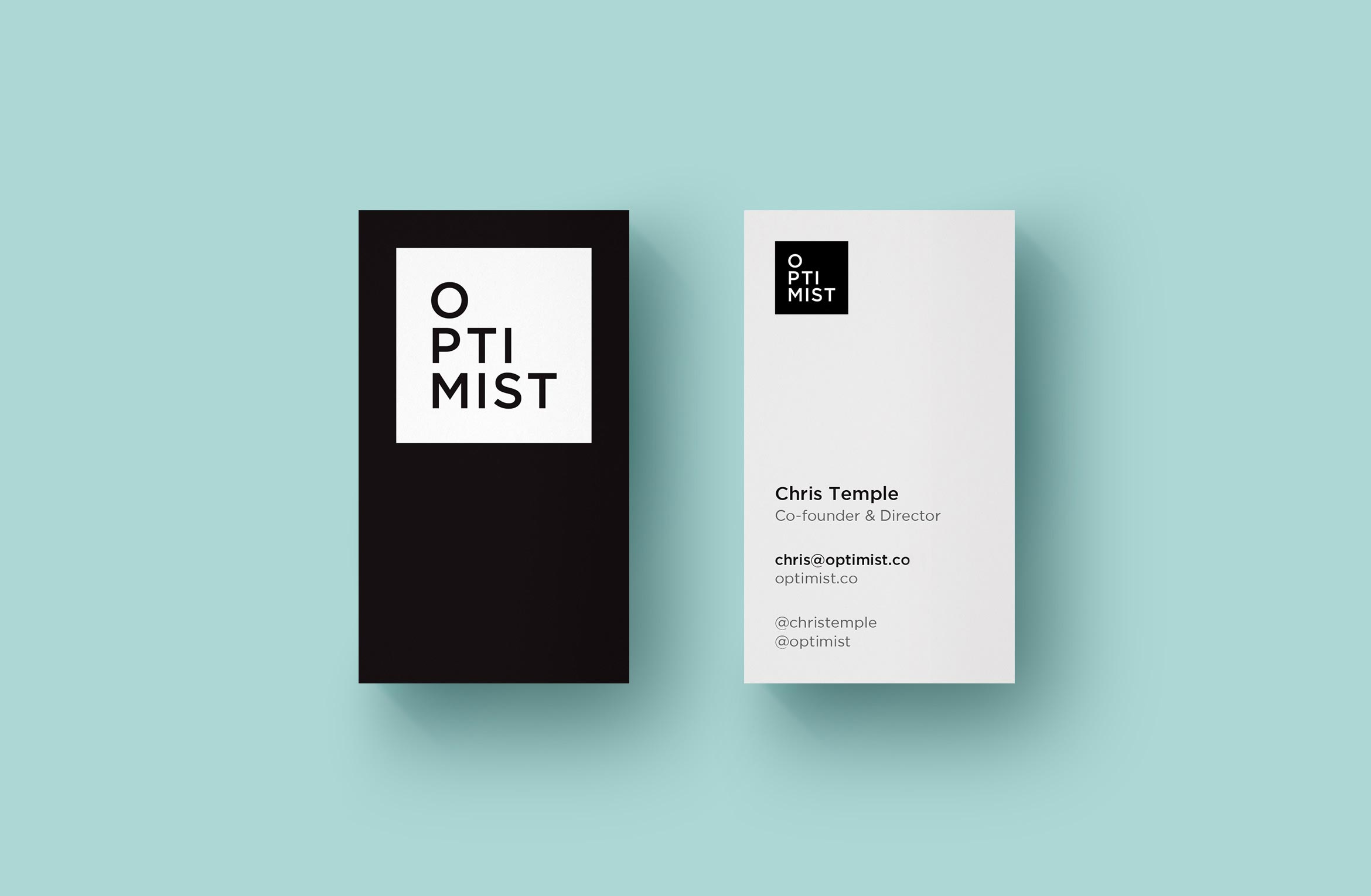
Formerly Living on One, these LA-based filmmakers create character-driven documentaries exploring complex issues through human stories and new perspectives. They changed their name and wanted an identity that felt modern, clean and instantly recognizable as an Optimist film. The word Optimist is stacked to look like its rising inside a simple square.
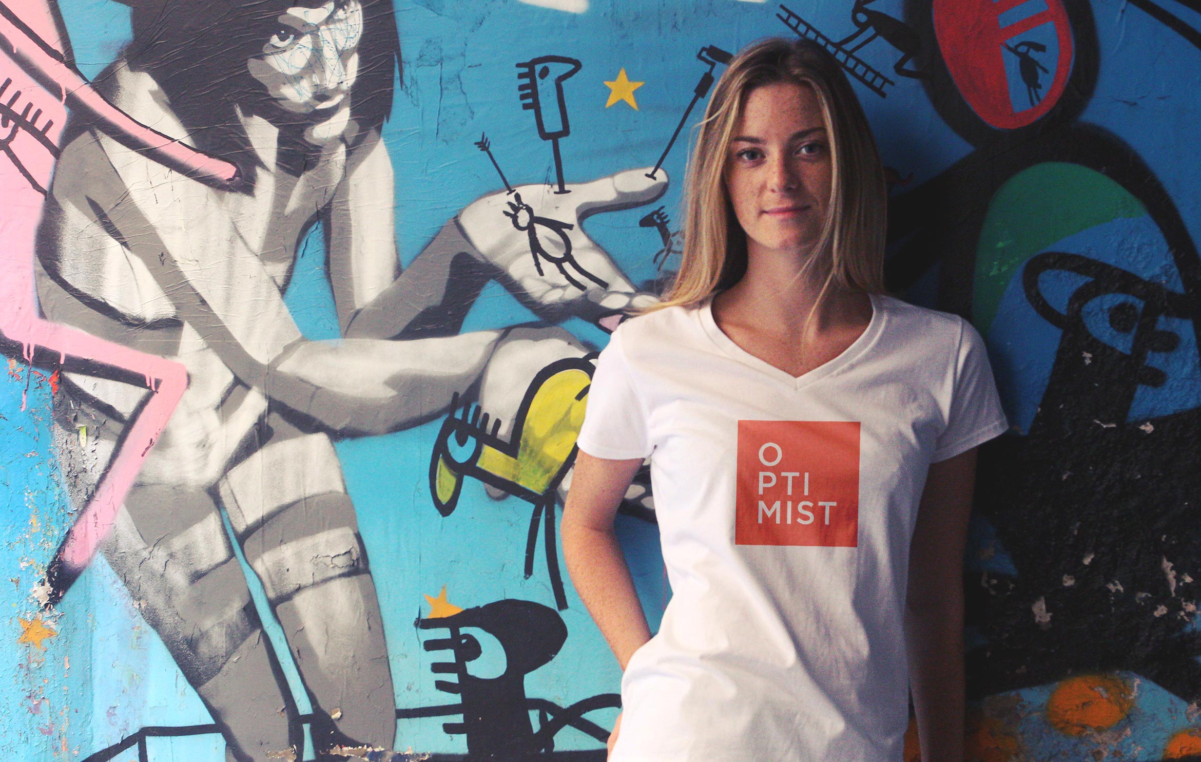
Video Branding was important to create a distinctive look for their content. The white logo was applied as a bug in the corner of all of their social media videos and theatrical films, as well as a clean and legible caption style using the same Gotham font.
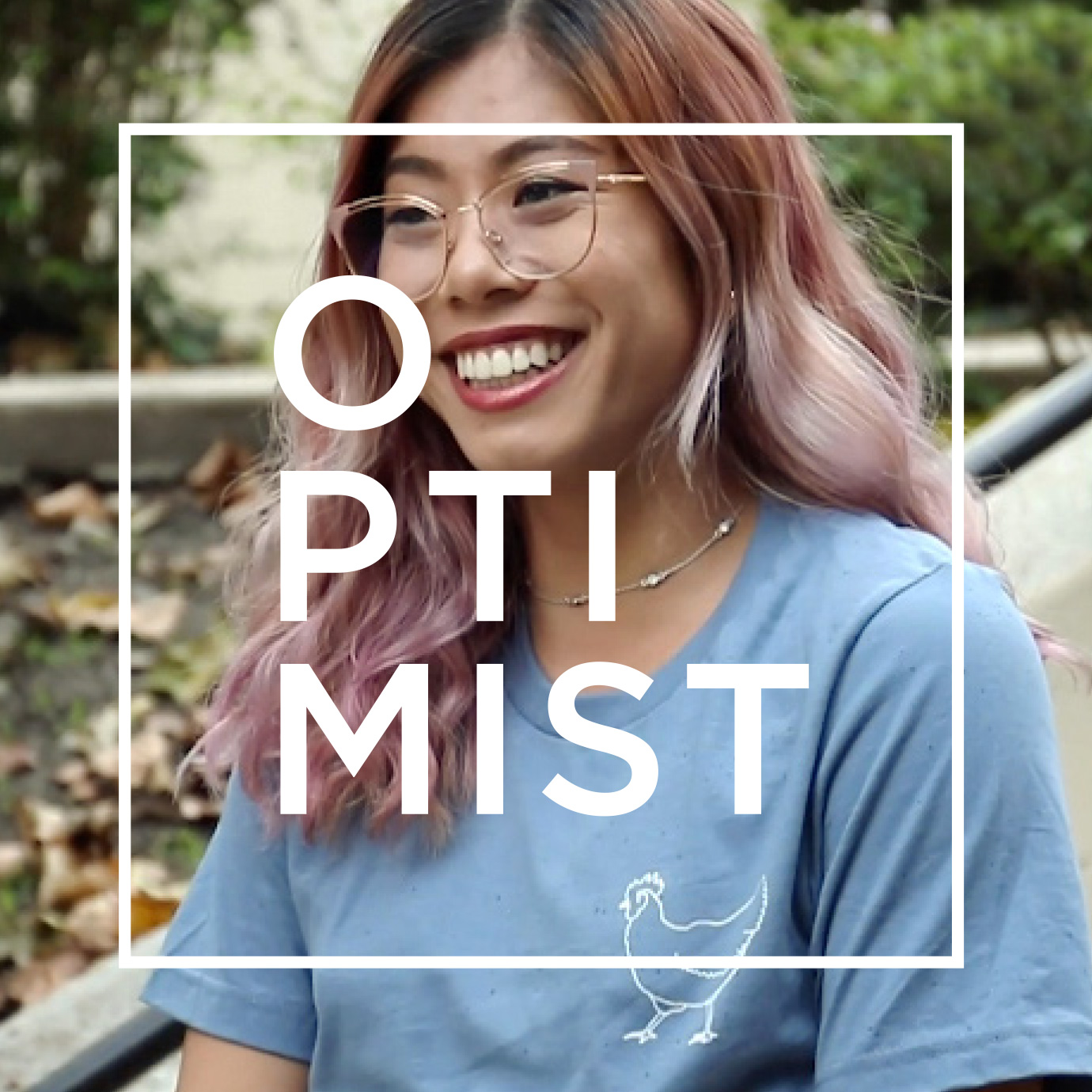
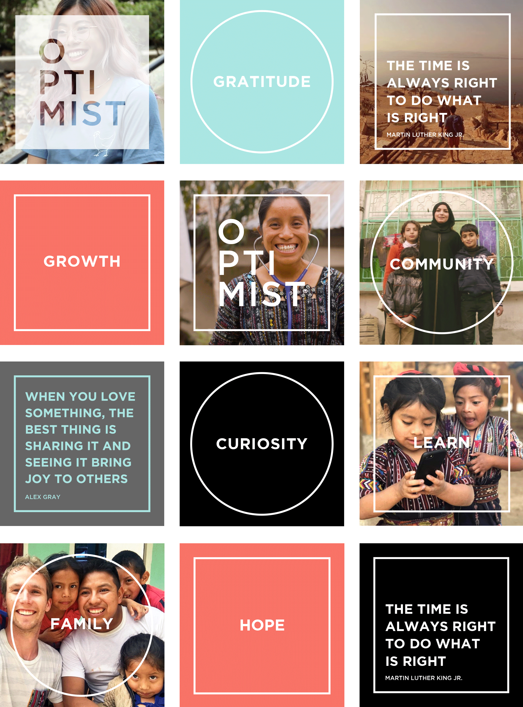
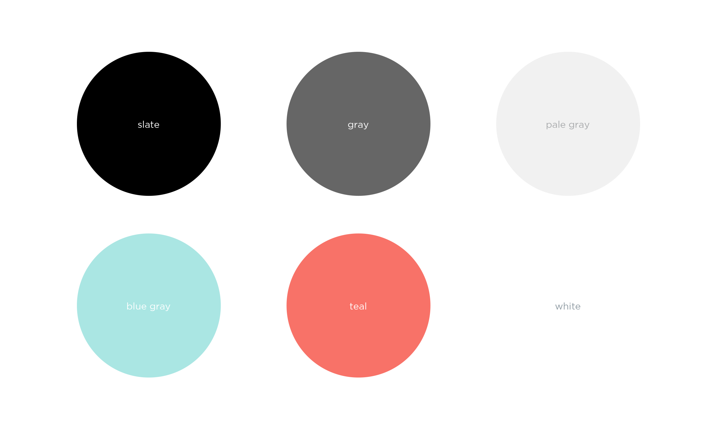
A branded visual design for Instagram is instantly recognizable as Optimist. Using quotes and aspirational words, we paired their photography with clean typography, and a supporting color palette and used square and circle motifs to highlight the message.

Deliverables:
- Brand Identity
- Brand Guidelines
- Video Branding
- Social Media Assets
- Business Cards
- Promotional Swag
Brand Styleguide outlines rules and guidelines for the logo, color palette, typography and graphics. The in-house content team will use this to create branded social media posts for a cohesive look.
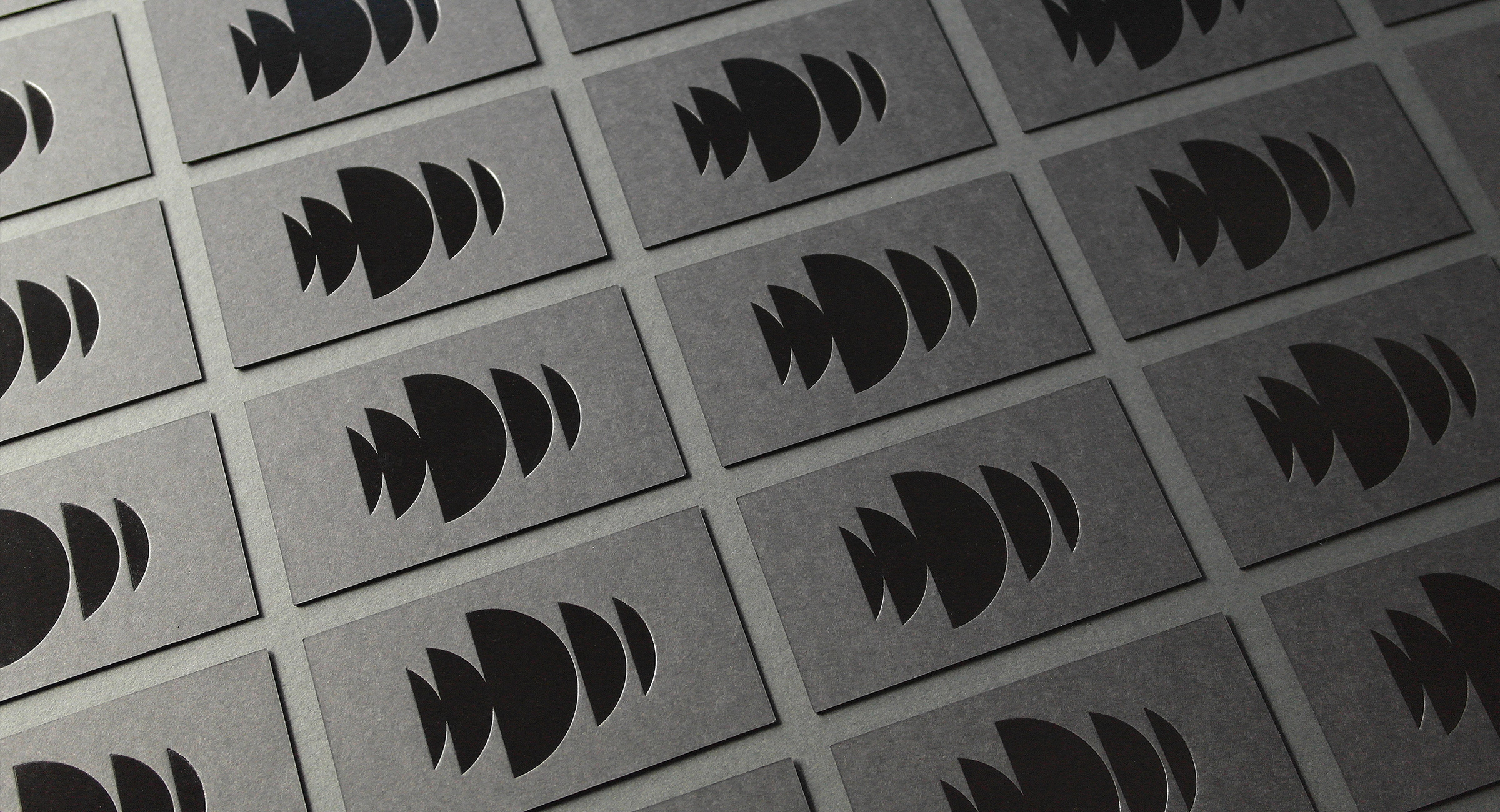
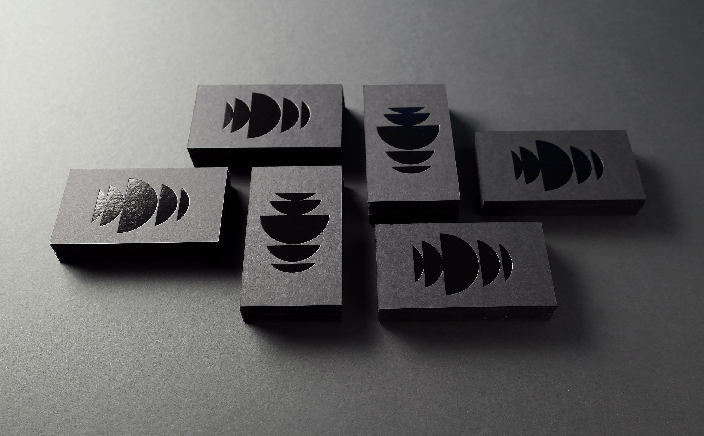
Demarest production
arts & media / brand identity / print
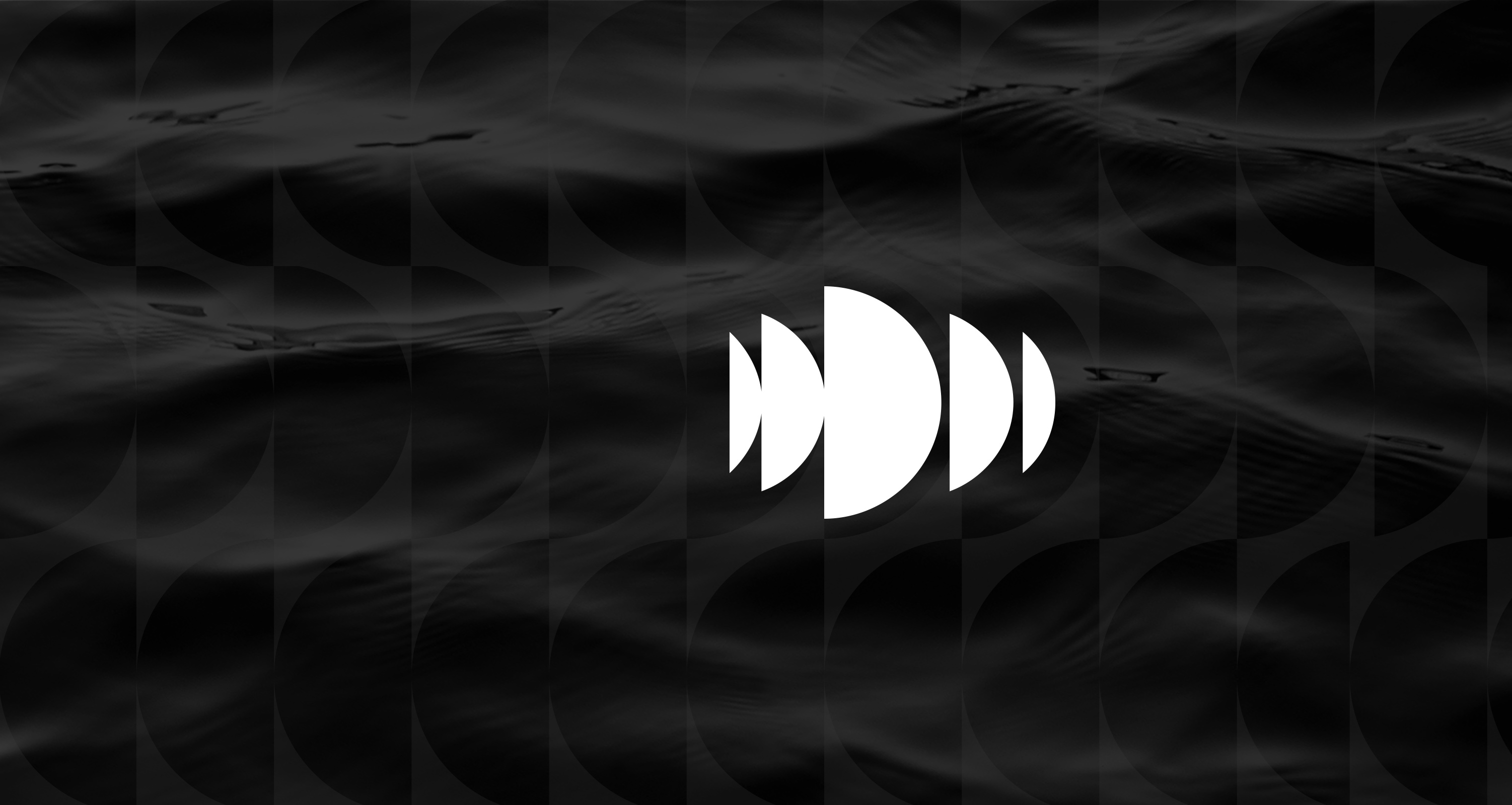

Demarest empowers great ideas in film and technology to deliver content
Demarest is a unique film and television production company that also invests in technologies that create and deliver premium content across all mediums. They wanted to remove the “films” from their name and redesign their identity to better reflect their innovative business model.
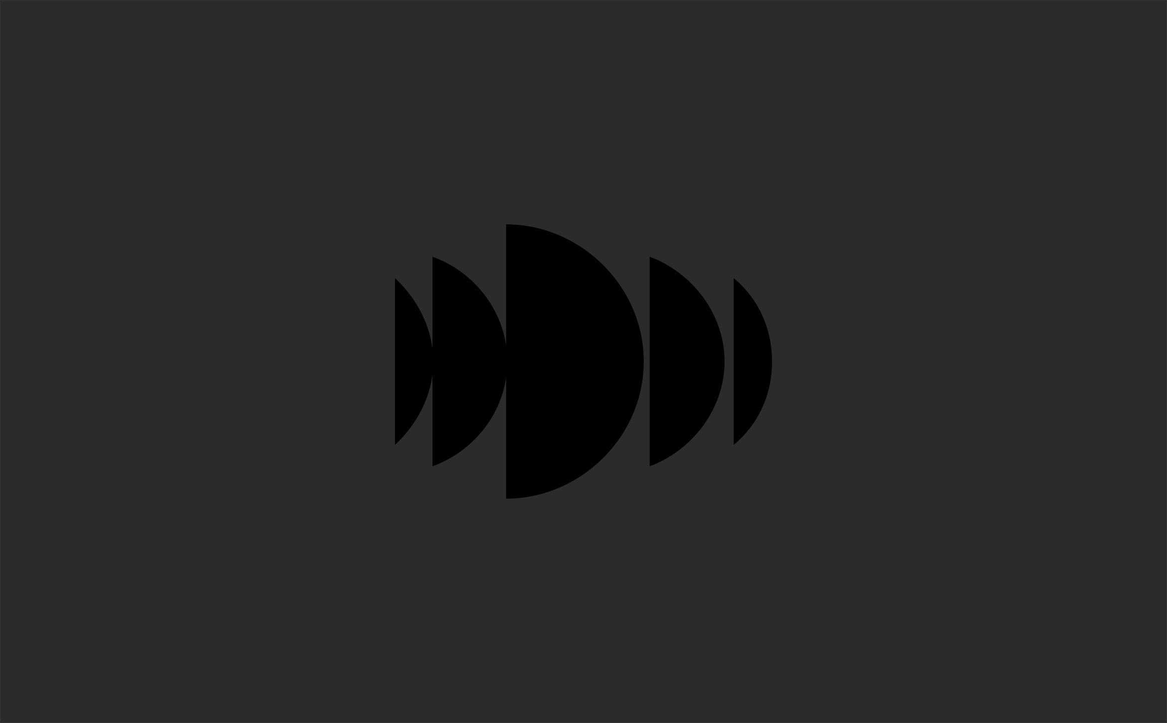
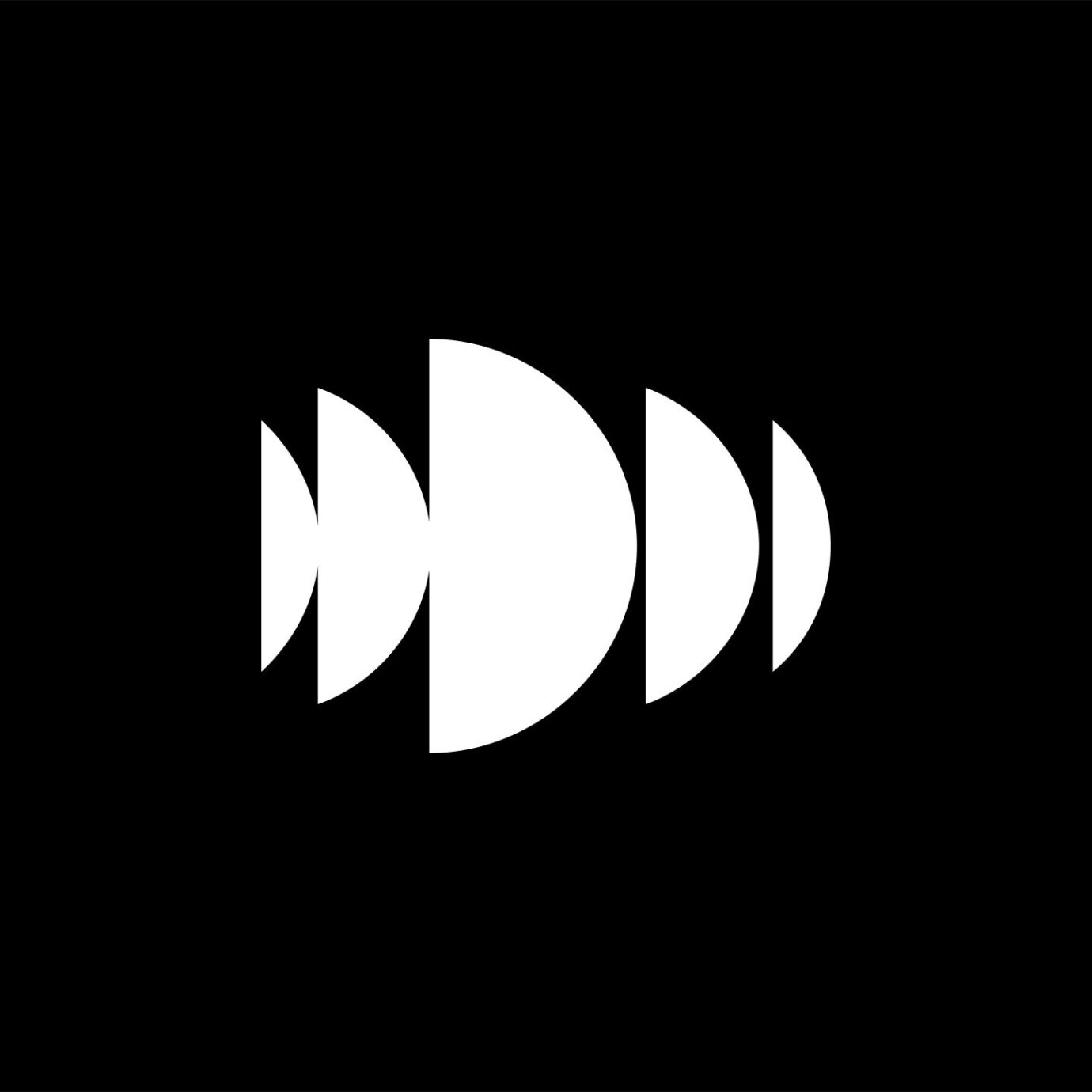
The mark is composed of bisected circles that echo the letter “D”, creating an innovative wave pattern that’s full of motion and energy reminiscent of light refracting on dark water.
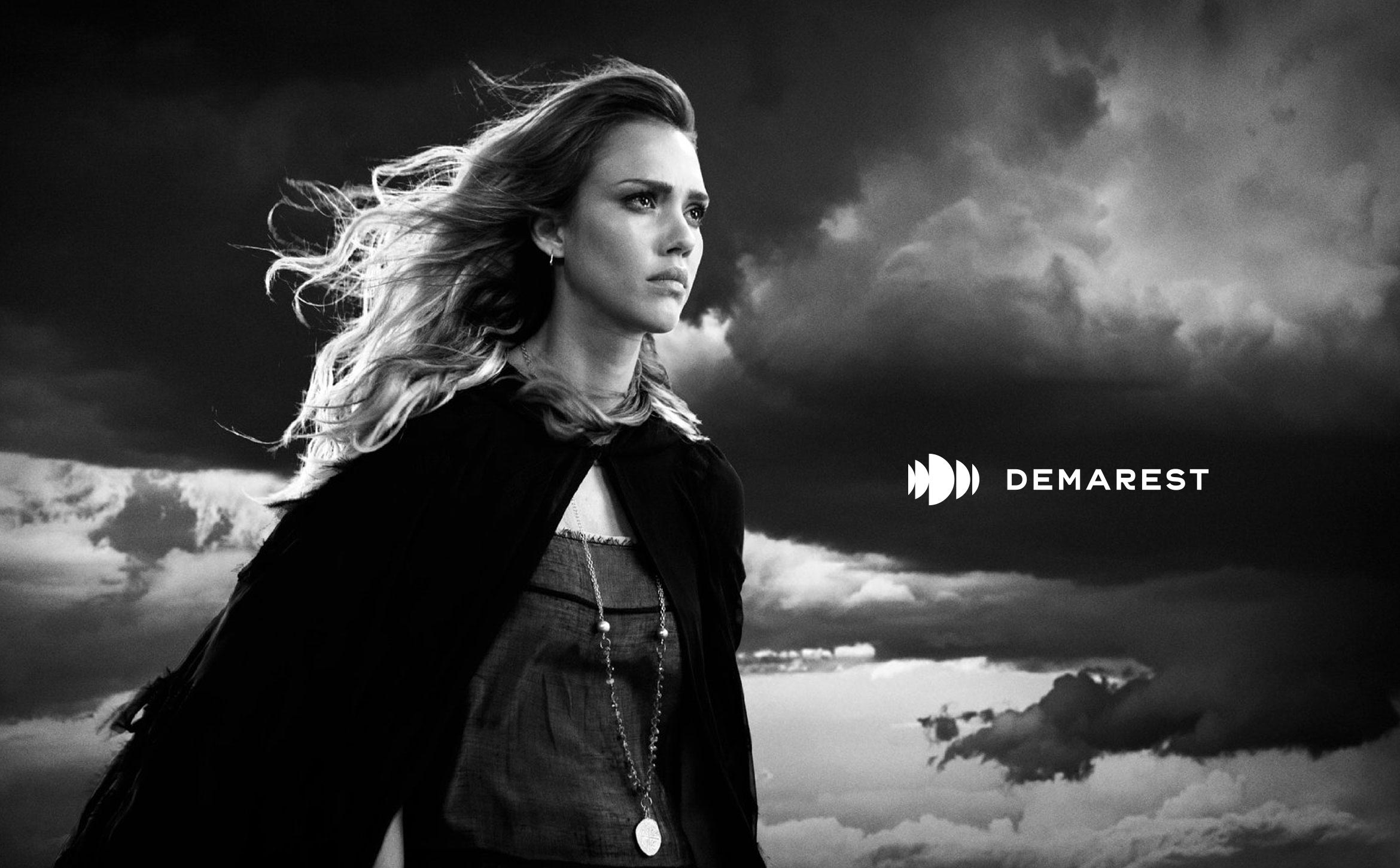
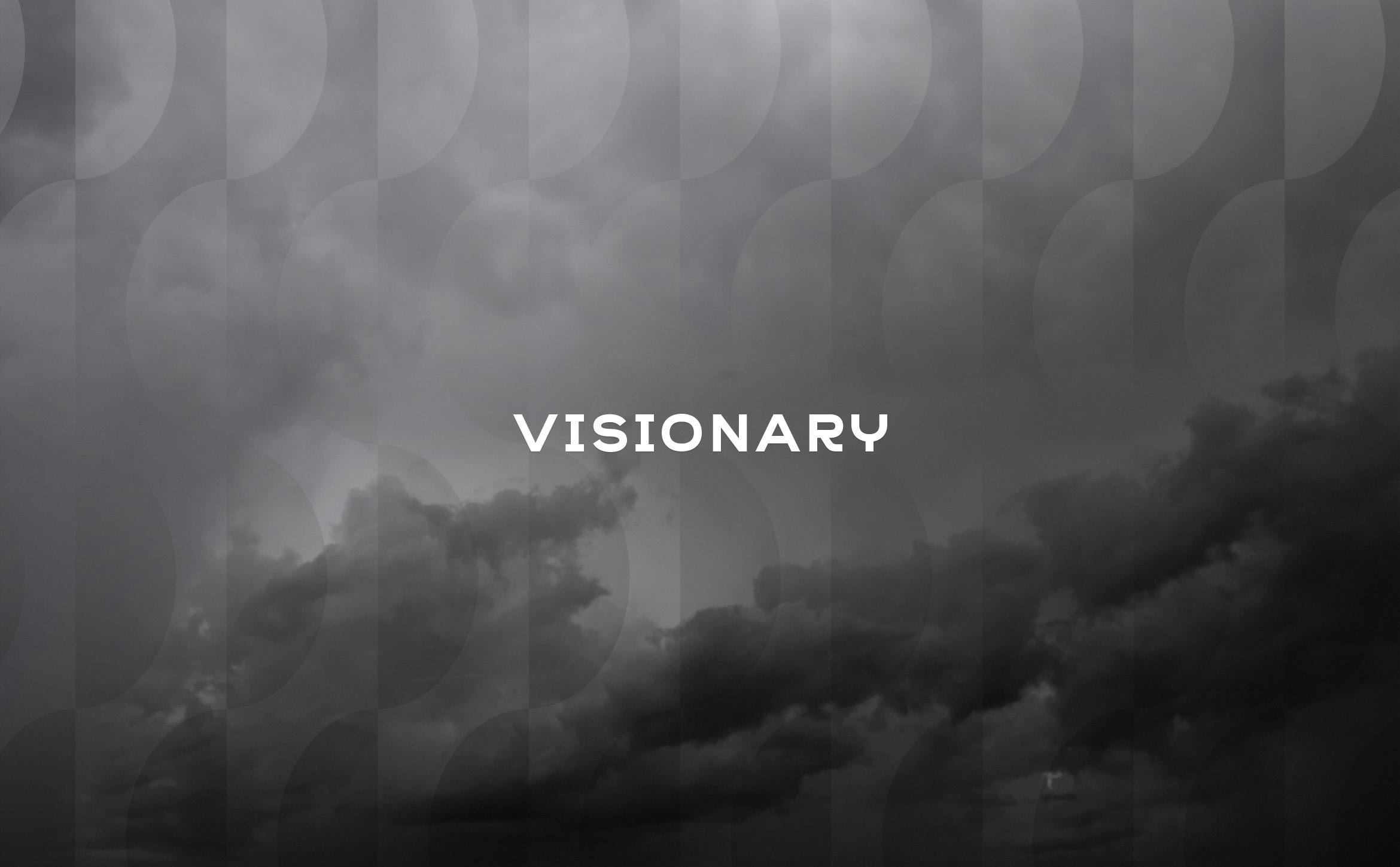
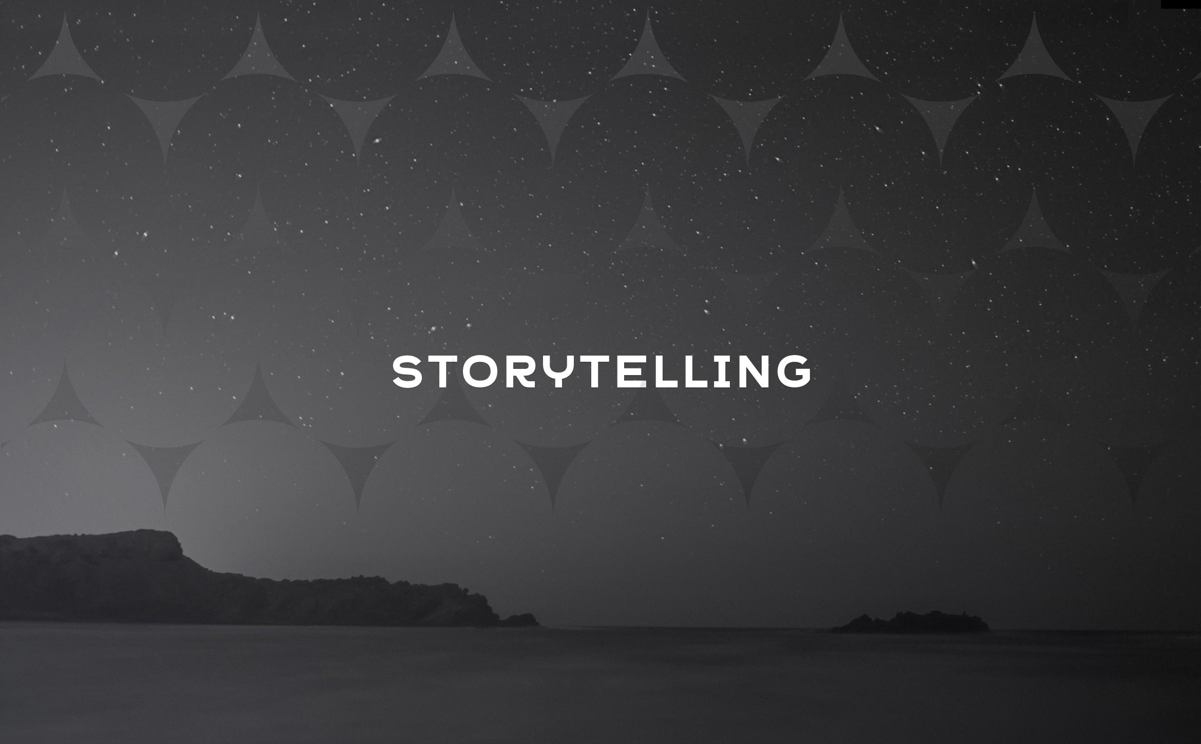
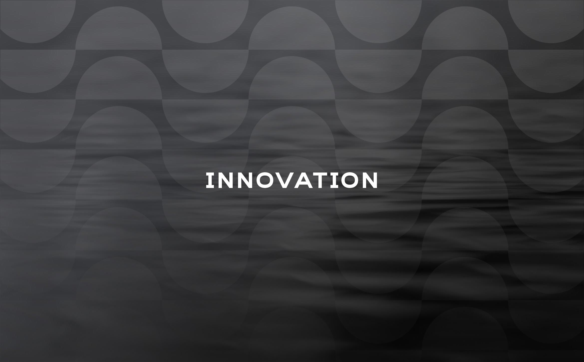
The name Demarest means “of the swamp” in French. Images of water and nature combined with pattern motifs evoke a mysterious place where ideas are born. Moody images help bring a responsive WordPress site to life.


Deliverables:
- Brand Identity
- Brand Styleguide
- Website Design
- Business Cards
- Content Creation
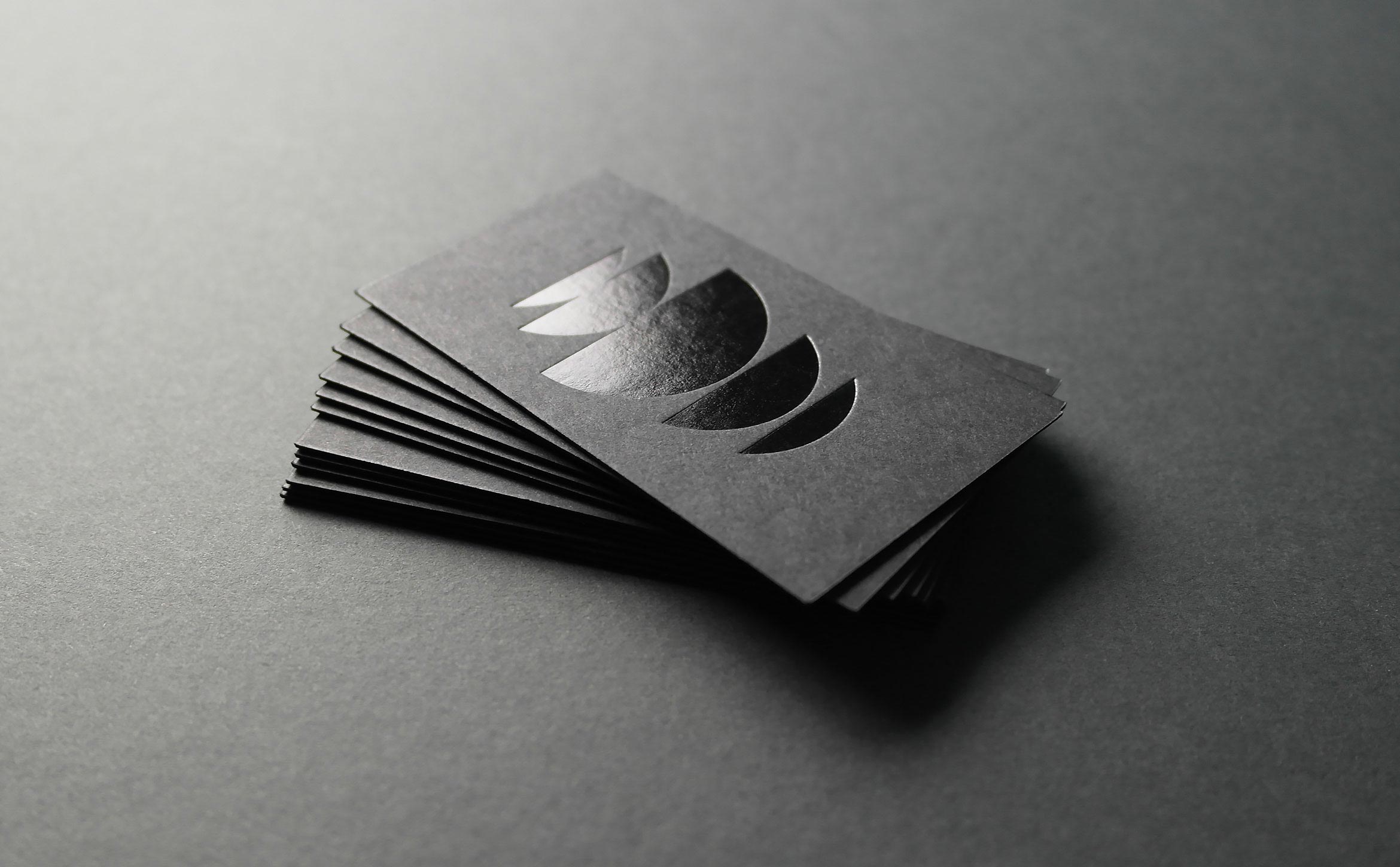
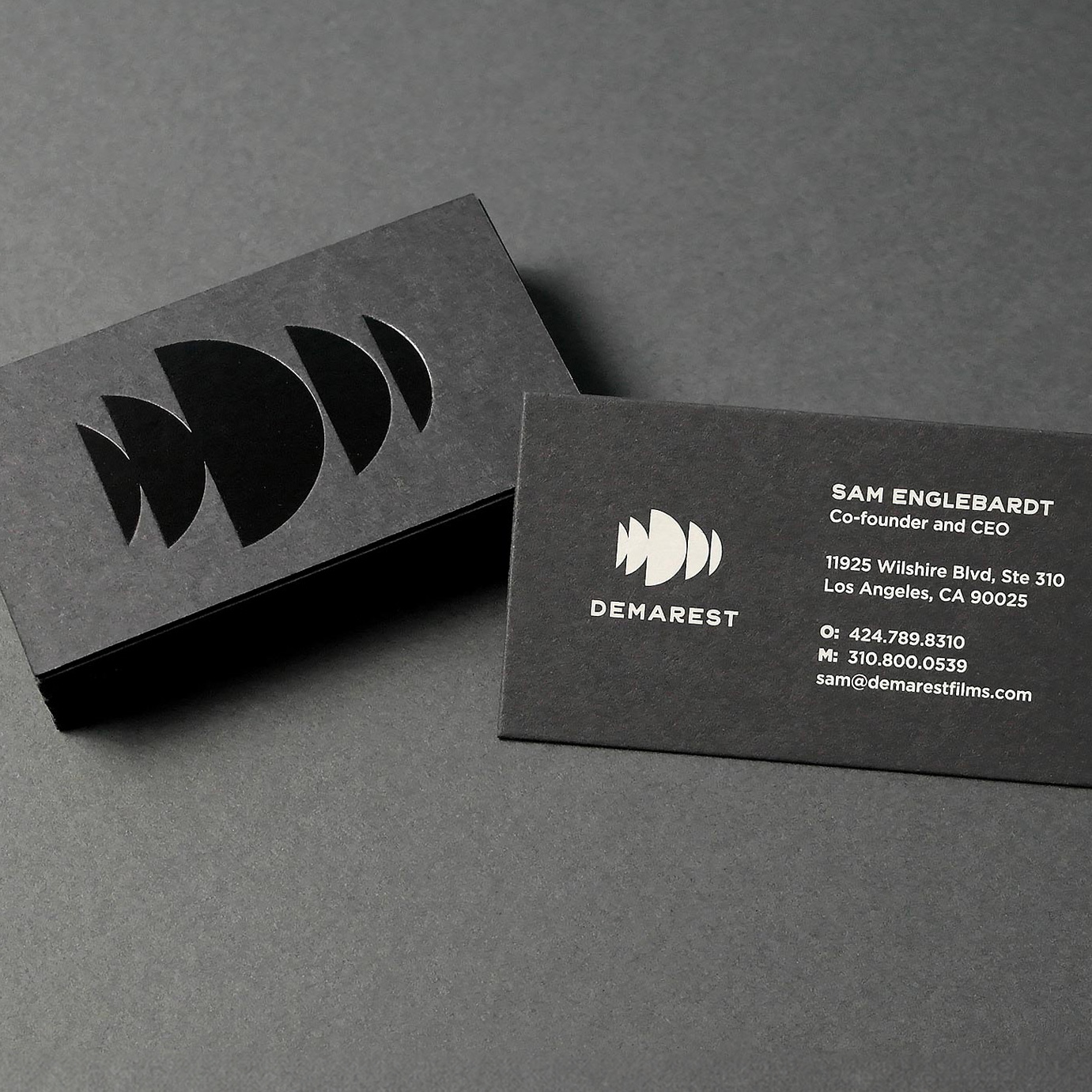
We designed dark and mysterious business cards for the team. Cards are printed using duplexed French Muscletone stock with black foil embossed on the front and silkscreened pale gray ink on the back.
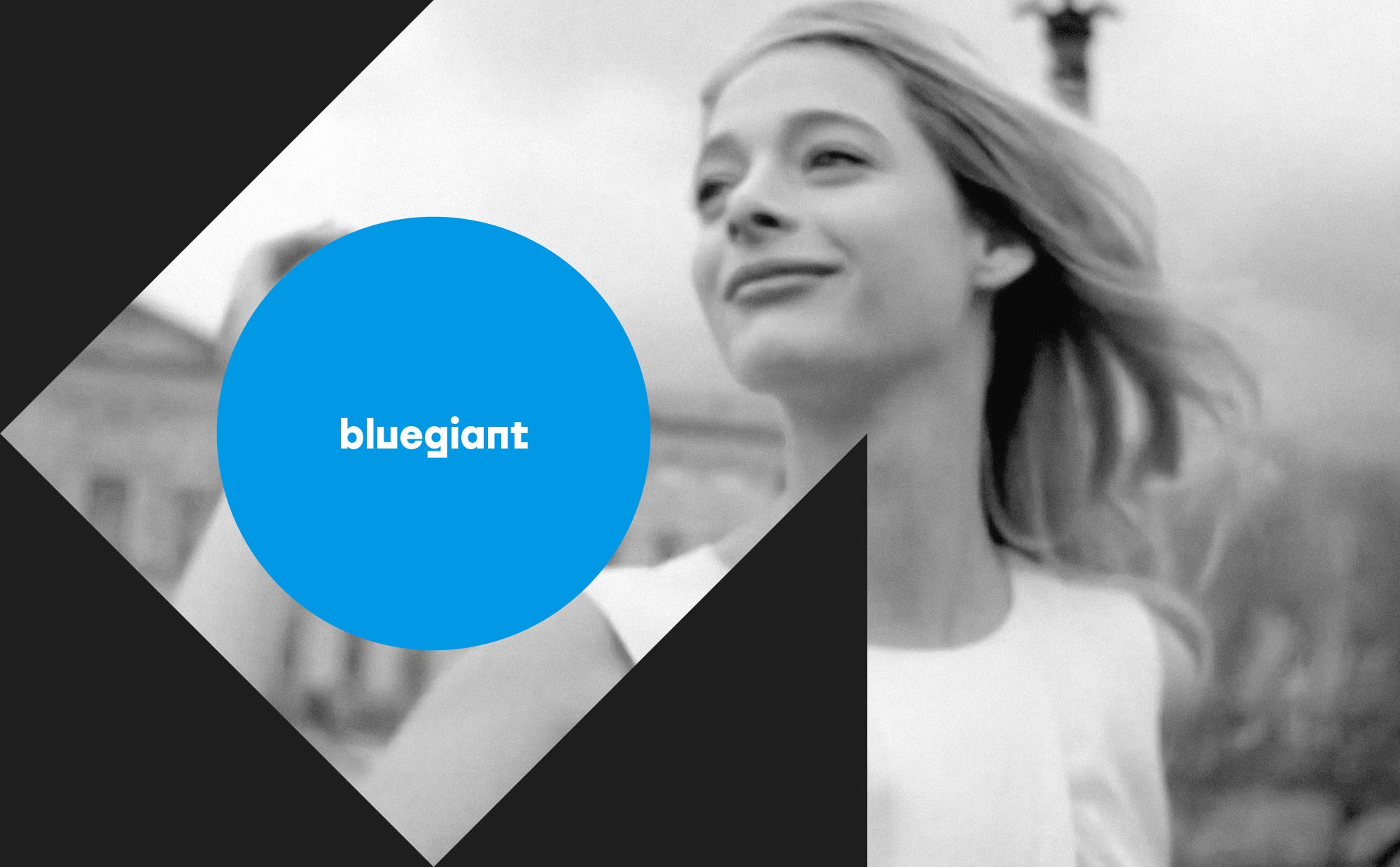
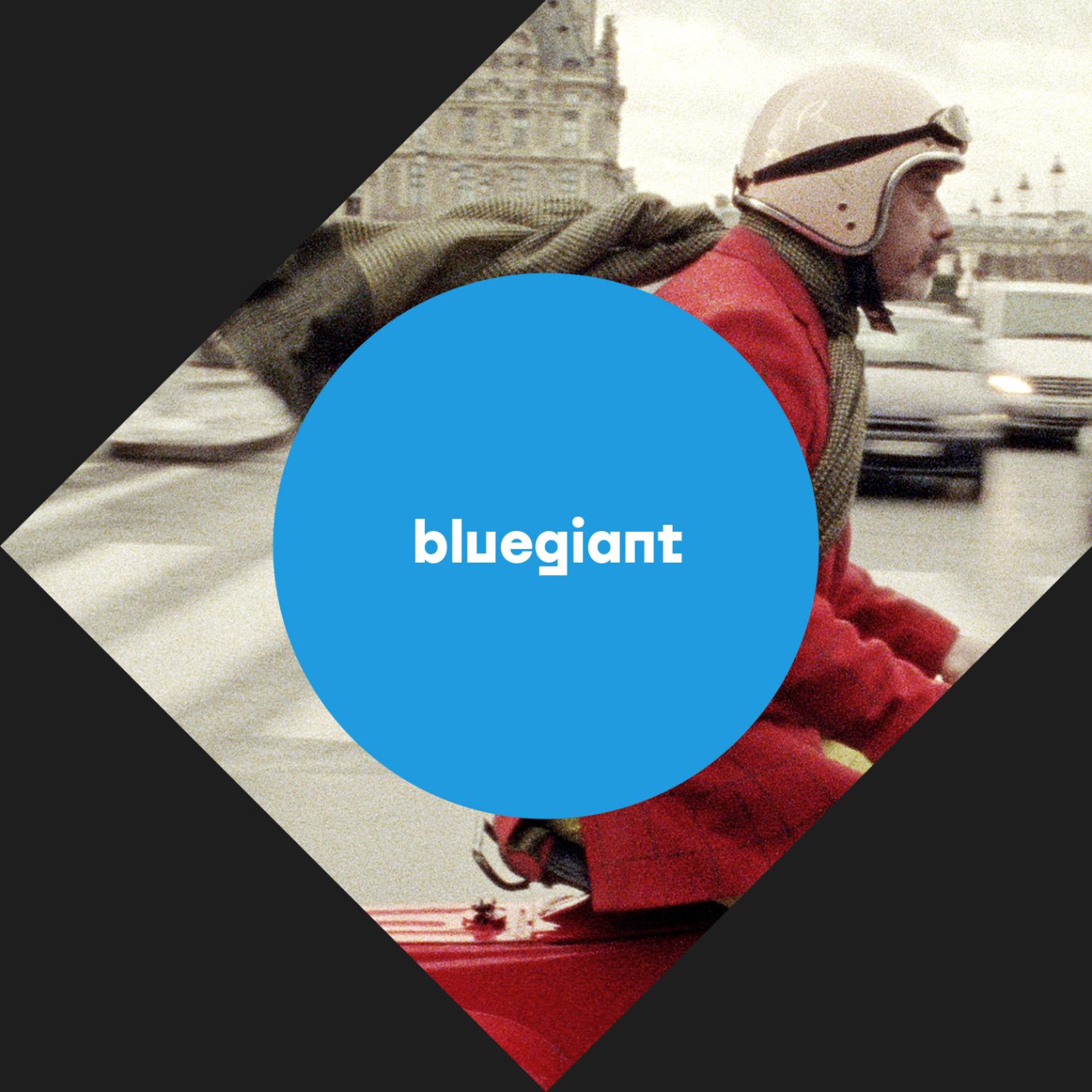
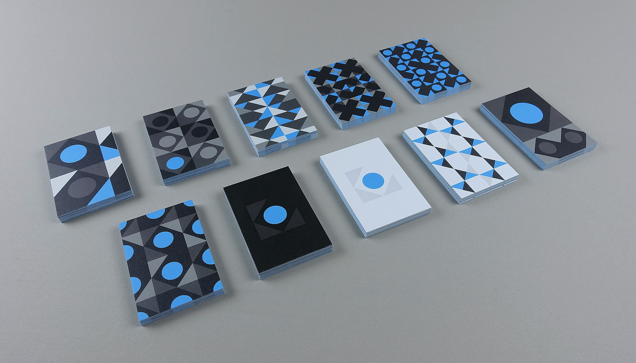
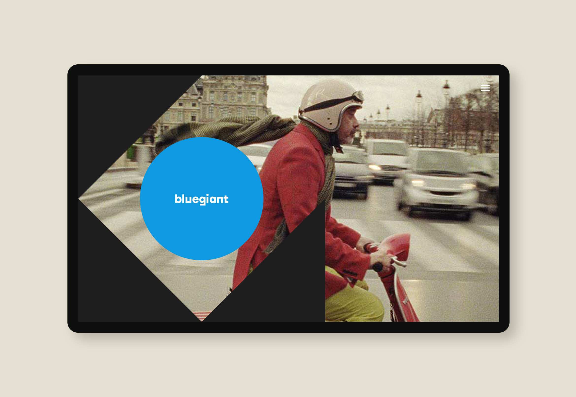
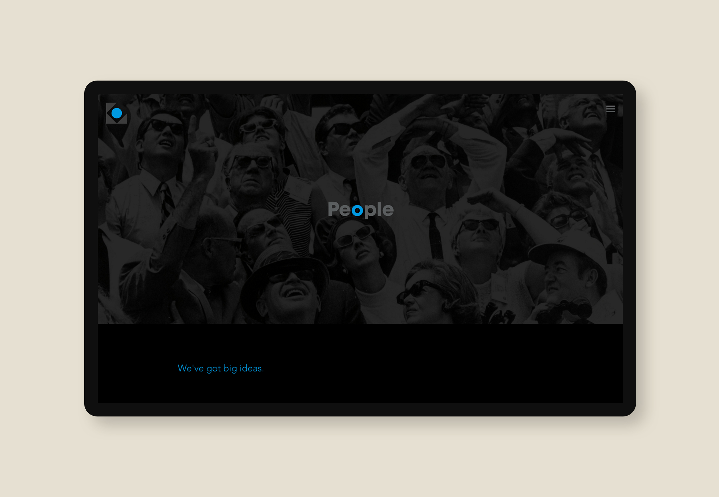
Bluegiant productions
media / brand identity / web / print
Bluegiant productions gets a stellar and polished Mid-century modern rebrand
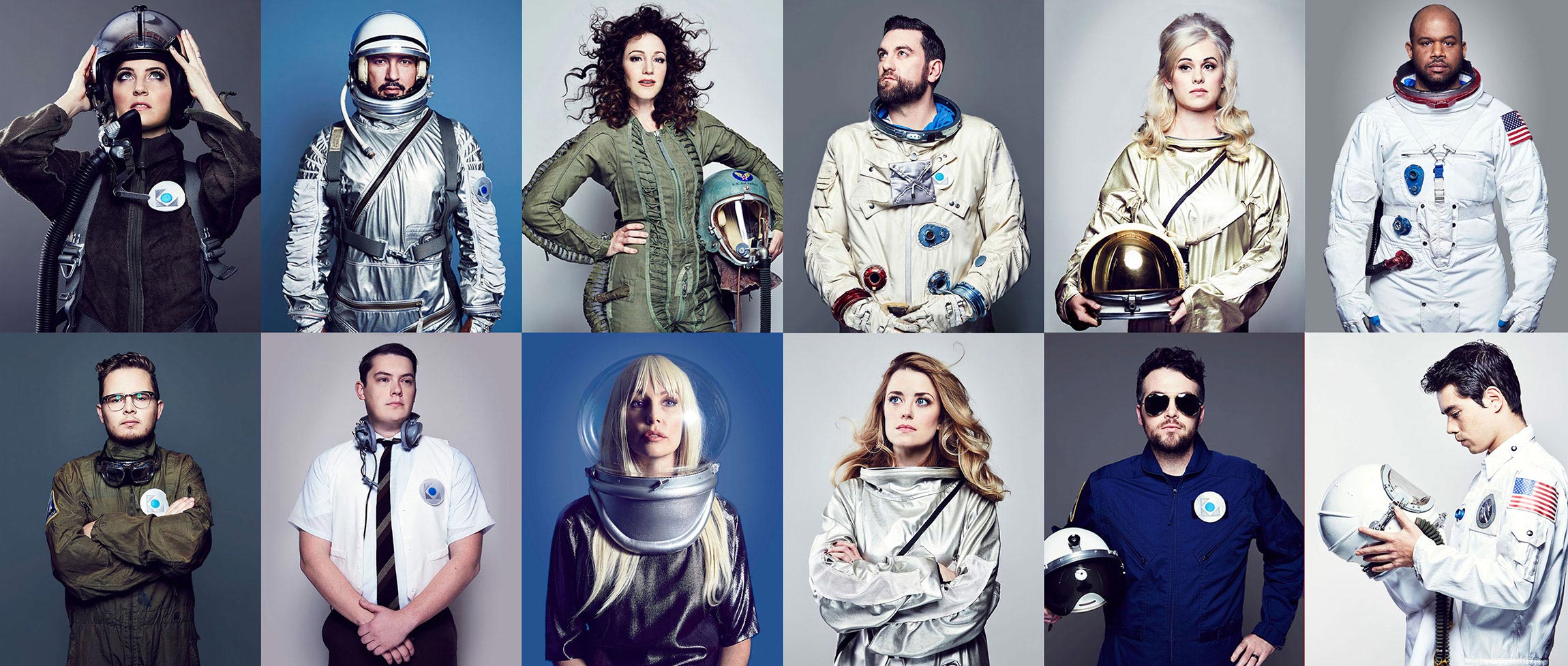
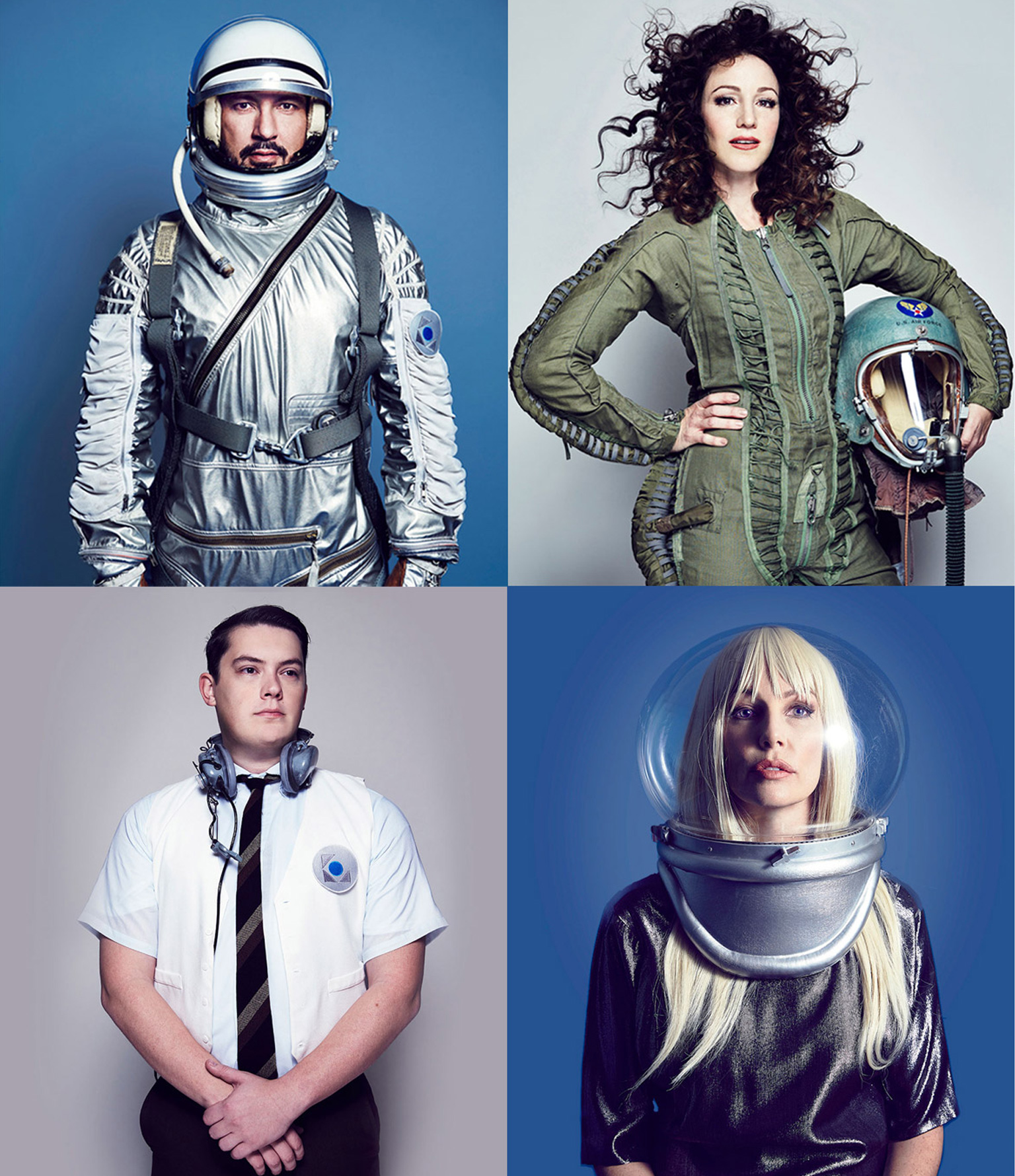
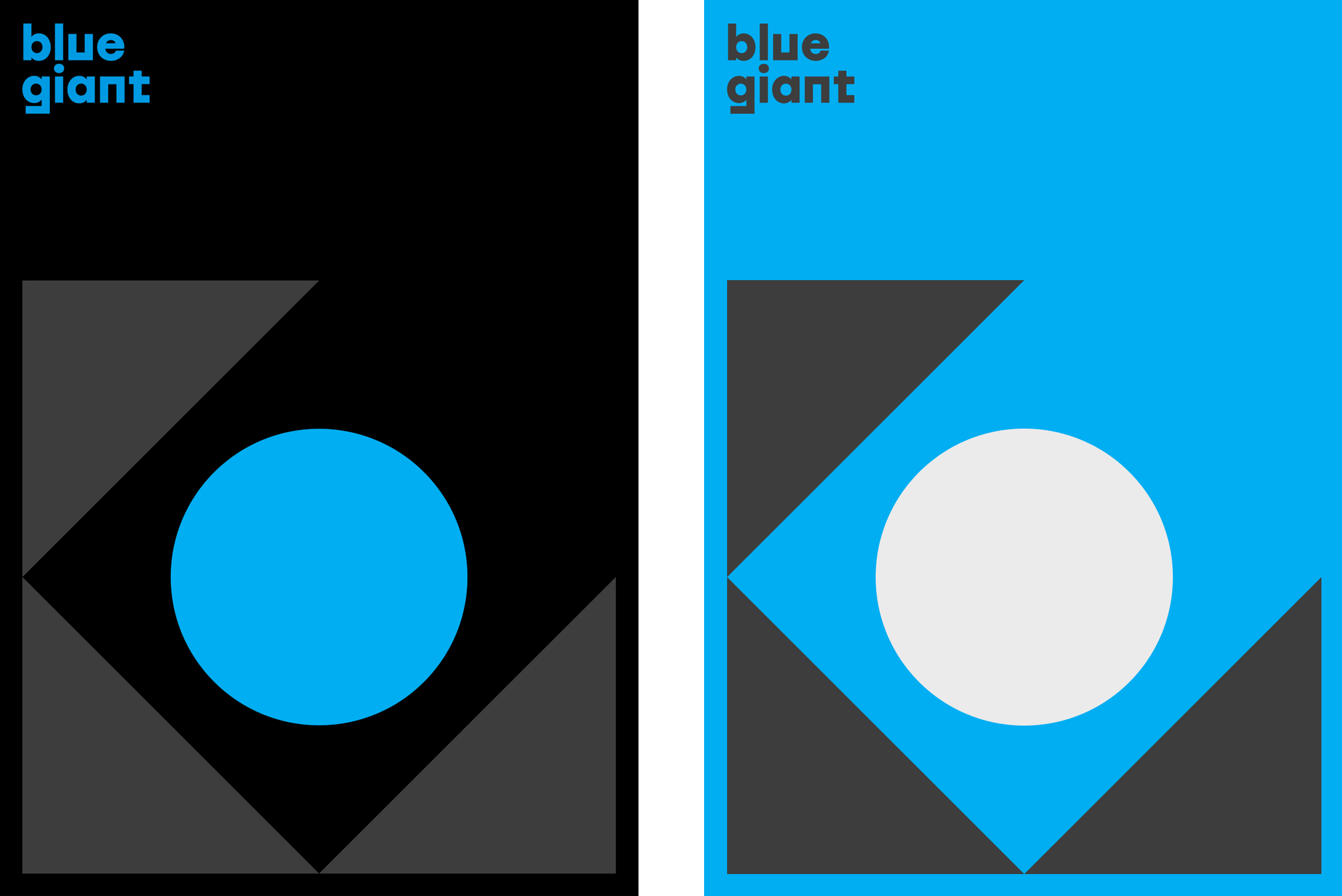
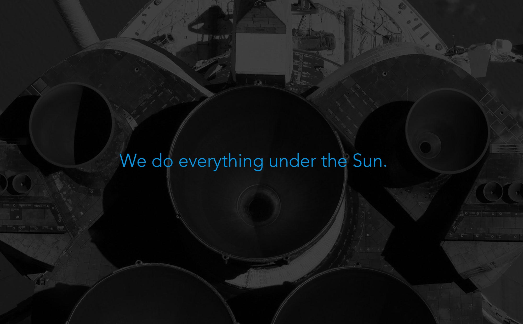
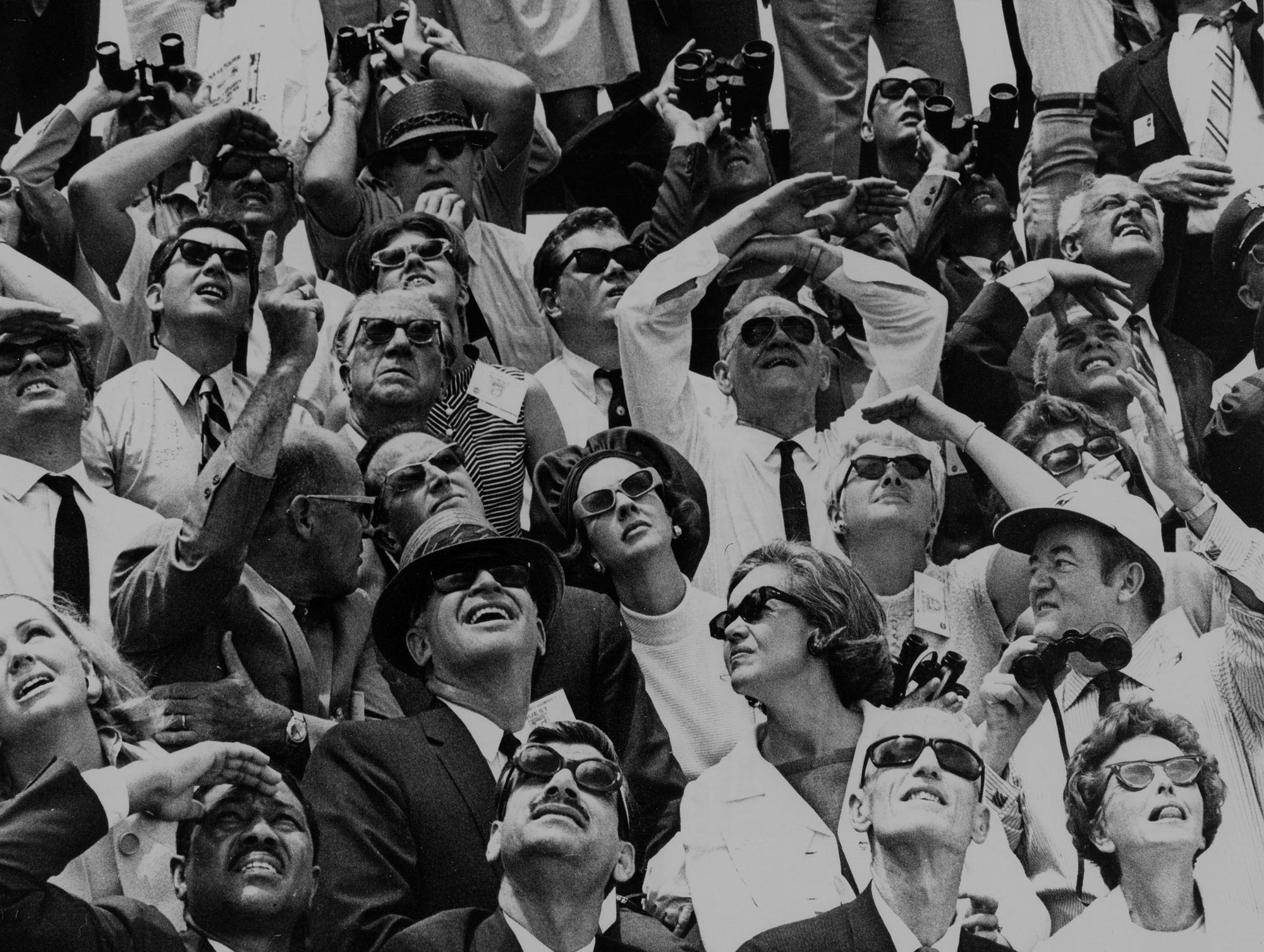
As one of many LA-based film production companies, Bluegiant wanted to stand out and show their stylish and creative side. The proposed identity evokes a Mid-century modern style with geometric shapes harnessing a “blue giant” star. The look and feel combines black, dark colors and cyan with outer space, astronauts and vintage spaceship imagery that evokes style and charm.
Deliverables:
- Brand Identity
- Visual System
- Print Collateral Design
- Web Design
- Web Development
- Content Creation
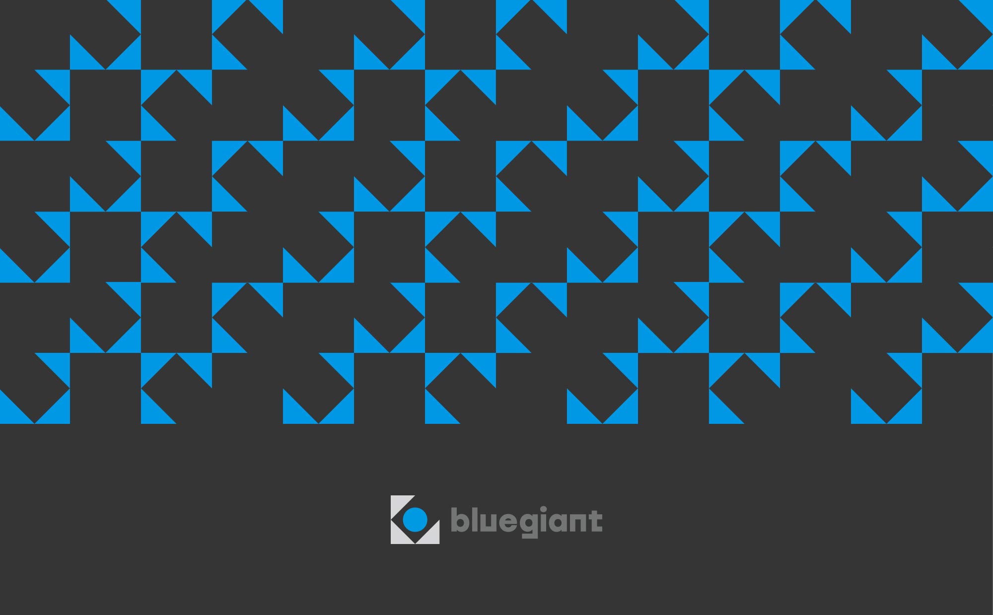
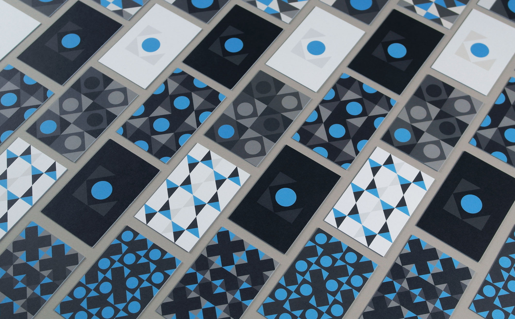
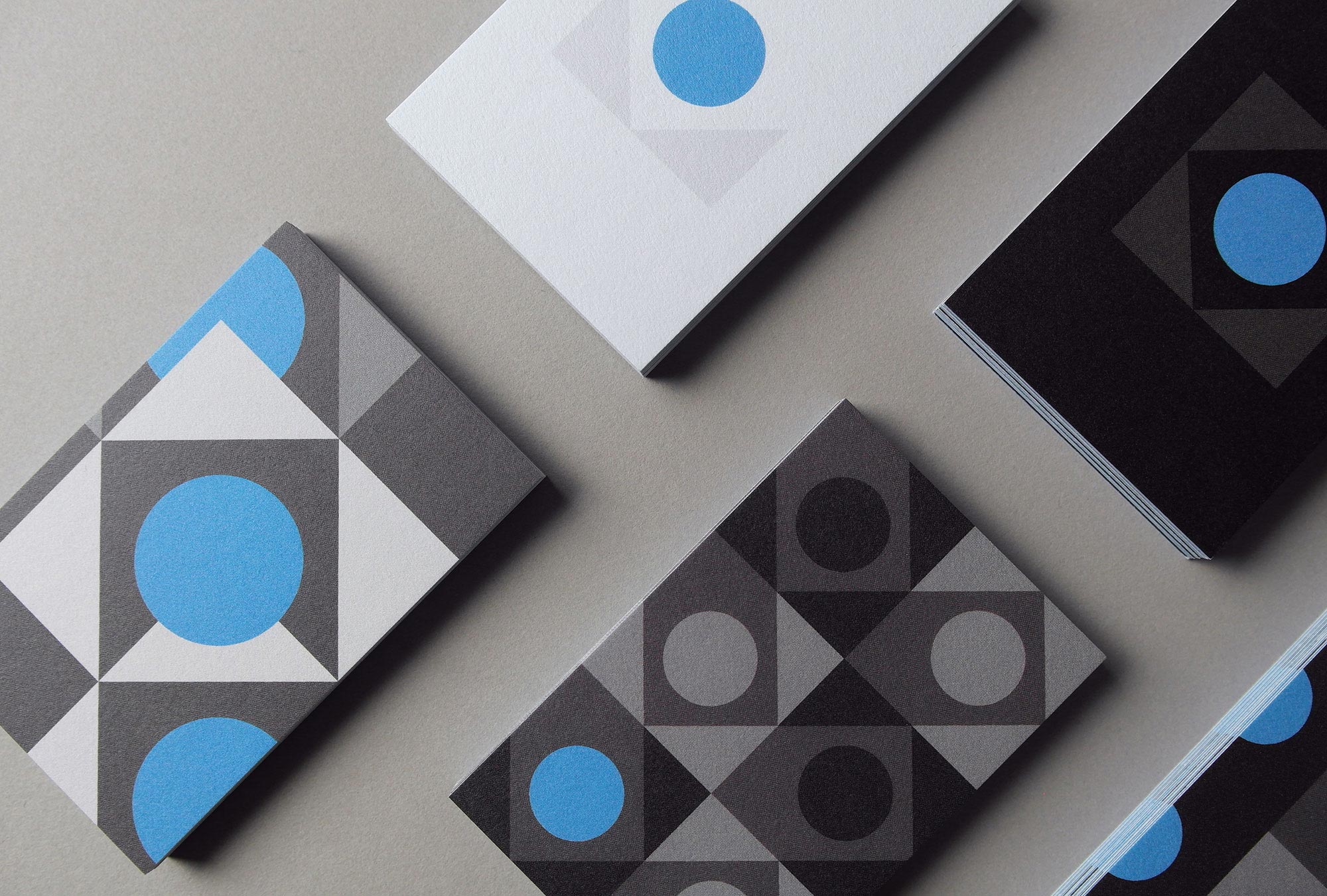
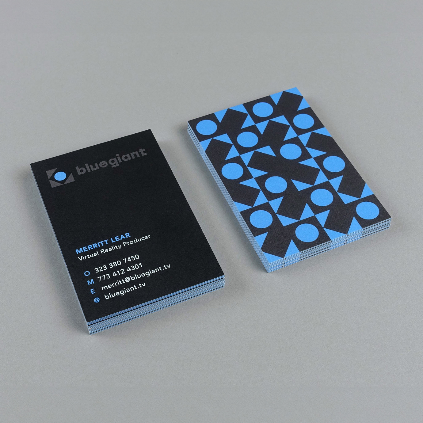
A set of 12 patterns made out of circles and triangles taken from the main mark were printed on Luxe MOO business cards for the entire team. Letting clients choose their own design becomes a fun conversation starter.
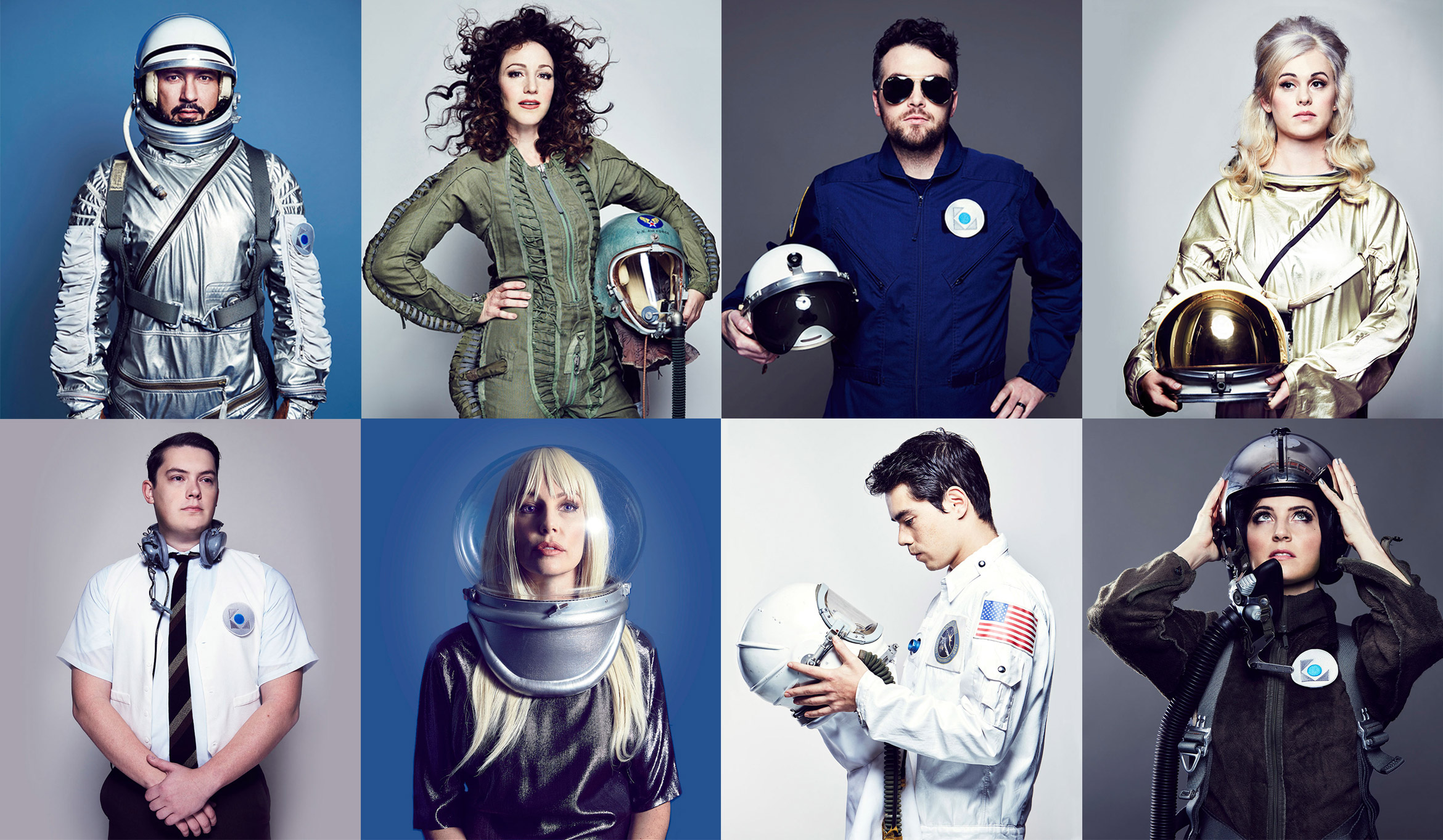
Bluegiant ran with our creative direction idea for a team photoshoot by wearing vintage astronaut suits to show everyone’s personality. Zoom out and zoom in shots were used for the people page on the website.
A brochure site showcases Bluegiant’s work with fun animations, edgy copy, a video reel and space-related imagery throughout.
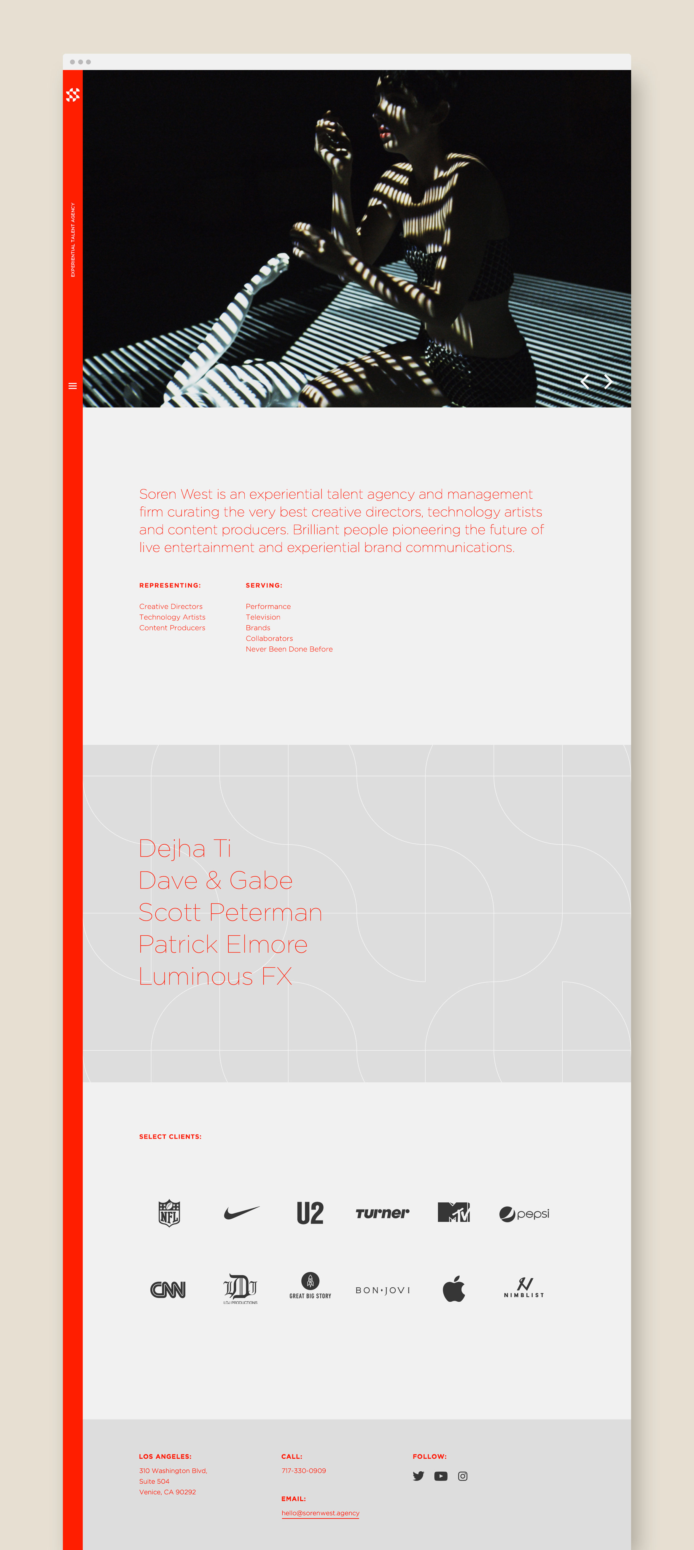
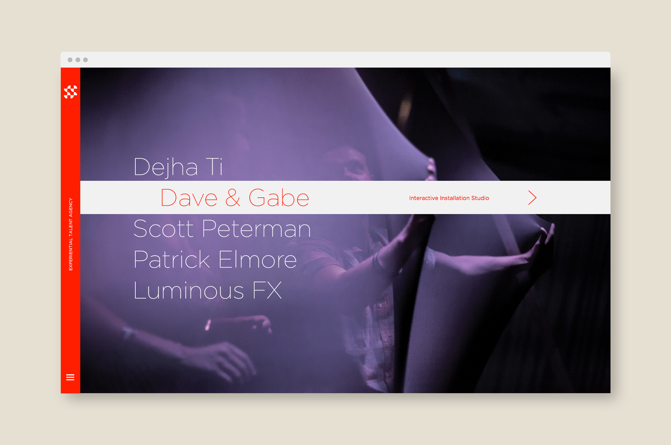
Soren West productions
arts & media / brand identity / print
Soren West creates experiential content, immersive events and entertainment
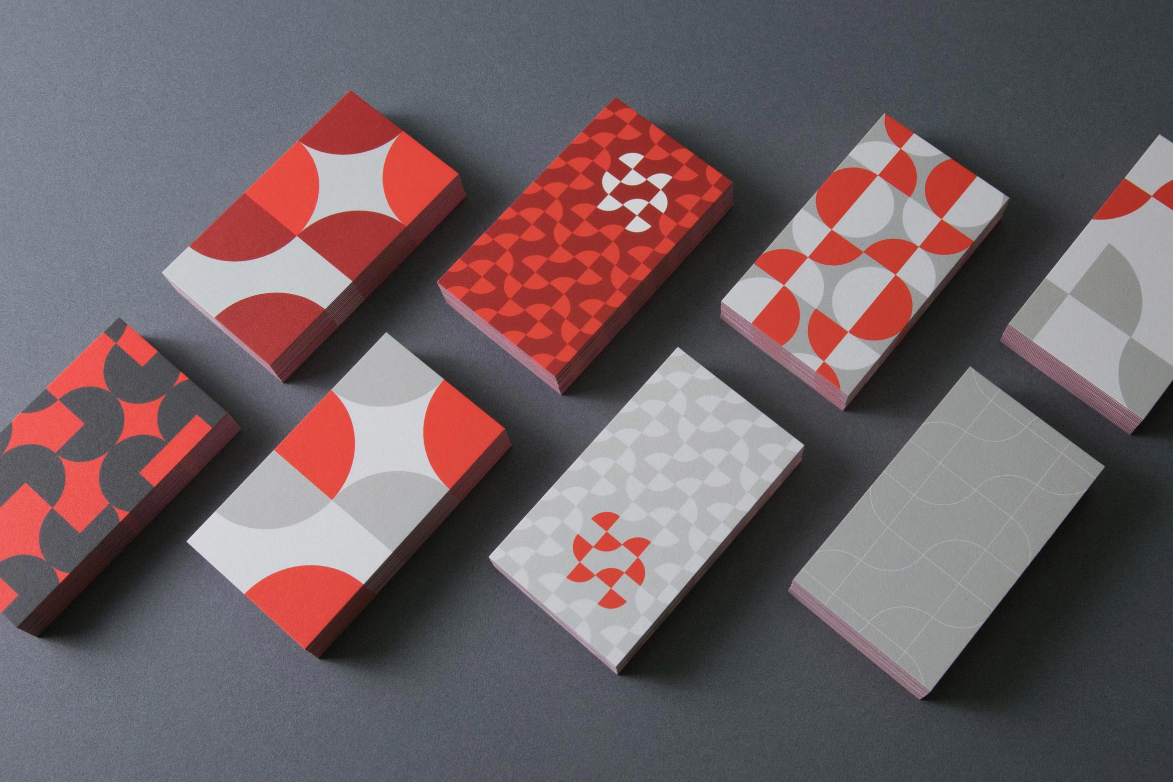
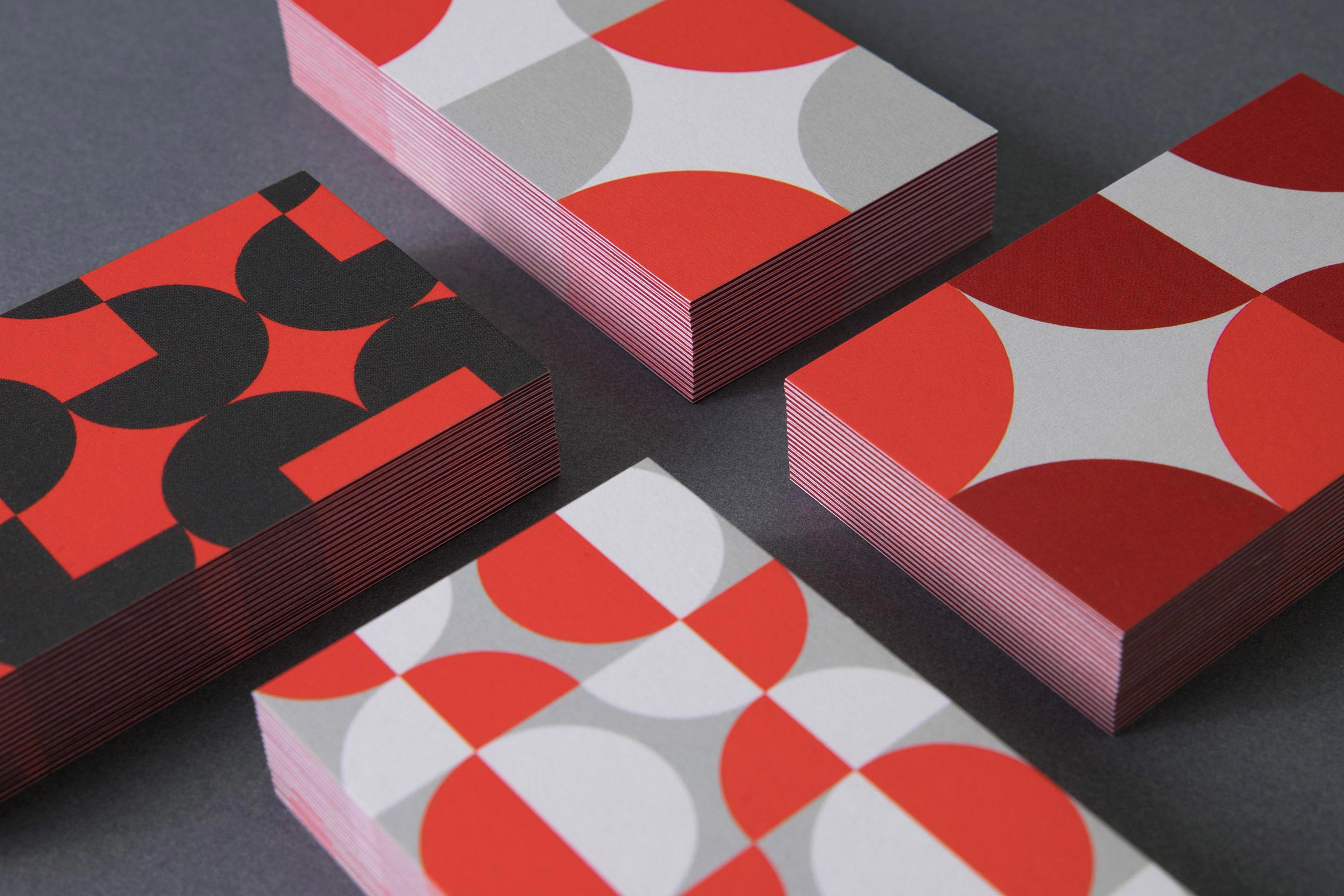
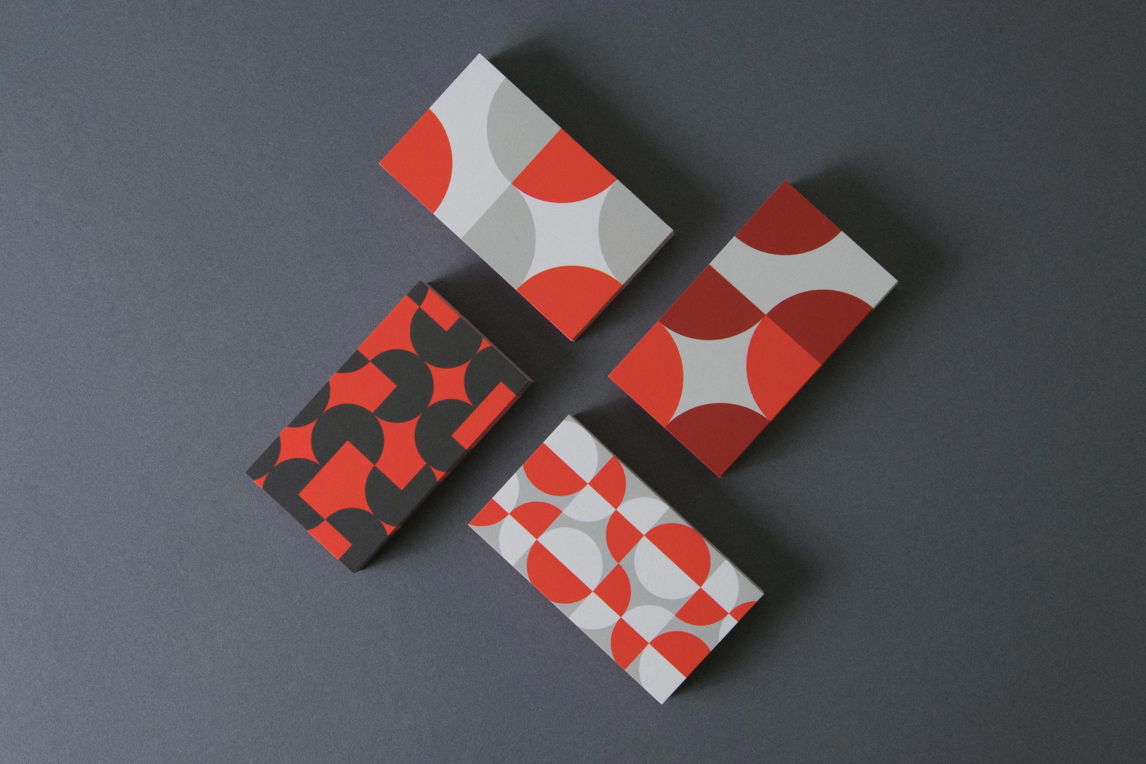
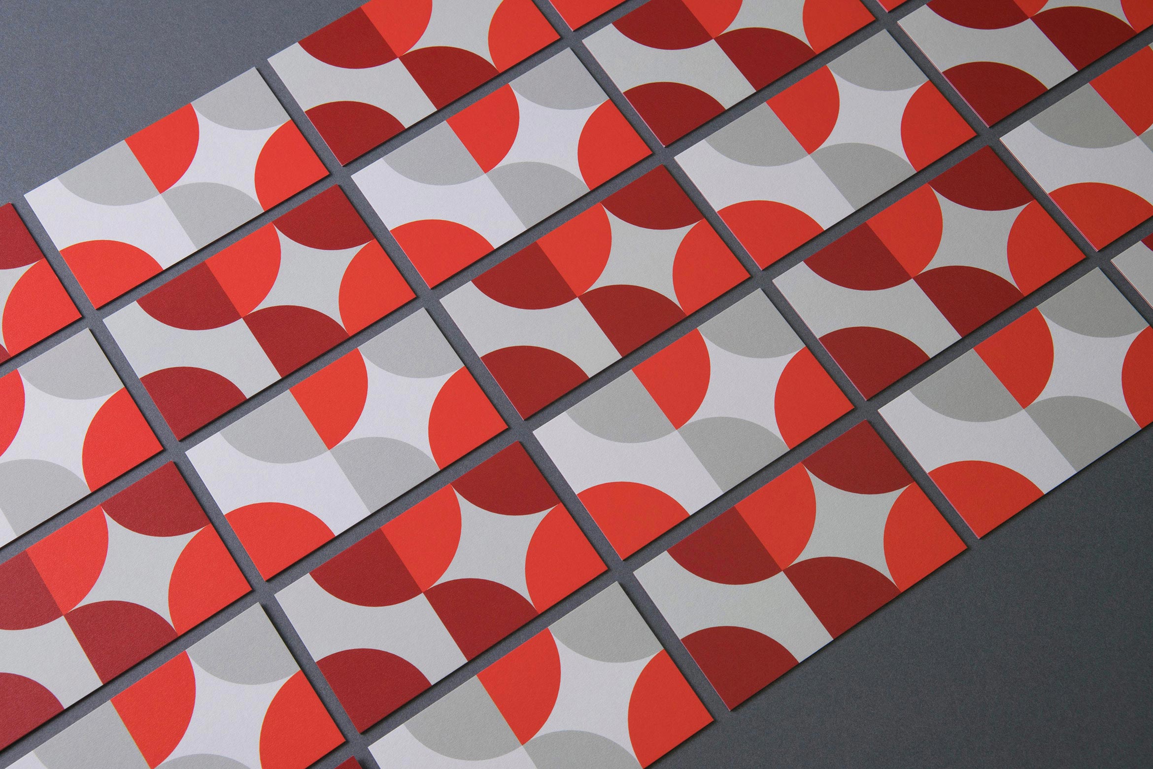
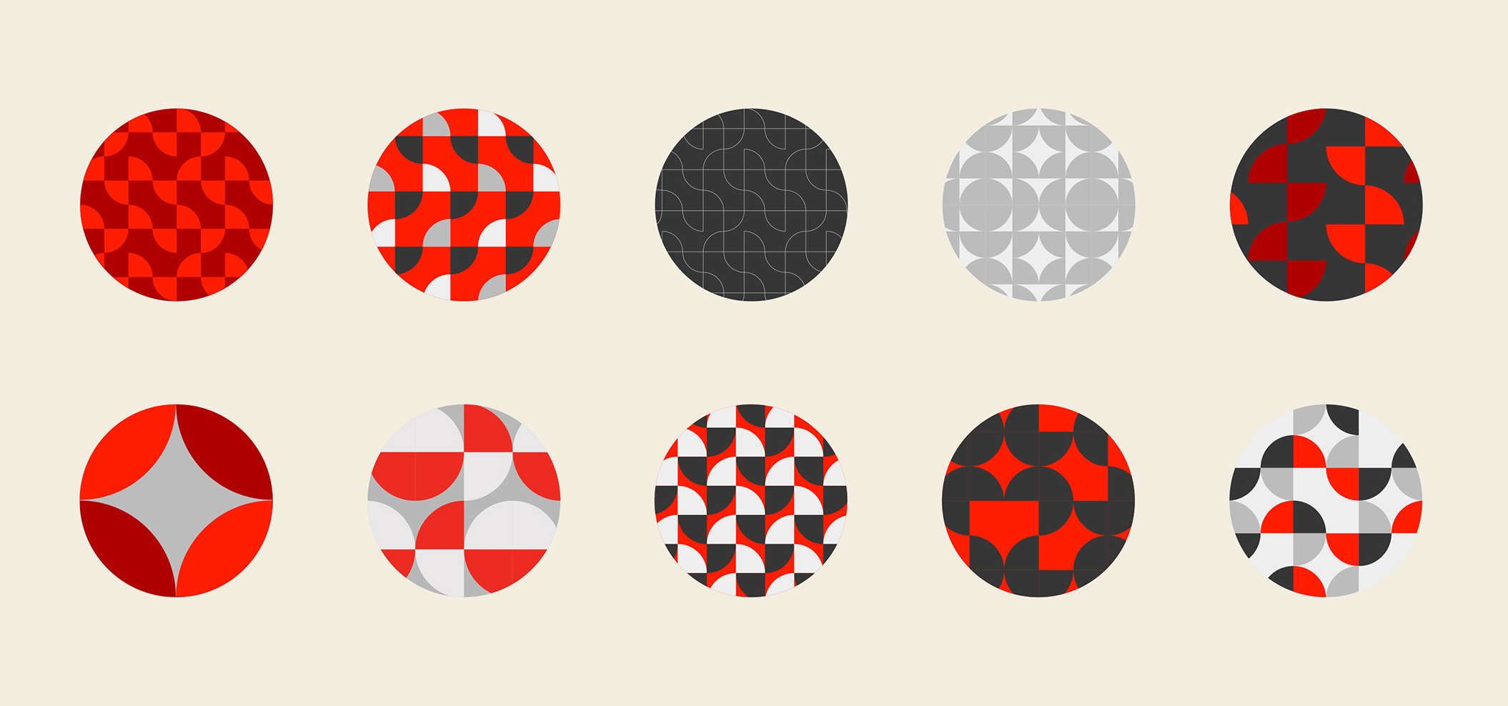
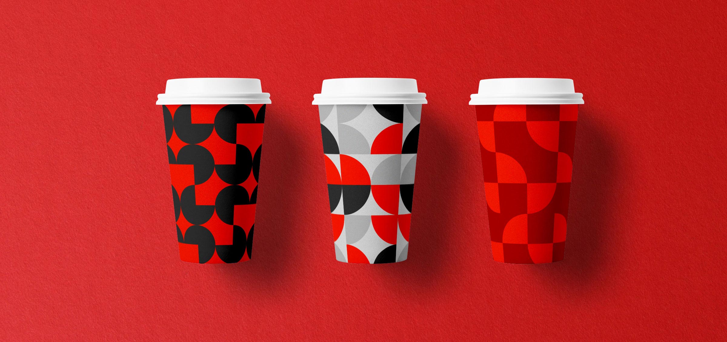
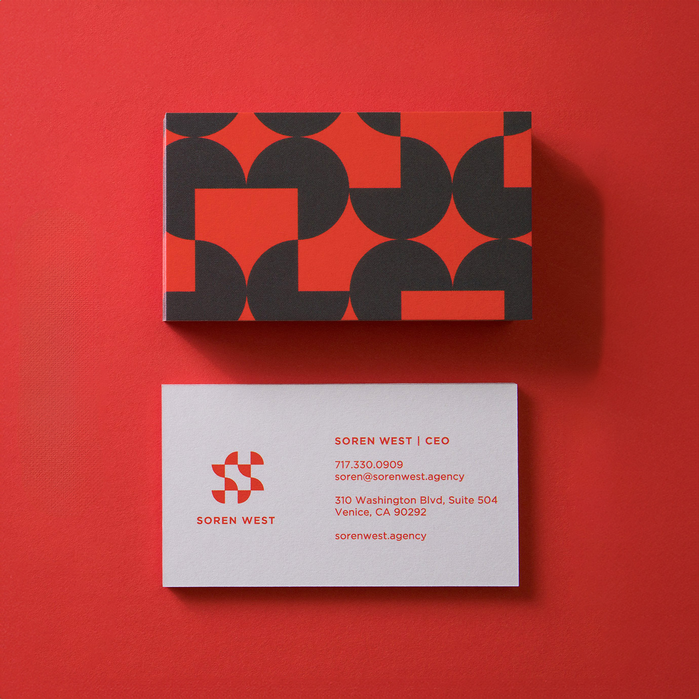
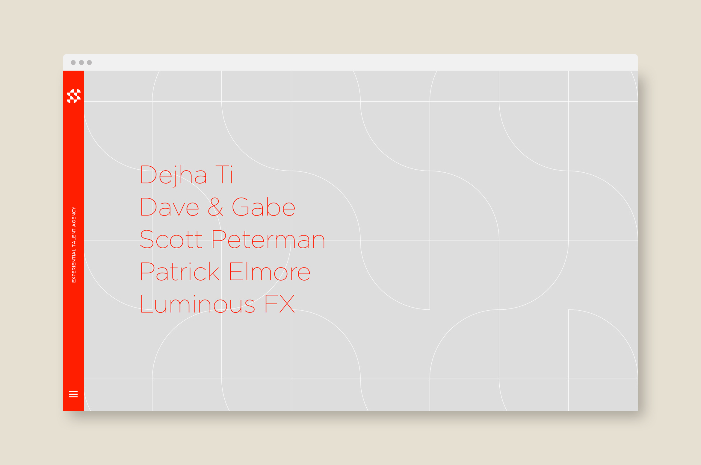
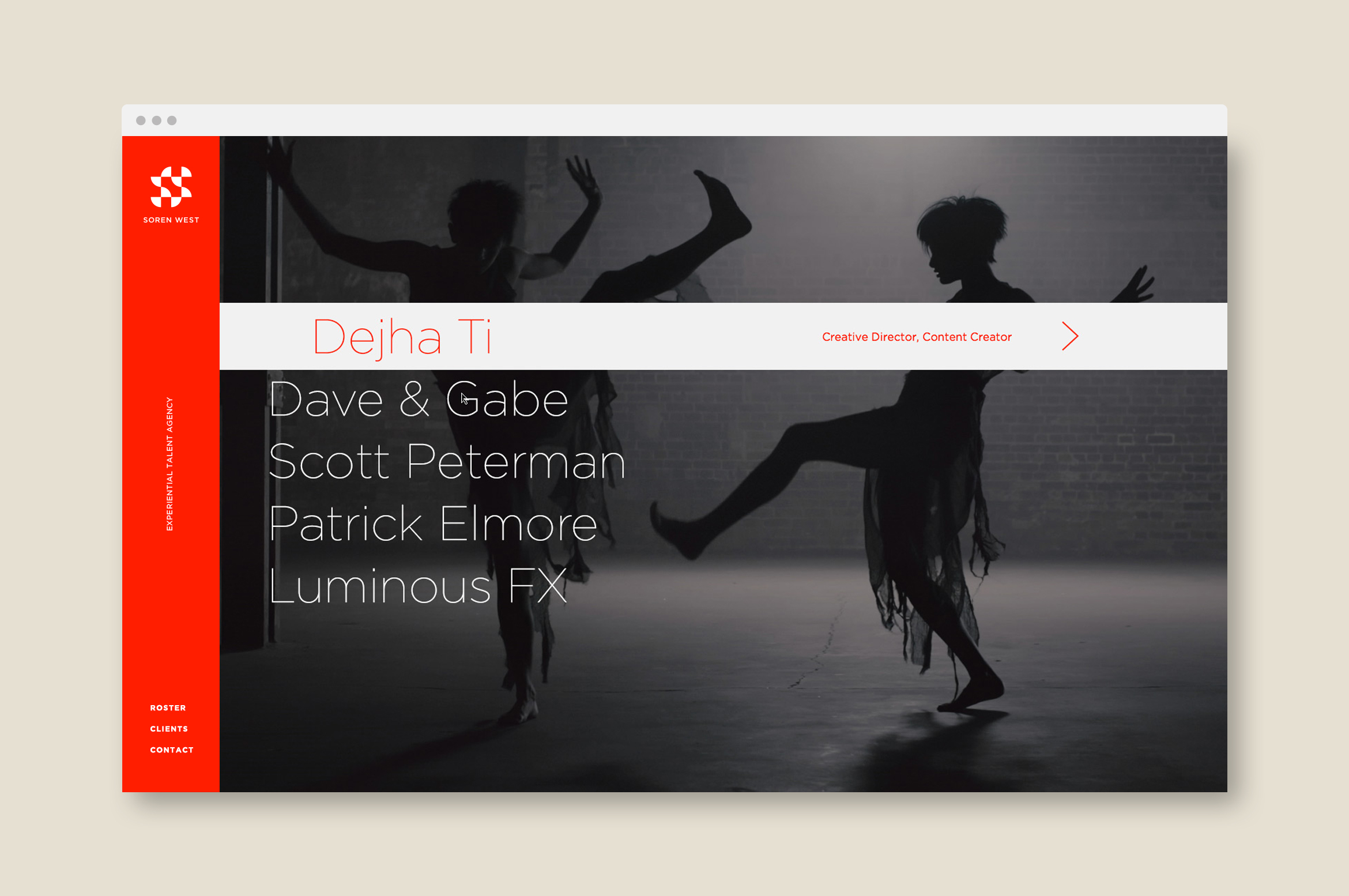
Soren produces immersive events and visual experiences, and manages a roster of creative directors and technology artists that are pioneering experiential brand communications for big brands. Soren’s brand identity is as unique and playful as his roster of artists, starting with an artistic “S” monogram made out of quarter circles that connect in different ways.
Quarter circles from the wordmark are always moving and create a “messy modernism” visual style. Patterns are creative and versatile, with endless animation and collateral possibilities. A series of business cards cleverly uses different designs that become a conversation starter in meetings.
Deliverables:
- Brand Identity
- Brand Guidelines
- Visual System
- Website Design
- Web Development
- Print Collateral
Shortly after the single page website went live we created a brochure site to help establish Soren West as a new production company. The half circle patterns were animated as thin lines to create an experience as unique as his projects.
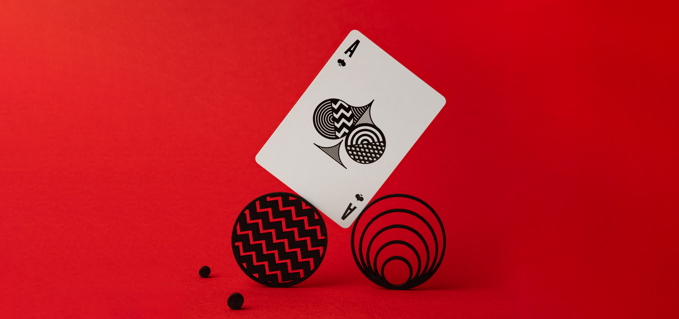
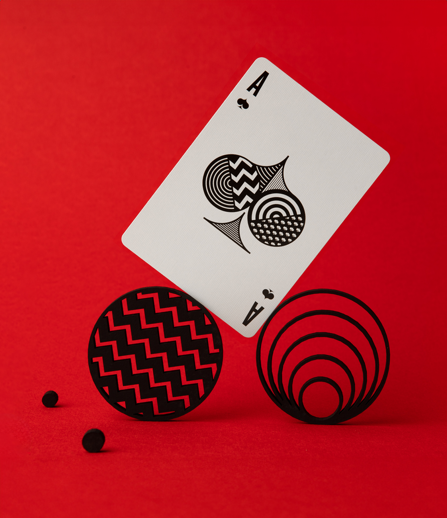
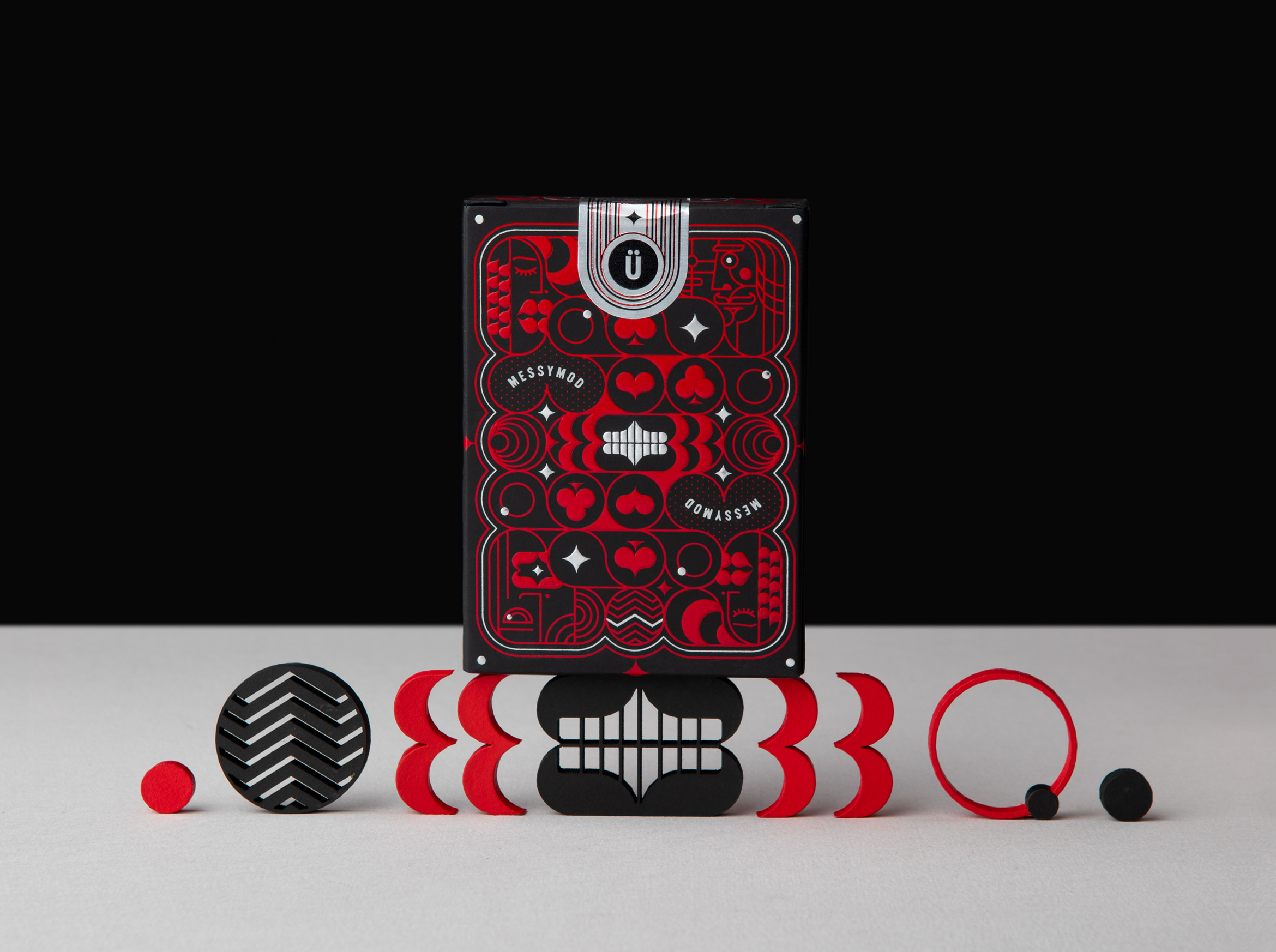
Art of Play x TRÜF
illustration / packaging design
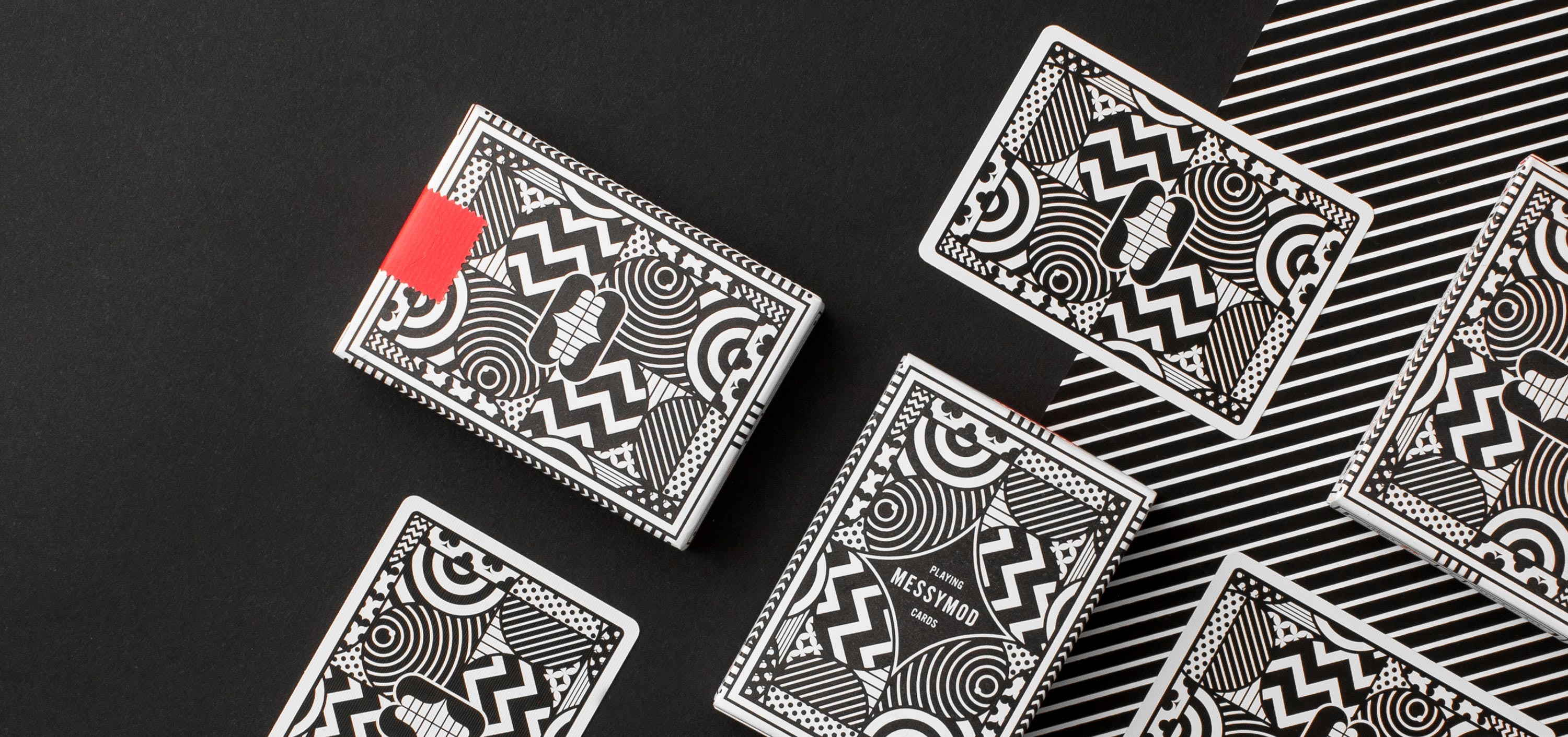
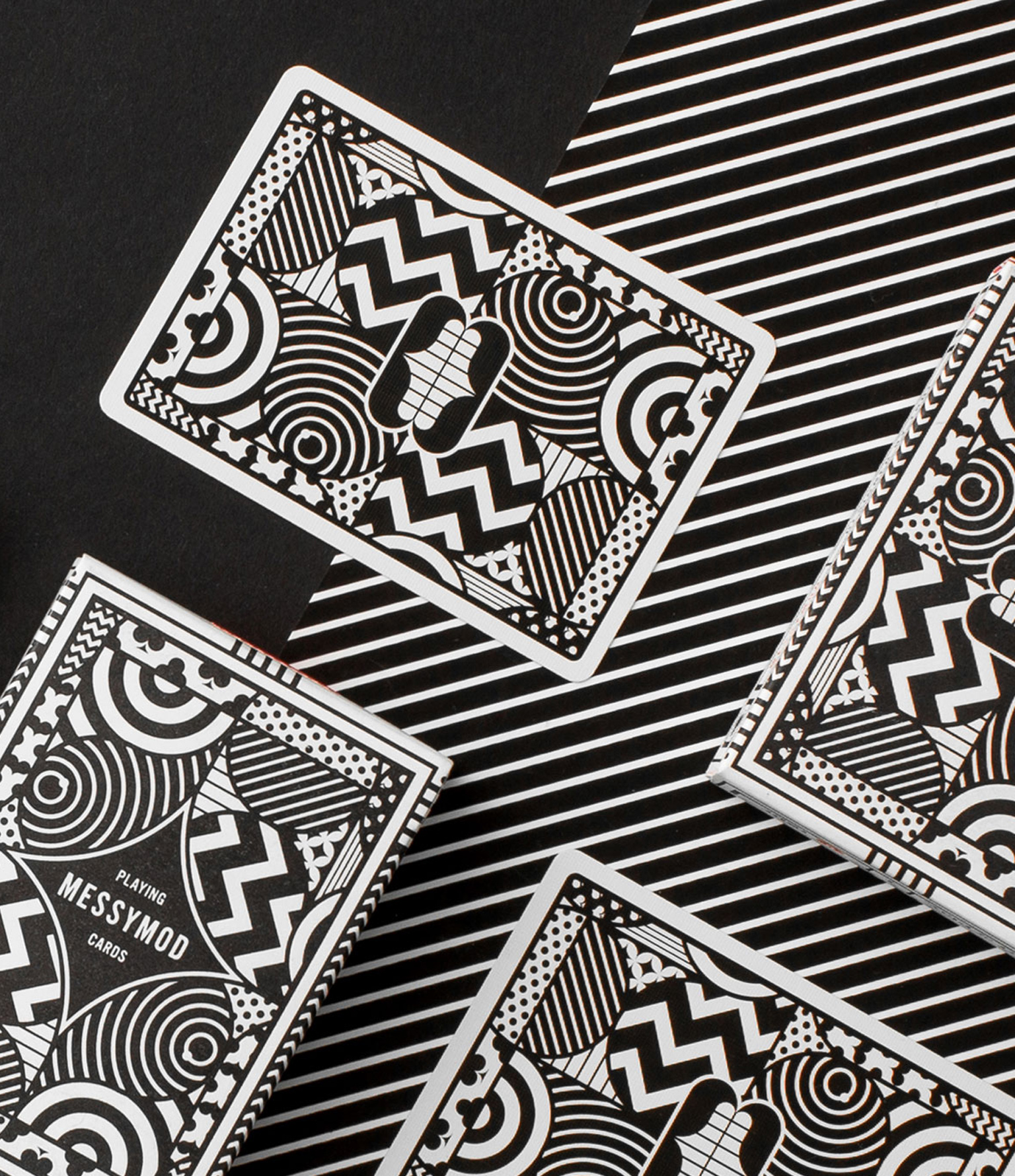
Art of Play x TRÜF = a weird, reimagined deck of Messymod Playing Cards
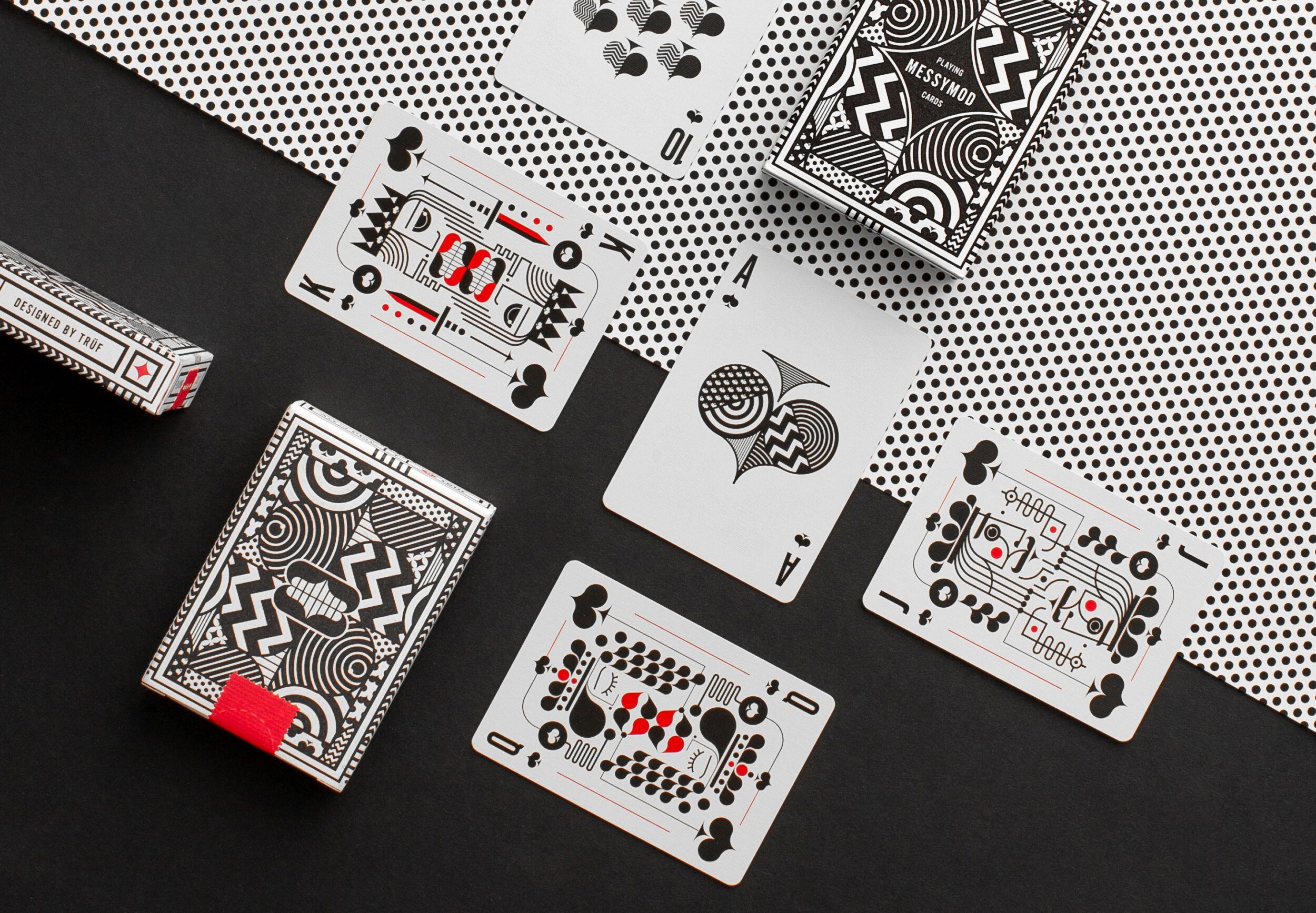
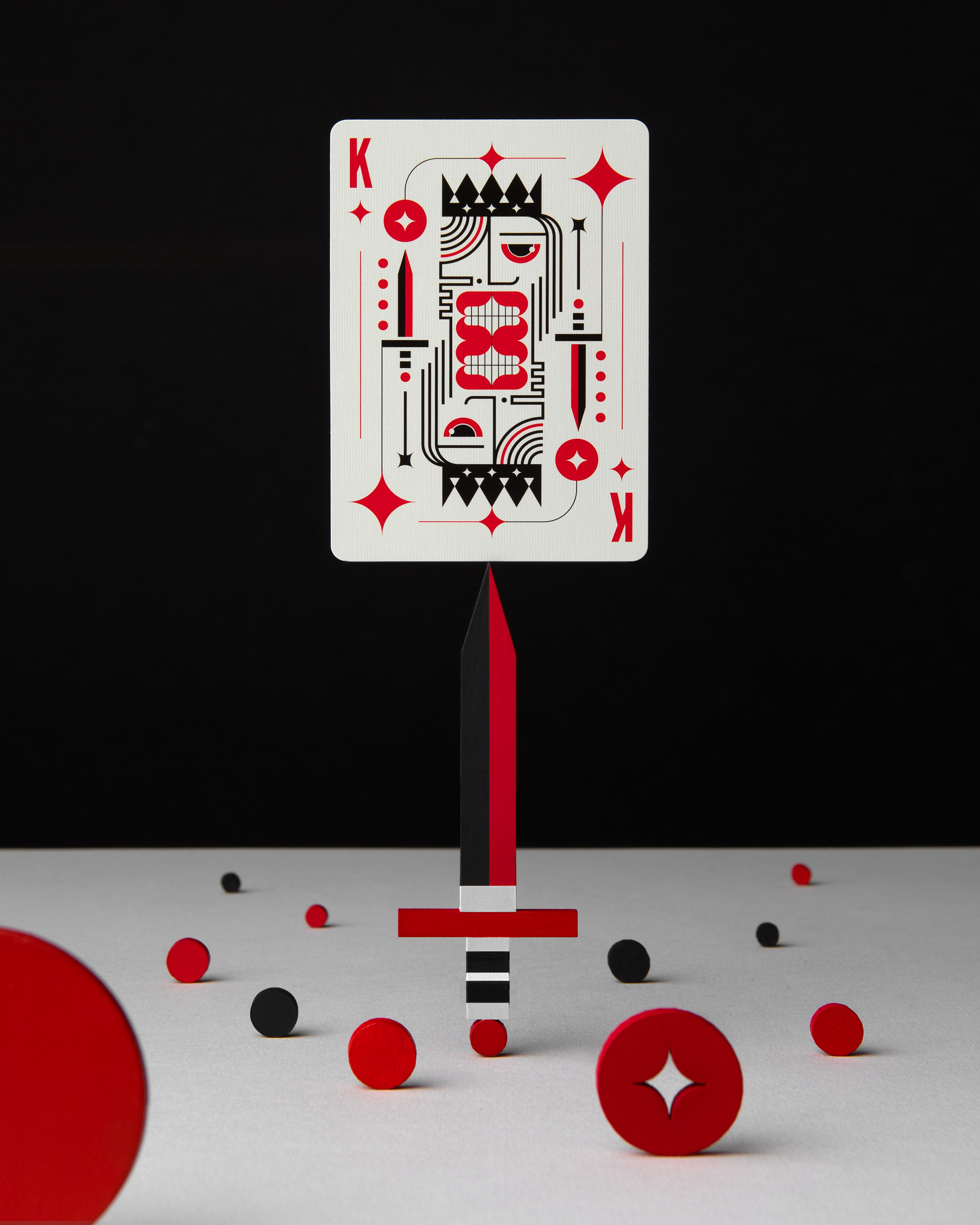
We collaborated with Art of Play, makers of some of the finest playing cards in the universe, to bring you one strange deck. These cards feature a completely custom design in typical Messymod fashion which can be described as minimal, modern, graphic, quirky, stylized, grotesque, delightful and just plain weird.
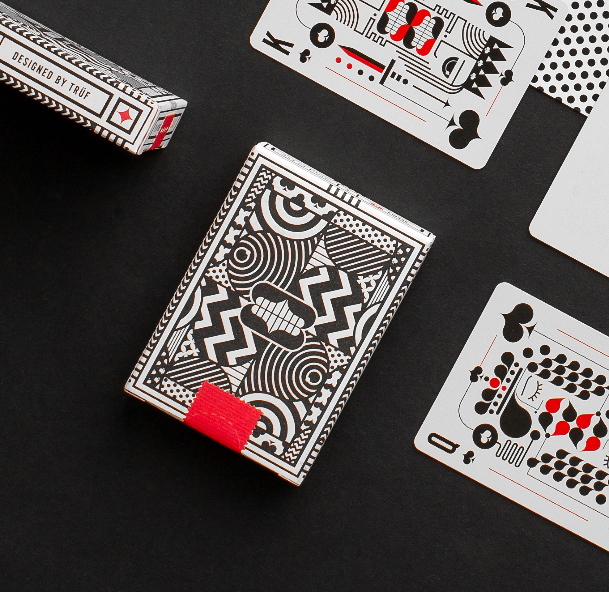

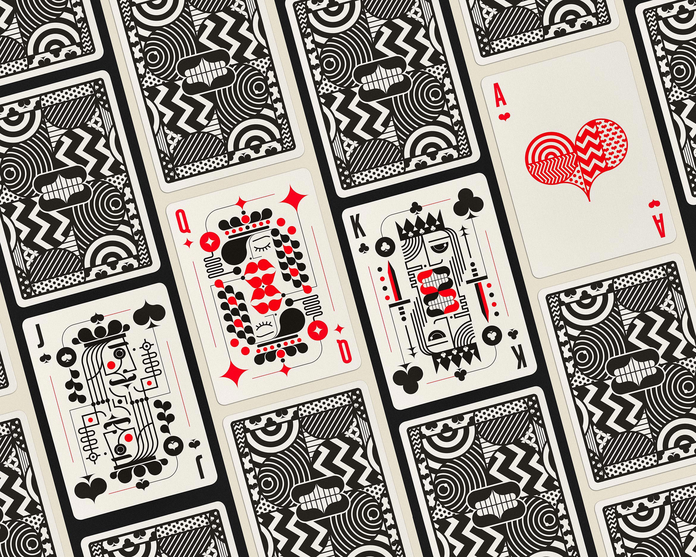
We designed this deck so that each card has its own presence and personality, making them ideal pieces of artwork that can stand on their own. Each card has patterns of suits within suits for endless fun while still being recognizable.
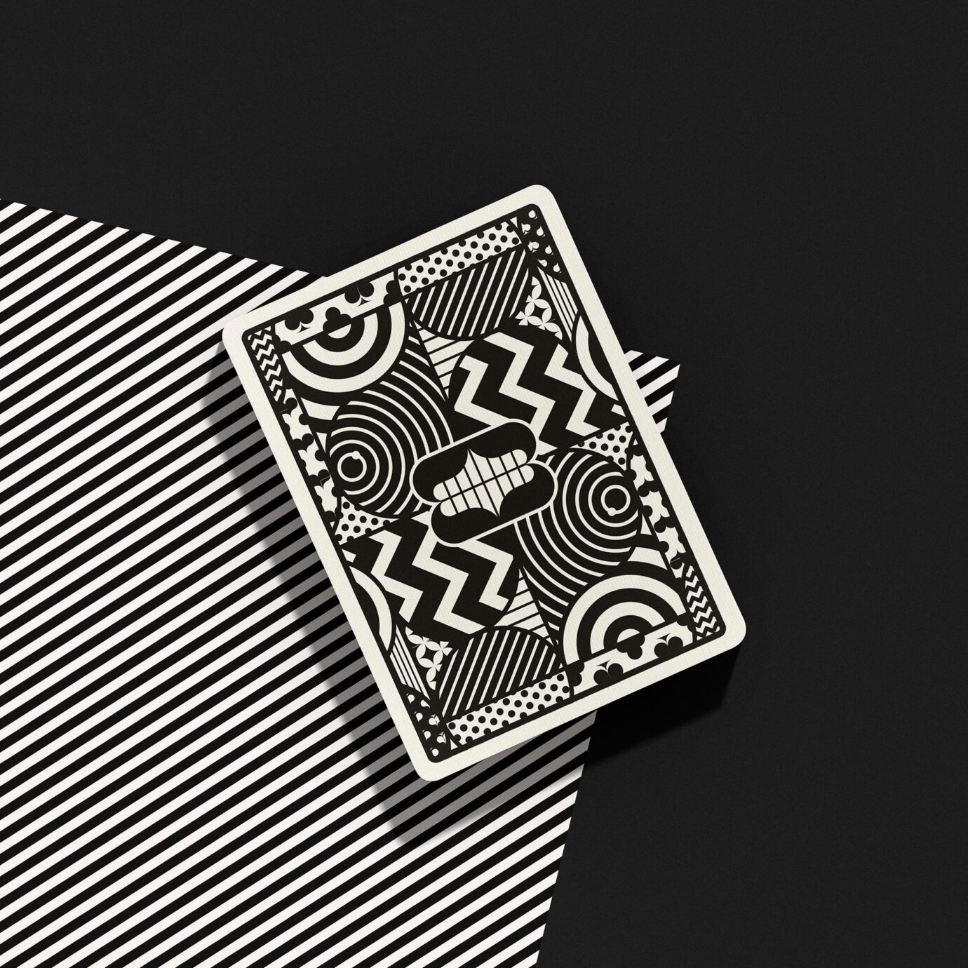
Packaged in a premium letterpress-printed tuck box both inside and out. Printed by the U.S. Playing Card Co. on Art of Play’s trademark thin stock preferred by expert cardists. Available in our messymod shop as an Art + Play bundle.
All photographs courtesy of Art of Play and Pablo Frey.